What can we learn from the IPCC climate models based upon their ability to reconstruct the global average surface temperature variations during the 20th Century?
While the title of this article suggests I�ve found evidence of natural climate cycles in the IPCC models, it�s actually the temperature variability the models CANNOT explain that ends up being related to known climate cycles. After an empirical adjustment for that unexplained temperature variability, it is shown that the models are producing too much global warming since 1970, the period of most rapid growth in atmospheric carbon dioxide. This suggests that the models are too sensitive, in which case they are forecasting too much future warming, too.
Climate Models� 20th Century Runs
We begin with the IPCC’s best estimate of observed global average surface temperature variations over the 20th Century, from the “HadCRUT3” dataset. (Monthly running 3-year averages are shown throughout.) Of course, there are some serious concerns over the validity of this observed temperature record, especially over the strength of the long-term warming trend, but for the time being let’s assume it is correct (click on image to see a large version).
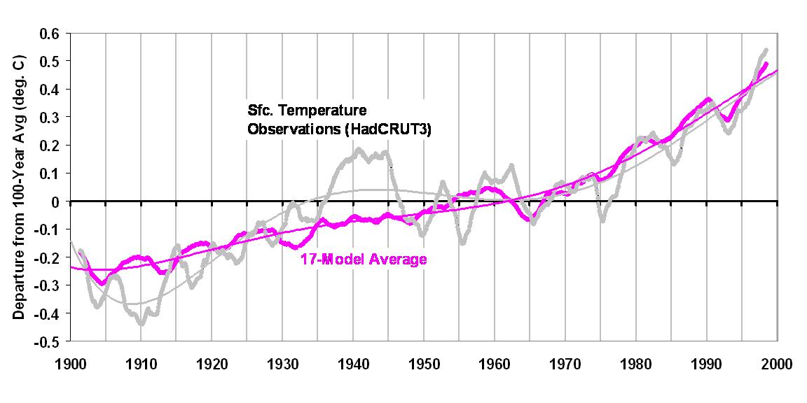
Also shown in the above graph is the climate model temperature reconstruction for the 20th Century averaged across 17 of the 21 climate models which the IPCC tracks. To provide a reconstruction of 20th Century temperatures included in the PCMDI archive of climate model experiments, each modeling group was asked to use whatever forcings they believed were involved in producing the observed temperature record. Those forcings generally include increasing carbon dioxide, various estimates of aerosol (particulate) pollution, and for some of the models, volcanoes. (Also shown are polynomial fits to the curves, to allow a better visualization of the decadal time scale variations.)
There are a couple of notable features in the above chart. First, the average warming trend across all 17 climate models (+0.64 deg C per century) exactly matches the observed trend…I didn’t plot the trend lines, which lie on top of each other. This agreement might be expected since the models have been adjusted by the various modeling groups to best explain the 20th Century climate.
The more interesting feature, though, is the inability of the models to mimic the rapid warming before 1940, and the lack of warming from the 1940s to the 1970s. These two periods of inconvenient temperature variability are well known: (1) the pre-1940 warming was before atmospheric CO2 had increased very much; and (2) the lack of warming from the 1940s to the 1970s was during a time of rapid growth in CO2. In other words, the stronger warming period should have been after 1940, not before, based upon the CO2 warming effect alone.
Natural Climate Variability as an Explanation for What The Models Can Not Mimic
The next chart shows the difference between the two curves in the previous chart, that is, the 20th Century temperature variability the models have not, in an average sense, been able to explain. Also shown are three known modes of natural variability: the Pacific Decadal Oscillation (PDO, in blue); the Atlantic Multidecadal Oscillation (AMO, in green); and the negative of the Southern Oscillation Index (SOI, in red). The SOI is a measure of El Nino and La Nina activity. All three climate indicies have been scaled so that their net amount of variability (standard deviation) matches that of the “unexplained temperature” curve.
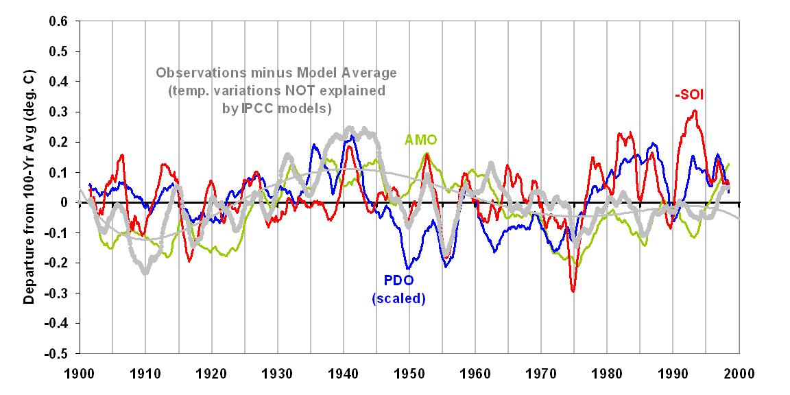
As can be seen, the three climate indices all bear some level of resemblance to the unexplained temperature variability in the 20th Century.
An optimum linear combination of the PDO, AMO, and SOI that best matches the models� �unexplained temperature variability� is shown as the dashed magenta line in the next graph. There are some time lags included in this combination, with the PDO preceding temperature by 8 months, the SOI preceding temperature by 4 months, and the AMO having no time lag.
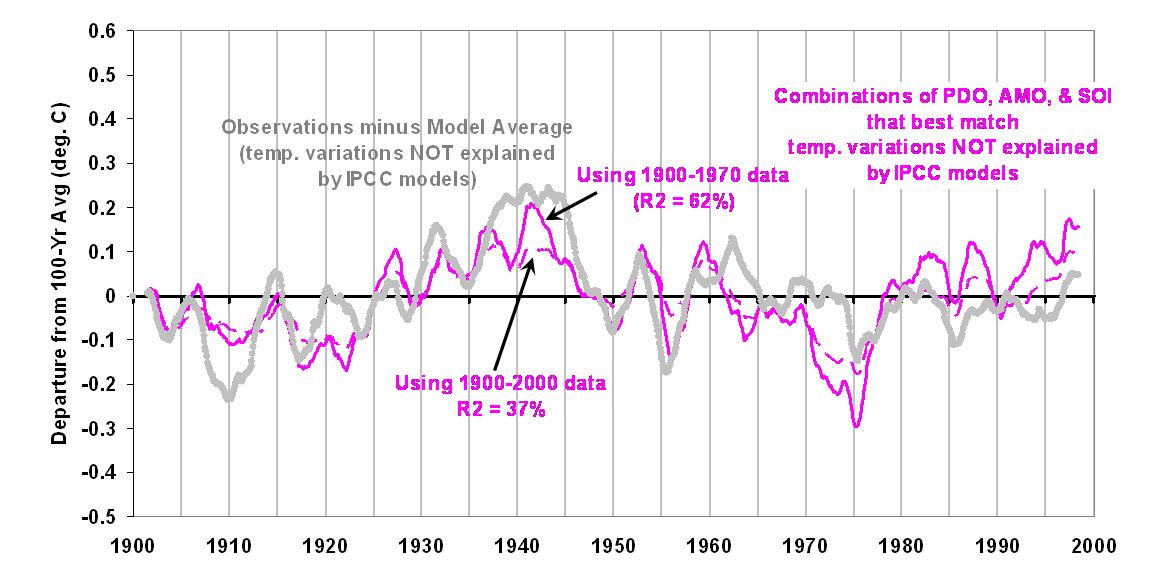
This demonstrates that, at least from an empirical standpoint, there are known natural modes of climate variability that might explain at least some portion of the temperature variability seen during the 20th Century. If we exclude the post-1970 data from the above analysis, the best combination of the PDO, AMO, and SOI results in the solid magenta curve. Note that it does a somewhat better job of capturing the warmth around 1940.
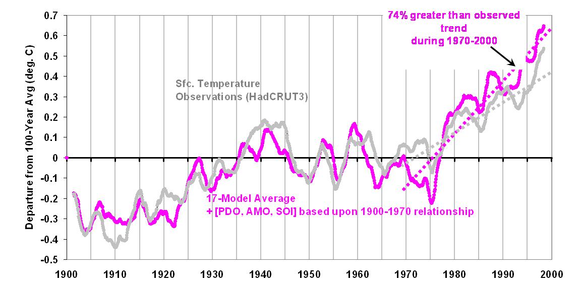
Now, let’s add this natural component in with the original model curve we saw in the first graph, first based upon the full 100 years of overlap:
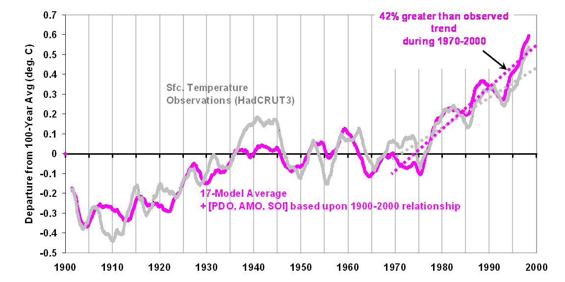
We now find a much better match with the observed temperature record. But we see that the post-1970 warming produced by the combined physical-statistical model tends to be over-stated, by about 40%. If we use the 1900 to 1970 overlap to come up with a natural variability component, the following graph shows that the post-1970 warming is overstated by even more: 74%.
Interpretation
What I believe this demonstrates is that after known, natural modes of climate variability are taken into account, the primary period of supposed CO2-induced warming during the 20th Century � that from about 1970 onward � does not need as strong a CO2-warming effect as is programmed into the average IPCC climate model. This is because the natural variability seen BEFORE 1970 suggests that part of the warming AFTER 1970 is natural! Note that I have deduced this from the IPCC’s inherent admission that they can not explain all of the temperature variability seen during the 20th Century.
The Logical Absurdity of Some Climate Sensitivity Arguments
This demonstrates one of the absurdities (Dick Lindzen�s term, as I recall) in the way current climate change theory works: For a given observed temperature change, the smaller the forcing that caused it, the greater the inferred sensitivity of the climate system. This is why Jim Hansen believes in catastrophic global warming: since he thinks he knows for sure that a relatively tiny forcing caused the Ice Ages, then the greater forcing produced by our CO2 emissions will result in even more dramatic climate change!
But taken to its logical conclusion, this relationship between the strength of the forcing, and the inferred sensitivity of the climate system, leads to the absurd notion that an infinitesimally small forcing causes nearly infinite climate sensitivity(!) As I have mentioned before, this is analogous to an ancient tribe of people thinking their moral shortcomings were responsible for lightning, storms, and other whims of nature.
This absurdity is avoided if we simply admit that we do not know all of the natural forcings involved in climate change. And the greater the number of natural forcings involved, then the less we have to worry about human-caused global warming.
The IPCC, though, never points out this inherent source of bias in its reports. But the IPCC can not admit to scientific uncertainty…that would reduce the chance of getting the energy policy changes they so desire.

 Home/Blog


