Archive for February, 2010

Spurious Warming in the Jones U.S. Temperatures Since 1973

Saturday, February 27th, 2010

INTRODUCTION
As I discussed in my last post, I’m exploring the International Surface Hourly (ISH) weather data archived by NOAA to see how a simple reanalysis of original weather station temperature data compares to the Jones CRUTem3 land-based temperature dataset.

While the Jones temperature analysis relies upon the GHCN network of ‘climate-approved’ stations whose number has been rapidly dwindling in recent years, I’m using original data from stations whose number has been actually growing over time. I use only stations operating over the entire period of record so there are no spurious temperature trends caused by stations coming and going over time. Also, while the Jones dataset is based upon daily maximum and minimum temperatures, I am computing an average of the 4 temperature measurements at the standard synoptic reporting times of 06, 12, 18, and 00 UTC.

U.S. TEMPERATURE TRENDS, 1973-2009
I compute average monthly temperatures in 5 deg. lat/lon grid squares, as Jones does, and then compare the two different versions over a selected geographic area. Here I will show results for the 5 deg. grids covering the United States for the period 1973 through 2009.

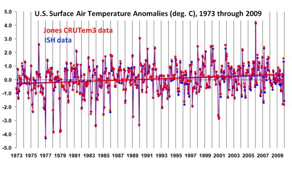
The following plot shows that the monthly U.S. temperature anomalies from the two datasets are very similar (anomalies in both datasets are relative to the 30-year base period from 1973 through 2002). But while the monthly variations are very similar, the warming trend in the Jones dataset is about 20% greater than the warming trend in my ISH data analysis.
CRUTem3-and-ISH-US-1973-2009

This is a little curious since I have made no adjustments for increasing urban heat island (UHI) effects over time, which likely are causing a spurious warming effect, and yet the Jones dataset which IS (I believe) adjusted for UHI effects actually has somewhat greater warming than the ISH data.

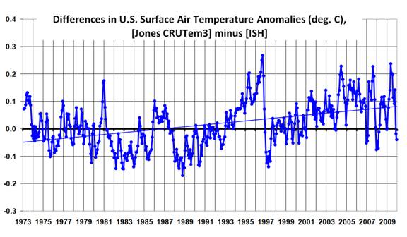
A plot of the difference between the two datasets is shown next, which reveals some abrupt transitions. Most noteworthy is what appears to be a rather rapid spurious warming in the Jones dataset between 1988 and 1996, with an abrupt “reset” downward in 1997 and then another spurious warming trend after that.
CRUTem3-minus-ISH-US-1973-2009

While it might be a little premature to blame these spurious transitions on the Jones dataset, I use only those stations operating over the entire period of record, which Jones does not do. So, it is difficult to see how these effects could have been caused in my analysis. Also, the number of 5 deg grid squares used in this comparison remained the same throughout the 37 year period of record (23 grids).

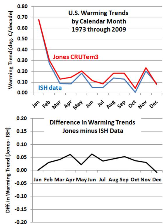
The decadal temperature trends by calendar month are shown in the next plot. We see in the top panel that the greatest warming since 1973 has been in the months of January and February in both datasets. But the bottom panel suggests that the stronger warming in the Jones dataset seems to be a warm season, not winter, phenomenon.
CRUTem3-vs-ISH-US-1973-2009-by-calendar-month

THE NEED FOR NEW TEMPERATURE RENALYSES
I suspect it would be difficult to track down the precise reasons why the differences in the above datasets exist. The data used in the Jones analysis has undergone many changes over time, and the more complex and subjective the analysis methodology, the more difficult it is to ferret out the reasons for specific behaviors.

I am increasingly convinced that a much simpler, objective analysis of original weather station temperature data is necessary to better understand how spurious influences might have impacted global temperature trends computed by groups such as CRU and NASA/GISS. It seems to me that a simple and easily repeatable methodology should be the starting point. Then, if one can demonstrate that the simple temperature analysis has spurious temperature trends, an objective and easily repeatable adjustment methodology should be the first choice for an improved version of the analysis.

In my opinion, simplicity, objectivity, and repeatability should be of paramount importance. Once one starts making subjective adjustments of individual stations’ data, the ability to replicate work becomes almost impossible.

Therefore, more important than the recently reported “do-over” of a global temperature reanalysis proposed by the UK’s Met Office would be other, independent researchers doing their own global temperature analysis. In my experience, better methods of data analysis come from the ideas of individuals, not from the majority rule of a committee.

Of particular interest to me at this point is a simple and objective method for quantifying and removing the spurious warming arising from the urban heat island (UHI) effect. The recent paper by McKitrick and Michaels suggests that a substantial UHI influence continues to infect the GISS and CRU temperature datasets.

In fact, the results for the U.S. I have presented above almost seem to suggest that the Jones CRUTem3 dataset has a UHI adjustment that is in the wrong direction. Coincidentally, this is also the conclusion of a recent post on Anthony Watts’ blog, discussing a new paper published by SPPI.

It is increasingly apparent that we do not even know how much the world has warmed in recent decades, let alone the reason(s) why. It seems to me we are back to square one.


New Work on the Recent Warming of Northern Hemispheric Land Areas

Saturday, February 20th, 2010

INTRODUCTION

Arguably the most important data used for documenting global warming are surface station observations of temperature, with some stations providing records back 100 years or more. By far the most complete data available are for Northern Hemisphere land areas; the Southern Hemisphere is chronically short of data since it is mostly oceans.

But few stations around the world have complete records extending back more than a century, and even some remote land areas are devoid of measurements. For these and other reasons, analysis of “global” temperatures has required some creative data massaging. Some of the necessary adjustments include: switching from one station to another as old stations are phased out and new ones come online; adjusting for station moves or changes in equipment types; and adjusting for the Urban Heat Island (UHI) effect. The last problem is particularly difficult since virtually all thermometer locations have experienced an increase in manmade structures replacing natural vegetation, which inevitably introduces a spurious warming trend over time of an unknown magnitude.

There has been a lot of criticism lately of the two most publicized surface temperature datsets: those from Phil Jones (CRU) and Jim Hansen (GISS). One summary of these criticisms can be found here. These two datasets are based upon station weather data included in the Global Historical Climate Network (GHCN) database archived at NOAA’s National Climatic Data Center (NCDC), a reduced-volume and quality-controlled dataset officially blessed by your government for climate work.

One of the most disturbing changes over time in the GHCN database is a rapid decrease in the number of stations over the last 30 years or so, after a peak in station number around 1973. This is shown in the following plot which I pilfered from this blog.

Given all of the uncertainties raised about these data, there is increasing concern that the magnitude of observed ‘global warming’ might have been overstated.

TOWARD A NEW SATELLITE-BASED SURFACE TEMPERATURE DATASET

We have started working on a new land surface temperature retrieval method based upon the Aqua satellite AMSU window channels and “dirty-window” channels. These passive microwave estimates of land surface temperature, unlike our deep-layer temperature products, will be empirically calibrated with several years of global surface thermometer data.

The satellite has the benefit of providing global coverage nearly every day. The primary disadvantages are (1) the best (Aqua) satellite data have been available only since mid-2002; and (2) the retrieval of surface temperature requires an accurate adjustment for the variable microwave emissivity of various land surfaces. Our method will be calibrated once, with no time-dependent changes, using all satellite-surface station data matchups during 2003 through 2007. Using this method, if there is any spurious drift in the surface station temperatures over time (say due to urbanization) this will not cause a drift in the satellite measurements.

Despite the shortcomings, such a dataset should provide some interesting insights into the ability of the surface thermometer network to monitor global land temperature variations. (Sea surface temperature estimates are already accurately monitored with the Aqua satellite, using data from AMSR-E).

THE INTERNATIONAL SURFACE HOURLY (ISH) DATASET

Our new satellite method requires hourly temperature data from surface stations to provide +/- 15 minute time matching between the station and the satellite observations. We are using the NOAA-merged International Surface Hourly (ISH) dataset for this purpose. While these data have not had the same level of climate quality tests the GHCN dataset has undergone, they include many more stations in recent years. And since I like to work from the original data, I can do my own quality control to see how my answers differ from the analyses performed by other groups using the GHCN data.

The ISH data include globally distributed surface weather stations since 1901, and are updated and archived at NCDC in near-real time. The data are available for free to .gov and .edu domains. (NOTE: You might get an error when you click on that link if you do not have free access. For instance, I cannot access the data from home.)

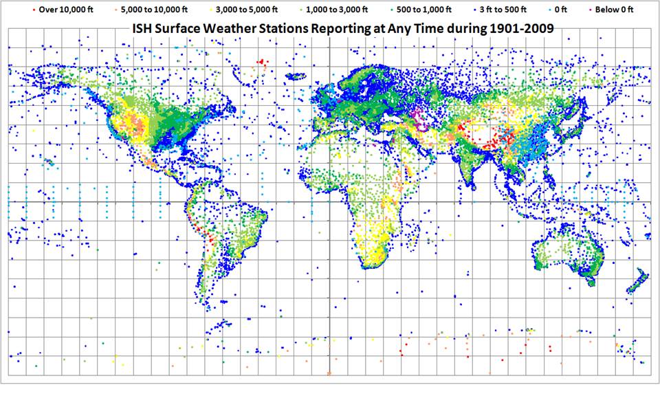
The following map shows all stations included in the ISH dataset. Note that many of these are no longer operating, so the current coverage is not nearly this complete. I have color-coded the stations by elevation (click on image for full version).
ISH-station-map-1901-thru-2009

WARMING OF NORTHERN HEMISPHERIC LAND AREAS SINCE 1986

Since it is always good to immerse yourself into a dataset to get a feeling for its strengths and weaknesses, I decided I might as well do a Jones-style analysis of the Northern Hemisphere land area (where most of the stations are located). Jones’ version of this dataset, called “CRUTem3NH”, is available here.

I am used to analyzing large quantities of global satellite data, so writing a program to do the same with the surface station data was not that difficult. (I know it’s a little obscure and old-fashioned, but I always program in Fortran). I was particularly interested to see whether the ISH stations that have been available for the entire period of record would show a warming trend in recent years like that seen in the Jones dataset. Since the first graph (above) shows that the number of GHCN stations available has decreased rapidly in recent years, would a new analysis using the same number of stations throughout the record show the same level of warming?

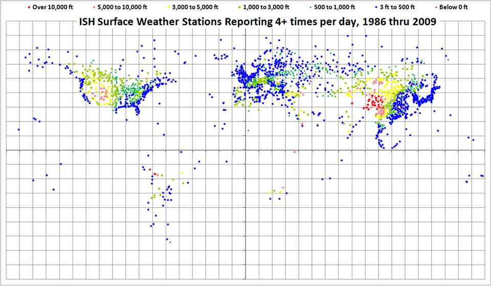
The ISH database is fairly large, organized in yearly files, and I have been downloading the most recent years first. So far, I have obtained data for the last 24 years, since 1986. The distribution of all stations providing fairly complete time coverage since 1986, having observations at least 4 times per day, is shown in the following map.
ISH-station-map-1986-thru-2009-6-hrly

I computed daily average temperatures at each station from the observations at 00, 06, 12, and 18 UTC. For stations with at least 20 days of such averages per month, I then computed monthly averages throughout the 24 year period of record. I then computed an average annual cycle at each station separately, and then monthly anomalies (departures from the average annual cycle).

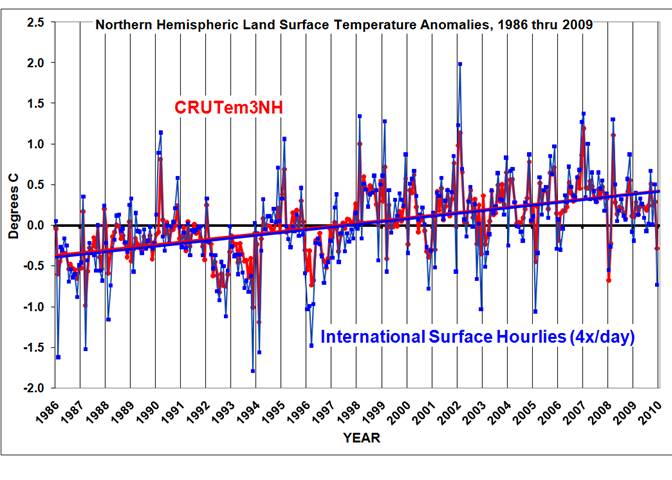
Similar to the Jones methodology, I then averaged all station month anomalies in 5 deg. grid squares, and then area-weighted those grids having good data over the Northern Hemisphere. I also recomputed the Jones NH anomalies for the same base period for a more apples-to-apples comparison. The results are shown in the following graph.
ISH-vs-CRUTem3NH-1986-thru-2009

I’ll have to admit I was a little astounded at the agreement between Jones’ and my analyses, especially since I chose a rather ad-hoc method of data screening that was not optimized in any way. Note that the linear temperature trends are essentially identical; the correlation between the monthly anomalies is 0.91.

One significant difference is that my temperature anomalies are, on average, magnified by 1.36 compared to Jones. My first suspicion is that Jones has relatively more tropical than high-latitude area in his averages, which would mute the signal. I did not have time to verify this.

Of course, an increasing urban heat island effect could still be contaminating both datasets, resulting in a spurious warming trend. Also, when I include years before 1986 in the analysis, the warming trends might start to diverge. But at face value, this plot seems to indicate that the rapid decrease in the number of stations included in the GHCN database in recent years has not caused a spurious warming trend in the Jones dataset — at least not since 1986. Also note that December 2009 was, indeed, a cool month in my analysis.

FUTURE PLANS
We are still in the early stages of development of the satellite-based land surface temperature product, which is where this post started.

Regarding my analysis of the ISH surface thermometer dataset, I expect to extend the above analysis back to 1973 at least, the year when a maximum number of stations were available. I’ll post results when I’m done.

In the spirit of openness, I hope to post some form of my derived dataset — the monthly station average temperatures, by UTC hour — so others can analyze it. The data volume will be too large to post at this website, which is hosted commercially; I will find someplace on our UAH computer system so others can access it through ftp.

While there are many ways to slice and dice the thermometer data, I do not have a lot of time to devote to this side effort. I can’t respond to all the questions and suggestions you e-mail me on this subject, but I promise I will read them.


January 2010 Global Tropospheric Temperature Map

Tuesday, February 9th, 2010

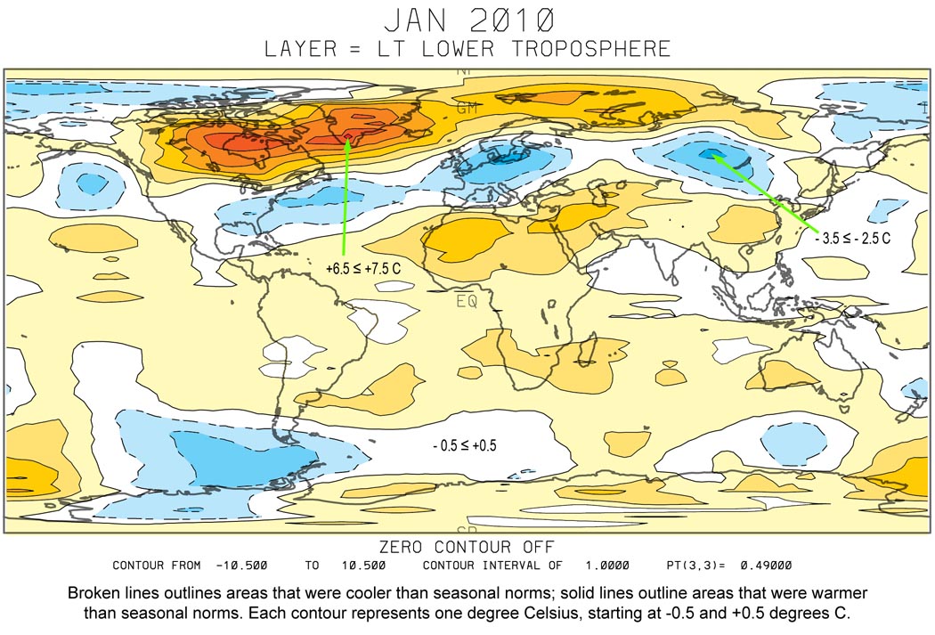
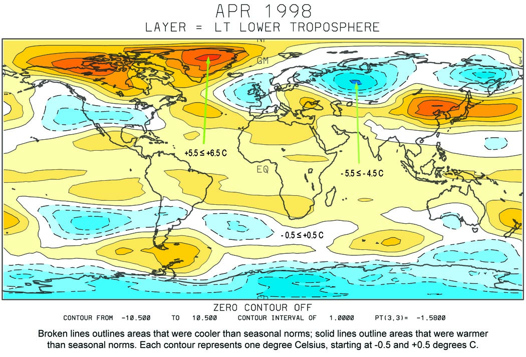
Here’s the UAH lower tropospheric temperature anomaly map for January, 2010. As can be seen, Northern Hemispheric land, on a whole, is not as cold as many of us thought (click on image for larger version). Below-normal areas were restricted to parts of Russia and China, most of Europe, and the southeastern United States. Most of Canada and Greenland were well above normal:
UAH_LT_2010_01_grid
It should also be remembered that lower tropospheric temperature anomalies for one month over a small region are not necessarily going to look like surface temperature anomalies.

Since January 2010 was the third-warmest month in the 32-year satellite record, it might be of interest to compare the above patterns with the warmest month of record, April, 1998, which was an El Nino year, too:
UAH_LT_1998_04_grid


Some Thoughts on the Warm January, 2010

Monday, February 8th, 2010

I continue to get lots of e-mails asking how global average tropospheric temperatures for January, 2010 could be at a record high (for January, anyway, in the 32 year satellite record) when it seems like it was such a cold January where people actually live.

I followed up with a short sea surface temperature analysis from AMSR-E data which ended up being consistent with the AMSU tropospheric temperatures.

I’m sure part of the reason is warm El Nino conditions in the Pacific. Less certain is my guess that when the Northern Hemisphere continents are unusually cold in winter, then ocean surface temperatures, at least in the Northern Hemisphere, should be unusually warm. But this is just speculation on my part, based on the idea that cold continental air masses can intensify when they get land-locked, with less flow of maritime air masses over the continents, and less flow of cold air masses over the ocean. Maybe the Arctic Oscillation is an index of this, as a few of you have suggested, but I really don’t know.

Also, remember that there are always quasi-monthly oscillations in the amount of heat flux from the ocean to the atmosphere, primarily in the tropics, which is why a monthly up-tick in tropospheric temperatures is usually followed by a down-tick the next month, and vice-versa.

So, it could be that all factors simply conspired to give an unusually warm spike in January…only time will tell.

But this event has also spurred me to do something I’ve been putting off for years, which is develop limb corrections for the Aqua AMSU instrument. This will allow us to make global grids from the data (current grids are still based upon NOAA-15, which we know has a spurious warming over land areas from orbital decay and a changing local observation time). Since the Aqua AMSU is the first instrument on a satellite whose orbit is actively maintained, there will be no problem with those data since Aqua came online in mid-2002.

[Don’t get confused here…we use NOAA-15 AMSU ONLY to get spatial patterns, which are then forced to match the Aqua AMSU measurements when averaged in latitude bands. So, using NOAA-15 data does not corrupt the global or latitude-band averages…but they do affect how the warm and cool patterns are partitioned between land and ocean.]

I might also extend the analysis to specifically retrieve near-surface temperatures over land. I did this several years ago with SSM/I data over land, but never tried to get it published. It could be that such a comparison between AMSU surface and near-surface channels will uncover some interesting things about the urban heat island effect, since I use hourly surface temperature observations as training data in that effort.


NASA Aqua Sea Surface Temperatures Support a Very Warm January, 2010

Thursday, February 4th, 2010

When I saw the “record” warmth of our UAH global-average lower tropospheric temperature (LT) product (warmest January in the 32-year satellite record), I figured I was in for a flurry of e-mails: “But this is the coldest winter I’ve seen since there were only 3 TV channels! How can it be a record warm January?”

Sorry, folks, we don’t make the climate…we just report it.

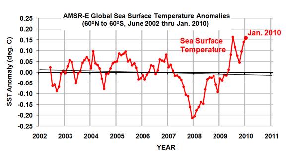
But, I will admit I was surprised. So, I decided to look at the AMSR-E sea surface temperatures (SSTs) that Remote Sensing Systems has been producing from NASA’s Aqua satellite since June of 2002. Even though the SST data record is short, and an average for the global ice-free oceans is not the same as global, the two do tend to vary together on monthly or longer time scales.

The following graph shows that January, 2010, was indeed warm in the sea surface temperature data:
AMSR-E-SST-thru-Jan-2010
But it is difficult to compare the SST product directly with the tropospheric temperature anomalies because (1) they are each relative to different base periods, and (2) tropospheric temperature variations are usually larger than SST variations.

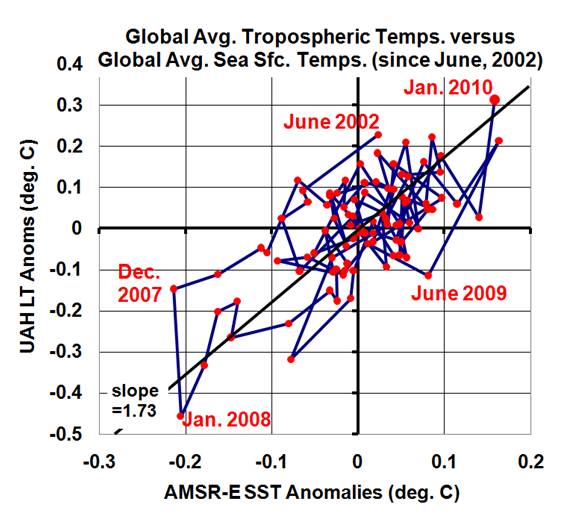
So, I recomputed the UAH LT anomalies relative to the SST period of record (since June, 2002), and plotted the variations in the two against each other in a scatterplot (below). I also connected the successive monthly data points with lines so you can see the time-evolution of the tropospheric and sea surface temperature variations:
UAH-LT-vs-AMSR-E-SST-thru-Jan-2010
As can be seen, January, 2010 (in the upper-right portion of the graph) is quite consistent with the average relationship between these two temperature measures over the last 7+ years.

[NOTE: While the tropospheric temperatures we compute come from the AMSU instrument that also flies on the NASA Aqua satellite, along with the AMSR-E, there is no connection between the calibrations of these two instruments.]


January 2010 UAH Global Temperature Update +0.72 Deg. C

Thursday, February 4th, 2010

UPDATE (4:00 p.m. Jan. 4): I’ve determined that the warm January 2010 anomaly IS consistent with AMSR-E sea surface temperatures from NASA’s Aqua satellite…I will post details later tonight or in the a.m. – Roy


YR MON GLOBE NH SH TROPICS
2009 01 +0.304 +0.443 +0.165 -0.036
2009 02 +0.347 +0.678 +0.016 +0.051
2009 03 +0.206 +0.310 +0.103 -0.149
2009 04 +0.090 +0.124 +0.056 -0.014
2009 05 +0.045 +0.046 +0.044 -0.166
2009 06 +0.003 +0.031 -0.025 -0.003
2009 07 +0.411 +0.212 +0.610 +0.427
2009 08 +0.229 +0.282 +0.177 +0.456
2009 09 +0.422 +0.549 +0.294 +0.511
2009 10 +0.286 +0.274 +0.297 +0.326
2009 11 +0.497 +0.422 +0.572 +0.495
2009 12 +0.288 +0.329 +0.246 +0.510
2010 01 +0.724 +0.841 +0.607 +0.757

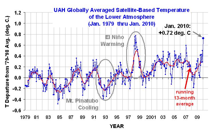
UAH_LT_1979_thru_Jan_10

The global-average lower tropospheric temperature anomaly soared to +0.72 deg. C in January, 2010. This is the warmest January in the 32-year satellite-based data record.

The tropics and Northern and Southern Hemispheres were all well above normal, especially the tropics where El Nino conditions persist. Note the global-average warmth is approaching the warmth reached during the 1997-98 El Nino, which peaked in February April of 1998.

This record warmth will seem strange to those who have experienced an unusually cold winter. While I have not checked into this, my first guess is that the atmospheric general circulation this winter has become unusually land-locked, allowing cold air masses to intensify over the major Northern Hemispheric land masses more than usual. Note this ALSO means that not as much cold air is flowing over and cooling the ocean surface compared to normal. Nevertheless, we will double check our calculations to make sure we have not make some sort of Y2.01K error (insert smiley). I will also check the AMSR-E sea surface temperatures, which have also been running unusually warm.

After last month’s accusations that I’ve been ‘hiding the incline’ in temperatures, I’ve gone back to also plotting the running 13-month averages, rather than 25-month averages, to smooth out some of the month-to-month variability.

We don’t hide the data or use tricks, folks…it is what it is.

[NOTE: These satellite measurements are not calibrated to surface thermometer data in any way, but instead use on-board redundant precision platinum resistance thermometers (PRTs) carried on the satellite radiometers. The PRT’s are individually calibrated in a laboratory before being installed in the instruments.]