Archive for May, 2010

Misinterpreting Natural Climate Change as Manmade

Monday, May 31st, 2010

The simple climate model I have made publicly available can be used to demonstrate many basic concepts regarding climate change.

Here I will use it to demonstrate that the global warming so commonly blamed on humanity’s greenhouse gas emissions can just as easily be explained as largely natural in origin, most likely due to a natural decrease in global cloud cover.

In general, there are TWO POTENTIAL EXPLANATIONS OF CLIMATE WARMING:
(1) X deg. C warming = anthropogenic CO2 increase + sensitive climate system
(2) X deg. C warming = natural forcing + anthropogenic CO2 increase + insensitive climate system

While I will run the model with an assumed ocean mixing depth of 50 meters of water, the same general effects can be demonstrated with very different depths, say, 10 meters or 500 meters. I have also added some weak natural variability on monthly to yearly time scales to better mimic what happens in the real climate system. You can run the model yourself if you are curious.

While the model is admittedly simple, it does exactly what the most complex computerized climate models must do to simulate global-average warming: (1) conserve energy by increasing temperature in response to an accumulation of energy, and (2) adjust the magnitude of that temperature change through feedbacks (e.g. cloud changes) in the climate system.

CASE 1: Anthropogenic Global Warming in a Sensitive Climate System
In the first example I run the simple forcing-feedback climate model with gradually increasing carbon dioxide causing an extra forcing of 0.25 Watts per sq. meter every ten years, acting upon a very sensitive climate system. “Sensitive” in this case is a net feedback parameter of 1.0 Watt per sq. meter per deg. C, which would correspond to about 3.8 deg. C of warming from a doubling of atmospheric carbon dioxide (2XCO2). (It is expected that we will reach 2XCO2 later in this century.) This amount of warming is on the high side of what the IPCC projects for the future.

The following plot shows 50 years of resulting warming (blue trace) from the model, as well as the radiative imbalance at the top of the model atmosphere (red trace). In this plot, when the radiative balance is negative it means there is an accumulation of energy in the climate system which will then cause subsequent warming.
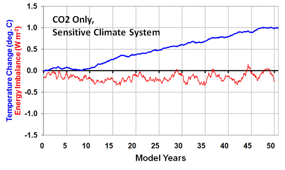
These are the two main sources of information used to diagnose the reasons for global climate variability and climate change. In the real climate system, the warming (blue trace) could be measured by either surface thermometers, or from Earth-orbiting satellites. The red trace (radiative imbalance) is what is measured by satellite instruments (e.g. the CERES instruments on the Terra satellite since 2000, and on the Aqua satellite since 2002).

CASE 2: Natural Global Warming in an Insensitive Climate System
To demonstrate that the same satellite-observed behavior can mostly caused by natural climate change, in the second example I run the simple forcing-feedback climate model with the same amount of CO2 forcing as in CASE 1, but now add to it 1.0 Watt per sq. meter of additional forcing from gradually decreasing cloud cover allowing more sunlight in. This gives a total forcing of 1.25 Watt per sq. meter every ten years.

But now I also change the net feedback to correspond to a very IN-sensitive climate system. “Insensitive” in this case is a net feedback parameter of 6.0 Watts per sq. meter per deg. C, which would correspond to just over 0.5 deg. C of warming from a doubling of atmospheric carbon dioxide (2XCO2). This amount of warming is well below the 1.5 deg. C lower limit the IPCC projects for the future as a result of 2XCO2.
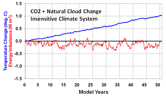
As can be seen in the second plot above, the same rate of warming occurs as in CASE 1, and the radiative imbalance of the Earth remains about the same as in CASE 1 as well.

What this demonstrates is that there is no way to distinguish anthropogenic warming of a sensitive climate system from natural warming within an insensitive climate system, based only upon the two main sources of information we rely on for climate change research: (1) temperature change, and (2) radiative imbalance data collected by satellites.

THE CRITICAL IMPORTANCE OF THIS AMBIGUITY
The reason why this fundamental ambiguity exists is that the radiative imbalance of the Earth as measured by satellites is a combination of forcing AND feedback, and those two processes always act in opposition to one another and can not be easily separated.

For instance, a satellite-measured imbalance of -1 unit can be caused by either -2 units of forcing combined with +1 unit of net feedback, OR by -5 units of forcing combined with +4 units of net feedback. There is no way to know for sure which is happening because cause and effect are intermingled.

After many months of research examining satellite data and the output from 18 of the IPCC climate models, I have found no way to separate this natural “internal radiative forcing” of temperature change from feedback resulting from that temperature change.

So how is it that the “consensus” of climate scientists is that CASE 1 is what is really happening in the climate system? Because when researchers have observed a decrease in cloud cover accompanying warming, they assume that the cloud decrease was CAUSED BY the warming (which would be positive cloud feedback). They do NOT consider the possibility that the cloud decrease was the CAUSE OF the warming.

In other words, they assume causation in only one direction (feedback) is occurring. This then gives the illusion of a sensitive climate system.

In fact, our new research to appear in Journal of Geophysical Research demonstrates that when natural cloud changes cause temperature changes, the presence of negative cloud feedback cannot even be detected. This is because causation in one direction (clouds forcing temperature) almost completely swamps causation in the opposite direction (temperature forcing clouds, which is by definition feedback).

[NOTE: The claims that there are “fingerprints” of anthropogenic warming are not true. The upper-tropospheric “hot spot”; greater warming over land than over the ocean; and greater warming at high latitudes than at low latitudes, are ALL to expected with any source of warming.]

WHEN WILL THEY LEARN?
Based upon my discussions with mainstream climate researchers, I am finding great reluctance on their part to even consider that such a simple error in interpretation could have been made after 20 years of climate research. As a result of this reluctance, most will not listen (or read) long enough to even understand what I am talking about. A few do understand, but they are largely in the “skeptics camp” anyway, and so their opinions are discounted.

When other scientists are asked about our work, they dismiss it without even understanding it. For instance, the last time I testified in congress, Kevin Trenberth countered my testimony with a pronouncement to the effect of “clouds cannot cause climate change“, which is an astoundingly arrogant and uninformed thing for a scientist to say. After all, we find clear evidence of clouds causing year-to-year climate variability in ALL of the IPCC models, so who is to say this cannot occur on decadal — or even centennial — time scales?

CLIMATE CHAOS
I’m often asked, what could cause such cloud changes? Well, we know that there are a myriad of factors other than just temperature that affect cloud formation. The most likely source of long-term cloud changes would be changes in ocean circulation, which can have very long time scales. But then I’m asked, what caused the ocean changes?

Well, what causes chaos? All of this could simply be the characteristics of a nonlinear dynamical “chaotic” climate system. While a few people have objected to my use of the term “chaotic” in this context, I see no reason why the traditional application of chaos theory to small space and time scales (such as in weather) can not be extended to the larger space and time scales involved in climate. Either way, chaos involves complex nonlinear behavior we do not yet understand, very small changes in which can have profound effects on the system later. It seems to me that such behavior can occur on all kinds of space and time scales.

In conclusion…Yes, Virginia, natural climate cycles really can exist.


The Missing Climate Model Projections

Sunday, May 23rd, 2010

The strongest piece of evidence the IPCC has for connecting anthropogenic greenhouse gas emissions to global warming (er, I mean climate change) is the computerized climate model. Over 20 climate models tracked by the IPCC now predict anywhere from moderate to dramatic levels of warming for our future in response to increasing levels of atmospheric carbon dioxide. In many peoples’ minds this constitutes some sort of “proof” that global warming is manmade.

Yet, if we stick to science rather than hyperbole, we might remember that science cannot “prove” a hypothesis….but sometimes it can disprove one. The advancement of scientific knowledge comes through new hypotheses for how things work which replace old hypotheses that are either not as good at explaining nature, or which are simply proved to be wrong.

Each climate model represents a hypothesis for how the climate system works. I must disagree with my good friend Dick Lindzen’s recent point he made during his keynote speech at the 4th ICCC meeting in Chicago, in which he asserted that the IPCC’s global warming hypothesis is not even plausible. I think it is plausible.

And from months of comparing climate model output to satellite observations of the Earth’s radiative budget, I am increasingly convinced that climate models can not be disproved. Sure, there are many details of today’s climate system they get wrong, but that does not disprove their projections of long-term global warming.

Where the IPCC has departed from science is that they have become advocates for one particular set of hypotheses, and have become militant fighters against all others.

They could have made their case much stronger if, in addition to all their models that produce lots of warming, they would have put just as much work into model formulations that predicted very little warming. If those models could not be made to act as realistically as those that do produce a lot of warming, then their arguments would carry more weight.

Unfortunately, each modeling group (or the head of each group) already has an idea stuck in their head regarding how much warming looks “about right”. I doubt that anyone could be trusted to perform an unbiased investigation into model formulations which produce very little warming in response to increasing atmospheric greenhouse gas concentrations.

As I have mentioned before, our research to appear in JGR sometime in the coming weeks demonstrates that the only time feedback can be clearly observed in satellite observations — which is only under special circumstances — it is strongly negative. And if that is the feedback operating on the long time scales associated with global warming, then we have dodged the global warming bullet.

But there is no way I know of to determine whether this negative feedback is actually stabilizing the climate system on those long time scales. So, we are stuck with a bunch of model hypotheses to rely on for forecasts of the future, and the IPCC admits it does not know which is closer to the truth.

As a result of all this uncertainty, the IPCC starts talking in meaningless probabilistic language that must make many professional statisticians cringe. These statements are nothing more than pseudo-scientific ways of making their faith in the models sound more objective, and less subjective.

One of the first conferences I attended as a graduate student in meteorology was an AMS conference on hurricanes and tropical meteorology, as I recall in the early 1980’s. Computer models of hurricane formation were all the rage back then. A steady stream of presentations at the conference showed how each modeling group’s model could turn any tropical disturbance into a hurricane. Pretty cool.

Then, a tall lanky tropical expert named William Gray stood up and said something to the effect of, “Most tropical disturbances do NOT turn into hurricanes, yet your models seem to turn anything into a hurricane! I think you might be missing something important in your models.”

I still think about that exchange today in regard to climate modeling. Where are the model experiments that don’t produce much global warming? Are those models any less realistic in their mimicking of today’s climate system than the ones that do?

If you tell me that such experiments would not be able to produce the past warming of the 20th Century, then I must ask, What makes you think that warming was mostly due to mankind? As readers here are well aware, a 1% or 2% change in cloud cover could have caused all of the climate change we saw during the 20th Century, and such a small change would have been impossible to detect.

Also, modelers have done their best to remove model “drift” — the tendency for models to drift away from today’s climate state. Well, maybe that’s what the real climate system does! Maybe it drifts as cloud cover slowly changes due to changing circulation patterns.

It seems to me that all the current crop of models do is reinforce the modelers’ preconceived notions. Dick Lindzen has correctly pointed out that the use of the term “model validation”, rather than “model testing”, belies a bias toward a belief in models over all else.

It is time to return to the scientific method before those who pay us to do science — the public — lose all trust of scientists.


In Defense of the Globally Averaged Temperature

Saturday, May 22nd, 2010

I sometimes hear my fellow climate realists say that a globally-averaged surface temperature has little or no meaning in the global warming debate. They claim it is too ill-defined, not accurately known, or little more than just an average of a bunch of unrelated numbers from different regions of the Earth.

I must disagree.

The globally averaged surface temperature is directly connected to the globally averaged tropospheric temperature through convective overturning of the atmosphere. This is about 80% of the mass of the atmosphere. You cannot warm or cool the surface temperature without most of the atmosphere following suit.

The combined surface-deep layer atmospheric temperature distribution is then the thermal source of most of the infrared (IR) radiation that cools the Earth in response to solar heating by the sun. Admittedly, things like water vapor, clouds, and CO2 end up also modulating the rate of loss of IR to space, but it is the temperature which is the ultimate source of this radiation. And unless the rate of IR loss to space equals the rate of solar absorption in the global average, the global average temperature will change.

The surface temperature also governs important physical processes, for instance the rate at which the surface “tries” to lose water through evaporation.

If the globally averaged temperature is unimportant, then so are the global average cloudiness, or water vapor content. Just because any one of these globally-averaged variables is insufficient in and of itself to completely define a specific physical process does not mean that it is not a useful number to monitor.

Finally, the globally averaged temperature is not just a meaningless average of a bunch of unrelated numbers. This is because the temperature of any specific location on the Earth does not exist in isolation of the rest of the climate system. If you warm the temperature locally, you then will change the horizontal air pressure gradient, and therefore the wind which transports heat from that location to other locations. Those locations are in turn connected to others.

In fact, the entire global atmosphere is continually overturning, primarily in response to the temperature of the surface as it is heated by the sun. Sinking air in some regions is warmed in response to rising air in other regions, and that rising air is the result of latent heat release in cloud and precipitation systems as water vapor is converted to liquid water. The latent heat was originally picked up by the air at the surface, where the temperature helped govern the rate of evaporation.

In this way, clouds and precipitation in rising regions can transport heat thousands of kilometers away by causing warming of the sinking air in other regions. Surprisingly, atmospheric heat is continually transported into the Sahara Desert in this way, in order to compensate for the fact that the Sahara would actually be a COOL place since it loses more IR energy to space than it gains solar energy from the sun. (This is because the bright sand reflects much of the sunlight back to space).

Similarly, the frigid surface temperature of the Arctic or Antarctic in wintertime is prevented from getting even colder by heat transport from lower latitudes.

In this way, the temperature of one location on the Earth is ultimately connected to all other locations on the Earth. As such, the globally averaged surface temperature — and its intimate connection to most of the atmosphere through convective overturning — is probably the single most important index of the state of the climate system we have the ability to measure.

Granted, it is insufficient to diagnose other things we need to know, but I believe it is the single most important component of any “big picture” snapshot of climate system at any point in time.


Global Average Sea Surface Temperatures Poised for a Plunge

Thursday, May 20th, 2010

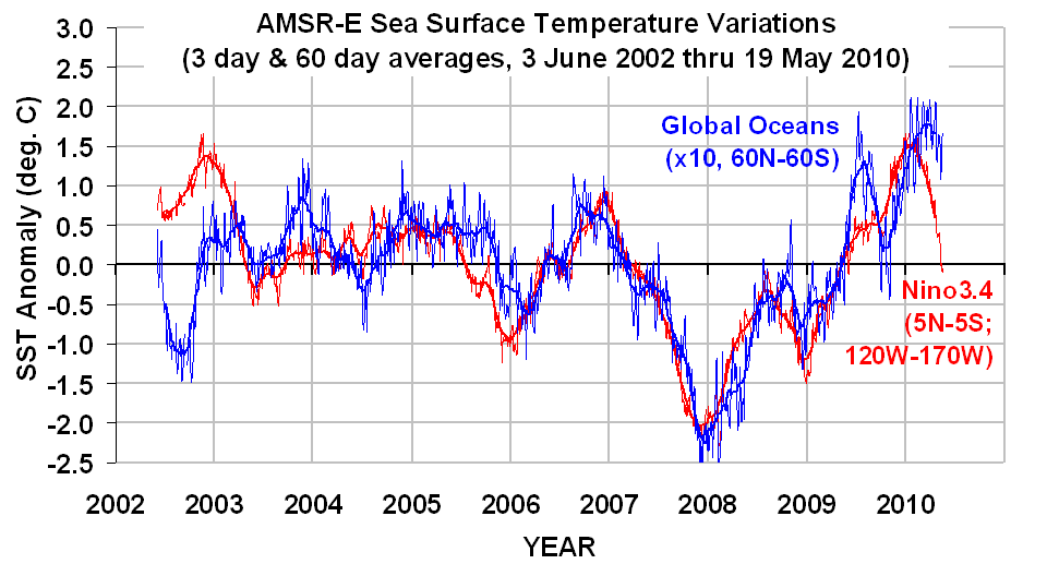
Just an update…as the following graph shows, sea surface temperatures (SSTs) along the equatorial Pacific (“Nino3.4” region, red lines) have been plunging, and global average SSTs have turned the corner, too. (Click on the image for the full-size, undistorted version. Note the global values have been multiplied by 10 for display purposes.)

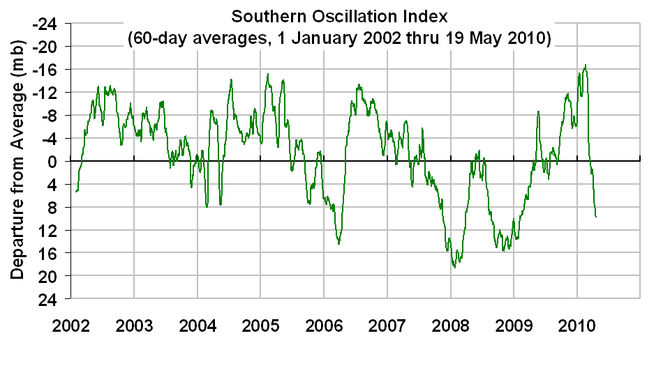
The corresponding sea level pressure difference between Tahiti and Darwin (SOI index, next graph) shows a rapid transition toward La Nina conditions is developing.

Being a believer in natural, internal cycles in the climate system, I’m going to go out on a limb and predict that global-average SSTs will plunge over the next couple of months. Based upon past experience, it will take a month or two for our (UAH) tropospheric temperatures to then follow suit.


El Nino Rapidly Fading, La Nina Just Around the Corner?

Friday, May 14th, 2010

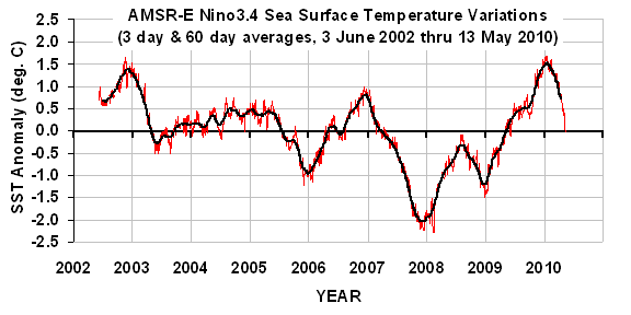
The most recent El Nino event is rapidly dying, as seen in the following plot of sea surface temperature (SST) variations averaged over the Nino3.4 region (5N to 5S, 120W to 170W) as measured by the AMSR-E instrument on NASA’s Aqua satellite during its period of record, 2 June 2002 through yesterday, 13 May 2010:

The 60-day cooling rate as of yesterday was the strongest seen yet in the 8 year period of record for the Nino3.4 region.

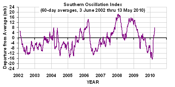
A similar plot of the Southern Oscillation Index (SOI) data, based upon the sea level air pressure difference between Tahiti and Darwin is consistent with the SST cooling, showing an increase in the pressure gradient across the tropical South Pacific, which portends increasing trade winds and cooling of the ocean surface:

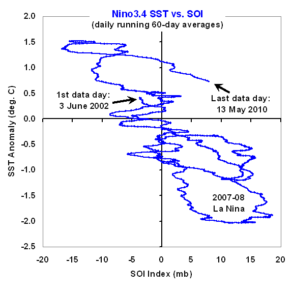
A plot of these two time series against one another (next plot) reveals that the most recent SSTs are unusually warm for the 60-day average SOI value:

There are at least three ways to interpret this excursion from the average relationship seen in the plot. One is that longer-term warming, whether natural or anthropogenic, has raised the temperature ‘baseline’ about which the El Nino/La Nina events oscillate.

A second possibility is that we are in for continued rapid cooling in the Pacific as the SSTs fall to values more consistent with the SOI index.

A third is that the current excursion toward La Nina territory is going to reverse, and SOI values will decrease to more neutral conditions, while SSTs remain relatively high.

As is always the case, all we can do is sit back and watch.


By Popular Demand: A Daily Global Average CERES Dataset

Thursday, May 13th, 2010

Since I keep getting requests for the data from which I do my analyses, I’ve decided to provide the main dataset I use here, in an Excel spreadsheet. The comments at the top of the spreadsheet are pretty self-explanatory and include links to the original data. After you click on and open the file with Excel, save it to your computer so you can analyze the data.

What’s In the File, Kenneth?

From original satellite data online at 2 sources, I have calculated daily global-average anomalies (departures from the average annual cycle) in (1) total-sky emitted longwave (LW, or infrared) radiative flux; (2) total-sky reflected shortwave (SW, or solar) radiative flux, and (3) UAH tropospheric temperatures (TMT).

The original radiative flux data that I computed these anomalies from are the Terra satellite CERES Flight Model 1 (FM1) instrument-based ES4 (ERBE-like) daily global gridpoint datasets, available here. These are large files in a binary format, and are not for the weak of heart.

The original UAH TMT temperature data come from here.

All of the original data were area-averaged over the Earth for each day during the 9.5 year Terra CERES period of record, March 2000 through September 2009. An average annual cycle was computed, filtered with a +/- 10 day smoother applied every day, and then anomalies were computed by subtracting the smoothed average annual cycle values from the original data. I program these calculations in Fortran-95, put the data in an Excel spreadsheet, then do all future calculations and graphical plots in Excel.

And remember, folks…“If you torture the data long enough, it will confess.”


Global Warming’s $64 Trillion Question

Thursday, May 13th, 2010

Edited 1:35 p.m. CDT 5/13/10: Trivia question added, at the end of the post.

Despite its relative simplicity, I continue to find myself trying to explain to experts and lay persons alike how scientists made the Great Global Warming Blunder when it comes to predictions of global warming.

On the bright side, this morning I received an e-mail from a chemist who looked at the math of the problem after reading my new book, and then came to the understanding on his own. And that’s great!

For the most part, though, the climate community continues to suffer from a mental block when it comes to the true role of clouds in global warming. All climate models now change clouds with CO2 warming in ways that amplify that warming, some by a catastrophic amount.

As my latest book describes, I contend that they have been fooled by Mother Nature, and that in fact warming alters clouds in ways that mitigate – not amplify — the small amount of direct warming caused by increasing atmospheric CO2.

The difference between clouds magnifying versus mitigating warming could be the difference between global warming being little more than an academic curiosity…or a disaster for life on Earth.

So, once again I find myself trying to explain a concept that I find the public understands better than the climate experts do: when it comes to clouds and temperature, the direction of causation really does matter.

Why Are There Fewer Clouds when it is Warm?

The “scientific consensus” has been that, because unusually warm conditions are observed to be accompanied by less cloud cover, warming obviously causes cloud cover to decrease. This would be bad news, since decreasing cloud cover in response to warming would let more sunlight in, and amplify the initial warming. That’s called positive cloud feedback.

But what they have difficulty understanding is that causation in the opposite direction (cloud changes causing temperature changes) gives the ILLUSION of positive cloud feedback. It turns out that, when less cloud cover causes warmer temperatures, the cloud feedback in response to that warming is almost totally obscured.

Believe it, the experts have not accounted for this effect. I find it bizarre that most are not even aware it is an issue! As far as I know, I am the only one actively researching the issue.

As a result, the experts have fooled themselves into believing cloud feedbacks are positive. We have demonstrated theoretically in our new paper now accepted for publication in JGR that, even if strong negative cloud feedback exists, cloud changes causing temperature change will make it LOOK like positive cloud feedback.

And this indeed happens in the real climate system. The only time cloud feedback can be clearly seen in the real climate system is when temperature changes are caused by something other than clouds. And in those cases, we find that the net feedback is strongly negative (around 6 Watts per sq. meter of extra energy lost by the Earth per deg. C of global-average warming).

Unfortunately, those events only occur on relatively short climate time scales: 1 month or so. Whether this negative feedback also exists for long-term climate warming is less certain.

Do Climate Models Agree With Satellite Observations of Clouds and Temperature?

The fact that all the climate models which produce substantial global warming also approximate what we measure from satellites is NOT a validation of the feedbacks in those models. So far, after analyzing thousands of years of climate model runs, I have found no convincing way to validate the climate models’ long-term feedbacks with short-term (approx. 10 years or so) satellite observations. The reason is the same: all models have cloud variations causing temperature variations, which then obscures the feedback we are trying to measure.

But there’s another test that could be made. The modelers’ case would be stronger if they could demonstrate that 20 additional climate models, all with various amounts of negative – rather than positive — cloud feedback, are less consistent with our satellite observations than the current crop of models, all of which had positive cloud feedback.

I suspect they do not spend much time on that possibility. A climate model that does not produce much climate change is going to have difficult time getting continued funding for its support.

Trivia Question to Illustrate the Point: Assume continually increasing CO2 in the atmosphere is the only source of climate variability, and we experience continuous slow warming as a result. Will the outgoing longwave radiation (OLR, or infrared) being emitted by the Earth increase…or decrease…during this process?
ANSWER: If warming is the result of increasing CO2 in the atmosphere, then the outgoing longwave radiation (OLR) from the Earth will DECREASE over time. As scientists already know, it is this decrease in OLR that causes the warming in the first place. But because the climate system cannot warm instantly in response (there is a time lag due to the heat capacity of land, ocean, and atmosphere), the increased OLR from warming can never fully make up for the decrease in OLR causing the warming. That warming-induced increase represents the FEEDBACK RESPONSE. But it is forever more than offset by the FORCING from increasing CO2. Now, If we know the time-history of the forcing, it can be subtracted from the OLR to get the feedback. Indeed, this is how feedbacks are diagnosed from climate model experiments involving transient CO2 forcing. The “blunder” I talk about refers to the fact that climate researchers have not accounted for natural sources of radiative forcing (cloud variations) in their attempts to diagnose feedback in the real climate system.

Technical Note: We have found from modeling studies that if the natural cloud variations were truly random in time, the error in diagnosed feedback would be random, not biased toward positive feedback, and would average out to near zero in the long term. But in the real climate system, these cloud variations have preferred time scales….in other words, they have some degree of autocorrelation in time. When that happens, there ends up being a bias in the direction of positive feedback.


Strong Negative Feedback from the Latest CERES Radiation Budget Measurements Over the Global Oceans

Friday, May 7th, 2010

Arguably the single most important scientific issue – and unresolved question – in the global warming debate is climate sensitivity. Will increasing carbon dioxide cause warming that is so small that it can be safely ignored (low climate sensitivity)? Or will it cause a global warming Armageddon (high climate sensitivity)?

The answer depends upon the net radiative feedback: the rate at which the Earth loses extra radiant energy with warming. Climate sensitivity is mostly determined by changes in clouds and water vapor in response to the small, direct warming influence from (for instance) increasing carbon dioxide concentrations.

The net radiative feedback can be estimated from global, satellite-based measurements of natural climate variations in (1) Earth’s radiation budget, and (2) tropospheric temperatures.

These feedback estimates have been mostly constrained by the availability of the first measurement: the best calibrated radiation budget data comes from the NASA CERES instruments, with data now available for 9.5 years from the Terra satellite, and 7 years from the Aqua satellite. Both datasets now extend through September of 2009.

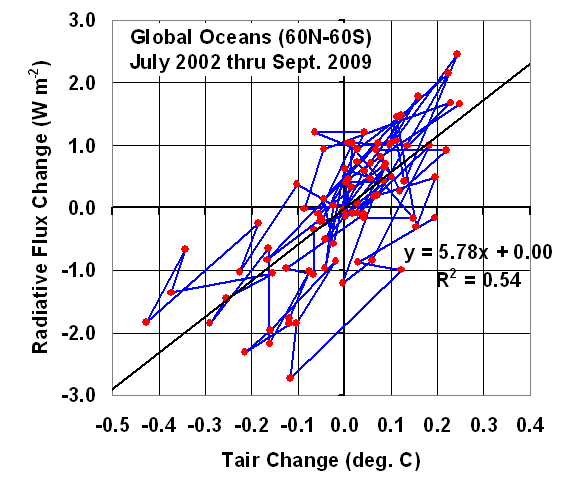
I’ve been slicing and dicing the data different ways, and here I will present 7 years of results for the global (60N to 60S) oceans from NASA’s Aqua satellite. The following plot shows 7 years of monthly variations in the Earth’s net radiation (reflected solar shortwave [SW] plus emitted infrared longwave [LW]) compared to similarly averaged tropospheric temperature from AMSU channel 5.

Simple linear regression yields a net feedback factor of 5.8 Watts per sq. meter per degree C. If this was the feedback operating with global warming, then it would amount to only 0.6 deg. C of human-caused warming by late in this century. (Use of sea surface temperatures instead of tropospheric temperatures yields a value of over 11).

Since we have already experienced 0.6 deg. C in the last 100 years, it would also mean that most of our current global warmth is natural, not anthropogenic.

But, as we show in our new paper (in press) in the Journal of Geophysical Research, these feedbacks can not be estimated through simple linear regression on satellite data, which will almost always result in an underestimate of the net feedback, and thus an overestimate of climate sensitivity.

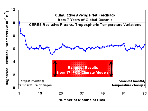
Without going into the detailed justification, we have found that the most robust method for feedback estimation is to compute the month-to-month slopes (seen as the line segments in the above graph), and sort them from the largest 1-month temperature changes to the smallest (ignoring the distinction between warming and cooling).

The following plot shows, from left to right, the cumulative average line slope from the largest temperature changes to the smaller ones. This average is seen to be close to 10 for the largest month-to-month temperature changes, then settling to a value around 6 after averaging of many months together. (Note that the full period of record is not used: only monthly temperature changes greater than 0.03 deg. C were included. Also, it is mostly coincidence that the two methods give about the same value.)

A net feedback of 6 operating on the warming caused by a doubling of atmospheric CO2 late in this century would correspond to only about 0.5 deg. C of warming. This is well below the 3.0 deg. C best estimate of the IPCC, and even below the lower limit of 1.5 deg. C of warming that the IPCC claims to be 90% certain of.

How Does this Compare to the IPCC Climate Models?

In comparison, we find that none of the 17 IPCC climate models (those that have sufficient data to do the same calculations) exhibit this level of negative feedback when similar statistics are computed from output of either their 20th Century simulations, or their increasing-CO2 simulations. Those model-based values range from around 2 to a little over 4.

These results suggest that the sensitivity of the real climate system is less than that exhibited by ANY of the IPCC climate models. This will end up being a serious problem for global warming predictions. You see, while modelers claim that the models do a reasonably good job of reproducing the average behavior of the climate system, it isn’t the average behavior we are interested in. It is how the average behavior will CHANGE.

And the above results show that not one of the IPCC climate models behaves like the real climate system does when it comes to feedbacks during interannual climate variations…and feedbacks are what determine how serious manmade global warming will be.


APRIL 2010 UAH Global Temperature Update: +0.50 deg. C

Wednesday, May 5th, 2010


YR MON GLOBE NH SH TROPICS
2009 1 0.252 0.472 0.031 -0.065
2009 2 0.247 0.569 -0.074 -0.044
2009 3 0.191 0.326 0.056 -0.158
2009 4 0.162 0.310 0.013 0.012
2009 5 0.140 0.160 0.120 -0.057
2009 6 0.044 -0.011 0.100 0.112
2009 7 0.429 0.194 0.665 0.507
2009 8 0.242 0.229 0.254 0.407
2009 9 0.504 0.590 0.417 0.592
2009 10 0.361 0.335 0.387 0.381
2009 11 0.479 0.458 0.536 0.478
2009 12 0.283 0.350 0.215 0.500
2010 1 0.649 0.861 0.437 0.684
2010 2 0.603 0.725 0.482 0.792
2010 3 0.653 0.853 0.454 0.726
2010 4 0.501 0.796 0.207 0.634

UAH_LT_1979_thru_Apr_10

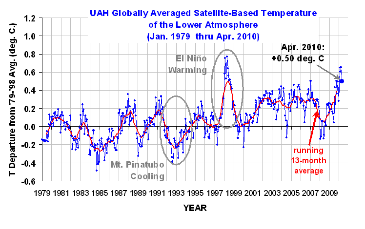
The global-average lower tropospheric temperature continues warm: +0.50 deg. C for April, 2010, although it is 0.15 deg. C cooler than last month. The linear trend since 1979 is now +0.14 deg. C per decade.

Arctic temps (not shown) continued a 5-month string of much above normal temps (similar to Nov 05 to Mar 06) as the tropics showed signs of retreating from the current El Nino event. Antarctic temperatures were cooler than the long term average. Through the first 120 days of 1998 versus 2010, the average anomaly was +0.655 in 1998, and +0.602 in 2010. These values are within the margin of error in terms of their difference, so the recent global tropospheric warmth associated with the current El Nino has been about the same as that during the peak warmth of the 1997-98 El Nino.

As a reminder, two months ago we changed to Version 5.3 of our dataset, which accounts for the mismatch between the average seasonal cycle produced by the older MSU and the newer AMSU instruments. This affects the value of the individual monthly departures, but does not affect the year to year variations, and thus the overall trend remains the same as in Version 5.2. ALSO…we have added the NOAA-18 AMSU to the data processing in v5.3, which provides data since June of 2005. The local observation time of NOAA-18 (now close to 2 p.m., ascending node) is similar to that of NASA’s Aqua satellite (about 1:30 p.m.). The temperature anomalies listed above have changed somewhat as a result of adding NOAA-18.

[NOTE: These satellite measurements are not calibrated to surface thermometer data in any way, but instead use on-board redundant precision platinum resistance thermometers (PRTs) carried on the satellite radiometers. The PRT’s are individually calibrated in a laboratory before being installed in the instruments.]


Global Tropospheric Temperature Variations Since 2002 over Land Versus Ocean

Saturday, May 1st, 2010

While investigating cloud feedbacks over the ocean with the CERES Earth radiation budget instruments, I thought I would take a quick look to see how lower atmospheric temperature variations over land and ocean compare to each other. Part of my interest was the recent cold winter over the U.S. and Europe, which has seemed strange to some since our global-average temperatures are running quite warm lately.

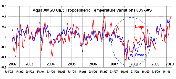
The following plot shows tropospheric temperature variations over land versus ocean since mid-2002 as measured by the AMSU instrument on the Aqua satellite. I’ve restricted the averaging between 60N and 60S latitudes, which is 86.6% of the surface area of the Earth. These are daily running 31-day average anomalies (departures from the average seasonal cycle).

In the big picture, I was a little surprised to see that, on average, there is essentially no time lag between the land and ocean temperature variations. The correlation between the two curves is +0.63 at zero days time lag. I would have expected a tendency for oceanic changes to precede land changes, since we usually think of oceanic warming or cooling events driving land areas more than vice versa.

We also see that the recent cold winter over the U.S. and Europe was not reflective of global land areas, which is not that surprising since those regions represent only about 5% of the surface area of the Earth.

I have been particularly interested in the cause of the global cooling event of 2007-08, which I have circled in the plot above. I had assumed that this was primarily an oceanic phenomenon, but as can be seen, land areas were similarly affected.

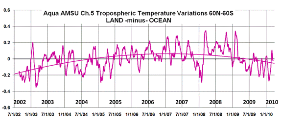
The difference between the land and ocean curves is shown in the next plot, along with a second order polynomial fit to the data. There seems to be a low-frequency change in this relationship, with several years of land-warmer-than-ocean now switching to ocean-warmer-than-land. I have no obvious explanation to offer for this.

And if you are wondering just how real the temperature fluctuations shown above are, I also computed the oceanic atmospheric temperature variations (blue curve, 1st graph) from the AMSU flying on a totally different satellite — NOAA-15 — and found that the curves from Aqua and NOAA-15 were virtually indistinguishable.

[The reason why the above analysis is restricted to the period since 2002 is that Aqua is the first orbit-maintained satellite. Previous satellites had decaying orbits, which caused a change in the local observation time over the years which resulted in a long-term drift in over-land temperatures due to the strong day-night cycle in temperature.]