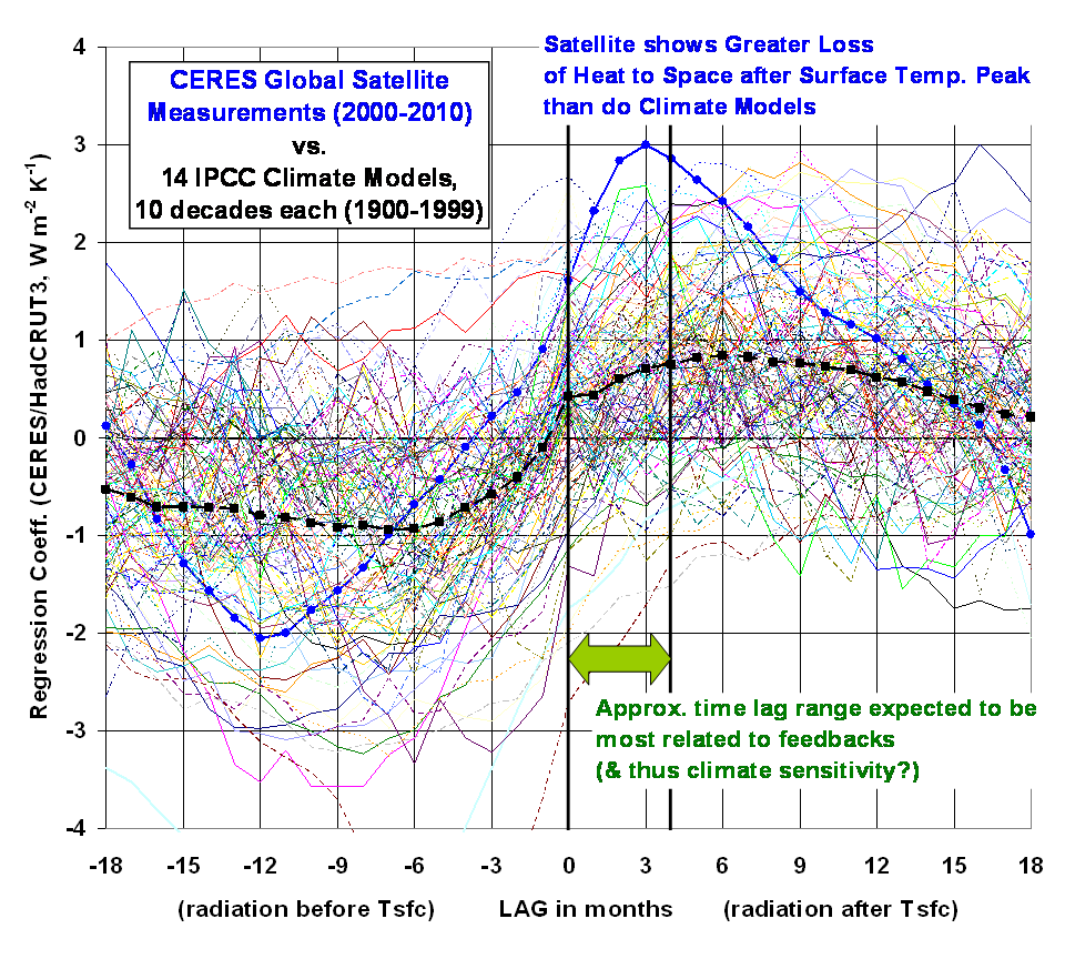
Since one of the criticisms of our recent Remote Sensing paper was that we cherry-picked the climate models we chose to compare the satellite observations of climate variations to, here are all 140 10-year periods from all 14 climate models’ 20th Century runs we analyzed (click to see the full res. version):

As you can see, the observations of the Earth (in blue, CERES radiative energy budget versus HadCRUT3 surface temperature variations) are outside the range of climate model behavior, at least over the span of time lags we believe are most related to feedbacks, which in turn determine the sensitivity of the climate system to increasing greenhouse gas concentrations. (See Lindzen & Choi, 2011 for more about time lags).
Now, at ZERO time lag, there are a few decades from a few models (less than 10% of them) which exceed the satellite measurements. So, would you then say that the satellite measurements are “not inconsistent” with the models? I wouldn’t.
Especially since the IPCC’s best estimate of future warming (about 3 deg C.) from a doubling of atmospheric CO2 is almost exactly the AVERAGE response of ALL of the climate models. Note that the average of all 140 model decades (dashed black line in the above graph) is pretty darn far from the satellite data.
So, even with all of 140 cherries picked, we still see evidence there is something wrong with the IPCC models in general. And I believe the problem is they are too sensitive, and thus are predicting too much future global warming.

 Home/Blog


