With all of the hoopla over recent temperatures, I decided to see how far back in time I could extend my U.S. surface temperature analysis based upon the NOAA archive of Integrated Surface Hourly (ISH) data.
The main difference between this dataset and the others you hear about is that trends are usually based upon daily maximum and minimum temperatures (Tmax and Tmin), which have the longest record of observation. Unfortunately, one major issue with those datasets is that the time of day at which the maximum or minimum temperature is recorded makes a difference, due to a double-counting effect. Since the time of observation of Tmax and Tmin has varied over the years, this potentially large effect must be adjusted for, however imperfectly.
Here I will show U.S. temperature trends since 1943 based upon 4x per day observations, always made at the same synoptic times 00, 06, 12, and 18 UTC. This ends up including only about 50 stations, roughly evenly distributed throughout the U.S., but I thought it would be a worthwhile exercise nonetheless. Years before 1943 simply did not have enough stations reporting, and it wasn’t until World War II when routine weather observations started being made on a more regular and widespread basis.
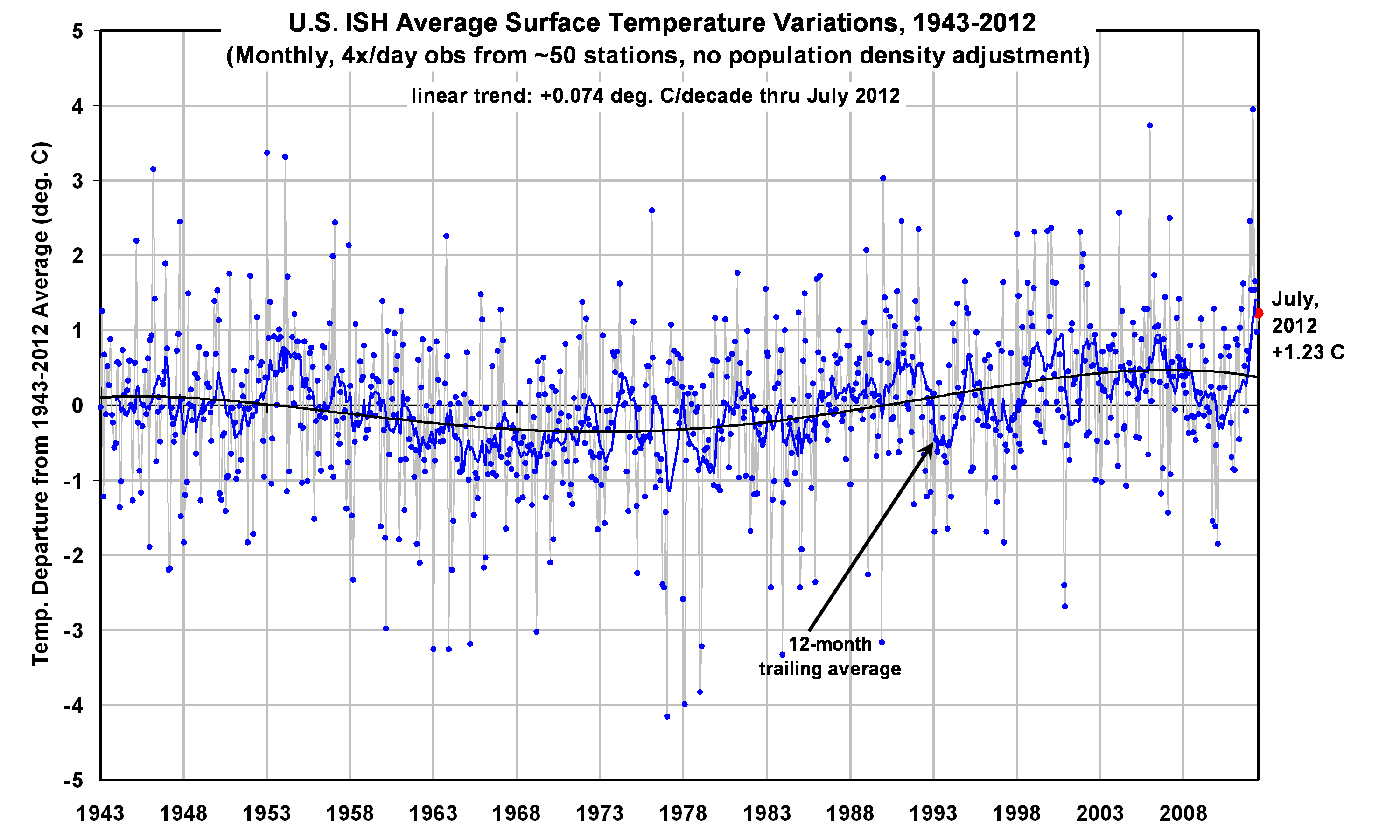
The following plot shows monthly temperature departures from the 70-year (1943-2012) average, along with a 4th order polynomial fit to the data, and it supports the view that the 1960s and 1970s were unusually cool, with warmer conditions existing in the 1940s and 1950s (click for large version):

It’s too bad that only a handful of the stations extend back into the 1930’s, which nearly everyone agrees were warmer in the U.S. than the 40’s and 50’s.
What About Urban Heat Island Effects?
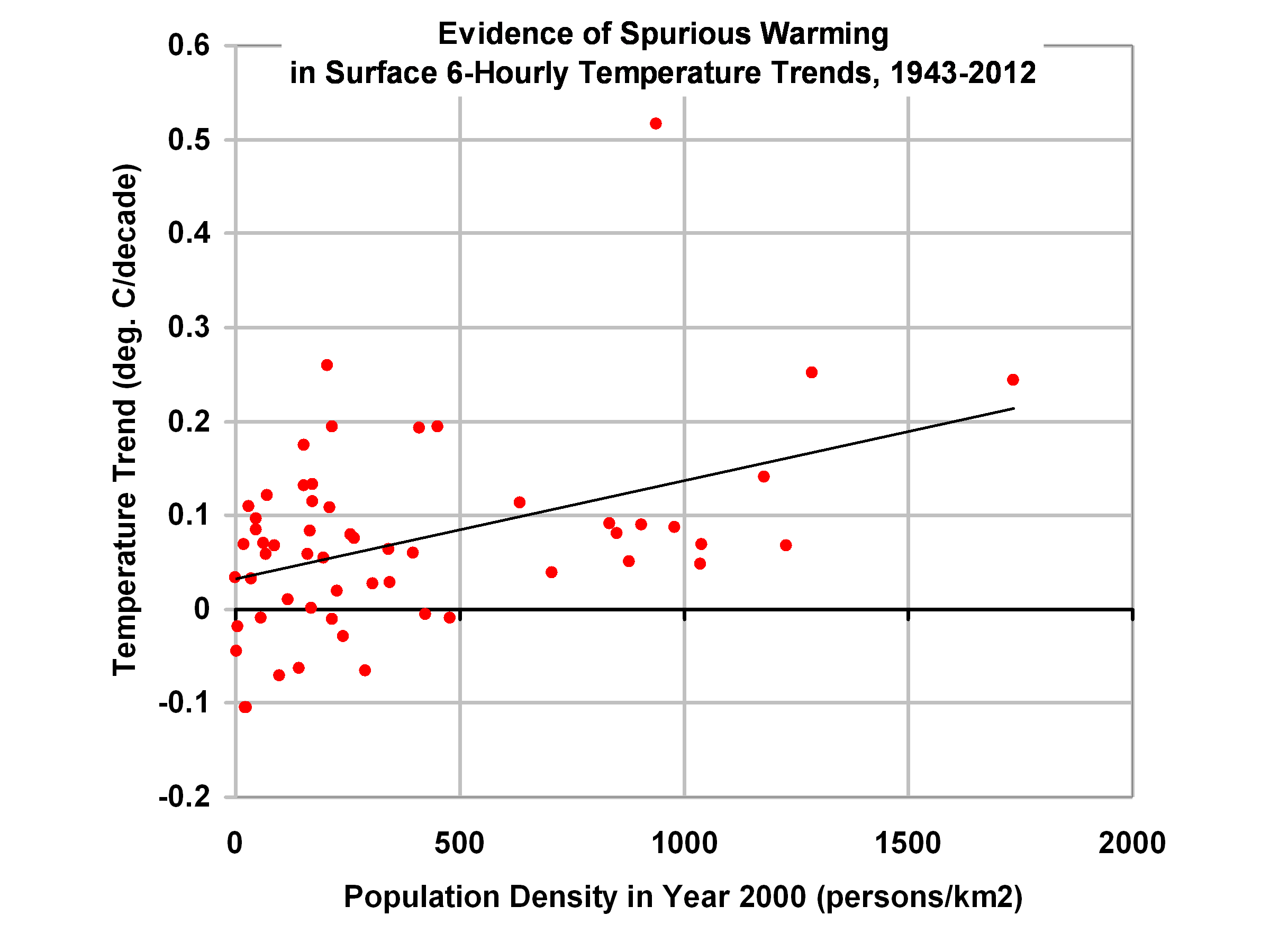
Now, the above results have no adjustments made for possible Urban Heat Island (UHI) effects, something Anthony Watts has been spearheading a re-investigation of. But what we can do is plot the individual station temperature trends for these ~50 stations against the population density at the station location as of the year 2000, along with a simple linear regression line fit to the data:

It is fairly obvious that there is an Urban Heat Island effect in the data which went into the first plot above, with the most populous stations generally showing the most warming, and the lowest population locations showing the least warming (or even cooling) since 1943. For those statisticians out there, the standard error of the calculated regression slope is 29% of the slope value.
So, returning to the first plot above, it is entirely possible that the early part of the record was just warm as recent years, if UHI adjustments were made.
Unfortunately, it is not obvious how to make such adjustments accurately. It must be remembered that the 2nd plot above only shows the relative UHI warming of higher population stations compared to the lower population stations, and previous studies have suggested that even the lower population stations experience warming as well. In fact, published studies have shown that most of the spurious UHI warming is observed early in population growth, with less warming as population grows even larger.
Again, what is different about the above dataset is it is based upon temperature observations made 4x/day, always at the same time, so there is no issue with changing time-of-observation, as there is with the use of Tmax and Tmin data.
Of course, all of this is preliminary, and not ready for peer review. But it is interesting.

 Home/Blog


