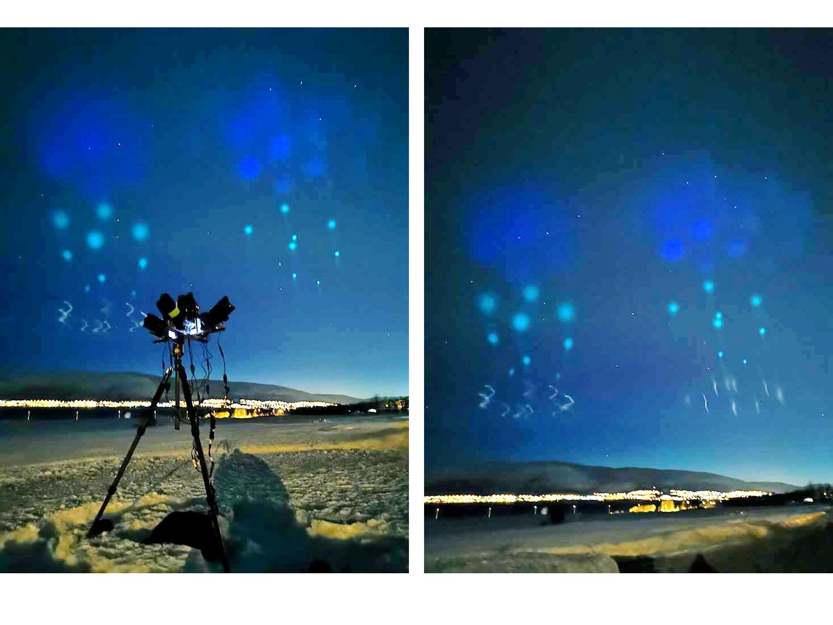
Famed Arctic and aurora photographer Ole C Salomonsen has reported in the last hour strange lights over Tromso, Norway. Ole says the sight is the “weirdest stuff I’ve seen”.
I’ve taken the liberty of increasing the brightness of two of the images he posted:
Strange lights in the sky photographed by famed aurora photographer Ole Salomonsen around midnight, Saturday April 6 2019 from Tromso, Norway.
I can’t imagine what this is, but I suspect it’s related to some sort of rocket-borne experiment. But the spatial distribution of the lights is very strange. I assume Ole will update us with time lapse photography in the near future.
UPDATE: Frank Olsen, also in Norway, posted the following photo, and said that this was indeed rocket-borne experiments containing special chemicals:
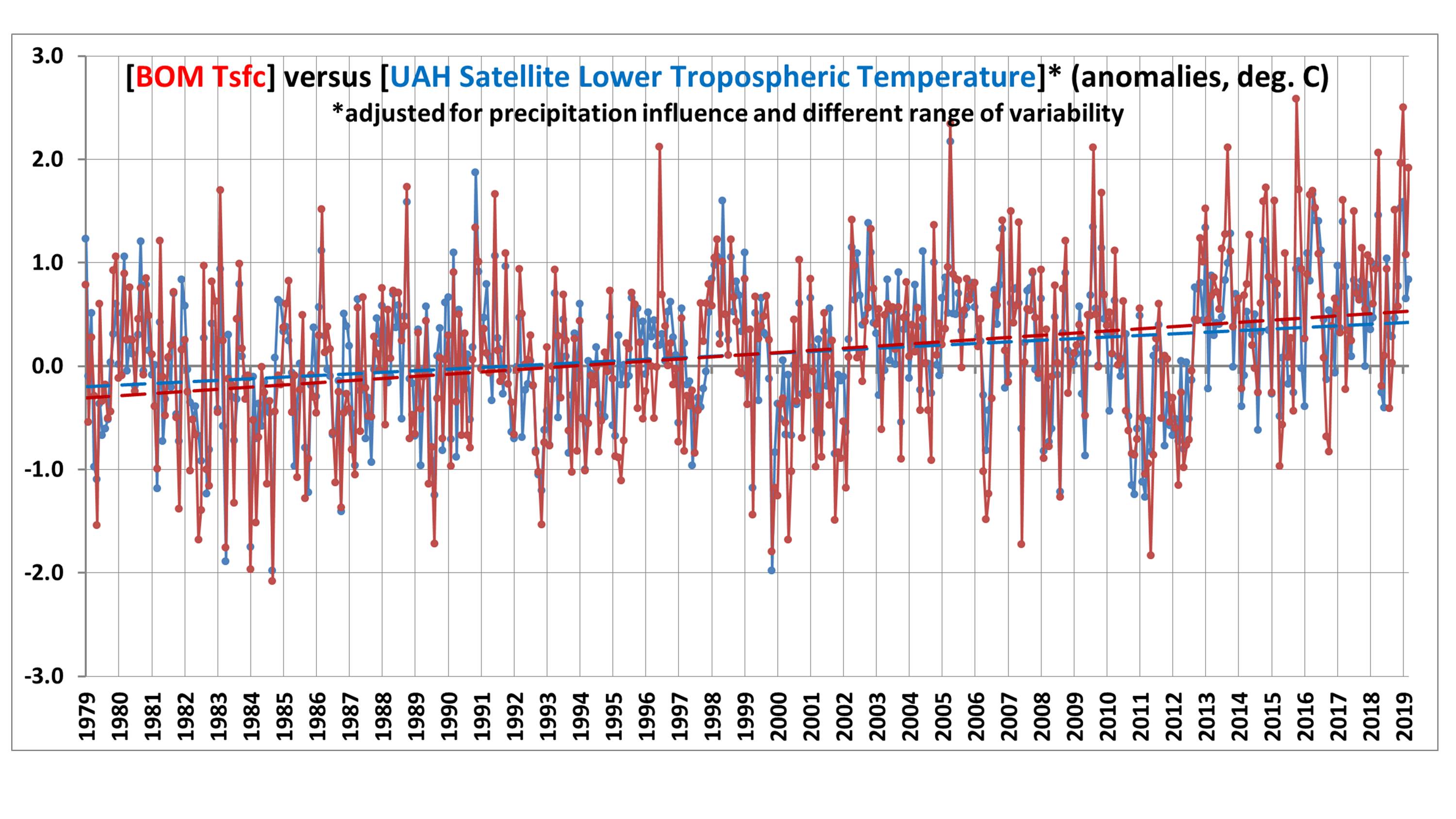
Summary:The monthly anomalies in Australia-average surface versus satellite deep-layer lower-tropospheric temperatures correlate at 0.70 (with a 0.57 deg. C standard deviation of their difference), increasing to 0.80 correlation (with a 0.48 deg. C standard deviation of their difference) after accounting for precipitation effects on the relationship. The 40-year trends (1979-2019) are similar for the raw anomalies (+0.21 C/decade for Tsfc, +0.18 deg. C for satellite), but if the satellite and rainfall data are used to estimate Tsfc through a regression relationship, the adjusted satellite data then has a reduced trend of +0.15 C/decade. Thus, those who compare the UAH monthly anomalies to the BOM surface temperature anomalies should expect routine disagreements of 0.5 deg. C or more, due to the inherently different nature of surface versus tropospheric temperature measurements.
I often receive questions from Australians about the UAH LT (lower troposphere) temperature anomalies over Australia, as they sometimes differ substantially from the surface temperature data compiled by BOM. As a result, I decided to do a quantitative comparison.
While we expect that the tropospheric and surface temperature variations should be somewhat correlated, there are reasons to expect the correlation to not be high. The surface-troposphere system is not regionally isolated over Australia, as the troposphere can be affected by distant processes. For example, subsidence warming over the continent can be caused by vigorous precipitation systems hundreds or thousands of miles away.
I use our monthly UAH LT anomalies for Australia (available here), and monthly anomalies in average (day+night) surface temperature and rainfall (available from BOM here). All monthly anomalies from BOM have been recomputed to be relative to the 1981-2010 base period to make them comparable to the UAH LT anomalies. The period analyzed here is January 1979 through March 2019.
Results Before Adjustments
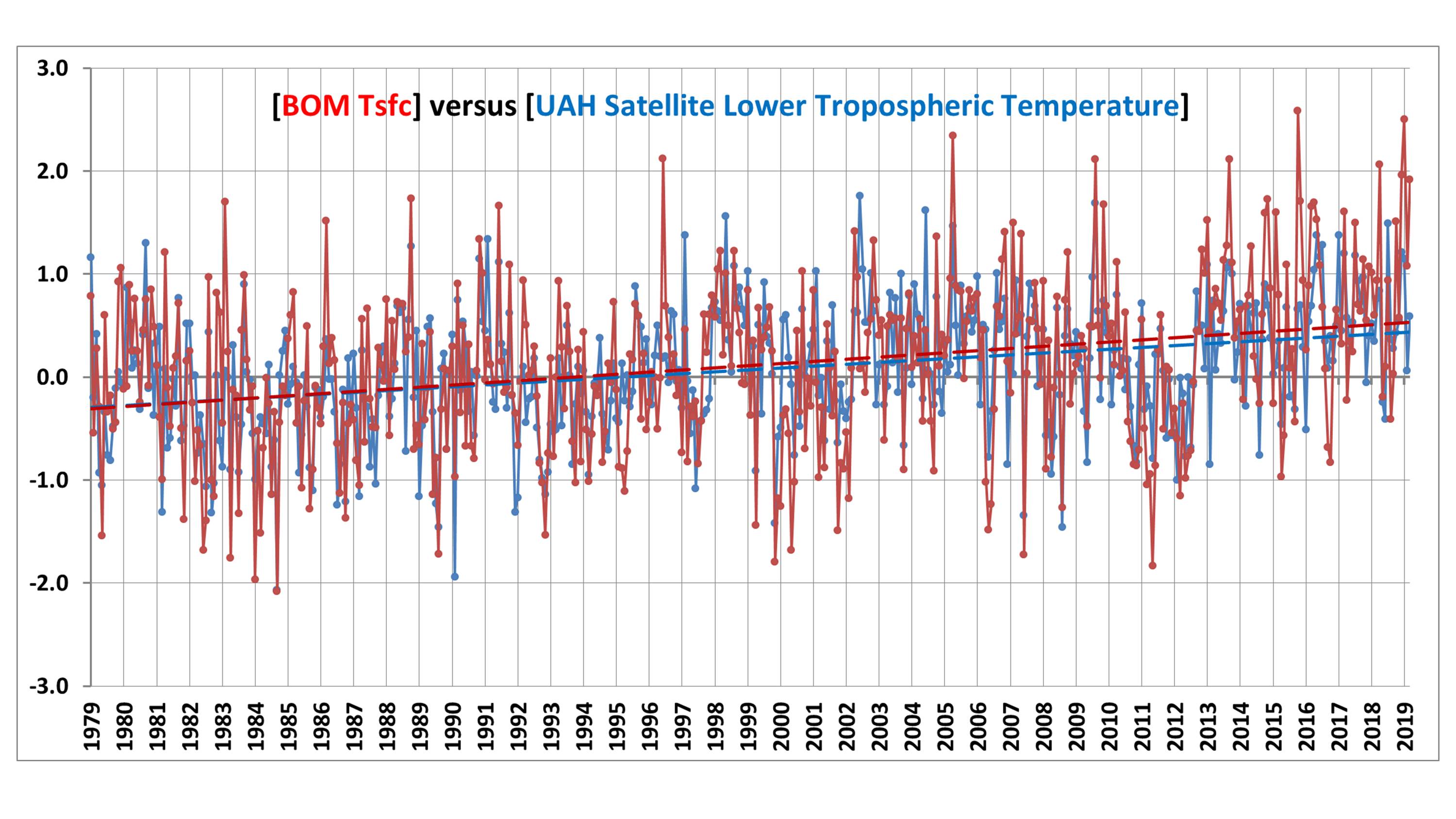
A time series comparison between monthly Tsfc and LT anomalies shows warming in both, with a Tsfc warming trend of +0.21 C/decade, and and a satellite LT trend of +0.18 C/decade:
Fig. 1. Australia average surface temperature (red) and satellite lower tropospheric temperature (LT, blue) anomalies from January 1979 through March 2019.
The correlation between the two time series is 0.70, indicating considerable — but not close — agreement between the two measures of temperature. The standard deviation of their difference is 0.57 deg. C, which means that people doing a comparison of UAH and BOM anomalies each month should not be surprised to see 0.6 deg. C differences (or more).
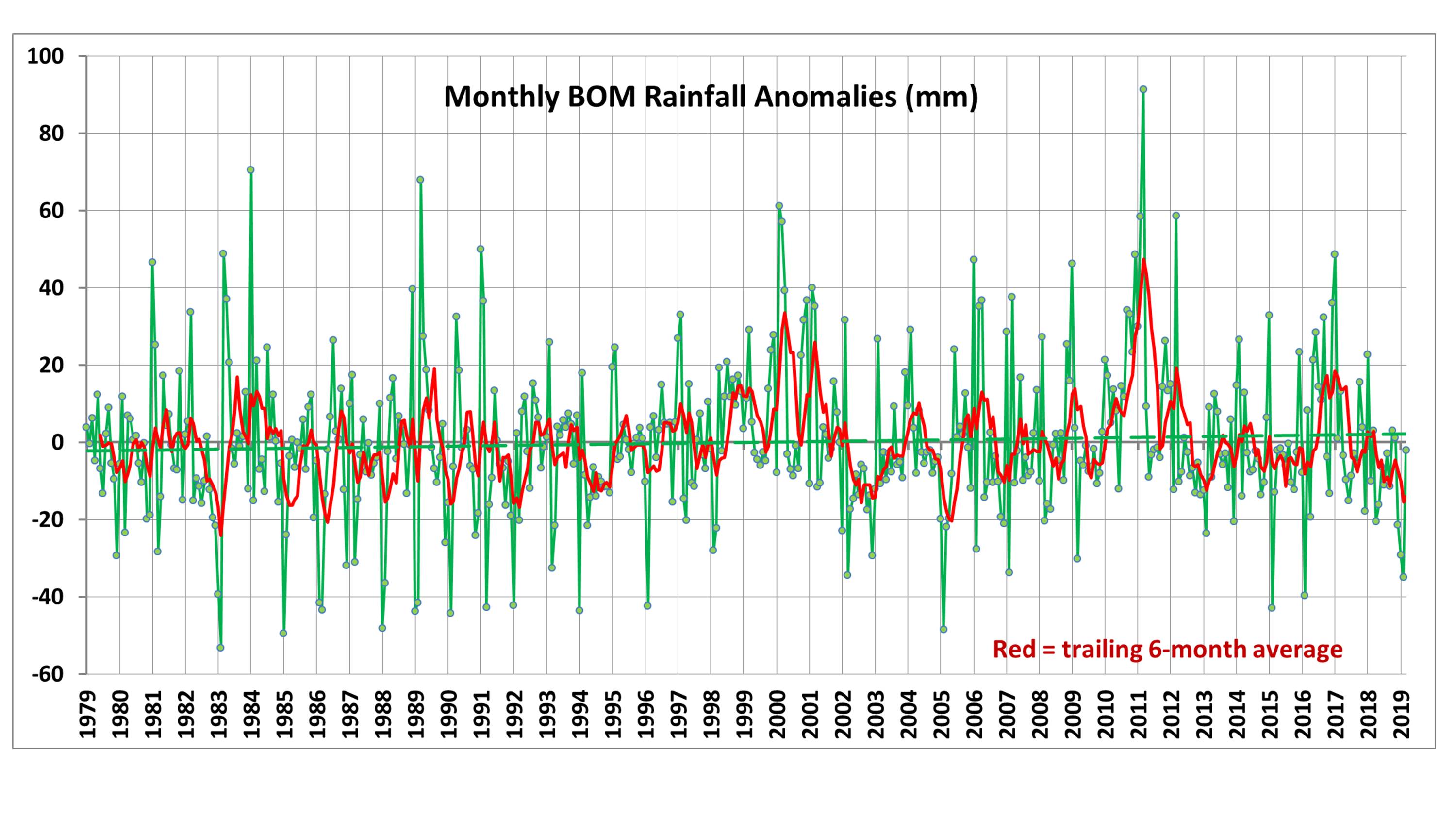
Part of the disagreement comes from rainfall conditions, which can affect the temperature lapse rate in the troposphere. For reference, the following plot shows Australian precipitation anomalies for the same period:
Fig. 2. Australia precipitation anomalies from January 1979 through March 2019.
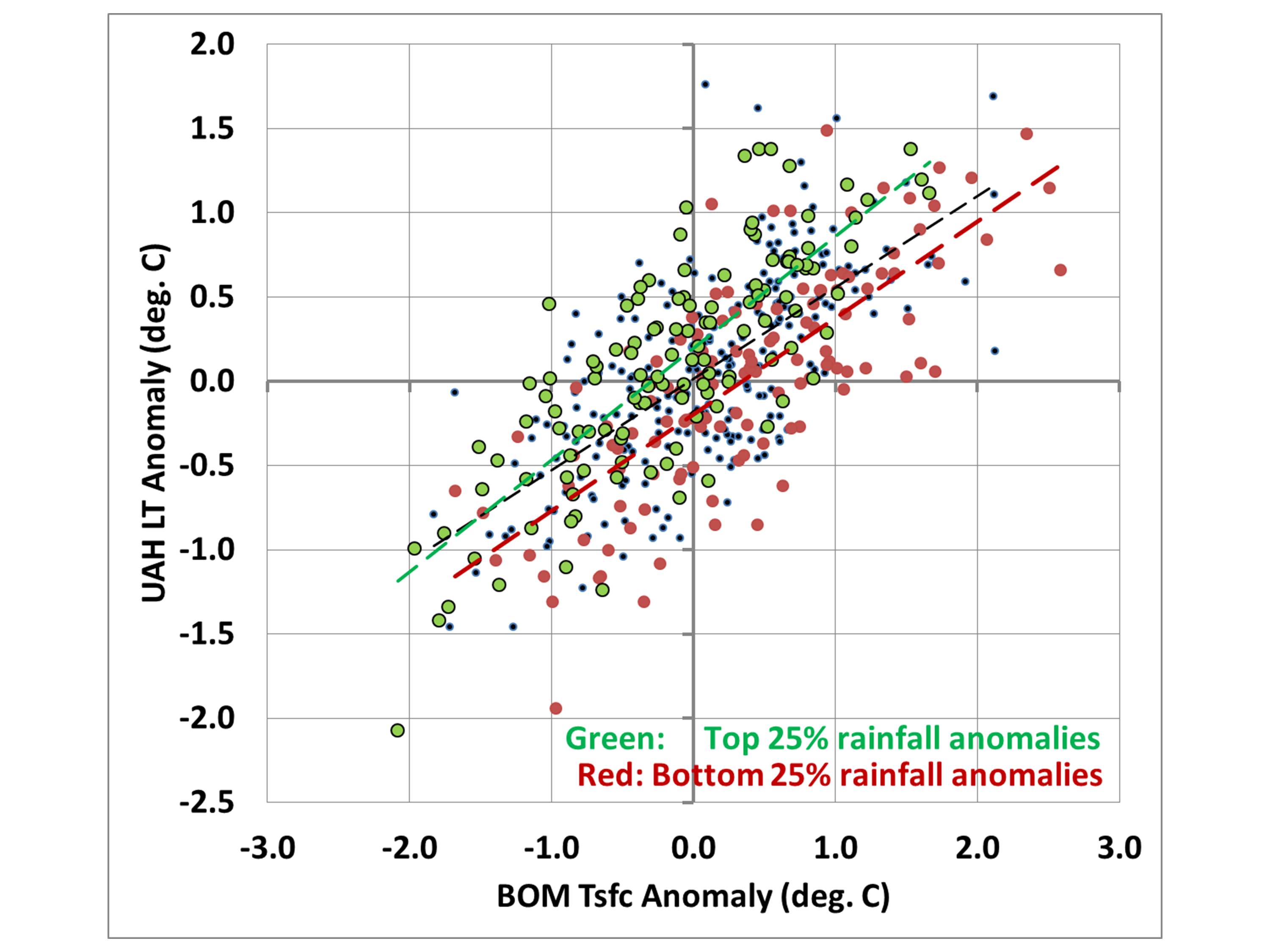
If we take the data in Fig. 1 and create a scatter plot, but show the months with the 25% highest precipitation anomalies in green and the lowest 25% precipitation in red, we see that drought periods tend to have higher surface temperatures compared to tropospheric temperatures, while the wettest periods tend to have lower surface temperatures compared to the troposphere:
Fig. 3. Scatterplot of the data in Fig. 1, but with color coding of those months with the 25% highest (green) and lowest (red) precipitation departures from average.
A More Apples-to-Apples Comparison
Comparing tropospheric and surface temperatures is a little like comparing apples and oranges. But one interesting thing we can do is to regress the surface temperature data against the tropospheric temperatures plus rainfall data to get equations that provide a “best estimate” of the surface temperatures from tropospheric temperatures and rainfall.
I did this for each of the 12 calendar months separately because it turned out that the precipitation relationship evident in Fig. 3 was only a warm season phenomenon. During the winter months of June, July, and August, the relationship to precipitation had the opposite sign, with excessive precipitation being associated with warmer surface temperature versus the troposphere, and drought conditions associated with cooler surface temperatures than the troposphere (on average).
So, using a different regression relationship for each calendar month (each month having either 40 or 41 years represented), I computed a satellite+rainfall estimate of surface temperature. The resulting “satellite” time series then changes somewhat, and the correlation between them increases from 0.70 to 0.80:
Fig. 4. As in Fig. 1, but now the satellite data are used along with precipitation data to provide a regression estimate of surface temperature.
Now the “satellite-based” trend is lowered to +0.15 C/decade, compared to the observed Tsfc trend of +0.21 C/decade. I will leave it to the reader to decide whether this is a significant difference or not.
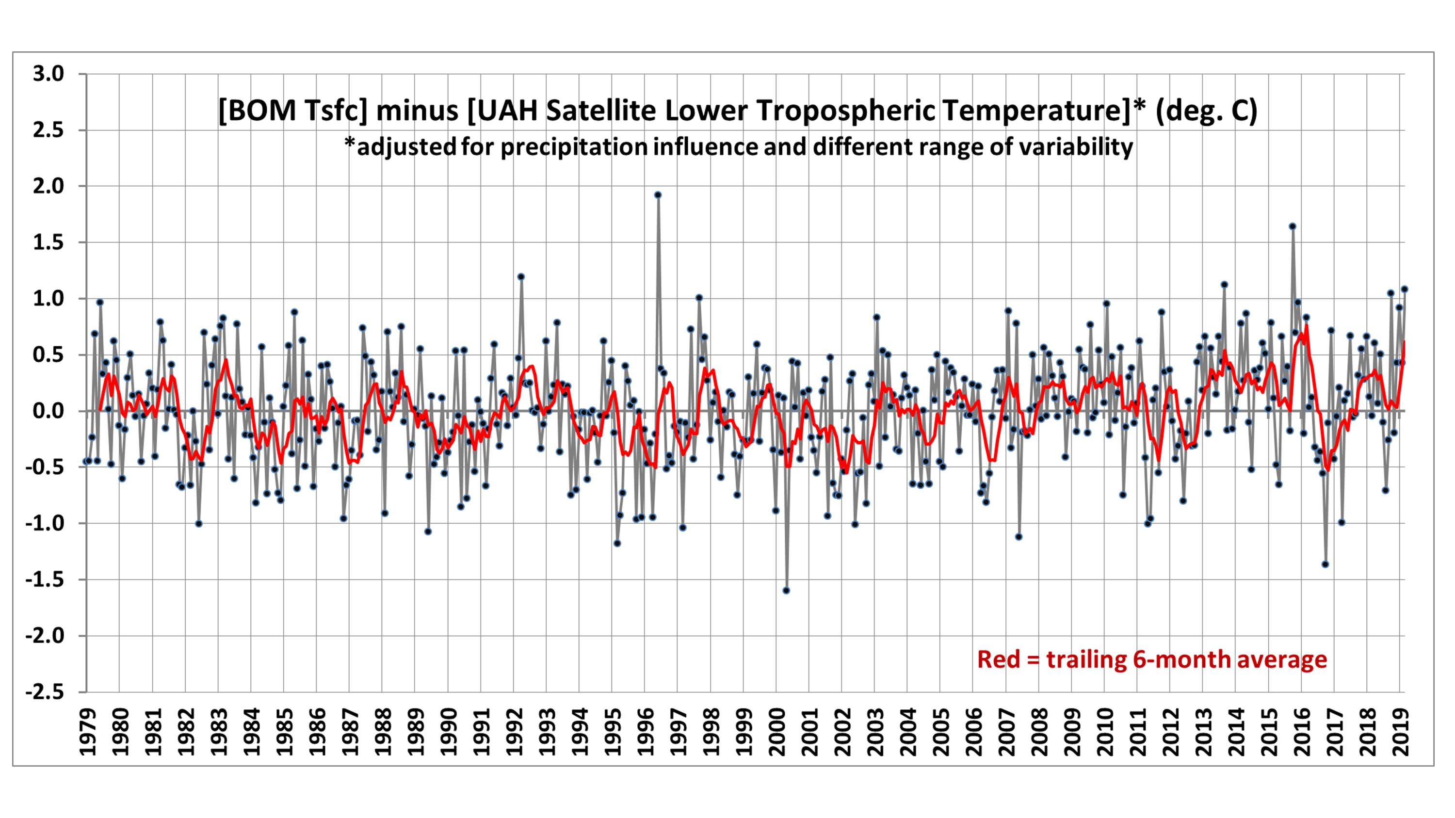
To make the differences in Fig. 4 a little easier to see, we can plot the difference time series between the two temperature measures:
Fig. 5. Difference between the two time series shown in Fig. 4.
Now we can see evidence of an enhanced warming trend in the Tsfc data versus the satellite over the most recent 20 years, which amounts to 0.40 deg. C during April 1999 – March 2019. I have no opinion on whether this is some natural fluctuation in the relationship between surface and tropospheric temperatures, problems in the surface data, problems in the satellite data, or some combination of all three.
Conclusions
The UAH tropospheric temperatures and BOM surface temperatures in Australia are correlated, with similar variability (0.70 correlation). Accounting for anomalous rainfall conditions increases the correlation to 0.80. The Tsfc trends have a slightly greater warming trend than the tropospheric temperatures, but the reasons for this are unclear. Users of the UAH data should expect monthly differences between the UAH and BOM data of 0.6 deg. C or so on a rather routine basis (after correcting for their different 30-year baselines used for anomalies: BOM uses 1961-1990 and UAH uses 1981-2010).
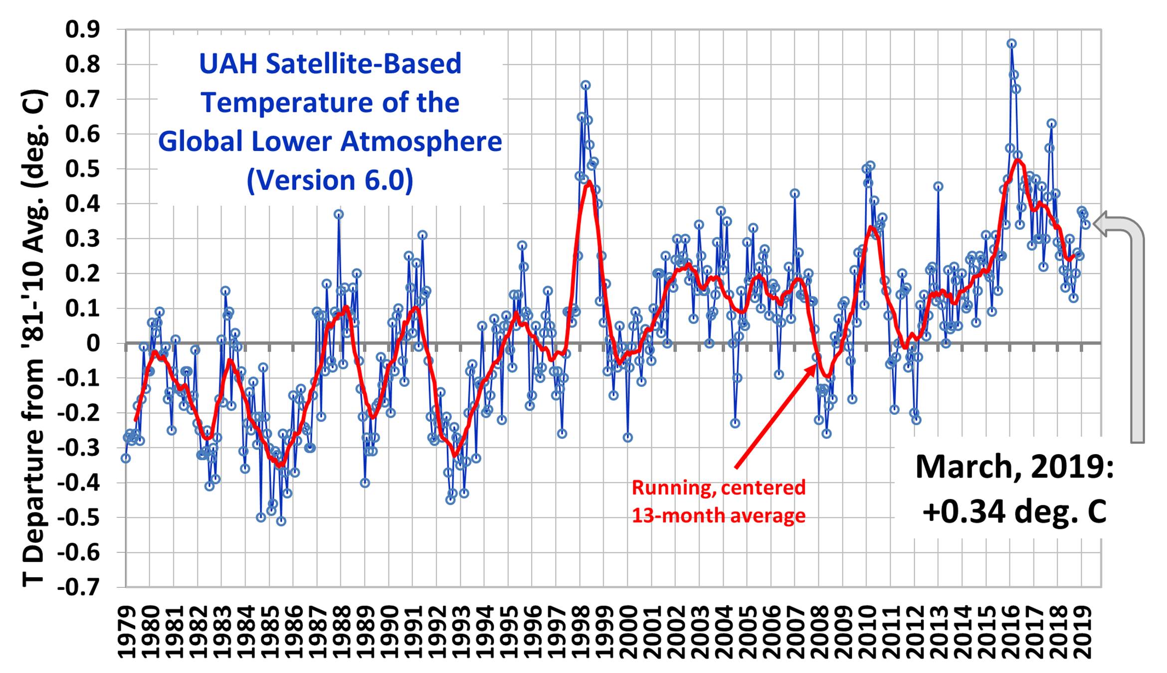
The Version 6.0 global average lower tropospheric temperature (LT) anomaly for March, 2019 was +0.34 deg. C, down slightly from the February, 2019 value of +0.37 deg. C:
We have made two changes in satellite processing starting with the March 2019 update. First, we have decided to stop processing of NOAA-18 data starting in 2017 because that satellite has drifted in local observation time beyond the ability of our Version 6 diurnal drift correction routine to handle it acccurately, as evidenced by spurious warming (not shown) in that satellite relative to the Metop-B satellite (which does not drift). By itself, this change reduces the trends very slightly. Secondly, we have applied a diurnal drift correction to NOAA-19, which previously did not need one because it had not drifted very far in local observation time. By itself, this increases the trends slightly.
The net effect of these two changes is virtually no change in trends (the global trend for 1979-2019 remains at +0.13 C/decade). However, individual monthly anomalies since January 2017 have changed somewhat, by amounts that are regionally dependent. For example, the standard deviation of the difference between the old and new monthly anomalies since January 2017 is 0.03 deg. C for the global averages, and 0.07 deg. C for the USA48 averages.
Various regional LT departures from the 30-year (1981-2010) average for the last 15 months are:
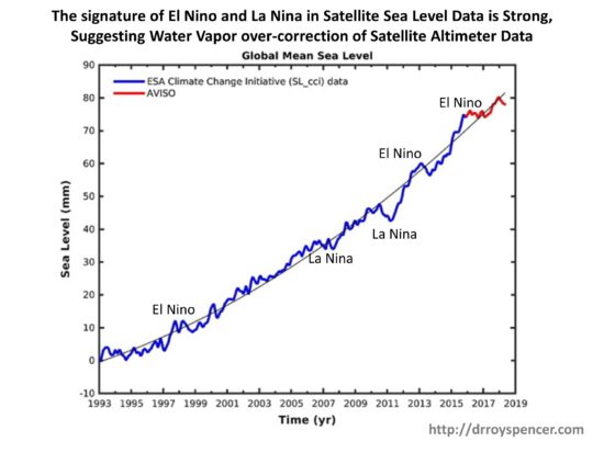
SUMMARY:Evidence is presented that an over-correction of satellite altimeter data for increasing water vapor might be at least partly responsible for the claimed “acceleration” of recent sea level rise.
UPDATE:A day after posting this, I did a rough calculation of how large the error in altimeter-based sea level rise could possibly be. The altimeter correction made for water vapor is about 6 mm in sea level height for every 1 mm increase in tropospheric water vapor. The trend in oceanic water vapor over 1993-2018 has been 0.48 mm/decade, which would require about [6.1 x 0.48=] ~3 mm/decade adjustment from increasing vapor. This can be compared to the total sea level rise over this period of 33 mm/decade. So it appears that even if the entire water vapor correction were removed, its impact on the sea level trend would reduce it by only about 10%.
I have been thinking about an issue for years that might have an impact on what many consider to be a standing disagreement between satellite altimeter estimates of sea level versus tide gauges.
Since 1993 when satellite altimeter data began to be included in sea level measurements, there has been some evidence that the satellites are measuring a more rapid rise than the in situ tide gauges are. This has led to the widespread belief that global-average sea level rise — which has existed since before humans could be blamed — is accelerating.
I have been the U.S. Science Team Leader for the Advanced Microwave Scanning Radiometer (AMSR-E) flying on NASA’s Aqua satellite. The water vapor retrievals from that instrument use algorithms similar to those used by the altimeter people.
I have a good understanding of the water vapor retrievals and the assumptions that go into them. But I have only a cursory understanding of how the altimeter measurements are affected by water vapor. I think it goes like this: as tropospheric water vapor increases, it increases the apparent path distance to the ocean surface as measured by the altimeter, which would cause a low bias in sea level if not corrected for.
What this potentially means is that *if* the oceanic water vapor trends since 1993 have been overestimated, too large of a correction would have been applied to the altimeter data, artificially exaggerating sea level trends during the satellite era.
What follows probably raises more questions that it answers. I am not an expert in satellite altimeters, I don’t know all of the altimeter publications, and this issue might have already been examined and found to be not an issue. I am merely raising a question that I still haven’t seen addressed in a few of the altimeter papers I’ve looked at.
Why Would Satellite Water Vapor Measurements be Biased?
The retrieval of total precipitable water vapor (TPW) over the oceans is generally considered to be one of the most accurate retrievals from satellite passive microwave radiometers.
Water vapor over the ocean presents a large radiometric signal at certain microwave frequencies. Basically, against a partially reflective ocean background (which is then radiometrically cold), water vapor produces brightness temperature (Tb) warming near the 22.235 GHz water vapor absorption line. When differenced with the brightness temperatures at a nearby frequency (say, 18 GHz), ocean surface roughness and cloud water effects on both frequencies roughly cancel out, leaving a pretty good signal of the total water vapor in the atmosphere.
What isn’t generally discussed, though, is that the accuracy of the water vapor retrieval depends upon the temperature, and thus vertical distribution, of the water vapor. Because the Tb measurements represent thermal emission by the water vapor, and the temperature of the water vapor can vary several tens of degrees C from the warm atmospheric boundary layer (where most vapor resides) to the cold upper troposphere (where little vapor resides), this means you could have two slightly different vertical profiles of water vapor producing different water vapor retrievals, even when the TPW in both cases was exactly the same.
The vapor retrievals, either explicitly or implicitly, assume a vertical profile of water vapor by using radiosonde (weather balloon) data from various geographic regions to provide climatological average estimates for that vertical distribution. The result is that the satellite retrievals, at least in the climatological mean over some period of time, produce very accurate water vapor estimates for warm tropical air masses and cold, high latitude air masses.
But what happens when both the tropics and the high latitudes warm? How do the vertical profiles of humidity change? To my knowledge, this is largely unknown. The retrievals used in the altimeter sea level estimates, as far as I know, assume a constant profile shape of water vapor content as the oceans have slowly warmed over recent decades.
Evidence of Spurious Trends in Satellite TPW and Sea Level Retrievals
For many years I have been concerned that the trends in TPW over the oceans have been rising faster than sea surface temperatures suggest they should be based upon an assumption of constant relative humidity (RH). I emailed my friend Frank Wentz and Remote Sensing Systems (RSS) a couple years ago asking about this, but he never responded (to be fair, sometimes I don’t respond to emails, either.)
For example, note the markedly different trends implied by the RSS water vapor retrievals versus the ERA Reanalysis in a paper published in 2018:
The upward trend in the satellite water vapor retrieval (RSS) is considerably larger than in the ERA reanalysis of all global meteorological data. If there is a spurious component of the RSS upward trend, it suggests there will also be a spurious component to the sea level rise from altimeters due to over-correction for water vapor.
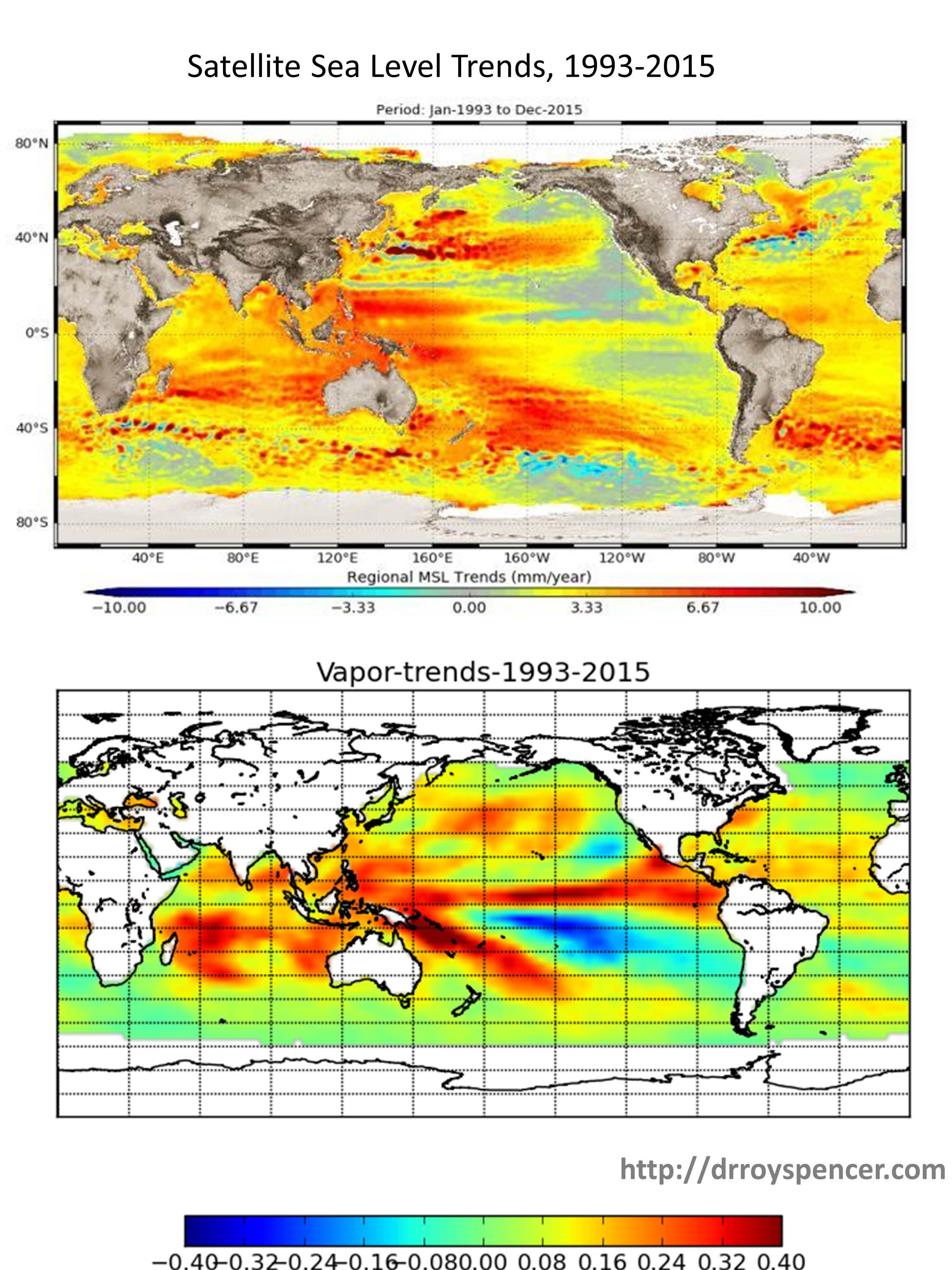
Now look at the geographical distribution of sea level trends from the satellite altimeters from 1993 through 2015 (published in 2018) compared to the retrieved water vapor amounts for exactly the same period I computed from RSS Version 7 TPW data:
The geographic pattern of 23-years of sea level rise from satellite altimeter data looks similar to the pattern of water vapor increase (percent per decade), suggesting cross-talk between the water vapor correction and sea level retrieval.
There is considerably similarity to the patterns, which is evidence (though not conclusive) for remaining cross-talk between water vapor and the retrieval of sea level. (I would expect such a pattern if the upper plot was sea surface temperature, but not for the total, deep-layer warming of the oceans, which is what primarily drives the steric component of sea level rise).
Further evidence that something might be amiss in the altimeter retrievals of sea level is the fact that global-average sea level goes down during La Nina (when vapor amounts also go down) and rise during El Nino (when water vapor also rises). While some portion of this could be real, it seems unrealistic to me that as much as ~15 mm of globally-averaged sea level rise could occur in only 2 years going from La Nina to El Nino conditions (figure adapted from here) :
Especially since we know that increased atmospheric water vapor occurs during El Nino, and that extra water must come mostly from the ocean…yet the satellite altimeters suggest the oceans riserather than fall during El Nino?
The altimeter-diagnosed rise during El Nino can’t be steric, either. As I recall (e.g. Fig. 3b here), the vertically integrated deep-ocean average temperature remains essentially unchanged during El Nino (warming in the top 100 m is matched by cooling in the next 200 m layer, globally-averaged), so the effect can’t be driven by thermal expansion.
Finally, I’d like to point out that the change in the shape of the vertical profile of water vapor that would cause this to happen is consistent with our finding of little to no tropical “hot-spot” in the tropical mid-troposphere: most of the increase in water vapor would be near the surface (and thus at a higher temperature), but less of an increase in vapor as you progress upward through the troposphere. (The hotspot in climate models is known to be correlated with more water vapor increase in the free-troposphere).
Again, I want to emphasize this is just something I’ve been mulling over for a few years. I don’t have the time to dig into it. But I hope someone else will look into the issue more fully and determine whether spurious trends in satellite water vapor retrievals might be causing spurious trends in altimeter-based sea level retrievals.
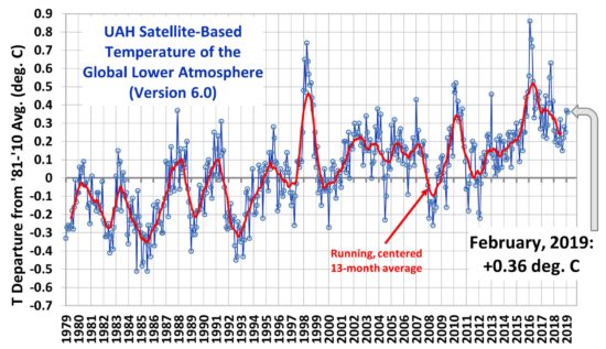
The Version 6.0 global average lower tropospheric temperature (LT) anomaly for February, 2019 was +0.36 deg. C, essentially unchanged from the January, 2019 value of +0.37 deg. C:
Various regional LT departures from the 30-year (1981-2010) average for the last 14 months are:
The linear temperature trend of the global average lower tropospheric temperature anomalies from January 1979 through February 2019 remains at +0.13 C/decade.
The UAH LT global anomaly image for February, 2019 should be available in the next few days here.
The new Version 6 files should also be updated at that time, and are located here:
I’ve received many more requests about the new disappearing-clouds study than the “gold standard proof of anthropogenic warming” study I addressed here, both of which appeared in Nature journals over the last several days.
The widespread interest is partly because of the way the study is dramatized in the media. For example, check out this headline, “A World Without Clouds“, and the study’s forecast of 12 deg. C of global warming.
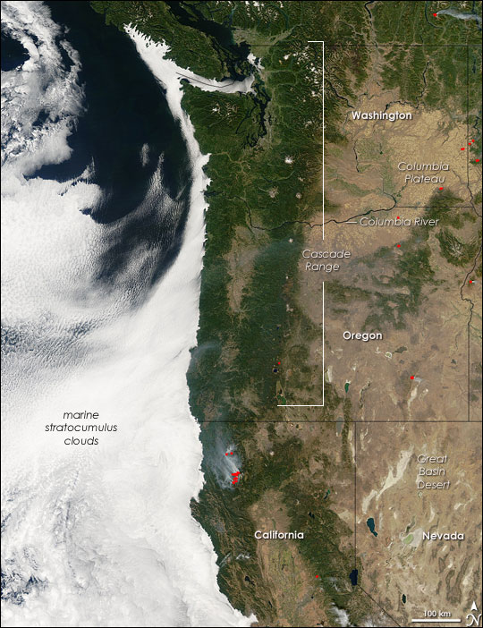
The disappearing clouds study is based upon the modelling of marine stratocumulus clouds, whose existence substantially cools the Earth. These extensive but shallow cloud decks cover the subtropical ocean regions over the eastern ocean basins where upwelling cold water creates a strong boundary layer inversion.
Marine stratocumulus clouds off the U.S. West Coast, which form in a water-chilled shallow layer of boundary layer air capped by warmer air aloft (NASA/GSFC).
In other words, the cold water causes a thin marine boundary layer of chilled air up to a kilometer deep, than is capped by warmer air aloft. The resulting inversion layer (the boundary between cool air below and warm air aloft) inhibits convective mixing, and so water evaporated from the ocean accumulates in the boundary layer and clouds then develop at the base of the inversion. There are complex infrared radiative processes which also help maintain the cloud layer.
The new modeling study describes how these cloud layers could dissipate if atmospheric CO2 concentrations get too high, thus causing a positive feedback loop on warming and greatly increasing future global temperatures, even beyond what the IPCC has predicted from global climate models. The marine stratocumulus cloud response to warming is not a new issue, as modelers have been debating for decades whether these clouds would increase or decrease with warming, thus either reducing or amplifying the small amount of direct radiative warming from increasing CO2.
The new study uses a very high resolution model that “grows” the marine stratocumulus clouds. The IPCC’s climate models, in contrast, have much lower resolution and must parameterize the existence of the clouds based upon larger-scale model variables. These high resolution models have been around for many years, but this study tries to specifically address how increasing CO2 in the whole atmosphere changes this thin, but important, cloud layer.
The high resolution simulations are stunning in their realism, covering a domain of 4.8 x 4.8 km:
The main conclusion of the study is that when model CO2 concentrations reach 1200 ppm or so (which would take as little as another 100 years or so assuming worst-case energy use and population growth projections like RCP8.5), a substantial dissipation of these clouds occurs causing substantial additional global warming, with up to 12 deg. C of total global warming.
Shortcomings in the Study: The Large-Scale Ocean and Atmospheric Environment
All studies like this require assumptions. In my view, the problem is not with the high-resolution model of the clouds itself. Instead, it’s the assumed state of the large-scale environment in which the clouds are assumed to be embedded.
Most importantly, it should be remembered that these clouds exist where cold water is upwelling from the deep ocean, where it has resided for centuries to millennia after initially being chilled to near-freezing in polar regions, and flowing in from higher latitudes. This cold water is continually feeding the stratocumulus zones, helping to maintain the strong temperature inversion at the top of the chilled marine boundary layer. Instead, their model has 1 meter thick slab ocean that rapidly responds to only whats going on with atmospheric greenhouse gases within the tiny (5 km) model domain. Such a shallow ocean layer would be ok (as they claim) IF the ocean portion of the model was a closed system… the shallow ocean only increases how rapidly the model responds… not its final equilibrium state. But given the continuous influx of cold water into these stratocumulus regions from below and from high latitudes in nature, it is far from a closed system.
Second, the atmospheric environment in which the high-res cloud model is embedded is assumed to have similar characteristics to what climate models produce. This includes substantial increases in free-tropospheric water vapor, keeping constant relative humidity throughout the troposphere. In climate models, the enhanced infrared effects of this absolute increase in water vapor leads to a tropical “hot spot”, which observations, so far, fail to show. This is a second reason the study’s results are exaggerated. Part of the disappearing cloud effect in their model is from increased downwelling radiation from the free troposphere as CO2 increases and positive water vapor feedback in the global climate models increases downwelling IR even more. This reduces the rate of infrared cooling by the cloud tops, which is one process that normally maintains them. The model clouds then disappear, causing more sunlight to flood in and warm the isolated shallow slab ocean. But if the free troposphere above the cloud does not produce nearly as large an effect from increasing water vapor, the clouds will not show such a dramatic effect.
The bottom line is that marine stratocumulus clouds exist because of the strong temperature inversion maintained by cold water from upwelling and transport from high latitudes. That chilled boundary layer air bumps up against warm free-tropospheric air (warmed, in turn, by subsidence forced by moist air ascent in precipitation systems possibly thousands of miles away). That inversion will likely be well-maintained in a warming world, thus maintaining the cloud deck, and not causing catastrophic global warming.
A new paper in Nature Climate Change by Santer et al. (paywalled) claims that the 40 year record of global tropospheric temperatures agrees with climate model simulations of anthropogenic global warming so well that there is less than a 1 in 3.5 million chance (5 sigma, one-tailed test) that the agreement between models and satellites is just by chance.
And, yes, that applies to our (UAH) dataset as well.
While it’s nice that the authors commemorate 40 years of satellite temperature monitoring method (which John Christy and I originally developed), I’m dismayed that this published result could feed a new “one in a million” meme that rivals the “97% of scientists agree” meme, which has been a very successful talking point for politicians, journalists, and liberal arts majors.
John Christy and I examined the study to see just what was done. I will give you the bottom line first, in case you don’t have time to wade through the details:
The new Santer et al. study merely shows that the satellite data have indeed detected warming (not saying how much) that the models can currently only explain with increasing CO2 (since they cannot yet reproduce natural climate variability on multi-decadal time scales).
That’s all.
But we already knew that, didn’t we? So why publish a paper that goes to such great lengths to demonstrate it with an absurdly exaggerated statistic such as 1 in 3.5 million (which corresponds to 99.99997% confidence)? I’ll leave that as a rhetorical question for you to ponder.T
There is so much that should be said, it’s hard to know where to begin.
Current climate models are programmed to only produce human-caused warming
First, you must realize that ANY source of temperature change in the climate system, whether externally forced (e.g. increasing CO2, volcanoes) or internally forced (e.g. weakening ocean vertical circulation, stronger El Ninos) has about the same global temperature signature regionally: more change over land than ocean (yes, even if the ocean is the original source of warming), and as a consequence more warming over the Northern than Southern Hemisphere. In addition, the models tend to warm the tropics more than the extratropics, a pattern which the satellite measurements do not particularly agree with.
Current climate model are adjusted in a rather ad hoc manner to produce no long-term warming (or cooling). This is because the global radiative energy balance that maintains temperatures at a relatively constant level is not known accurately enough from first physical principles (or even from observations), so any unforced trends in the models are considered “spurious” and removed. A handful of weak time-dependent forcings (e.g. ozone depletion, aerosol cooling) are then included in the models which can nudge them somewhat in the warmer or cooler direction temporarily, but only increasing CO2 can cause substantial model warming.
Importantly, we don’t understand natural climate variations, and the models don’t produce it, so CO2 is the only source of warming in today’s state-of-the-art models.
The New Study Methodology
The Santer et al. study address the 40-year period (1979-2018) of tropospheric temperature measurements. They average the models regional pattern of warming during that time, and see how well the satellite data match the models for the geographic pattern.
A few points must be made about this methodology.
As previously mentioned, the models already assume that only CO2 can produce warming, and so their finding of some agreement between model warming and satellite-observed warming is taken to mean proof that the warming is human-caused. It is not. Any natural source of warming (as we will see) would produce about the same kind of agreement, but the models have already been adjusted to exclude that possibility.
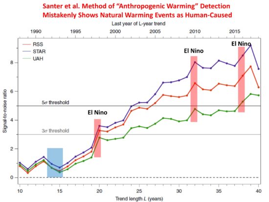
Proof of point #1 can be seen in their plot (below) of how the agreement between models and satellite observations increases over time. The fact that the agreement surges during major El Nino warm events is evidence that natural sources of warming can be mis-diagnosed as an anthropogenic signature. What if there is also a multi-decadal source of warming, as has been found to be missing in models compared to observations (e.g. Kravtsov et al., 2018)?
John Christy pointed out that the two major volcanic eruptions (El Chichon and Pinatubo, the latter shown as a blue box in the plot below), which caused temporary cooling, were in the early part of the 40 year record. Even if the model runs did not include increasing CO2, there would still be agreement between warming trends in the models and observations just because of the volcanic cooling early would lead to positive 40-year trends. Obviously, this agreement would not indicate an anthropogenic source, even though the authors methodology would identify it as such.
Their metric for measuring agreement between models and observations basically multiplies the regional warming pattern in the models with the regional warming pattern in the observations. If these patterns were totally uncorrelated, then there would be no diagnosed agreement. But this tells us little about the MAGNITUDE of warming in the observations agreeing with the models. The warming in the observations might only be 1/3 that of the models, or alternatively the warming in the models might be only 1/3 that in the observations. Their metric gives the same value either way. All that is necessary is for the temperature change to be of the same sign, and more warming in either the models or observations will cause an diagnosed increase in the level of agreement metric they use, even if the warming trends are diverging over time.
Their metric of agreement does not even need a geographic “pattern” of warming to reach an absurdly high level of statistical agreement. Warming could be the same everywhere in their 576 gridpoints covering most the Earth, and their metric would sum up the agreement at every gridpoint as independent evidence of a “pattern agreement”, even though no “pattern” of warming exists. This seems like a rather exaggerated statistic.
These are just some of my first impressions of the new study. Ross McKitrick is also examining the paper and will probably have a more elegant explanation of the statistics the paper uses and what those statistics can and cannot show.
Nevertheless, the metric used does demonstrate some level of agreement with high confidence. What exactly is it? As far as I can tell, it’s simply that the satellite observations show some warming in the last 40 years, and so do the models. The expected pattern is fairly uniform globally, which does not tell us much since even El Nino produces fairly uniform warming (and volcanoes produce global cooling). Yet their statistic seems to treat each of the 576 gridpoints as independent, which should have been taken into account (similar to time autocorrelation in time series). It will take more time to examine whether this is indeed the case.
In the end, I believe the study is an attempt to exaggerate the level of agreement between satellite (even UAH) and model warming trends, providing supposed “proof” that the warming is due to increasing CO2, even though natural sources of temperature change (temporary El Nino warming, volcanic cooling early in the record, and who knows what else) can be misinterpreted by their method as human-caused warming.
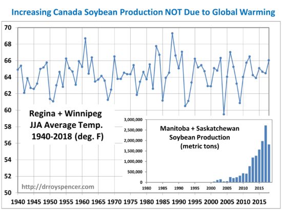
There is no shortage of articles claiming that global warming is causing agriculture of certain crops to push farther north, for example into the southern Canadian Prairie provinces of Manitoba and Saskatchewan.
My contacts in the grain trading business tell me that the belief is widespread.
For example, here’s a quote from a Manitoba Co-operator article,
Lutz Goedde, of the management and consulting firm McKinsey & Company, said Canada is in a unique position because of its northern latitude and large supply of fresh water…. Pointing to the steady northward trek of corn and soybeans, the agricultural business consultant said that the effects are already evident.
The problem with this view is that the two main weather stations located in this region (Regina and Winnipeg) do not show a statistically significant warming trend during the prime growing months of June, July, and August:
Average yearly growing season temperatures at Regina and Winnipeg show no obvious warming trend that might explain the rapid increase in soybean production in southern Manitoba and Saskatchewan since 2000. Temperature data from Environment and Climate Change Canada.
So what is really happening? The amount of various grains produced each year is the result of many factors, for example demand, expected price, and tariffs. All of these affect what crops farmers decide to plant. For example, Canadian soybean production has responded to increasing global demand for soybeans, especially in China where increasing prosperity has led to greater consumption of pork and poultry, both of which use soybean meal for feed.
So, once again, we see “global warming” being invoked as a cause where causation either doesn’t exist, or is only a minor player.
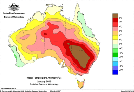
The Australian Bureau of Meteorology (BOM) claims January, 2019 was record-hot. There is no doubt it was very hot — but just how hot… and why?
The BOM announcement mentions “record” no less than 28 times… but nowhere (that I can find) in the report does it say just how long the historical record is. My understanding is that it is since 1910. So, of course, we have no idea what previous centuries might have shown for unusually hot summers.
The assumption is, of course, that anthropogenic global warming is to blame. But there is too much blaming of humans going on out there these days, when we know that natural weather fluctuations also cause record high (and low) temperatures, rainfall, etc.
But how is one to know what records are due to the human-component of global warming versus Mother Nature? (Even the UN IPCC admits some of the warming since the 1950s could be natural. Certainly, the warming from the Little Ice Age until 1940 was mostly natural.)
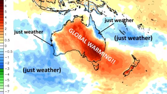
One characteristic of global warming is that it is (as the name implies) global — or nearly so (maybe not over Antarctica). In contrast, natural weather variations are regional, tied to natural variations and movements in atmospheric circulation systems.
That “weather” was strongly involved in the hot Australian January can be seen by the cooler than normal temperatures in coastal areas centered near Townsville in the northeast, and Perth in the southwest:
The extreme heat was caused by sinking air, which caused clear skies and record-low rainfall in some areas.
But why was the air sinking? It was being forced to sink by rising air in precipitation systems off-shore. All rising air must be exactly matched by an equal amount of sinking air, and places like Australia and the Sahara are naturally preferred for this — thus the arid and semi-arid environment. The heat originates from the latent heat release due to rain formation in those precipitation systems.
If we look at the area surrounding Australia in January, we can see just how localized the “record” warmth was. The snarky labels reflect my annoyance at people not thinking critically about the difference between ‘weather’ and ‘climate change’:
January 2019 surface temperature anomalies (deg. C, relative to the 1981-2010 average) from NOAA’s Global Forecast System (GFS) analysis fields. Unlabeled graphic courtesy of WeatherBell.com.
The Version 6.0 global average lower tropospheric temperature (LT) anomaly for January, 2019 was +0.37 deg. C, up from the December, 2018 value of +0.25 deg. C:
Global area-averaged lower tropospheric temperature anomalies (departures from 30-year calendar monthly means, 1981-2010). The 13-month centered average is meant to give an indication of the lower frequency variations in the data; the choice of 13 months is somewhat arbitrary… an odd number of months allows centered plotting on months with no time lag between the two plotted time series. The inclusion of two of the same calendar months on the ends of the 13 month averaging period causes no issues with interpretation because the seasonal temperature cycle has been removed, and so has the distinction between calendar months
Various regional LT departures from the 30-year (1981-2010) average for the last 13 months are:
The linear temperature trend of the global average lower tropospheric temperature anomalies from January 1979 through January 2019 remains at +0.13 C/decade.
The UAH LT global anomaly image for January, 2019 should be available in the next few days here.
The new Version 6 files should also be updated at that time, and are located here:

 Home/Blog