What follows is a response to Gavin Schmidt’s blog post at RealClimate.org entitled Spencer’s Shenanigans in which he takes issue with my claims in Global Warming: Observations vs. Climate Models. As I read through his criticism, he seems to be trying too hard to refute my claims while using weak (and even non-existent) evidence.
To summarize my claims regarding the science of global warming:
- Climate models relied upon to guide public policy have produced average surface global warming rates about 40% greater than observed over the last half-century (the period of most rapid warming)
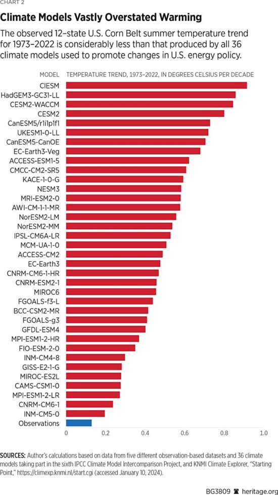
- The discrepancy is much larger in the U.S. Corn Belt, the world-leader in corn production, and widely believed to be suffering the effects of climate change (despite virtually no observed warming there).
- In the deep-troposphere (where our weather occurs, and where global warming rates are predicted to be the largest), the discrepancy between models and observations is also large based upon multiple satellite, weather balloon, and multi-data source reanalysis datasets.
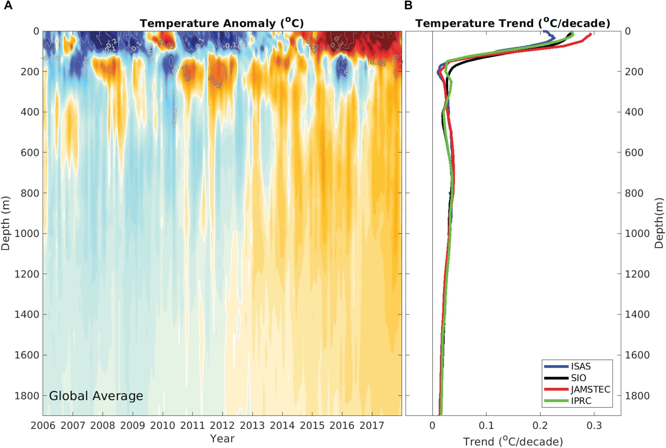
- The global energy imbalance involved in recent warming of the global deep oceans, whatever its cause, is smaller than the uncertainty in any of the natural energy flows in the climate system. This means a portion of recent warming could be natural and we would never know it.
- The observed warming of the deep ocean and land has led to observational estimates of climate sensitivity considerably lower (1.5 to 1.8 deg. C here, 1.5 to 2.2 deg. C, here) compared to the IPCC claims of a “high confidence” range of 2.5 to 4.0 deg. C.
- Climate models used to project future climate change appear to not even conserve energy despite the fact that global warming is, fundamentally, a conservation of energy issue.
In Gavin’s post, he makes the following criticisms, which I summarize below and which are followed by my responses. Note the numbered list follows my numbered claims, above.
1.1 Criticism: The climate model (and observation) base period (1991-2020) is incorrect for the graph shown (1st chart of 3 in my article). RESPONSE: this appears to be a typo, but the base period is irrelevant to the temperature trends, which is what the article is about.
1.2 Criticism: Gavin says the individual models, not the model-average should be shown. Also, not all the models are included in the IPCC estimate of how much future warming we will experience, the warmest models are excluded, which will reduce the discrepancy. RESPONSE: OK, so if I look at just those models which have diagnosed equilibrium climate sensitivities (ECS) in the IPCC’s “highly likely” range of 2 to 5 deg. C for a doubling of atmospheric CO2, the following chart shows that the observed warming trends are still near the bottom end of the model range:
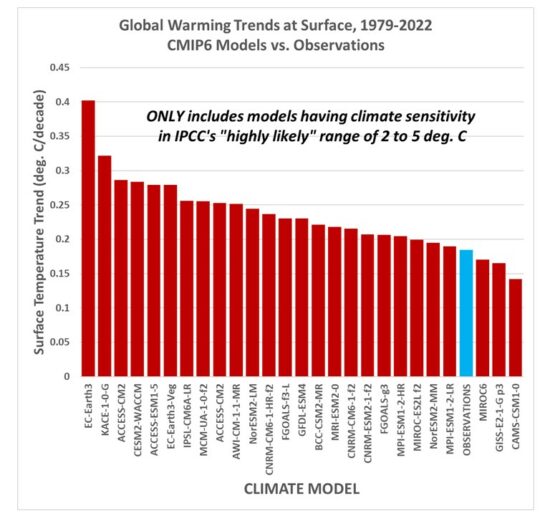
And since a few people asked how the results change with the inclusion of the record-warm year in 2023, the following chart shows the results don’t change very much.
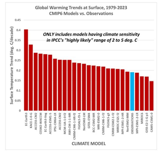
Now, it is true that leaving out the warmest models (AND the IPCC leaves out the coolest models) leads to a model average excess warming of 28% for the 1979-2022 trends (24% for the 1979-2023 trends), which is lower than the ~40% claimed in my article. But many people still use these most sensitive models to support fears of what “could” happen, despite the fact the observations support only those models near the lower end of the warming spectrum.
1.3 Criticism: Gavin shows his own comparison of models to observations (only GISS, but it’s very close to my 5-dataset average), and demonstrates that the observations are within the envelope of all models. RESPONSE: I never said the observations were “outside the envelope” of all the models (at least for global average temperatures, they are for the Corn Belt, below). My point is, they are near the lower end of the model spread of warming estimates.
1.4 Criticism: Gavin says that in his chart “there isn’t an extra adjustment to exaggerate the difference in trends” as there supposedly is in my chart. RESPONSE: I have no idea why Gavin thinks that trends are affected by how one vertically align two time series on a graph. They ARE NOT. For comparing trends, John Christy and I align different time series so that their linear trends intersect at the beginning of the graph. If one thinks about it, this is the most logical way to show the difference in trends in a graph, and I don’t know why everyone else doesn’t do this, too. Every “race” starts at the beginning. It seems Gavin doesn’t like it because it makes the models look bad, which is probably why the climate modelers don’t do it this way. They want to hide discrepancies, so the models look better.
2.1 Criticism: Gavin doesn’t like me “cherry picking” the U.S. Corn Belt (2nd chart of 3 in my article) where the warming over the last 50 years has been less than that produced by ALL climate models. RESPONSE: The U.S. Corn Belt is the largest corn-producing area in the world. (Soybean production is also very large). There has been long-standing concern that agriculture there will be harmed by increasing temperatures and decreased rainfall. For example, this publication claimed it’s already happening. But it’s not. Instead, since 1960 (when crop production numbers have been well documented), (or since 1973, or 1979…it doesn’t matter, Gavin), the warming has been almost non-existent, and rainfall has had a slight upward trend. So, why did I “cherry pick” the Corn Belt? Because it’s depended upon, globally, for grain production, and because there are claims it has suffered from “climate change”. It hasn’t.
3.1 Criticism: Gavin, again, objects to the comparison of global tropospheric temperature datasets to just the multi-model average (3rd of three charts in my article), rather than to the individual models. He then shows a similar chart, but with the model spread shown. RESPONSE: Take a look at his chart… the observations (satellites, radiosondes, and reanalysis datasets) are ALL near the bottom of the model spread. Gavin makes my point for me. AND… I would not trust his chart anyway, because the trend lines should be shown and the data plots vertically aligned so the trends intersect at the beginning. This is the most logical way to illustrate the trend differences between different time series.
4. Regarding my point that the global energy imbalance causing recent warming of the deep oceans could be partly (or even mostly) natural, Gavin has no response.
5. Regarding observational-based estimates of climate sensitivity being much lower than what the IPCC claims (based mostly on theory-based models), Gavin has no response.
6. Regarding my point that recent published evidence shows climate models don’t even conserve energy (which seems a necessity, since global warming is, fundamentally, an energy conservation issue), Gavin has no response.
Gavin concludes with this: “Spencer’s shenanigans are designed to mislead readers about the likely sources of any discrepancies and to imply that climate modelers are uninterested in such comparisons — and he is wrong on both counts.”
I will leave it to you to decide whether my article was trying to “mislead readers”. In fact, I believe that accusation would be better directed at Gavin’s criticisms and claims.
P.S. For those who haven’t seen it, Gavin and I were interviewed on John Stossel’s TV show, where he refused to debate me, and would not sit at the table with me. It’s pretty revealing.

 Home/Blog