Archive for October, 2024

A Demonstration: Low Correlations Do Not Necessarily Lead to Low Confidence in Data Regressions

Monday, October 28th, 2024

In a recent post I used our new Urban Heat Island (UHI) warming estimates at individual U.S. GHCN stations having at least 120 years of data to demonstrate that the homogenized (adjusted) GHCN data still contain substantial UHI effects. Therefore, spurious warming from UHI effects is inflating reported U.S. warming trends.

The data plots I presented had considerable scatter, though, leading to concerns that there is large uncertainty in my quantitative estimates of how much UHI warming remains in the GHCN data. So, I updated that post to include additional statistics of the regressions.

A Simple Example: High Correlation, But Low Confidence In the Regression Slope

The following plot of a small amount of data I created shows what looks like a pretty strong linear relationship between 2 variables, with a regression explained variance of 82% (correlation coefficient of 0.91).
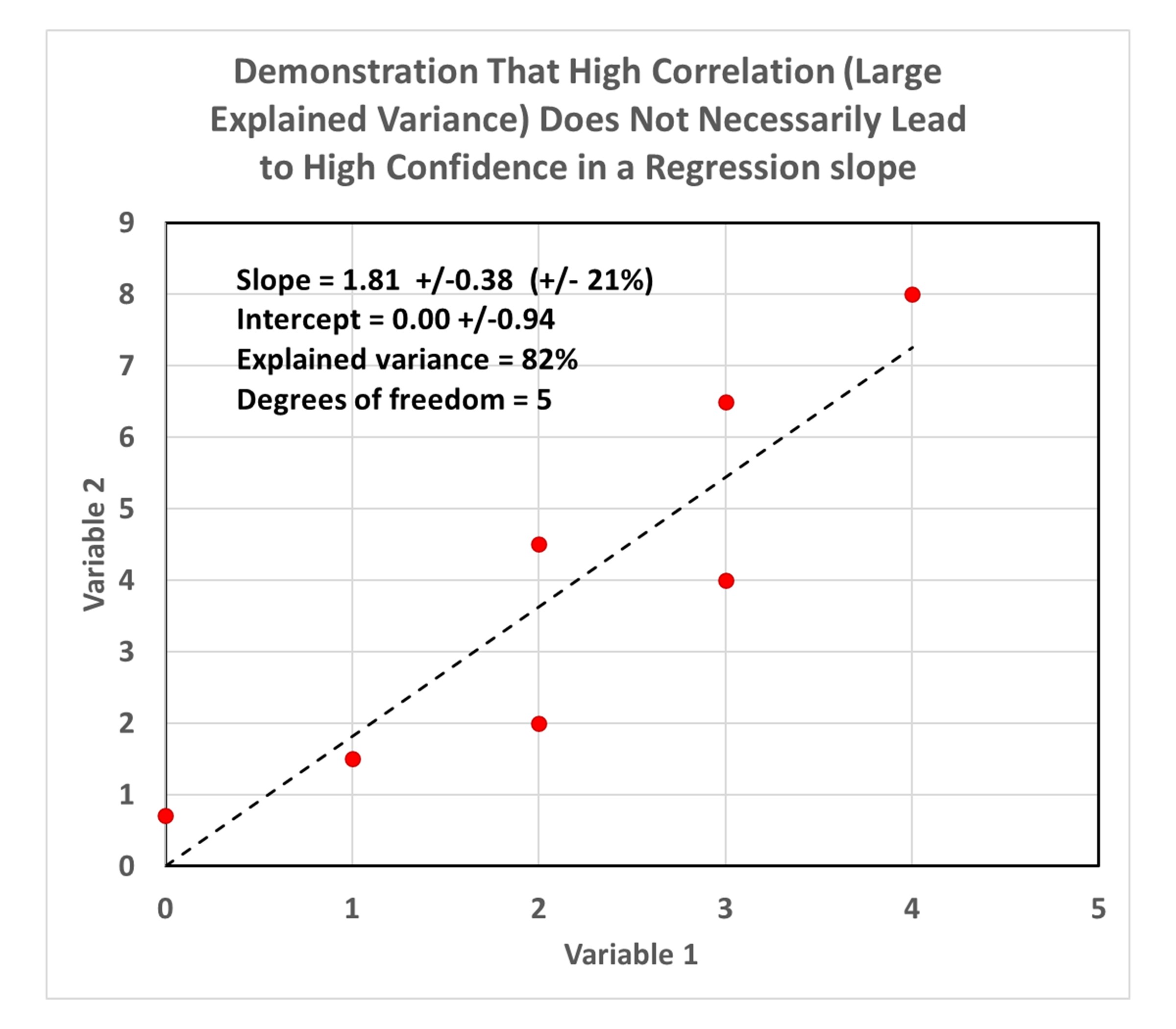
But because there are so few data points, there is large statistical uncertainty in the resulting diagnosed regression slope (21% uncertainty), as well as the regression intercept (which is diagnosed as 0.0, but with an uncertainty of +/- 0.94).

Now let’s look at the third data plot from my previous blog post, which demonstrated that there is UHI warming in not only the raw GHCN data, but in the homogenized data as well:
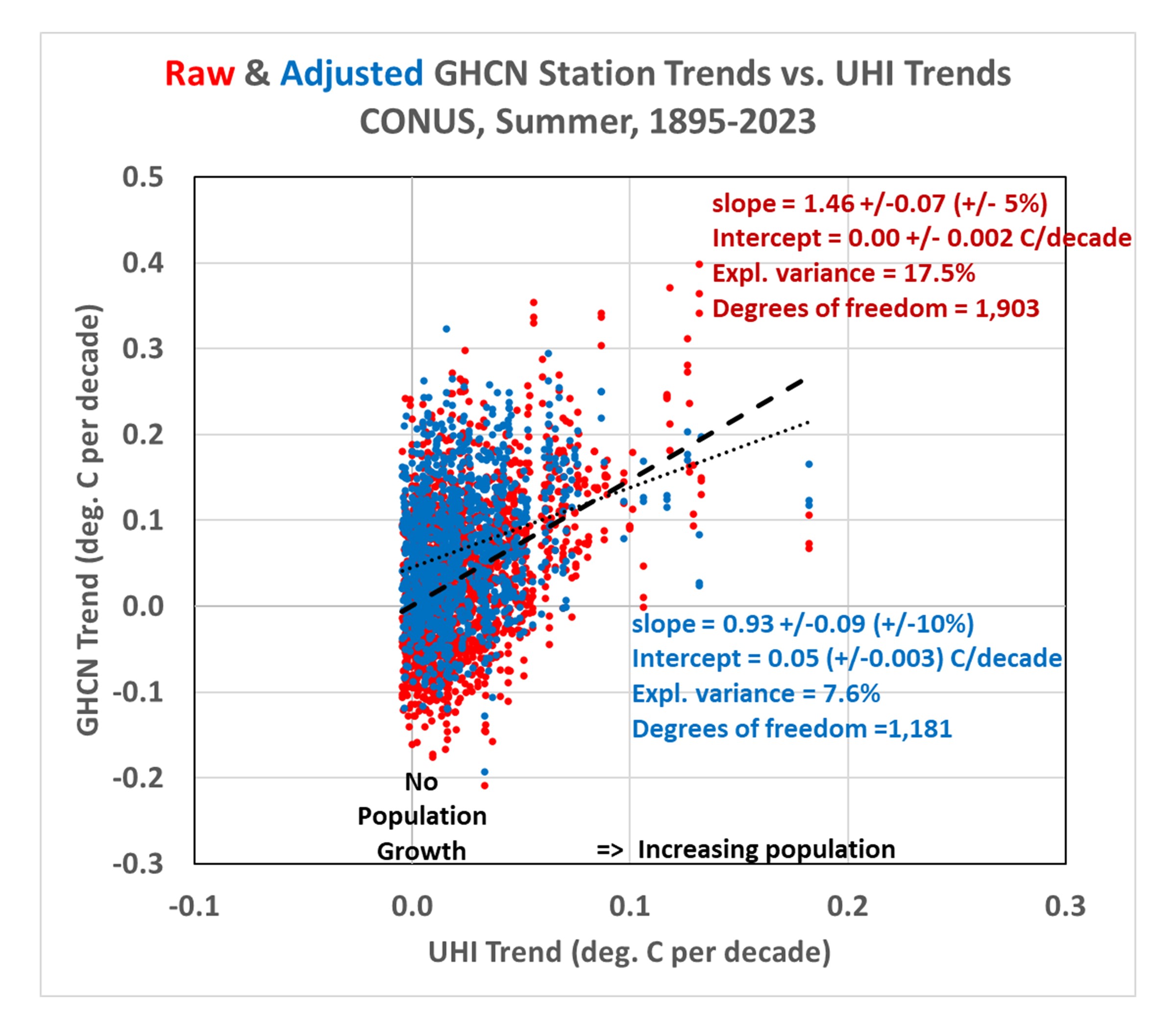
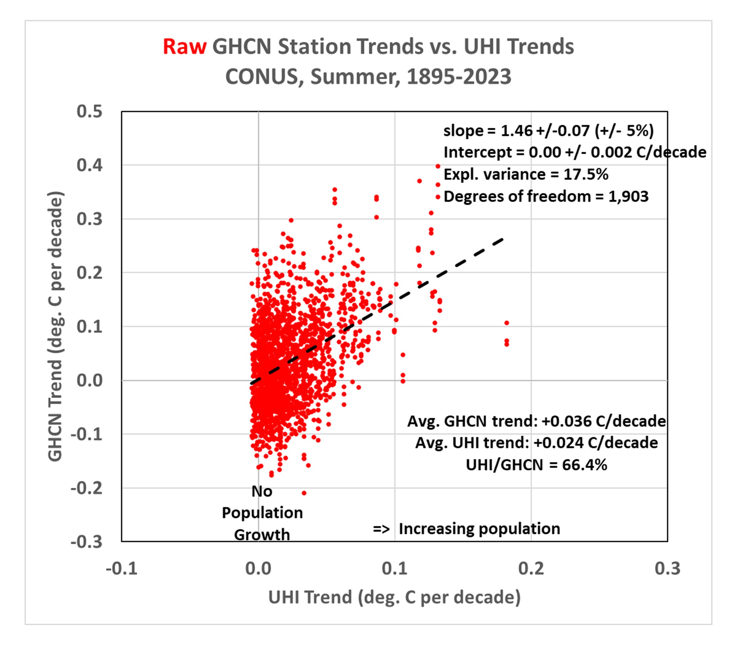
Importantly, even though the regression explained variances are rather low (17.5% for the raw data, 7.6% for the adjusted data), the confidence in the regression slopes is quite high (+/-5% for the raw GHCN regressions, and +/-10% for the homogenized GHCN regressions). Confidence is also high in the regression intercepts (+/-0.002 C/decade for the raw GHCN data, +/-0.003 C/decade for the homogenized GHCN data).

Compare these to the first plot above containing very few data points, which had a very high explained variance (82%) but a rather uncertain regression slope (+/- 21%).

The points I was making in my previous blog post depended upon both the regression slopes and the regression intercepts. The positive slopes demonstrated that the greater the population growth at GHCN stations, the greater the warming trend… not only in the raw data, but in the homogenized data as well. The regression intercepts of zero indicated that the data, taken as a whole, suggested zero warming trend (1895-2023) if the stations had not experienced population growth.

But it must be emphasized that these are all-station averages for the U.S., not area averages. It is “possible” that there has (by chance) actually been more climate warming at the locations where there has been more population growth. So it would be premature to claim there has been no warming trend in the U.S. after taking into account spurious UHI warming effects. I also showed that there has been warming if we look at more recent data (1961-2023).

But the main point of this post is to demonstrate that low correlations between two dataset variables do not necessarily mean low confidence in regression slopes (and intercepts). The confidence intervals also depend upon how much data are contained in the dataset.

As Retirement Approaches…

Saturday, October 26th, 2024

Since I’ve been getting questions about my retirement plans, I decided it’s time to address what I know so far.

John Christy will be retiring from UAH July 2026. Because my funding has been tied to his projects (including the Alabama Office of the State Climatologist, which he heads), there is a good chance I will also be retiring on or before that date.

The main issue with me continuing employment past his retirement date is the lack of funding from the federal government. We had a Department of Energy contract, but it is ending and we have very few friends in Washington since we remain on the “wrong side” of the science. The peer review process (which determines what proposals the government will fund) has been stacked against us for many years making it almost impossible to get funded to investigate the issues we believe are important to the climate debate.

It’s a little ironic that even though both John and I are “lukewarmers” that’s just not alarmist enough for us to be allowed to play in the climate sandbox with the big dogs (sorry for the mixed metaphor).

John and I still need to discuss how to keep the monthly satellite temperature updates going (if possible). There are three of us contributing to this effort. Danny Braswell (retired from UAH, but working part time) has been trying to get the newer ATMS instruments folded into our processing, but downloading the historical data is taking forever due to NOAA limitations on the number of files that can be requested on a daily basis. Also, much of the software had to be re-written to handle the differences between the AMSU and ATMS instruments scan geometries. John Christy is a good planner, and I’m hopeful we can work out something to keep the global temperature updates going, keeping in mind none of us is getting any younger.

On that subject, I am often asked if there are new, young researchers who can take our place. The problem is that their careers depend upon getting those same federal contracts we depended upon. Unfortunately, any projects that smell like climate skepticism are generally not funded, and young researchers will likely hurt their careers if they are considered to be replacements for John or me.

It has been many years since we received funding specifically to support the global temperature monitoring effort. The Remote Sensing Systems satellite temperature monitoring effort has much more funding success due to (in my opinion) Frank Wentz’s long-term, close friendship with one of NASA’s top managers. It helps to have friends in high places.

I will keep everyone updated as I learn more. Personally, I would like to continue the work I have started (especially the urban heat island work) if possible. Staying working, even part-time, helps keep me sane… I need to keep my mind active.

But advancing any science that doesn’t support global warming being a “crisis” remains an uphill battle. Several months before his death, Rush Limbaugh told me he thought we were losing that battle. But I’m willing to continue to fight it, anyway. I’m old enough to remember when the Soviet Union was believed to be an ever-present danger to the world that would never end, and yet it imploded. Maybe one day climate alarmism will suffer the same fate.

Urban Heat Island Effects Have Not Yet Been Removed from Official GHCN Warming Trends

Friday, October 25th, 2024

UPDATE (28 Oct. 2024): In response to concerns regarding the large amount of scatter in the data plots presented below, and the claims I make based upon those regressions, I have replaced all plots which now contain additional regression statistics. These statistics demonstrate high confidence. What many people don’t realize is that diagnosed regression slopes (and regression intercepts) can have high confidence despite low correlations (large scatter) if there are many data points. I will be posting a new article today showing an example of this.

Our paper (co-authored by John Christy and Danny Braswell) on computing the urban heat island (UHI) effect as a function of population density (PD) is now in the final stages of review after a 3rd round of edits, and I’m hopeful it will be accepted for publication soon. So far, I’ve only used Tavg data (the average of daily maximum and minimum temperatures) in developing and testing the method, and the paper uses only contiguous U.S. summertime data (June, July, August), which is what I will address here.

The method allows us to compute UHI trends using global gridded PD datasets that extend back to the 1800s. These UHI trends can then be compared to GHCN station temperature trends. If I do this for all U.S. GHCN stations having at least 120 years of complete monthly (June, July, or August) data out of 129 potential years during 1895-2023, the following plot shows some interesting results. (I begin with the “raw” data so we can then examine how homogenization changes the results.) Note the following plots have been updated to include regression statistics which demonstrate, despite low explained variances, the resulting regression slopes and intercepts have high confidence, due to the large number of data points (GHCN stations) contained in the plots.

  1. The greater a station’s population growth, the greater the observed warming trend. This is pretty convincing evidence that the raw GHCN data has substantial UHI effects impacting the computed trends (probably no surprise here). Note the UHI temperature trend averages 66% of the raw temperature trends.
  2. The regression line fit to the data intercepting zero shows that those stations with no population growth have, on average, no warming trend. While this might lead some to conclude there has been no net warming in the U.S. during 1895-2023, it must be remembered these are raw data, with no adjustments for time-of-observation (TOBS) changes or instrumentation type changes which might have biased most or all of the stations toward lower temperature trends.

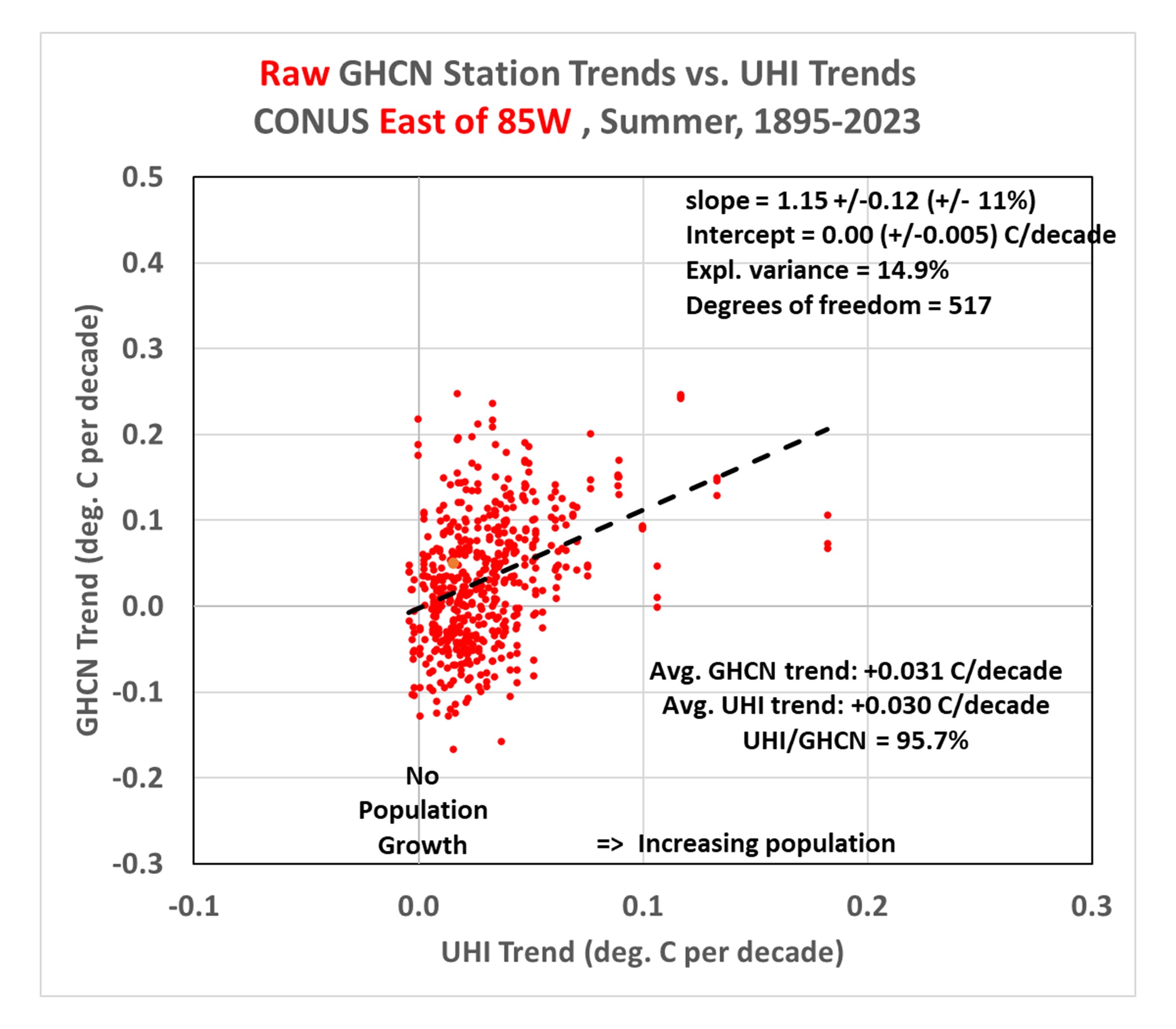
Since most of the rural stations (many of which have experienced little population growth) are in the western U.S., and there can be differences in actual temperature trends between the eastern and western U.S., let’s look at how things change if we just examine just the eastern U.S. (Ohio to the Florida peninsula, eastward):

This shows the Eastern U.S. has features similar to the U.S. as a whole, with a regression line intercept of zero (again) indicating those stations with no population growth have (on average) no warming trend in the raw GHCN data. But now, amazingly, the average UHI trend is over 95% of the raw station trends (!) This would seemingly suggest essentially all of the reported warming during 1895-2023 over the eastern U.S. has been due to the urbanization effect… if there are no systematic biases in the raw Tavg data that would cause those trends to be biased low. Also, as will be discussed below, this is the the period 1895-2023… the results for more recent decades are somewhat different.

Homogenization of the GHCN Data Produces Some Strange Effects

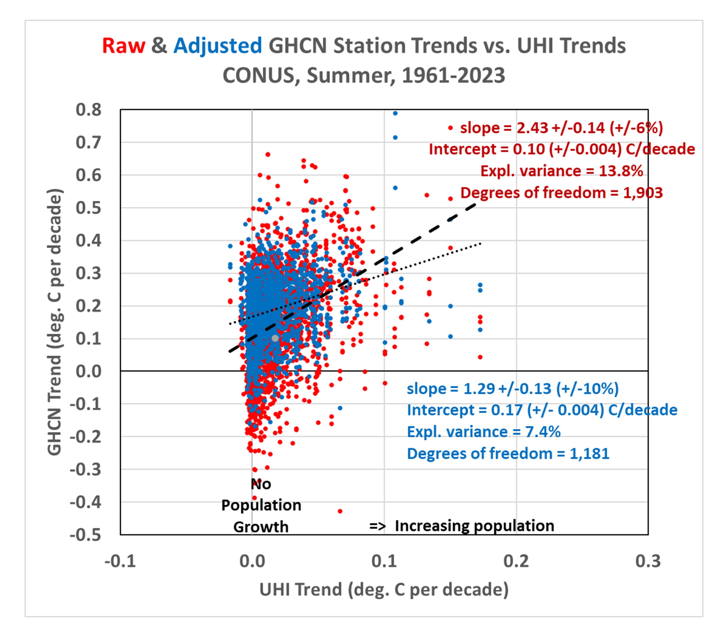
Next, let’s look at how the adjusted (homogenized) GHCN temperature trends compare to the UHI warming trends. Recall that the Pairwise Homogenization Algorithm (PHA) used by NOAA to create the “adjusted” GHCN dataset (which is the basis for official temperature statistics coming from the government) identifies and adjusts for step-changes in time at individual stations by comparing their temperature time series to the time series from surrounding stations. If we plot the adjusted data trend along with the raw data trends, the following figure shows some curious changes.

Here’s what homogenizations has done to the raw temperature data:

  1. Stations with no population growth (that had on average no warming trend) now have a warming trend. I can’t explain this. It might be the “urban blending” artifact of the PHA algorithm discussed by Katata et al. (2023, and references therein) whereby homogenization doesn’t adjust urban stations to “look like” rural stations, but instead tends to smooth out the differences between neighboring stations, causing a “bleeding” of urban effects into the rural stations.
  2. Stations with large population growth have had their warming trends reduced. This is the intended effect of homogenization.
  3. There still exists a UHI effect in the homogenized trends, but it has been reduced by about 50% compared to the raw trends. This suggests the PHA algorithm is only partially removing spurious warming signals from increasing urbanization.
  4. Homogenization has caused the all-station average warming trend to nearly double (+89%), from +0.036 to +0.067 deg. C per decade.I cannot explain this. It might be due to real effects from changes in instrumentation, the time-of-observation (TOBS) adjustment, an unintended artifact of the PHA algorithm, or some combination of all three.

Does This Mean Recent Warming In The U.S. Is Negligible?

Maybe not. While it does suggest problems with warming trends since 1895, if we examine the most recent period of warming (say, since 1961…a date I chose arbitrarily), we find considerably stronger warming trends.

Note that the GHCN trends since 1961 are nearly the same from raw (+0.192 C/decade) as from homogenized (+0.193 C/decade) data. The average UHI warming trend is only about 13% of the raw GHCN trend, and 10% of the homogenized trend, indicating little of the GHCN warming trend can be attributed to increases in population density.

But there still remains an urbanization signal in both the raw and adjusted data, as indicated by the non-zero regression slopes. One possible interpretation of these results is that, if the homogenization algorithm is distorting the station trends, and if we can use the raw GHCN data as a more accurate representation of reality, then the regression intercept of +0.10 deg. C/decade becomes the best estimate of the all-station average warming trend if NONE of the stations had any growth in population. That is little more than 50% of the homogenized data warming trend of +0.192 deg. C/decade.

What Does It All Mean?

First, there is evidence supporting the “urban blending” hypothesis of Katata et al., whereby the homogenization algorithm inadvertently blends urban station characteristics into rural temperature data. This appears to increase the all-station average temperature trend.

Second, homogenization appears to only remove about 50% of the UHI signal. Even after homogenization, GHCN temperature trends tend to be higher for stations with large population growth, lower for stations with little population growth. There is some evidence that truly rural stations would have only about 50% of the warming averaged across all U.S. stations, which is consistent with Anthony Watts’ estimates based upon restricting analysis to only those best-sited stations.

These results suggest there is now additional reason to distrust the official temperature trends reported for U.S. weather stations. They are, on average, too warm. By how much? That remains to be determined. Our method provides the first way (that I know of) to independently estimate the urban warming effect over time, albeit in an average sense (that is, it is accurate for the average across many stations, but its accuracy at individual stations is unknown). As my career winds down, I hope others in the future will extend this type of analysis.

[To see what the total UHI signal is in various calendar months around the world as of 2023, here are the hi-res images: Jan, Feb, Mar, Apr, May, Jun, Jul, Aug, Sep, Oct, Nov, Dec. More details of our method, along with links to monthly ArcGIS-format files of global UHI grids since 1800 (Version 0) are contained in my blog post from November, 2023.]

NC Floods, CA Drought, and The Role of Randomness

Tuesday, October 22nd, 2024

The recent devastating floods in western North Carolina were not unprecedented, but were certainly rare. A recent masters thesis examining flood deposits in the banks of the French Broad River over the last 250-300 years found that a flood in 1769 produced water levels approximately as high as those reported in the recent flood from Hurricane Helene. So, yes, the flood was historic.

Like all severe weather events, a superposition of several contributing factors are necessary to make an event “severe”, such as those that led to the NC floods. In that case, a strong hurricane combined with steering currents that would carry the hurricane on a track that would produce a maximum amount of orographic uplift on the east side of the Smoky Mountains was necessary in order to produce the widespread 12-20 inch rainfall amounts, and the steering currents had to be so strong that the hurricane would penetrate far inland with little weakening.

Again, all severe weather events represent the somewhat random combining of amplifying components: In the case of Hurricane Helene, they produced the unlucky massive flooding result that the region had not seen in hundreds of years.

The Random Component of Precipitation Variability

The rare superposition of several rare contributing factors, or the more common superposition of more common factors, can be examined through statistics when one examines many events. For example, it has long been known that precipitation statistics gathered over many years exhibit a log-normal frequency distribution. Simply put, the lowest precipitation amounts are the most frequent, and the highest amounts are the least frequent. This is the statistical result of the superposition of contributing factors, such as (in the case of excessive rainfall) abundant humidity, an unstable air mass, low-level convergence of air, a stationary or slow-moving storm (In western NC, the mountains providing uplift are stationary), etc.

Extreme precipitation events are (of course) the most rare, and as such, they can exhibit somewhat weird behavior. This is why hydrologists disagree over the usefulness of the term “100-year flood”, since most weather records don’t even extend beyond 100 years. One would probably need 1,000 years of rainfall records to get a good estimate of what constitutes a 100-year event.

Simulating Extreme Rainfall Events through Statistics

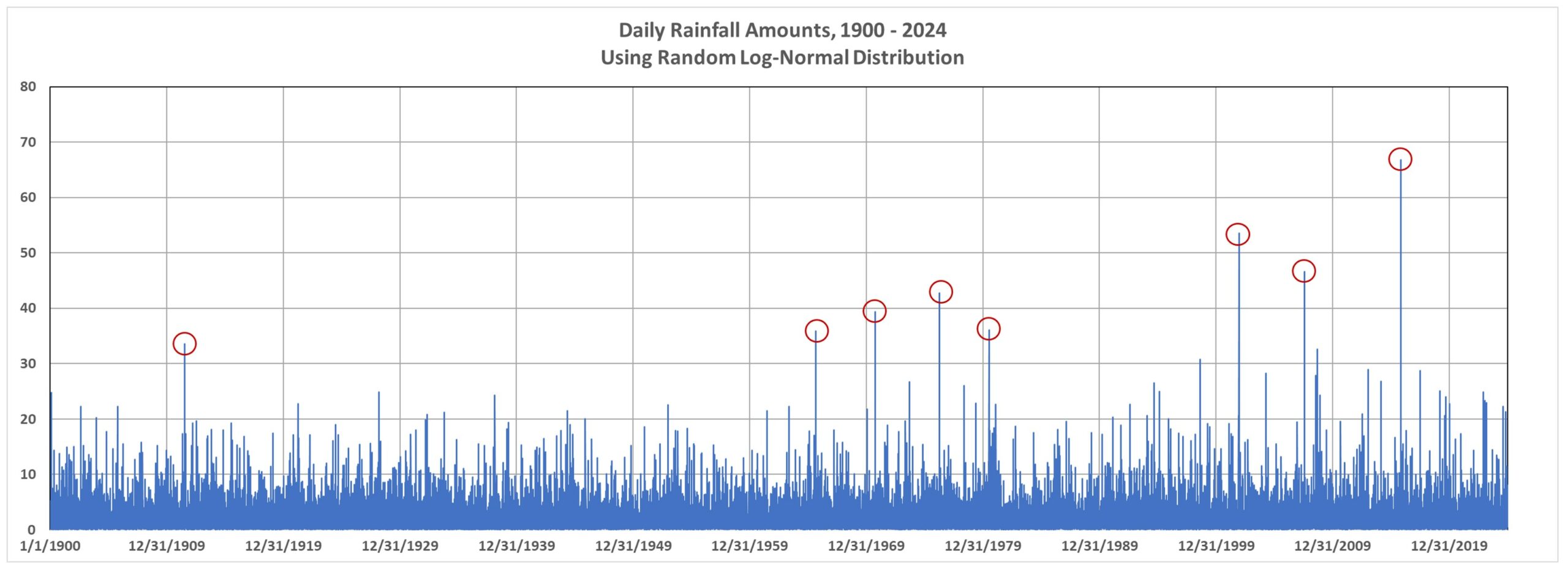
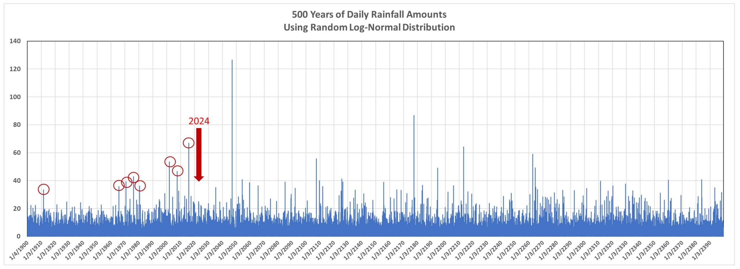
It is easy in Excel to make a simulated time series of rainfall totals having a log-normal distribution. For example, the following plot of hypothetical daily totals for the period 1900 through 2024 shows an seemingly increasing incidence of days with the heaviest rainfall (red circles). Could this be climate change?

But remember, these are randomly generated numbers. Just like you can flip a coin and sometimes get 4 heads (or 4 tails) in a row doesn’t mean there is some underlying cause for getting the same result several times in a row. If we extend the above plot from 125 years to 500 years, we see (following plot) that there is no long-term increasing trend in heavy rainfall amounts:

Black Swan Events

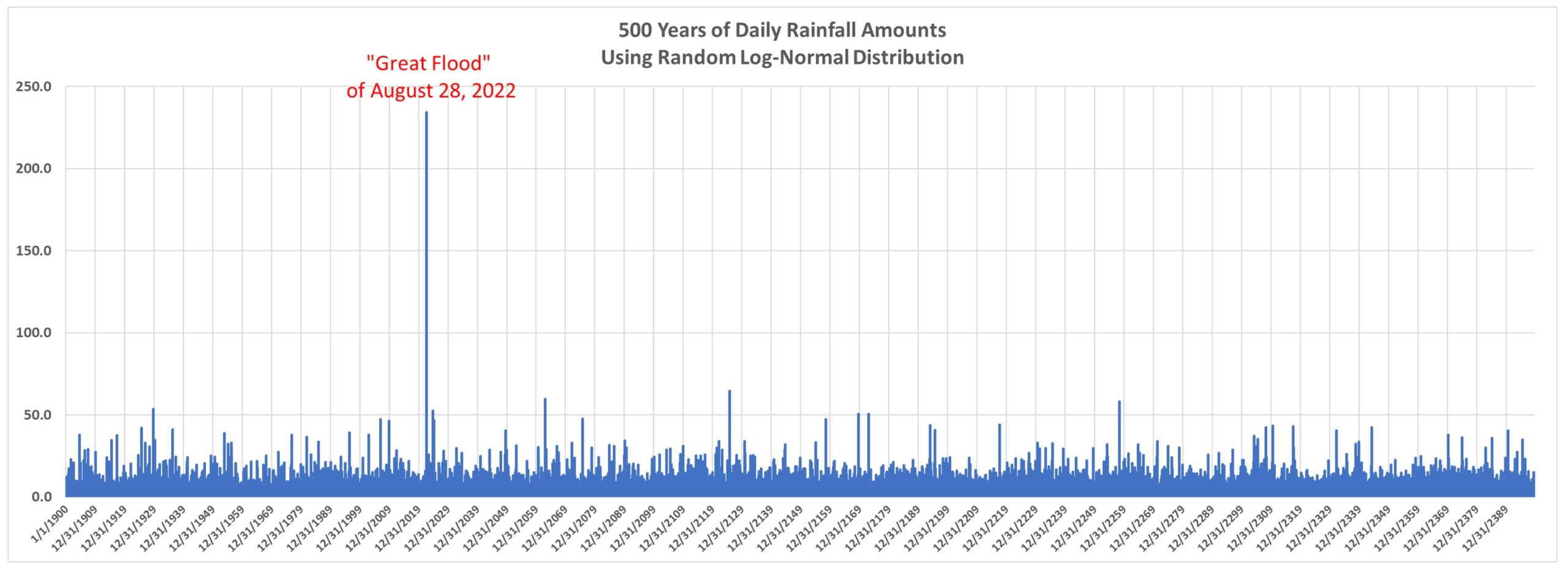
Or, how about this one, which I will call “The Great Flood of August 28, 2022”?:

Note that this event (generated with just log-normally distributed random numbers) far exceeds any other daily event in that 500-year plot.

The point here is that too often we tend to attribute severe weather events to some underlying cause that is emerging over time, such as global warming. And, I believe, some of the changes we have seen in nature are due to the (weak and largely benign) warming trend most regions of the world have experienced in the last 100 years.

But these events can occur without any underlying long-term change in the climate system. To attribute every change we see to global warming is just silly, especially when it comes to precipitation related events, such as flood… or even drought.

A “Random Drought”

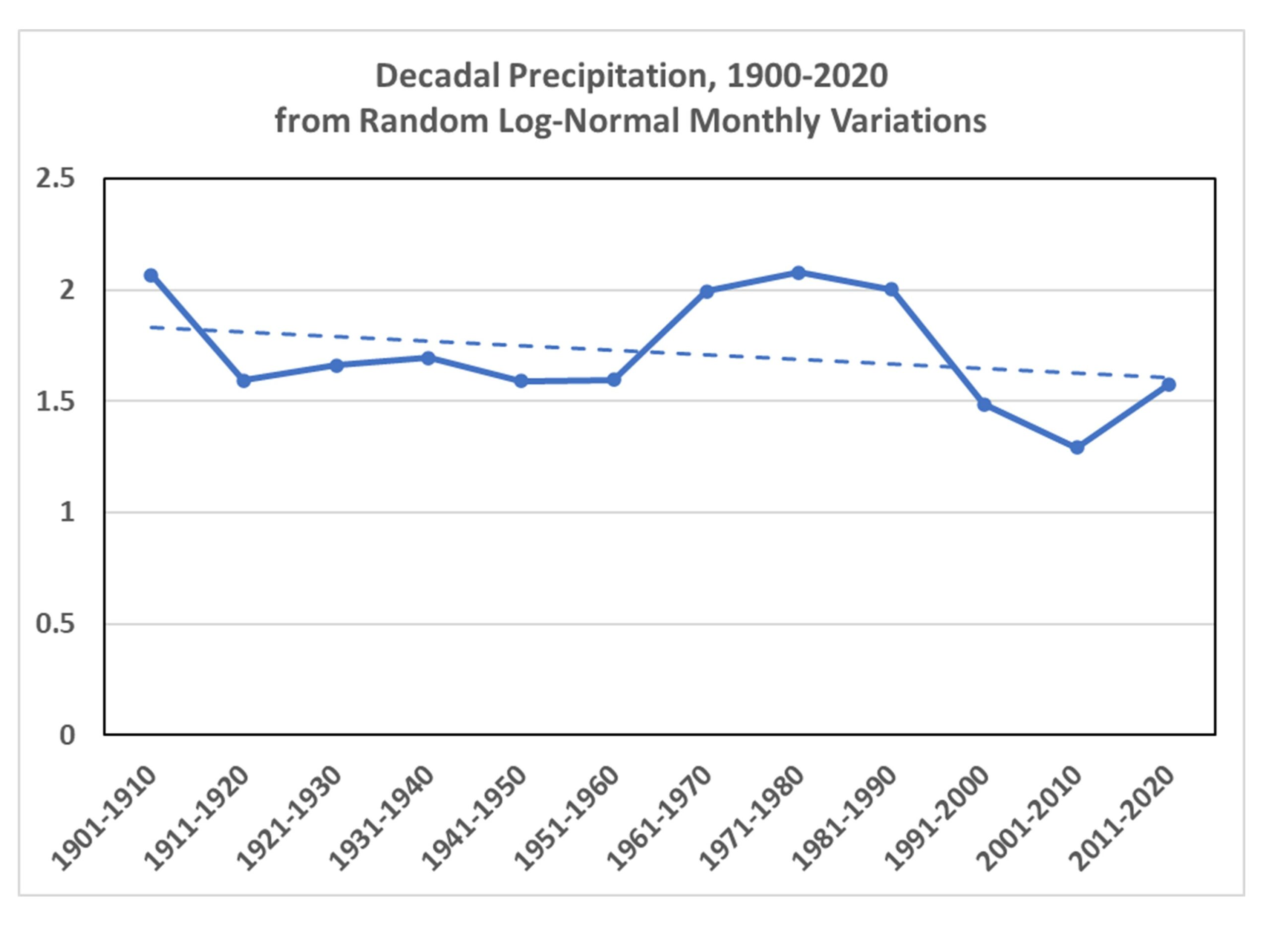
Now changing our daily random log-normal precipitation generator to a monthly time scale, we can look at how precipitation amounts change from decade to decade. Why monthly? Well, weather variations (and even climate cycles) tend to have preferred time scales. Several days for synoptic weather patterns, quasi-monthly for some kinds of persistent weather patterns, and even yearly or decadal for some natural internal climate cycles.

When I generate random log-normal time series at monthly time scales, and compute decadal averages over the last 120 years, seldom is the long-term trend close to zero. Here’s one what shows low precipitation for the most recent three decades, just purely through chance:

That looks like something we could attribute to drought in California, right? Yet, it’s just the result of random numbers.

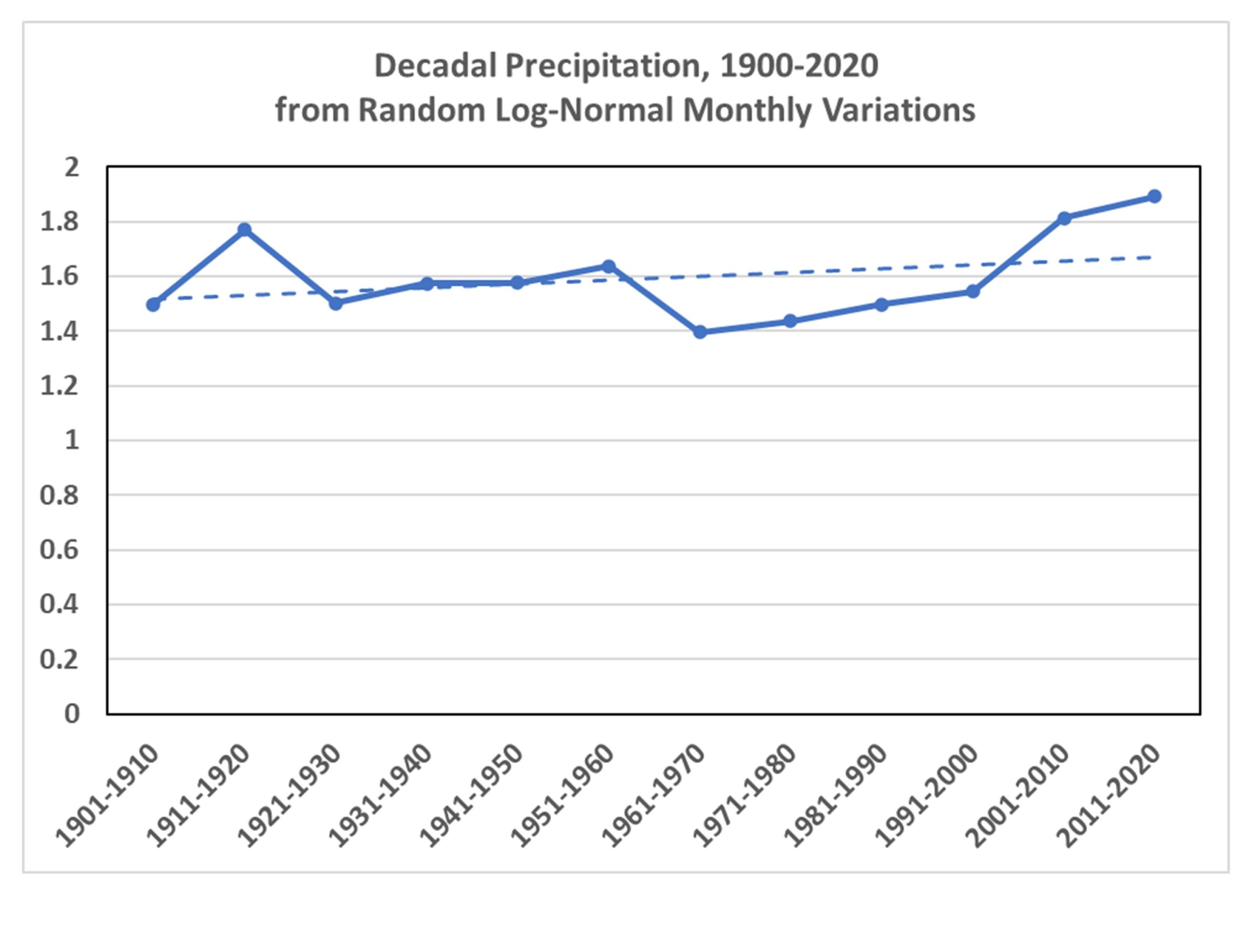
Or, we can choose one of the random simulations that has an increasing trend:

I’m sure someone could tie that to global warming.

A Final Word About 100-Year Flood Events

There seems to be some misunderstanding about 100-year events. These almost always apply to a specific location. So, you could have 100-year events every year in the U.S., and as long they are in different locations, there is nothing unusual about it. A 100-year flood in western North Carolina this year could be followed by a 100-year flood in eastern North Carolina next year. That doesn’t mean 100-year floods are getting more frequent.

I’m not claiming that all severe weather is due to randomness. Only that there is a huge random component to it, and that’s what makes attribution of any kind of severe weather event to climate change essentially impossible.

Florida Major Hurricanes, 1900-2024: What Do the Statistics Show?

Monday, October 7th, 2024

Florida residents must feel like they have been taking a beating from major hurricanes in recent years, but what do the data show?

The problem with human perception of such things is that the time scale of hurricane activity fluctuations is often longer than human experience. For example, a person born in the 1950s would have no memory of the beating Florida took in the 1940s from major hurricanes (a total of 5). But they would have many memories of the hurricane lull period of the 1970s and 1980s, each decade having only one major hurricane strike in Florida. Then, when an upswing in hurricane strikes occurs, it seems very unusual to them, and they assume that “hurricanes are getting worse”.

Another problem is that any statistics for an area as small as Florida, even over 100+ years, will be pretty noisy. Landfalling hurricanes for the eastern U.S. would be a better metric. And statistics for the entire Atlantic basin would be even better, except that satellite coverage didn’t start until the 1970s and hurricane intensity in remote areas before then would be poorly measured (or not measured at all).

Finally, tropical cyclone statistics for the entire tropics would be the best (if one was trying to determine if climate change is impacting cyclone intensity or frequency). But satellite data for the global tropics is, again, limited to the period since the 1970s. Global tropical cyclone data before the 1970s is sketchy, at best.

So, keeping in mind that any trends we see for Florida are going to be strongly influenced by the “luck of the draw” and the quasi-random nature of hurricane tracks (hurricanes are steered by the large-scale flow of air in the mid-troposphere, say around 20,000 ft altitude or so), what are the statistics of Florida major hurricane intensity and frequency since 1900?

Florida Major Hurricane Intensity & Number

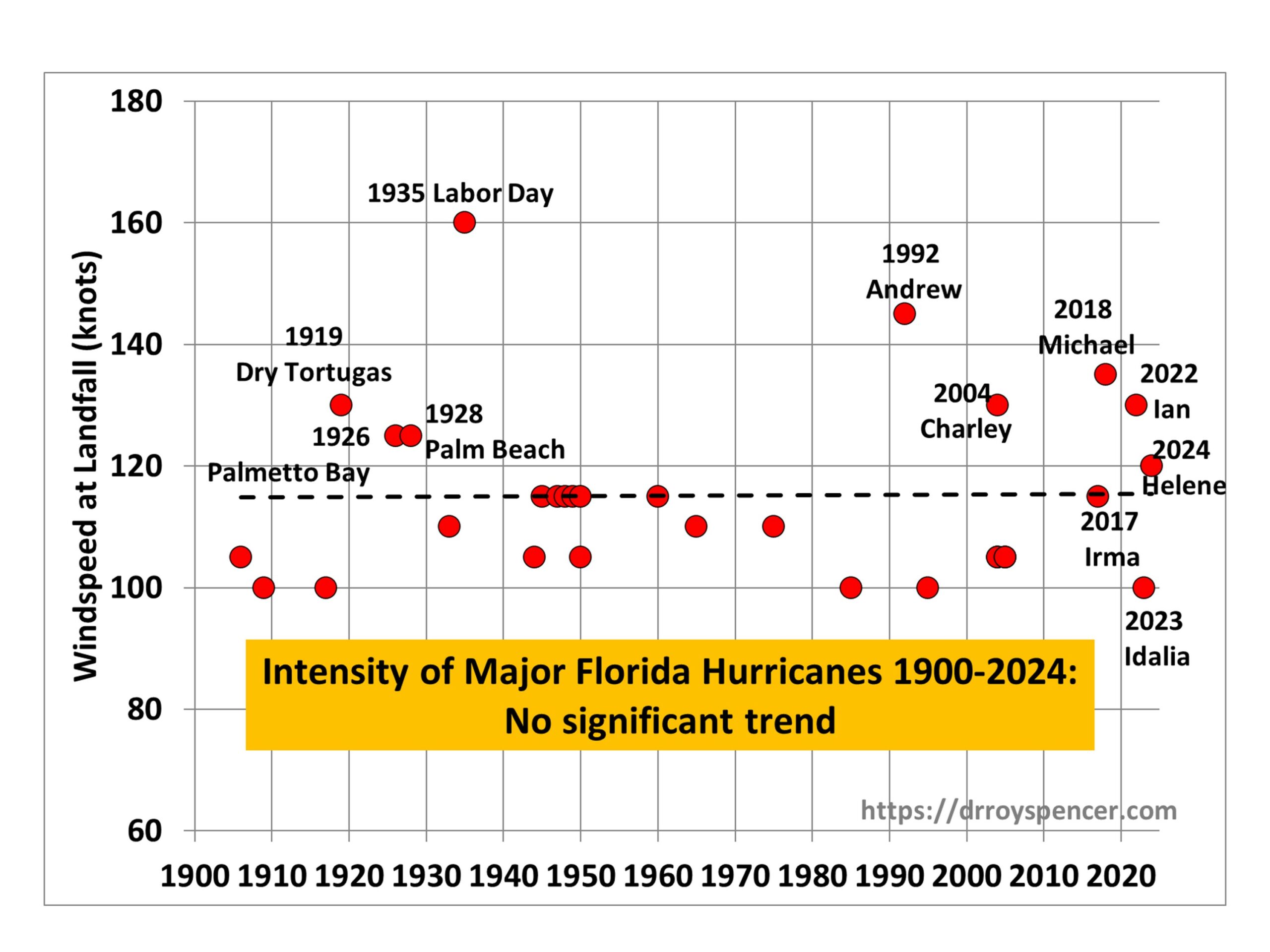
The following plot shows the intensity of major hurricanes (100 knots or greater maximum sustained wind speed) striking Florida since 1900, updated through recent (2024) Hurricane Helene:

As can be seen from the linear trend line, there has been no significant trend in the intensity of major hurricanes striking Florida since 1900.

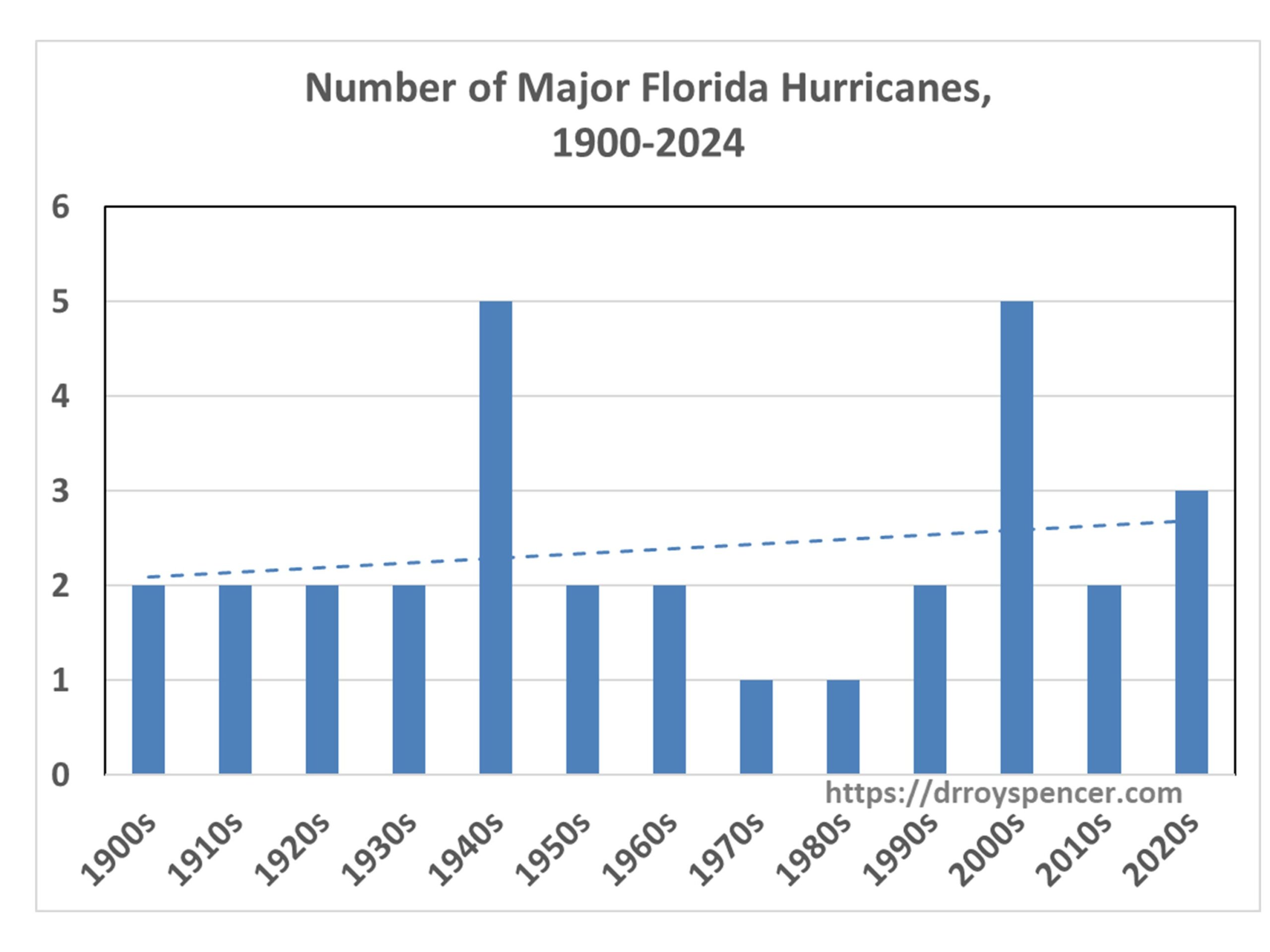
But what about the number of hurricanes? The next plot shows there has been a weak upward trend in the decadal totals of major hurricanes striking Florida since 1900:

Note that the 2020s number might well increase, since the end of the current (2024) hurricane season will be only half-way through the 2020s. While Hurricane Milton has just been classified as a major hurricane, in 2 days time it is expected to be under increasing wind shear, so it is not obvious it will strike Florida as a major hurricane, and so I did not include it in the above charts.

Another feature of the second chart above shows that a native Floridian born in the 1960s or 1970s would indeed have experienced an increase in major hurricanes striking Florida during their lifetime. But their first couple of decades of personal experience would have occurred during a historic lull in hurricane activity.

Why Start In 1900?

There is reason to believe that the number and/or intensity of major hurricanes striking Florida in the early 1900s has been underestimated, which would bias the trends in the above plots in the upward direction, spuriously suggesting a long-term increase in activity. First of all, there were virtually no people living in Florida in 1900. The population of Miami in 1896 was 444 persons. The intensity of a hurricane is based upon its maximum sustained 1 minute windspeed, which usually covers a very small area. Even with people now inhabiting much of the Florida coastline, it is rare for a coastal anemometer to measure the intensity that the National Hurricane Center gives to a hurricane, because those winds cover such a small area. So, how could it ever be known how intense some hurricanes were in the early 1900s?

Evidence for Long-Term Hurricane Fluctuations Unrelated to Water Temperature

Modern concern centers on the possibility that warm sea surface temperatures from global warming caused by anthropogenic CO2 emissions is making hurricanes stronger or more frequent. But studies of coastal lagoon sediments along the Gulf coast and Caribbean deposited by catastrophic hurricane landfalls show large fluctuations in activity on centennial to millennial time scales, even in the absence of the unusually warm sea surface temperatures measured today. (Example here.)

It should also be remembered that not long ago the U.S. experienced an “unprecedented” 11-year drought in major hurricane strikes. That significantly impacts our perception of what is “normal”. When the lull had reached 9 years, a NASA study found such an event was a 1-in-177-years occurrence. As I recall, that was increased to 1-in-250 years when the lull reached 11 years.

The point is that there is a huge amount of natural decadal- to centennial-time scale variability in hurricane activity in Florida (or any other hurricane-prone state). But with increasing numbers of people thinking that the government is somehow influencing hurricane activity (I’m seeing a lot of this on Twitter), I doubt that actual data will have much influence on those people, and as I approach 70 years on this Earth I have noticed a long-term decline in critical thinking regarding weather, climate, and causation. I doubt that trend will change any time soon.

UAH Global Temperature Update for September, 2024: +0.96 deg. C

Wednesday, October 2nd, 2024

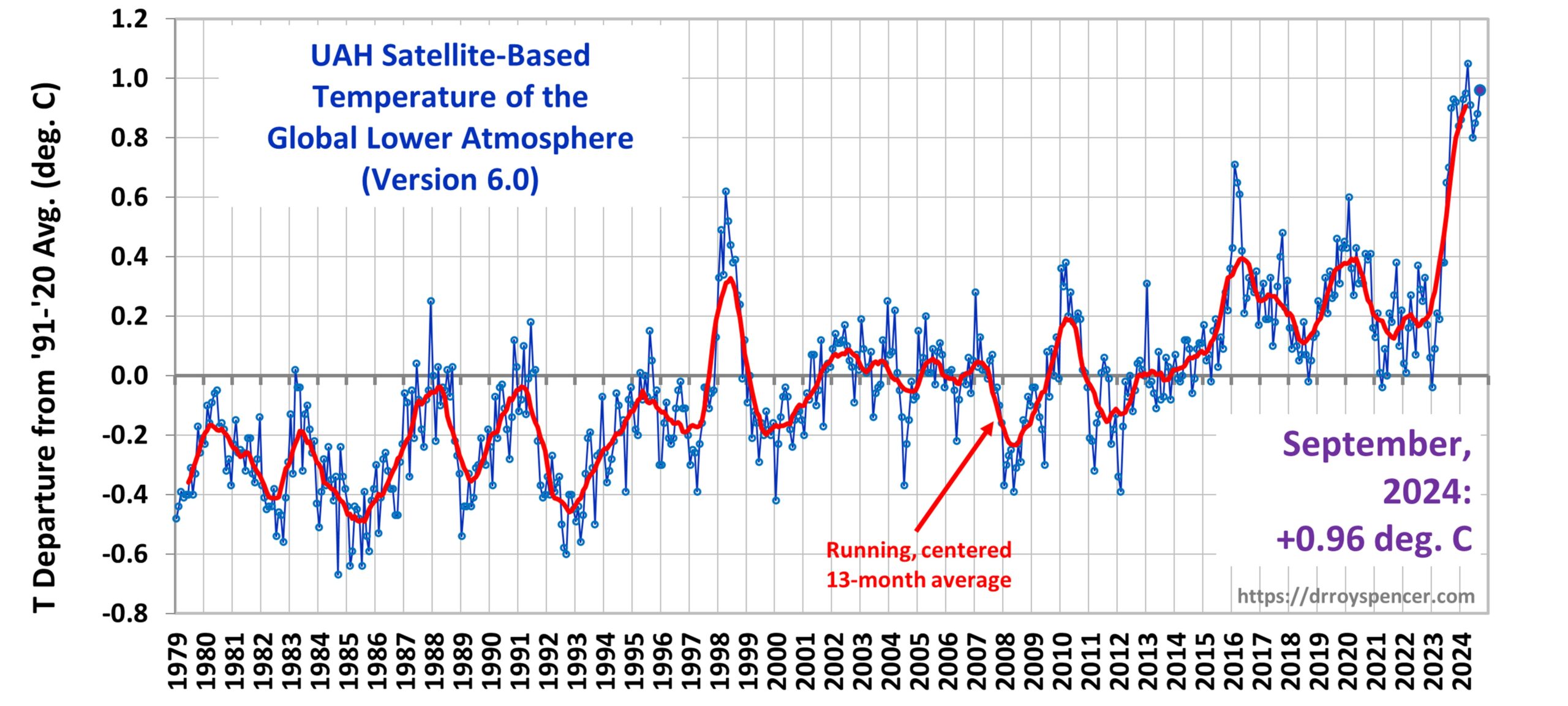
The Version 6 global average lower tropospheric temperature (LT) anomaly for September, 2024 was +0.96 deg. C departure from the 1991-2020 mean, up from the August, 2024 anomaly of +0.88 deg. C.

The linear warming trend since January, 1979 remains at +0.16 C/decade (+0.14 C/decade over the global-averaged oceans, and +0.21 C/decade over global-averaged land).

The following table lists various regional LT departures from the 30-year (1991-2020) average for the last 21 months (record highs are in red):

YEARMOGLOBENHEM.SHEM.TROPICUSA48ARCTICAUST
2023Jan-0.04+0.05-0.13-0.38+0.12-0.12-0.50
2023Feb+0.09+0.17+0.00-0.10+0.68-0.24-0.11
2023Mar+0.20+0.24+0.17-0.13-1.43+0.17+0.40
2023Apr+0.18+0.11+0.26-0.03-0.37+0.53+0.21
2023May+0.37+0.30+0.44+0.40+0.57+0.66-0.09
2023June+0.38+0.47+0.29+0.55-0.35+0.45+0.07
2023July+0.64+0.73+0.56+0.88+0.53+0.91+1.44
2023Aug+0.70+0.88+0.51+0.86+0.94+1.54+1.25
2023Sep+0.90+0.94+0.86+0.93+0.40+1.13+1.17
2023Oct+0.93+1.02+0.83+1.00+0.99+0.92+0.63
2023Nov+0.91+1.01+0.82+1.03+0.65+1.16+0.42
2023Dec+0.83+0.93+0.73+1.08+1.26+0.26+0.85
2024Jan+0.86+1.06+0.66+1.27-0.05+0.40+1.18
2024Feb+0.93+1.03+0.83+1.24+1.36+0.88+1.07
2024Mar+0.95+1.02+0.88+1.35+0.23+1.10+1.29
2024Apr+1.05+1.25+0.85+1.26+1.02+0.98+0.48
2024May+0.90+0.98+0.83+1.31+0.38+0.38+0.45
2024June+0.80+0.96+0.64+0.93+1.65+0.79+0.87
2024July+0.85+1.02+0.68+1.06+0.77+0.67+0.01
2024Aug+0.88+0.96+0.81+0.88+0.69+0.94+1.80
2024Sep+0.96+1.21+0.71+0.97+1.56+1.54+1.16

The full UAH Global Temperature Report, along with the LT global gridpoint anomaly image for September, 2024, and a more detailed analysis by John Christy, should be available within the next several days here.

Lower Troposphere:

http://vortex.nsstc.uah.edu/data/msu/v6.0/tlt/uahncdc_lt_6.0.txt

Mid-Troposphere:

http://vortex.nsstc.uah.edu/data/msu/v6.0/tmt/uahncdc_mt_6.0.txt

Tropopause:

http://vortex.nsstc.uah.edu/data/msu/v6.0/ttp/uahncdc_tp_6.0.txt

Lower Stratosphere:

http://vortex.nsstc.uah.edu/data/msu/v6.0/tls/uahncdc_ls_6.0.txt