The issue of global warming has so many facets that it has always been difficult to concisely state the objections we skeptics have to the theory (yes, �theory�) that our present warmth is caused by all of you consumers out there driving your SUVs and eating Big Macs. What follows is a demonstration of my main objection.
The claim that global warming is due to people is indeed a valid hypothesis. Human activity produces carbon dioxide, carbon dioxide in the atmosphere is increasing, and CO2 is indeed a greenhouse gas. Ergo�.
But how often in science is it decided that the first hypothesis to come along will forever be the only one allowed? That is effectively what the United Nations Intergovernmental Panel on Climate Change (IPCC) has done.
Ever since the IPCC was formed twenty years ago, their intent has been to tie global warming to human greenhouse gas emissions. They have never seriously investigated potential natural sources of global warming�except to say they can�t think of any that are large enough to cause the warming.
They then run their climate models with tiny forcings, such as a tiny change in solar output, and then say, �See? Natural forcings can not explain warming�only increasing CO2 can!� This conclusion is then advertised with words like �this demonstrates that natural forcings can not explain global warming�.
As I keep emphasizing, though, this only shows how little we know about natural climate variability. The assumption that the climate system has always been in balance, with a constant temperature, until humans came along is just that: an assumption. There is no way to prove it because we do not have the global measurements needed to prove it.
AN EXAMPLE OF NATURAL GLOBAL WARMING
To demonstrate how easy it is for nature to cause global warming, I�ve run an enhanced version of the simple climate model described by Spencer & Braswell (2008), and assumed daily random changes in cloud cover, smoothed them with a 10-year averaging filter, and run the model over a 50 year period of time. I have also included the increasing global energy imbalance due to increasing carbon dioxide at the rate of 0.2 Watts per sq. meter per decade. A 30 meter deep ocean mixed layer absorbs or loses energy in response to the imbalances, and the resulting heating and cooling slowly diffuse to a second layer 300 meters deep. I�ve assumed zero net feedback, as suggested by some observational studies.
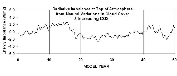
The following plot (Fig. 1) shows how much of a global radiative energy imbalance would be observed by satellites�if we had satellites that far back in time. The fluctuations seen here average about 1.4 Watts per sq. meter, which is similar to the 1.5 Watts per sq. meter that a recent reanalysis of Earth Radiation Budget Satellite data has shown (Wong. et al., 2006).

Fig. 1. Global average top-of-atmosphere radiative imbalance from increasing carbon dioxide and random cloud variations, the forcings from which drive the simple model’s temperature variations seen in Fig. 2.
By way of comparison, these variations are only 0.6% of the average amount of energy the Earth is continuously absorbing from the sun. So we are talking about small changes in global average cloud cover.
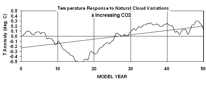
The temperature response of the global oceans to the CO2- and cloud-induced energy imbalances is shown in Fig. 2.

Fig. 2. Temperature response of the simple model to the random cloud and increasing CO2 forcing shown in Fig. 1.
As can be seen, realistic temperature variability is produced, and there are substantial warming and cooling trends that occur on time scales of 10 to 30 years or more. I picked this particular simulation (each one is different as the random numbers change) because it looks similar to the global-observed temperature variations since the 1940s�cooling for a couple of decades, then strong warming for 30 years, which then levels off.
In this particular simulation, 50% of the fifty year warming trend is due to the natural cloud variations, the other 50% is due to increasing CO2. If I remove the cloud variations, the temperature curve follows a trend line that looks like the one in Fig. 2, but with only half the slope.
The assumed (neutral) feedback corresponds to a net surface warming of about 1 deg. C for a doubling of carbon dioxide. Since we�ve already experienced that amount of warming in the last 100 years, this would mean that global warming would now be ended for about the next 50 years�.which is about how long it will take to reach CO2 doubling in the atmosphere.
If feedbacks end up being negative, though, then extra CO2 will have caused even less warming, which means that there is even more room for natural cloud variability to explain the warming experienced in the last 50 to 100 years. More about that possibility later.
The first objection to what I have just presented would probably be, �How do we know that natural cloud changes like that even exist?� Well, previous satellite studies (e.g. Wong et al.) have shown that similar fluctuations in the Earth�s radiative energy balance exist. All I�m claiming is that they existed in nature before we had satellites to measure them, which seems like an entirely reasonable assumption.
The second objection to what I have presented would probably be, �But you have not assumed positive feedback, and climate models show that the climate system has positive feedback!�
This issue is, of course, what I spend most of my time working on. And, as I have been harping on ad nauseum, the illusion of a sensitive climate system has arisen also because previous investigations have ignored natural, internally-generated cloud fluctuations, which cause a bias in their estimates of feedback toward positive feedback (Spencer & Braswell, 2008).
Our new mega-paper, almost ready for submission to JGR, introduces a new method to separate the effects of cloud forcing from cloud feedback. It leads to a diagnosis of strongly negative feedback in our most recent 7.5 year record of satellite data. (BTW, the negative feedback is only in the reflected solar part � probably due to low clouds. The infrared feedback was positive, probably due to positive water vapor feedback). The method also works pretty well at diagnosing the feedbacks in the IPCC climate models.
Oh, and guess what happens if we use the old traditional method of estimating feedback from the model data shown in Figs. 1 and 2 by plotting yearly averages of each against each other? You get a �false positive��stronger positive feedback than even any of the IPCC climate models exhibit�even though neutral feedback was assumed in the model simulation.
Natural climate variability is the 800 pound gorilla in the room that the IPCC has been ignoring.

 Home/Blog


