I’d like to thank everyone who has stepped up and made donations here after Google decided to de-monetize my web site. Your monthly donations have added up to more that what I brought in with Google’s Adsense program, and I am very grateful! Y’all rock!
Archive for the ‘Blog Article’ Category
A Thank You to My Donors
Thursday, November 10th, 2022The Warming that Happens in Vegas, Stays in Vegas
Thursday, November 10th, 2022Now that I’m back to researching the surface air temperature record and the Urban Heat Island (UHI) effect, I decided to revisit the temperatures in Las Vegas, Nevada. It’s been over 8 years since I posted about Las Vegas being the poster child for the UHI effect and I showed some warming trend calculations from the hourly temperature data at McCarren International Airport (now Harry Reid International Airport… not kidding) which suggested that much of the warming there has been from the urban heat island, not global climate change.
And this is the trouble with monitoring global climate trends — most of the land data are gathered where people build things… increasingly so. In June of last year, The Guardian, predictably, conflated the urban heat island effect with climate change when it stated,
“Driven by the climate crisis and intensified by the city’s expansive growth, Vegas is already cooking — and it is going to get worse.”
Many people don’t really make a distinction between the two. It is reasonable to ask the question, how much has the region around Las Vegas warmed in the last several decades, compared to in the city itself? The trouble is that there are few hourly temperature measurement locations with data extending back at least 50 years in the region that are rural in nature. The area is, after all, a desert, and people don’t usually choose to live in such locations.
I computed 50-year trends for Las Vegas and for a rural Nevada station, Winnemucca from 24-hourly data, which allows us to see how the trends change with time of day. I did this for the warmest half of the year, April through September. The following plot shows a remarkable feature… the strong warming in Las Vegas has been entirely at night. Winnemucca shows the background climate signal, with fairly uniform (and weak) warming trends throughout the day. But the impervious surfaces in Vegas — buildings, concrete, asphalt — absorb more sunlight during the day than the surrounding desert, and then at night release that heat into the air.
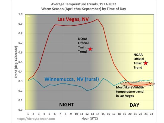
Part of the reason this happens is the albedo of the city is lower than that of the surrounding desert (thanks to Anthony Watts for reminding me of this). But at least as important is that fact that concrete has a thermal conductivity 9 times as large as sand does, so when it is heated by the sun, much more energy is stored down into the pavement. Sand would have gotten exceedingly hot, but just at the surface, and the extra energy would radiate away (infrared) as well as drive stronger atmospheric (dry) convection which would carry that heat away during the daytime.
Why would such a thing not show up during the day just as well? Because turbulent mixing driven by a strong super-adiabatic lapse rate near the surface spreads the heat up through the atmosphere and cooler air comes down to replace it, cooling the city during the day. But then at night, a temperature inversion forms, and the lowest levels of the atmosphere no longer exchange energy convectively with higher altitudes. In effect, the strong nighttime inversion that naturally occurs in the desert has weakened over the city as the pavement releases the extra energy it has stored during the day.
The actual background climate warming in the last 50 years in Las Vegas (whatever its cause), based upon the above plot, looks to be around 0.25 deg. C/decade. This is also part of the reason why it is important to monitor global temperature trends with satellite measurements of the deep troposphere — it provides a more robust measurement that is not as influenced by surface effects, such as the Urban Heat Island, and avoids conflation of Las Vegas heat with the “climate crisis”.
De-Urbanization of Surface Temperatures with the Landsat-Based “Built-Up” Dataset
Wednesday, November 2nd, 2022Overview
A relatively new global dataset of urbanization changes over the 40 year period 1975-2014 based upon Landsat data is used to determine the average effect urbanization has had on surface temperatures. A method is presented to compute the magnitude of the Urban Heat Island (UHI) effect on temperatures using the example of summertime 09 UTC (early morning) Integrated Surface Database (ISD) hourly data (mostly from airports) over the period 1973-2022 by comparing urbanization differences to temperature differences from closely-spaced weather stations. The results for the eastern U.S. lead to a 50-year warming trend 50% less than that from the official NOAA homogenized surface temperature dataset. It is likely that the daytime reductions in temperature trends will be less dramatic.
Background
Over the U.S., summertime warming in the official NOAA surface temperature record has been less than in all of the climate models used to guide national energy policy. That discrepancy could be even larger if spurious warming from increasing urbanization remains in surface temperature trends. While NOAA’s homogenization procedure has largely removed the trend differences between closely-spaced rural and urban stations, it is not clear whether the NOAA methodology actually removes increasing Urban Heat Island (UHI) effects since it’s possible it simply adjusts rural warming to match urban warming.
Anthony Watts has spearheaded a years-long effort to try to categorize how well-sited the USHCN network of temperature-monitoring stations is, and has found that the best-sited ones, on average, show temperature trends considerably lower than the official trends from NOAA. The well-sited thermometers are believed to have minimized the influence of local outbuildings, sidewalks, HVAC systems, parking lots, etc, on the trends. But economic growth, even in rural areas, can still lead to gradual spurious warming as the area outside the immediate vicinity of the thermometer undergoes growth. The issue is important enough that other methods of computing land-based temperature trends should be investigated. To that end, John Christy and I have been discussing ways to produce a new dataset of surface temperatures, with a largely independent set of weather stations and a very different data-adjustment philosophy.
Many readers here know I have been experimenting off an on over the years with U.S. surface thermometer data to try to determine how much U.S. warming trends have been affected by increasing urban influences. I have been trying to use datasets that can be applied globally, since it is impractical to visit and examine every weather observation site in the world. So far, I had been limited to using population density as a proxy for urbanization, but I have never been convinced this is good enough. The temperature data I use are mostly independent of the max/min data utilized by NOAA, and come from mostly airports. In the U.S., ASOS (Automated Surface Observing System) and AWOS data make up the bulk of these measurements, which are taken hourly, and which NOAA then does light quality control on and provides for a global network of stations as the Integrated Surface Database (ISD).
The Global Human Settlement (GHS) Datasets
Recently I became aware the EU’s European Commission Global Human Settlement Layer project which has developed global, high-resolution datasets quantifying the increasing influence of humans on the terrestrial environment. Of these Global Human Settlement (GHS) datasets I have chosen the “Built-Up” dataset layer of manmade structure densities developed from the Landsat series of satellites since 1975 as being the one most likely to be related to the UHI effect. It is on a global latitude/longitude grid at 30 second (nominal ~1 km) spatial resolution, and there are four separate dataset years: 1975, 1990, 2000, and 2014. This covers 40 of the 50 years (1973-2022) of hourly ISD I have been analyzing data from. In what follows I extrapolate that 40-year record for each weather station location to extend to the full 50 years (1973-2022) I am analyzing temperature data for.
Has Urbanization Increased Since the 1970s?
I feel like the starting point is to ask, Has there been a measurable increase in urbanization since the 1970s? Of course, the answer will depend upon the geographical area in question.
Since I like to immerse myself in a new dataset, I first examined the change in satellite-measured “Built-Up” areas in two towns I know well, at the full 1 km spatial resolution. My hometown of Sault Ste. Marie, Michigan (and area with very little growth during 1975-2014), and the area around Huntsville International Airport, which has seen rapid growth, especially in neighboring Madison, Alabama. The changes I saw for both regions looked entirely believable.
Next, I asked Danny Braswell to plot an image of the 40-year change in urbanization from this dataset over the southeast U.S. The result is shown in Fig. 1.
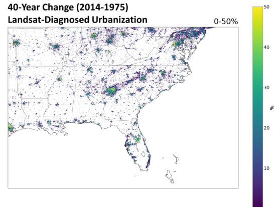
Fig. 1. The 40-year change in urbanization (2014 minus 1975) over the southeast U.S. from the Landsat-based “Built-Up” dataset.
Close examination shows that there has been an increase in manmade structures nearly everywhere that human settlements already existed. I was somewhat surprised to see that these increases are also widespread in Europe, so that we can expect some of the results I summarize below might well extend to other countries.
Quantifying the Urbanization Effect on Surface Air Temperature
I took all hourly-reporting weather stations (ASOS and AWOS), mostly from airports, in the ISD dataset and for all stations having data at least as far back as 1973. I computed the temperature differences at 09 UTC (close to the daily minimum temperature time) between stations no more that 50 km apart, as well as differences in the Landsat Built-Up values (0 to 100). The Built Up datasets are from 4 separate years: 1975, 1990, 2000, and 2014. I used five years of temperature data centered on those four Landsat years for a total of 20 years of August average 09 UTC temperatures to compare to the corresponding four years of urbanization differences. After considerable experimentation, I settled on the four spatial averaging zones shown in Fig. 2 to compute those urbanization differences. This allows a determination of the magnitude of the UHI influence as a function of distance from the thermometer station location.
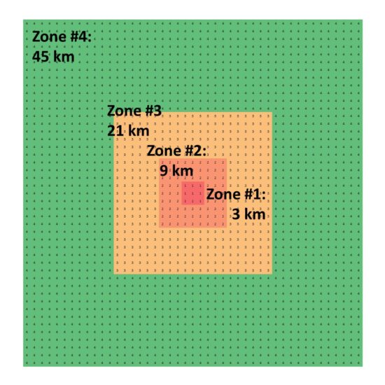
Fig. 2. Averaging zones for Landsat-based “Built-Up” data, nominally at 1 km resolution, for comparison to inter-station temperature differences.
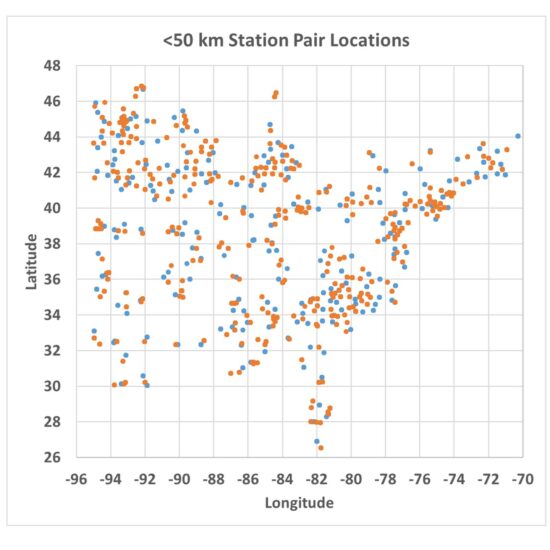
The station pairs used in the analysis are shown in Fig. 3 (sorry for the lack of state boundaries).
When the temperature differences are computed between those station pairs, they can be plotted against the Zone-average differences in urbanization as measured from Landsat. An example for Zone #3 is shown in Fig. 4, where we see the difference in closely spaced station temperatures is indeed related to the difference in Landsat-based urbanization, with some differences in temperature reaching 4 to 5 deg. C (up to 10 deg. F).
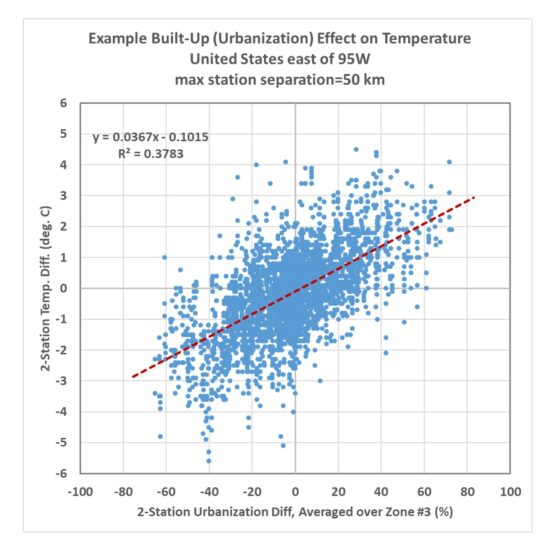
Fig. 4. Twenty years of inter-station temperature differences versus Landsat-based urbanization differences over the eastern United state. Temperature data were the monthly August averages at 09 UTC (close to the time of daily minimum temperature).
The actual algorithm to adjust temperatures uses not just the zone shown in Fig. 4, but all four zones of average Built-Up values in a multiple regression procedure. The resulting coefficients were:
Zone #1: +0.050 deg. C per 10% urbanization difference
Zone #2: +0.061 deg. C per 10% urbanization difference
Zone #3: +0.172 deg. C per 10% urbanization difference
Zone #4: +0.081 deg. C per 10% urbanization difference
The sum of these coefficients is 0.37 deg. C/per 10%, which is essentially the same as the regression coefficient in Fig. 3 for a single zone. The difference is that by using 4 averaging zones together, the correlation is improved somewhat (r=0.67 for the multiple regression), and we also get to see what regions of urbanization have the most influence on the temperatures. From the results above we see all of the averaging zones are important, with Zone 3 contributing the most to explaining the UHI effect on warming, and the 3×3 km zone closest to the thermometer has the last amount of information. Note that I have no information regarding the microclimate right next to the thermometer site (as Anthony uses), so if heat generating equipment was added in the vicinity of the thermometer over the 40 year period 1975-2014, that would not be quantified here and such spurious warming effects will remain in the temperature data even after I have de-urbanized the temperatures.
Application of the Method to Eastern U.S. Temperatures
The resulting regression-based algorithm basically allows one to compute the urban warming effect over time over the last 40-50 years. To the extent that the stations used in the analysis represent all of the eastern U.S., the regression relationship can be applied anywhere in that region, whether there are weather stations there or not.
I applied the method to 269 stations having sufficient data to compute 50-year trends (1973-2022) for August 09 UTC temperatures, and Fig. 5 shows the raw temperature trends versus the de-urbanized temperature trends. When stations in each of the 37 states are averaged together, and the state averages are area-weighted, there is a 40% reduction in the average temperature trend for those 37 states.
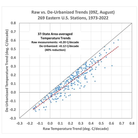
Fig. 5. Raw versus de-urbanized temperature trends across 269 stations in the eastern U.S. for 09 UTC August temperatures (approximately, August daily minimum temperatures).
For the reasons stated above, this might well be an underestimate of the full urbanization effect on eastern U.S. temperature trends.
We can examine the temperature at some individual stations. For example, Figs. 6, 7, 8, and 9 show the raw versus de-urbanized temperatures at Orlando, Indianapolis, Waterloo (IA), and Sault Ste. Marie, (MI). Since I am only dealing with a single month (August) there are no seasonal effects to remove so we can plot actual temperatures rather than temperature anomalies.
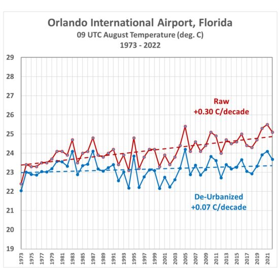
Fig. 6. Average August 09 UTC temperatures, 1973-2022, from raw hourly measurements and after Landsat-based de-urbanization adjustment.
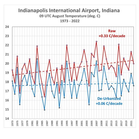
Fig. 7. Indianapolis average August 09 UTC temperatures, 1973-2022, from raw hourly measurements and after Landsat-based de-urbanization adjustment.
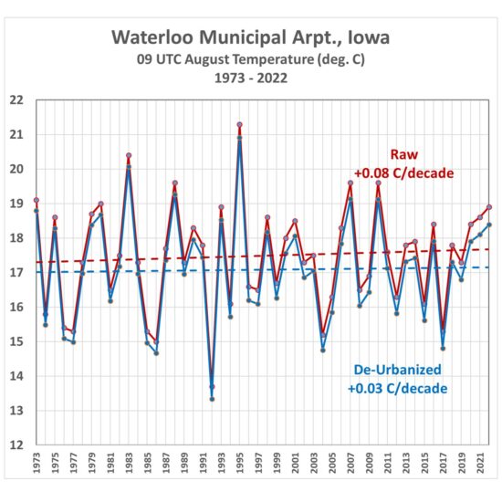
Fig. 8. Waterloo, IA average August 09 UTC temperatures, 1973-2022, from raw hourly measurements and after Landsat-based de-urbanization adjustment.
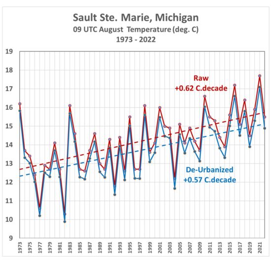
Fig. 9. Sault Ste. Marie, MI, average August 09 UTC temperatures, 1973-2022, from raw hourly measurements and after Landsat-based de-urbanization adjustment.
(As an aside, while I was in the University of Michigan’s Atmospheric and Oceanic Science program, I worked summers at the Sault weather office, and made some of the temperature measurements in Fig. 9 during 1977-1979.)
How Do These Trends Compare to Official NOAA Data?
The statewide-average temperatures from NOAA’s Climate at a Glance website were compared to the corresponding statewide averages computed here. First let’s look at how the raw ISD trends compare to the NOAA-adjusted data (Fig. 10).
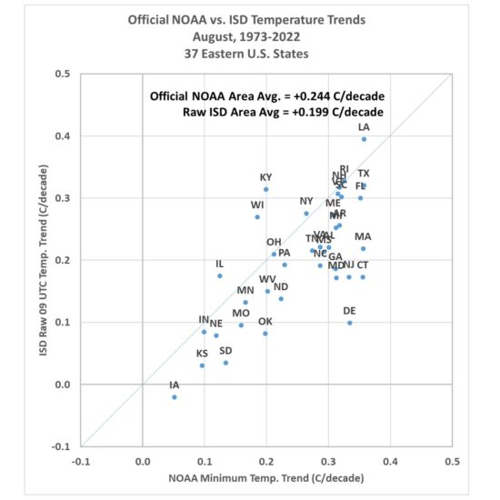
Fig. 10. Statewide-average August temperature trends, 1973-2022, from official NOAA-adjusted data versus the unadjusted hourly temperatures at 09 UTC.
Note the official NOAA temperatures have an average trend higher than the raw ISD data trend (they are mostly independent data sources): +0.244 C/decade vs. +0.199 C/decade. Once the de-urbanization procedure is applied to the individual ISD stations, the results show an average trend fully 50% below that produced by the official NOAA product (Fig. 11).
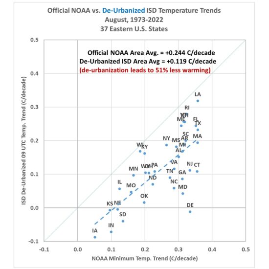
Fig. 11. As in Fig. 10, but after de-urbanization of the ISD 09 UTC temperatures and trends recomputed.
Summary and Conclusions
There is much more I could show, but from the analysis I’ve done so far I believe that the Landsat-based “Built-Up” (urbanization) dataset, which extends back to the 1970s, will be be useful for “de-urbanizing” land-based surface temperature datasets, in the U.S. as well as in other countries. The methodology outlined here is straightforward and the regression statistics are robust (the regression coefficients are all significant, at the 3-sigma level or better).
The urbanization effect on surface temperature trends for August at 09 UTC (near the time of daily minimum temperature) results in a 50% reduction in those trends over the last 50 years. From some preliminary looks I have had at the data from other months and times of day I’d say this will likely be the upper limit of de-urbanization adjustments. So, it is likely that trends in daytime temperature near the time of the daily maximum will not be reduced nearly as much as 50%.
But given the fact that all CMIP6 climate models produce U.S. summer temperature trends greater than the NOAA observations means the discrepancy between climate models and observations is even larger than currently suspected by many of us. John Christy and I believe it is time for a new surface temperature dataset, and the methodology outlined above looks like a viable approach to that end.
UAH Global Temperature Update for October, 2022: +0.32 deg. C
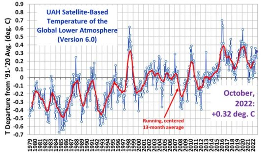
Wednesday, November 2nd, 2022The Version 6.0 global average lower tropospheric temperature (LT) anomaly for October, 2022 was +0.32 deg. C, up from the September, 2022 value of +0.24 deg. C.
The linear warming trend since January, 1979 now stands at +0.13 C/decade (+0.12 C/decade over the global-averaged oceans, and +0.18 C/decade over global-averaged land).
Various regional LT departures from the 30-year (1991-2020) average for the last 22 months are:
YEAR MO GLOBE NHEM. SHEM. TROPIC USA48 ARCTIC AUST
2021 01  0.12  0.34 -0.09 -0.08  0.36  0.50 -0.52
2021 02  0.20  0.32  0.08 -0.14 -0.65  0.07 -0.27
2021 03 -0.01  0.13 -0.14 -0.29  0.59 -0.78 -0.79
2021 04 -0.05  0.06 -0.15 -0.28 -0.01  0.02  0.29
2021 05  0.08  0.14  0.03  0.07 -0.41 -0.04  0.02
2021 06 -0.01  0.30 -0.32 -0.14  1.44  0.64 -0.76
2021 07  0.20  0.33  0.07  0.13  0.58  0.43  0.80
2021 08  0.17  0.27  0.08  0.07  0.33  0.83 -0.02
2021 09  0.25  0.19  0.33  0.09  0.67  0.02  0.37
2021 10  0.37  0.46  0.28  0.33  0.84  0.64  0.06
2021 11  0.09  0.11  0.06  0.14  0.50 -0.42 -0.29
2021 12  0.21  0.27  0.15  0.04  1.63  0.01 -0.06
2022 01  0.03  0.06  0.00 -0.23 -0.13  0.68  0.09
2022 02 -0.00  0.01 -0.02 -0.24 -0.04 -0.30 -0.50
2022 03  0.15  0.27  0.02 -0.07  0.22  0.74  0.02
2022 04  0.26  0.35  0.18 -0.04 -0.26  0.45  0.60
2022 05  0.17  0.25  0.10  0.01  0.59  0.23  0.19
2022 06  0.06  0.08  0.04 -0.36  0.46  0.33  0.11
2022 07  0.36  0.37  0.35  0.13  0.84  0.55  0.65
2022 08  0.28  0.31  0.24 -0.04  0.60  0.50 -0.01
2022 09  0.24  0.43  0.06  0.03  0.88  0.69 -0.29
2022 10  0.32  0.43  0.21  0.04  0.16  0.93  0.04
The full UAH Global Temperature Report, along with the LT global gridpoint anomaly image for October, 2022 should be available within the next several days here.
The global and regional monthly anomalies for the various atmospheric layers we monitor should be available in the next few days at the following locations:
Lower Troposphere: http://vortex.nsstc.uah.edu/data/msu/v6.0/tlt/uahncdc_lt_6.0.txt
Mid-Troposphere: http://vortex.nsstc.uah.edu/data/msu/v6.0/tmt/uahncdc_mt_6.0.txt
Tropopause: http://vortex.nsstc.uah.edu/data/msu/v6.0/ttp/uahncdc_tp_6.0.txt
Lower Stratosphere: http://vortex.nsstc.uah.edu/data/msu/v6.0/tls/uahncdc_ls_6.0.txt
50-Year U.S. Summer Temperature Trends: ALL 36 Climate Models Are Too Warm
Thursday, October 20th, 2022I’ll get right to the results, which are pretty straightforward.
As seen in the accompanying plot, 50-year (1973-2022) summer (June/July/August) temperature trends for the contiguous 48 U.S. states from 36 CMIP-6 climate model experiments average nearly twice the warming rate as observed by the NOAA climate division dataset.
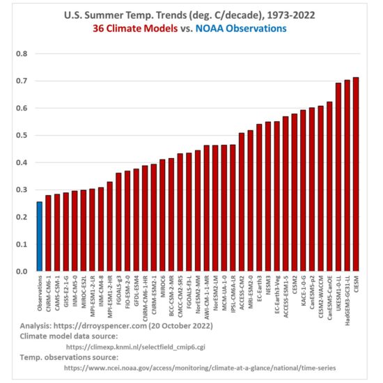 The 36 models are those catalogued at the KNMI Climate Explorer website, using Tas (surface air temperature), one member per model, for the ssp245 radiative forcing scenario. (The website says there are 40 models, but I found that four of the models have double entries). The surface temperature observations come from NOAA/NCEI.
The official NOAA observations produce a 50-year summer temperature trend of +0.26 C/decade for the U.S., while the model trends range from +0.28 to +0.71 C/decade.
As a check on the observations, I took the 18 UTC daily measurements from 497 ASOS and AWOS stations in the Global Hourly Integrated Surface Database (mostly independent from the official homogenized NOAA data) and computed similar trends for each station separately. I then took the median of all reported trends from within each of the 48 states, and did a 48-state area-weighted temperature trend from those 48 median values, after which I also got +0.26 C/decade. (Note that this could be an overestimate if increasing urban heat island effects have spuriously influenced trends over the last 50 years, and I have not made any adjustment for that).
The importance of this finding should be obvious: Given that U.S. energy policy depends upon the predictions from these models, their tendency to produce too much warming (and likely also warming-associated climate change) should be factored into energy policy planning. I doubt that it is, given the climate change exaggerations routinely promoted by environment groups, anti-oil advocates, the media, politicians, and most government agencies.
Lord Monckton Responds to Spencer’s Critique
Wednesday, October 5th, 2022Yesterday I posted a critique of Lord Christopher Monckton’s latest explanation of why he believes climate sensitivity is low. At issue is his claim that researchers have somehow neglected that the feedback response to a climate perturbation (e.g. how much warming occurs from adding CO2 to the atmosphere) needs to include the feedback response to the total emission temperature of the system, which he claims then greatly reduces the system “gain factor” and thus calculated climate sensitivity. I maintain that this is not how climate sensitivity in climate models is determined — only actual physical processes are modeled — and I used clouds as an example of why the system response to small perturbations cannot be determined by including the response of a cold (e.g. 2.7 Kelvin) Earth to solar heating (this is what I claim his argument amounts to when he includes the total system temperature in his system gain calculation). While he and I agree sensitivity to increasing CO2 is likely to be low, I laid out my explanation of why his reasoning is faulty. I invited him to respond, and I present that response, below, without comment. At a minimum this exchange might help us better understand exactly what Christopher is saying from a physical process standpoint, rather than a “system gain” standpoint.
I am most grateful to my friend Dr. Roy Spencer, one of the world’s foremost and most expert meteorological researchers and commentators, for the attention he has kindly devoted to our conclusion that official climatology has an insufficient understanding of control theory and has, therefore, led itself into a persistent and grave error.
I am still more grateful to him for this opportunity to reply to his latest posting on this topic, so as to set the record straight. Roy talks of my “feedback arguments suggesting a very low climate sensitivity”. Let me begin my response to that posting by clearing up the misconceptions that are evident in that thought. First, the arguments we make are not my arguments alone. My team includes many experts more than usually competent in both theoretical and applied control theory.
Secondly, our arguments do not “suggest a very low climate sensitivity”. Consider the position at the temperature equilibrium in 1850. The reference temperature that year was the 267.1 K sum of the 259.6 K sunshine or emission temperature and the 7.5 K directly-forced warming by, or reference sensitivity to, preindustrial noncondensing greenhouse gases; and the observed HadCRUT equilibrium global mean surface temperature was the 287.5 K sum of 259.6 K and the 27.9 K total natural greenhouse effect, which itself comprises the 7.5 K reference greenhouse-gas sensitivity and 20.4 K total feedback response.
Early papers on equilibrium doubled-CO2 sensitivity (ECS) based on explicitly quantifying feedback response, from Hansen (1984) onwards, show that the original reason why climatology imagined ECS to be of order 4 K was that the system-gain factor (the ratio of equilibrium sensitivity after feedback response and reference sensitivity before accounting for feedback response) was 27.9 / 7.5, or 3.7 (or, using the round numbers in vogue at the time, 32 / 8, or 4). Since midrange reference doubled-CO2 sensitivity (RCS) is 1.05 K, it was thus imagined that midrange ECS was 3.7 times 1.05, or about 4 K.
Once Hansen and others after him had repeated that midrange estimate often enough, it became impossible for the climatological community to move away from it. They were stuck with it. The whole shoddy house of cards would collapse if they revised it significantly.
The correct system-gain factor for 1850 was not 27.9 / 7.5, or 3.7. It was (259.6 + 27.9) / (259.6 + 7.5), or 1.08. In effect, climatologists had forgotten the Sun was shining and had, therefore, forgotten that there is a feedback response to emission temperature. They had overlooked that large emission-temperature feedback response, and had added all of it to the actually small feedback response to preindustrial greenhouse-gas reference sensitivity. They had thus reached their high midrange ECS of about 4 K by imagining, incorrectly, that the feedback response to emission temperature was zero, which is nonsense.
In reality, such feedback processes as subsist in the climate system at any given moment (such as 1850) must, at that moment, necessarily respond equally to each Kelvin of the entire reference temperature. Feedbacks do not, repeat not, respond solely to perturbation signals, the reference sensitivities. They also respond to the base signal, the emission temperature that would prevail even if there were no greenhouse gases in the air, because the Sun is shining.
Roy says that the underlined words are not true. [“Feedbacks do not, repeat not, respond solely to perturbation signals, the reference sensitivities. They also respond to the base signal, the emission temperature that would prevail even if there were no greenhouse gases in the air, because the Sun is shining.”] When I first realized that climatologists — on both sides of the debate — simply did not understand enough control theory to appreciate the truth of the underlined words, I discovered that a control theorist who was a friend of one of my distinguished co-authors did not realize they were true either. But he had his own lab. So he built a feedback amplifier circuit and tested the matter for himself. That was not easy, because so small is the true unit feedback response that he had to run wires into the next room so that his body temperature did not affect the readings. To his surprise, he found that the underlined words are correct.
Another control theorist, also a co-author, suggested that we should consult a national laboratory of physical engineering to put the point beyond doubt. So we did, and the lab came to exactly the same conclusion, after months of delay because the operator’s body temperature again interfered with the readings, and he had not thought to run wires into an adjacent room. So the matter is not in doubt.
Next, Roy incorrectly assumes that we maintain that “the climate system’s response to a small perturbation from its current state might be discerned from its response to the presence of solar heating assuming an initial cold Earth”.
In reality, we start not with “an initial cold Earth” but with the climate of 1850. We do not need to know what might have happened at 2.73 K ambient temperature. In 1850, when the equilibrium temperature was measured to a respectable precision, the system-gain factor — the ratio of equilibrium to reference temperature — was 287.5 / 267.1, or somewhat below 1.08. All we say, therefore, in relation to 1850 (we go back no further than that) is that ECS based on climatology’s original method adjusted to take account of the fact that in 1850 the feedback processes then extant had to respond equally to each Kelvin of reference temperature regardless of its origin is 1.08 times the 1.05 K RCS, or about 1.1 K.
We then demonstrate via a detailed energy-budget calculation that using mainstream midrange initial conditions it is perfectly possible that the system-gain factor following a CO2 doubling compared with 1850 remains somewhat below 1.08 and that, therefore, ECS is about 1.1 K.
However, we also draw explicit attention to the fact that, precisely because feedbacks respond to the entire reference temperature, and precisely because the base signal, emission temperature, is 30 times larger than the perturbation signal, reference sensitivity to natural and anthropogenic greenhouse gases, even a very small change in the feedback regime compared with the equilibrium in 1850 would exert a disproportionately large influence on ECS. In fact, a mere 1% increase in the system-gain factor at a new moment of equilibrium compared with 1850 would push ECS up by 300% to the 4 K that is the CMIP6 models’ current midrange projection. Therefore, our method does not prove that ECS is low: instead, it shows that it may be low, but proves that ECS is not reliably constrainable.
We draw the conclusion, applying standard feedback analysis, that it is simply not possible to derive ECS as climatologists now do, by diagnosing feedback strengths from the outputs of the general-circulation models and then deriving ECS therefrom. Or, to put it another way, the interval of system-gain factors implicit in IPCC’s current 3 [2, 5] K ECS interval is only 1.10 [1.09, 1.13], an interval so tiny as to fall well within the published uncertainty envelope of feedback strengths, rendering any attempt to predict ECS no better than guesswork.
Albeit by an entirely different method, we reach the same conclusion as Pat Frank in his important paper of 2019, in which he demonstrated that the envelope of uncertainty in ECS arising from propagation of the published uncertainty in a single climatic variable — the low-cloud fraction — was so large that all projections of ECS that have ever made fall within that envelope and are, therefore, mere guesswork. They have no predictive validity at all.
Roy devotes much of his article to the question of clouds. However, in the entire posting by my to which his piece is a response, the word “clouds” occurs only once, and in a context peripheral to the central argument. We point out, in common with Professor Lindzen, that at emission temperature, when by definition there are no greenhouse gases in the air, there would be no clouds either, wherefore, by the Professor’s calculation, emission temperature would not be 259.6 K but more like 271 K, which would of course reduce ECS still further. However, we explicitly point out that we take no account of that fact at all. Our analysis does not depend on the value of the cloud or any individual feedback. Roy says our analysis implies that further warming will not be mitigated by an increase in cloud cover. But our method carries no such implication, for it takes no view on ECS, other than to point out that on the basis of mainstream, midrange data it is possible that ECS may be as little as 1.1 K.
Roy then says climate sensitivity does not depend upon feedback analysis. Indeed, models do not implement feedback formulism directly. Instead, feedback strengths are diagnosed from the models’ outputs (see e.g. Soden & Held 2006 or Vial et al. 2013 for the method). However, the climate is a feedback-moderated dynamical system. Therefore, feedback formulism in control theory is applicable to it and we may, as we have done, apply feedback formulism to the published ECS interval. We may, as we have done, show that in this as in any system where the base signal exceeds the perturbation signal by orders of magnitude it is not possible reliably to predict the output signal in response to a given small perturbation in the total input signal where, as in the climate, the envelope of uncertainty in feedback strength grossly exceeds the interval of uncertainty in the absolute system-gain factor.
It is for this reason that it matters that climatologists had, in effect, forgotten that the Sun is shining and that, therefore, at any time in the industrial era, in the presence of the greenhouse gases, some 29/30ths of total feedback response is feedback response to the emission temperature — i.e., to the surprising fact that the Sun is shining.
It is simple to deduce, again from mainstream, midrange data, that each $1 billion spent on attempting to reach global net-zero CO2 emissions by 2050 would abate between one five-millionth and one millionth of a Kelvin of future global warming, at a total cost potentially exceeding total global corporate profits over the next 30 years (and indefinitely thereafter). Even if there were a real “climate emergency”, the expenditure would not be justifiable, because it would purchase an abatement amounting to only 3/8 K (if you believe IPCC’s midrange ECS estimate) or 1/7 K (if instead we note that since 1990 the world has warmed at little more than a third of the originally-predicted rate). In short, there is nothing we can do to abate future global warming other than reverting to the Stone Age — the decision that the UK Government under the unlamented Boris Johnson had in effect taken.
But there is no rational or legitimate excuse for doing anything about global warming on the basis of any current predictions, because, as Pat Frank has already demonstrated in his way and as we have demonstrated in ours, all predictions of global warming are mere guesswork. Would you trash the Western economies, and continue the inexorable transfer of industries, jobs, profits, wealth and global economic and political hegemony from the democratic, Judaeo-Christian, freedom-loving West to the grim oligarchs of Communist-led China and Russia on the basis of forecasts that are proven guesswork and are not borne out by events? We wouldn’t. I do hope that this has cleared up some misconceptions about our result.
— Christopher Monckton (4 October 2022)
No, Climatologists Did Not “Forget the Sun Was Shining”
Tuesday, October 4th, 2022Lord Christopher Monckton is a talented mathematician, and there are many things on which we agree. But it is unhelpful to the skeptical response to claims of a supposed climate emergency to be chasing rabbits down holes when others have already gone on that chase. So, what follows is my latest attempt to explain why Monckton’s feedback arguments supporting a very low climate sensitivity cannot be supported. This doesn’t mean his conclusion is wrong, only the line of reasoning that led him to that conclusion.
Couched in the obscure language of feedback analysis, and the mathematical gymnastics deriving from initial assumptions regarding those feedbacks, Lord Monckton’s latest explanation of his climate feedback theory (Why It Matters That Climatologists Forgot the Sun Was Shining) tends to skirt around actual physical processes. For if he were to actually investigate what meteorologists and climate scientists already know of atmospheric processes, he would not still be pushing his current theory.
Here I will try to explain, based upon actual atmospheric processes, why his argument does not make physical sense.
Christopher’s latest installment explaining his logic begins (emphasis added),
It is now almost two years since we submitted our paper on the central error perpetrated by climatologists in their attempts to derive climate sensitivity to anthropogenic greenhouse-gas forcings — namely, their failure to appreciate that such feedback processes as subsist in the climate system at any given moment must, at that moment, necessarily respond equally to each Kelvin of the entire reference temperature. Feedbacks do not, repeat not, respond solely to perturbation signals, the reference sensitivities. They also respond to the base signal, the emission temperature that would prevail even if there were no greenhouse gases in the air, because the Sun is shining.
I cannot emphasize enough just how bold (and wrong) the underlined assertion is. The idea that the climate system’s response to a small perturbation from its current state might be discerned from its response to the presence of solar heating assuming a theoretical initial cold Earth is not new, but was rejected many years ago based upon the known behavior of clouds and the atmospheric circulations associated with them.
The issue is not unlike the Ramanathan and Collins (1991) “cloud thermostat” hypothesis, which imagines that just because the Pacific Warm Pool is limited in its warmth by local cloud formation, that global warming will be limited by even more cloud formation. Hartmann and Michelsen (1993) and Lau et al. (1994) quickly responded to that claim by pointing out that vertical circulations created in the cloudy air must also produce descending, clear air elsewhere. Thus, more clouds on one region can actually cause fewer clouds elsewhere. This shows than even an expert in atmospheric radiative transfer (Ramanathan) could be misled without an adequate understanding of atmospheric circulation systems.
I’m not claiming that further warming of the climate system won’t be mitigated by an increase in clouds, as Monckton’s analysis implies. Just that we cannot get to that conclusion from the evidence presented.
Yes, Clouds Cool the Climate System
It has long been known that clouds, on average, cool the climate system. Sunlight heats the surface of the Earth, which combined with the atmospheric destabilization from the greenhouse effect, leads to convective heat transport away from the surface. Due to the presence of water, clouds form, reflecting sunlight back to outer space. While those clouds also enhance the water vapor-dominated greenhouse effect, the solar reflection (albedo) effect dominates, leading to the observation that clouds, on average, cool the climate system.
So, it might seem logical to assume (at least as a starting point) that any additional source of heating (positive energy imbalance) would lead to even more clouds, and thus a negative cloud feedback. As far as I can tell, this is the physical underpinning of Monckton’s argument. Of course, clouds might not be the only element of his argument, but clouds are arguably the most prominent example.
The trouble is that when clouds form, most of them are embedded in ascending air currents. All of that ascending air must be exactly matched by an equal amount of descending air, which is almost always cloud-free.
Thus, one cannot create more clouds without creating more clear air. When you experience a cloud-free day, it’s because ascending cloudy air with precipitation, hundreds of miles away, is forcing the air over you to sink. This is why cloud feedbacks are so uncertain, and why we cannot use the average base-state response of the climate system to the presence of sunlight to estimate climate sensitivity.
Another way to express this is that the climate system’s response to solar heating is non-linear. Initial warming from a base state of a cold, dark Earth to a solar heated one is to create clouds (a cooling effect), but the resulting vertical air circulations means you cannot created an ever more cloud-covered Earth with ever more heating. Descending air currents in response to rising air currents will not allow it.
Even Climate Models Tell Us This is the Case
Like weather forecast models, modern 3D climate models deal with the equations of motion, conservation of mass, energy, moist processes, and the atmospheric equation of state. In other words, they depend upon physics. (This does not mean all of those physical processes — especially cloud microphysical processes — are sufficiently well known to allow useful predictions of future average climate states. I don’t believe they are. My point is that the models depend upon our knowledge of the physics of a wide variety of complex processes.)
If you start-up a computerized climate model from an initial cold state (pick any cold temperature you want, say 50 Kelvin), with no clouds, the modeled system will warm, clouds will form, and the system will eventually reach a state of quasi-equilibrium, with the global area-average rate of absorbed solar energy equaling the average rate of infrared cooling to outer space. These results are consistent with the statement that “clouds cool the climate system”.
But if a small energy perturbation is then added (e.g. from more CO2 in the atmosphere reducing the rate of IR cooling, or from increasing the intensity of sunlight), clouds in the model will often respond by being reduced, not increased, in response to the small CO2-induced warming. Years ago we did this experiment with a limited-domain version of the ARPS cloud-resolving model. Global climate models would do the same thing.
The cloud response to the perturbation is not prescribed by the modelers as a cloud feedback. It is the result of the physics (and cloud microphysics) in the model. Climate model feedbacks are not prescribed; they are diagnosed after the model is run from model output.
I’m not claiming cloud feedbacks are negative or positive. Only that you cannot use the observation that “clouds cool the climate system” as a basis for determining cloud feedbacks in response to adding more CO2 to the atmosphere. And, as far as I can tell, this is the physical assumption Monckton makes in his feedback-based arguments.
Climate Sensitivity Does Not Depend Upon Feedback Analysis
For better or worse, Jule Charney and his co-authors in 1979 decided to use the forcing-feedback paradigm to explain the response of the climate system to increasing CO2. As a result, some climate skeptics have seized upon the lack of a direct one-to-one correspondence between feedbacks in electrical circuit design and climate feedback analysis. But the use of the forcing-feedback paradigm was simply a way for climate researchers to explain, in conceptual terms, how the climate system responds to an imposed energy imbalance.
While this paradigm has been useful (even quantitatively), the sensitivity of modern 3D climate models does not depend upon feedback analysis, per se. One could talk about sensitivity kernels or other plain-language terms for the partial derivatives without using the f-word. The feedback concepts which Lord Monckton imagines the climate system depends upon are only used by climate modelers as a simple way to conceptually describe the behavior (output) of climate models: that for an imposed energy imbalance in the climate system, a certain amount of warming takes place after all temperature-dependent adjustments (e.g. cloud and water vapor changes in response to warming) in the system occur. These temperature-dependent responses (feedbacks) either amplify (positive feedback) or reduce (negative feedback) the direct warming effect from the imposed energy imbalance. (Remember, almost without exception, the temperature change in anything is the result of energy imbalance).
Now, it is true that feedbacks in the models are indeed quantitatively diagnosed based upon perturbations from the models average pre-industrial climate state. But that is the only way it makes sense, because the warming in response to a perturbation (say, a doubling of atmospheric CO2) involves changes in (say) clouds from their average pre-industrial state. The fact that sunlight shining on a theoretical cold, dark earth creates warming which creates clouds (“climatologists forgot the sun is shining“) is not relevant to climate sensitivity — and even the climate models themselves (run from a cold, dark Earth state) will produce the process which Monckton imagines controls climate sensitivity.
I consider Christopher Monckton a friend, and I implore him to stop chasing this rabbit. I am asked about his ideas from time to time, and as a result I must, once again, attempt to explain why I believe he is wrong.
UAH Global Temperature Update for September, 2022: +0.24 deg. C
Monday, October 3rd, 2022The Version 6.0 global average lower tropospheric temperature (LT) anomaly for September, 2022 was +0.24 deg. C, down slightly from the August, 2022 value of +0.28 deg. C.
The linear warming trend since January, 1979 still stands at +0.13 C/decade (+0.11 C/decade over the global-averaged oceans, and +0.18 C/decade over global-averaged land).
Various regional LT departures from the 30-year (1991-2020) average for the last 21 months are:
YEAR MO GLOBE NHEM. SHEM. TROPIC USA48 ARCTIC AUST
2021 01  0.12  0.34 -0.09 -0.08  0.36  0.50 -0.52
2021 02  0.20  0.32  0.08 -0.14 -0.66  0.07 -0.27
2021 03 -0.01  0.13 -0.14 -0.29  0.59 -0.78 -0.79
2021 04 -0.05  0.05 -0.15 -0.28 -0.02  0.02  0.29
2021 05  0.08  0.14  0.03  0.06 -0.41 -0.04  0.02
2021 06 -0.01  0.30 -0.32 -0.14  1.44  0.63 -0.76
2021 07  0.20  0.33  0.07  0.13  0.58  0.43  0.80
2021 08  0.17  0.26  0.08  0.07  0.32  0.83 -0.02
2021 09  0.25  0.18  0.33  0.09  0.67  0.02  0.37
2021 10  0.37  0.46  0.27  0.33  0.84  0.63  0.06
2021 11  0.08  0.11  0.06  0.14  0.50 -0.43 -0.29
2021 12  0.21  0.27  0.15  0.03  1.63  0.01 -0.06
2022 01  0.03  0.06  0.00 -0.24 -0.13  0.68  0.09
2022 02 -0.00  0.01 -0.02 -0.24 -0.05 -0.31 -0.50
2022 03  0.15  0.27  0.02 -0.08  0.22  0.74  0.02
2022 04  0.26  0.35  0.18 -0.04 -0.26  0.45  0.60
2022 05  0.17  0.24  0.10  0.01  0.59  0.23  0.19
2022 06  0.06  0.07  0.04 -0.36  0.46  0.33  0.11
2022 07  0.36  0.37  0.35  0.13  0.84  0.55  0.65
2022 08  0.28  0.31  0.24 -0.04  0.59  0.50 -0.01
2022 09  0.24  0.43  0.06  0.03  0.88  0.69 -0.29
The full UAH Global Temperature Report, along with the LT global gridpoint anomaly image for September, 2022 should be available within the next several days here.
The global and regional monthly anomalies for the various atmospheric layers we monitor should be available in the next few days at the following locations:
Lower Troposphere: http://vortex.nsstc.uah.edu/data/msu/v6.0/tlt/uahncdc_lt_6.0.txt
Mid-Troposphere: http://vortex.nsstc.uah.edu/data/msu/v6.0/tmt/uahncdc_mt_6.0.txt
Tropopause: http://vortex.nsstc.uah.edu/data/msu/v6.0/ttp/uahncdc_tp_6.0.txt
Lower Stratosphere: http://vortex.nsstc.uah.edu/data/msu/v6.0/tls/uahncdc_ls_6.0.txt
After Hurricane Ian: No Trend in Florida Landfalls, Global Activity Trending Down
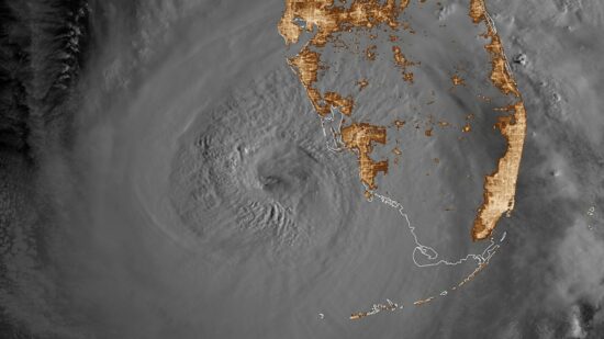
Thursday, September 29th, 2022With Hurricane Ian (now a tropical storm) exiting the east coast of Florida, there is no shortage of news reports tying this storm to climate change. Even if those claims actually include data to support their case, those data are usually for cherry-picked regions and time periods. If global warming is causing a change in tropical cyclone activity, it should show up in global statistics.
The latest peer-reviewed study (March 2022, here) of the accumulated wind energy in tropical cyclones since 1990 (when we started have sufficient global data) showed a decrease in hurricane activity. There was an increase in Atlantic activity, but this was matched by an even larger decrease in Pacific activity, due to a shift from El Nino to La Nina conditions during that time.
So, yes, there is climate change involved in the uptick in Atlantic activity in recent decades. But it’s natural.
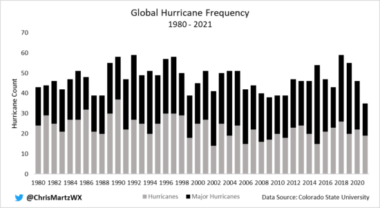
Looking at just the numbers of global hurricanes since 1980, we see no obvious trends.
Even if we did see an increase, the improvements in global satellite monitoring would be responsible for some of that. It is impossible to talk about meaningful global statistics (especially trends) before the 1980s due to a lack of satellite data. Ships of opportunity are insufficient for trend calculations, especially since ships try to avoid storms, not sample them.
A document-based study of hurricanes impacting the Lesser Antilles since the late 1600s found a downward trend (not statistically significant) in hurricane activity during 1690-2007.
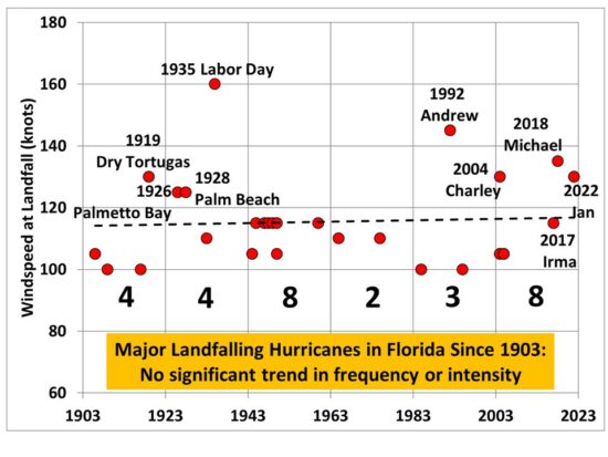
In my 2017 Kindle book Inevitable Disaster: Why Hurricanes Can’t Be Blamed on Global Warming, I looked at major hurricane landfalls in Florida, which showed no trends. With Hurricane Ian and Michael (2018) added to the dataset, there is still no statistically significant trends in either intensity or frequency of landfalling major hurricanes in Florida.
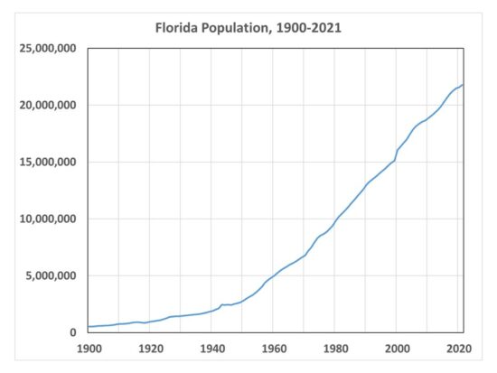
Of course hurricane damages have increased dramatically during the same period, but this is due to the explosive growth in coastal infrastructure there. Miami had only 444 residents in 1896, and now the metro area has over 6,000,000 population. As seen in the following plot, Florida population has increased by a factor of over 40 since 1900.
Given that hurricanes will always be with us, what is the best defense against them? Wealth. Hurricane Ian came ashore with 150 mph sustained winds, but warnings from modern instrumentation and forecast tools led to mass evacuations. At this writing, only 5 deaths have been reported (I’m sure that will rise). Modern building codes help reduce wind damage. I watched storm chaser Reed Timmer live reporting from the eyewall of Hurricane Ian as it made landfall, and I didn’t see any roofs coming off the houses (but I’m sure there were some that did). Damage from storm surge flooding, however, will be extensive and costly.
UAH Global Temperature Update for August, 2022: +0.28 deg. C
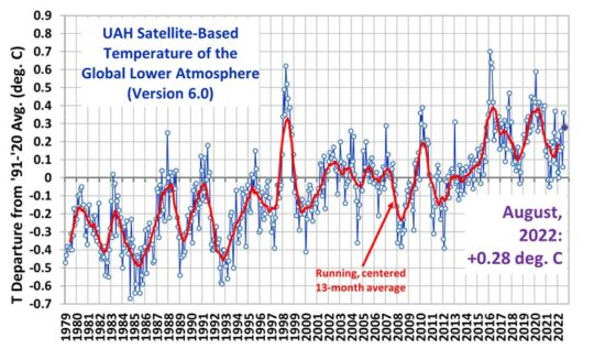
Thursday, September 1st, 2022The Version 6.0 global average lower tropospheric temperature (LT) anomaly for August, 2022 was +0.28 deg. C, down from the July, 2022 value of +0.36 deg. C.
The linear warming trend since January, 1979 still stands at +0.13 C/decade (+0.11 C/decade over the global-averaged oceans, and +0.18 C/decade over global-averaged land).
Various regional LT departures from the 30-year (1991-2020) average for the last 20 months are:
YEAR MO GLOBE NHEM. SHEM. TROPIC USA48 ARCTIC AUST
2021 01  0.12  0.34 -0.09 -0.08  0.36  0.50 -0.52
2021 02  0.20  0.32  0.08 -0.14 -0.66  0.07 -0.27
2021 03 -0.01  0.13 -0.14 -0.29  0.59 -0.78 -0.79
2021 04 -0.05  0.05 -0.15 -0.28 -0.02  0.02  0.29
2021 05  0.08  0.14  0.03  0.06 -0.41 -0.04  0.02
2021 06 -0.01  0.30 -0.32 -0.14  1.44  0.63 -0.76
2021 07  0.20  0.33  0.07  0.13  0.58  0.43  0.80
2021 08  0.17  0.26  0.08  0.07  0.32  0.83 -0.02
2021 09  0.25  0.18  0.33  0.09  0.67  0.02  0.37
2021 10  0.37  0.46  0.27  0.33  0.84  0.63  0.06
2021 11  0.08  0.11  0.06  0.14  0.50 -0.43 -0.29
2021 12  0.21  0.27  0.15  0.03  1.63  0.01 -0.06
2022 01  0.03  0.06  0.00 -0.24 -0.13  0.68  0.09
2022 02 -0.00  0.01 -0.02 -0.24 -0.05 -0.31 -0.50
2022 03  0.15  0.27  0.02 -0.08  0.22  0.74  0.02
2022 04  0.26  0.35  0.18 -0.04 -0.26  0.45  0.60
2022 05  0.17  0.24  0.10  0.01  0.59  0.23  0.19
2022 06  0.06  0.07  0.04 -0.36  0.46  0.33  0.11
2022 07  0.36  0.37  0.35  0.13  0.84  0.55  0.65
2022 08  0.28  0.31  0.24 -0.04  0.59  0.50 -0.01
The full UAH Global Temperature Report, along with the LT global gridpoint anomaly image for August, 2022 should be available within the next several days here.
The global and regional monthly anomalies for the various atmospheric layers we monitor should be available in the next few days at the following locations:
Lower Troposphere: http://vortex.nsstc.uah.edu/data/msu/v6.0/tlt/uahncdc_lt_6.0.txt
Mid-Troposphere: http://vortex.nsstc.uah.edu/data/msu/v6.0/tmt/uahncdc_mt_6.0.txt
Tropopause: http://vortex.nsstc.uah.edu/data/msu/v6.0/ttp/uahncdc_tp_6.0.txt
Lower Stratosphere: http://vortex.nsstc.uah.edu/data/msu/v6.0/tls/uahncdc_ls_6.0.txt

 Home/Blog