Guest post by Paul Driessen
Weekly, daily, even hourly, we are told that global temperatures are rising, ice caps are melting, and hurricanes, tornadoes, wildfires, floods and droughts are all getting more frequent, intense and destructive because of climate change. Not just climate change, of course, but manmade climate change, due to humanity’s use of fossil fuels — which provide 80% of all the energy that powers America and the world.
The claims assume Earth’s climate and weather were unchanged and unchanging until recent decades. That presumption is belied of course by multiple glacial and interglacial periods; the Roman and Medieval Warm Periods; the Little Ice Age; the Dust Bowl, Anasazi and Mayan droughts; the Galveston, Texas hurricane of 1900 and Great Labor Day Hurricane of 1935; the 1925 Tri-State Tornado; and countless other climate eras and extreme weather events throughout history.
But all would be vastly better, we are further misinformed, if the world simply stopped using those fuels, and switched to “clean, green, renewable, sustainable” wind, solar, biofuel and battery technologies.
Climate alarm messages are conveyed repeatedly in classrooms, newspapers, television and radio news programs, social media, movies and other media — while contrarian voices and evidence are routinely and vigorously suppressed by an increasingly powerful Big Tech, political and academic Cancel Culture.
These messages, and green energy agendas justified by them, are likely to gain far more influence under a Harris-Biden Administration, especially one pushed further and further to the left by Alexandria Ocasio-Cortez and her vocal, often violent “progressive” allies.
In 2016, the Committee For A Constructive Tomorrow (CFACT) released its documentary film Climate Hustle. The factual, often hilarious movie featured scientists, weather forecasters and other experts who challenged claims that our cars, factories and farms are causing catastrophic climate. It was featured in 400 U.S. movie theaters, where it made a persuasive case that the climate apocalypse is “an overheated environmental con job.”
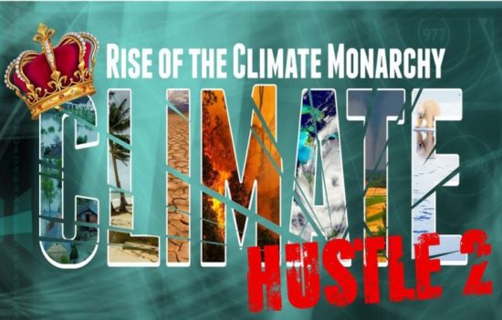
Now, this Thursday, September 24, CFACT is releasing Climate Hustle 2: Rise of the Climate Monarchy. The worldwide streaming event will go live at 8:00 pm local time, in every time zone on Earth, wherever you live.
You can get your tickets here to watch the online world premiere — with unlimited replay viewing through September 27, in case you miss the opening.
For those who missed it or want a refresher, CFACT is also offering a re-broadcast of Climate Hustle 1 for instant viewing. You can get combined tickets for both events here.
Climate Hustle 2 is masterfully hosted and narrated by Hollywood’s Kevin Sorbo, who played Hercules in the television movie. Like CH1, it features a superb lineup of experts [ including me – Roy] who challenge claims of “climate tipping points” and “extreme weather cataclysms.” Equally important, they also expose, debunk and demolish the tricks, lies and hidden agendas of global warming and green energy campaigners.
CH2 exposes the campaigners’ and politicians’ real agendas. Not surprisingly, as Michael Moore and Jeff Gibbs demonstrate in their Planet of the Humans documentary, those real agendas are money, power, ideology and control. Especially, control over our energy, economy, industries, living standards and personal choices. The campaigners and politicians also have little regard for the ecological, health and human rights consequences that inevitably accompany the ever-widening adoption of wind, solar, biofuel and battery technologies.
Climate Hustle 2: Rise of the Climate Monarchy hits hard. As CFACT says, “Lies will be smashed. Names will be named. Hypocrites unmasked. Grifters defrocked. Would-be tyrants brought low.”
Accompanying Sorbo is CFACT’s and Climate Depot’s Marc Morano, who hosted Climate Hustle 1. The journal Nature Communications has called Morano the world’s most effective climate communicator. He is also the person climate alarmists most want blacklisted and banned from public discourse.
Meteorologist and WattsUpWithThat.com host Anthony Watts says CH2 highlights numerous instances of “hypocrisy, financial corruption, media bias, classroom indoctrination, political correctness and other troubling matters surrounding the global warming issue.” It offers a true perspective of just how hard the media and climate alarmists are pushing an agenda, and how equally hard climate skeptics are pushing back.” Al Gore’s Inconvenient Truth presents rhetoric, doom and misinformation. But “if you want a practical and sensible view of what is really happening with climate, watch Climate Hustle 2.”
The Wall Street Journal cites scientist Roger Pielke, Jr., who points out that hurricanes hitting the U.S. have not increased in frequency or intensity since 1900. The Journal also notes that the National Oceanic and Atmospheric Administration has said “it is premature to conclude that human activities — and particularly greenhouse gas emissions — have already had a detectable impact on Atlantic hurricane or global tropical cyclone activity.” And let’s not forget the record twelve-year absence of Category 3-5 hurricanes making landfall in the United States. (Was that due to more atmospheric carbon dioxide?)
As to tornadoes, a Washington Post article clearly shows that many more violent F4 and F5 tornadoes hit the United States between 1950 and 1985, than during the next 35 years, 1986-2020. Even more amazing, in 2018, for the first year in recorded history, not one violent tornado struck the U.S.
Canada’s Friends of Science says, once you see Climate Hustle 2, “you can’t unsee the damage the climate monarchy is doing to every aspect of scientific inquiry, to freedom and to democratic society.”
CFACT president Craig Rucker says “Politicians have abandoned any semblance of scientific reality and are instead regurgitating talking points from radical pressure groups to a media that has little interest in vetting their credibility.” In fact, the Cancel Culture is actively suppressing any climate skeptic views.
Twitter actively banned Climate Hustle 2 and froze CFACT’s Twitter account. On appeal the account was unfrozen, but the ban adversely affected thousands of CFACT Twitter followers.
Amazon Prime Video has removed Climate Hustle 1 from its website. CFACT tried to appeal, but Amazon didn’t respond. You can watch the trailer, but the actual film is now “unavailable in your area.” Amazon only lets people buy new DVDs through the film’s producer, CDR Communications ($19.95) — while also processing fulfillment for third party vendors who sell used DVDs (for over $45).
Wikipedia claims Climate Hustle is “a 2016 film rejecting the existence and cause of climate change, narrated by climate change denialist Marc Morano… and funded by the Committee for a Constructive Tomorrow, a free market pressure group funded by the fossil fuel lobby.” (CFACT has received no fossil fuel money for over a decade, and got only small amounts before that.)
Newspapers, TV and radio news programs, social media sites, schools and other arenas should present all the news and foster open discussion and debate. But many refuse to do so. Instead, they function as thought police, actively and constantly finding and suppressing what you can see, read, hear and say, because it goes against their narratives and the agendas they support.
Climate and energy are high on that list. That makes Climate Hustle 1 and 2 especially important this year — and makes it essential that every concerned voter and energy user watch and promote this film.
Paul Driessen is senior policy analyst for the Committee For A Constructive Tomorrow and author of books and articles on energy, environment, climate and human rights issues.

 Home/Blog
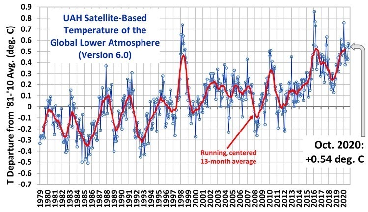
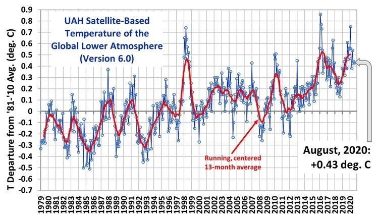
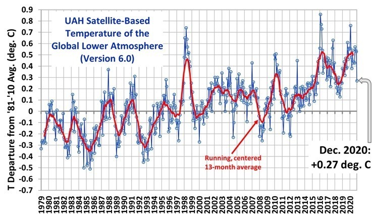 For comparison, the CDAS global surface temperature anomaly for the last 30 days at Weatherbell.com was +0.31 deg. C.
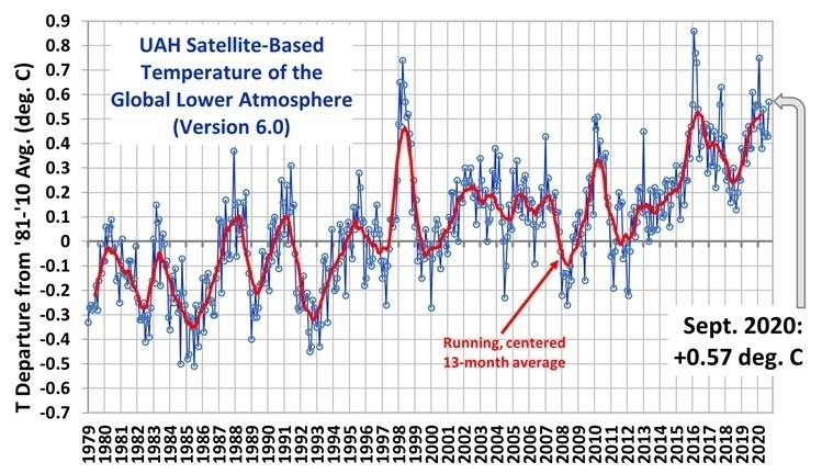