DrRoySpencer.com has been demonetized by Google for “unreliable and harmful claims”. This means I can no longer generate revenue to support the website using the Google Adsense program.
From a monetary standpoint, it’s not a big deal because what I make off of Google ads is in the noise level of my family’s monthly budget. It barely made more than I pay in hosting fees and an (increasingly expensive) comment spam screener.
I’ve been getting Google warnings for a couple months now about “policy violations”, but nowhere was it listed what pages were in violation, and what those violations were. There are Adsense rules about ad placement on the page (e.g. a drop-down menu cannot overlay an ad), so I was assuming it was something like that, but I had no idea where to start looking with hundreds of web pages to sift through. It wasn’t until the ads were demonetized that Google offered links to the pages in question and what the reason was.
Of course, I should have figured out it was related to Google’s new policy about misleading content; a few months ago Google announced they would be demonetizing climate skeptic websites. I was kind of hoping my content was mainstream enough to avoid being banned since:
- I believe the climate system has warmed
- I believe most of this warming is probably due to greenhouse gas emissions from fossil fuel burning
Many of you know that I defend much of mainstream climate science, including climate modeling as an enterprise. Where I depart of the “mainstream” is how much warming has occurred, how much future warming can be expected, and what should be done about it from an energy policy perspective.
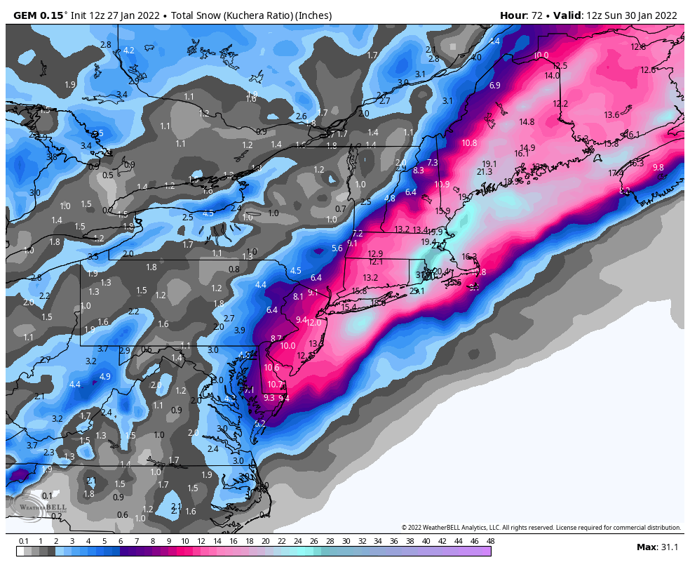
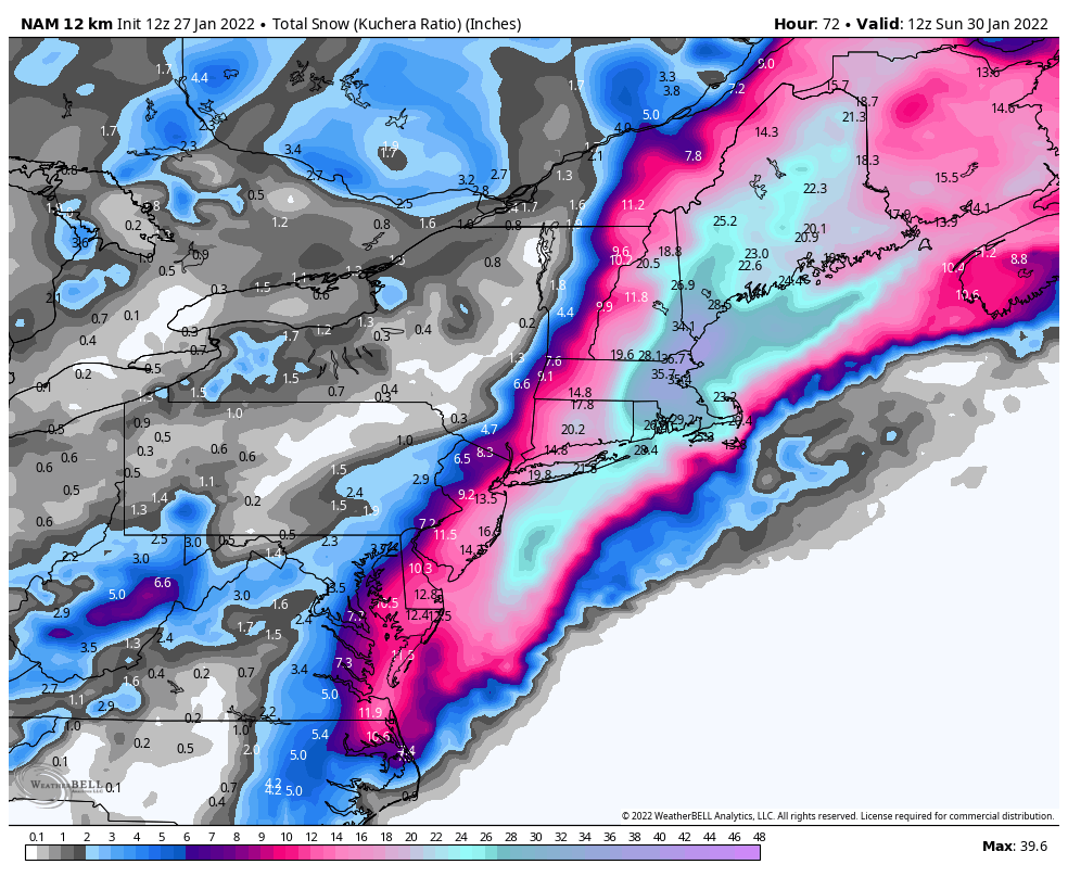
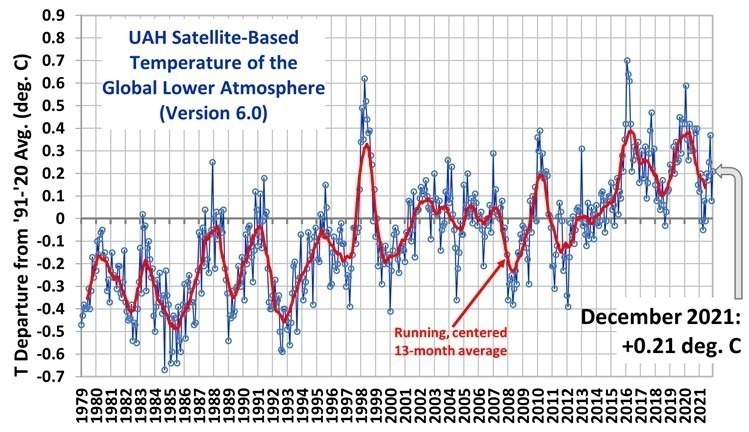
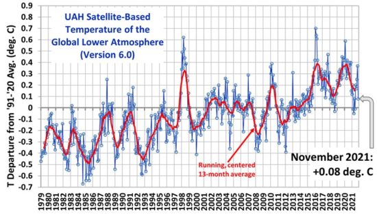
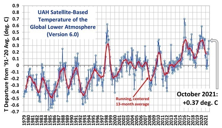
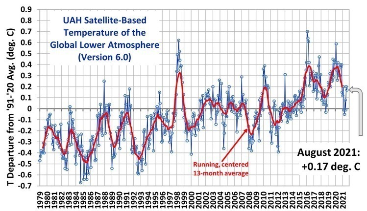
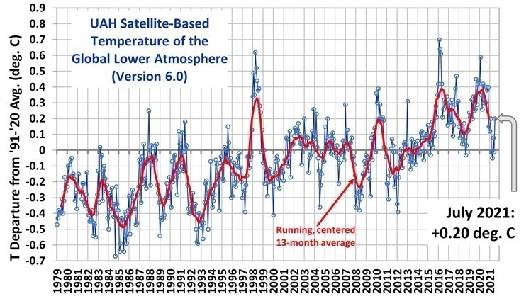
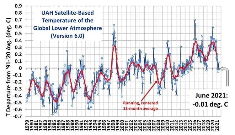
From the information provided by Google about my violations, in terms of the number of ads served, by far the most frequented web pages here at drroyspencer.com with “unreliable and harmful claims” are our (UAH) monthly global temperature update pages. This is obviously because some activists employed by Google (who are probably weren’t even born when John Christy and I received both NASA and American Meteorological Society awards for our work) don’t like the answer our 43-year long satellite dataset gives. Nevermind that our dataset remains one of the central global temperature datasets used by mainstream climate researchers in their work.
For now I don’t plan on appealing the decision, because it’s not worth the aggravation. If you are considered a “climate skeptic” (whatever that means) Google has already said you are targeted for termination from their Adsense program. I can’t expect their liberal arts-educated “fact checkers” to understand the nuances of the global warming debate.

 Home/Blog