Executive Summary
A new paper by Santer et al. in Journal of Climate shows that observed trends during 1988-2019 in sea surface temperature [SST], tropospheric temperature [TLT and TMT], and total tropospheric water vapor [TWV] are generally inconsistent, by varying amounts, with climate model trends over the same period. The study uses ratios between observed trends in these variables to explore how well the ratios match model expectations, with the presumption that the models provide “truth” in such comparisons. Special emphasis is placed on the inconsistency between TWV moistening rates and the satellite tropospheric temperature warming rates: the total water vapor has risen faster than one would expect for the weak rate of satellite-observed tropospheric warming (but both are still less than the average climate model trends in either CMIP5 or CMIP6).
While the paper itself does not single out the tropospheric temperatures as being in error, widespread reporting of the paper used the same biased headline, for instance this from DailyMail.com: “Satellites may have been underestimating the planet’s warming for decades”. The reporting largely ignored the bulk of what was in the paper, which was much less critical of the satellite temperature trends, and which should have been more newsworthy. For example: (1) SST warming is shown in the paper to be well below climate model expectations from both CMIP5 and CMIP6, which one might expect could have been a major conclusion; (2) the possibility that the satellite-based TWV is rising too rapidly (admitted in the paper, and addressed below), and especially (3) the possibility that TWV is not a good proxy anyway for mid- and upper-tropospheric warming (discussed below).
As others have shown, free-tropospheric vapor (not well captured by TWV) would be the proper proxy for free-tropospheric warming, and the fact that climate models maintain constant relative humidity with altitude during warming is not based upon basic physical processes (as the authors imply), but instead upon arbitrary moistening assumptions implicit in model convective parameterizations. Observational evidence is shown that free-tropospheric humidity does not increase with tropospheric temperature as much as in the GFDL climate model. Thus, weak tropospheric warming measured by satellites could be evidence of weak water vapor feedback in the free troposphere, which in turn could explain the weaker than (model) expected surface warming. A potential reason for a high bias in TWV trends is also addressed, which is consistent with the other variables’ trend behavior.
Evidence Presented in Santer et al. (2021)
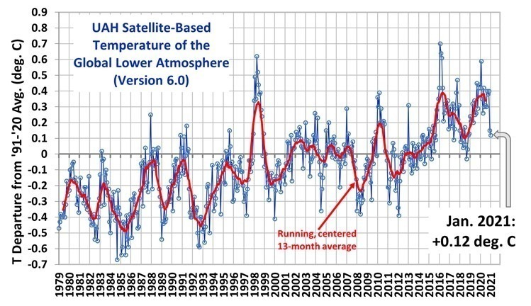
I’ve been asked by several people to comment on a new paper in Journal of Climate by Santer et al. (Using Climate Model Simulations to Constrain Observations) that has as one of its conclusions the possibility that satellite-based warming estimates of tropospheric temperature might be too low. Based upon my initial examination of the paper, I conclude that there is nothing new in the paper that would cast doubt on the modest nature of tropospheric warming trends from satellites — unless one believes climate models as proof, in which case we don’t need observations anyway.
The new study focuses on the period 1988-2019 so that total integrated water vapor retrievals over the ocean from the SSM/I and SSMIS satellite-based instruments can be used. Recent surface and tropospheric warming has indeed been accompanied by increasing water vapor in the troposphere, and the quantitative relationship between temperature and vapor is used by the authors as a guide to help determine whether the tropospheric warming rates from satellites have been unrealistically low.
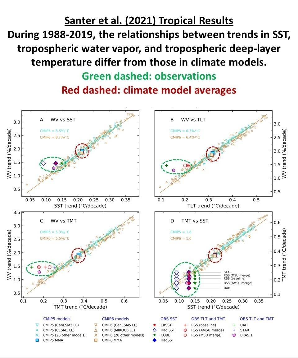
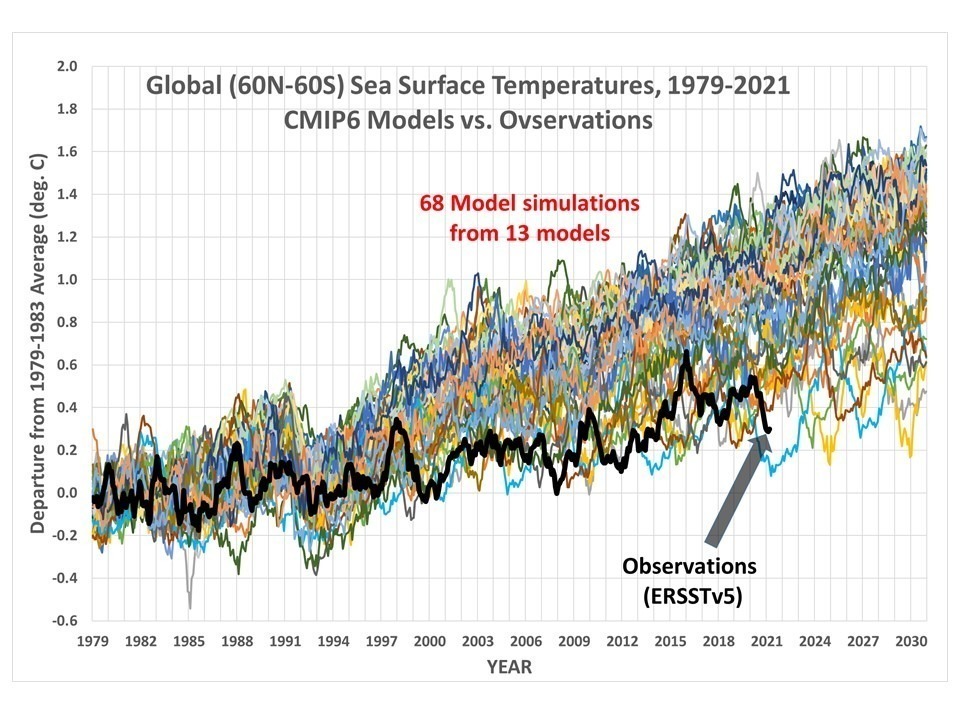
Most of the pertinent conclusions in the new paper come from their Fig. 9, which I have annotated for clarity in Fig. 1, below.
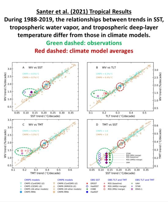
Fig. 1. Adapted from Santer et al. (2021), comparison plots of tropical trends (1988-2019) in total integrated water vapor, sea surface temperature, and tropospheric temperature, in climate models versus observations. Note in (A) and (D) the sea surface temperature trends are well below the average model trends, which curiously was not part of the media-reported results. These plots show that in all four of the properties chosen for analysis (SST, TLT, TMT, and TWV) the observed trends are below the average climate model trends (the latter of which determine global policy responses to anthropogenic GHG emissions). The fact the observations fall off of the model-based regression lines is (as discussed below) due to some combination of errors in the observations and errors in the climate model assumptions.
The Problem with Using Integrated Water Vapor Increases as a Proxy for Tropospheric Warming
A central conclusion of the paper is that total integrated water vapor has been rising more rapidly than SST trends suggest, while tropospheric temperature has been rising less rapidly (assuming the models are correct that SST warming should be significantly amplified in the troposphere). This pushes the observations away from the climate model-based regression lines in Fig. 1a, 1b, and 1b.
The trouble with using TWV moistening as a proxy for tropospheric warming is that while TWV is indeed strongly coupled to SST warming, how well it is coupled to free-tropospheric (above the boundary layer) warming in nature is very uncertain. TWV is dominated by boundary layer water vapor, while it is mid- to upper-tropospheric warming (and thus in the TMT satellite measurements) which is strongly related to how much the humidity increases at these high altitudes (Po-Chedley et al., 2018).
This high-altitude region is not well represented in TWV retrievals. Satellite based retrievals of TWV use the relatively weak water vapor line near 22 GHz, and so are mainly sensitive to the water vapor in the lowest layer of the atmosphere.
Furthermore, these retrievals are dependent upon an assumptions regarding the profile shape of water vapor in the atmosphere. If global warming is accompanied by a preferential moistening of the lower troposphere (due to increased surface evaporation) and a thickening of the moist boundary layer, the exceedingly important free-tropospheric humidity increase might not be as strong as is assumed in these retrievals, which are based upon regional profile differences over different sea surface temperature regimes.
As shown by Spencer & Braswell (1997) and others, the ability of the climate system to cool to outer space is strongly dependent upon humidity changes in the upper troposphere during warming (see Fig. 2). The upper troposphere has very low levels of water vapor in both relative and absolute terms, yet these low amounts of vapor in the upper 75% of the troposphere have a dominating control on cooling to outer space.
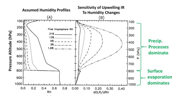
Fig. 2. Adapted from Spencer & Braswell, 1997: The rate of humidity increases in the free troposphere (above the boundary layer) with long-term surface warming can dominate water vapor feedback, and thus free-tropospheric warming (e.g. from satellite-based TMT), as well as surface warming. The precipitation processes which govern the humidity in this region (and especially how they change with warming) are very uncertain and only crudely handled in climate models.
As indicated in Fig. 2, water vapor in the lowest levels of the troposphere is largely controlled by surface evaporation. If the surface warms, increasing evaporation moistens the boundary layer, and constant relative humidity is a pretty good rule of thumb there. But in the mid- and upper- troposphere, detrained air from precipitation systems largely determines humidity. The fraction of condensed water vapor that is removed by precipitation determines how much is left over to moisten the environment. The free-tropospheric air sinking in clear air even thousands of km away from any precipitation systems had its humidity determined when that air ascended in those precipitation systems, days to weeks before. As demonstrated by Renno, Emanuel, and Stone (1994) with a model containing an explicit atmospheric hydrologic cycle, precipitation efficiency determines whether the climate is cool or warm, through its control on the main greenhouse gas, water vapor.
Importantly, we do not know how precipitation efficiency changes with warming, therefore we don’t know how strong water vapor feedback is in the real climate system. We know that tropical rain systems are more efficient than higher latitude systems (as many of us know anecdotally from visiting the tropics, where even shallow clouds can produce torrential rainfall). It is entirely reasonable to expect that global warming will be accompanied by an increase in precipitation efficiency, and recent research is starting to support this view (e.g. Lutsko and Cronin, 2018). This would mean that free-tropospheric absolute (specific) humidity might not increase as much as climate models assume, leading to less surface warming (as is observed) and less tropospheric amplification of surface warming (as is observed).
Because climate models do not yet include the precipitation microphysics governing precipitation efficiency changes with warming, the models’ behavior regarding temperature versus humidity in the free troposphere should not be used as “truth” when evaluating observations.
While climate models tend to maintain constant relative humidity throughout the troposphere during warming, thus causing strong positive water vapor feedback (e.g. Soden and Held, 2006) and so resulting in strong surface warming and even stronger tropospheric warming, there are difference between models in this respect. In the CMIP5 models analyzed by Po-Chedley et al. (2018, their Fig. 1a) there is a factor of 3 variation in the lapse rate feedback across models, which is a direct measure of how much tropospheric amplification there is of surface warming (the so-called “hotspot”). That amplification is, in turn, directly related (they get r = -0.85) to how much extra water vapor is detrained into the free troposphere (also in their Fig. 1a).
What Happens To Free Tropospheric Humidity in the Real World?
In the real world, it is not clear that free-tropospheric water vapor maintains constant relative humidity with warming (which would result in strong surface warming, and even stronger tropospheric warming). We do not have good long-term measurements of free-tropospheric water vapor changes on a global basis.
Some researchers have argued that seasonal and regional relationships can be used to deduce water vapor feedback, but this seems unlikely. How the whole system changes with warming over time is not so certain.
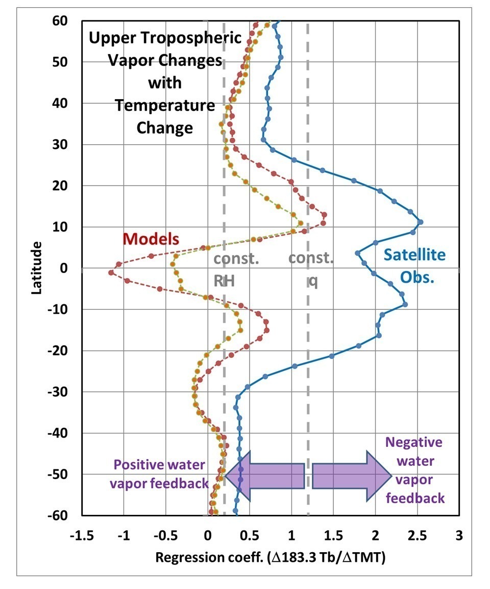
For example, if we use satellite measurements near 183 GHz (e.g. available from the NOAA AMSU-B instruments since late 1998), which are very sensitive to upper tropospheric vapor, we find in the tropics that tropospheric temperature and humidity changes over time appear to be quite different in satellite observations versus the GFDL climate model (Fig. 3).

Fig. 3. Zonal averages of gridpoint regression coefficients between monthly anomalies in 183.3 GHz TB and TMT during 2005-2015 in observations (blue) and in two GFDL climate models (red and orange), indicating precipitation systems in the real world dry out the free troposphere with warming more than occurs in climate models, potentially reducing positive water vapor feedback and thus global warming.
More details regarding the results in Fig. 3. can be found here.
Possible Biases in Satellite-Retrieved Water Vapor Trends
While satellite retrievals of TWV are known to be quite accurate when compared to radiosondes, subtle changes in the vertical profile of water vapor during global warming can potentially cause biases in the TWV trends. The Santer et al. (2021) study mentions the possibility that the total vertically-integrated atmospheric water vapor trends provided by satellites since mid-1987 might be too high, but does not address any reasons why.
This is an issue I have been concerned about for many years because the TWV trend since 1988 (only retrievable over the ocean) has been rising faster than we would expect based upon sea surface temperature (SST) warming trends combined with the assumption of constant relative humidity throughout the depth of the troposphere (see Fig. 1a, 1b, 1c above).
How might such a retrieval bias occur? Retrieved TWV is proportional to warming of a passive microwave Tb near the weak 22.235 GHz water vapor absorption line over the radiometrically-cold (reflective) ocean surface. As such, it depends upon the temperature at which the water vapor is emitting microwave radiation.
TWV retrieval depends upon assumed shapes of the vertical profile of water vapor in the troposphere, that is, what altitudes and thus what temperatures the water vapor is emitting at. These assumed vertical profile shapes are based upon radiosonde (weather balloon) data from different regions and different seasons having different underlying sea surface temperatures. But these regionally- and seasonally-based shape variations might not reflect shape changes during warming. If the vast majority of the moistening with long-term warming occurs in the boundary layer (see Fig. 2 above, below 800 hPa pressure altitude), with maybe slight thickening of the boundary layer, but the upper troposphere experiences little moistening, then the retrieved TWV could be biased high because the extra water vapor is emitting microwave radiation from a lower (and thus warmer) altitude than is assumed by the retrieval. This will lead to a high bias in retrieved water vapor over time as the climate system warms and moistens. As the NASA AMSR-E Science Team leader, I asked the developer of the TWV retrieval algorithm about this possibility several years ago, but never received a response.
The New Santer at al. Study Ignores Radiosonde Evidence Supporting Our UAH Satellite Temperatures
As an aside, it is also worth noting that the new study does not even reference our 2018 results (Christy et al., 2018) showing that the most stable radiosonde datasets support the UAH satellite temperature trends.
Conclusion
The new study by Santer et al. does not provide convincing evidence that the satellite measurements of tropospheric temperature trends are unrealistically low, and the media reporting of their study in this regard was biased. Their conclusion (which they admit is equivocal) depends upon the belief in climate models for how upper tropospheric warming relates to increasing total tropospheric water vapor (TWV) amounts. Since TWV does not provide much sensitivity to upper tropospheric water vapor changes, and those changes largely determine how much tropospheric amplification of surface temperature trends will occur (e.g. the “tropical hotspot”), TWV cannot determine whether tropospheric temperature trends are realistic or not.
Furthermore, there is some evidence that the TWV trends are themselves biased high, which the study authors admit is one possible explanation for the trend relationships they have calculated.
The existing observations as presented in the Santer et al. study are largely consistent with the view that global warming is proceeding at a significantly lower rate that is predicted by the latest climate models, and that much of the disagreement between models and observations can be traced to improper assumptions in those models.
Specifically:
1) SST warming has been considerably less that the models predict, especially in the tropics
2) Tropospheric amplification of the surface warming has been weak or non-existent, suggesting weaker positive water vapor feedback in nature than in models
3) Weak water vapor feedback, in turn, helps explain weak SST warming (see [1]).
4) Recent published research (and preliminary evidence shown in Fig. 3, above) support the view that climate model water vapor feedback is too strong, and so current models should not be used to validate observations in this regard.
5) Satellite-based total water vapor trends cannot be used to infer water vapor feedback because they are probably biased high due to vertical profile assumptions and because they probably do not reflect how free-tropospheric water vapor has changed with warming, which has a large impact on water vapor feedback.
REFERENCES
Christy, J. R., R. W. Spencer, W. D. Braswell, and R. Junod, 2018: Examination of space-based bulk atmospheric temperatures used in climate research.
Intl. J. Rem. Sens., DOI:https://doi.org/10.1080/01431161.2018.1444293
Lutsko, N. J. and T. W. Cronin, 2018: Increase in precipitation efficiency with surface warming in radiative-convective equilibrium. J. of Adv. Model. Earth Sys., DOI:https://doi.org/10.1029/2018MS001482.
Po-Chedley, S., K. C. Armour, C. M. Bitz, M. D. Zelinka, B. D. Santer, and Q. Fu, 2018: Sources of intermodel spread in the lapse rate and water vapor feedbacks. J. Climate, DOI:https://doi.org/10.1175/JCLI-D-17-0674.1.
Renno, N. O., K. A. Emanuel, and P. H. Stone, 1994: Radiative-convective model with an explicit hydrologic cycle: 1. Formulation and sensitivity to model parameters, J. Geophys. Res. – Atmos., DOI:https://doi.org/10.1029/94JD00020.
Santer, B. D., S. Po-Chedley, C. Mears, J. C. Fyfe, N. Gillett, Q. Fu, J. F. Painter, S. Solomon, A. K. Steiner, F. J. Wentz, M. D. Zelinka, and C.-Z. Zou, 2021: Using climate model simulations to constrain observations. J. Climate, DOI:https://doi.org/10.1175/JCLI-D-20-0768.1
Soden, B. J., and I. M. Held, 2006: An assessment of climate feedbacks in coupled ocean–atmosphere models. J. Climate, DOI:https://doi.org/10.1175/JCLI3799.1.
Spencer, R.W., and W.D. Braswell, 1997: How dry is the tropical free troposphere? Implications for global warming theory. Bull. Amer. Meteor. Soc., 78, 1097-1106.

 Home/Blog