Fig. 1. Bushfire smoke flowing eastward from SE Australia on January 4, 2020 as seen from the International Space Station (NASA).
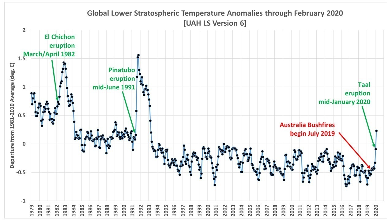
John Christy pointed out to me that our UAH lower stratosphere (“LS”) temperature product which has peak sensitivity at about 17 km (70 hPa pressure) has increased in the last 2 months to its warmest value since the post-Pinatubo period of warming (1991-93). This can be seen in the following plot of global average anomalies.
Fig. 2. UAH Version 6 global-average lower stratospheric (LS) temperature anomalies for January 1979 through February 2020.
At first I though we might be seeing warming from the mid-January eruption of Taal volcano in the Philippines, but even the much more massive mid-June 1991 eruption of Pinatubo did not show up in the LS temperatures until the month following the eruption, while we see evidence of warming in Fig. 2 in the same month as the Taal eruption.
NASA had previously reported that the smoke from the Australian bushfires had been detected in January as as high as 20-25 km, well into the stratosphere (see here, here, and here). The measurements come from the CALIPSO spacecraft which has a lidar instrument capable of accurate altitude measurements of aerosols.
The mechanism for the warming of the lower stratosphere by the smoke is some combination of direct solar heating of the smoke particles, and infrared (“greenhouse”) warming of the smoke layer, the latter being the mechanism that caused the warming after the eruptions of El Chichon and Pinatubo. The aerosol layer is very cold, and it intercepts infrared radiation from below and so warms slightly.
I will try to examine the specific latitude band (30S-60S) being affected in more detail, including temperature measurements from higher up (which we do not produce official products for). The difficulty is that there is considerable natural variation in the tropical and extra-tropical temperatures in the stratosphere which have a see-saw behavior due to variations in the strength of the Brewer-Dobson circulation. As a result, these stratospheric aerosol effects on temperature tend to show up best in global or nearly-global averages (Fig. 2, above) where such circulation induced changes average out.
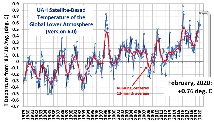
The Version 6.0 global average lower tropospheric temperature (LT) anomaly for February, 2020 was +0.76 deg. C, up considerably from the January, 2020 value of +0.57 deg. C.
This is the warmest monthly anomaly since March 2016 (+0.77 deg. C), and the warmest February since 2016 (+0.86 deg. C), both due to El Nino warmth. Continuing weak El Nino conditions are also likely responsible for the current up-tick in temperature, as I recently demonstrated here.
The linear warming trend since January, 1979 remains at +0.13 C/decade (+0.12 C/decade over the global-averaged oceans, and +0.18 C/decade over global-averaged land).
Various regional LT departures from the 30-year (1981-2010) average for the last 14 months are:
The UAH LT global gridpoint anomaly image for February, 2020 should be available in the next few days here.
The global and regional monthly anomalies for the various atmospheric layers we monitor should be available in the next few days at the following locations:
Last week I was privileged to present an invited talk (PDF here) to the Winter Roundtable of the the Pacific Pension & Investment Institute in Pasadena, CA. The PPI meeting includes about 120 senior asset managers representing about $25 Trillion in investments. Their focus is on long-term investing with many managing the retirement funds of private sector and state employees.
They had originally intended the climate change session to be a debate, but after numerous inquiries were unable to find anyone who was willing to oppose me.
Like most people, these asset managers represent a wide variety of views on climate change, but what they have in common is they are under increasing pressure to make “sustainable investing” a significant fraction of their portfolios. Some managers view this as an infringement on their fiduciary responsibility to provide the highest rates of return for their customers. Others believe that sustainable investing (e.g. in renewable energy projects) is a good long-term investment if not a moral duty. Nearly all have now divested from coal. Many investment funds now highlight their sustainable investments, as they cater to investors who (for a variety of reasons) want to be part of this new trend.
My understanding is that most investment managers have largely been convinced that climate change is a serious threat. My message was that this is not the case, and that at a minimum the dangers posed by human-caused climate change have been exaggerated. Furthermore, the benefits of more carbon dioxide in the atmosphere (e.g. increased agricultural productivity with no sign of climate change-induced agricultural harm) are seldom mentioned. I showed Bjorn Lomborg’s evidence for the 95% reduction in weather-related mortality over the last 100 years, as well as Roger Pielke, Jr’s Munich Re data showing no increase in insured damages as a fraction of GDP.
One meeting organizer took considerable professional risk in insisting that I be invited to provide a more balanced view of climate change than most of the attendees had been exposed to before, and there was considerable anxiety about my inclusion in the program. Fortunately, my message (a 30 minute PowerPoint presentation [pdf here] with a panel discussion afterward) was unexpectedly well-received. An e-mail circulated after the meeting claimed that I had “changed the dynamic of future meetings.” The Heartland Institute was also involved in making this happen.
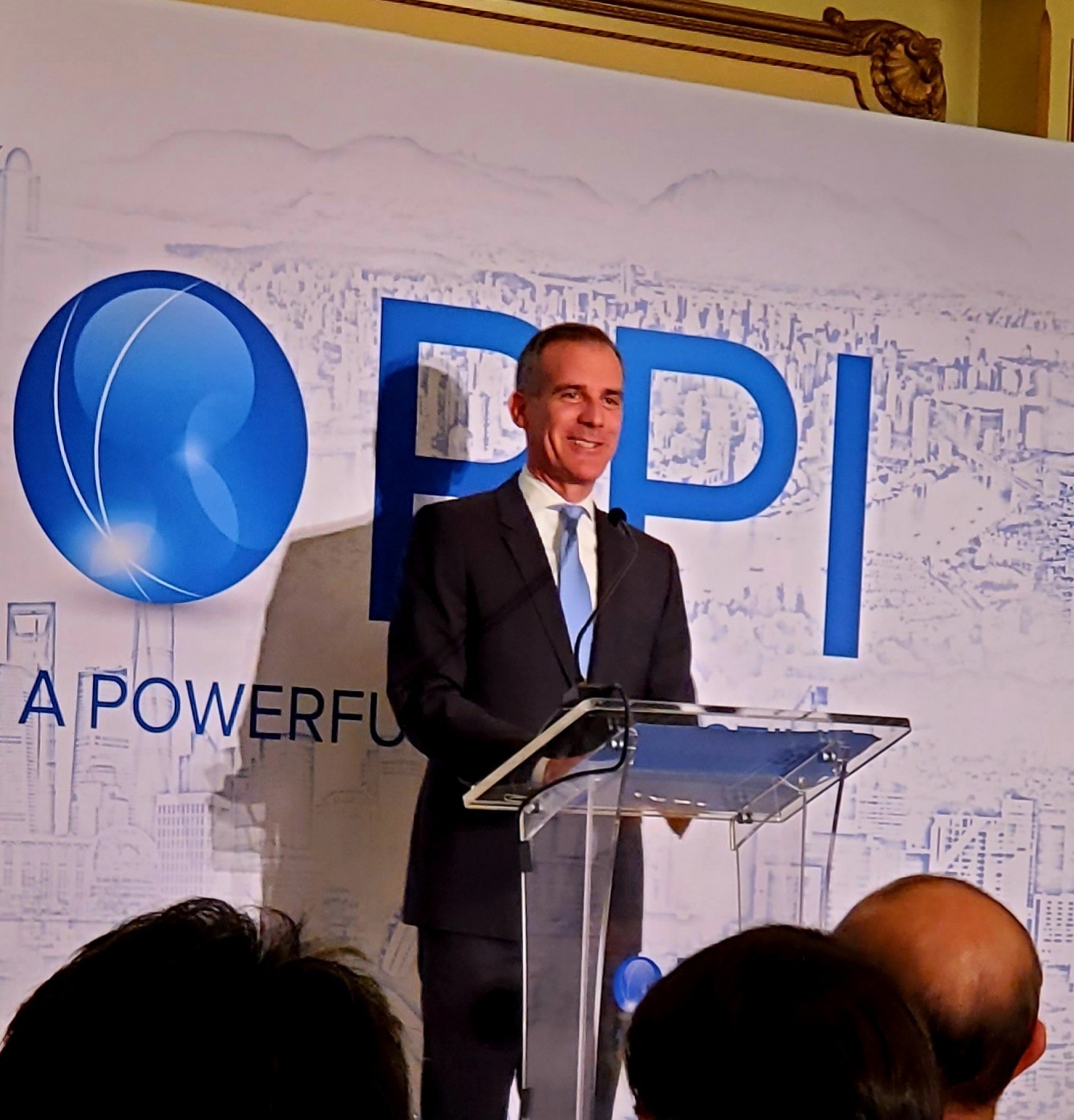
Los Angeles Mayor Eric Garcetti gave a speech at the first night’s dinner, in which he (as you might expect) mentioned the challenge of climate change, reducing “carbon” emissions, and his young daughter’s anxiety over global warming.
Los Angeles Mayor Eric Garcetti addresses the Winter Roundtable of the PPI Institute, 12 February 2020, Pasadena, CA.
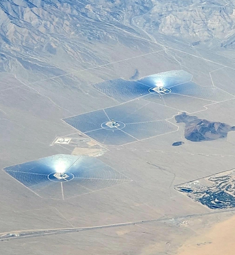
The experience for me was gratifying. Even those few participants who disagreed with me were very polite, and we all got along very well. In what might be considered a bit of irony, on my flight to LAX we flew past the failed Ivanpah solar power facility southwest of Las Vegas, which produced a blinding white light for about 5 minutes.
Ivanpah solar energy facility in California’s Mojave Desert on 12 February 2020, taken from about 33,000 ft. altitude.
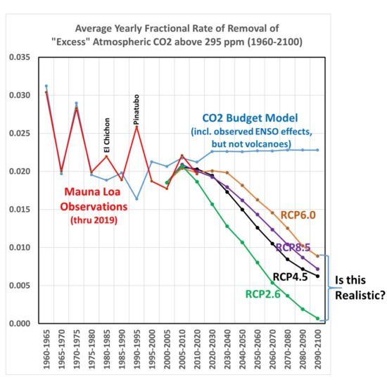
Well, as I suspected (and warned everyone) in my blog post yesterday, a portion of my calculations were in error regarding how much CO2 is taken out of the atmosphere in the global carbon cycle models used for the RCP (Representative Concentration Pathway) scenarios. A few comments there said it was hard to believe such a discrepancy existed, and I said so myself.
The error occurred by using the wrong baseline number for the “excess” CO2 (atmospheric CO2 content above 295 ppm) that I divided by in the RCP scenarios.
Here is the corrected Fig. 1 from yesterday’s post. We see that during the overlap between Mauna Loa CO2 observations (through 2019) and the RCP scenarios (starting in 2000), the RCP scenarios do approximately match the observations for the fraction of atmospheric CO2 above 295 ppm.
Fig. 1. (corrected) Computed average yearly rate of removal of atmospheric CO2 above a baseline value of 295 ppm from (1) historical emissions estimates compared to Mauna Loa CO2 data (red), (2) the RCP scenarios used by the IPCC CMIP5 climate models Lower right), and (3) in a simple time-dependent CO2 budget model forced with historical emissions before, and EIA-based assumed emissions after, 2018 (blue). Note the time intervals change from 5 to 10 years in 2010.
But now, the RCP scenarios have a reduced rate of removal in the coming decades during which that same factor-of-4 discrepancy with the Mauna Loa observation period gradually develops. More on that in a minute.
First, I should point out that the CO2 sink (removal rate) in terms of ppm/yr in three of the four RCP scenarios does indeed increase in absolute terms from (for example ) the 2000-2005 period to the 2040-2050 period: from 1.46 ppm/year during 2000-2005 to 2.68 ppm/yr (RCP4.5), 3.07 ppm/yr (RCP6.0), and 3.56 ppm/yr (RCP8.5). RCP2.6 is difficult to compare to because it involves not only a reduction of emissions, but actual negative CO2 emissions in the future from enhanced CO2 uptake programs. So, the RCP curves in Fig.1 should not be used to infer a reduced rate of CO2 uptake; it is only a reduced uptake relative to the atmospheric CO2 “overburden” relative to more pre-Industrial levels of CO2.
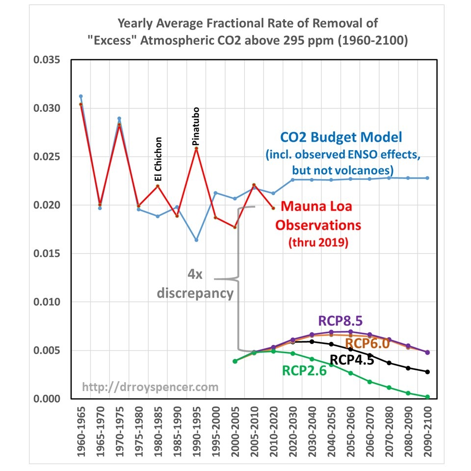
How Realistic are the Future RCP CO2 Removal Fractions?
I have been emphasizing that the Mauna Loa data are extremely closely matched by a simple model (blue line in Fig. 1) that assumes CO2 is removed from the atmosphere at a constant rate of 2.3%/yr of the atmospheric excess over a baseline value of 295 ppm.
OK, now actually look at that figure I just linked to, because the fit is amazingly good. I’ll wait….
Now, if I reduce the model specified CO2 removal rate value from 2.3 to 2.0%/yr, I cannot match the Mauna Loa data. Yet the RCP scenarios insist that value will decrease markedly in the coming decades.
Who is correct? Will nature continue to remove 2.0-2.3%/yr of the CO2 excess above 295 ppm, or will that removal rate drop precipitously? If it stays fairly constant, then the future RCP scenarios are overestimating future atmospheric CO2 concentrations, and as a result climate models are predicting too much future warming.
Unfortunately, as far as I can tell, this situation can not be easily resolved. Since that removal fraction is MY metric (which seems physically reasonable to me), but is not how the carbon cycle models are built, it can be claimed that my model is too simple, and does not contain the physics necessary to address how CO2 sinks change in the future.
Which is true. All I can say is that there is no evidence from the past 60 years (1959-2019) of Mauna Loa data that the removal fraction is changing…yet.
The Version 6.0 global average lower tropospheric temperature (LT) anomaly for January, 2020 was +0.56 deg. C, unchanged from the December 2019 value of +0.56 deg. C.
The linear warming trend since January, 1979 remains at +0.13 C/decade (+0.11 C/decade over the global-averaged oceans, and +0.18 C/decade over global-averaged land).
Various regional LT departures from the 30-year (1981-2010) average for the last 25 months are:
The UAH LT global gridpoint anomaly image for January, 2020 should be available in the next few days here.
The global and regional monthly anomalies for the various atmospheric layers we monitor should be available in the next few days at the following locations:
Note: What I present below is scarcely believable to me. I have looked for an error in my analysis, but cannot find one. Nevertheless, extraordinary claims require extraordinary evidence, so let the following be an introduction to a potential issue with current carbon cycle models that might well be easily resolved by others with more experience and insight than I possess.
UPDATE (2/6/2020):It turns out I made an error (as I feared) in my calculations that went into Fig. 1, below. You might want to instead read my corrected results here and what they suggest.The bottom line is that the IPCC carbon cycle models by 2100 reduce the fractional rate of removal of extra atmospheric CO2 by a factor of 3-4 versus what has actually been happening over the last 60 years of Mauna Loa CO2 data.That (as Fig. 2 in my previous post suggested) will have an effect on future CO2 projections and, in turn, global warming forecasts.But my previous claim that the discrepancy exists during the Mauna Loa record was incorrect.
Summary
Sixty years of Mauna Loa CO2 data compared to yearly estimates of anthropogenic CO2 emissions shows that Mother Nature has been removing 2.3%/year of the “anthropogenic excess” of atmospheric CO2 above a baseline of 295 ppm. When similar calculations are done for the RCP (Representative Concentration Pathway) projections of anthropogenic emissons and CO2 concentrations it is found that the carbon cycle models those projections are based upon remove excess CO2 at only 1/4th the observed rate. If these results are anywhere near accurate, the future RCP projections of CO2, as well as the resulting climate model projection of resulting warming, are probably biased high.
Introduction
My previous post from a few days ago showed the performance of a simple CO2 budget model that, when forced with estimates of yearly anthropogenic emissions, very closely matches the yearly average Mauna Loa CO2 observations during 1959-2019. I assume that a comparable level of agreement is a necessary condition of any model that is relied upon to predict future levels of atmospheric CO2 if it is have any hope of making useful predictions of climate change.
In that post I forced the model with EIA projections of future emissions (0.6%/yr growth until 2050) and compared it to the RCP (Representative Concentration Pathway) scenarios used for forcing the IPCC climate models. I concluded that we might never reach a doubling of atmospheric CO2 (2XCO2).
But what I did not address was the relative influence on those results of (1) assumed future anthropogenic CO2 emissions versus (2) how fast nature removes excess CO2 from the atmosphere. Most critiques of the RCP scenarios address the former, but not the latter. Both are needed to produce an RCP scenario.
I implied that the RCP scenarios from models did not remove CO2 fast enough, but I did not actually demonstrate it. That is the subject of this short article.
What Should the Atmospheric CO2 Removal Rate be Compared To?
The Earth’s surface naturally absorbs from, and emits into, the huge atmospheric reservoir of CO2 through a variety of biological and geochemical processes.
We can make the simple analogy to a giant vat of water (the atmospheric reservoir of CO2), with a faucet pouring water into the vat and a drain letting water out of the vat. Let’s assume those rates of water gain and loss are nearly equal, in which case the level of water in the vat (the CO2 content of the atmosphere) never changes very much. This was supposedly the natural state of CO2 flows in and out of the atmosphere before the Industrial Revolution, and is an assumption I will make for the purposes of this analysis.
Now let’s add another faucet that drips water into the vat very slowly, over many years, analogous to human emissions of CO2. I think you can see that there must be some change in the removal rate from the drain to offset the extra gain of water, otherwise the water level will rise at the same rate that the additional water is dripping into the vat. It is well known that atmospheric CO2 is rising at only about 50% the rate at which we produce CO2, indicating the “drain” is indeed flowing more strongly.
Note that I don’t really care if 5% or 50% of the water in the vat is exchanged every year through the actions of the main faucet and the drain; I want to know how much faster the drain will accomodate the extra water being put into the tank, limiting the rise of water in the vat. This is also why any arguments [and models] based upon atomic bomb C-14 removal rates are, in my opinion, not very relevant. Those are useful for determining the average rate at which carbon cycles through the atmospheric reservoir, but not for determining how fast the extra ‘overburden’ of CO2 will be removed. For that, we need to know how the biological and geochemical processes change in response to more atmospheric CO2 than they have been used to in centuries past.
The CO2 Removal Fraction vs. Emissions Is Not a Useful Metric
For many years I have seen reference to the average equivalent fraction of excess CO2 that is removed by nature, and I have often (incorrectly) said something similar to this: “about 50% of yearly anthropogenic CO2 emissions do not show up in the atmosphere, because they are absorbed.” I believe this was discussed in the very first IPCC report, FAR. I’ve used that 50% removal fraction myself, many times, to describe how nature removes excess CO2 from the atmosphere.
Recently I realized this is not a very useful metric, and as phrased above is factually incorrect and misleading. In fact, it’s not 50% of the yearly anthropogenic emissions that is absorbed; it’s an amount that is equivalent to 50% of emissions. You see, Mother Nature does not know how much CO2 humanity produces every year; all she knows is the total amount in the atmosphere, and that’s what the biosphere and various geochemical processes respond to.
It’s easy to demonstrate that the removal fraction, as is usually stated, is not very useful. Let’s say humanity cut its CO2 emissions by 50% in a single year, from 100 units to 50 units. If nature had previously been removing about 50 units per year (50 removed versus 100 produced is a 50% removal rate), it would continue to remove very close to 50 units because the atmospheric concentration hasn’t really changed in only one year. The result would be that the new removal fraction would shoot up from 50% to 100%.
Clearly, that change to a 100% removal fraction had nothing to do with an enhanced rate of removal of CO2; it’s entirely because we made the removal rate relative to the wrong variable: yearly anthropogenic emissions. It should be referenced instead to how much “extra” CO2 resides in the atmosphere.
The “Atmospheric Excess” CO2 Removal Rate
The CO2 budget model I described here and here removes atmospheric CO2 at a rate proportional to how high the CO2 concentration is above a background level nature is trying to “relax” to, a reasonable physical expectation that is supported by observational data.
Based upon my analysis of the Mauna Loa CO2 data versus the Boden et al. (2017) estimates of global CO2 emissions, that removal rate is 2.3%/yr of the atmospheric excess above 295 ppm. That simple relationship provides an exceedingly close match to the long-term changes in Mauna Loa yearly CO2 observations, 1959-2019 (I also include the average effects of El Nino and La Nina in the CO2 budget model).
So, the question arises, how does this CO2 removal rate compare to the RCP scenarios used as input to the IPCC climate models? The answer is shown in Fig. 1, where I have computed the yearly average CO2 removal rate from Mauna Loa data, and the simple CO2 budget model in the same way as I did from the RCP scenarios. Since the RCP data I obtained from the source has emissions and CO2 concentrations every 5 (or 10) years from 2000 onward, I computed the yearly average removal rates using those bounding years from both observations and from models.
Fig. 1. Computed average yearly rate of removal of atmospheric CO2 above a baseline value of 295 ppm from (1) historical emissions estimates compared to Mauna Loa CO2 data (red), (2) the RCP scenarios used by the IPCC CMIP5 climate models Lower right), and (3) in a simple time-dependent CO2 budget model forced with historical emissions before, and EIA-based assumed emissions after, 2018 (blue). Note the time intervals change from 5 to 10 years in 2010.
The four RCP scenarios do indeed have an increasing rate of removal as atmospheric CO2 concentrations rise during the century, but their average rates of removal are much too low. Amazingly, there appears to be about a factor of four discrepancy between the CO2 removal rate deduced from the Mauna Loa data (combined with estimates of historical CO2 emissions) versus the removal rate in the carbon cycle models used for the RCP scenarios during their overlap period, 2000-2019.
Such a large discrepancy seems scarcely believable, but I have checked and re-checked my calculations, which are rather simple: they depend only upon the atmospheric CO2 concentrations, and yearly CO2 emissions, in two bounding years. Since I am not well read in this field, if I have overlooked some basic issue or ignored some previous work on this specific subject, I apologize.
Recomputing the RCP Scenarios with the 2.3%/yr CO2 Removal Rate
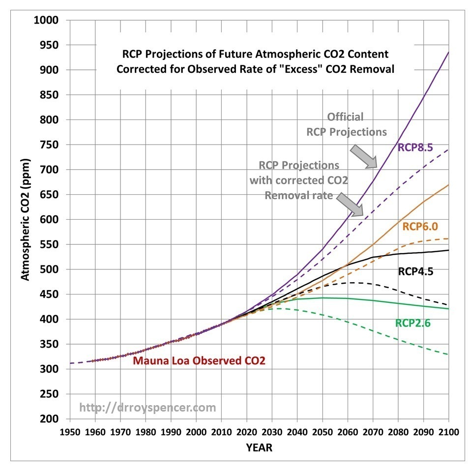
This raises the question of what the RCP scenarios of future atmospheric CO2 content would look like if their assumed emissions projections were combined with the Manua Loa-corrected excess CO2 removal rate of 2.3%/yr (above an assumed background value of 295 ppm). Those results are shown in Fig. 2.
Fig. 2. Four RCP scenarios of future atmospheric CO2 through 2100 (solid lines), and corrected for the observed rate of excess CO2 removal based upon Mauna Loa data (2.3%/yr of the CO2 excess above 295 ppm, dashed lines).
Now we can see the effect of just the differences in the carbon cycle models on the RCP scenarios: those full-blown models that try to address all of the individual components of the carbon cycle and how it changes as CO2 concentrations rise, versus my simple (but Mauna Loa data-supportive) model that only deals with the empirical observation that nature removes excess CO2 at a rate of 2.3%/yr of the atmospheric excess above 295 ppm.
This is an aspect of the RCP scenario discussion I seldom see mentioned: The realism of the RCP scenarios is not just a matter of what future CO2 emissions they assume, but also of the carbon cycle model which removes excess CO2 from the atmosphere.
Discussion
I will admit to knowing very little about the carbon cycle models used by the IPCC. I’m sure they are very complex (although I dare say not as complex as Mother Nature) and represent the state-of-the-art in trying to describe all of the various processes that control the huge natural flows of CO2 in and out of the atmosphere.
But uncertainties abound in science, especially where life (e.g. photosynthesis) is involved, and these carbon cycle models are built with the same philosophy as the climate models which use the output from the carbon cycle models: These models are built on the assumption that all of the processes (and their many approximations and parameterizations) which produce a reasonably balanced *average* carbon cycle picture (or *average* climate state) will then accurately predict what will happen when that average state changes (increasing CO2 and warming).
That is not a given.
Sometimes it is useful to step back and take a big-picture approach: What are the CO2 observations telling us about how the global average Earth system is responding to more atmospheric CO2? That is what I have done here, and it seems like a model match to such a basic metric (how fast is nature removing excess CO2 from the atmosphere, as the CO2 concentration rises) would be a basic and necessary test of those models.
According to Fig. 1, the carbon cycle models do not match what nature is telling us. And according to Fig. 2, it makes a big difference to the RCP scenarios of future CO2 concentrations in the atmosphere, which will in turn impact future projections of climate change.
Last night at the State of the Union Address, President Trump awarded radio talk show host and conservative commentator Rush Limbaugh the Presidential Medal of Freedom. If you haven’t heard, Rush was recently diagnosed with stage 4 lung cancer.
I cannot think of a more deserving recipient of our country’s highest civilian honor. Rush has been the most influential modern advocate for political conservatism and free markets, influencing millions of people not only here in the U.S., but in other countries where freedom is highly valued, if not by their government, then at least by some of their people. For over 30 years on his daily 3-hour radio show, he has done it with good humor, never straying from his principles, while still being entertaining.
His adherence to his principles has meant he does not always agree with Republican politicians, who sometimes stray from those principles. I recall standing around his pool table and him telling us how a senior adviser from President George W. Bush’s administration would fly down to his Palm Beach residence to pressure him into changing his position on some issue, which he refused to do.
Rush has always said that people who disagree with him usually do so, not because they have listened to him and dispute his views, but because of what the media says about him. He has inspired millions to stop waiting for the world to do something for them, and to start doing for themselves with hope and good cheer. He is the one who suggested I write my first book, Climate Confusion.
Some claim he is just an entertainer who doesn’t really believe all of what he says. But I can tell you from spending time with him, and from hundreds of conversations with him, that he is the real deal. His relatively modest upbringing and overcoming numerous obstacles in his personal and professional life have led him to mentor others in all walks of life, encouraging them to excel and to never give up. At least twice, he has taken time from his busy day to talk me down off the ledge when I was discouraged about criticism I receive in my work.
So, congratulations to someone who has helped to make America stronger, and who has inspired so many people around the world. This is a well-deserved honor bestowed upon a modern American treasure.
Posted in Blog Article | Comments Off on Limbaugh Receives the Presidential Medal of Freedom
The Energy Information Agency (EIA) projects a growth in energy-based CO2 emissions of +0.6%/yr through 2050. But translating future emissions into atmospheric CO2 concentration requires a global carbon budget model, and we frequently accept the United Nations reliance on such models to tell us how much CO2 will be in the atmosphere for any given CO2 emissions scenario. Using a simple time-dependent CO2 budget model forced with yearly estimates of anthropogenic CO2 emissions and optimized to match Mauna Loa observations, I show that the EIA emissions projections translate into surprisingly low CO2 concentrations by 2050. In fact, assuming constant CO2 emissions after 2050, the atmospheric CO2 content eventually stabilizes at just under 2XCO2.
Introduction
I have always assumed that we are on track for a doubling of atmospheric CO2 (“2XCO2”), if not 3XCO2 or 4XCO2. After all, humanity’s CO2 emissions continue to increase, and even if they stop increasing, won’t atmospheric CO2 continue to rise?
It turns out, the answer is probably “no”.
The rate at which nature removes CO2 from the atmosphere, and what controls that rate, makes all the difference.
Even if we knew exactly what humanity’s future CO2 emissions were going to be, how much Mother Nature takes out of the atmosphere is seldom discussed or questioned. This is the domain of global carbon cycle models which we seldom hear about. We hear about the improbability of the RCP8.5 concentration scenario (which has gone from “business-as-usual”, to “worst case”, to “impossible”), but not much about how those CO2 concentrations were arrived at from CO2 emissions data.
So, I wanted to address the question, What is the best estimate of atmospheric CO2 concentrations through the end of this century, based upon the latest estimates of future CO2 emissions, and taking into account how much nature has been removing from the atmosphere?
As we produce more and more CO2, the amount of CO2 removed by various biological and geophysical processes also goes up. The history of best estimates of yearly anthropogenic CO2 emissions, combined with the observed rise of atmospheric CO2 at Mauna Loa, Hawaii, tells us a lot about how fast nature adjusts to more CO2.
As we shall see, it is entirely possible that even if we continued producing large quantities of CO2, those levels in the atmosphere might eventually stabilize.
In their most recent 2019 report, the U.S. Energy Information Agency (EIA) projects that energy-based emissions of CO2 will grow at 0.6% per year until 2050, which is what I will use to project future atmospheric CO2 concentrations. I will show what this emissions scenario translates into using a simple atmospheric CO2 budget model that has been calibrated with the Mauna Loa CO2 observations. And we will see that the resulting remaining amount of CO2 in the atmosphere is surprisingly low.
A Review of the CO2 Budget Model
I previously presented a simple time-dependent CO2 budget model of global atmospheric CO2 concentration that uses (1) yearly anthropogenic CO2 emissions, along with (2) the central assumption (supported by the Mauna Loa CO2 data) that nature removes CO2 from the atmosphere at a rate in direct proportion to how high atmospheric CO2 is above some natural level the system is trying to ‘relax’ to.
As described in my previous blog post, I also included an empirical El Nino/La Nina term since El Nino is associated with higher CO2 in the atmosphere, and La Nina produces lower concentrations. This captures the small year-to-year fluctuations in CO2 from ENSO activity, but has no impact on the long-term behavior of the model.
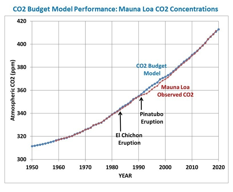
The model is initialized in 1750 with the Boden et al. (2017) estimates of year anthropogenic emissions, and produces an excellent fit to the Mauna Loa CO2 observations using the assumption of a baseline (background) CO2 level of 295 ppm and a natural removal rate of 2.33% per year of the atmospheric excess above that baseline.
Here is the resulting fit of the model to Mauna Loa data, with generally excellent results. (The post-Pinatubo reduction in atmospheric CO2 is believed to be due to increased photosynthesis due to an increase in diffuse sunlight penetration into forest canopies caused by the volcanic aerosols):
Fig. 1. Calibrated CO2 budget model compared to the Mauna Loa, Hawaii CO2 observations. The model is forced with the Boden et al. (2017) estimates of yearly anthropogenic CO2 emissions, and removes CO2 in proportion to the excess of atmospheric CO2 above a baseline value.
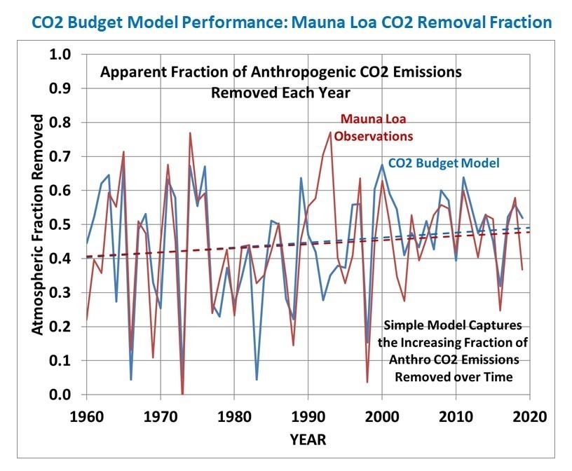
The model even captures the slowly increasing trend in the apparent yearly fractional removal of CO2 emissions.
Fig. 2. Yearly apparent fraction of anthropogenic emissions removed by nature, in the Mauna Loa observations (red) versus the model (blue).
Model Projections of Atmospheric CO2
I forced the CO2 model with the following two future scenario assumptions:
1) EIA assumption of 0.6% per year growth in emissions through 2050 2) Constant emissions from 2050 onward
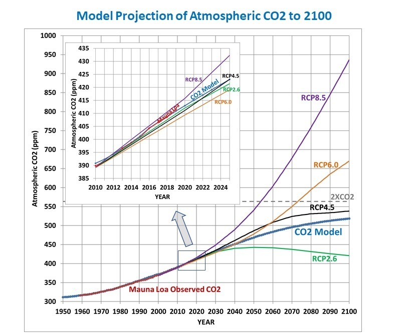
The resulting CO2 concentrations are shown in Fig. 3, along with the UN/IPCC CO2 concentration scenarios, RCP2.6, RCP4.5, RCP6.0, and RCP8.5, used in the CMIP5 climate model projections.
Interestingly, with these rather reasonable assumptions regarding CO2 emissions, the model does not even reach a doubling of atmospheric CO2, and reaches an equilibrium CO2 concentration of 541 ppm in the mid-2200s.
Discussion
In my experience, the main complaint about the current model will be that it is “too simple” and therefore probably incorrect. But I would ask the reader to examine how well the simple model assumptions explain 60 years of CO2 observations (Figs. 1 & 2).
Also, I would recall the faulty predictions many years ago by the global carbon cycle modelers that the Earth system could not handle so much atmospheric CO2, and that the fraction which is removed over time would start to decrease. As Fig. 2 (above) shows, that has not happened. Maybe when it comes to photosynthesis, more life begets still more life, leading to a slowly increasing ability of the biosphere to remove excess CO2 from the atmosphere.
Given the large uncertainties in how the global carbon cycle responds to more CO2 in the atmosphere, it is entirely reasonable to hypothesize that the rate at which the ocean and land removes CO2 from the atmosphere is simply proportional to how high the atmospheric concentration gets above some baseline value. This simple hypothesis does not necessarily imply that the processes controlling CO2 sources and sinks are also simple; only that the net global rate of removal of atmospheric CO2 can be parameterized in a very simple form.
The Mauna Loa CO2 data clearly supports that hypothesis (Fig. 1 and Fig. 2). And the result is that, given the latest projections of CO2 emissions, future CO2 concentrations will not only be well below the RCP8.5 scenario, but might not even be as high as RCP4.5, with atmospheric CO2 concentrations possibly not even reach a doubling (560 ppm) of estimated pre-Industrial levels (280 ppm) before leveling off. This result is even without future reductions in CO2 emissions, which is a possibility as new energy technologies become available.
I think this is at least as important an issue to discuss as the implausibility (impossibility?) of the RCP8.5 scenario. And it raises the question of just how good the carbon cycle models are that the UN IPCC depends upon to translate anthropogenic emissions to atmospheric CO2 observations.
The increasing global ocean heat content (OHC) is often pointed to as the most quantitative way to monitor long-term changes in the global energy balance, which is believed to have been altered by anthropogenic greenhouse gas emissions. The challenge is that long-term temperature changes in the ocean below the top hundred meters or so become exceedingly small and difficult to measure. The newer network of Argo floats since the early 2000s has improved global coverage dramatically.
A new Cheng et al. (2020) paper describing record warm ocean temperatures in 2019 has been discussed by Willis Eschenbach who correctly reminds us that such “record setting” changes in the 0-2000 m ocean heat content (reported in Zettajoules, which is 10^^21 Joules) amount to exceedingly small temperature changes. I calculate from their data that 2019 was only 0.004 0.009 deg. C warmer than 2018.
Over the years I have frequently pointed out that the global energy imbalance (less than 1 W/m2) corresponding to such small rates of warming is much smaller than the accuracy with which we know the natural energy flows (1 part in 300 or so), which means Mother Nature could be responsible for the warming and we wouldn’t even know it.
The Cheng (2017) dataset of 0-2000m ocean heat content changes extends the OHC record back to 1940 (with little global coverage) and now up through 2019. The methodology of that dataset uses optimum interpolation techniques to intelligently extend the geographic coverage of limited data. I’m not going to critique that methodology here, and I agree with those who argue creating data where it does not exist is not the same as having real data. Instead I want to answer the question:
If we take the 1940-2019 global OHC data (as well as observed sea surface temperature data) at face value, and assume all of the warming trend was human-caused, what does it imply regarding equilibrium climate sensitivity (ECS)?
Let’s assume ALL of the warming of the deep oceans since 1940 has been human-caused, and that the Cheng dataset accurately captures that. Furthermore, let’s assume that the HadSST sea surface temperature dataset covering the same period of time is also accurate, and that the RCP radiative forcing scenario used by the CMIP5 climate models also represents reality.
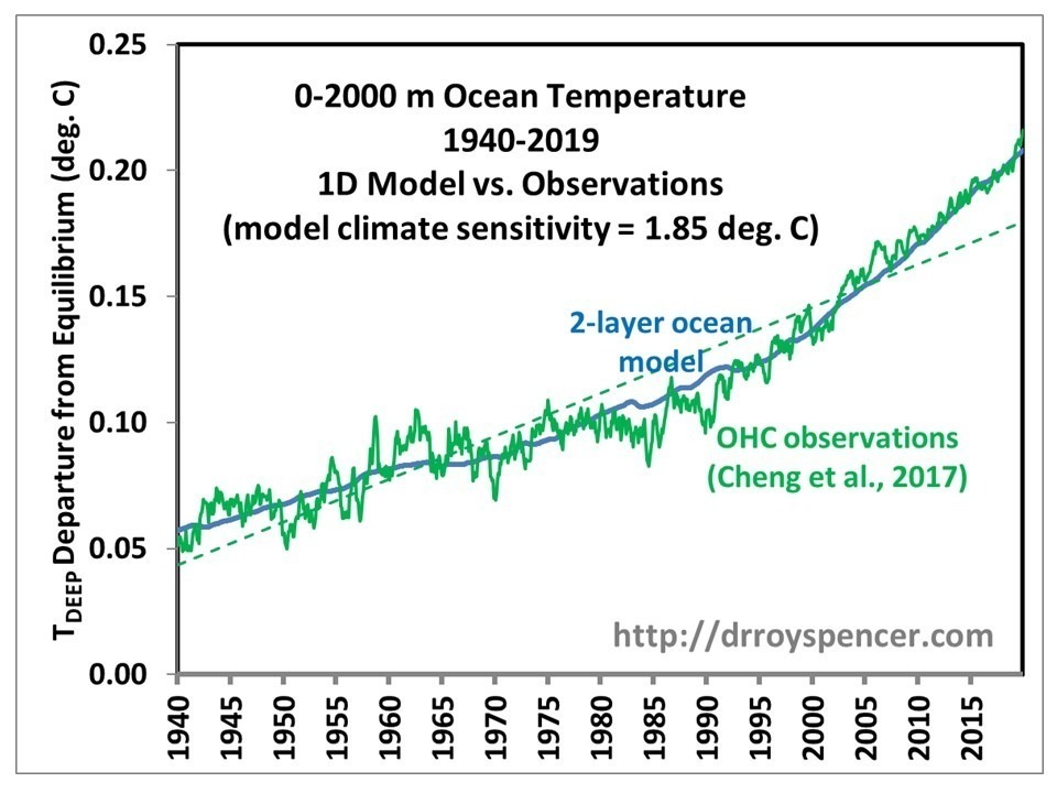
I updated my 1D model of ocean temperature with the Cheng data so that I could match its warming trend over the 80-year period 1940-2019. That model also includes El Nino and La Nina (ENSO) variability to capture year-to-year temperature changes. The resulting fit I get with an assumed equilibrium climate sensitivity of 1.85 deg. C is shown in the following figure.
Fig. 1. Deep-ocean temperature variations 1940-2019 explained with a 2-layer energy budget model forced with RCP6 radiative forcing scenario and a model climate sensitivity of 1.85 deg. C. The model also matches the 1940-2019 and 1979-2019 observed sea surface temperature trends to about 0.01 C/decade. If ENSO effects are not included in the model, the ECS is reduced to 1.7 deg. C.
Thus, based upon basic energy budget considerations in a 2-layer ocean model, we can explain the IPCC-sanctioned global temperature datasets with a climate sensitivity of only 1.85 deg. C. And even that assumes that ALL of the warming is due to humans which, as I mentioned before, is not known since the global energy imbalance involved is much smaller than the accuracy with which we know natural energy flows.
If I turn off the ENSO forcing I have in the model, then after readjusting the model free parameters to once again match the observed temperature trends, I get about 1.7 deg. C climate ECS. In that case, there are only 3 model adjustable parameters (ECS, the ocean top layer thickness [18 m], and the assumed rate or energy exchange between the top layer and the rest of the 0-2000m layer, [2.1 W/m2 per deg C difference in layer temperatures away from energy equilibrium]). Otherwise, there are 7 model adjustable parameters in the model with ENSO effects turned on.
For those who claim my model is akin to John von Neumann’s famous claim that with 5 variables he can fit an elephant and make its trunk wiggle, I should point out that none of the model’s adjustable parameters (mostly scaling factors) vary in time. They apply equally to each monthly time step from 1765 through 2019. The long-term behavior of the model in terms of trends is mainly governed by (1) the assumed radiative forcing history (RCP6), (2) the assumed rate of heat storage (or extraction) in the deep ocean as the surface warms (or cools), and (3) the assumed climate sensitivity, all within an energy budget model with physical units.
My conclusion is that the observed trends in both surface and deep-layer temperature in the global oceans correspond to low climate sensitivity, only about 50% of what IPCC climate models produce. This is the same conclusion as Lewis & Curry made using similar energy budget considerations, but applied to two different averaging periods about 100 years apart rather than (as I have done) in a time-dependent forcing-feedback model.
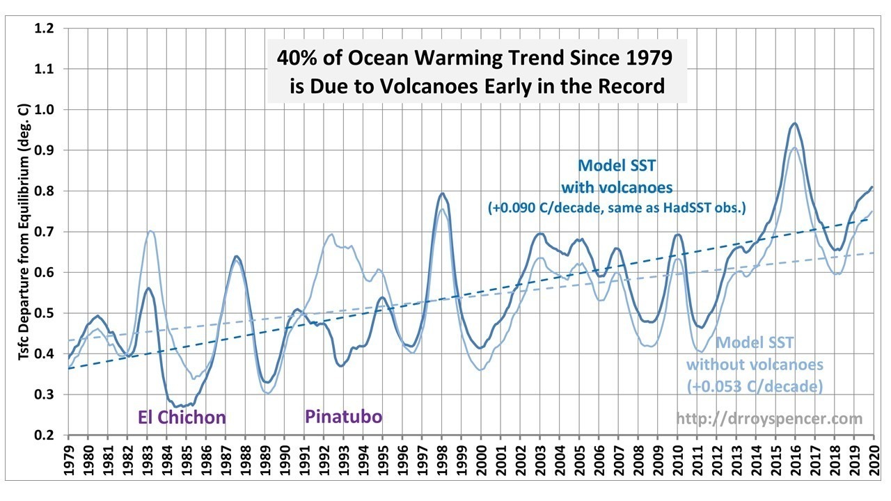
In 2017, Christy & McNider published a study where they estimated and removed the volcanic effects from our UAH lower tropospheric (LT) temperature record, finding that 38% of the post-1979 warming trend was due to volcanic cooling early in the record.
Yesterday in my blog post I showed results from a 1D 2-layer forcing-feedback ocean model of global-average SSTs and deep-ocean temperature variations up through 2019. The model is forced with (1) the RCP6 radiative forcings scenario (mostly increasing anthropogenic greenhouse gases and aerosols and volcanoes) and (2) the observed history of El Nino and La Nina activity as expressed in the Multivariate ENSO Index (MEI) dataset. The model was optimized with adjustable parameters, with two of the requirements being model agreement with the HadSST global temperature trend during 1979-2019, and with deep-ocean (0-2000m) warming since 1990.
Since the period since 1979 is of such interest, I re-ran the model with the RCP6 volcanic aerosol forcing estimates removed. The results are shown in Fig. 1.
Fig. 1. 1D model simulation of global (60N-60S) average sea surface temperature departures from assumed energy equilibrium (in 1765), with and without the RCP6 volcanic radiative forcings included.
The results show that 41% of the ocean warming in the model was simply due to the two major volcanoes early in the record. This is in good agreement with the 38% estimate from the Christy & McNider study.
It is interesting to see the “true” warming effects of the 1982-83 and 1991-1993 El Nino episodes, which were masked by the eruptions. The peak model temperatures in those events were only 0.1 C below the record-setting 1997-98 El Nino, and 0.2 C below the 2015-16 El Nino.
This is not a new issue, of course, as Christy & McNider also published a similar analysis in Nature in 1994.
These volcanic effects on the post-1979 warming trend should always be kept in mind when discussing the post-1979 temperature trends.
NOTE: In a previous version of this post I suggested that the Christy & McNider (1994) paper had been scrubbed from Google. It turns out that Google could not find it if the authors’ middle initials were included(but DuckDuckGo had no problem finding it).

 Home/Blog