Archive for the ‘Blog Article’ Category

New Santer et al. Paper on Satellites vs. Models: Even Cherry Picking Ends with Model Failure

Tuesday, October 18th, 2016

(the following is mostly based upon information provided by Dr. John Christy)

Dr. John Christy’s congressional testimonies on 8 Dec 2015 and 2 Feb 2016 in which he stated that climate models over-forecast climate warming by a factor of 2.5 to 3, apparently struck a nerve in Climate Consensus land.

In a recently published paper in J. Climate entitled Comparing Tropospheric Warming in Climate Models and Satellite Data, Santer et al. use a combination of lesser-known satellite datasets and neglect of radiosonde data to reduce the model bias to only 1.7 times too much warming.

Wow. Stop the presses.

Part of the new paper’s obfuscation is a supposed stratospheric correction to the mid-tropospheric temperature channel the satellite datasets use. Of course, Christy’s comparisons between models and satellite data are always apples-to-apples, so the small influence of the stratosphere on the MT channel is included in both satellite and climate model data. The stratospheric correction really isn’t needed in the tropics, where the model-observation bias is the largest, because there is virtually no stratospheric influence on the MT channel there.

Another obfuscation is the reference the authors make to previously-published radiosonde comparisons:

“we do not compare model results with radiosonde-based atmospheric temperature measurements, as has been done in a number of previous studies (Gaffen et al. 2000; Hegerl and Wallace 2002; Thorne et al. 2007, 2011; Santer et al. 2008; Lott et al. 2013).”

Conveniently omitted from the list are the most extensive radiosonde comparisons published (Christy, J.R., R.W. Spencer and W.B Norris, 2011: The role of remote sensing in monitoring global bulk tropospheric temperatures. Int. J. Remote Sens. 32, 671-685, and references therein). This is the same kind of marginalization I have experienced in my previous research life in satellite rainfall estimation. By publishing a paper and ignoring the published work of others, they can marginalize your influence on the research community at large. They also keep people from finding information that might undermine the case they are trying to build in their paper.

John Christy provides this additional input:

My testimony in Dec 2015 and Feb 2016 included all observational datasets in their latest versions at that time. Santer et al. neglected the independent datasets generated from balloon measurements. The brand new “hot” satellite dataset (NOAAv4.0) used by Santer et al. to my knowledge has no documentation.

Here is my testimony of 2 Feb 2016 (pg 5):

I’ve shown here that for the global bulk atmosphere, the models overwarm the atmosphere by a factor of about 2.5. As a further note, if one focuses on the tropics, the models show an even stronger greenhouse warming in this layer … the models over-warm the tropical atmosphere by a factor of approximately 3.

Even when we use the latest satellite datasets used by Santer, these are the results which back up my testimony.

Global MT trends (1979-2015, C/decade) & magnification factor models vs. dataset:


102ModelAvg +0.214
___UWein(2) +0.090 2.38x radiosonde
_____RATPAC +0.087 2.47x radiosonde
_______UNSW +0.092 2.33x radiosonde
____UAHv6.0 +0.072 2.97x satellite
____RSSv4.0 +0.129 1.66x satellite
___NOAAv4.0 +0.136 1.57x satellite
________ERA +0.082 2.25x reanalysis

The range of model warming rate magnification versus observational datasets goes from 1.6x (NOAAv4.0) to 3.0x with median value of 2.3x for models warming faster than the observations.

Tropical MT trends (1979-2015, C/decade) & magnification factor models vs. dataset:


102ModelAvg +0.271
___UWein(2) +0.095 2.85x radiosonde
_____RATPAC +0.068 3.96x radiosonde
_______UNSW +0.073 3.69x radiosonde
____UAHv6.0 +0.065 4.14x satellite
____RSSv4.0 +0.137 1.98x satellite
___NOAAv4.0 +0.160 1.69x satellite
________ERA +0.082 3.31x reanalysis

Range goes from 1.7 (NOAAv4.0) to 4.1 with a median value of 3.3 for the models warming faster than the observations.

Therefore, the testimony of 2 Feb 2016 is corroborated by the evidence.

Overall, it looks to me like Santer et al. twist themselves into a pretzel by cherry picking data, using a new hot satellite dataset that appears to be undocumented, ignores independent (radiosonde) evidence (since it does not support their desired conclusion), and still arrives at a substantial 1.7x average bias in the climate models warming rates.

Global Warming be Damned: Record Corn, Soybeans, Wheat

Friday, October 14th, 2016

For many years we have been warned that climate change is creating a “climate crisis”, with heat and drought reducing agricultural yields to the point that humanity will suffer. Every time there’s a drought, we are told that this is just one more example of human-caused climate change.

But droughts have always occurred. The question is: Are they getting worse? And, has modest warming had any effects on grain yields?

We have yet to experience anything like the Dust Bowl drought of the 1930s, or the mega-droughts the western U.S. tree ring record suggests occurred in centuries past.

And even if they do occur, how do we know they were not caused by the same natural factors that cause those previous droughts? While “global warming” must cause more precipitation overall (because there is more evaporation), whether this means increased drought conditions anywhere is pretty difficult to predict because it would require predicting an average change in weather patterns, which climate models so far have essentially no skill at.

So, here we are with yet another year (2016) experiencing either record or near-record yields in corn, soybeans, and wheat. Even La Nina, which was widely feared would cause reduced crop yields this year, did not materialize.

How can this be?

How has Climate Changed in the U.S. Corn Belt?

Let’s start with precipitation for the main growing months of June-July-August over the 12-state Corn Belt (IL, IN, IA, KS, NE, ND, SD, MO, WI, MN, MI, OH). All data come from official NOAA sources. Since 1900, if anything, there has been a slight long-term increase in growing season precipitation:

corn-belt-precip-jja-thru-2016

In fact, the last three years (2014-16) has seen the highest 3-yr average precip amount in the entire record.

If we examine temperature, there has been some warming in recent decades, but nothing like that predicted for the same region from the CMIP5 climate models:

corn-belt-temp-jja-thru-2016-vs-42-cmip5-models

That plot alone should tell you that something is wrong with the climate models. It’s not even obvious a statistically significant warming has occurred, let alone attribute it to a cause, given all of the adjustments (or lack of proper adjustments) that have been made to the surface thermometer data over the years. Note the models also cannot explain the Dust Bowl warmth of the 1930s, because the models do not mimic the natural changes in Pacific Ocean circulation which are believed to be the cause.

So, has Climate Change Not Influenced Grain Yields?

Let’s assume the temperature and precipitation observations accurately reveal what has really happened. Has climate change since 1960 impacted corn yields in the U.S.?

As part of some consulting I do for a company that monitors grain markets and growing conditions around the world, last year I quantified how year-to-year variations in U.S. corn yields depend on year-to-year changes in precipitation and temperature, over the period 1960 through 2014. I then applied that relationship to the long-term trends in precipitation and temperature.

What I found was that there might be a small long-term decrease in yields due to climate change, but it is far exceeded by technological advancements that increase yields.

In fact, based upon studies of the dependence of corn yield on CO2 fertilization, the negative climate impact is even outweighed by the CO2 fertilization effect alone. (More CO2 is well known to fertilize, as well as increase drought tolerance and make plants more efficient in their water use).

The people I know in the grain trading business do not even factor in climate change…primarily because they do not yet see evidence of it.

It might well be there…but it is so overwhelmed by other positive factors, especially improved varieties, that it cannot be observed in corn yield data. In fact, if varieties can be made more heat tolerant, it might be that there will be no climate change impact on yields.

So, once again, claims of severe agricultural impacts from climate change continue to reside in the realm of science fiction….in the future, if at all.

4,001 Days: The Major Hurricane Drought Continues

Friday, October 7th, 2016

Also, The Hurricane Center Doesn’t Overestimate…But It Does Over-warn

matthew-hype-cartoon

Today marks 4,001 days since the last major hurricane (Wilma in 2005) made landfall in the United States. A major hurricane (Category 3 to 5) has maximum sustained winds of at least 111 mph, and “landfall” means the center of the hurricane eye crosses the coastline.

This morning it looks like Matthew will probably not make landfall along the northeast coast of Florida. Even if it does, its intensity is forecast to fall below Cat 3 strength this evening. The National Hurricane Center reported at 7 a.m. EDT that Cape Canaveral in the western eyewall of Matthew experienced a wind gust of 107 mph.

(And pleeeze stop pestering me about The Storm Formerly Known as Hurricane Sandy, it was Category 1 at landfall. Ike was Cat 2.)

While coastal residents grow weary of “false alarms” when it comes to hurricane warnings, the National Weather Service has little choice when it comes to warning of severe weather events like tornadoes and hurricanes. Because of forecast uncertainty, the other option (under-warning) would inevitably lead to a catastrophic event that was not warned.

This would be unacceptable to the public. Most of us who live in “tornado alley” have experienced dozens if not hundreds of tornado warnings without ever seeing an actual tornado. I would wager that hurricane conditions are, on average, experienced a small fraction of the time that hurricane warnings are issued for any given location.

The “maximum sustained winds” problem

Another issue that is not new is the concern that the “maximum sustained winds” reported for hurricanes are overestimated. I doubt this is the case. But there is a very real problem that the area of maximum winds usually covers an extremely small portion of the hurricane. As a result, seldom does an actual anemometer (wind measuring device) on a tower measure anything close to what is reported as the maximum sustained winds. This is because there aren’t many anemometers with good exposure and the chances of the small patch of highest winds hitting an instrumented tower are pretty small.

It also raises the legitimate question of whether maximum sustained winds should be focused on so much when hurricane intensity is reported.

Media hype also exaggerates the problem. Even if the maximum sustained wind estimate was totally accurate, the area affected by it is typically quite small, yet most of the warned population is under the impression they, personally, are going to experience such extreme conditions.


How are maximum sustained winds estimated?

Research airplanes fly into western Atlantic hurricanes and measure winds at flight level in the regions most likely to have the highest winds, and then surface winds are estimated from average statistical relationships. Also, dropsonde probes are dropped into high wind regions and GPS tracking allows near-surface winds to be measured pretty accurately. Finally, a Stepped Frequency Microwave Radiometer (SFMR) on board the aircraft measures the roughness of the sea surface to estimate wind speed.

As the hurricane approaches the U.S. coastline, doppler radar also provides some ability to measure wind speeds from the speed of movement of precipitation blowing toward or away from the radar.

I don’t think we will solve the over-warning problem of severe weather events any time soon.

And it looks like the major hurricane drought for the U.S. is probably going to continue.

Matthew Could Get Loopy, Hit Florida Twice

Wednesday, October 5th, 2016

(UPDATED 7:25 a.m. EDT Thursday October 6)

Several days ago, it seemed unlikely that Major Hurricane Matthew, now with 125 mph sustained winds, would come close enough to the east coast of Florida to pose a serious threat.

But now many of the recent weather forecast model runs have Matthew possibly hitting the Sunshine State twice, separated by about 4-5 days during which the hurricane does a complete loop and return to the state weaker, probably as a Tropical Storm (model graphic courtesy of WeatherBELL.com):

loopy-matthew-2

This is a large departure from previous forecasts, and the National Hurricane Center’s discussion this morning is still hinting at the new scenario where Matthew does not recurve poleward the way most hurricanes do. It’s possible Matthew will then cross Florida and enter the Gulf of Mexico. Such unusual hurricane tracks are particularly difficult to forecast.

Of course, the worst impacts will be along the eastern shore of Florida tonight and Friday as Matthew is supposed to arrive as an historic Category 4 storm, making landfall 4,001 days after the last major hurricane (Cat 3 or stronger) hit the U.S. (Wilma in 2005).

If “Loopy Matthew” hits Florida twice, I suppose it’s fitting that it affords Florida coastal residents a chance to hold the longest hurricane party ever.

UAH Global Temperature Update for September 2016: +0.44 deg. C

Monday, October 3rd, 2016

September Temperature Unchanged from August

NOTE: This is the eighteenth monthly update with our new Version 6.0 dataset. Differences versus the old Version 5.6 dataset are discussed here. Note we are now at “beta5” for Version 6, and the paper describing the methodology has been conditionally accepted for publication.

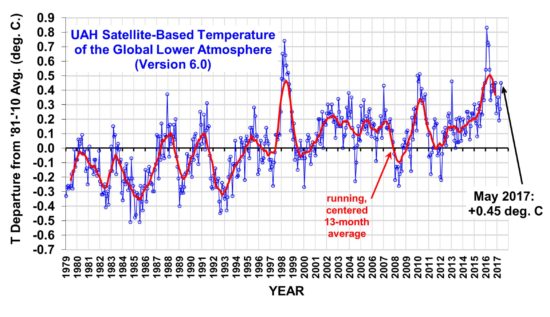
The Version 6.0 global average lower tropospheric temperature (LT) anomaly for September 2016 is +0.44 deg. C, statistically unchanged from the August, 2016 value of +0.43 deg. C (click for full size version):

uah_lt_1979_thru_september_2016_v6

[Note that the August value of +0.43 is changed slightly from its previously reported value of +0.44. This is because inter-satellite calibrations are improved with each additional month of global data, which can change previous months’ results by several thousandths of a degree.]

The global, hemispheric, and tropical LT anomalies from the 30-year (1981-2010) average for the last 21 months are:

YEAR MO GLOBE NHEM. SHEM. TROPICS
2015 01 +0.30 +0.44 +0.15 +0.13
2015 02 +0.19 +0.34 +0.04 -0.07
2015 03 +0.18 +0.28 +0.07 +0.04
2015 04 +0.09 +0.19 -0.01 +0.08
2015 05 +0.27 +0.34 +0.20 +0.27
2015 06 +0.31 +0.38 +0.25 +0.46
2015 07 +0.16 +0.29 +0.03 +0.48
2015 08 +0.25 +0.20 +0.30 +0.53
2015 09 +0.23 +0.30 +0.16 +0.55
2015 10 +0.41 +0.63 +0.20 +0.53
2015 11 +0.33 +0.44 +0.22 +0.52
2015 12 +0.45 +0.53 +0.37 +0.61
2016 01 +0.54 +0.69 +0.39 +0.84
2016 02 +0.83 +1.17 +0.50 +0.99
2016 03 +0.73 +0.94 +0.52 +1.09
2016 04 +0.71 +0.85 +0.58 +0.94
2016 05 +0.55 +0.65 +0.44 +0.72
2016 06 +0.34 +0.51 +0.17 +0.38
2016 07 +0.39 +0.48 +0.30 +0.48
2016 08 +0.43 +0.55 +0.32 +0.50
2016 09 +0.44 +0.50 +0.39 +0.37

The pause in El Nino cooling continues as recent Climate Prediction Center forecasts have been leaning more toward ENSO-neutral condtions rather than La Nina.

To see how we are now progressing toward a record warm year in the satellite data, the following chart shows the average rate of cooling for the rest of 2016 that would be required to tie 1998 as warmest year in the 38-year satellite record:

uah-v6-lt-with-2016-projection

Based upon this chart, as we enter the home stretch, it looks increasingly like 2016 might be a new record-warm year (since the satellite record began in 1979) in the UAH dataset.

The “official” UAH global image for September, 2016 should be available in the next several days here.

The new Version 6 files (use the ones labeled “beta5”) should be updated soon, and are located here:

Lower Troposphere: http://vortex.nsstc.uah.edu/data/msu/v6.0beta/tlt/uahncdc_lt_6.0beta5.txt
Mid-Troposphere: http://vortex.nsstc.uah.edu/data/msu/v6.0beta/tmt/uahncdc_mt_6.0beta5.txt
Tropopause: http://vortex.nsstc.uah.edu/data/msu/v6.0beta/ttp/uahncdc_tp_6.0beta5.txt
Lower Stratosphere: http://vortex.nsstc.uah.edu/data/msu/v6.0beta/tls/uahncdc_ls_6.0beta5.txt

2+2=4

Sunday, October 2nd, 2016

2+2=4.

Matthew to Arrive 4,000 days after Last Major Hurricane

Thursday, September 29th, 2016

Updated 7:30 a.m. EDT Saturday, Oct. 1.

Major Hurricane Matthew was briefly a Category 5 hurricane overnight, the first Cat 5 in the Atlantic in nine years. It now has 155 mph sustained winds, making it a strong Category 4 storm on the Saffir-Simpson scale.

Matthew is over the south-central Caribbean, traveling slowly westward, but a turn to the north is expected on Sunday. Matthew is expected to cross eastern Cuba Tuesday morning and possibly make U.S. landfall somewhere on the East Coast around next Friday or Saturday.

Thursday will mark exactly 4,000 days after Major Hurricane Wilma’s landfall.

Hurricane Wilma, the last major hurricane (Cat 3 or stronger) to hit the U.S., struck Florida on October 24, 2005. Will Matthew arrive as the first major hurricane to strike the U.S. in almost 11 years? Only time will tell. (Sandy was Cat 1 at landfall, and technically not a hurricane at that time. Hurricane Ike, 2008, was a Cat 2.)

Here is the latest GFS model forecast for Matthew on midnight Sunday, Oct. 9 (graphics courtesy of Weatherbell.com):

gfs_mslp_uv10m_ma_33

That particular forecast, which remains very uncertain this far in advance, has Matthew making landfall at Cape Hatteras, Cape Cod, and then going inland in Maine. Here is the spread of model forecasts from NOAA’s GEFS ensemble forecast system:

gefs_al14_2016100100

The Faster a Planet Rotates, the Warmer its Average Temperature

Wednesday, September 28th, 2016

This is a followup to my post from yesterday where I provided time-dependent model results of the day-night cycle in lunar temperatures.

One of the fascinating things about the model result (which I would not have expected) is that all other things being equal, the faster a solar-illuminated planet rotates, the warmer its average temperature will be. The calculations I provided are for planets without an atmosphere (e.g. the Moon).

Before examining the issue, I would have guessed that the rotation rate would not matter. Or, maybe I would have guessed that a more-slowly rotating planet would get warmer, since the period of sunlight is longer and higher daytime temperatures would be achieved.

But I would have been wrong.

Simple Thought Experiment

The reason is very simple, and is related to the non-linearity of the Stefan-Boltzmann equation, which can be used to estimate how warm a body gets based upon the rate at which it absorbs solar energy when its only mechanism to cool is through thermal emission of radiation:

Fig. 1. The non-linearity of the Stefan-Boltzmann equation can lead to very different average planetary temperatures given the same long-term average absorbed solar flux.

Fig. 1. The non-linearity of the Stefan-Boltzmann equation can lead to very different average planetary temperatures given the same long-term average absorbed solar flux.

Imagine a body with a realistic heat capacity that uniformly absorbs a solar intensity of 1,000 Watts per sq. meter for 1 second, then 0 W/m2 for one second, over and over. Think of it as a 2 sec long diurnal cycle. That rapidly flickering energy source would be too fast for the temperature to come into equilibrium with the absorbed sunlight (or lack of sunlight). It would, in effect, be like a continuous energy source of 500 W/m2 in intensity, and the resulting S-B temperature (assuming a thermal radiative emissivity of 1.0) would be about 307 Kelvin, taken from the curve in Fig. 1.

Now imagine the energy source stays on for a very long time, say 10,000 days, then stays off for 10,000 days (a 20,000 day diurnal cycle…the Moon has a 29.5 day diurnal cycle). From Fig. 1 we see that during the daytime the temperature would approach 365 Kelvin, and at night it would approach 0 Kelvin. In this case the average temperature would be about 182 Kelvin…which is 125 deg. colder than 307 K!

The only difference in the two imaginary cases is the length of the day/night cycle. The long-term average rate of absorbed sunlight is the same.

Yesterday I showed that the difference in rotation rate between the Earth and the Moon caused the more-slowly rotating Moon to be about 55 deg. colder than the Earth, all other things being equal (no atmosphere, the same albedo and IR emissivity, and a surface bulk heat capacity which gives model temperatures than match actual lunar observations). The effect is muted the greater the surface bulk heat capacity, since that also reduces the diurnal temperature range.

Basically, any process which increases the day-night temperature range (such as a longer diurnal cycle) will decrease the average temperature of a planet, simply because of the non-linearity of the S-B equation. I suspect the effect does not exist if the surface being heated has zero heat capacity, since the temperature of the surface will instantly come into equilibrium with the absorbed sunlight; in that case the length of day would not matter. But since that is physically impossible, it does not apply to real planets.

Errors in Estimating Earth’s No-Atmosphere Average Temperature

Tuesday, September 27th, 2016

ABSTRACT
While the non-linearity of the Stefan-Boltzmann equation leads to at least a 60 deg. C overestimate of the Moon’s average surface temperature if a global-average solar flux is used in place of computing temperatures over a sphere with a diurnal cycle, the error is only about 5 deg. C for the Earth. The difference is due the the very long lunar day (29.5 Earth days), which causes a very large diurnal cycle in temperature, which enhances the errors arising from the nonlinearity of the S-B equation.

PrintThe greenhouse effect is often claimed to cause an average warming of the Earth’s surface of about 33 deg. C, from an atmosphere-free value of about 255 K to the observed value of around 288 K. In the no-atmosphere case, the absorbed solar flux heats the surface up until the thermal emission of longwave radiation matches the intensity of absorbed sunlight.

Typically this theoretical average surface temperature is computed using a global average of the absorbed solar flux, and then using the Stefan-Boltzmann equation to find the emitting temperature that matches it.

But the strong nonlinearity of how the S-B flux depends upon temperature can lead to a warm bias in the no-atmosphere temperature estimate if a wide range of solar fluxes are used in a single average:

Fig. 1. The non-linearity of the Stefan-Boltzmann equation leads to a warm bias if a global average solar flux is used to estimate a global average equivalent emitting temperature.

Fig. 1. The non-linearity of the Stefan-Boltzmann equation leads to a warm bias if a global average solar flux is used to estimate a global average equivalent emitting temperature.

If the absorbed solar flux does not vary much over the spherical shape of a planet without an atmosphere, then using a global-average solar flux will give a pretty good estimate of the global average surface temperature.

But the absorbed solar flux actually varies a lot over a spherical planet.

So, just how large of an error is introduced by the use of a global average flux to calculate an average temperature? (My recent discussions with David South, an Auburn forestry professor, led me to reexamine this issue.)

In the case of the Moon, the error is very large. As has been pointed out elsewhere (e.g. by Willis Eschenbach here, and Nikolov & Zeller here), extreme day-night temperature swings on the Moon can cause a single-solar flux estimate of surface temperature to be biased very high, due to the nonlinearity of the S-B equation. The error can be many tens of degrees C.

Clearly, the 33 deg. C estimate for the Earth’s atmospheric greenhouse effect depends upon how accurate our estimate is of the average surface temperature of the Earth without an atmosphere. (I won’t go into the reasons why we really don’t know what the Earth would look like without an atmosphere, which affects it’s albedo and thus how much sunlight it would absorb, which in turn will impact the temperature calculation).

Since the non-linearity induced error depends upon just how hot surface temperature gets during the daytime, you need to do the calculations using a diurnal cycle, including how deep the solar heating (and nighttime cooling) penetrates into the surface. Also, obviously, the calculations need to be done on a sphere.

So, I put together this model spreadsheet that allows you to change planets (through the assumed solar irradiance), the assumed solar albedo of the atmosphere-free planet, surface longwave emissivity, and how deep of a water/soil layer is assumed to change in its temperature in response to imbalances between absorbed sunlight and thermally-emitted longwave radiation.

The time-dependent calculations are done in 96 increments of a day, which is 15 minutes for the Earth, at latitudes of 5, 15, 25, 35, 45, 55, 65, 75, and 85 degrees separately at assumed equinox conditions. Cosine latitude weighting then gives a pretty good estimate of the area averaged temperature over the sphere. It can take up to a couple weeks for the polar regions to finally equilibrate when the model is initialized at absolute zero temperature. The plots that follow are after 40 day-night cycles of the model run.

When I run the model for the Moon, which has a 29.5 Earth-day diurnal cycle, I found that I needed a soil layer of about 0.05 meters depth (about 2 inches) to match actual temperature measurements on the Moon (see Willis’s post here for some actual lunar temperature measurements). This is the thickness of soil assumed to be uniform in temperature that responds to solar heating and IR cooling. Of course, in reality the very top of the soil surface will get the hottest/coldest, with the temperature swings dampening strongly with depth; the model just uses a thin, uniform-temperature layer that approximates the average behavior of the real, thicker layer.

Fig. 2. Diurnal cycle in lunar surface temperatures at different latitudes calculated from a simple time-dependent model during equinox conditions.

Fig. 2. Diurnal cycle in lunar surface temperatures at different latitudes calculated from a simple time-dependent model during equinox conditions.

Significantly, the resulting global area average lunar temperature of 212 K is 61 K colder than the 273 K one gets by just putting the global average absorbed solar flux through the S-B equation to get a single temperature. As discussed by Willis, this shows the large bias that can result from S-B equation calculations when one doesn’t bother to average over a wide range of temperatures.

So, How Large is the S-B Bias in Earth Temperature Calculations?

Just how big is this warm bias effect when computing what the Earth’s global average surface temperature would be in the absence of an atmosphere?

If I repeat the model calculations in Fig. 2 and only change the length of the diurnal cycle, from 29.5 Earth days (for the Moon) to 1 day, we get (obviously) a greatly reduced diurnal range in temperature (22 deg. C diurnal range, global average, versus 209 deg. C diurnal range for the Moon), and a global average surface temperature of 267 K. This is only 6 deg. below the 273 K value using a single solar flux in the S-B equation:

Fig. 3. As in Fig. 2, but with a 24 hr (Earth) diurnal cycle rather than 29.5 days (lunar diurnal cycle).

Fig. 3. As in Fig. 2, but with a 24 hr (Earth) diurnal cycle rather than 29.5 days (lunar diurnal cycle).

If I use the more traditionally-used Earth albedo value of 0.3, I get a global average surface temperature of 251 K, which is only 5 deg. C below the single solar flux calculation of 256 K. Thus, the error caused by using a single global average solar flux to estimate a global average terrestrial temperature in the S-B equation is much less for the Earth than it is for the Moon.

Fig. 4. As in Fig. 3, but using a solar albedo of 0.3 rather than 0.1.

Fig. 4. As in Fig. 3, but using a solar albedo of 0.3 rather than 0.1.

Conclusion

Using the S-B equation with a global average absorbed solar flux to compute the global average emitting temperature of the Moon leads to a very large warm bias, as reported by others.

But that lunar bias (about 60 deg. C) is mostly due to the very long period of daylight on the moon, which is 29.5 times longer than on Earth. When the Earth’s diurnal cycle length is used, the warm bias is only about 5 deg. C.

One might then wonder if this means that the 33 deg. C greenhouse effect on Earth should really be 38 deg. C?

Maybe…but I would say that the 33 deg. C number is suspect anyway. First, because it depends upon an albedo of 0.3, which is probably too high. If I use a lunar albedo for the Earth, then the GHE becomes only 21 deg. C with the new calculations. One might wonder if the no-atmosphere Earth would be ice covered, with a very high albedo and very low surface temperatures, but the existence of water would lead to evaporation/sublimation, and a water vapor atmosphere. So an ice Earth is, I believe, incompatible with the assumption of no atmosphere. But I’m open to different arguments on this point.

Secondly, the 33 deg. C number isnt really the greenhouse effect, anyway. It’s more of a total “atmosphere effect”, the final result after atmospheric convection has cooled the surface substantially below the very high temperatures the greenhouse effect would cause in the case of pure radiative equilibrium (see Manabe and Strickler, 1964).

So, you can get a wide variety of numbers for the estimated surface warming effect of the atmosphere (combined effect of greenhouse warming and convective cooling). They depend on what assumptions you make in your calculations related to what an atmosphere-free Earth would look like, which are at the very least uncertain, and at most, physically impossible.

The bottom line, though, is that neglect of the nonlinearity of the S-B equation leads to about a 5 deg. C overestimate of the average surface temperature of the Earth in the absence of an atmosphere.

NOTE: Most of the comments on this post will likely be off-topic, centering around the extreme minority view of a few people that there is no atmospheric “greenhouse effect” involving the atmosphere emitting infrared radiation toward the surface.

UAH Global Temperature Update for August, 2016: +0.44 deg. C

Thursday, September 1st, 2016

August Temperature Up a Little from July

NOTE: This is the seventeenth monthly update with our new Version 6.0 dataset. Differences versus the old Version 5.6 dataset are discussed here. Note we are now at “beta5” for Version 6, and the paper describing the methodology is back to the journal editors from peer review.

The Version 6.0 global average lower tropospheric temperature (LT) anomaly for August 2016 is +0.44 deg. C, up a little from the July, 2016 value +0.39 deg. C (click for full size version):

UAH_LT_1979_thru_August_2016_v6

The global, hemispheric, and tropical LT anomalies from the 30-year (1981-2010) average for the last 20 months are:

YEAR MO GLOBE NHEM. SHEM. TROPICS
2015 01 +0.30 +0.44 +0.15 +0.13
2015 02 +0.19 +0.34 +0.04 -0.07
2015 03 +0.18 +0.28 +0.07 +0.04
2015 04 +0.09 +0.19 -0.01 +0.08
2015 05 +0.27 +0.34 +0.20 +0.27
2015 06 +0.31 +0.38 +0.25 +0.46
2015 07 +0.16 +0.29 +0.03 +0.48
2015 08 +0.25 +0.20 +0.30 +0.53
2015 09 +0.23 +0.30 +0.16 +0.55
2015 10 +0.41 +0.63 +0.20 +0.53
2015 11 +0.33 +0.44 +0.22 +0.52
2015 12 +0.45 +0.53 +0.37 +0.61
2016 01 +0.54 +0.69 +0.39 +0.84
2016 02 +0.83 +1.17 +0.50 +0.99
2016 03 +0.73 +0.94 +0.52 +1.09
2016 04 +0.71 +0.85 +0.58 +0.94
2016 05 +0.55 +0.65 +0.44 +0.72
2016 06 +0.34 +0.51 +0.17 +0.38
2016 07 +0.39 +0.48 +0.30 +0.48
2016 08 +0.44 +0.55 +0.32 +0.50

The July-August pause in cooling as La Nina approaches is unusual compared to the few other dissipating El Nino events in the satellite period of record; recent weeks’ ENSO predictions from CPC have suggested the coming La Nina won’t be as stong as previously forecast. Also, warmth elsewhere is offsetting cooling in the tropical Pacific, keeping global average temperatures up; the CFSv2 model average surface temperature for August as compiled at Weatherbell.com was +0.42 deg. C.

To see how we are now progressing toward a record warm year in the satellite data, the following chart shows the average rate of cooling for the rest of 2016 that would be required to tie 1998 as warmest year in the 38-year satellite record:
UAH-v6-LT-with-2016-projection

Based upon this chart, as we enter the home stretch, it now looks like a horse race to see whether 2016 will or won’t exceed 1998 as a new record-warm year (since the satellite record began in 1979).

The “official” UAH global image for August, 2016 should be available in the next several days here.

The new Version 6 files (use the ones labeled “beta5”) should be updated soon, and are located here:

Lower Troposphere: http://vortex.nsstc.uah.edu/data/msu/v6.0beta/tlt/uahncdc_lt_6.0beta5.txt
Mid-Troposphere: http://vortex.nsstc.uah.edu/data/msu/v6.0beta/tmt/uahncdc_mt_6.0beta5.txt
Tropopause: http://vortex.nsstc.uah.edu/data/msu/v6.0beta/ttp/uahncdc_tp_6.0beta5.txt
Lower Stratosphere: http://vortex.nsstc.uah.edu/data/msu/v6.0beta/tls/uahncdc_ls_6.0beta5.txt