I continue to see some commenters here supporting the notion that the warmth of the lower atmosphere and the Earth’s surface can be explained through atmospheric pressure, rather than the so-called “greenhouse effect” (GE). The GE comes from the ability of greenhouse gases in the atmosphere to absorb (gain) and emit (lose) infrared radiation at terrestrial temperatures.
Of course, if there is no GE, then global warming cannot be caused by the addition of more greenhouse gases to the atmosphere. This view has a pretty widespread following, and I continue to get emails asking me about it.
I consider the “no such thing as a greenhouse effect” people to be wrong, and once again I will try to explain the reasons why. The GE does not contradict the 2nd Law of Thermodynamics, and without the GE, we would not even have weather in the atmosphere (more on that, below). I have written many posts covering this subject over the years, but since the issue persists, I will go over the high points once again.
WHAT CAUSES TEMPERATURE TO CHANGE?
The first thing we have to agree upon is what causes the temperature (of anything) to change: energy gain and energy loss. It doesn’t matter whether we are talking about air, the human body, a car engine, or a pot on the stove…temperature goes up when energy gain exceeds energy loss, and temperature goes down when energy loss exceeds energy gain. This is basic thermodynamics, it is how quantitative temperature changes are estimated when engineers design stuff, in weather forecast models, and in physics calculations in general. If we cannot agree on this basic point there is no reason to continue the discussion.
WHY IS THE ENERGETIC VIEW OF TEMPERATURE IMPORTANT?
The reason why we must talk in terms of an ‘energy budget’ when discussing temperature is that people tend to forget that energy LOSS is just as important as energy GAIN. For example, you cannot compute what the temperature of an object will be by shining sunlight of a known intensity on it. Yes, sunlight is virtually the only source of energy in the climate system, but the average surface temperature of the Earth cannot be estimated from the strength of this source; the processes which control the rate of energy LOSS are also involved. And the Earth’s greenhouse effect reduces the rate of energy loss by the Earth’s surface and lower atmosphere.
AIR PRESSURE
First, let’s examine the effect of air pressure. It is true that if you take an air parcel at low pressure (say, high in the atmosphere) and bring it down to the surface it will be compressed and its temperature will go up. If no heat is gained or lost to its surroundings (an adiabatic process, and we will ignore the complicating effects of water vapor condensing) the rate of temperature rise is about 9.8 deg. C per kilometer in altitude, the so-called ‘adiabatic lapse rate’.
So, if the atmosphere was continually mixed, and we ignore the effects of water evaporation and condensation, then the atmosphere would be warmer near the surface than at high altitudes, and the temperature would fall off with height at the rate of about 9.8 deg. C/km. This is the basis for the argument that it’s not the greenhouse effect that warms the Earth surface so much (and Venus’ surface dramatically more), but atmospheric pressure, instead.
But this incomplete view has a number of unexplained problems…
For example, what would the absolute temperatures be? The adiabatic lapse rate only tells you how temperature changes with height…not what the actual temperature would be. So, what temperature would you start the parcel of air high in the atmosphere at, before bringing it to the surface and warming it? Why did you choose that initial temperature? Existing theory, with the greenhouse effect, can allow you to compute that temperature from first principles.
And how to explain the effect of convective heat transfer from the Earth’s surface to the atmosphere, if the atmosphere has no way to cool itself? I think that the no-GE folks agree that there is net convective heat transfer from the surface of the earth up into the atmosphere (that’s mostly how the atmosphere get heated, by the surface). As part of this, water is also evaporated at the surface which requires energy…this energy is then released high in the atmosphere when the vapor condenses into clouds and precipitation, contributing to the convective heat transfer.
If this convective heating of the atmosphere is continuously occurring, what prevents the atmosphere from warming endlessly? It must have some mechanism of heat loss just as large as the heat gain in order for the temperature to finally settle out around some average value. The answer is that the atmosphere continuously cools by emission of infrared radiation to outer space, primarily by ‘greenhouse gases’ in the atmosphere, water vapor being the most important, and carbon dioxide being second most important.
But that IR emission occurs in all directions…not just upward. And it’s the downward emission of IR radiation that causes the greenhouse effect.
THE GREENHOUSE EFFECT
Anything that emits IR also absorbs IR, and this makes the intuitive understanding of how IR radiation affects the atmospheric temperature profile difficult. Unlike the sun, which is a single (and ultimate) source of energy, every atmospheric layer is both an emitter and absorber of IR energy. The fact we can’t see IR radiation with our eyes further impedes our intuition.
Importantly, the amount of IR energy a parcel of air absorbs is mostly independent of temperature, but the amount it emits is very dependent on temperature. The idea that air emits IR at the same rate it absorbs is, in general, just plain incorrect.
The atmosphere, even though it is colder than the surface of the Earth, emits IR toward the surface. This does not violate the 2nd Law of Thermodynamics, which only says that the NET flow of energy must be from higher temperature to lower temperature.
EXAMPLE: Think of two identical, solid plates at the same temperature facing each other. Hopefully we can all agree that there will be no net flow of IR energy between them, because they are both emitting IR at the same intensity.
Now imagine one plate is 10 deg. C cooler than the other…there will be a net flow of IR radiation from the warmer plate to the cooler plate, right?
But what if the cooler plate is 200 deg. C cooler than the warm plate, rather than only 10 deg. C cooler? Can we agree that the net flow of IR radiation will be even larger? If so, that means that the IR radiation from the cool plate to the warm plate affects the net flow of IR energy between the two plates, right? So, the colder object does effect the energy budget (and thus temperature) of the warmer object…because energy LOSS is just as important as energy gain when determining temperature.
If you want to (curiously) argue that the cold plate doesn’t actually emit energy that is absorbed by the warmer plate (as PhD physicist Claes Johnson has argued with me), you still must admit that the temperature of the cold plate DOES affect the net rate of IR transfer from the warmer surface to the colder surface, right? Well, that’s all that is required for the existence of the greenhouse effect.
And that’s what happens with the atmosphere…downward IR radiation from the sky reduces the net IR loss by the Earth’s surface, causing it to achieve a higher temperature than it would have if there was no downward radiation from the sky, and the Earth’s surface was allowed to emit IR unimpeded to the cold depths of outer space (2.7 K temperature). It doesn’t matter that the atmosphere is colder than the surface.
How do we know there is downward IR radiation from the sky?
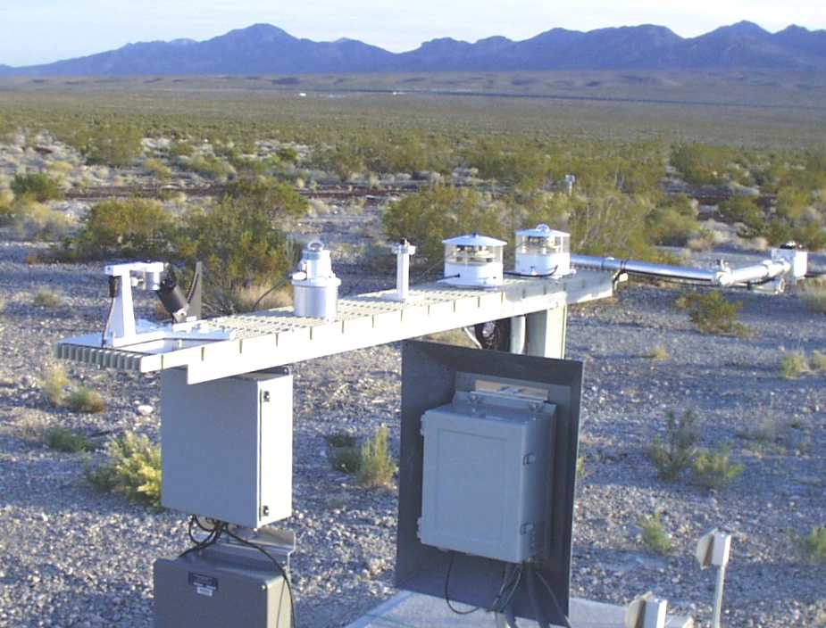
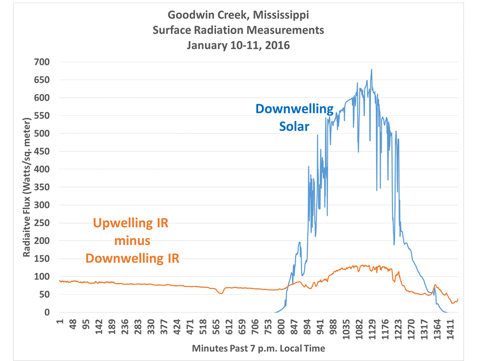
Because it can be measured. Instruments that are selectively sensitive to IR measure changes in temperature within the instrument in response to changes in the balance between incoming and outgoing IR radiation. You can buy a handheld IR thermometer, which is sensitive to a range of IR wavelengths that are only somewhat affected by water vapor and CO2, point it directly upward at a clear sky, and it will register a fairly cold temperature. By itself, this doesn’t prove much. But if you then point it at an oblique angle (say 45 deg), it will register a warmer temperature.
Now, think about what just happened… even though you are pointed the IR thermometer at a cold target, its temperature actually went up! So, cold objects can actually make warm objects even warmer still! (If that cold object is warmer that an even colder object it replaces…like the atmosphere at a cold temperature instead of outer space near absolute zero temperature).
This is the most direct proof of the greenhouse effect I can think of. After all, what is the greenhouse effect? It is downward IR radiation from the sky causing the surface temperature to increase, compared to if that downward radiation didn’t exist. That’s exactly what happens within the handheld IR thermometer, and it is going on everywhere on Earth, all the time.
WEATHER WOULD NOT EXIST WITHOUT THE GREENHOUSE EFFECT
One of the features of a greenhouse atmosphere, which many people don’t realize, is that in addition to the lower atmosphere being warmer, the upper atmosphere is colder than it would otherwise be without the greenhouse gases. For example, addition of CO2 to the atmosphere is supposed to warm the surface, but cool the stratosphere and mesosphere. Greenhouse gases destabilize the atmosphere to the point that convection occurs, which then pushes the lapse rate toward a convective one (between dry adiabatic and moist adiabatic). This was first demonstrated with radiative transfer calculations by Manabe and Strickler (1964).
So, it is actually the destabilization of the atmosphere (net radiative warming below, net cooling aloft) by the greenhouse effect that leads to convection, clouds, and precipitation. If the atmosphere could not absorb or emit IR energy at all (a physical impossibility), and if we ignore sunlight absorption by ozone and water vapor, the atmosphere would become the same temperature as the Earth’s surface through direct conduction. This would take a very long period of time to occur, because air is such a good thermal insulator (which is why Styrofoam works so well). This kind of atmosphere is very stable, convectively, and vertical motions would largely cease (there might be some small planetary-scale motions due to the poles being cooler than the tropics.
FINAL COMMENTS
The quasi-adiabatic lapse rate observed in the atmosphere is the result of convective overturning, which itself is caused by destabilization of the atmosphere by the greenhouse effect. The lapse rate, by itself, cannot explain why the surface temperature of the Earth is what it is…it only tells us how the temperature changes with height in response to convective overturning….not what the temperature would be.
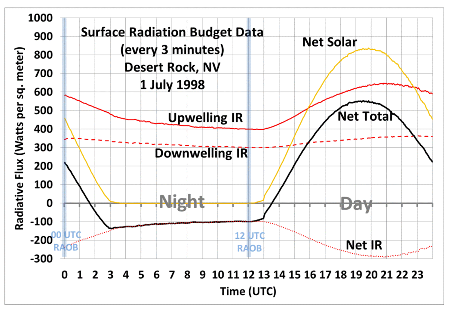
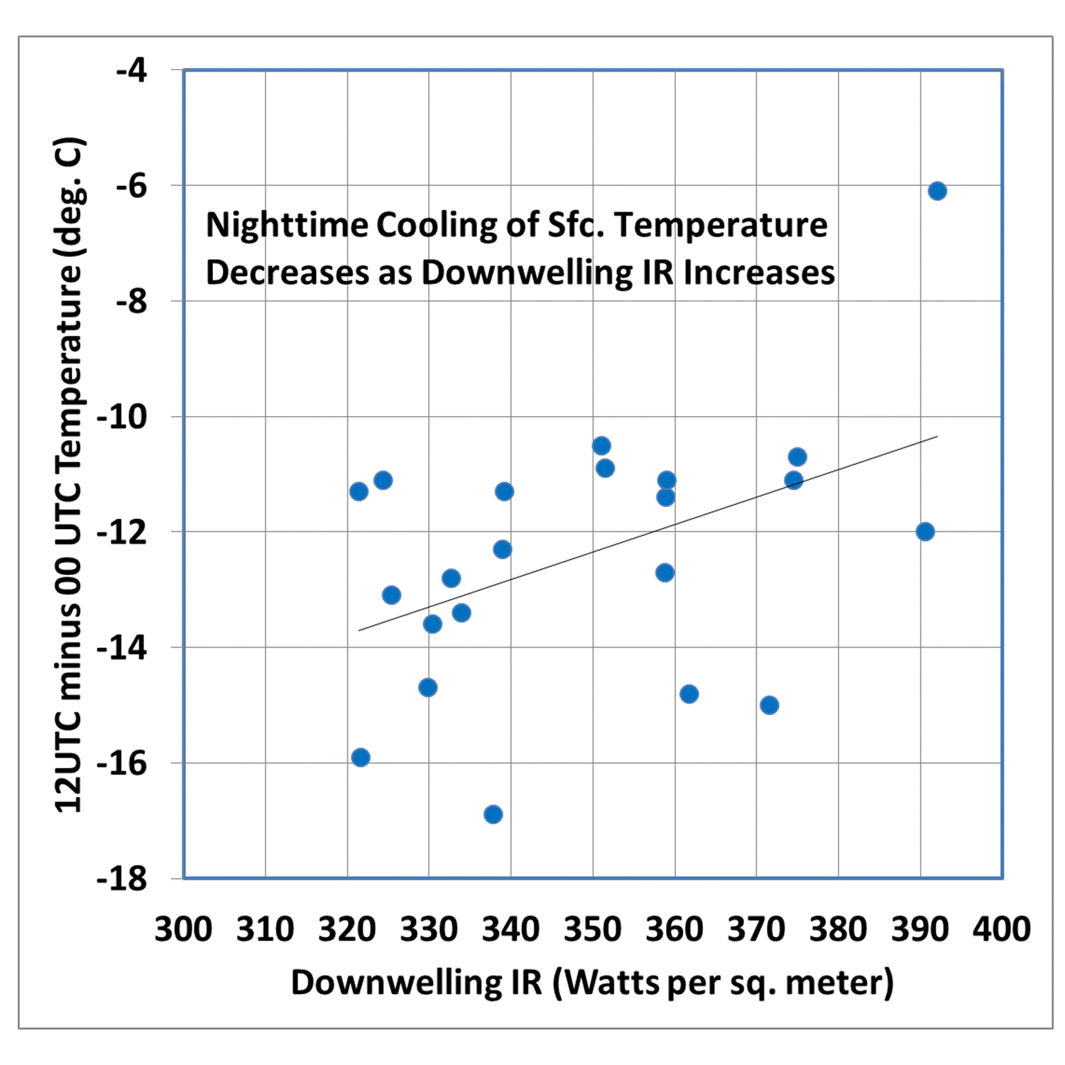
The atmospheric greenhouse effect involves radiative fluxes of hundreds of Watts per sq meter, and is included in all of the weather forecast models that are used around the world every day to forecast weather. Without the GE, the models would simply not work; you cannot ignore infrared radiative transfer in the atmosphere. Without downwelling IR radiation from the sky, nighttime on Earth would be much colder than is observed, as 300+ W/m2 of continuous cooling to outer space would cause rapid temperature drops.
Those IR effects are the basis for atmospheric temperature sounding from IR radiometers, flying since the 1980s with the HIRS instruments. The technology simply would not work if CO2 in the atmosphere was no emitting IR radiation upward and downward. The latest NASA AIRS instrument has actually measured the decrease in IR energy from the Earth as CO2 in the atmosphere has increased. This is observational evidence that an increased greenhouse effect reduces the rate of loss of IR energy to outer space, which should lead to some warming.
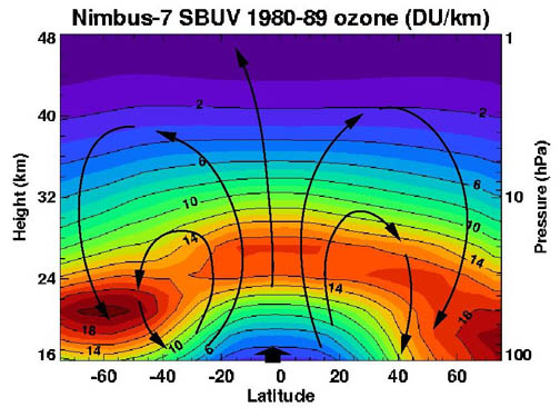
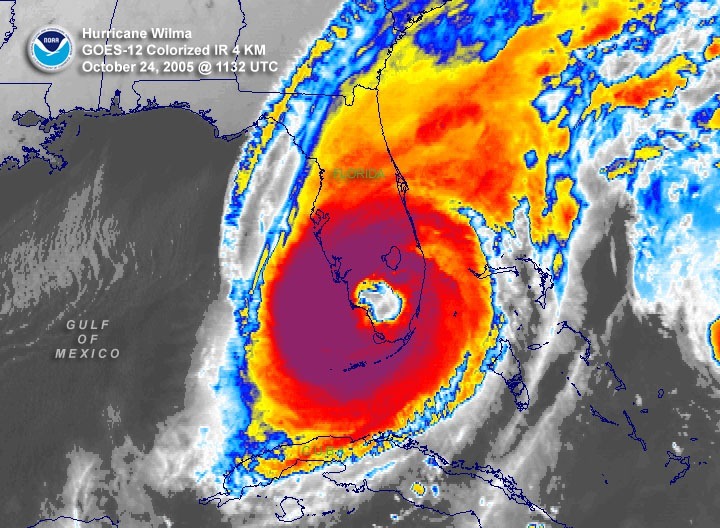
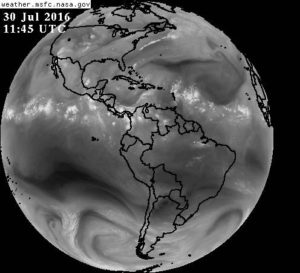 The IR emission by water vapor, which obscures the satellites view of the surface, can be seen in this GOES 6.7 micron image from this morning. That IR emission is occurring downward as well as upward, contributing to the greenhouse effect.
The fact that you can see the direct effects of the atmospheric greenhouse effect with even a $50 handheld IR thermometer provides further evidence that the greenhouse effect exists.
A few of the comments which will follow this post will no doubt argue against what I just presented. Fancy, technical buzzwords will be thrown around to convince you why I’m wrong. Australian Doug Cotton (who sometimes posts comments under fake names) is the leading proponent of this view. Yes, I agree with Doug that if you take a parcel of at at a certain temperature and compress it (increase its pressure), its temperature will rise…but this comes nowhere near to quantitatively explaining why the Earth’s surface temperature (or upper atmospheric temperature) is what it is.
Let me just say that, the concepts I have outlined above have been used to predict what the average temperature profile of the atmosphere looks like, from first principles and based upon laboratory measurements of the IR absorption by various gases, and they work very well (we have done this ourselves). You can run a time-dependent 1D model with an assumed atmosphere near absolute zero, or even at 1,000 deg. C, and the physics in the model (involving physcially-based energy gain and energy loss terms in every atmospheric layer) will gradually produce an average temperature profile that looks very much like that observed in the real atmosphere.
Until the no-greenhouse effect people can do the same, their hand waving arguments will be only that: hand waving arguments. And even if they could do it, how would they justify ignoring infrared radiative transfer effects in the atmosphere, which have been so well established for many years?
Finally, just because the greenhouse effect exists does not mean that global warming in response to increasing carbon dioxide will be a serious problem…that is another issue entirely, and involves things like cloud feedbacks. I’m only referring to the existence of the Earth’s natural greenhouse effect, which to me is largely settled science.
If you are interested in my many other posts on other aspects of the greenhouse effect, just enter that search term into the search box near the top of the sidebar panel to the right.

 Home/Blog