Archive for the ‘Blog Article’ Category

St. Pat’s Day Greeted with Green Aurora, Severe Geomagnetic Storm

Tuesday, March 17th, 2015

A coronal mass ejection (CME) from the sun just arrived at Earth this morning, producing aurora and leading to severe geomagnetic storm conditions, with a Kp index of 8 now verified as of 10 a.m. EDT.

Here’s one aurora photo from Lake Superior Photo in Marquette, MI this morning, before the strongest portion of the CME arrived:

LSP-aurora-3-17-2015

You can also check out some of the latest photos posted at SpaceWeather.com’s Realtime Aurora Gallery.

According to NOAA, here are the expected impacts today:

Potential Impacts: Area of impact primarily poleward of 45 degrees Geomagnetic Latitude.

Induced Currents – Possible widespread voltage control problems and some protective systems may mistakenly trip out key assets from the power grid. Induced pipeline currents intensify.

Spacecraft – Systems may experience surface charging; increased drag on low earth orbit satellites, and tracking and orientation problems may occur.

Navigation – Satellite navigation (GPS) degraded or inoperable for hours.

Radio – HF (high frequency) radio propagation sporadic or blacked out.

Aurora – Aurora may be seen as low as Alabama and northern California.

What if Boston Had Record Low Snowfall?

Monday, March 16th, 2015

By yesterday evening, Boston officially received its greatest seasonal snowfall on record, 108.6 inches. The popular meme is that this is just one more example of human-caused climate change.

But unless you are in elementary school, or just don’t pay attention to what scientists or Al Gore say, you will remember when global warming was going to cause less snow.

If the Boston snows have been the result of global warming, how do we explain the long-term decrease in Washington DC snowfall?…

snow-DC-washinton-post

Or New York City snowfall?…

NYC_snow_central-park-masterresource

Those cities should also be experiencing more snow if global warming is to blame.

So, I ask, what would have been blamed if Boston (or New England in general) had received record low snow amounts this winter? Or, if the same region had seen record warmth, rather than record cold?

I will guarantee you — global warming would have also been blamed.

You see, this is the trouble with global warming theory. Everything that happens is folded into it, resulting in an endless list of absurd, and often contradictory, claims about the things that global warming / climate change causes.

Is it any wonder that the public is increasingly dismissive of what we climate scientists say?

A PhD and a computer have, so far, been insufficient tools to provide useful predictions of the future of our climate system. The current state of climate science — or maybe I should say, how scientists have allowed the media and politicians to portray it — is a continuing source of embarrassment to some of us.

Even Though Warming Has Stopped, it Keeps Getting Worse?

Monday, March 9th, 2015

I was updating a U.S. Corn Belt summer temperature and precipitation dataset from the NCDC website, and all of a sudden the no-warming-trend-since-1900 turned into a significant warming trend. (Clarification: the new warming trend for 1900-2013 is still not significantly different from zero at the 90% confidence level. H/T, Pat Michaels)

As can be seen in the following chart, the largest adjustments were to earlier years in the dataset, which were made colder. The change in the linear trend goes from 0.2 deg F/century to 0.6 deg. F/century.

Corn-belt-JJA-temperature-precip-1895-2013-diff-in-datasets

I know others have commented on the tendency of thermometer data adjustments by NOAA always leading to greater warming.

As Dick Lindzen has noted, it seems highly improbable that successive revisions to the very same data would lead to ever greater warming trends. Being the co-developer of a climate dataset (UAH satellite temperatures) I understand the need to make adjustments for known errors in the data…when you can quantitatively demonstrate an error exists.

But a variety of errors in data measurement and collection would typically have both positive and negative signs. For example, orbit decay causes a spurious cooling trend in the satellite lower tropospheric temperatures (discovered by RSS), while the instrument body temperature effect causes a spurious warming trend (discovered by us). The two effects approximately cancel out over the long term, but we (and RSS) make corrections for them anyway since they affect different years differently.

Also, the drift in satellite local observation time associated with orbit decay causes spurious cooling in the 1:30 satellites, but spurious warming in the 7:30 satellites. Again this shows that a variety of errors typically have positive and negative signs.

In contrast, the thermometer data apparently need to be adjusted in such a way that almost always leads to greater and greater warming trends.

How odd.

Worst Dust Storm in 12 Years Hits Oman

Sunday, March 8th, 2015

A spectacular satellite view of the dust storm that hit portions of Oman yesterday. High winds coming off the deserts of southern Iran associated with a cold front are what causes this kind of event. The first image shows the front just north of Muscat City, the second a few hours later shows coastal Oman enveloped in dust, then the third image from today (March 8) shows a cyclonic pattern to the cloud of dust (click image for full-size):
Oman-dust-storm-March-7-8-2015

Extraordinary Color View of Eastern U.S. Snow Cover

Saturday, March 7th, 2015

Much of the Eastern U.S. finally had a clear day yesterday (March 6, 2015) , allowing the NASA MODIS imager to capture this extraordinary view of the new snow (up to 20 inches in Kentucky) laid down through the Ohio Valley and mid-Atlantic states (click for full-size):
MODIS-3-7-2015-US-snow

Of Bad Luck and Space Mission Numbering

Wednesday, March 4th, 2015

lift-not-have-number-13 A couple of days ago, one of DoD’s polar-orbiting weather satellites — “F-13” — exploded. They aren’t sure why, but one insider has claimed it was an overheated battery. I guess I don’t see how an overheated battery causes the disintegration of a satellite into 40+ chunks, unless it ignited leftover hydrazine propellant.

Now, I don’t consider myself superstitious, but there has been a pattern of failure among space missions involving the number “13”.

Out of the NOAA polar orbiting satellites (NOAA-6, -7, -8, -9, -10, -11, -12, -13, -14, -15, 16, -17, -18, -19), which one might you guess failed? That’s right, NOAA-13. In 1993 after less than 2 weeks on orbit, NOAA-13 experienced a short circuit in it’s battery charging system, rendering the satellite useless. In contrast, NOAA-15 is now in it’s 17th year of continuous operation.

And guess which Apollo mission nearly ended in disaster? Apollo-13, after an oxygen tank exploded and Tom Hanks almost single-highhandedly brought the Moon mission safely home.

And what about the GOES-13 geostationary weather satellite that failed just before hurricane season started (in 2013!). It was later brought back from the dead (after 2013, of course).

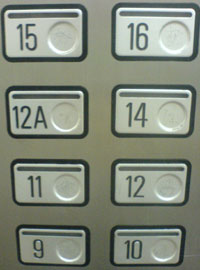
I think I would just skip “13” when numbering satellites. Maybe use “12A” instead.

And don’t get me started about calling a satellite “ADEOS”. The Japanese Earth observation satellites ADEOS-I and ADEOS-II both failed early in their missions from solar panel malfunctions. The successful follow-on Japanese satellite is GCOM-W, which fortunately doesn’t mean “bye-bye” in any language.

Oh! I almost forgot! The Japanese name for the 2 failed ADEOS satellites was “Midori”, which in Japanese means…wait for it…”green”.

UAH Global Temperature Update for Feb. 2015: +0.30 deg. C

Wednesday, March 4th, 2015

The Version 5.6 global average lower tropospheric temperature (LT) anomaly for February, 2015 is +0.30 deg. C, down a little from the January 2015 value of +0.35 deg. C (click for full size version):
UAH_LT_1979_thru_February_2015_v5

The global, hemispheric, and tropical LT anomalies from the 30-year (1981-2010) average for the last 14 months are:

YR MON GLOBAL NH SH TROPICS
2014 01 +0.291 +0.387 +0.194 -0.029
2014 02 +0.170 +0.320 +0.020 -0.103
2014 03 +0.170 +0.338 +0.002 -0.001
2014 04 +0.190 +0.358 +0.022 +0.092
2014 05 +0.326 +0.325 +0.328 +0.175
2014 06 +0.305 +0.315 +0.295 +0.510
2014 07 +0.304 +0.289 +0.319 +0.451
2014 08 +0.199 +0.244 +0.153 +0.061
2014 09 +0.294 +0.187 +0.401 +0.181
2014 10 +0.365 +0.333 +0.396 +0.189
2014 11 +0.329 +0.354 +0.303 +0.247
2014 12 +0.322 +0.465 +0.178 +0.296
2015 01 +0.351 +0.553 +0.150 +0.126
2015 02 +0.296 +0.434 +0.157 +0.015

Note that the El Nino warmth in the tropics seems to have fizzled, falling about 0.25 deg C in the last few months to near the 1979-2010 average value, which is unusual since February has been the usual time of peak tropospheric warmth in response to previous El Nino events.

The global image for February, 2015 should be available in the next day or so here.

Popular monthly data files (these might take a few days to update):

uahncdc_lt_5.6.txt (Lower Troposphere)
uahncdc_mt_5.6.txt (Mid-Troposphere)
uahncdc_ls_5.6.txt (Lower Stratosphere)

40 deg. Temperature Drop for Deep South

Wednesday, March 4th, 2015

A strong cold front is forming today and will plunge through the Deep South, bringing a 40 deg. F temperature drop.

Here’s a time lapse video of hourly temperature forecasts from the WRF high resolution model, showing just how abrupt the temperature change will be as the front passes (original graphics from Weatherbell.com):

Winter storm warnings have been issued for northern portions of the South where up to a foot of snow is expected, mainly through the Ohio River Valley:

nam_3hr_snow_acc_east_17

Snow for all 50 States Forecast in Next 7 Days

Friday, February 27th, 2015

The unseasonable cold is expected to continue over much of the U.S., with some interruptions, and the latest GFS model forecast shows some snow for portions of all 50 states in the next seven days. (Graphic courtesy of Weatherbell.com, click for full-size):

GFS total snowfall forecast for the 7 days ending Friday morning, March 6, 2015.

GFS total snowfall forecast for the 7 days ending Friday morning, March 6, 2015.

And, yes, I checked…even in Hawaii.

On Natural Climate Variability and Climate Models

Friday, February 27th, 2015

The “pause” in global warming is becoming increasingly difficult for the climate establishment to ignore, which is a good thing. They are now coming up with reasons why there has been a “pause” (a term I dislike because it implies knowledge of future warming, which no one has), and spinning it as if it is bad new for us.

But when they assume that natural climate variations can cause a cooling influence, they are also admitting there can be natural sources of warming.

A natural change in ocean circulation is the leading potential explanation for the pause. Due to the huge temperature difference between surface waters and deep water, any small change in ocean overturning can result in either warming or cooling of surface temperatures. If the ocean was isothermal with depth, such a mechanism would not exist.

The point of this post is to remind people of what I have stated before: to the extent that a change in ocean circulation has negated anthropogenic warming in the last 15+ years, an opposite change likely enhanced warming during the 1970s to 1990s.

You can’t have one without the other. Natural fluctuations in ocean vertical circulation are cyclical. You can’t attribute the recent warming hiatus to natural forcings without also addressing the role of potential natural forcings in causing the previous warming period. At best, it betrays a bias in reasoning; at worst, it is logically inconsistent.

This is not just a minor detail that is irrelevant to long-term climate predictions because the models were mostly developed (and modelers’ opinions regarding sensitivity formed) during a period (the 1970s to 1990s) when substantial natural warming was occurring, yet they assumed it was entirely manmade. Correcting for the mistake would alter our understanding of climate change as well as any proposed energy policies to (supposedly) avert it.

This is why the paper we published in APJAS last year was so important. It demonstrated that El Ninos change the planetary radiation budget, allowing more solar heating of the system. The paper was rejected out of hand by many in the climate establishment simply because it did not support the IPCC party line. (Odd, since our results potentially explain why their models continue to produce, on average, twice as much warming as has been observed.)

Most of those who criticized it probably didn’t even read it, or try to understand it. (I’ve had reviewers of papers reject our paper without even reading it, because their objections were based upon what they assumed was in the paper, rather than what was actually in the paper!)

Before I go over some of the details of that paper (again), here’s a graph which conceptually explains the big-picture significance of it. Please read the informational boxes. Go ahead, I’ll wait…

90-CMIP5-models-vs-observations-with-pause-explanation

The simplicity of our 1D model (one vertical dimensional) is one of its strengths. Global average surface temperature changes (as James Hansen has also stated), can only be due to 3 processes: (1) radiative forcing, (2) radiative feedback, and (3) changes in ocean vertical circulation, all of which can be addressed with a 1D model like ours.

Contrary to straw-man criticisms of the model, it was not meant to replicate El Nino and La Nina (which even 3D coupled climate models cannot do), but instead to (1) take the observed radiative perturbation of the climate system associated with ENSO since we have had good CERES satellite radiative budget observations (since 2000), and then (2) extend that relationship back in time with the known history of El Nino and La Nina to see how much of recent ocean warming was due to ENSO.

Admittedly, the model we used was not perfect, just as no model is. Even complex 3D climate models include a myriad of assumptions and approximations, most of which can be improved upon. Our critics will use technical jargon to make it sound like our model is worthless even though their 3D models, after billions of dollars of investment, still do not produce demonstrably better forecasts of global warming than 1D models!

The central issue we addressed in Spencer & Braswell (2014) — which cannot be brushed aside by claiming there are imperfections of our model — is this:

1) satellite radiative budget observations show the Earth’s radiative balance changes with ENSO, with the radiative changes occurring before the actual temperature changes occur (implying causation). In particular, El Nino warmth (and La Nina coolness) is partly (about 1/3) radiatively-caused. We termed this “internal radiative forcing” of the climate system, probably due to a change in global average cloudiness associated with changes in atmospheric circulation.

2) Since there are periods when El Nino is stronger than La Nina (e.g. 1970s-1990s), this then causes periods of natural warming.

3) Models that ignore natural sources of warming must be tuned to be too sensitive, in order to explain the observed 1970s-1990s warming with increasing CO2 alone (or nearly alone). They then produce too much warming in future decades.

The basic idea of something like ENSO producing multi-decadal periods of warming or cooling was not original to us. We simply used observational data (satellite radiative budget measurements) to demonstrate the natural radiative warming (and cooling) mechanism exists, and then used an energy balance model to quantitatively estimate just how much of recent ocean warming could be explained by the mechanism.

No nitpicking over our finite differencing scheme, or our extension of the bottom of the ocean to only 2,000 m depth, changes this fact.

In fact, it doesn’t even matter if you call the ENSO radiative effect a “forcing” or a “feedback” (an argument I’ve had with Andy Dessler)…the model shows that when the effect is included in an energy balance model, with the observed time lag, it reduces the resulting model climate sensitivity by about 50%.

I know….I’ve said all of this before. But it needs to be repeated. Climate change issues are complex, and whenever we can find clarity and significance, it needs to be drilled into our heads so we don’t lose sight of real progress in our understanding.

Even our simple 1D model produced a higher climate sensitivity consistent with IPCC claims if we assumed all climate change was due to the same forcings they assume. The IPCC’s climate models are too sensitive (produce too much warming in response to increasing CO2) because they have basically assumed virtually all previous warming was due to increasing CO2, not due to Nature.

The models produce results consistent with whatever assumptions are programmed into them. We should always question our assumptions, which are usually wrong, and continually strive to make them less wrong.

I don’t have hopes that the IPCC will change their tune, however, because that organization was not formed to find out if anthropogenic global warming was a problem. It assumed that from the outset. And by the time their models are unequivocally proved wrong, all of the modelers will be retired — or dead.

But what our analysis also implies is that, when the current natural cooling effect goes away, some warming will resume. It just won’t be as strong as current models predict. Admittedly, we only addressed ENSO as a natural forcing mechanism. To the extent other mechanisms are at work, climate sensitivity might be even lower than we calculated, and future warming would be even more benign.

I wouldn’t even rule out future cooling. But for now, I sure wouldn’t bet on it.

At this point, no one really knows.