Home/Blog
The goal of reaching “Net Zero” global anthropogenic emissions of carbon dioxide sounds overwhelmingly difficult. While humanity continues producing CO2 at increasing rates (with a temporary pause during COVID), how can we ever reach the point where these emissions start to fall, let alone reach zero by 2050 or 2060?
What isn’t being discussed (as far as I can tell) is the fact that atmospheric CO2 levels (which we will assume for the sake of discussion causes global warming) will start to fall even while humanity is producing lots of CO2.
Let me repeat that, in case you missed the point:
Atmospheric CO2 levels will start to fall even with modest reductions in anthropogenic CO2 emissions.
Why is that? The reason is due to something called the CO2 “sink rate”. It has been observed that the more CO2 there is in the atmosphere, the more quickly nature removes the excess. The NASA studies showing “global greening” in satellite imagery since the 1980s is evidence of that.
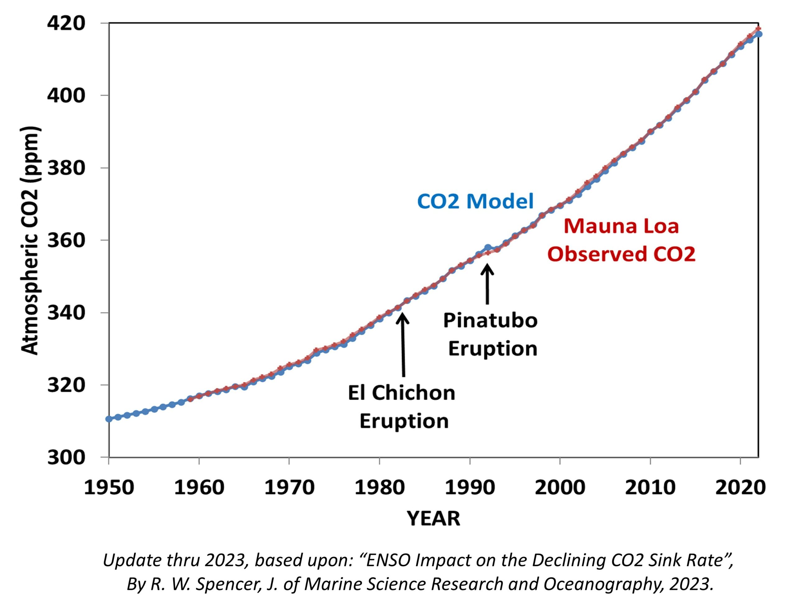
Last year I published a paper showing that the record of atmospheric CO2 at Mauna Loa, HI suggests that each year nature removes an average of 2% of the atmospheric excess above 295 ppm (parts per million). The purpose of the paper was to not only show how well a simple CO2 budget model fits the Mauna Loa CO2 measurements, but also to demonstrate that the common assumption that nature is becoming less able to remove “excess” CO2 from the atmosphere appears to be an artifact of El Nino and La Nina activity since monitoring began in 1959. As a result, that 2% sink rate has remained remarkably constant over the last 60+ years. (By the way, the previously popular CO2 “airborne fraction” has huge problems as a meaningful statistic, and I wish it had never been invented. If you doubt this, just assume CO2 emissions are cut in half and see what the computed airborne fraction does. It’s meaningless.)
Here’s my latest model fit to the Mauna Loa record through 2023, where I have added a stratospheric aerosol term to account for the fact that major volcanic eruptions actually *reduce* atmospheric CO2 due to increased photosynthesis from diffuse sunlight penetrating deeper into vegetation canopies:
What Would a “Modest” 1% per Year Reduction in Global CO2 Emissions Do?
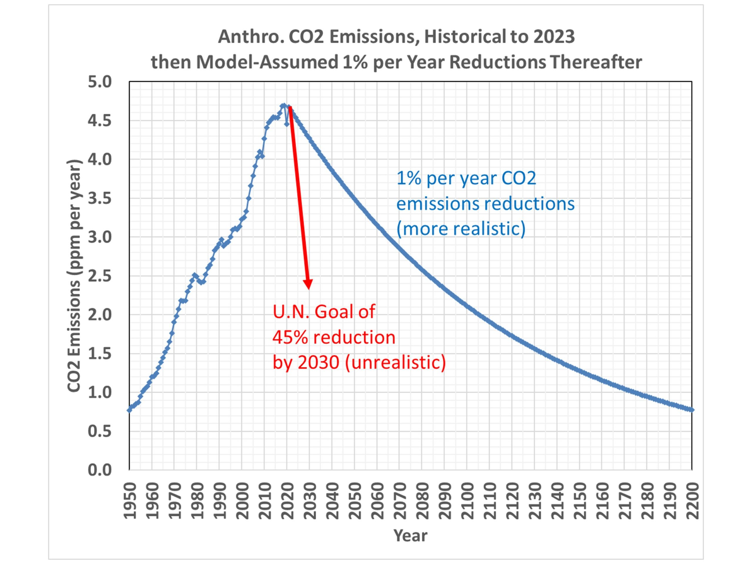
The U.N. claims that CO2 emissions will need to decline rapidly to achieve Net Zero by mid-Century. Specifically, they say 45% reductions below 2010 levels will need to be made by 2030, and Net Zero will need to be achieved by 2050, in order to limit future global warming to the (rather arbitrary) goal of 1.5 deg. C.
But let’s look at what a much more modest reduction in CO2 emissions (1% per year) would do to future atmospheric CO2 concentrations. Here’s a plot of the history of global CO2 emissions, and how that trajectory would change with 1% per year reductions from 2023 onward. (Even this seems optimistic, but we can all agree the U.N.’s goal is delusional),
When we run the CO2 model with these assumed emissions, here’s how the atmospheric CO2 concentration responds:
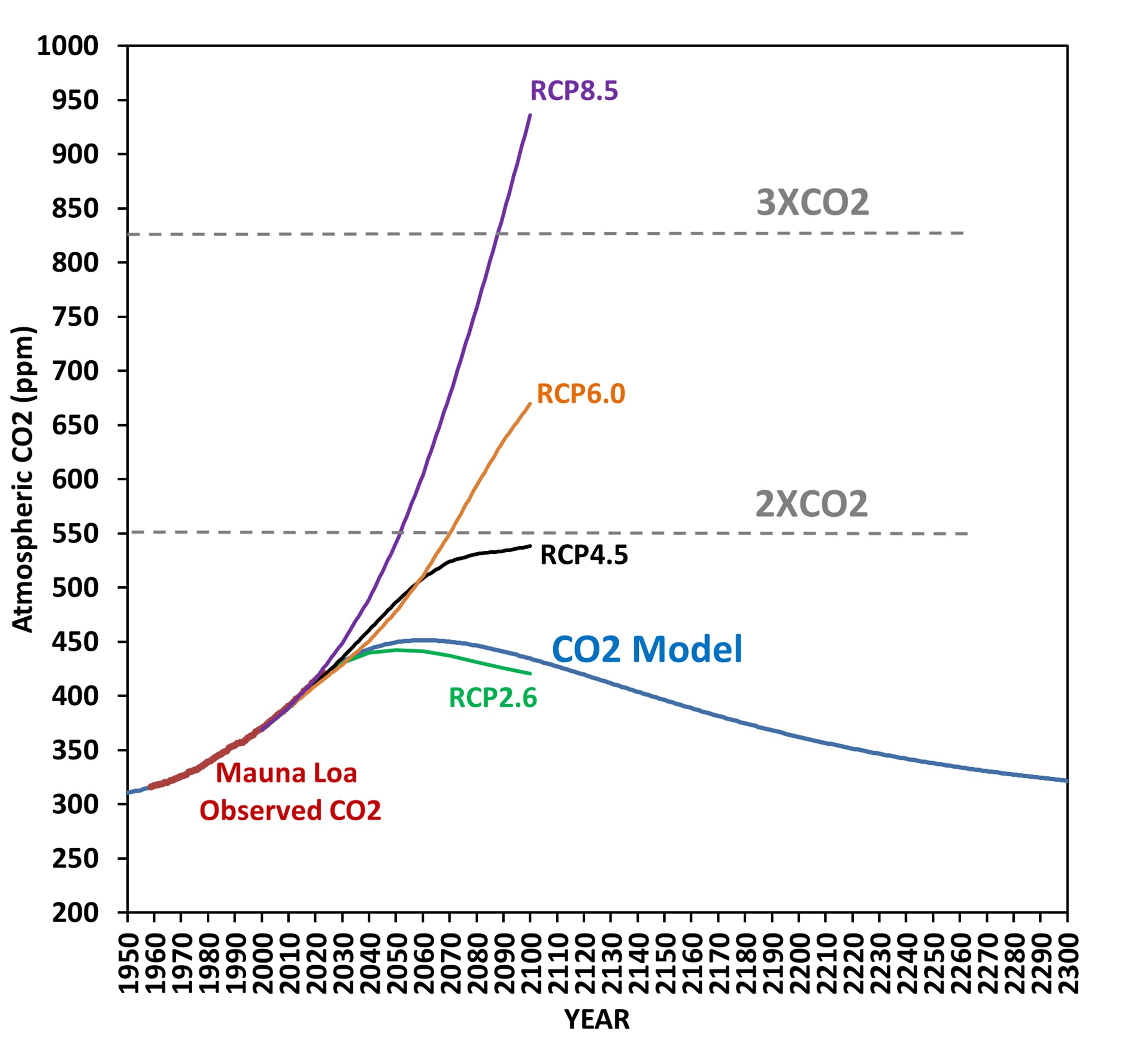
Even though the CO2 emissions continue, atmospheric CO2 levels start to fall around 2060. Also shown for reference are the four CMIP5 scenarios of future CO2 emissions, with RCP8.5 often being the one used to scare people regarding future climate change, despite it being extremely unlikely.
The message here is that CO2 emissions don’t have to be cut very much for atmospheric CO2 levels to reverse their climb, and start to fall. The reason is that nature removes CO2 in proportion to how much excess CO2 resides in the atmosphere, and that rate of removal can actually exceed our CO2 emissions with modest cuts in emissions.
I don’t understand why this issue is not being discussed. All of the Net Zero rhetoric I see seems to imply that warming will continue if we don’t cut our CO2 emissions to essentially zero. But that’s not true, because that’s not how nature works.