UAH Update for January 2011: Global Temperatures in Freefall

February 2nd, 2011

…although this, too, shall pass, when La Nina goes away.

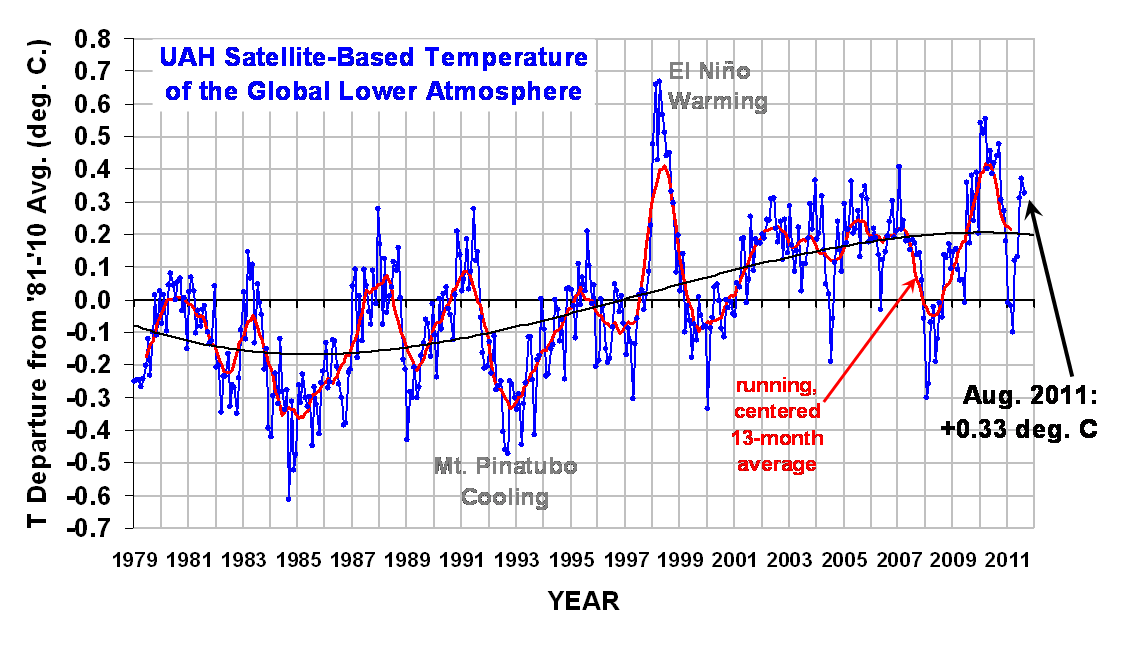
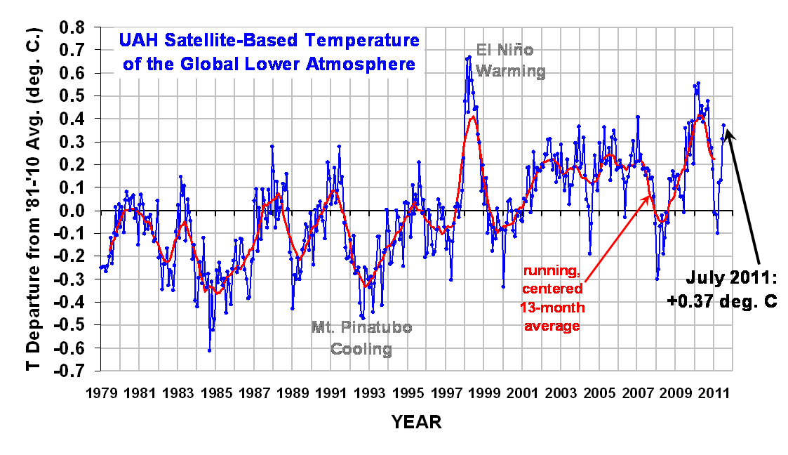
UAH_LT_1979_thru_Jan_2011


YR MON GLOBE NH SH TROPICS
2010 1 0.542 0.675 0.410 0.635
2010 2 0.510 0.553 0.466 0.759
2010 3 0.554 0.665 0.443 0.721
2010 4 0.400 0.606 0.193 0.633
2010 5 0.454 0.642 0.265 0.706
2010 6 0.385 0.482 0.287 0.485
2010 7 0.419 0.558 0.280 0.370
2010 8 0.441 0.579 0.304 0.321
2010 9 0.477 0.410 0.545 0.237
2010 10 0.306 0.257 0.356 0.106
2010 11 0.273 0.372 0.173 -0.117
2010 12 0.181 0.217 0.145 -0.222
2011 1 -0.009 -0.055 0.038 -0.369

LA NINA FINALLY BEING FELT IN TROPOSPHERIC TEMPERATURES
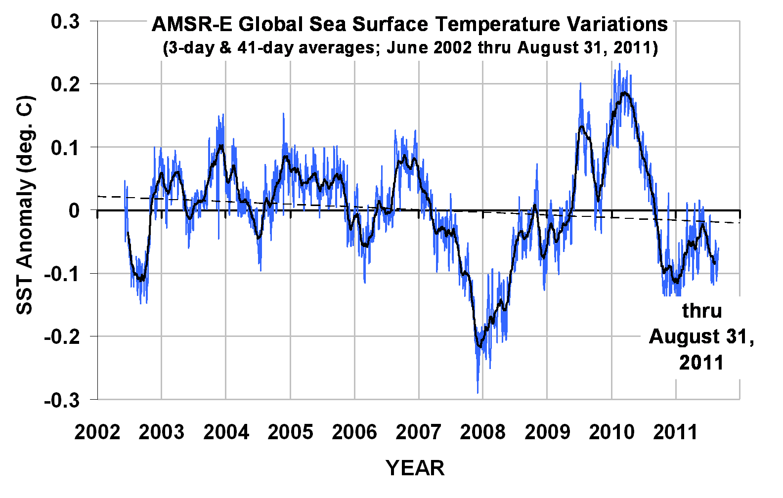
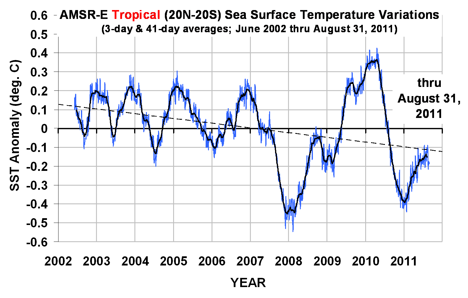
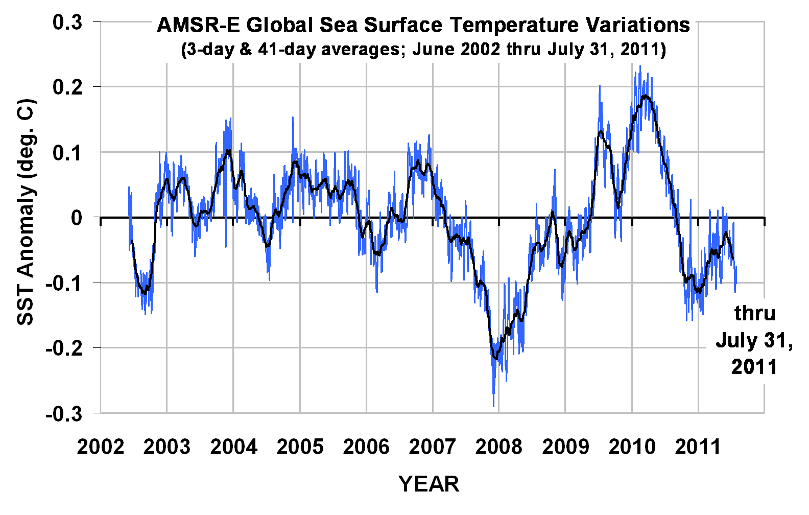
January 2011 experienced a precipitous drop in lower tropospheric temperatures over the tropics, Northern Hemisphere, and Southern Hemisphere. This was not unexpected, since global average sea surface temperatures have been falling for many months, with a head start as is usually the case with La Nina.

This is shown in the following plot (note the shorter period of record, and different zero-baseline):

SO WHY ALL THE SNOWSTORMS?
While we would like to think our own personal experience of the snowiest winter ever in our entire, Methuselah-ian lifespan has some sort of cosmic — or even just global — significance, I would like to offer this plot of global oceanic precipitation variations from the same instrument that measured the above sea surface temperatures (AMSR-E on NASA’s Aqua satellite):

Note that precipitation amounts over the global-average oceans vary by only a few percent. What this means is that when one area gets unusually large amounts of precipitation, another area must get less.

Precipitation is always associated with rising air, and so a large vigorous precipitation system in one location means surrounding regions must have enhanced sinking air (with no precipitation).

In the winter, of course, the relatively warmer oceans next to cold continental air masses leads to snowstorm development in coastal areas. If the cold air mass over the midwest and eastern U.S. is not dislodged by warmer Pacific air flowing in from the west, then the warm oceanic air from the Gulf of Mexico and western Atlantic keeps flowing up and over the cold dome of air, producing more snow and rain. The “storm track” and jet stream location follows that boundary between the cold and warm air masses.

WeatherShop.com Gifts, gadgets, weather stations, software and more...click here!

A Challenge to the Climate Research Community

February 2nd, 2011

I’ve been picking up a lot of chatter in the last few days about the ‘settled science’ of global warming. What most people don’t realize is that the vast majority of published research on the topic simply assumes that warming is manmade. It in no way “proves” it.

If the science really is that settled, then this challenge should be easy:

Show me one peer-reviewed paper that has ruled out natural, internal climate cycles as the cause of most of the recent warming in the thermometer record.

Studies that have suggested that an increase in the total output of the sun cannot be blamed, do not count…the sun is an external driver. I’m talking about natural, internal variability.

The fact is that the ‘null hypothesis’ of global warming has never been rejected: That natural climate variability can explain everything we see in the climate system.

OMG! ANOTHER GLOBAL WARMING SNOWSTORM!!

January 31st, 2011

I really can’t decide whether I should hate Al Gore… or thank him for giving me something to write about.

He has caused the spread of more pseudo-scientific incompetence on the subject of global warming (I’m sorry — climate change) than any climate scientist could possibly have ever accomplished. Who else but a politician could spin so much certainty out of a theory?

As someone who has lived and breathed meteorology and climate for 40 years now, I can assure you that this winter’s storminess in the little 2% patch of the Earth we like to call the ‘United States of America’ has nothing to do with your SUV.

Natural climate variability? Maybe.

But I would more likely chalk it up to something we used to call “WEATHER”.

Let me give you a few factoids:

1) No serious climate researcher — including the ones I disagree with — believes global warming can cause colder weather. Unless they have become delusional as a result of some sort of mental illness. One of the hallmarks of global warming theory is LESS extratropical cyclone activity — not more.

2) If some small region of the Earth is experiencing unusually persistent storminess, you can bet some other region is experiencing unusually quiet weather. You see, in the winter we get these things called ‘storm tracks’….

3) Evidence for point #2 is that we now have many years of global satellite measurements of precipitation which shows that the annual amount of precipitation that falls on the Earth stays remarkably constant from year to year. The AREAS where it occurs just happen to move around a whole lot. Again, we used to call that “weather”.

4) Global average temperature anomalies (departures from seasonal norms) have been falling precipitously for about 12 months now. Gee, maybe these snowstorms are from global cooling! Someone should look into that! (I know…cold and snow from global cooling sounds crazy….I’m just sayin’….)

I could go on and on.

Now, I know I’m not going to change the minds of any of the True Believers…those who read all of Reverend Al’s sermons, and say things like, “You know, global warming can mean warmer OR colder, wetter OR drier, cloudier OR sunnier, windier OR calmer, …”. Can I get an ‘amen’??

But I hope I can still save a few of those out there who are still capable of independent reasoning and thought.

NOW can I go to bed?

UPDATE: Further Evidence of Low Climate Sensitivity from NASA’s Aqua Satellite

January 28th, 2011

After yesterday’s post, I decided to run the simple forcing-feedback model we developed to mimic the Aqua satellite observations of global oceanic temperature and radiative flux variations.

I’ve also perused the comments people have made there, and will try to clarify what I’ve done and why it’s important.

First of all, my (and even the IPCC’s) emphasis on changes in the global radiative budget cannot be overemphasized when we are trying to figure out whether “global warming” is mostly manmade or natural, and how the climate system responds to forcing.

Changes in the global-average radiative budget are about the only way for the Earth to warm or cool on time scales of years or longer (unless there is some sort of change in geothermal heat flux…we won’t even go there.)

What we want to know, ultimately, is how much warming will result from the radiative imbalance caused by adding CO2 to the atmosphere. It is natural to try to answer that question by examining how Mother Nature handles things when there are natural, year-to-year warmings and coolings. I believe that the NASA satellite assets we have in orbit right now are going to go a long way toward providing that answer.

The answer depends upon how clouds, evaporation, water vapor, etc., change IN RESPONSE TO a temperature change, thus further altering the radiative balance and final temperature response. This is called feedback, and it is traditionally referenced to a surface temperature change.

The GOOD news is that we have pretty accurate satellite measurements of the rather small, year-to-year changes in global radiative fluxes over the last 10 years, as well as of the temperature changes that accompanied them.

The BAD news is that, even if those measurements were perfect, determining feedback (temperature causing radiative changes) is confounded by natural forcings (radiative changes causing temperature changes).

This interplay between natural variations in global-average temperature and radiative flux are always occurring, intermingled together, and the goal is to somehow disentangle them to get at the feedback part.

Keep in mind that “feedback” in the climate system is more of a conceptual construct. It isn’t something we can measure directly with an instrument, like temperature. But the feedback concept is useful because we are pretty sure that elements of the climate system (e.g. clouds) WILL change in response to any radiative imbalance imposed upon the system, and those changes will either AMPLIFY or REDUCE the temperature changes resulting from the initial imbalance. (While it might not be exactly the same kind of feedback electrical engineers deal with, there is currently no better term to describe the process…a process which we know must be occurring, and must be understood in order to better predict human-caused global warming.)

More than any other factor, feedbacks will determine whether anthropogenic global warming is something we need to worry about.

An Example from the Kitchen
While this might all seem rather cryptic, ALL of these processes have direct analogs to a pot of water warming on the stove. You can turn the heat up on the stove (forcing), and the water will warm. But if you also remove the lid in proportion to the stove being turned up (negative feedback), you can reduce the warming. It’s all based upon energy conservation concepts, which ordinary people are exposed to every day.

The IPCC believes Mother Nature covers up the pot even more as the stove is turned up, causing even more warming in response to a “forcing”.

I think they are wrong.

NASA Aqua Satellite Observations of the Global Oceans
Similar to what I plotted yesterday, the following plot shows time-lagged regression coefficients between time series of global oceanic radiative flux (from the CERES instrument on Aqua), and sea surface temperature (from AMSR-E on Aqua). Yesterday’s plot also showed the results when I used the Hadley Center’s SST measurements (the dashed line in that graph), and the results were almost identical. But since I’m the U.S. Science Team Leader for AMSR-E, I’ll use it instead. 🙂

The way these regression coefficients can be interpreted is that they quantify the rate at which radiative energy is GAINED by the global ocean during periods when SST is rising, and the rate at which radiative energy is LOST when SST is falling. Conceptually, the vertical line at zero months time lag can be thought of as corresponding to the time of peak SST.

The Simple Model “Best” Match to the Satellite Data
I’ve run our simple forcing-feedback model (originally suggested to us by Isaac Held at Princeton) to try to match the satellite observations. I force the model with quasi-random time variations in the global radiative energy budget — representing, say, natural, quasi-chaotic variations in cloud cover — and then see how the model temperatures respond. The model has been available here for many months now, if you want to play with it.

The model’s response to these radiative forcings depends upon how I set the model’s: (1) ocean mixing depth, which will determine how much the temperature will change for a given energy imbalance imposed upon the model, and (2) feedback parameter, which is what we ultimately want to determine from the satellite data.

I found that a 70 meter deep layer provided about the right RATIO between the satellite-observed monthly radiative variations (0.8 Watts per sq. meter standard deviation) and SST variations (0.08 deg. C standard deviation). At the same time, I had to adjust the magnitude of the radiative forcing to get about the right ABSOLUTE MAGNITUDES for those standard deviation statistics, too.

The “best fit” I got after about an hour of fiddling around with the inputs is represented by the blue curve in the above chart. Importantly, the assumed feedback parameter (5.5) is solidly in “negative feedback” territory. IF this was the true feedback operating in the real climate system on the long time scales of ‘global warming’, it would mean that our worries over anthropogenic global warming have been, for all practical purposes, a false alarm.

The Simple Model Run With the IPCC’s Average Feedback

At this point, a natural question is, How does the simple model behave if I run it with a feedback typical of the IPCC climate models? The average net feedback parameter across the IPCC models is about 1.4 Watts per sq. meter per degree, and the following plot shows the simple model’s response to that feedback value compared to the satellite observations.

A comparison between the 2 charts above would seems to indicate that the satellite data are more consistent with negative feedback (which, if you are wondering, is a net feedback parameter greater than 3.2 W m-2 K-1) than they are with positive feedback. But it could be that feedbacks diagnosed from the IPCC models only over the global oceans will be necessary to provide a more apples-to-apples comparison on this point.

Important Caveat
While it would be tempting to think that the IPCC models are potentially invalidated by this comparison, Dessler (2010) has correctly pointed out that the short-term feedback behavior of the IPCC models appear to have little or no relationship to their long-term climate sensitivity.

In other words, even if short-term feedbacks in the real climate system are strongly negative, this doesn’t prove the long-term global warming in the models is wrong.

In fact, NO ONE HAS YET FOUND A WAY WITH OBSERVATIONAL DATA TO TEST CLIMATE MODEL SENSITIVITY. This means we have no idea which of the climate models projections are more likely to come true.

This dirty little secret of the climate modeling community is seldom mentioned outside the community. Don’t tell anyone I told you.

This is why climate researchers talk about probable ranges of climate sensitivity. Whatever that means!…there is no statistical probability involved with one-of-a-kind events like global warming!

There is HUGE uncertainty on this issue. And I will continue to contend that this uncertainty is a DIRECT RESULT of researchers not distinguishing between cause and effect when analyzing data.

Toward Improved Climate Sensitivity Estimates
As I mentioned yesterday, Dessler (2010) only addressed ZERO-time lag relationships, as did all previous investigators doing similar kinds of work. In contrast, the plots I am presenting here (and in yesterday’s post) show how these regression coefficients vary considerably with time lag. In fact, at zero time lag, the relationships become virtually meaningless. Cause and effect are hopelessly intertwined.

But we CAN measure radiative changes BEFORE a temperature peak is reached, and in the months FOLLOWING the peak. Using such additional “degrees of freedom” in data analysis will be critical if we are to ever determine climate sensitivity from observational data. I know that Dick Lindzen is also advocating the very same point. If you are a lay person who understands this, can i get an “amen”? Because, so far, other climate researchers are keeping their mouths shut.

It is imperative that the time lags (at a minimum) be taken into account in such studies. Our previous paper (Spencer & Braswell, 2010) used phase space plots as a way of illustrating time lag behavior, but it could be that plots like I have presented here would be more readily understood by other scientists.

Unfortunately, the longer the climate community establishment keeps its head in the sand on this issue , the more foolish they will look in the long run.

New Results on Climate Sensitivity: Models vs. Observations

January 27th, 2011

Partly as a result of my recent e-mail debate with Andy Dessler on cloud feedbacks (the variable mostly likely to determine whether we need to worry about manmade global warming), I have once again returned to an analysis of the climate models and the satellite observations.

I have just analyzed the 20th Century runs from the IPCC’s three most sensitive models (those producing the most global warming), and the 3 least sensitive models (those that produce the least global warming), and compared their behavior to the 10 years of global temperature and radiative budget data Dessler analyzed (as did Spencer & Braswell, 2010).

The following plot shows the most pertinent results. While it requires some explanation, an understanding of it will go a long way to better appreciating not only how climate models and the real world differ, but also what happens when the Earth warms and cools from year-to-year…say from El Nino or La Nina.

What the plot shows is (on the vertical axis) how much net loss or gain in radiant energy occurs for a given amount of global-average surface warming, at different time lags relative to that temperature peak (on the horizontal axis). You can click on the graph to get a large version.

All observations are shown with black curves; the climate model relationships are shown in either red (3 models that predict the most global warming during the 21st Century), or blue (the 3 models predicting the least warming). Let’s examine what these curves tell us:

1) RADIATIVE ENERGY ACCUMULATES DURING WARMING IN ADVANCE OF THE TEMPERATURE PEAK: In the months preceding a peak in global temperatures (the left half of the graph), both models and observations show the Earth receives more radiant energy than it loses (try not to be confused by the negative sign). This probably occurs from circulation-induced changes in cloud cover, most likely a decrease in low clouds letting more sunlight in (“SW” means shortwave, i.e. solar)…although an increase in high cloud cover or tropospheric humidity could also be involved, which causes a reduction in the rate if infrared (longwave, or “LW”) energy loss. This portion of the graph supports my (and Lindzen’s) contention that El Nino warming is partly a radiatively-driven phenomenon. [The curves with the much larger excursions are for oceans-only, from instruments on NASA’s Aqua satellite. The larger excursions are likely related to the higher heat capacity of the oceans: it takes more radiative input to cause a given amount of surface warming of the oceans than of the land.]

2) RADIATIVE ENERGY IS LOST DURING COOLING AFTER THE TEMPERATURE PEAK: In the months following a peak in global average temperature, there is a net loss of radiative energy by the Earth. Note that THIS is where there is more divergence in the behavior of the climate models, and the observations. While all the climate models showed about the same amount of radiative input per degree of warming, during the cooling period there is a tendency for the least sensitive climate models (blue curves) to lose more energy than the sensitive models. NOTE that this distinction is NOT apparent at zero time lag, which is the relationship examined by Dessler 2010.

WHAT DOES THE DIVERGENCE BETWEEN THE MODELS DURING THE COOLING PERIOD MEAN?
Why would the climate models that produce less global warming during the 21st Century (blue curves) tend to lose MORE radiant energy for a given amount of surface temperature cooling? The first answer that comes to my mind is that a deeper layer of the ocean is involved during cooling events in these models.

For instance, look that the red curve with the largest dots…the IPCC’s most sensitive model. During cooling, the model gives up much less radiant energy to space than it GAINED during the surface warming phase. The most obvious (though not necessarily correct) explanation for this is that this model (MIROC-Hires) tends to accumulate energy in the ocean over time, causing a spurious warming of the deep ocean.

These results suggest that much more can be discerned about the forcing and feedback behavior of the climate system when time lags between temperature and radiative changes are taken into account. This is why Spencer & Braswell (2010) examined phase space plots of the data, and why Lindzen is emphasizing time lags in 2 papers he is currently struggling to get through the peer review cycle.

SO WHICH OF THE CLIMATE MODELS IS MORE LIKELY TO BE CORRECT?

This is a tough one. The above plot seems to suggest that the observations favor a low climate sensitivity…maybe even less than any of the models. But the results are less than compelling.

For instance, at 3 months after the temperature peak, the conclusion seems clear: the satellite data show a climate system less sensitive than even the least sensitivie model. But by 9 months after the temperature peak, the satellite observations show the same relationship as one of the most sensitive climate models.

So, I’m sure that you can look at this chart and see all kinds of relationships that support your view of climate change, and that’s fine. But *MY* contention is that we MUST move beyond the simplistic statistics of the past (e.g., regressions only at zero time lag) if we are to get ANY closer to figuring out whether the observed behavior of the real climate system supports either (1) a resilient climate system virtually immune to the activities of humans, or (2) a climate system that is going to punish our use of fossil fuels with a global warming Armageddon.

The IPCC is no nearer to answering that question than they were 20 years ago. Why?

Dessler-Spencer Cloud Feedback Debate Update

January 20th, 2011

The e-mail debate I have been having with Andy Dessler over his recent paper purporting to show positive cloud feedback in 10 years of satellite data appears to have reached an impasse.

Dick Lindzen has chimed in on my side in recent days, but Andy continues to claim that – at least during the 2000-2010 period in question — I have provided no evidence that clouds cause climate variations.

This is remarkably similar to how Kevin Trenberth rebutted my last congressional testimony…”clouds don’t cause climate change”, is approximately what I recall Kevin saying.

So, let’s return to Andy Dessler’s main piece of evidence, which is Fig. 2 from his paper, showing how monthly, global-average changes in (1) clouds and (2) surface temperature relate to each other, in the satellite observations (top panel), and in the ECHAM climate model (bottom panel, click for large version):

Andy has fitted regression lines to the data, and both have a slope approaching zero (for some reason, I can’t even find correlation coefficients in his paper). He claims these regression slopes support positive cloud feedback, in both the satellite observations and the climate model.

Now, why do I (and Dick Lindzen) disagree with this interpretation of the data? Because, while feedback is — by definition — temperature change (the horizontal axis) causing a cloud-induced radiative change (the vertical axis), NO ACCOUNTING HAS BEEN MADE FOR CAUSATION IN THE OPPOSITE DIRECTION.

And as shown most recently by Spencer & Braswell (2010, SB2010), any non-feedback source of cloud variations will (necessarily) cause a temperature response that is highly DE-correlated…just as we see in the satellite data! In fact, we showed that a near-zero regression slope can occur with even strongly NEGATIVE cloud feedback.

The bottom line is that, you can not use simple regression to infer cloud feedbacks from data like those seen in Dessler’s data plots.

This is not a new claim…there have been earlier papers cautioning against inferring cloud feedback (a specific kind of causation) from such data. The first two papers that come to mind are Aries & Rossow (2003 QJRMS), and Stephens (2005 J Climate). Nevertheless, researchers continue to use such statistics to try to justify the claimed reality of continuing climate model projections of strong global warming.

I’m sorry, but finding some statistical relationship with a near-zero correlation in BOTH the satellite data AND in the climate model behavior is (in my opinion) nowhere near proving that climate models are useful for long-term predictions of the climate system.

If that makes me a “denier”, so be it.

Dec. 2010 UAH Global Temperature Update: +0.18 deg. C

January 3rd, 2011

UPDATE #1(1/3/10, 2:50 p.m. CST): Graph fixed…it was missing Dec. 2010.

UPDATE #2(1/3/10, 3:25 p.m. CST): Appended global sea surface temperature anomalies from AMSR-E.

NEW 30-YEAR BASE PERIOD IMPLEMENTED!


YR MON GLOBE NH SH TROPICS
2010 1 0.542 0.675 0.410 0.635
2010 2 0.510 0.553 0.466 0.759
2010 3 0.554 0.665 0.443 0.721
2010 4 0.400 0.606 0.193 0.633
2010 5 0.454 0.642 0.265 0.706
2010 6 0.385 0.482 0.287 0.485
2010 7 0.419 0.558 0.280 0.370
2010 8 0.441 0.579 0.304 0.321
2010 9 0.477 0.410 0.545 0.237
2010 10 0.306 0.257 0.356 0.106
2010 11 0.273 0.372 0.173 -0.117
2010 12 0.180 0.213 0.147 -0.221


UAH_LT_1979_thru_Dec_10

NEW 30-YEAR BASE PERIOD IMPLEMENTED!
Sorry for yelling like that, but if you have been following our global tropospheric temperature updates every month, you will have to re-calibrate your brains because we have just switched from a 20 year base period (1979 – 1998) to a more traditional 30 year base period (1981-2010) like that NOAA uses for climate “normals”.

This change from a 20 to a 30 year base period has 2 main impacts:

1) because the most recent decade averaged somewhat warmer than the previous two decades, the anomaly values will be about 0.1 deg. C lower than they used to be. This does NOT affect the long-term trend of the data…it only reflects a change in the zero-level, which is somewhat arbitrary.

2) the 30-year average annual cycle shape will be somewhat different, and more representative of “normal” of the satellite record than with 20 years; as a result, the month-to-month changes in the anomalies might be slightly less “erratic” in appearance. (Some enterprising person should check into that with the old versus new anomaly datasets).

Note that the tropics continue to cool as a result of the La Nina still in progress, and the Northern Hemisphere also cooled in December, more consistent with the anecdotal evidence. 🙂

I will provide a global sea surface temperature update later today.

WHO WINS THE RACE FOR WARMEST YEAR?
As far as the race for warmest year goes, 1998 (+0.424 deg. C) barely edged out 2010 (+0.411 deg. C), but the difference (0.01 deg. C) is nowhere near statistically significant. So feel free to use or misuse those statistics to your heart’s content.

THE DISCOVER WEBSITE: NOAA-15 PROBLEMS STARTING IN MID-DECEMBER
For those tracking our daily updates of global temperatures at the Discover website, remember that only 2 “channels” can be trusted for comparing different years to each other, both being the only ones posted there from NASA’s Aqua satellite:

1) only ch. 5 data should be used for tracking tropospheric temperatures,
2) the global-average “sea surface” temperatures are from AMSR-E on Aqua, and should be accurate.

The rest of the channels come from the AMSU on the 12 year old NOAA-15 satellite, WHICH IS NOW EXPERIENCING LARGE AMOUNTS OF MISSING DATA AS OF AROUND DECEMBER 20, 2010. This is why some of you have noted exceptionally large temperature changes in late December. While we wait for NOAA to investigate, it seems like more than coincidence that the NOAA-15 AMSU status report had a December 17 notice that the AMSU scan motor position was being reported incorrectly due to a bit error.

The notice says that problem has been sporadic, but increasing over time as has the amount of missing data I have seen during my processing. At this early stage, I am guessing that the processing software cannot determine which direction the instrument is pointing when making its measurements, and so the data from the radiometer are not being processed.

The daily NOAA-15 AMSU imagery available at the Discover website shows that the data loss is much more in the Northern Hemisphere than the Southern Hemisphere, which suggests that the temperature of the instrument is probably involved in the bit error rate. But at this point, this is all my speculation, based upon my past experience studying how the temperature of these instruments vary throughout the orbit as the solar illumination of the spacecraft varies.

SST UPDATE FROM AMSR-E

The following plot shows global average sea surface temperatures from the AMSR-E instrument over the lifetime of the Aqua satellite, through Dec 31, 2010. The SSTs at the end of December suggest that the tropospheric temperatures in the previous graph (above) still have a ways to fall in the coming months to catch up to the ocean, which should now be approaching its coolest point if it follows the course of previous La Nina’s.

WeatherShop.com Gifts, gadgets, weather stations, software and more...click here!

Why Most Published Research Findings are False

January 3rd, 2011

Those aren’t my words — it’s the title of a 2005 article, brought to my attention by Cal Beisner, which uses probability theory to “prove” that “…most claimed research findings are false”. While the article comes from the medical research field, it is sufficiently general that some of what it discusses can be applied to global warming research as well.

I would argue that the situation is even worse for what I consider to the central theory of the climate change debate: that adding greenhouse gases to the atmosphere causes significant warming of the climate system. Two corollaries of that theory are that (1) the warming we have seen in recent decades is human-caused, and (2) significant warming will continue into the future as we keep using fossil fuels.

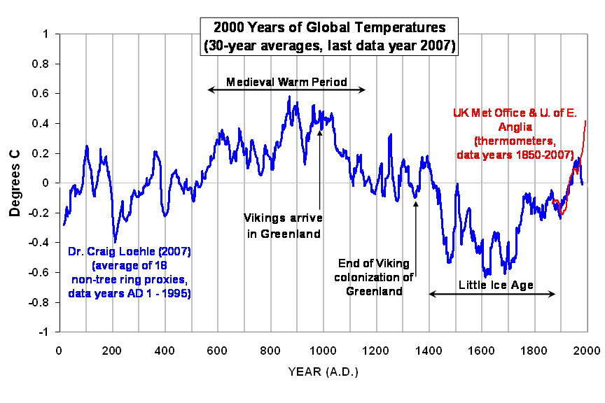
The first problem I see with scientifically determining whether the theory of anthropogenic global warming (AGW) is likely to be true is that it is a one-of-a-kind event. This immediately reduces our scientific confidence in pinpointing the cause of warming. The following proxy reconstruction of temperature variations over the last 2,000 years suggests global warming (and cooling), are the rule, not the exception, and so greenhouse gas increases in the last 100 years occurring during warming might be largely a coincidence.

Twice I have testified in congress that unbiased funding on the subject of the causes of warming would be much closer to a reality if 50% of that money was devoted to finding natural reasons for climate change. Currently, that kind of research is almost non-existent.

A second, related problem is that we cannot put the Earth in the laboratory to run controlled experiments on. Now, we CAN determine in the laboratory that certain atmospheric constituents (water vapor, water droplets, carbon dioxide, methane) absorb and emit infrared energy…the physical basis for the so-called greenhouse effect. But the ultimate uncertainty over atmospheric feedbacks — e.g. determining whether cloud changes with warming reduce or amplify that warming — cannot be tested with any controlled experiment.

A third problem is the difficulty in separating cause from effect. Determining whether atmospheric feedbacks are positive or negative requires analysis of entire, quasi-global atmospheric circulation systems. Just noticing that more clouds tend to form over warm regions does not tell you anything useful about whether cloud feedbacks are positive or negative. Atmospheric and oceanic circulation systems involve all kinds of interrelated processes in which cause and effect must surely be operating. But separating cause from effect is something else entirely.

For example, just establishing that years experiencing global warmth have less cloud cover letting more sunlight in does not prove positive cloud feedback…simply because the warming could have been the result of — rather than the cause of — fewer clouds. This is the subject that Andy Dessler and I have been debating recently, and I consider it to be the Achilles heel of AGW theory.

After all, it is not the average role of clouds in the climate system that is being debated — we already know it is a cooling effect. It’s instead how clouds will change as a result of warming that we are interested in. Maybe they are the same thing (which is what I’m betting)…but so far, no one has found a way to prove or disprove it. And I believe cause-versus-effect is at the heart of that uncertainty.

A fourth problem with determining whether AGW theory is true or not is closely related to a similar problem medical research has — the source of funding. This has got to be one of the least appreciated sources of bias in global warming research. In pharmaceutical research, experimentally demonstrating the efficacy of some new drug might be influenced by the fact that the money for the research came from the company that developed the drug in the first place. This is partly why double-blind studies involving many participants (we have only one: Earth) were developed.

But in global warming research, there is a popular misconception that oil industry-funded climate research actually exists, and has skewed the science. I can’t think of a single scientific study that has been funded by an oil or coal company.

But what DOES exist is a large organization that has a virtual monopoly on global warming research in the U.S., and that has a vested interest in AGW theory being true: the U.S. Government. The idea that government-funded climate research is unbiased is laughable. The push for ever increasing levels of government regulation and legislation, the desire of government managers to grow their programs, the dependence of congressional funding of a problem on the existence of a “problem” to begin with, and the U.N.’s desire to find reasons to move toward global governance, all lead to inherent bias in climate research.

At least with medical research, there will always be funding because disease will always exist. But human-caused warming could end up to be little more than a false alarm…as well as a black eye for the climate research community. And lest we forget, possibly the biggest funding-related source of bias in climate research is that research community of scientists. Everyone knows that if the AGW “problem” is no longer a problem, their source of research funding will disappear.

Sometimes I get accused of being a conspiracy nut for believing these things. Well, whoever accuses me of that has obviously not worked in government or spent much time dealing with program managers in Washington. There is no conspiracy, because these things are not done in secret. The U.N.’s Agenda 21 is there for all to read.

The bottom line is that there could scarcely be a more ill-posed scientific question than whether global warming is human-caused: a one of a kind event, the Earth can’t be put into a laboratory to study, cause and effect are intermingled, and the political and financial sources of bias in the resulting research are everywhere.

So, when some scientist says we “know” that warming is human-caused, I cringe at the embarrassing abundance of scientific ignorance on display. No wonder the public doesn’t trust scientific predictions — just as suggested by the 2005 study I mentioned at the outset, those predictions have almost always been wrong!

Dessler and Spencer Debate Cloud Feedback

December 31st, 2010

What follows is a mini-debate by e-mail during the last 3 weeks between myself and Andy Dessler over the question of whether cloud feedbacks in the climate system are positive or negative.

Last night, Andy Revkin suggested that I post it. I believe this e-mail exchange is rather unusual during a time when scientists arguing over global warming more often spar with sound bites in the popular press rather than personally between themselves.

This was partly the result of my somewhat scathing post on December 9, 2010 regarding Science recently publishing Andy’s paper claiming positive cloud feedback. (I was not asked to peer review Andy’s paper even though I have published the most recent and directly comparable paper on the subject.)

The e-mail debate, which is still in progress, has been cc’d to a variety of people, the more recognizable addresses being: mann@meteo.psu.edu; gschmidt@giss.nasa.gov; trenbert@ucar.edu; jgillis@nytimes.com; rkerr@aaas.org; santer1@llnl.gov; revkin@optonline.net; rlindzen@mit.edu; olivermorton@economist.com; ekintisch@aaas.org; p.campbell@nature.com; john.christy@nsstc.uah.edu; mlemonick@climatecentral.org; eric.berger@chron.com; jhalpern@howard.edu.

The exchange of e-mails is listed in chronological order, following an initial e-mail alert from Scott Mandia of the Climate Science Rapid Response Team of my blog post on Andy’s paper. I am not posting Scott’s e-mail in respect of his privacy.

I entered the e-mail discussion after Scott criticized my my blog post implying that Andy’s paper being published by Science on the last day of the Cancun climate conference was motivated by more than just science. I have italicized where one of us quotes from an earlier e-mail.

SPENCER (11 December, 2010, #1 of 2):
In retrospect, my questioning of the timing has distracted from the central science issues, and was a bad move on my part. My apologies to Andy.
-Roy

SPENCER (11 December, 2010, #2 of 2):
…but I stand by my assertion that Andy’s paper is a step backwards for science. I would debate him or anyone else on this issue in a public or professional forum at any time.

I would be happy to submit a response to Science if I thought it had “a snowball’s chance”, but many of us have learned over the years that the editorial process there is quite biased on the subject of anthropogenic global warming.

BTW, I have stopped corresponding with Andy after he made public our e-mail exchange without asking me.
-Roy Spencer

DESSLER (11 December, 2010):
Roy-

I certainly accept your apology.

…but I stand by my assertion that Andy’s paper is a step backwards for science. I would debate him or anyone else on this issue in a public or professional forum at any time.

I ACCEPT! Let’s start immediately. Since you’re willing to do this essentially anywhere and anytime, I say we do this via e-mail. And since you want this to be public, I pledge to post the entirety of all of our e-mail correspondence on a blog that everyone can read (and since you also have copies of our correspondence, you’ll also be free to post it).

If you accept (and I don’t see how you can refuse given your statement above), then you can begin by answering this e-mail I sent to you yesterday:

Hi Roy-
I wanted to follow up on our interesting discussion. My main question involves your theory of cause-and-effect for an ENSO. During our first e-mails it seemed you were saying it was caused by clouds, but then things seemed to change. Could you send me a short summary of what’s driving the temperature changes during those cycles?
Thanks!

I look forward to a renewed and energetic discussion of these issues. After all, this is how science is supposed to operate.

And to the reporters on this e-mail, I hope you all see that the mainstream science community is pushing to engage the skeptics. I hope Roy shows that skeptics are similarly willing to engage.

Regards,
Andy Dessler

SPENCER (13 December, 2010):
Andy:

Sorry about the late reply…I wanted to get to the office to look at some IPCC model output that might help shed light on this.

So, since you want to talk about ENSO, let’s do that.

Of all the IPCC AR4 climate models, the one that has the best match to observed sea surface temperatures (SST) related to ENSO is CNRM-CM3 (see Fig. 8.13 from the IPCC AR4 Report).

The first attached plot shows 20 years (1980-2000) of monthly anomalies in global radiative flux and surface temperature from that model’s 20th Century runs:

[PLOT OF CNRM-CM3 TIME SERIES}

A scatter plot of the data is next:

[CNRM-CM3 SCATTER PLOT]

See the spirals? Thats due to radiative forcing of SSTs. How do we know? Because there are only two possibilities: radiative changes (directly or indirectly) causing temperature changes, or temperature changes (directly or indirectly) causing radiative changes (by definition, feedback). The reason the spirals appear is that the radiative forcing is proportional to the CHANGE of temperature with time…not the temperature directly. Feedback is essentially instantaneous with the current radiative state of the armosphere and surface.

This is shown in the following lag correlation plot for the entire 20th Century:

[LAG CORRELATION PLOT]

That atmsopheric circulation changes alone can cause ENSO-typ behavior was also demonstrated by this paper in GRL, The Slab Ocean El Nino.

AGAIN I want to emphasize…the evidence for the direction of causation is whether a lag exists or not.

The NEXT question is to what extent this de-correlated behavior affects the regression slope…this was a subject of our 2010 JGR paper. All I know so far is that, on average, it biases the regression slope toward zero (which could be misinterpreted as a borderline unstable climate system).

-Roy

DESSLER (14 December 2010):
Roy-

Thanks for your message … I knew you couldn’t stay mad at me 😉

Before I get into the details of the correlation, I’d like to get one thing straight: you’re arguing that the warming during an El Nino is caused by radiative heating by clouds. Right?

Once you confirm that, we can move on with the discussion. If you’re not saying that, then I’m confused by your message — in that case, I’d appreciate it if you could please explain the role of clouds in driving surface temperatures variations during ENSO.

Thanks!

SPENCER (15 December 2010):
Andy:

Feedbacks and forcings involve *temperature* changes, not abstract concepts like “El Nino”. Thus, your question is a bit of a red herring.

What I *AM* saying is that the time-evolving nature of the temperature and radiative flux anomalies is consistent with a significant, non-feedback cloud-induced temperature change. That is what the phase space analysis reveals.

Now, what all of this might mean for how El Nino & La Nina evolve over time is an interesting question, I agree,…I’m just trying to make sure we don’t lose sight of the quantitative evidence. Whether the evidence I am talking about necessarily implies a non-feedback role for clouds in how El Nino and La Nina evolve over time, that is a separate question.

-Roy

DESSLER (18 December 2010):
Roy-

Thanks for your response. I would have gotten back sooner, but I was at the AGU meeting.

What I *AM* saying is that the time-evolving nature of the temperature and radiative flux anomalies is consistent with a significant, non-feedback cloud-induced temperature change. That is what the phase space analysis reveals.

The problem here is that correlation is not causality: if I beat a drum during an eclipse, the Sun will return 100% of the time. You could claim that the time-evolving nature of the drum beating and return of the sun is consistent with a causal mechanism, and you’d be right. It is indeed consistent. But it’s also wrong — we both know that the drum does not make the Sun return.

The existence of a correlation does not mean that there is a causal link — so we cannot conclude that the correlation you’ve identified tells us anything about the role of clouds in generating ENSO surface temperature changes.

Rather, we have to look at the energy budget of an ENSO event. Those data contradict the idea that clouds are important in ENSO: analyses of the heat budget of ENSO (e.g., Trenberth et al., 2010: Relationships between tropical sea surface temperatures and top-of-atmosphere radiation. Geophys. Res. Lett., 37, L03702, doi:10.1029/2009GL042314 and references therein) don’t show a role for clouds.

In fact, the original Cane and Zebiak model of ENSO does not really even have clouds in it

So my question to you is whether there exists any physical evidence (beyond just the correlation) that clouds play any role at all in generating ENSO temperature variations?

Thanks!

SPENCER (20 December 2010):
Andy:

OK, I think now you are raising the possibility that what I am calling a “non-feedback radiative forcing” was at some previous time itself a feedback upon temperature. If that were the case, then there would be a lagged correlation, and you would then need to do your feedback parameter diagnosis at some time lag between the radiative flux and temperature data…not simultaneously. This is what Lindzen has been trying to get published, and is another way of getting a feedback estimate.

But it is not what you did in your Science paper. When I do it with the same 10-year CERES dataset you used, I get a very different result…outside the range of most if not all climate models.

-Roy

DESSLER (21 December 2010):

Roy-

Let me be clear: I am not “raising any possibilities” here. What I am trying to do is get you to articulate YOUR THEORY of ENSO causality. I’ve been trying to do this since our initial e-mail and trying to get a straight answer is beginning to feel like eating jello with chopsticks.

So let’s get back to the issue at hand: Do you have any physical evidence that clouds are playing a significant role in causing temperature variations during ENSO (besides the correlation, which (I think) we agree does not prove causality)? If so, what is it? If not, do you concede that I have the correct direction of causality in my paper?

After we resolve this, we can start talking about lags, etc.

Thanks again for your willingness to engage in discussions on this issue!

SPENCER (22 December 2010):
Andy:

How can you insist I answer a question, the answer to which would not refute (or prove) what we demonstrated in Spencer & Braswell (2010 JGR) anyway?

You can ask me, “Do you still beat your wife?”, and I’m not going to answer yes or no to that one either.

Remember, it is not me, but YOU who is claiming our results necessarily imply that clouds are part of the forcing of ENSO-related temperature changes…and you might well be right. If so, congratulations on your finding.

And I would say this interpretation IS entirely reasonable: that a change in the trade winds associated with the initiation of El Nino causes a change in cloud cover, which then is part of the forcing of El Nino-related temperature changes. THAT sounds entirely reasonable to me, and is consistent with the evidence we presented.

But that does NOT mean “clouds cause El Nino”.

Don’t confuse qualitative statements like these with what we showed QUANTITATIVELY in Spencer & Braswell, which was a simple statement of the CONSERVATION OF ENERGY:

The satellite data show radiative imbalances causing temperature changes with time.

That’s just a statement of the 1st Law of Thermodynamics. Are you claiming the 1st Law didn’t apply during 2000-2010?

Maybe YOU should answer THAT question before we continue the discussion.

But if you continue to insist on me answering “yes or no” to a question that is not relevant to what we are debating, I suggest we end this now.

-Roy

DESSLER (26 December 2010):
For those not following closely, let me recap the argument that Roy and I are having. In my research paper, I showed that the energy trapped by clouds increases as the surface temperature increases, and concluded that there is a positive cloud feedback acting. Roy objected to this saying that clouds are actually causing the surface temperature change, so I have cause and effect backwards. My response to this is that the temperature variations over the last 10 years are primarily driven by ENSO, and we know that ENSO is not caused by clouds.

This is the crux of our disagreement. In his last e-mail to me, Roy said, “The satellite data show radiative imbalances causing temperature changes with time” and “Our analysis shows that non-feedback cloud variations do cause large amounts of temperature variability during the satellite data period in question.”

But neither of Roy’s claims seem correct to me. I do not think he’s actually demonstrated that clouds are causing temperature changes.

To resolve this, I pose the following question to Roy: can you summarize for everyone on this list the evidence that clouds are affecting surface temperature over the last ten years. And can we quantify how much are clouds affecting the surface temperature? Are they responsible for 1% of the variance, or 99% of the variance, etc.?

And to show you that I am willing to answer your questions, I will answer the question you posed to me in your last e-mail: “Are you claiming the 1st Law didn’t apply during 2000-2010? Maybe YOU should answer THAT question before we continue the discussion.” The answer is that I do not dispute that the first law applies. I agree that energy is always conserved.

Happy holidays.

Thanks!

SPENCER (30 December 2010):
OK, let me see if I can briefly summarize my side of this…

The evidence that clouds cause a substantial portion of the temperature changes during the ten-year period in question is twofold:

(1) the temperature changes tend to lag the radiative flux changes, something that is revealed by “connecting the dots” in the scatterplots of radiative flux-vs-temperature, and

(2) this lagged behavior strongly decorrelates the temperature-versus-radiative flux variations (as is seen in Andy’s, and virtually all previously published, scatter plots of this type).

This poorly-correlated behavior is consistent with the short-term behavior of most if not all of the AR4 climate models, and was mimicked by our simple forcing-feedback model, both of which we published in JGR earlier this year.

In contrast, feedback (temperature causing cloud changes, which is what Andy believes is going on) is much closer to simultaneous, which would lead to strongly correlated data (which is seldom observed…except on month-to-month time scales).

Our JGR paper also demonstrated that this decorrelation was not simply due to noisy data…”connecting the dots” (phase space plots) shows looping and spiral patterns, rather than the zig-zag patterns one gets with random noise.

In the big picture, what the satellite data suggest is a sort of meandering of the climate system through varying states of radiative IMbalance, with the temperature changes always trying to play catch-up with the radiative flux changes, …but then the atmospheric circulation causes another change in cloudiness, and the temperature then has to slowly respond to that, too, …etc. Radiative equilibrium is never actually reached.

Regarding Andy’s question of just what percentage of all of the variability is due to “forcing” versus “feedback” is still an open question. All I know is that the “forcing” so strongly decorrelates that data that doing linear regression to get a feedback estimate is going to result in a regression slope approaching zero, which is then commonly misinterpreted as strongly positive feedback.

(We also showed in our JGR paper that short satellite periods of record can even lead to a bias in the direction of NEGATIVE feedback…but this is much less likely than a bias in the direction of positive feedback.)

-Roy

The Dessler Cloud Feedback Paper in Science: A Step Backward for Climate Research

December 9th, 2010

How clouds respond to warming – the ‘cloud feedback’ problem – will likely determine whether manmade global warming becomes either the defining environmental event of the 21st Century, or is merely lost in the noise of natural climate variability.

Unfortunately, diagnosing cloud feedback from our global satellite observations has been surprisingly difficult. The problem isn’t the quality of the data, though. The problem is figuring out what the cloud and temperature behaviors we observe in the data mean in terms of cause and effect.

So, Andy Dessler’s (a Texas A&M climate researcher) new paper appearing in Science this week is potentially significant, for it claims to have greatly closed the gap in our understanding of cloud feedback.

Dessler’s paper claims to show that cloud feedback is indeed positive, and generally supportive of the cloud feedbacks exhibited by the IPCC computerized climate models. This would in turn support the IPCC’s claim that anthropogenic global warming will become an increasingly serious problem in the future.

Unfortunately, the central evidence contained in the paper is weak at best, and seriously misleading at worst. It uses flawed logic to ignore recent advancements we have made in identifying cloud feedback.

In fact, the new paper is like going back to using only X-rays for medical imaging when we already have MRI technology available to us.

What the New Study Shows

So what is this new evidence of positive cloud feedback that Dessler has published? Well, actually it is not new. It’s basically the same evidence we published in the Journal of Geophysical Research.

Yet we came to a very different conclusion, which was that the only clear evidence of feedback we found in the data was of strongly negative cloud feedback.

But how can this be? How can two climate researchers, using the same dataset, come to opposite conclusions?

The answer lies in an issue that challenges researchers in most scientific disciplines – separating cause from effect.

Dessler’s claim (and the IPCC party line) is that cloud changes are caused by temperature changes, and not the other way around. Causation only occurs in one direction, not the other.

In their interpretation, if one observes a warmer year being accompanied by fewer clouds, then that is evidence of positive cloud feedback. Why? Because if warming causes fewer clouds, it lets in more sunlight, which then amplifies the warming. That is positive cloud feedback in a nutshell.

But what if the warming was caused by fewer clouds, rather than the fewer clouds being caused by warming? In other words, what if previous researchers have simply mixed up cause and effect when estimating cloud feedback?

A Step Backwards for Climate Science

What we demonstrated in our JGR paper earlier this year is that when cloud changes cause temperature changes, it gives the illusion of positive cloud feedback – even if strongly negative cloud feedback is really operating!

I can not overemphasize the importance of that last statement.

We used essentially the same satellite dataset Dessler uses, but we analyzed those data with something called ‘phase space analysis’. Phase space analysis allows us to “see” behaviors in the climate system that would not be apparent with traditional methods of data analysis. It is like using an MRI to see a type of tumor that X-rays cannot reveal.

What we showed was basically a new diagnostic capability that can, to some extent, separate cause from effect. This is a fundamental advancement – and one that the news media largely refused to report on.

The Dessler paper is like someone publishing a medical research paper that claims those tumors do not exist, because they still do not show up on our latest X-ray equipment…even though the new MRI technology shows they DO exist!

Sound strange? Welcome to my world.

We even replicated that behavior see in the satellite data analyzed with phase space analysis — our ‘MRI for the climate system’ – by using a simple forcing-feedback climate model containing negative cloud feedback. It showed that, indeed, when clouds cause temperature changes, the illusion of positive cloud feedback is created…even when strongly negative cloud feedback really exists.

Why Dessler Assumed We Are Wrong

To Dessler’s credit, he actually references our paper. But he then immediately discounts our interpretation of the satellite data.

Why?

Because, as he claims, (1) most of the climate variability during the satellite period of record (2000 to 2010) was due to El Nino and La Nina (which is largely true), and (2) no researcher has ever claimed that El Nino or La Nina are caused by clouds.

This simple, blanket claim was then intended to negate all of the evidence we published.

But this is not what we were claiming, nor is it a necessary condition for our interpretation to be correct. El Nino and La Nina represent a temporary change in the way the coupled atmospheric-ocean circulation system operates. And any change in the atmospheric circulation can cause a change in cloud cover, which can in turn cause a change in ocean temperatures. We even showed this behavior for the major La Nina cooling event of 2007-08 in our paper!

It doesn’t mean that “clouds cause El Nino”, as Dessler suggests we are claiming, which would be too simplistic and misleading of a statement. Clouds are complicated beasts, and climate researchers ignore that complexity at their peril.

Very Curious Timing

Dessler’s paper is being announced on probably THE best day for it to support the IPCC’s COP-16 meeting here in Cancun, and whatever agreement is announced tomorrow in the way of international climate policy.

I suspect – but have no proof of it – that Dessler was under pressure to get this paper published to blunt the negative impact our work has had on the IPCC’s efforts.

But if this is the best they can do, the scientists aligning themselves with the IPCC really are running out of ideas to help shore up their climate models, and their claims that our climate system is very sensitive to greenhouse gas emissions.

The weak reasoning the paper employs – and the evidence we published which it purposely ignores! – combined with the great deal of media attention it will garner at a time when the IPCC needs to regain scientific respectability (especially after Climategate), makes this new Science paper just one more reason why the public is increasingly distrustful of the scientific community when it comes to research having enormous policy implications.