Warming in Last 50 Years Predicted by Natural Climate Cycles

June 6th, 2010

One of the main conclusions of the 2007 IPCC report was that the warming over the last 50 years was most likely due to anthropogenic pollution, especially increasing atmospheric CO2 from fossil fuel burning.

But a minority of climate researchers have maintained that some — or even most — of that warming could have been due to natural causes. For instance, the Pacific Decadal Oscillation (PDO) and Atlantic Multi-decadal Oscillation (AMO) are natural modes of climate variability which have similar time scales to warming and cooling periods during the 20th Century. Also, El Nino — which is known to cause global-average warmth — has been more frequent in the last 30 years or so; the Southern Oscillation Index (SOI) is a measure of El Nino and La Nina activity.

A simple way to examine the possibility that these climate cycles might be involved in the warming over the last 50 years in to do a statistical comparison of the yearly temperature variations versus the PDO, AMO, and SOI yearly values. But of course, correlation does not prove causation.

So, what if we use the statistics BEFORE the last 50 years to come up with a model of temperature variability, and then see if that statistical model can “predict” the strong warming over the most recent 50 year period? That would be much more convincing because, if the relationship between temperature and these 3 climate indicies for the first half of the 20th Century just happened to be accidental, we sure wouldn’t expect it to accidentally predict the strong warming which has occurred in the second half of the 20th Century, would we?

Temperature, or Temperature Change Rate?
This kind of statistical comparison is usually performed with temperature. But there is greater physical justification for using the temperature change rate, instead of temperature. This is because if natural climate cycles are correlated to the time rate of change of temperature, that means they represent heating or cooling influences, such as changes in global cloud cover (albedo).

Such a relationship, shown in the plot below, would provide a causal link of these natural cycles as forcing mechanisms for temperature change, since the peak forcing then precedes the peak temperature.

Predicting Northern Hemispheric Warming Since 1960
Since most of the recent warming has occurred over the Northern Hemisphere, I chose to use the CRUTem3 yearly record of Northern Hemispheric temperature variations for the period 1900 through 2009. From this record I computed the yearly change rates in temperature. I then linearly regressed these 1-year temperature change rates against the yearly average values of the PDO, AMO, and SOI.

I used the period from 1900 through 1960 for “training” to derive this statistical relationship, then applied it to the period 1961 through 2009 to see how well it predicted the yearly temperature change rates for that 50 year period. Then, to get the model-predicted temperatures, I simply added up the temperature change rates over time.

The result of this exercise in shown in the following plot.

What is rather amazing is that the rate of observed warming of the Northern Hemisphere since the 1970’s matches that which the PDO, AMO, and SOI together predict, based upon those natural cycles’ PREVIOUS relationships to the temperature change rate (prior to 1960).

Again I want to emphasize that my use of the temperature change rate, rather than temperature, as the predicted variable is based upon the expectation that these natural modes of climate variability represent forcing mechanisms — I believe through changes in cloud cover — which then cause a lagged temperature response.

This is powerful evidence that most of the warming that the IPCC has attributed to human activities over the last 50 years could simply be due to natural, internal variability in the climate system. If true, this would also mean that (1) the climate system is much less sensitive to the CO2 content of the atmosphere than the IPCC claims, and (2) future warming from greenhouse gas emissions will be small.


Updated: Low Climate Sensitivity Estimated from the 11-Year Cycle in Total Solar Irradiance

June 4th, 2010

NOTE: This has been revised since finding an error in my analysis, so it replaces what was first published about an hour ago.

As part of an e-mail discussion on climate sensitivity I been having with a skeptic of my skepticism, he pointed me to a paper by Tung & Camp entitled Solar-Cycle Warming at the Earth’s Surface and an Observational Determination of Climate Sensitivity.

The authors try to determine just how much warming has occurred as a result of changing solar irradiance over the period 1959-2004. It appears that they use both the 11 year cycle, and a small increase in TSI over the period, as signals in their analysis. The paper purports to come up with a fairly high climate sensitivity that supports the IPCC’s estimated range, which then supports forecasts of substantial global warming from increasing greenhouse gas concentrations.

The authors start out in their first illustration with a straight comparison between yearly averages of TSI and global surface temperatures during 1959 through 2004. But rather than do a straightforward analysis of the average solar cycle to the average temperature cycle, the authors then go through a series of statistical acrobatics, focusing on those regions of the Earth which showed the greatest relationship between TSI variations and temperature.

I’m not sure, but I think this qualifies as cherry picking — only using those data that support your preconceived notion. They finally end up with a fairly high climate sensitivity, equivalent to about 3 deg. C of warming from a doubling of atmospheric CO2.

Tung and Camp claim their estimate is observationally based, free of any model assumptions. But this is wrong: they DO make assumptions based upon theory. For instance, it appears that they assume the temperature change is an equilibrium response to the forcing. Just because they used a calculator rather than a computer program to get their numbers does not mean their analysis is free of modeling assumptions.

But what bothers me the most is that there was a much simpler, and more defensible way to do the analysis than they presented.

A Simpler, More Physically-Based Analysis

The most obvious way I see to do such an analysis is to do a composite 11-year cycle in TSI (there were 4.5 solar cycles in their period of analysis, 1959 through 2004) and then compare it to a similarly composited 11-year cycle in surface temperatures. I took the TSI variations in their paper, and then used the HadCRUT3 global surface temperature anomalies. I detrended both time series first since it is the 11 year cycle which should be a robust solar signature…any long term temperature trends in the data could potentially be due to many things, and so it should not be included in such an analysis.

The following plot shows in the top panel my composited 11-year cycle in global average solar flux, after applying their correction for the surface area of the Earth (divide by 4), and correct for UV absorption by the stratosphere (multiply by 0.85). The bottom panel shows the corresponding 11-year cycle in global average surface temperatures. I have done a 3-year smoothing of the temperature data to help smooth out El Nino and La Nina related variations, which usually occur in adjacent years. I also took out the post-Pinatubo cooling years of 1992 and 1993, and interpolated back in values from the bounding years, 1991 and 1994.

Note there is a time lag of about 1 year between the solar forcing and the temperature response, as would be expected since it takes time for the upper ocean to warm.

It turns out this is a perfect opportunity to use the simple forcing-feedback model I have described before to see which value for the climate sensitivity provides the best fit to the observed temperature response to the 11-year cycle in solar forcing. The model can be expressed as:

Cp[dT/dt] = TSI – lambda*T,

Where Cp is the heat capacity of the climate system (dominated by the upper ocean), dT/dt is the change in temperature of the system with time, TSI represents the 11 year cycle in energy imbalance forcing of the system, and lambda*T is the net feedback upon temperature. It is the feedback parameter, lambda, that determines the climate sensitivity, so our goal is to find a value for a best value for lambda.

I ran the above model for a variety of ocean depths over which the heating/cooling is assumed to occur, and a variety of feedback parameters. The best fits between the observed and model-predicted temperature cycle (an example of which is shown in the lower panel of the above figure) occur for assumed ocean mixing depths around 25 meters, and a feedback parameter (lambda) of around 2.2 Watts per sq. meter per deg. C. Note the correlation of 0.97; the standard deviation of the difference between the modeled and observed temperature cycle is 0.012 deg. C

My best fit feedback (2.2 Watts per sq. meter per degree) produces a higher climate sensitivity (about 1.7 deg. C for a doubling of CO2) than what we have been finding from the satellite-derived feedback, which runs around 6 Watts per sq. meter per degree (corresponding to about 0.55 deg. C of warming).

Can High Climate Sensitivity Explain the Data, Too?

If I instead run the model with the lambda value Tung and Camp get (1.25), the modeled temperature exhibits too much time lag between the solar forcing and temperature response….about double that produced with a feedback of 2.2.

Discussion

The results of this experiment are pretty sensitive to errors in the observed temperatures, since we are talking about the response to a very small forcing — less than 0.2 Watts per sq. meter from solar max to solar min. This is an extremely small forcing to expect a robust global-average temperature response from.

If someone else has published an analysis similar to what I have just presented, please let me know…I find it hard to believe someone has not done this before. I would be nice if someone else went through the same exercise and got the same answers. Similarly, let me know if you think I have made an error.

I think the methodology I have presented is the most physically-based and easiest way to estimate climate sensitivity from the 11-year cycle in solar flux averaged over the Earth, and the resulting 11-year cycle in global surface temperatures. It conserves energy, and makes no assumptions about the temperature being in equilibrium with the forcing.

I have ignored the possibility of any Svensmark-type mechanism of cloud modulation by the solar cycle…this will have to remain a source of uncertainty for now.

The bottom line is that my analysis supports a best-estimate 2XCO2 climate sensitivity of 1.7 deg. C, which is little more than half of that obtained by Tung & Camp (3.0 deg. C), and approaches the lower limit of what the IPCC claims is likely (1.5 deg. C).


May 2010 UAH Global Temperature Update: +0.53 deg. C.

June 4th, 2010


YR MON GLOBE NH SH TROPICS
2009 1 0.251 0.472 0.030 -0.068
2009 2 0.247 0.564 -0.071 -0.045
2009 3 0.191 0.324 0.058 -0.159
2009 4 0.162 0.316 0.008 0.012
2009 5 0.140 0.161 0.119 -0.059
2009 6 0.043 -0.017 0.103 0.110
2009 7 0.429 0.189 0.668 0.506
2009 8 0.242 0.235 0.248 0.406
2009 9 0.505 0.597 0.413 0.594
2009 10 0.362 0.332 0.393 0.383
2009 11 0.498 0.453 0.543 0.479
2009 12 0.284 0.358 0.211 0.506
2010 1 0.648 0.860 0.436 0.681
2010 2 0.603 0.720 0.486 0.791
2010 3 0.653 0.850 0.455 0.726
2010 4 0.501 0.799 0.203 0.633
2010 5 0.534 0.775 0.293 0.710

UAH_LT_1979_thru_May_10

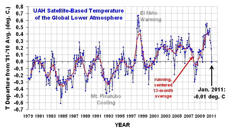
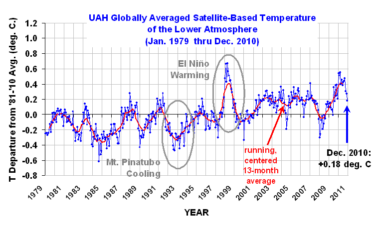
The global-average lower tropospheric temperature remains warm: +0.53 deg. C for May, 2010. The linear trend since 1979 is now +0.14 deg. C per decade.Tropics picked up a bit, but SSTs indicate El Nino has ended and we may be headed to La Nina. NOAA issued a La Nina Watch yesterday.

In the race for the hottest calendar year, 1998 still leads with the daily average for 1 Jan to 31 May being +0.65 C in 1998 compared with +0.59 C for 2010. (Note that these are not considered significantly different.) As of 31 May 2010, there have been 151 days in the year. From our calibrated daily data, we find that 1998 was warmer than 2010 on 96 of them.

As a reminder, three months ago we changed to Version 5.3 of our dataset, which accounts for the mismatch between the average seasonal cycle produced by the older MSU and the newer AMSU instruments. This affects the value of the individual monthly departures, but does not affect the year to year variations, and thus the overall trend remains the same as in Version 5.2. ALSO…we have added the NOAA-18 AMSU to the data processing in v5.3, which provides data since June of 2005. The local observation time of NOAA-18 (now close to 2 p.m., ascending node) is similar to that of NASA’s Aqua satellite (about 1:30 p.m.). The temperature anomalies listed above have changed somewhat as a result of adding NOAA-18.

[NOTE: These satellite measurements are not calibrated to surface thermometer data in any way, but instead use on-board redundant precision platinum resistance thermometers (PRTs) carried on the satellite radiometers. The PRT’s are individually calibrated in a laboratory before being installed in the instruments.]


Millennial Climate Cycles Driven by Random Cloud Variations

June 2nd, 2010

I’ve been having an e-mail discussion with another researcher who publishes on the subject of climate feedbacks, and who remains unconvinced of my ideas regarding the ability of clouds to cause climate change. Since I am using the simple forcing-feedback model as evidence of my claims, I thought I would show some model results for a 1,000 year integration period.

What I want to demonstrate is one of the issues that is almost totally forgotten in the global warming debate: long-term climate changes can be caused by short-term random cloud variations.

The main reason this counter-intuitive mechanism is possible is that the large heat capacity of the ocean retains a memory of past temperature change, and so it experiences a “random-walk” like behavior. It is not a true random walk because the temperature excursions from the average climate state are somewhat constrained by the temperature-dependent emission of infrared radiation to space.

A 1,000 Year Model Run

The temperature variability in this model experiment is entirely driven by a 1,000 year time series of monthly random numbers, which is then smoothed with a 30-year filter to mimic multi-decadal variability in cloud cover.

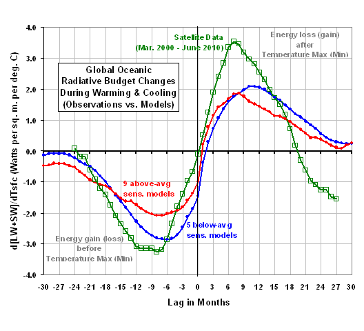
I’ve run the model with a 700 m deep ocean, and strong negative feeedback (6 Watts per sq. meter of extra loss of energy to space per degree of warming, which is equivalent to only 0.5 deg. C of warming for a doubling of atmospheric CO2. This is what we observed in satellite data for month-to-month global average temperature variations.)

The first plot below shows the resulting global average radiative imbalance, which is a combination of (1) the random cloud forcing and (2) the radiative feedback upon any temperature change from that forcing. Note that the standard deviation of these variations over the 1,000 year model integration is only one-half of one percent of the average rate at which solar energy is absorbed by the Earth, which is about 240 Watts per sq. meter.

I also computed the average 10-year trends for all 10-year periods contained in the 1,000 year time series shown above, and got about the same value as NASA’s best radiation budget instrument (CERES) has observed from the Terra satellite for the ten-year period 2000 – 2010: about 1 Watt per sq. meter per decade. Thus, we have satellite evidence that the radiative imbalances seen above are not unrealistic.

The second plot shows the resulting temperature changes over the 1,000 year model run. Note that even though the time scale of the forcing is relatively short — 30 year smoothed monthly random numbers — the 700 m ocean layer can experience much longer time scale temperature changes.

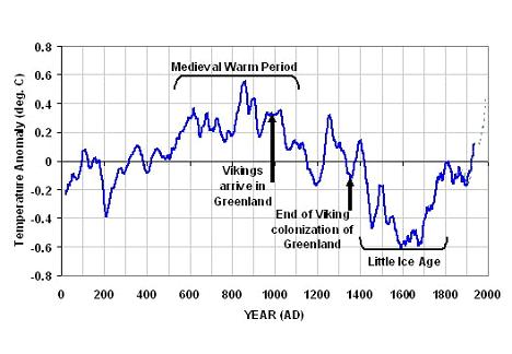
In fact, if we think of this as the real temperature history for the last 1,000 years, we might even imagine a “Medieval Warm Period” 600 years before the end of the integration, with rapid global warming commencing in the last century.

Hmmm…sounds vaguely familiar.

The main point here is that random cloud variations in the climate system can cause climate change. You don’t need a change in solar irradiance, or any other external forcing mechanism.

The above plots also illustrate the danger in comparing things like sunspot activity (and its presumed modulation of cloud cover) to long-term temperature changes. As you can see, the temperature variations in the second plot look nothing like the global energy imbalance variations in the first plot. This is for two reasons: (1) forcing (global radiative imbalance) due to cloud variations is related to the time rate of change of temperature….not to the temperature per se; and (2) the ocean’s “memory” of previous forcing leads to much longer time scale temperature behavior than the short-term cloud forcing might have suggested.

The fact that climate change can be caused by seemingly random, short-term processes has been totally lost in the climate debate. I’m not sure why. Could it be that, if we were to admit the climate system can vary in unpredictable ways, there would be less room for our egos to cause climate change?


Misinterpreting Natural Climate Change as Manmade

May 31st, 2010

The simple climate model I have made publicly available can be used to demonstrate many basic concepts regarding climate change.

Here I will use it to demonstrate that the global warming so commonly blamed on humanity’s greenhouse gas emissions can just as easily be explained as largely natural in origin, most likely due to a natural decrease in global cloud cover.

In general, there are TWO POTENTIAL EXPLANATIONS OF CLIMATE WARMING:
(1) X deg. C warming = anthropogenic CO2 increase + sensitive climate system
(2) X deg. C warming = natural forcing + anthropogenic CO2 increase + insensitive climate system

While I will run the model with an assumed ocean mixing depth of 50 meters of water, the same general effects can be demonstrated with very different depths, say, 10 meters or 500 meters. I have also added some weak natural variability on monthly to yearly time scales to better mimic what happens in the real climate system. You can run the model yourself if you are curious.

While the model is admittedly simple, it does exactly what the most complex computerized climate models must do to simulate global-average warming: (1) conserve energy by increasing temperature in response to an accumulation of energy, and (2) adjust the magnitude of that temperature change through feedbacks (e.g. cloud changes) in the climate system.

CASE 1: Anthropogenic Global Warming in a Sensitive Climate System
In the first example I run the simple forcing-feedback climate model with gradually increasing carbon dioxide causing an extra forcing of 0.25 Watts per sq. meter every ten years, acting upon a very sensitive climate system. “Sensitive” in this case is a net feedback parameter of 1.0 Watt per sq. meter per deg. C, which would correspond to about 3.8 deg. C of warming from a doubling of atmospheric carbon dioxide (2XCO2). (It is expected that we will reach 2XCO2 later in this century.) This amount of warming is on the high side of what the IPCC projects for the future.

The following plot shows 50 years of resulting warming (blue trace) from the model, as well as the radiative imbalance at the top of the model atmosphere (red trace). In this plot, when the radiative balance is negative it means there is an accumulation of energy in the climate system which will then cause subsequent warming.

These are the two main sources of information used to diagnose the reasons for global climate variability and climate change. In the real climate system, the warming (blue trace) could be measured by either surface thermometers, or from Earth-orbiting satellites. The red trace (radiative imbalance) is what is measured by satellite instruments (e.g. the CERES instruments on the Terra satellite since 2000, and on the Aqua satellite since 2002).

CASE 2: Natural Global Warming in an Insensitive Climate System
To demonstrate that the same satellite-observed behavior can mostly caused by natural climate change, in the second example I run the simple forcing-feedback climate model with the same amount of CO2 forcing as in CASE 1, but now add to it 1.0 Watt per sq. meter of additional forcing from gradually decreasing cloud cover allowing more sunlight in. This gives a total forcing of 1.25 Watt per sq. meter every ten years.

But now I also change the net feedback to correspond to a very IN-sensitive climate system. “Insensitive” in this case is a net feedback parameter of 6.0 Watts per sq. meter per deg. C, which would correspond to just over 0.5 deg. C of warming from a doubling of atmospheric carbon dioxide (2XCO2). This amount of warming is well below the 1.5 deg. C lower limit the IPCC projects for the future as a result of 2XCO2.

As can be seen in the second plot above, the same rate of warming occurs as in CASE 1, and the radiative imbalance of the Earth remains about the same as in CASE 1 as well.

What this demonstrates is that there is no way to distinguish anthropogenic warming of a sensitive climate system from natural warming within an insensitive climate system, based only upon the two main sources of information we rely on for climate change research: (1) temperature change, and (2) radiative imbalance data collected by satellites.

THE CRITICAL IMPORTANCE OF THIS AMBIGUITY
The reason why this fundamental ambiguity exists is that the radiative imbalance of the Earth as measured by satellites is a combination of forcing AND feedback, and those two processes always act in opposition to one another and can not be easily separated.

For instance, a satellite-measured imbalance of -1 unit can be caused by either -2 units of forcing combined with +1 unit of net feedback, OR by -5 units of forcing combined with +4 units of net feedback. There is no way to know for sure which is happening because cause and effect are intermingled.

After many months of research examining satellite data and the output from 18 of the IPCC climate models, I have found no way to separate this natural “internal radiative forcing” of temperature change from feedback resulting from that temperature change.

So how is it that the “consensus” of climate scientists is that CASE 1 is what is really happening in the climate system? Because when researchers have observed a decrease in cloud cover accompanying warming, they assume that the cloud decrease was CAUSED BY the warming (which would be positive cloud feedback). They do NOT consider the possibility that the cloud decrease was the CAUSE OF the warming.

In other words, they assume causation in only one direction (feedback) is occurring. This then gives the illusion of a sensitive climate system.

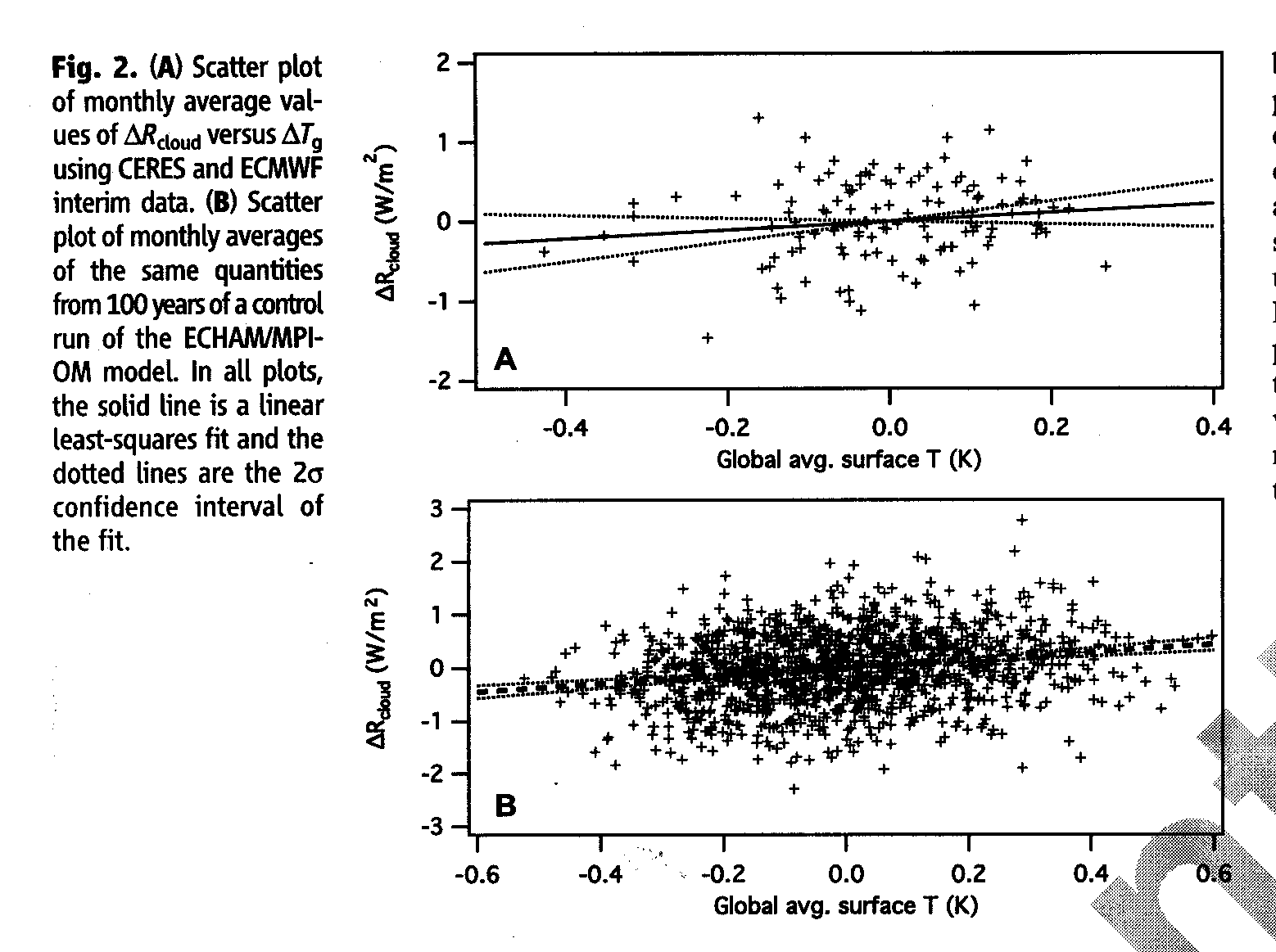
In fact, our new research to appear in Journal of Geophysical Research demonstrates that when natural cloud changes cause temperature changes, the presence of negative cloud feedback cannot even be detected. This is because causation in one direction (clouds forcing temperature) almost completely swamps causation in the opposite direction (temperature forcing clouds, which is by definition feedback).

[NOTE: The claims that there are “fingerprints” of anthropogenic warming are not true. The upper-tropospheric “hot spot”; greater warming over land than over the ocean; and greater warming at high latitudes than at low latitudes, are ALL to expected with any source of warming.]

WHEN WILL THEY LEARN?
Based upon my discussions with mainstream climate researchers, I am finding great reluctance on their part to even consider that such a simple error in interpretation could have been made after 20 years of climate research. As a result of this reluctance, most will not listen (or read) long enough to even understand what I am talking about. A few do understand, but they are largely in the “skeptics camp” anyway, and so their opinions are discounted.

When other scientists are asked about our work, they dismiss it without even understanding it. For instance, the last time I testified in congress, Kevin Trenberth countered my testimony with a pronouncement to the effect of “clouds cannot cause climate change“, which is an astoundingly arrogant and uninformed thing for a scientist to say. After all, we find clear evidence of clouds causing year-to-year climate variability in ALL of the IPCC models, so who is to say this cannot occur on decadal — or even centennial — time scales?

CLIMATE CHAOS
I’m often asked, what could cause such cloud changes? Well, we know that there are a myriad of factors other than just temperature that affect cloud formation. The most likely source of long-term cloud changes would be changes in ocean circulation, which can have very long time scales. But then I’m asked, what caused the ocean changes?

Well, what causes chaos? All of this could simply be the characteristics of a nonlinear dynamical “chaotic” climate system. While a few people have objected to my use of the term “chaotic” in this context, I see no reason why the traditional application of chaos theory to small space and time scales (such as in weather) can not be extended to the larger space and time scales involved in climate. Either way, chaos involves complex nonlinear behavior we do not yet understand, very small changes in which can have profound effects on the system later. It seems to me that such behavior can occur on all kinds of space and time scales.

In conclusion…Yes, Virginia, natural climate cycles really can exist.


The Missing Climate Model Projections

May 23rd, 2010

The strongest piece of evidence the IPCC has for connecting anthropogenic greenhouse gas emissions to global warming (er, I mean climate change) is the computerized climate model. Over 20 climate models tracked by the IPCC now predict anywhere from moderate to dramatic levels of warming for our future in response to increasing levels of atmospheric carbon dioxide. In many peoples’ minds this constitutes some sort of “proof” that global warming is manmade.

Yet, if we stick to science rather than hyperbole, we might remember that science cannot “prove” a hypothesis….but sometimes it can disprove one. The advancement of scientific knowledge comes through new hypotheses for how things work which replace old hypotheses that are either not as good at explaining nature, or which are simply proved to be wrong.

Each climate model represents a hypothesis for how the climate system works. I must disagree with my good friend Dick Lindzen’s recent point he made during his keynote speech at the 4th ICCC meeting in Chicago, in which he asserted that the IPCC’s global warming hypothesis is not even plausible. I think it is plausible.

And from months of comparing climate model output to satellite observations of the Earth’s radiative budget, I am increasingly convinced that climate models can not be disproved. Sure, there are many details of today’s climate system they get wrong, but that does not disprove their projections of long-term global warming.

Where the IPCC has departed from science is that they have become advocates for one particular set of hypotheses, and have become militant fighters against all others.

They could have made their case much stronger if, in addition to all their models that produce lots of warming, they would have put just as much work into model formulations that predicted very little warming. If those models could not be made to act as realistically as those that do produce a lot of warming, then their arguments would carry more weight.

Unfortunately, each modeling group (or the head of each group) already has an idea stuck in their head regarding how much warming looks “about right”. I doubt that anyone could be trusted to perform an unbiased investigation into model formulations which produce very little warming in response to increasing atmospheric greenhouse gas concentrations.

As I have mentioned before, our research to appear in JGR sometime in the coming weeks demonstrates that the only time feedback can be clearly observed in satellite observations — which is only under special circumstances — it is strongly negative. And if that is the feedback operating on the long time scales associated with global warming, then we have dodged the global warming bullet.

But there is no way I know of to determine whether this negative feedback is actually stabilizing the climate system on those long time scales. So, we are stuck with a bunch of model hypotheses to rely on for forecasts of the future, and the IPCC admits it does not know which is closer to the truth.

As a result of all this uncertainty, the IPCC starts talking in meaningless probabilistic language that must make many professional statisticians cringe. These statements are nothing more than pseudo-scientific ways of making their faith in the models sound more objective, and less subjective.

One of the first conferences I attended as a graduate student in meteorology was an AMS conference on hurricanes and tropical meteorology, as I recall in the early 1980’s. Computer models of hurricane formation were all the rage back then. A steady stream of presentations at the conference showed how each modeling group’s model could turn any tropical disturbance into a hurricane. Pretty cool.

Then, a tall lanky tropical expert named William Gray stood up and said something to the effect of, “Most tropical disturbances do NOT turn into hurricanes, yet your models seem to turn anything into a hurricane! I think you might be missing something important in your models.”

I still think about that exchange today in regard to climate modeling. Where are the model experiments that don’t produce much global warming? Are those models any less realistic in their mimicking of today’s climate system than the ones that do?

If you tell me that such experiments would not be able to produce the past warming of the 20th Century, then I must ask, What makes you think that warming was mostly due to mankind? As readers here are well aware, a 1% or 2% change in cloud cover could have caused all of the climate change we saw during the 20th Century, and such a small change would have been impossible to detect.

Also, modelers have done their best to remove model “drift” — the tendency for models to drift away from today’s climate state. Well, maybe that’s what the real climate system does! Maybe it drifts as cloud cover slowly changes due to changing circulation patterns.

It seems to me that all the current crop of models do is reinforce the modelers’ preconceived notions. Dick Lindzen has correctly pointed out that the use of the term “model validation”, rather than “model testing”, belies a bias toward a belief in models over all else.

It is time to return to the scientific method before those who pay us to do science — the public — lose all trust of scientists.


In Defense of the Globally Averaged Temperature

May 22nd, 2010

I sometimes hear my fellow climate realists say that a globally-averaged surface temperature has little or no meaning in the global warming debate. They claim it is too ill-defined, not accurately known, or little more than just an average of a bunch of unrelated numbers from different regions of the Earth.

I must disagree.

The globally averaged surface temperature is directly connected to the globally averaged tropospheric temperature through convective overturning of the atmosphere. This is about 80% of the mass of the atmosphere. You cannot warm or cool the surface temperature without most of the atmosphere following suit.

The combined surface-deep layer atmospheric temperature distribution is then the thermal source of most of the infrared (IR) radiation that cools the Earth in response to solar heating by the sun. Admittedly, things like water vapor, clouds, and CO2 end up also modulating the rate of loss of IR to space, but it is the temperature which is the ultimate source of this radiation. And unless the rate of IR loss to space equals the rate of solar absorption in the global average, the global average temperature will change.

The surface temperature also governs important physical processes, for instance the rate at which the surface “tries” to lose water through evaporation.

If the globally averaged temperature is unimportant, then so are the global average cloudiness, or water vapor content. Just because any one of these globally-averaged variables is insufficient in and of itself to completely define a specific physical process does not mean that it is not a useful number to monitor.

Finally, the globally averaged temperature is not just a meaningless average of a bunch of unrelated numbers. This is because the temperature of any specific location on the Earth does not exist in isolation of the rest of the climate system. If you warm the temperature locally, you then will change the horizontal air pressure gradient, and therefore the wind which transports heat from that location to other locations. Those locations are in turn connected to others.

In fact, the entire global atmosphere is continually overturning, primarily in response to the temperature of the surface as it is heated by the sun. Sinking air in some regions is warmed in response to rising air in other regions, and that rising air is the result of latent heat release in cloud and precipitation systems as water vapor is converted to liquid water. The latent heat was originally picked up by the air at the surface, where the temperature helped govern the rate of evaporation.

In this way, clouds and precipitation in rising regions can transport heat thousands of kilometers away by causing warming of the sinking air in other regions. Surprisingly, atmospheric heat is continually transported into the Sahara Desert in this way, in order to compensate for the fact that the Sahara would actually be a COOL place since it loses more IR energy to space than it gains solar energy from the sun. (This is because the bright sand reflects much of the sunlight back to space).

Similarly, the frigid surface temperature of the Arctic or Antarctic in wintertime is prevented from getting even colder by heat transport from lower latitudes.

In this way, the temperature of one location on the Earth is ultimately connected to all other locations on the Earth. As such, the globally averaged surface temperature — and its intimate connection to most of the atmosphere through convective overturning — is probably the single most important index of the state of the climate system we have the ability to measure.

Granted, it is insufficient to diagnose other things we need to know, but I believe it is the single most important component of any “big picture” snapshot of climate system at any point in time.


Global Average Sea Surface Temperatures Poised for a Plunge

May 20th, 2010

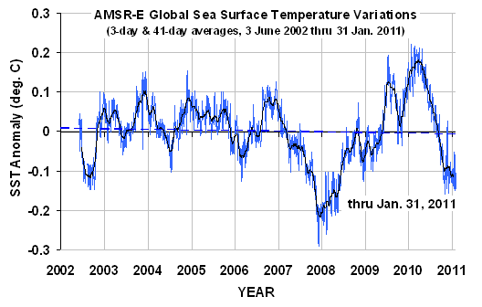
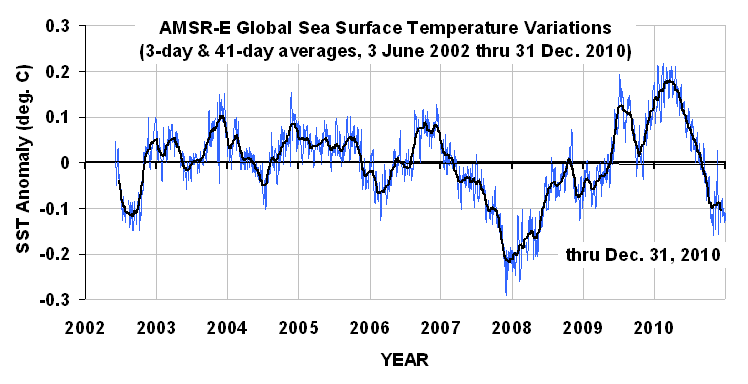
Just an update…as the following graph shows, sea surface temperatures (SSTs) along the equatorial Pacific (“Nino3.4” region, red lines) have been plunging, and global average SSTs have turned the corner, too. (Click on the image for the full-size, undistorted version. Note the global values have been multiplied by 10 for display purposes.)

The corresponding sea level pressure difference between Tahiti and Darwin (SOI index, next graph) shows a rapid transition toward La Nina conditions is developing.

Being a believer in natural, internal cycles in the climate system, I’m going to go out on a limb and predict that global-average SSTs will plunge over the next couple of months. Based upon past experience, it will take a month or two for our (UAH) tropospheric temperatures to then follow suit.


El Nino Rapidly Fading, La Nina Just Around the Corner?

May 14th, 2010

The most recent El Nino event is rapidly dying, as seen in the following plot of sea surface temperature (SST) variations averaged over the Nino3.4 region (5N to 5S, 120W to 170W) as measured by the AMSR-E instrument on NASA’s Aqua satellite during its period of record, 2 June 2002 through yesterday, 13 May 2010:

The 60-day cooling rate as of yesterday was the strongest seen yet in the 8 year period of record for the Nino3.4 region.

A similar plot of the Southern Oscillation Index (SOI) data, based upon the sea level air pressure difference between Tahiti and Darwin is consistent with the SST cooling, showing an increase in the pressure gradient across the tropical South Pacific, which portends increasing trade winds and cooling of the ocean surface:

A plot of these two time series against one another (next plot) reveals that the most recent SSTs are unusually warm for the 60-day average SOI value:

There are at least three ways to interpret this excursion from the average relationship seen in the plot. One is that longer-term warming, whether natural or anthropogenic, has raised the temperature ‘baseline’ about which the El Nino/La Nina events oscillate.

A second possibility is that we are in for continued rapid cooling in the Pacific as the SSTs fall to values more consistent with the SOI index.

A third is that the current excursion toward La Nina territory is going to reverse, and SOI values will decrease to more neutral conditions, while SSTs remain relatively high.

As is always the case, all we can do is sit back and watch.


By Popular Demand: A Daily Global Average CERES Dataset

May 13th, 2010

Since I keep getting requests for the data from which I do my analyses, I’ve decided to provide the main dataset I use here, in an Excel spreadsheet. The comments at the top of the spreadsheet are pretty self-explanatory and include links to the original data. After you click on and open the file with Excel, save it to your computer so you can analyze the data.

What’s In the File, Kenneth?

From original satellite data online at 2 sources, I have calculated daily global-average anomalies (departures from the average annual cycle) in (1) total-sky emitted longwave (LW, or infrared) radiative flux; (2) total-sky reflected shortwave (SW, or solar) radiative flux, and (3) UAH tropospheric temperatures (TMT).

The original radiative flux data that I computed these anomalies from are the Terra satellite CERES Flight Model 1 (FM1) instrument-based ES4 (ERBE-like) daily global gridpoint datasets, available here. These are large files in a binary format, and are not for the weak of heart.

The original UAH TMT temperature data come from here.

All of the original data were area-averaged over the Earth for each day during the 9.5 year Terra CERES period of record, March 2000 through September 2009. An average annual cycle was computed, filtered with a +/- 10 day smoother applied every day, and then anomalies were computed by subtracting the smoothed average annual cycle values from the original data. I program these calculations in Fortran-95, put the data in an Excel spreadsheet, then do all future calculations and graphical plots in Excel.

And remember, folks…“If you torture the data long enough, it will confess.”