Global Warming’s $64 Trillion Question

May 13th, 2010

Edited 1:35 p.m. CDT 5/13/10: Trivia question added, at the end of the post.

Despite its relative simplicity, I continue to find myself trying to explain to experts and lay persons alike how scientists made the Great Global Warming Blunder when it comes to predictions of global warming.

On the bright side, this morning I received an e-mail from a chemist who looked at the math of the problem after reading my new book, and then came to the understanding on his own. And that’s great!

For the most part, though, the climate community continues to suffer from a mental block when it comes to the true role of clouds in global warming. All climate models now change clouds with CO2 warming in ways that amplify that warming, some by a catastrophic amount.

As my latest book describes, I contend that they have been fooled by Mother Nature, and that in fact warming alters clouds in ways that mitigate – not amplify — the small amount of direct warming caused by increasing atmospheric CO2.

The difference between clouds magnifying versus mitigating warming could be the difference between global warming being little more than an academic curiosity…or a disaster for life on Earth.

So, once again I find myself trying to explain a concept that I find the public understands better than the climate experts do: when it comes to clouds and temperature, the direction of causation really does matter.

Why Are There Fewer Clouds when it is Warm?

The “scientific consensus” has been that, because unusually warm conditions are observed to be accompanied by less cloud cover, warming obviously causes cloud cover to decrease. This would be bad news, since decreasing cloud cover in response to warming would let more sunlight in, and amplify the initial warming. That’s called positive cloud feedback.

But what they have difficulty understanding is that causation in the opposite direction (cloud changes causing temperature changes) gives the ILLUSION of positive cloud feedback. It turns out that, when less cloud cover causes warmer temperatures, the cloud feedback in response to that warming is almost totally obscured.

Believe it, the experts have not accounted for this effect. I find it bizarre that most are not even aware it is an issue! As far as I know, I am the only one actively researching the issue.

As a result, the experts have fooled themselves into believing cloud feedbacks are positive. We have demonstrated theoretically in our new paper now accepted for publication in JGR that, even if strong negative cloud feedback exists, cloud changes causing temperature change will make it LOOK like positive cloud feedback.

And this indeed happens in the real climate system. The only time cloud feedback can be clearly seen in the real climate system is when temperature changes are caused by something other than clouds. And in those cases, we find that the net feedback is strongly negative (around 6 Watts per sq. meter of extra energy lost by the Earth per deg. C of global-average warming).

Unfortunately, those events only occur on relatively short climate time scales: 1 month or so. Whether this negative feedback also exists for long-term climate warming is less certain.

Do Climate Models Agree With Satellite Observations of Clouds and Temperature?

The fact that all the climate models which produce substantial global warming also approximate what we measure from satellites is NOT a validation of the feedbacks in those models. So far, after analyzing thousands of years of climate model runs, I have found no convincing way to validate the climate models’ long-term feedbacks with short-term (approx. 10 years or so) satellite observations. The reason is the same: all models have cloud variations causing temperature variations, which then obscures the feedback we are trying to measure.

But there’s another test that could be made. The modelers’ case would be stronger if they could demonstrate that 20 additional climate models, all with various amounts of negative – rather than positive — cloud feedback, are less consistent with our satellite observations than the current crop of models, all of which had positive cloud feedback.

I suspect they do not spend much time on that possibility. A climate model that does not produce much climate change is going to have difficult time getting continued funding for its support.

Trivia Question to Illustrate the Point: Assume continually increasing CO2 in the atmosphere is the only source of climate variability, and we experience continuous slow warming as a result. Will the outgoing longwave radiation (OLR, or infrared) being emitted by the Earth increase…or decrease…during this process?
ANSWER: If warming is the result of increasing CO2 in the atmosphere, then the outgoing longwave radiation (OLR) from the Earth will DECREASE over time. As scientists already know, it is this decrease in OLR that causes the warming in the first place. But because the climate system cannot warm instantly in response (there is a time lag due to the heat capacity of land, ocean, and atmosphere), the increased OLR from warming can never fully make up for the decrease in OLR causing the warming. That warming-induced increase represents the FEEDBACK RESPONSE. But it is forever more than offset by the FORCING from increasing CO2. Now, If we know the time-history of the forcing, it can be subtracted from the OLR to get the feedback. Indeed, this is how feedbacks are diagnosed from climate model experiments involving transient CO2 forcing. The “blunder” I talk about refers to the fact that climate researchers have not accounted for natural sources of radiative forcing (cloud variations) in their attempts to diagnose feedback in the real climate system.

Technical Note: We have found from modeling studies that if the natural cloud variations were truly random in time, the error in diagnosed feedback would be random, not biased toward positive feedback, and would average out to near zero in the long term. But in the real climate system, these cloud variations have preferred time scales….in other words, they have some degree of autocorrelation in time. When that happens, there ends up being a bias in the direction of positive feedback.


Strong Negative Feedback from the Latest CERES Radiation Budget Measurements Over the Global Oceans

May 7th, 2010

Arguably the single most important scientific issue – and unresolved question – in the global warming debate is climate sensitivity. Will increasing carbon dioxide cause warming that is so small that it can be safely ignored (low climate sensitivity)? Or will it cause a global warming Armageddon (high climate sensitivity)?

The answer depends upon the net radiative feedback: the rate at which the Earth loses extra radiant energy with warming. Climate sensitivity is mostly determined by changes in clouds and water vapor in response to the small, direct warming influence from (for instance) increasing carbon dioxide concentrations.

The net radiative feedback can be estimated from global, satellite-based measurements of natural climate variations in (1) Earth’s radiation budget, and (2) tropospheric temperatures.

These feedback estimates have been mostly constrained by the availability of the first measurement: the best calibrated radiation budget data comes from the NASA CERES instruments, with data now available for 9.5 years from the Terra satellite, and 7 years from the Aqua satellite. Both datasets now extend through September of 2009.

I’ve been slicing and dicing the data different ways, and here I will present 7 years of results for the global (60N to 60S) oceans from NASA’s Aqua satellite. The following plot shows 7 years of monthly variations in the Earth’s net radiation (reflected solar shortwave [SW] plus emitted infrared longwave [LW]) compared to similarly averaged tropospheric temperature from AMSU channel 5.

Simple linear regression yields a net feedback factor of 5.8 Watts per sq. meter per degree C. If this was the feedback operating with global warming, then it would amount to only 0.6 deg. C of human-caused warming by late in this century. (Use of sea surface temperatures instead of tropospheric temperatures yields a value of over 11).

Since we have already experienced 0.6 deg. C in the last 100 years, it would also mean that most of our current global warmth is natural, not anthropogenic.

But, as we show in our new paper (in press) in the Journal of Geophysical Research, these feedbacks can not be estimated through simple linear regression on satellite data, which will almost always result in an underestimate of the net feedback, and thus an overestimate of climate sensitivity.

Without going into the detailed justification, we have found that the most robust method for feedback estimation is to compute the month-to-month slopes (seen as the line segments in the above graph), and sort them from the largest 1-month temperature changes to the smallest (ignoring the distinction between warming and cooling).

The following plot shows, from left to right, the cumulative average line slope from the largest temperature changes to the smaller ones. This average is seen to be close to 10 for the largest month-to-month temperature changes, then settling to a value around 6 after averaging of many months together. (Note that the full period of record is not used: only monthly temperature changes greater than 0.03 deg. C were included. Also, it is mostly coincidence that the two methods give about the same value.)

A net feedback of 6 operating on the warming caused by a doubling of atmospheric CO2 late in this century would correspond to only about 0.5 deg. C of warming. This is well below the 3.0 deg. C best estimate of the IPCC, and even below the lower limit of 1.5 deg. C of warming that the IPCC claims to be 90% certain of.

How Does this Compare to the IPCC Climate Models?

In comparison, we find that none of the 17 IPCC climate models (those that have sufficient data to do the same calculations) exhibit this level of negative feedback when similar statistics are computed from output of either their 20th Century simulations, or their increasing-CO2 simulations. Those model-based values range from around 2 to a little over 4.

These results suggest that the sensitivity of the real climate system is less than that exhibited by ANY of the IPCC climate models. This will end up being a serious problem for global warming predictions. You see, while modelers claim that the models do a reasonably good job of reproducing the average behavior of the climate system, it isn’t the average behavior we are interested in. It is how the average behavior will CHANGE.

And the above results show that not one of the IPCC climate models behaves like the real climate system does when it comes to feedbacks during interannual climate variations…and feedbacks are what determine how serious manmade global warming will be.


APRIL 2010 UAH Global Temperature Update: +0.50 deg. C

May 5th, 2010


YR MON GLOBE NH SH TROPICS
2009 1 0.252 0.472 0.031 -0.065
2009 2 0.247 0.569 -0.074 -0.044
2009 3 0.191 0.326 0.056 -0.158
2009 4 0.162 0.310 0.013 0.012
2009 5 0.140 0.160 0.120 -0.057
2009 6 0.044 -0.011 0.100 0.112
2009 7 0.429 0.194 0.665 0.507
2009 8 0.242 0.229 0.254 0.407
2009 9 0.504 0.590 0.417 0.592
2009 10 0.361 0.335 0.387 0.381
2009 11 0.479 0.458 0.536 0.478
2009 12 0.283 0.350 0.215 0.500
2010 1 0.649 0.861 0.437 0.684
2010 2 0.603 0.725 0.482 0.792
2010 3 0.653 0.853 0.454 0.726
2010 4 0.501 0.796 0.207 0.634

UAH_LT_1979_thru_Apr_10

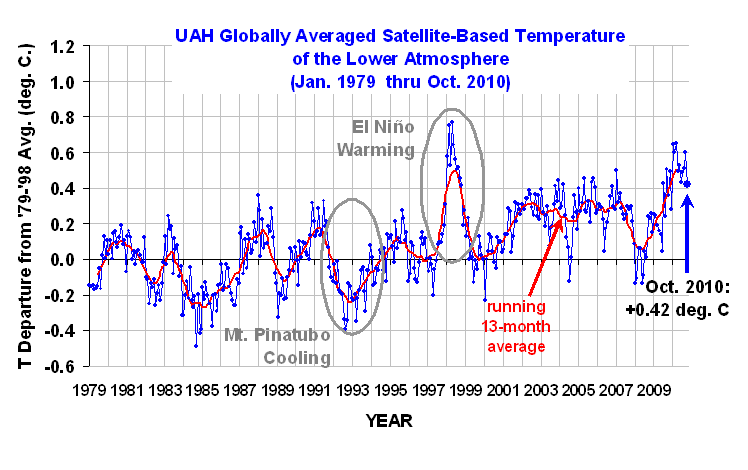
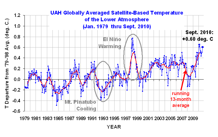
The global-average lower tropospheric temperature continues warm: +0.50 deg. C for April, 2010, although it is 0.15 deg. C cooler than last month. The linear trend since 1979 is now +0.14 deg. C per decade.

Arctic temps (not shown) continued a 5-month string of much above normal temps (similar to Nov 05 to Mar 06) as the tropics showed signs of retreating from the current El Nino event. Antarctic temperatures were cooler than the long term average. Through the first 120 days of 1998 versus 2010, the average anomaly was +0.655 in 1998, and +0.602 in 2010. These values are within the margin of error in terms of their difference, so the recent global tropospheric warmth associated with the current El Nino has been about the same as that during the peak warmth of the 1997-98 El Nino.

As a reminder, two months ago we changed to Version 5.3 of our dataset, which accounts for the mismatch between the average seasonal cycle produced by the older MSU and the newer AMSU instruments. This affects the value of the individual monthly departures, but does not affect the year to year variations, and thus the overall trend remains the same as in Version 5.2. ALSO…we have added the NOAA-18 AMSU to the data processing in v5.3, which provides data since June of 2005. The local observation time of NOAA-18 (now close to 2 p.m., ascending node) is similar to that of NASA’s Aqua satellite (about 1:30 p.m.). The temperature anomalies listed above have changed somewhat as a result of adding NOAA-18.

[NOTE: These satellite measurements are not calibrated to surface thermometer data in any way, but instead use on-board redundant precision platinum resistance thermometers (PRTs) carried on the satellite radiometers. The PRT’s are individually calibrated in a laboratory before being installed in the instruments.]


Global Tropospheric Temperature Variations Since 2002 over Land Versus Ocean

May 1st, 2010

While investigating cloud feedbacks over the ocean with the CERES Earth radiation budget instruments, I thought I would take a quick look to see how lower atmospheric temperature variations over land and ocean compare to each other. Part of my interest was the recent cold winter over the U.S. and Europe, which has seemed strange to some since our global-average temperatures are running quite warm lately.

The following plot shows tropospheric temperature variations over land versus ocean since mid-2002 as measured by the AMSU instrument on the Aqua satellite. I’ve restricted the averaging between 60N and 60S latitudes, which is 86.6% of the surface area of the Earth. These are daily running 31-day average anomalies (departures from the average seasonal cycle).

In the big picture, I was a little surprised to see that, on average, there is essentially no time lag between the land and ocean temperature variations. The correlation between the two curves is +0.63 at zero days time lag. I would have expected a tendency for oceanic changes to precede land changes, since we usually think of oceanic warming or cooling events driving land areas more than vice versa.

We also see that the recent cold winter over the U.S. and Europe was not reflective of global land areas, which is not that surprising since those regions represent only about 5% of the surface area of the Earth.

I have been particularly interested in the cause of the global cooling event of 2007-08, which I have circled in the plot above. I had assumed that this was primarily an oceanic phenomenon, but as can be seen, land areas were similarly affected.

The difference between the land and ocean curves is shown in the next plot, along with a second order polynomial fit to the data. There seems to be a low-frequency change in this relationship, with several years of land-warmer-than-ocean now switching to ocean-warmer-than-land. I have no obvious explanation to offer for this.

And if you are wondering just how real the temperature fluctuations shown above are, I also computed the oceanic atmospheric temperature variations (blue curve, 1st graph) from the AMSU flying on a totally different satellite — NOAA-15 — and found that the curves from Aqua and NOAA-15 were virtually indistinguishable.

[The reason why the above analysis is restricted to the period since 2002 is that Aqua is the first orbit-maintained satellite. Previous satellites had decaying orbits, which caused a change in the local observation time over the years which resulted in a long-term drift in over-land temperatures due to the strong day-night cycle in temperature.]


Earths Missing Energy: Trenberth’s Plot Proves My Point

April 28th, 2010

The plot that is included in Kevin Trenberth’s most recent post on Roger Pielke, Sr.’s blog actually proves the point I have been making: The trend in the imbalance in the Earth’s radiation budget as measured by the CERES instrument of NASA’s Terra satellite that has been building since about 2000 is primarily in the reflected solar (shortwave, or SW, or RSW) component, not the emitted infrared (longwave, or LW) component.

To demonstrate that, the following is the chart from Trenberth’s most recent post, upon which I have overlaid the 2000-2008 trend lines from MY plots of CERES data, and which we have computed from the official NASA-blessed ES-4 Edition 2 global gridpoint dataset.

The plots I provided in my previous post have greater resolution in the vertical axis.

For those who are following this mini-debate, please see that post, not Roger’s version of my post, which was a draft version of my post and was incomplete.

And, again I point out, the most recent dip in the LW curve (above) is consistent with cooling of the global average troposphere seen in our plot of AMSU5 data. UPDATE, 1:45 p.m. CDT: small correction to above figure.


A Response to Kevin Trenberth

April 26th, 2010

Kevin Trenberth has a response over at Roger Pielke, Sr’s blog to my comments about his and John Fasullo’s recent Science Perspectives article about “missing energy” in the climate system.

Trenberth and Fasullo discuss in their original Science Perspectives article the observational evidence for missing energy being lost somewhere in the climate system, based upon satellite radiation budget measurements of the Earth which suggest that extra energy has been accumulating in the climate system for about the last 10 years, but with no appreciable warming of the upper ocean and atmosphere to accompany it as would be expected.

I posted some comments here about my view that the missing energy does not really exist. I also pointed out that they failed to mention that the missing energy over the period since about 2000 was in the reflected sunlight component, not the emitted infrared. This now makes two “missing energy” sources…the other one being the lack of expected warming from increasing carbon dioxide concentrations, which causes a steadily increasing global radiative imbalance in the infrared.

So, Kevin’s response on Pielke Sr’s blog begins with, “I saw Roy Spencer’s comment for the first time and it is not correct”, but I see no specific refutation of any of the points I made.

To further support my comments, here are the global-average CERES ERBE-like ES-4 Edition 2 radiative flux anomalies for reflected solar (1st graph) and outgoing longwave radiation (OLR, 2nd graph) for the period 2000 through 2008…these are daily running 91-day averages:


Clearly, the long-term “trend” during 2000 through 2008 was in the reflected solar (SW), not OLR (LW).

What is important for global warming or cooling is the sum of the global SW and LW, shown in the following graph (note I have flipped the y-axis, to correspond to the sense of the plot Kevin and John Fasullo showed in their Science Perspectives article):

But rather that address my points, Kevin instead focuses on the anomalous drop in OLR around the beginning of 2008. While he makes it sound like this event is currently inexplicable, he should recognize that there is indeed a very simple explanation for it: global-average temperatures were quite low at that time, as seen in the next graph:

After all, OLR is THERMALLY emitted radiation, and so it depends upon temperature. What would be the expected OLR response to such a drop in temperature? Well, we know that the expected change in OLR resulting from a 1 deg. C decrease in global average temperature should be a drop of about 3.2 Watts per sq. meter per degree C. The above temperature plot shows a fall of about 0.4 deg. C from early 2007 to early 2008, which should then cause a reduction in OLR by about (0.4 x 3.2 ), or about 1.3 Watts per sq. meter.

And indeed, as seen in the LW plot above, there was a fall of about 1 Watt per sq. meter in the LW (OLR) during the same time. To the extent that the drop in OLR with cooling was not quite as much as might be expected could be due to a small positive feedback in high clouds and/or water vapor. These are just rough estimates, anyway…the point is, one must take into account temperature changes when diagnosing the reasons for changes in OLR. This fact is seldom mentioned.

In our new paper accepted for publication in JGR, we show that the 2007-08 cooling event Kevin Trenberth discussed was due to a temporary increase in low cloud cover, evidence of which is clearly seen in the form of a large spike in reflected sunlight in the first plot, above. There is a lead-lag relationship between the two which clearly indicates the primary direction of causation.

And, as discussed in our JGR paper, this fact makes the diagnosis of feedback from natural climate variations much more difficult than previous researchers have been led to believe.


Simple Climate Model Release, Version 1.0

April 26th, 2010

In my new book, The Great Global Warming Blunder: How Mother Nature Fooled the World’s Top Climate Scientists, I show the results of experiments with a simple climate model that runs in an Excel spreadsheet. The model is meant to illustrate how natural monthly-to-yearly variability in global (a) cloud cover and (b) surface evaporation can affect our satellite observations of (1) temperature and (2) total radiative flux.

Those last two measurements are what are traditionally used to determine the temperature “sensitivity” of our climate system. By specifying that sensitivity (with a total feedback parameter) in the model, one can see how an analysis of simulated satellite data will yield observations that routinely suggest a more sensitive climate system (lower feedback parameter) than was actually specified in the model run.

And if our climate system generates the illusion that it is sensitive, climate modelers will develop models that are also sensitive, and the more sensitive the climate model, the more global warming it will predict from adding greenhouse gasses to the atmosphere.

Here is the model to download. It is currently set up to do a 100 50 year simulation at monthly daily time resolution. Here are two example plots from the model, run with a 50 meter deep ocean and a feedback parameter of 3 Watts per sq. meter per deg. C…but the output of the model suggests a feedback of 2.08, rather than 3:

The 4 basic inputs to the model are in large blue font, all of which are adjustable. These include (in no particular order):

1) Bulk heat capacity of the system, specified as an equivalent ocean water depth (nominally 50 meters deep).
2) Net feedback parameter (controlling the model’s temperature sensitivity to energy imbalances)
3) Radiative forcing (e.g. from natural variations in cloud cover)
4) Non-radiative forcing (from fluctuations in convective heat transfer between the surface and atmosphere)

Those last 2 heat flux forcings are driven by a random number generator. The radiative forcing also has a low-pass filter applied to the monthly random numbers, which seems to mimic the satellite observations pretty well.

In addition to these 4 inputs, one can also “turn on” carbon dioxide forcing, which will lead to a long-term warming trend in the model at a rate that depends mainly upon the specified feedback parameter and ocean depth.

NOTES:
(1) After running the model many times, eventually the memory cache used by Excel gets filled up (I think), and garbage numbers start to appear. Just close out Excel and re-open it to fix this.
(2) A new model run is automatically made any time ANY entry in the spreadsheet is changed, including when you do a file “Save”. So if you want to show someone the results of a specific model run, you are going to have to copy and “special paste” the values somewhere else, and then make a new graphs from those.


Some Comments on Earth’s “Missing Energy”

April 21st, 2010

A recent short article by Kevin Trenberth and John Fasullo discussed the fact that our satellites that monitor (1) the total amount of sunlight absorbed by the Earth, and (2) the total infrared (IR) energy given off by the Earth, have suggested that these flows of energy in and out of the Earth’s climate system have been increasingly out of balance in the last 10 years, with an increase in absorbed energy by as much as 1 Watt per sq. meter.

Even though this 1 Watt per sq. meter is small compared to the average flows of energy — which are estimated to be somewhere around 235 to 240 Watts per sq. meter — it represents a substantial heating effect.

The problem is that the oceans have not been warming in response to this imbalance. Trenberth and Fasullo seem to lean toward the possibility that this heat is “missing” somewhere, maybe temporarily trapped in the deep ocean. Roger Pielke, Sr., has voiced his opinion that the heat could not have magically avoided the ocean temperature sensors, both in space and floating around the world’s oceans, which monitor ocean surface and upper layer temperatures.

Since I’ve received a number of requests to give my opinion, I decided I would weigh in on the subject. While I agree that there is a mystery here, there are a few points and opinions I’d like to share.

1) THE MISSING ENERGY IS IN THE SOLAR, NOT THE INFRARED

Trenberth and Fasullo don’t highlight the fact that the “missing” energy is not in the infrared, which is where manmade global warming allegedly originates, but in the reflected solar component. The infrared component has essentially no trend between March 2000 and December 2007 (the last CERES Earth radiation budget data I have analyzed).

This suggests a small decrease in low or mid-level cloud cover, letting more sunlight in. The fact that the extra energy is not showing up as a temperature increase in the ocean makes me suspect the measurements themselves. If there is a problem with the Earth radiation budget measurements, then obviously there is no missing energy.

2) MAYBE THE DISCREPANCY WAS ACTUALLY BEFORE 2000
Trenberth and Fasullo correctly point out that the absolute accuracy of these radiation budget instruments is not good enough to measure very small radiation imbalances…just the CHANGE in that imbalance over time. Well then maybe it was the period BEFORE 2000 where there was an imbalance, with extra energy being lost by the Earth, but no cooling, and NOW the solar and infrared flows are once again in balance. Just a thought.

3) OCEAN TEMPERATURES ARE MUCH EASIER TO MEASURE THAN THE EARTH’S RADIATION BUDGET
Trenberth and Fasullo briefly acknowledge that there might be measurement errors involved here, and I would argue that this is much more likely in the Earth radiation budget measurements than in the ocean temperature measurements. The amount of solar energy the Earth absorbs is particularly difficult to measure because a monitoring satellite is only a single point in space, whereas the total amount of sunlight being reflected off clouds goes in all different directions.

Because of this complication, many detailed calculations must be made by the dataset developers to estimate the energy flows at all angles, based upon years of accumulated statistics with radiation budget instruments that measure some of the clouds at different angles. I think the dataset developers are doing the best they can with the available information, but what we are asking the data to reveal to us is a very small signal.

4) “YOU’VE LOST ANOTHER SUBMARINE”?
We have already been dealing with some missing global warming in the last 10 to 30 years, since 95% of the climate models suggest our carbon dioxide emissions should have caused more global warming than what has been observed — and that is due to an infrared effect. Now, we are told that there is missing SOLAR energy, too?

This reminds me of the 1990 movie, The Hunt for Red October. After an entire movie dealing with a missing experimental Soviet submarine, the end of the movie shows the Soviet Ambassador asking the U.S. to help find…what!?…ANOTHER missing submarine? It was a funny line.

I’m sorry, but at some point we need to ask whether all of this missing warming and energy are missing because they really do not exist. This is Roger Pielke, Sr.’s opinion, and at this point it is mine as well. Only time will tell.


The Great Global Warming Blunder: How Mother Nature Fooled the World’s Top Climate Scientists

April 20th, 2010

Today (April 20) is the official release date of my new book entitled: “The Great Global Warming Blunder: How Mother Nature Fooled the World’s Top Climate Scientists“, published by Encounter Books.

About one-half of Blunder is a non-technical description of our new peer reviewed and soon-to-be-published research which supports the opinion that a majority of Americans already hold: that warming in recent decades is mostly due to a natural cycle in the climate system — not to an increase in atmospheric carbon dioxide from fossil fuel burning.

Believe it or not, this potential natural explanation for recent warming has never been seriously researched by climate scientists. The main reason they have ignored this possibility is that they cannot think of what might have caused it.

You see, climate researchers are rather myopic. They think that the only way for global-average temperatures to change is for the climate system to be forced ‘externally’…by a change in the output of the sun, or by a large volcanic eruption. These are events which occur external to the normal, internal operation of the climate system.

But what they have ignored is the potential for the climate system to cause its own climate change. Climate change is simply what the system does, owing to its complex, dynamic, chaotic internal behavior.

As I travel around the country, I find that the public instinctively understands the possibility that there are natural climate cycles. Unfortunately, it is the climate “experts” who have difficulty grasping the concept. This is why I am taking my case to the public in this book. The climate research community long ago took the wrong fork in the road, and I am afraid that it might be too late for them to turn back.

NATURE’S SUNSHADE: CLOUDS
The most obvious way for warming to be caused naturally is for small, natural fluctuations in the circulation patterns of the atmosphere and ocean to result in a 1% or 2% decrease in global cloud cover. Clouds are the Earth’s sunshade, and if cloud cover changes for any reason, you have global warming — or global cooling.

How could the experts have missed such a simple explanation? Because they have convinced themselves that only a temperature change can cause a cloud cover change, and not the other way around. The issue is one of causation. They have not accounted for cloud changes causing temperature changes.

The experts have simply mixed up cause and effect when observing how clouds and temperature vary. The book reveals a simple way to determine the direction of causation from satellite observations of global average temperature and cloud variations. And that new tool should fundamentally change how we view the climate system.

Blunder also addresses a second major mistake that results from ignoring the effect of natural cloud variations on temperature: it results in the illusion that the climate system is very sensitive. The experts claim that, since our climate system is very sensitive, then our carbon dioxide emissions are all that is needed to explain global warming. There is no need to look for alternative explanations.

But I show that the experts have merely reasoned themselves in a circle on this subject. When properly interpreted, our satellite observations actually reveal that the system is quite IN-sensitive. And an insensitive climate system means that nature does not really care whether you travel by jet, or how many hamburgers or steaks you eat.

CARBON DIOXIDE: FRIEND OR FOE?
The supposed explanation that global warming is due to increasing atmospheric carbon dioxide from our burning of fossil fuels turns out to be based upon little more than circumstantial evidence. It is partly a symptom of our rather primitive understanding of how the climate system works.

And I predict that the proposed cure for global warming – reducing greenhouse gas emissions – will someday seem as outdated as using leeches to cure human illnesses.

Nevertheless, despite the fact that scientific knowledge is continually changing, it is increasingly apparent that the politicians are not going to let little things like facts get in their way. For instance, a new draft climate change report was released by the U.S. yesterday (April 19) which, in part, says: “Global warming is unequivocal and primarily human-induced … Global temperature has increased over the past 50 years. This observed increase is due primarily to human-induced emissions of heat-trapping gases.”

You see, the legislative train left the station many years ago, and no amount of new science will slow it down as it accelerates toward its final destination: forcibly reducing greenhouse gas emissions.

But in Blunder I address what other scientists should have the courage to admit: that maybe putting more CO2 in the atmosphere is a good thing. Given that it is necessary for life on Earth, the amount of CO2 in the atmosphere is surprisingly small. We already know that nature is gobbling up 50% of what humanity produces, no matter how fast we produce it. So, it is only logical to address the possibility that nature — that life on Earth — has actually been starved for carbon dioxide.

This should give you some idea of the major themes of my new book. I am under no illusion that the book will settle the scientific debate over global warming.

To the contrary — I am hoping the debate will finally begin.


The Spencer’s Swimming Pool Goes Solar

April 14th, 2010

I have always been intrigued by solar power. Getting free energy from the sun is an attractive idea — if one ignores the fact that the equipment necessary to convert that “free” energy into a useful form can get a little pricey.

So, combining my interest in solar power with my wife’s desire that our swimming pool warm up faster in the spring (and stay warm later in the fall), I had an excuse to finally build a solar heater for our swimming pool.

Now, I could have bought one of the many products on the market for doing this, but what fun would that be? I wanted to build something from scratch, something that would help start conversation when people visit.

And if it actually worked, that would be even better.

And now, after about 6 hours and $260 invested, I have a portable system that is producing “free” solar energy and dumping it into the pool. Yes, I know I could have built it cheaper…but that wasn’t my goal.

I started with the observation that our garden hoses get really hot when sitting in the sun. So, I thought, why not use black garden hoses as the solar collector? I then computed how much area is covered by a 100 foot garden hose…not very much…just over 6 sq. ft. Since I wanted to go with expensive “eco”-rated lead-free rubber hoses, I didn’t want to have to buy too many of those puppies.

So, since I knew that commercial solar collectors had water tubes embedded in black, solar-absorbent sheets of metal (which is where most of the solar energy is absorbed), I decided I would attach the rubber hose to a homemade collector. The collector surface would then transmit that extra solar energy to the water hoses.

I started with a 4×8 foot sheet of Styrofoam insulation board, about 1 inch thick, to keep the collector lightweight and reduce heat losses through the back of the collector surface. I cut the 4×8 sheet in half, so I could make two separate 4×4 foot collectors, permitting easier carrying and storage when not in use.

For the collector surface I bought a 50 foot roll, 20 inches wide, of aluminum flashing used for roofing applications. I cut 4 foot lengths and glued down 3 of them to each Styrofoam sheet with construction adhesive. Aluminum has a very high thermal conductivity, about 9,000 times that of air, which is what you want for a solar collector. You want your materials to conduct most of the heat to the water circulating through the tubes before the surrounding air has a chance of stealing it away.

Now that I had 2 aluminum-covered Styrofoam sheets, the next step was to spray paint them black. Black is always the best solar absorber color…that’s why it’s black! Black reflects virtually no sunlight, and any sunlight that is not reflected from a solid, opaque surface must then be absorbed…which is what you want in a solar collector.

I used 1 can of flat black enamel spray paint for each of the two 4×4 foot collector surfaces. By the time the paint was dry, it was late enough in the morning for the sun to start peeking over the trees behind our house and start warming the collector surfaces. I put my hand on one — OUCH! Too hot to touch!…I thought to myself, “this is a good thing”.

The next step was to lay out 100 feet of black rubber garden hose on each sheet in a uniform spiral pattern, which then results in about 2 inches of collector surface separating each coil. Rubber has a thermal conductivity about 6 times that of air, so it is nowhere near as good a solar collector material as aluminum or copper. Copper tubing would have been a much better choice, with a thermal conductivity over 15,000 times that of air – but it would have also been much more expensive.

Next I needed to attach the hoses to the painted aluminum in such a way that the hot aluminum would efficiently transmit heat to the cooler water-filled hose. I had read somewhere that common silicone caulk has about 10 times the thermal conductivity of air, so my plan was to attach the hoses to the collector surfaces with black caulk.

But first I needed to get the garden hose to stay coiled in place, so I used a hot glue gun to tack it down. I quickly found that the hot collector surface and black hose sitting in the sun was too hot for the hot glue to solidify! How am I going to get around this problem?

I decided I would cool the hose by starting to pump pool water through it before the collectors were finished. I attached the $40 submersible fountain pump I bought at Lowes to one end of the hose, lowered it to the bottom of the pool, then draped the other end of the hose over the edge of the pool for the return flow. I plugged the pump in and, Voila!, my solar collection system was working before it was even assembled!

I proceeded to tack the hose down into position with the hot glue gun, which was a pain since hot glue does not stick to cool rubber worth a darn. I then used about 4 tubes of black silicone caulk on each of the collectors to seal both sides of the hose where it met the aluminum surface. This was the most tedious part of the job, with almost 400 feet caulk applied to almost 200 feet of hose.

As seen in the above photo, I made the collectors so they could be attached in series. That way, I could construct and add as many collectors as I wanted to the system.

After everything was hooked up and running, I checked to see how fast my 35 Watt pump was pumping water through the hose – I measured about 2 gallons per minute, which is 120 gallons per hour (gph). This is much less than the pump’s rating of 300 to 500 gph, but that’s due to the large amount of friction within 200 feet of garden hose.

The above picture was taken at 11:45 a.m. (1 hour before solar noon) on April 14, 2010. At that time, the two collectors together were raising the water temperature from 77 deg. F at the pump inlet to 85 deg. F at the outlet, a temperature increase of 8 degrees. So, every 60 seconds, the collectors together were warming 2 gallons of water by 8 deg. F. When you run the numbers, this ends up being an energy transfer rate of about 2.3 kilowatts.

Since the area of each of the two collectors is about 1.5 sq. meters, this means about 800 Watts per sq. meter of heat flux was being usefully generated by the collectors. I’m guestimating that this would be about 80% efficiency, assuming about 1,000 Watts per sq. meter is falling on my collectors at this time. (The sun’s elevation in the sky was approaching 65 degrees at this time, and I had the collectors tilted toward the sun at about 15 degrees.) By the way, none of the numbers I have come up are here meant to be very accurate.

Due to shading by trees, our pool gets only about 5 ˝ hours of direct sunlight each day, between 11 a.m. and 4:30 p.m., with solar noon occurring at 12:45 p.m. Since the elevation of the sun in the sky changes during that time, let’s assume I get the equivalent of 4 hours of solar energy at the rate mentioned above, measured at 11:45 a.m.

Our pool is a rather small fiberglass one, holding 6,600 gallons of water. I compute from the above numbers that the solar collection system adds about an extra 0.7 deg. F of warming on a sunny day, which is a 30% enhancement to the 2 deg. F of warming the pool experiences naturally on a sunny day.

What would it cost to heat the same amount of water with electricity? If I can get 2.3 kilowatts of heat input for 4 hours, that’s 9.2 kilowatt-hours of energy, which at our electric rate of about 9 cents per kwh, is only 83 cents worth of electricity per sunny day.

Hmmm.

For my investment of $260, at a daily savings of 83 cents, I will need to operate the solar collectors for 310 days (!) to reduce the cost per kilowatt-hour to that which I could have gotten from an electric pool heater. If we use the system for 30 sunny days in the spring, and then 30 sunny days in the fall (which seems unlikely), that would take about 5 years. Of course, an electric pool heater would also have cost something to buy, too.

So, maybe this project did not make much sense economically. But, looking on the bright side, what I gain from my investment is (1) a longer swimming season, (2) a conversation starter, and (3) an extra blog posting.