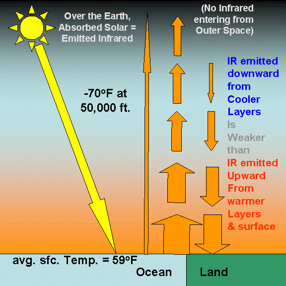
SPECIAL MESSAGE: For those following Miskolczi’s work, and his claims regarding “Aa=Ed”, if those two radiative fluxes (Aa and Ed) are not EXACTLY equal, then Miskolczi has found nothing that disagrees with current greenhouse theory. That they are NEARLY equal has been known for a long time (e.g. Kiehl & Trenberth, 1997). Their near-equality is due to the fact that IR radiative flows are continuously “trying” to achieve radiative equilibrium between layers of the atmosphere, and between the atmosphere and the Earth’s surface. If those two quantities were more “un-equal” then they are in nature, then radiation-induced temperature changes in the atmosphere, and at the surface, would be much larger than we observe.
Again…if Aa does not EXACTLY balance Ed, then Miskolczi has found NOTHING that departs from the fundamental mechanism of the greenhouse effect.
ADDENDUM…his additional finding of a relatively constant greenhouse effect from 60 years of radiosonde data (because humidity decreases have offset CO2 increases) is indeed tantalizing. But few people believe long-term trends in radiosonde humidities. His result depends upon the reality of unusually high humidities in the 1950s and 1960s. Without those, there is no cancellation between decreasing humidity and increasing CO2 as he claims.
Executive Summary
Using both radiative transfer theory and radiosonde (weather balloon) observations to support his views, Miskolczi (2010) builds a case that the Earth�s total greenhouse effect remains constant over time.
While this might well be true, I do not believe he has demonstrated from theory why this should be the case.
His computation of a relatively constant greenhouse effect with 60 years of radiosonde observations is tantalizing, but depends upon the reality of high humidities measured by these sensors before the mid-1960s, data which are widely considered to be suspect. Even with today�s radiosonde humidity sensors, the humidity accuracy is not very high.
On the theory side, much of what he claims depends upon the validity of his statement,
“for..two regions (or bodies) A and B, the rate of flow of radiation emitted by A and absorbed by B is equal to the rate of flow the other way, regardless of other forms of (energy) transport that may be occurring.�
If this statement was true, then IR radiative transfers cannot change the temperature of anything, and Earth�s natural greenhouse effect cannot exist. Yet, elsewhere he implies that the greenhouse effect IS important to temperature by claiming that the greenhouse effect stays constant with time. The reader is left confused.
His italicized statement, above, is an extreme generalization of Kirchoffs Law of Radiation, where he has allowed the 2 bodies to have different temperatures, and also allow any amount of extra energy of any type to enter or leave the 2-body system. No matter what else is going on, Miskolczi claims there is no net radiative energy exchanges between two objects, because those 2 flows in opposite directions are always equal.
This appears to fly in the face of people’s real world experiences.
Nevertheless, Miskolczi�s (and previous investigators�) calculations of a NEAR-equality of these IR flows are quite correct, and are indeed consistent with current greenhouse theory. Others trying to understand this issue need to understand that greenhouse theory already �knows� these flows are almost equal. If the imbalance between them was not small, then the temperature changes we see in nature would be much larger than what we do see.
But it is their small departure from equality that makes all the difference.
Introduction
For the last couple of years I have been getting requests for my opinion on papers published by Ferenc Miskolczi, the latest of which recently appeared in Energy & Environment.
Since his latest work builds upon earlier work, here I will comment on his most recent paper.
I have been reluctant to comment (and still am) because the material is rather slow going, and I do not understand a couple of the claims he makes.
I glad to see his most recent paper has dropped discussion of the Virial Theorem (VT). From what I�ve read, I suspect the VT does not preclude the Earth�s average surface temperature from changing as greenhouse gas (GHG) concentrations change. After all, since GHGs cause temperature falls in the upper atmosphere at the same time they are causing temperature rises at the surface and lower atmosphere, catastrophic global warming could theoretically occur without much change in the average temperature of the atmosphere, anyway.
Nevertheless, the fact that one of his claims would undermine the theory of anthropogenic global warming makes it unusually important for us to understand his work, and so I will provide what I think I understand at this point in time. I have spent many hours examining it and thinking about it, since I think scientists always need to remain open to radical new ideas.
Some of what he reports is indeed useful. For instance, his idea that nature might keep the Earth�s total greenhouse effect relatively constant is a valid hypothesis�one which I have advanced before. The observational evidence he finds to support it is certainly tantalizing, but entirely depends on the reality of relatively high humidities measured by radiosondes way back in the 1950s and early 1960s.
But I disagree with his explanation of why the atmosphere’s total greenhouse effect should remain the same, particularly his use of Kirchoff�s Law of Radiation.
Different amounts of IR being absorbed and re-emitted by greenhouse gases at different altitudes in the atmosphere are fundamental to the explanation of Earth’s natural greenhouse effect. But Miskolczi claims that there is no net exchange of infrared radiation between different layers of the atmosphere, or between the atmosphere and surface of the Earth.
If this were true, then (as far as I can tell) there is no way for IR radiation to affect the temperature of anything. I know of no one else who believes this, and it seems to fly in the face of common sense.
But then, understanding the greenhouse effect requires more than an average amount of common sense, anyway. So I will spend a fair amount of time explaining how the greenhouse effect works�partly to convince you, the reader, and partly to convince myself that it still makes sense to me.
Of course, my opinions are always open for revision given new understanding. If I have misinterpreted or misrepresented something Miskolczi believes or has published, then I apologize.
If after reading this, he would like to respond to my criticisms, I would be glad to post that response here, unedited by me.
The Importance of an Outside Energy Source to the “Greenhouse Effect”
There is a recurring theme to the arguments from those who say adding greenhouse gases (GHGs) to the atmosphere cannot change its temperature. I’ve been trying to understand where this idea comes from, and I think I know one major source of confusion. I want to mention it up front, because it impacts people preconceived notions when they approach the issue.
If the Earth’s atmosphere was isolated, with a constant amount of total energy contained within it, and you added more CO2 at the same temperatures as the surrounding air, then it is indeed true that the average temperature of the atmosphere would not change.
In other words, simply adding CO2 cannot increase the heat content of an energetically isolated atmosphere.
But that is not what happens in the real world, because the real world is not energetically isolated. In the real world, there is an outside energy source available to the climate system — the sun.
Since temperature is, in some sense, a measure of accumulated thermal energy in an object, any change which alters the rates at which energy flows into, or out of, the object can change how much heat accumulates in the object, and thus its temperature. Greenhouse gases change the rate at which an object loses energy.
I think this might be one source of confusion on the part of those who claim that increasing the Earth’s greenhouse effect cannot change its temperature. Hopefully, this will make sense to you, because it is a key point.
Miskolczi�s Global Infrared Energy Budget
One of the useful things Miskolczi did was to make detailed calculations of the infrared (IR) radiative energy flows within the atmosphere, and between the atmosphere and the Earth�s surface, from many years of radiosonde (weather balloon) data.
I have no serious problems with how he has done those calculations; but I do have a problem with what infers about how IR radiation impacts (or doesn�t impact) the temperatures we observe in the climate system. As I’ve often said, making the measurements is usually the easy part of research; determining what they mean in terms of causation is the difficult part.
Curiously, Miskolczi claims some of these radiative flow rates (fluxes) have never been calculated before, when in fact people have calculated them. Maybe not in exactly the same way, and maybe not in as detailed a manner as he does, but different researchers usually use somewhat different procedures when doing radiative calculations anyway.
But even if his calculations are the most accurate ever performed, their differences from what is already known about infrared energy flows in the atmosphere are not sufficient to require a new explanation of greenhouse theory. There is no new information here that would make us believe that the IR flows in and out of the atmosphere and surface of the Earth are exactly equal.
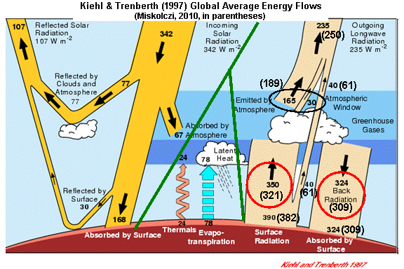
For instance, let�s examine the same IR energy flows computed by Kiehl & Trenberth (1997, hereafter K&T). I stole the following chart from another website and artistically enhanced it with Miskolczi�s values in parentheses…the green lines separate the three major classes of energy flow: solar, infrared, and convective.

Note that the two studies get similar numbers for the individual components of the Earth�s infrared energy budget (the tan-colored arrows on the right side):
We will examine these numbers in a little more detail, below, but first let�s briefly review what the consensus view of how the �greenhouse effect� operates, and how it is believed to affect temperatures in the climate system.
Radiation, Temperature, and the Greenhouse Effect
Central to the theory of the Earth�s natural greenhouse effect is the fact that greenhouse gases in the atmosphere absorb and emit infrared energy.
In the usual explanation of the greenhouse effect, greenhouse gases warm the lower atmosphere and Earth�s surface above what their temperatures would have been without those greenhouse gases. (Seldom mentioned is that they also make upper atmospheric temperatures lower than they would otherwise be.)
Without greenhouse gases, the observed global average surface temperature of around 59 deg. F would be more like 0 deg. F. (Also seldom mentioned is that without convective heat transfer from the surface to atmosphere, that temperature would be more like 140 deg. F…but that’s another blog post).
Understanding the greenhouse effect can be confusing because of the seemingly contradictory roles of greenhouse gases in the climate system. Without GHGs, the atmosphere would have no way of losing the heat it accumulates from convective heat transfer caused by solar heating of the surface.
So, one major role of GHGs is to allow the atmosphere to COOL, to lose excess energy to space in the face of continual solar heating of the climate system.
But, at the same time GHGs allow the atmosphere to cool, they also WARM the surface temperature above what it would be without those gases.
But how can this be? How can something that allows the atmosphere to lose energy to space also make the surface warmer?
Because, when an IR absorbing atmosphere is placed between the solar-heated Earth’s surface and the cold depths of outer space, it not only absorbs some of the upwelling IR radiation from the Earth�s surface, it also emits some IR energy back toward the surface.
If you find this difficult to believe, then consider this�

Lost In Space
Imagine you find yourself lost in outer space, floating aimlessly, with your warm skin exposed to the cold background of the cosmos.
Sure, keep your clothes on.
There is no sun or nearby stars to add much energy to your body. Your skin would gradually cool by losing IR radiation. (Of course, if the lack of air didn�t kill you first, you would freeze to death. Bear with me here…)
But now imagine you then surround yourself with a blanket. We won’t even use a fancy, NASA-invented, IR-reflective �space blanket��just a woolen one. And let�s even assume the temperature of the woolen blanket was extremely low — just above absolute zero.
Some of the IR radiation you emit, instead of being lost to the depths of space, would then be intercepted by the blanket. This would raise the temperature of the blanket. As that happened, the inside of the blanket would begin to emit some IR energy back toward your body, while the outside of the blanket would emit energy to outer space.
As a result, the temperature of your skin would remain higher than it would without the blanket — even though the blanket would remain at a lower temperature than your skin.
So, contrary to what some would intuitively expect, the introduction of a cold object has made a warm object warmer than it would have otherwise been.
But it didn’t actually RAISE the temperature of your skin. In this example, all we have done is slow the rate of cooling of your body, and you would eventually freeze to death anyway.
But if you had a continuous supply of energy available (like the Earth does with the sun), and had reached a steady state of shivering and discomfort and THEN added the blanket, your skin would indeed increase its temperature, compared to if the (colder) blanket was not there.
Of course, this example is just an analog to the Earth in space.
The Earth has an energy source (the sun), and it has a “radiative blanket” (greenhouse gases) enveloping it.
The greenhouse effect has to do with the rate of energy flow OUT of the climate system. It reduces that rate of energy loss.
And since temperature represents the amount of energy accumulated by one object, a second object entering the picture and reducing the first object�s ability to lose energy can cause the first object’s temperature to rise – IF – like the Earth, the first object has some external source of energy being continuously pumped in.
Miskolczi�s Computed Infrared Flows in and Out of the Earth�s Surface
So now let�s return to the above energy budget illustration, and look first at the IR flows at the Earth�s surface which I have circled in the lower right portion of the diagram. I�ll reproduce the figure, below, for your convenience.

Note that the average intensity of IR radiation emitted by the sky down to the surface (with the somewhat misleading name, “back radiation”) is nearly as large as the IR flow in the opposite direction.
As can be seen, both investigators find these two flows to be very nearly equal. Miskolczi states,
�the total flux of IR energy emitted by the atmosphere downward toward the Earth�s surface (ED) very nearly equals the upward flux from the surface and absorbed by the atmosphere (AA).�
That these two quantities are NEARLY equal has been known for a long time. It is partly a reflection of the fact that the entire depth of the atmosphere is mostly opaque to the transfer of IR radiation all the way through it. Miskolczi computes a global average infrared �optical thickness� of 1.87 for the entire depth of the atmosphere. I doubt that others would strenuously object to this value.
It is also partly due to something Miskolczi does not believe: that IR flows of energy from greenhouse gases have changed temperatures in the system to MINIMIZE the imbalances in IR energy flows between different components of the system.
But, just like any continuous heat transfer process (conduction, convection), the net heat flow of thermally emitted radiation from higher to lower temperatures can never quite �catch up�. After all, without some energy imbalance, the heat flow would end completely. Yet, we know that it is going on day after day.
Now, let�s discuss just how close these radiative flows are to each other in magnitude. Due partly to the large infrared opacity of the atmosphere, K&T calculated that the downwelling IR emitted by the atmosphere (324 Watts per sq. meter) is about 93% of the upwelling IR absorbed by the atmosphere (350 Watts per sq. meter).
Miskolczi gets a somewhat higher proportion, about 96%. If you see people discussing “ED=AA“, it is this (near-) equality they are talking about.
So, at face value, both studies have computed that the surface of the Earth, on average, loses somewhat more IR energy to the atmosphere than it absorbs from the atmosphere.
This makes physical sense since (1) the Earth�s surface is totally opaque to IR radiation, while the atmosphere isn�t; and (2) the Earth�s surface is warmer than the average temperature of the atmosphere.
But Miskolczi�s startling claim is that these two flows must be EQUAL — not only between the surface and the atmosphere as a whole, but between any two layers within the atmosphere.
He further claims that computations anyone makes that suggest otherwise are in error, due to neglect of other effects. He removes the small observed difference between the flows in opposite directions with an �empirical hemispheric emissivity factor� to force them to be equal, consistent with his assumption that they are equal.
I believe this claim regarding the equality of IR energy flows is the most fundamental issue that others would disagree with.
Radiative Exchange Equilibrium: A Consequence of Kirchoff�s Radiation Law?
Miskolczi makes the following statement regarding this supposed equality, which he calls �radiative exchange equilibrium�:
“for..two regions (or bodies) A and B, the rate of flow of radiation emitted by A and absorbed by B is equal to the rate of flow the other way, regardless of other forms of (energy) transport that may be occurring.�
This is the most surprising claim I have ever seen in this business, and I am quite certain it is false. (I�m not TOTALLY certain, because I could be dreaming right now, and you know how dreams can fool you).
He appears to attribute this to Kirchoff�s Law of Radiation (which he notes was actually discovered before Kirchoff).
But Kirchoff originally demonstrated his law with two plates in isolation, in a vacuum, with no other sources of energy from their surroundings.
Let�s look at how Kirchoff�s Law is stated by several different sources:
�At thermal equilibrium, the emissivity of a body (or surface) equals its absorptivity.�
�The ratio of emitted radiation to absorbed radiation is the same for all blackbodies at the same temperature.�
�The emissivity of a body is equal to its absorbance at the same temperature.�
�At equilibrium, the radiation emitted must equal the radiation absorbed.�
Note Miskolczi has done away with two caveats regarding his 2 bodies, A and B, that Kirchoff included: (1) energy equilibrium between two bodies, and (2) the bodies are isolated (no energy exchanges) from their environment. These conditions are not satisfied either at the Earth’s surface or in the atmosphere.
If Miskolczi is correct that the amount of thermal radiation emitted by an object (or layer of the atmosphere) ALWAYS equals the amount absorbed, this necessarily implies something that no one else I know of believes: that INFRARED RADIATIVE FLOWS BETWEEN IR ABSORBERS AND EMITTERS CANNOT CHANGE THEIR TEMPERATURE.
Let�s think about that. For IR energy flows to change the temperature of something, you need either a �convergence� of IR energy (absorption greater than emission) to cause the temperature to rise, or �divergence� of IR energy (emission greater than absorption) to cause temperature to fall.
But if the IR fluxes emitted and absorbed by an atmospheric layer are always the same, as Miskolczi claims, then the temperature of that layer cannot be changed through IR energy flows at all. Period.
And if THAT is true, then the greenhouse effect does not exist. Or, at a minimum, it is not caused by infrared radiation.
Another Thought Experiment
Obviously, if IR-absorbing layers A and B are identical in every way, including their temperatures, then the rate of IR flows between them will indeed be equal.
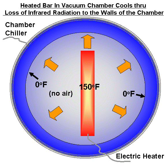
But let�s say layers A and B don’t touch (no conduction), and they do not interact with their surroundings. This would be like Kirchoff’s original experiment with the two plates.
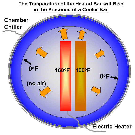
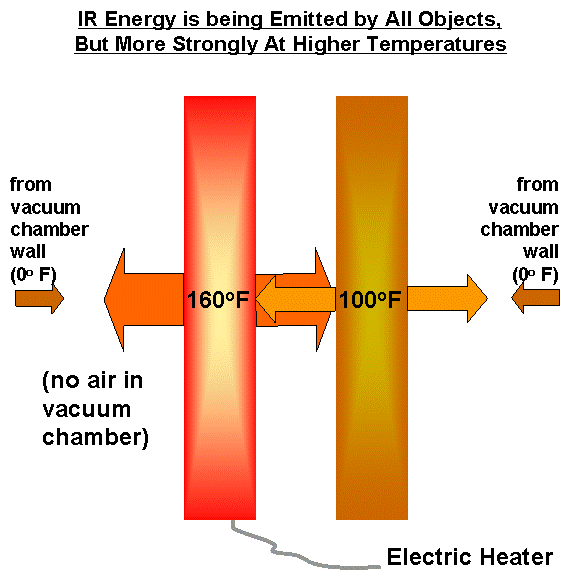
Now, let’s take a blowtorch and heat layer A by 100 degrees. Layer A will now emit IR at a greater intensity than before, since its emission is proportional to the 4th power of its absolute temperature. Since the amount emitted is now greater that the rate of IR it is absorbing from layer B, layer A’s temperature will fall.
Meanwhile, over at layer B, since IR opacity is defined based upon the fraction of incident radiation it absorbs as that radiation is passing through, and layer A is now emitting IR at a greater rate than before (due to the blowtorch), Layer B now absorbs more than it is emitting.
This process � which Miskolczi claims does not exist � will eventually cause both layers to reach a new state of equilibrium, with equal temperatures, where both are emitting and absorbing IR energy at the same rate.
But Miskolczi�s theory says that the hotter layer will still emit radiation with the same intensity as it absorbs it. There would be no way for the hotter layer to transfer energy to the cooler layer. Presumably, the two layers� temperatures would stay 100 deg. different.
Unless I am missing something important, this is a necessary consequence of Miskolczi�s claim. Maybe he thinks that since two atmospheric layers are already in a “quasi-steady state”, that their IR absorption equals their IR emission.
But this ignores other energy flows that we know are happening…most importantly, the convective transport of heat from the surface to the atmosphere. The surface is continuously dumping more energy into the atmosphere through convection. The atmosphere must emit more than it absorbs in order to cool itself.
The Hypothesis of a Constant Greenhouse Effect
Miskolczi additionally shows from 61 years of radiosonde data that a long-term decrease in the Earth�s greenhouse effect from humidity decreases in the middle and upper atmosphere have approximately counterbalanced the increase in the greenhouse effect from rising CO2 levels.
At face value, this might suggest that nature has mechanisms in place so that the total infrared opacity of the atmosphere remains about constant, consistent with the absorbed solar energy, and so the Earth�s temperature is naturally stabilized.
This might well be true.
But his conclusion from the radiosonde data depends upon the reality of relatively high humidity values in the very early years of radiosonde measurements, the 1950s and early 1960s. If you remove those years from his Fig. 9, then the drying trend that cancels the warming from increasing CO2 turns into a moistening trend.
Global �reanalysis� datasets extending back that far in time would have also the same problem, because those early radiosondes provide the most important source of information for the reanalysis.
Now, it might well be that nature has such a greenhouse effect-stabilizing mechanism in place, and that the total greenhouse effect stays at a relatively constant value for a given amount of absorbed solar energy. I have sometimes advanced the same possibility myself.
But I do not believe that Miskolczi has demonstrated either that it is the case, or why it should be the case.
In fact, the very nature of his claim that there are natural counterbalancing mechanisms at work keeping the greenhouse effect at a constant value implies that he thinks that the greenhouse effect DOES impact global average temperatures.
This seems to conflict with his claim that, by �law�, anything that absorbs IR at a certain rate must also emit IR at the same rate.
Since this law would remove the greenhouse effect entirely from the discussion of temperature change, why talk about compensating influences on the greenhouse effect? This does not make sense to me.
If Miskolczi is correct that the surface of the Earth does not lose any more IR energy than it gains from the overlying atmosphere, how is the surface cooled? Through 2 other mechanisms: (1) convective heat transfer from the surface to the atmosphere, and (2) loss of IR directly from the surface to outer space.
That convective heat transport is the dominant mechanism for moving heat from the surface to the atmosphere is not in dispute. I get angry e-mails from people who ask, �Why do you always talk about radiation? Convection is where it�s at!�
Yes, we all know that. For years I have talked and written about the cooling effects of weather are stronger than the warming effects of greenhouse gases. Lindzen in 1990 also emphasized this. We meteorologists were taught much more about convection than about solar and infrared radiation.
Even the (controversial and often maligned) K&T energy diagram shows the convective heat loss by the surface to the atmosphere (102 Watts per sq. meter) is about 4 times larger that the rate of IR loss by the surface to the atmosphere (26 Watts per sq. meter).
Thus, even in the �scientific consensus� view of global warming, convection is by far the primary mechanism by which the surface transfers heat to the atmosphere in the face of solar heating.
Yet, most of the computerized climate models still predict substantial global warming. So, obviously, they think a small change in radiation from more CO2 is pretty important.
IR Absorption and Emission Between Atmospheric Layers
So far, we have discussed the IR fluxes between the Earth�s surface and the atmosphere as a whole. What about the interaction between different layers in the atmosphere?
As I mentioned above, Miskolczi claims that the rates of IR exchange between atmospheric layers must be equal. He presents as evidence the fact that at any given level in the atmosphere, the rate of IR absorption by greenhouse gases is *nearly* the same as the rate of emission. This is shown in Fig. 3 of Miskolczi�s paper.
But the fact that these two flows are *nearly* the same is also consistent with standard greenhouse gas theory. It�s the tiny imbalance in them that makes all the difference. The greenhouse effect only becomes significant as we add up the cumulative effect of all the layers of the atmosphere.
Temperature changes have already minimized the imbalances between these IR flows, but a small imbalance still remains. This keeps the NET flow of IR energy through the climate system going “downhill”, from higher temperatures to lower temperatures.
To illustrate how tiny these IR imbalances in nature are, let�s examine what happens when we look at IR absorption and emission in 1 meter thick atmospheric layers, as Miskolczi presents in his Fig. 3.
The heat capacity of air is somewhat over 1,000 Joules per kilogram per degree C, which means it takes 1,000 Joules of energy to raise the temperature of 1 kilogram of air by 1 deg. C.
Conveniently, in the lower atmosphere 1 kg of air corresponds to about 1 cubic meter (1 m3) of air. So, for a 1 meter thick layer of air, 1,000 Watts per sq. meter (W m-2) heating applied for 1 sec would raise the temperature by 1 deg. C.
Or, since there are 86,000 seconds in a day, it would take (1000/86,000) = 0.01 Watts per sq. meter to get 1 deg. C per day warming rate.
Finally, if we double this, it takes about 0.02 Watts per sq. meter imbalance between IR absorption and emission to get 2 deg. C per day of temperature change, a very small number, indeed. And since the 1960s, investigators have been publishing atmospheric cooling rates of about 2 deg. C per day, which are caused by these tiny imbalances.
So, we see that it only takes a tiny imbalance between absorbed and emitted IR energy to accomplish realistic rates of cooling � or heating.
It�s the great depths over which these tiny numbers add up that matters. If we scale up to a layer 1,000 m thick in the lower atmosphere, then we need around 20 W/m2 more IR lost than gained by that layer for a cooling rate of 2 deg. C per day. (The required radiative flux imbalances go down dramatically with height, though, since air density drops rapidly with height…I have not added this effect in).
Once we reach the TOP of the atmosphere, the flow if IR from outer space into the atmosphere (essentially 0 Watts per sq. meter) is WAY out of balance with that upwelling from below: 235 Watts per sq. meter if you believe K&T; 250 Watts per sq. meter if you believe Miskolczi.
So, we see that for very thin layers of the atmosphere the IR emitted is very close to the IR absorbed. At the Earth�s surface, the flows exchanged between the surface and the atmosphere are very nearly equal. But not quite.
All of this has been known for a long time, and is totally consistent with greenhouse theory.
The Big Picture
With few exceptions, no two layers of the atmosphere ever reach a state of radiative equilibrium with one another, as Miskolczi claims. The same is true for the Earth�s surface and the overlying atmosphere as a whole.
All components are usually at different temperatures, with external sources of energy being absorbed, released, and flowing through them. As a result of these complexities, there is no requirement through Kirchoff�s Law that they emit and absorb radiation at the same rates.
Now, it IS true that those flows are “trying” to equalize, by exchanging IR energy in a direction that reduces temperature differences between layers. As a result, the differences in IR flows in opposite directions are indeed small � but they are not zero. Temperature changes have already relieved much of the imbalance.
Despite that fact that a major function of greenhouse gases is to provide a way for an atmosphere to cool to outer space, their presence at the same time warms the surface and lower atmosphere. While this seems counterintuitive, upon some reflection and thought we realize that this does make sense after all.
The currently �accepted� theory suggests that adding more CO2 to the atmosphere has a small, but not totally negligible additional warming influence. Yes, the atmosphere is already mostly opaque at those IR wavelengths where CO2 absorption is significant. But not totally. Everyone knows that, including those scientists who work on climate models that produce catastrophic global warming.
The big question is, how much will that warming be? That�s where feedbacks come in…the warming magnification (positive feedback) or reduction (negative feedback) of the relatively weak CO2-induced warming by changes in clouds and other elements of the climate system. And that�s what I spend most of my research time on.
I have not yet seen any compelling evidence that there exists a major flaw in the theory explaining the basic operation of the Earth�s natural Greenhouse Effect.
I would love for there to be one. But I don�t see it yet.
And, again, if I have mangled what Miskolczi has said, I apologize. He is free to respond here if he wants to.
Reference
Miskolczi, F., 2010: The stable stationary Value of the Earth�s global average atmospheric Planck-weighted greenhouse gas optical thickness. Energy and Environment, 21, No.4, 243-272.


 Home/Blog