Direct Evidence that Most U.S. Warming Since 1973 Could Be Spurious

March 16th, 2010

INTRODUCTION
My last few posts have described a new method for quantifying the average Urban Heat Island (UHI) warming effect as a function of population density, using thousands of pairs of temperature measuring stations within 150 km of each other. The results supported previous work which had shown that UHI warming increases logarithmically with population, with the greatest rate of warming occurring at the lowest population densities as population density increases.

But how does this help us determine whether global warming trends have been spuriously inflated by such effects remaining in the leading surface temperature datasets, like those produced by Phil Jones (CRU) and Jim Hansen (NASA/GISS)?

While my quantifying the UHI effect is an interesting exercise, the existence of such an effect spatially (with distance between stations) does not necessarily prove that there has been a spurious warming in the thermometer measurements at those stations over time. The reason why it doesn’t is that, to the extent that the population density of each thermometer site does not change over time, then various levels of UHI contamination at different thermometer sites would probably have little influence on long-term temperature trends. Urbanized locations would indeed be warmer on average, but “global warming” would affect them in about the same way as the more rural locations.

This hypothetical situation seems unlikely, though, since population does indeed increase over time. If we had sufficient truly-rural stations to rely on, we could just throw all the other UHI-contaminated data away. Unfortunately, there are very few long-term records from thermometers that have not experienced some sort of change in their exposure…usually the addition of manmade structures and surfaces that lead to spurious warming.

Thus, we are forced to use data from sites with at least some level of UHI contamination. So the question becomes, how does one adjust for such effects?

As the provider of the officially-blessed GHCN temperature dataset that both Hansen and Jones depend upon, NOAA has chosen a rather painstaking approach where the long-term temperature records from individual thermometer sites have undergone homogeneity “corrections” to their data, mainly based upon (presumably spurious) abrupt temperature changes over time. The coming and going of some stations over the years further complicates the construction of temperature records back 100 years or more.

All of these problems (among others) have led to a hodgepodge of complex adjustments.

A SIMPLER TECHNIQUE TO LOOK FOR SPURIOUS WARMING

I like simplicity of analysis — whenever possible, anyway. Complexity in data analysis should only be added when it is required to elucidate something that is not obvious from a simpler analysis. And it turns out that a simple analysis of publicly available raw (not adjusted) temperature data from NOAA/NESDIS NOAA/NCDC, combined with high-resolution population density data for those temperature monitoring sites, shows clear evidence of UHI warming contaminating the GHCN data for the United States.

I will restrict the analysis to 1973 and later since (1) this is the primary period of warming allegedly due to anthropogenic greenhouse gas emissions; (2) the period having the largest number of monitoring sites has been since 1973; and (3) a relatively short 37-year record maximizes the number of continuously operating stations, avoiding the need to handle transitions as older stations stop operating and newer ones are added.

Similar to my previous posts, for each U.S. station I average together four temperature measurements per day (00, 06, 12, and 18 UTC) to get a daily average temperature (GHCN uses daily max/min data). There must be at least 20 days of such data for a monthly average to be computed. I then include only those stations having at least 90% complete monthly data from 1973 through 2009. Annual cycles in temperature and anomalies are computed from each station separately.

I then compute multi-station average anomalies in 5×5 deg. latitude/longitude boxes, and then compare the temperature trends for the represented regions to those in the CRUTem3 (Phil Jones’) dataset for the same regions. But to determine whether the CRUTem3 dataset has any spurious trends, I further divide my averages into 4 population density classes: 0 to 25; 25 to 100; 100 to 400; and greater than 400 persons per sq. km. The population density data is at a nominal 1 km resolution, available for 1990 and 2000…I use the 2000 data.

All of these restrictions then result in thirteen 24 to 26 5-deg grid boxes over the U.S. having all population classes represented over the 37-year period of record. In comparison, the entire U.S. covers about 31 40 grid boxes in the CRUTem3 dataset. While the following results are therefore for a regional subset (at least 60%) of the U.S., we will see that the CRUTem3 temperature variations for the entire U.S. do not change substantially when all 31 40 grids are included in the CRUTem3 averaging.

EVIDENCE OF A LARGE SPURIOUS WARMING TREND IN THE U.S. GHCN DATA

The following chart shows yearly area-averaged temperature anomalies from 1973 through 2009 for the 13 24 to 26 5-deg. grid squares over the U.S. having all four population classes represented (as well as a CRUTem3 average temperature measurement). All anomalies have been recomputed relative to the 30-year period, 1973-2002.

The heavy red line is from the CRUTem3 dataset, and so might be considered one of the “official” estimates. The heavy blue curve is the lowest population class. (The other 3 population classes clutter the figure too much to show, but we will soon see those results in a more useful form.)

Significantly, the warming trend in the lowest population class is only 47% of the CRUTem3 trend, a factor of two difference.

Also interesting is that in the CRUTem3 data, 1998 and 2006 would be the two warmest years during this period of record. But in the lowest population class data, the two warmest years are 1987 and 1990. When the CRUTem3 data for the whole U.S. are analyzed (the lighter red line) the two warmest years are swapped, 2006 is 1st and then 1998 2nd.

From looking at the warmest years in the CRUTem3 data, one gets the impression that each new high-temperature year supersedes the previous one in intensity. But the low-population stations show just the opposite: the intensity of the warmest years is actually decreasing over time.

To get a better idea of how the calculated warming trend depends upon population density for all 4 classes, the following graph shows – just like the spatial UHI effect on temperatures I have previously reported on – that the warming trend goes down nonlinearly as population density of the stations decrease. In fact, extrapolation of these results to zero population density might produce little warming at all!

This is a very significant result. It suggests the possibility that there has been essentially no warming in the U.S. since the 1970s.

Also, note that the highest population class actually exhibits slightly more warming than that seen in the CRUTem3 dataset. This provides additional confidence that the effects demonstrated here are real.

Finally, the next graph shows the difference between the lowest population density class results seen in the first graph above. This provides a better idea of which years contribute to the large difference in warming trends.

Taken together, I believe these results provide powerful and direct evidence that the GHCN data still has a substantial spurious warming component, at least for the period (since 1973) and region (U.S.) addressed here.

There is a clear need for new, independent analyses of the global temperature data…the raw data, that is. As I have mentioned before, we need independent groups doing new and independent global temperature analyses — not international committees of Nobel laureates passing down opinions on tablets of stone.

But, as always, the analysis presented above is meant more for stimulating thought and discussion, and does not equal a peer-reviewed paper. Caveat emptor.


Urban Heat Island, a US-versus-Them Update

March 11th, 2010

My post from yesterday showed a rather unexpected difference between the United States versus the rest of the world for the average urban heat island (UHI) temperature-population relationship. Updated results shown below have now reduced that discrepancy…but not removed it.

I have now included more station temperature and population data by removing my requirement that two neighboring temperature measurement stations must have similar fractions of water coverage (lakes, coastlines, etc.). The results (shown below, second panel) reveal less of a discrepancy between the U.S. and the rest of the world than in my previous post. The US now shows weak warming at the lowest population densities, rather than cooling as was presented yesterday.

Also, I adjusted the population bin boundaries used for averaging to provide more uniform numbers of station pairs per bin. This has reduced the differences between individual years (top panel), suggesting more robust results. It has also increased the overall UHI warming effect, with about 1.0 deg. C average warming at a population density of 100 persons per sq. km.
ISH-UHI-warming-global-and-US-non-US


Global Urban Heat Island Effect Study: An Update

March 10th, 2010

This is an update to my previous post describing a new technique for estimating the average amount of urban heat island (UHI) warming accompanying an increase in population density. The analysis is based upon 4x per day temperature observations in the NOAA International Surface Hourly (ISH) dataset, and on 1 km population density data for the year 2000.

I’m providing a couple of charts with new results, below. The first chart shows the global yearly average warming-vs-population density increase from each year from 2000 to 2009. They all show clear evidence of UHI warming, even for small population density increases at very low population density. A population density of only 100 persons per sq. km exhibits average warming of about 0.8 deg. C compared to a nearby unpopulated temperature monitoring location.
ISH-UHI-warming-global-by-year

In this analysis, the number of independent temperature monitoring stations having at least 1 neighboring station with a lower population density within 150 km of it, increased from 2,183 in 2000, to 4,290 in 2009…an increase by a factor of 2 in ten years. The number of all resulting station pairs increased from 9,832 in 2000 to 30,761 in 2009, an increase of 3X.

The next chart shows how the results for the U.S. differ from non-US stations. In order to beat down the noise for the US-only results, I included all ten years (2000 thru 2009) in the analysis. The US results are obviously different from the non-US stations, with much less warming with an increase in population density, and even evidence of an actual slight cooling for the lowest population categories.
ISH-UHI-US-vs-nonUS-2000-2009

The cooling signal appeared in 5 of the 10 years, not all of them, a fact I am mentioning just in case someone asks whether it existed in all 10 years. I don’t know the reason for this, but I suspect that a little thought from Anthony Watts, Joe D’Aleo & others will help figure it out.

John Christy has agreed to co-author a paper on this new technique, since he has some experience publishing in this area of research (UHI & land use change effects on thermometer data) than me. We have not yet decided what journal to submit to.


February 2010 UAH Global Temperature Update: Version 5.3 Unveiled

March 5th, 2010

UPDATED: 2:16 p.m. CST March 6, 2010: Added a plot of the differences between v5.3 and v5.2.


YR MON GLOBE NH SH TROPICS
2009 1 0.213 0.418 0.009 -0.119
2009 2 0.220 0.557 -0.117 -0.091
2009 3 0.174 0.335 0.013 -0.198
2009 4 0.135 0.290 -0.020 -0.013
2009 5 0.102 0.109 0.094 -0.112
2009 6 0.022 -0.039 0.084 0.074
2009 7 0.414 0.188 0.640 0.479
2009 8 0.245 0.243 0.247 0.426
2009 9 0.502 0.571 0.433 0.596
2009 10 0.353 0.295 0.410 0.374
2009 11 0.504 0.443 0.565 0.482
2009 12 0.262 0.331 0.190 0.482
2010 1 0.630 0.809 0.451 0.677
2010 2 0.613 0.720 0.506 0.789

UAH_LT_1979_thru_Feb_10

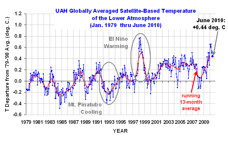
The global-average lower tropospheric temperature remained high, at +0.61 deg. C for February, 2010. This is about the same as January, which in our new Version 5.3 of the UAH dataset was +0.63 deg. C. February was second warmest in the 32-year record, behind Feb 1998 which was itself the second warmest of all months. The El Nino is still the dominant temperature signal; many people living in Northern Hemisphere temperate zones were still experiencing colder than average weather.

The new dataset version does not change the long-term trend in the dataset, nor does it yield revised record months; it does, however, reduce some of the month-to-month variability, which has been slowly increasing over time.

Version 5.3 accounts for the mismatch between the average seasonal cycle produced by the older MSU and the newer AMSU instruments. This affects the value of the individual monthly departures, but does not affect the year to year variations, and thus the overall trend remains the same.

Here is a comparison of v5.2 and v5.3 for global anomalies in lower tropospheric temperature.

YR MON v5.2 v5.3
2009 1 0.304 0.213
2009 2 0.347 0.220
2009 3 0.206 0.174
2009 4 0.090 0.135
2009 5 0.045 0.102
2009 6 0.003 0.022
2009 7 0.411 0.414
2009 8 0.229 0.245
2009 9 0.422 0.502
2009 10 0.286 0.353
2009 11 0.497 0.504
2009 12 0.288 0.262
2010 1 0.721 0.630
2010 2 0.740 0.613

trends since 11/78: +0.132 +0.132 deg. C per decade

The following discussion is provided by John Christy:
As discussed in our running technical comments last July, we have been looking at making an adjustment to the way the average seasonal cycle is removed from the newer AMSU instruments (since 1998) versus the older MSU instruments. At that time, others (e.g. Anthony Watts) brought to our attention the fact that UAH data tended to have some systematic peculiarities with specific months, e.g. February tended to be relatively warmer while September was relatively cooler in these comparisons with other datasets. In v5.2 of our dataset we relied considerably on the older MSUs to construct the average seasonal cycle used to calculated the monthly departures for the AMSU instruments. This created the peculiarities noted above. In v5.3 we have now limited this influence.

UPDATE: The following chart, which differences the v5.3 and v5.2 versions of the dataset clearly illustrates this spurious component to the seasonal cycle which has been removed:
TLT_GL_v.5.2_vs_v5.3

The adjustments are very minor in terms of climate as they impact the relative departures within the year, not the year-to-year variations. Since the errors are largest in February (almost 0.13 C), we believe that February is the appropriate month to introduce v5.3 where readers will see the differences most clearly. Note that there is no change in the long term trend as both v5.2 and v5.3 show +0.132 C/decade. All that happens is a redistribution of a fraction of the anomalies among the months. Indeed, with v5.3 as with v5.2, Jan 2010 is still the warmest January and February 2010 is the second warmest Feb behind Feb 1998 in the 32-year record.

For a more detailed discussion of this issue written last July, email John Christy at christy@nsstc.uah.edu for the document.

[NOTE: These satellite measurements are not calibrated to surface thermometer data in any way, but instead use on-board redundant precision platinum resistance thermometers (PRTs) carried on the satellite radiometers. The PRT’s are individually calibrated in a laboratory before being installed in the instruments.]

The Global Average Urban Heat Island Effect in 2000 Estimated from Station Temperatures and Population Density Data

March 3rd, 2010

UPDATE #1 (12:30 p.m. CST, March 3): Appended new discussion & plots showing importance of how low-population density stations are handled.

UPDATE #2 (9:10 a.m. CST, March 4): Clarifications on methodology and answers to questions.

ABSTRACT
Global hourly surface temperature observations and 1 km resolution population density data for the year 2000 are used together to quantify the average urban heat island (UHI) effect. While the rate of warming with population increase is the greatest at the lowest population densities, some warming continues with population increases even for densely populated cities. Statistics like those presented here could be used to correct the surface temperature record for spurious warming caused by the UHI effect, providing better estimates of temperature trends.

METHOD
Using NOAA’s International Surface Hourly (ISH) weather data from around the world during 2000, I computed daily, monthly, and then 1-year average temperatures for each weather station. For a station to be used, a daily average temperature computation required the 4 synoptic temperature observations at 00, 06, 12, and 18 UTC; a monthly average required at least 20 good days per month; and a yearly average required all 12 months.

For each of those weather station locations I also stored the average population density from the 1 km gridded global population density data archived at the Socioeconomic Data and Applications Center (SEDAC).
pop-density-2000

All station pairs within 150 km of each other had their 1-year average difference in temperature related to their difference in population. Averaging of these station pairs’ results was done in 10 population bins each for Station1 and Station2, with bin boundaries at 0, 20, 50, 100, 200, 400, 800, 1600, 3200, 6400, and 50000 persons per sq. km.

Because some stations are located next to large water bodies, I used an old USAF 1/6 deg lat/lon percent water coverage dataset to ensure that there was no more than a 20% difference in the percent water coverage between the two stations in each match-up. (I believe this water coverage dataset is no longer publicly available).

Elevation effects were estimated by regressing station pair temperature differences against station elevation differences, which yielded a cooling rate of 5.4 deg. C per km increase in station elevation. Then, all station temperatures were adjusted to sea level (0 km elevation) with this relationship.

After all screening, a total of 10,307 unique station pairs were accepted for analysis from 2000.

RESULTS & DISCUSSION
The following graph shows the average rate of warming with population density increase (vertical axis), as a function of the average populations of the station pairs. Each data point represents a population bin average for the intersection of a higher population station with its lower-population station mate.
pop-density-vs-rate-of-ISH-station-warming

Using the data in the above graph, we can now compute average cumulative warming from a population density of zero, the results of which are shown in the next graph. [Note that this step would be unnecessary if every populated station location had a zero-population station nearby. In that case, it would be much easier to compute the average warming associated with a population density increase.]
ISH-station-warming-vs-pop-density

This graph shows that the most rapid rate of warming with population increase is at the lowest population densities. The non-linear relationship is not a new discovery, as it has been noted by previous researchers who found an approximate logarithmic dependence of warming on population.

Significantly, this means that monitoring long-term warming at more rural stations could have greater spurious warming than monitoring in the cities. For instance, a population increase from 0 to 20 people per sq. km gives a warming of +0.22 deg C, but for a densely populated location having 1,000 people per sq. km, it takes an additional 1,500 people (to 2,500 people per sq. km) to get the same 0.22 deg. C warming. (Of course, if one can find stations whose environment has not changed at all, that would be the preferred situation.)

Since this analysis used only 1 year of data, other years could be examined to see how robust the above relationship is. Also, since there are gridded population data for 1990, 2000, and 2010 (estimated), one could examine whether there is any indication of the temperature-population relationship changing over time.

This is the type of information which I can envision being used to adjust station temperatures throughout the historical record, even as stations come, go, and move. As mentioned above, the elevation adjustment for individual stations can be done fairly easily, and the population adjustments could then be done without having to inter-calibrate stations.

Such adjustments help to maximize the number of stations used in temperature trend analysis, rather than simply throwing the data out. Note that the philosophy here is not to provide the best adjustments for each station individually, but to do adjustments for spurious effects which, when averaged over all stations, will remove the effect when averaged over all stations. This ensures simplicity and reproducibility of the analysis.

UPDATE #1:
The above results are quite sensitive to how the stations with very low population densities are handled. I’ve recomputed the above results by adding a single data point representing 724 more station pairs where BOTH stations are within the lowest population density category: 0 to 20 people per sq. km. This increases the signal of warming at low population densities, from the previously mentioned +0.22 deg C warming from zero to 20 people per sq. km, to +0.77 deg. C of warming.
ISH-station-warming-vs-pop-density-with-lowest-bin-full

This is over a factor of 3 more warming from 0 to 20 persons per sq. km with the additional data. This is important because most weather observation sites have relatively low population densities: in my dataset, I find that one-half of all stations have population densities below 100 persons per sq. km. The following plot zooms in on the lower left corner of the previous plot so you can better see the warming at the lowest population densities.

ISH-station-warming-vs-pop-density-with-lowest-bin-full-0-to-200

Clearly, any UHI adjustments to past thermometer data will depend upon how the UHI effect is quantified at these very low population densities.

Also, since I didn’t mention it earlier, I should clarify that population density is just an accessible index that is presumed to be related to how much the environment around the thermometer site has been modified over time, by replacing vegetation with manmade structures. Population density is not expected to always be a good index of this modification — for instance, population densities at large airports can be expected to be low, but the surrounding runway surfaces and airplane traffic can be expected to cause considerable spurious warming, much more than would be expected for their population density.

UPDATE #2: Clarifications and answers to questions

After sifting through the 212 comments posted in the last 12 hours at Anthony Watts’ site, I thought I would answer those concerns that seemed most relevant.

Many of the questions and objections posted there were actually answered by others peoples’ posts — see especially the 2 comments by Jim Clarke at time stamps 18:23:56 & 01:32:40. Clearly, Jim understood what I did, why I did it, and phrased the explanations even better than I could have.

Some readers were left confused since my posting was necessarily greatly simplified; the level of detail for a journal submission would increase by about a factor of ten. I appreciate all the input, which has helped clarify my thinking.

RATIONALE FOR THE STUDY

While it might not have been obvious, I am trying to come up with a quantitative method for correcting past temperature measurements for the localized warming effects due to the urban heat island (UHI) effect. I am generally including in the “UHI effect” any replacement of natural vegetation by manmade surfaces, structures and active sources of heat. I don’t want to argue about terminology, just keep things simple.

For instance, the addition of an outbuilding and a sidewalk next to an otherwise naturally-vegetated thermometer site would be considered UHI-contaminated. (As Roger Pielke, Sr., has repeatedly pointed out, changes in land use, without the addition of manmade surfaces and structures, can also cause temperature changes. I consider this to be a much more difficult influence to correct for in the global thermometer data.)

The UHI effect leads to a spurious warming signal which, even though only local, has been given global significance by some experts. Many of us believe that as much as 50% (or more) of the “global warming” signal in the thermometer data could actually be from local UHI effects. The IPCC community, in contrast, appears to believe that the thermometer record has not been substantially contaminated.

Unless someone quantitatively demonstrates that there is a significant UHI signal in the global thermometer data, the IPCC can claim that global temperature trends are not substantially contaminated by such effects.

If there were sufficient thermometer data scattered around the world that are unaffected by UHI effects, then we could simply throw away all of the contaminated data. A couple of people wondered why this is not done. I believe that there is not enough uncontaminated data to do this, which means we must find some way of correcting for UHI effects that exist in most of the thermometer data — preferably extending back 100 years or more.

Since population data is one of the few pieces of information that we have long term records for, it makes sense to determine if we can quantify the UHI effect based upon population data. My post introduces a simple method for doing that, based upon the analysis of global thermometer and population density data for a single year, 2000. The analysis needs to be done for other years as well, but the high-resolution population density data only extends back to 1990.

Admittedly, if we had good long-term records of some other variable that was more closely related to UHI, then we could use that instead. But the purpose here is not to find the best way to estimate the magnitude of TODAY’S UHI effect, but to find a practical way to correct PAST thermometer data. What I posted was the first step in that direction.

Clearly, satellite surveys of land use change in the last 10 or 20 years are not going to allow you to extend a method back to 1900. Population data, though, ARE available (although of arguable quality). But no method will be perfect, and all possible methods should be investigated.

STATION PAIRING

My goal is to quantify how much of a UHI temperature rise occurs, on average, for any population density, compared to a population density of zero. We can not do this directly because that would require a zero-population temperature measurement near every populated temperature measurement location. So, we must do it in a piecewise fashion.

For every closely-spaced station pair in the world, we can compare the temperature difference between the 2 stations to the population density difference between the two station locations. Using station pairs is easily programmable on a computer, allowing the approx 10,000 temperature measurements sites to be processed relatively quickly.

Using a simple example to introduce the concept, theoretically one could compute:

1) how much average UHI warming occurs from going from 0 to 20 people per sq. km, then
2) the average warming going from 20 to 50 people per sq. km, then
3) the average warming going from 50 to 100 people per. sq. km,
etc.

If you can compute all of these separate statistics, we can determine how the UHI effect varies with population density going from 0 to the highest population densities.

Unfortunately, the populations of any 2 closely-spaced stations will be highly variable, not neatly ordered like this simple example. We need some way of handling the fact that stations do NOT have population densities exactly at 0, 20, 100 (etc.) persons per sq. km., but can have ANY population density. I handle this problem by doing averaging in specific population intervals.

For each pair of closely spaced stations, if the higher-population station is in population interval #3, and the lower population station is in population interval #1, I put that station pair’s year-average temperature difference in a 2-dimensional (interval#3, interval#1) population “bin” for later averaging.

Not only is the average temperature difference computed for all station pairs falling in each population bin, but also computed are the average populations in those bins. We will need those statistics later for our calculations of how temperature increases with population density.

Note that we can even compute the temperature difference between stations in the SAME population bin, as long as we keep track of which one has the higher population and which has the lower population. If the population densities for a pair of stations are exactly the same, we do not include that pair in the averaging.

The fact that the greatest warming RATE is observed at the lowest population densities is not a new finding. My comment that the greatest amount of spurious warming might therefore occur at the rural (rather than urban) sites, as a couple of people pointed out, presumes that rural sites tend to increase in population over the years. This might not be the case for most rural sites.

Also, as some pointed out, the UHI warming will vary with time of day, season, geography, wind conditions, etc. These are all mixed in together in my averages. But the fact that a UHI signal clearly exists without any correction for these other effects means that the global warming over the last 100 years measured using daily max/min temperature data has likely been overestimated. This is an important starting point, and its large-scale, big-picture approach complements the kind of individual-station surveys that Anthony Watts has been performing.

Spurious Warming in the Jones U.S. Temperatures Since 1973

February 27th, 2010

INTRODUCTION
As I discussed in my last post, I’m exploring the International Surface Hourly (ISH) weather data archived by NOAA to see how a simple reanalysis of original weather station temperature data compares to the Jones CRUTem3 land-based temperature dataset.

While the Jones temperature analysis relies upon the GHCN network of ‘climate-approved’ stations whose number has been rapidly dwindling in recent years, I’m using original data from stations whose number has been actually growing over time. I use only stations operating over the entire period of record so there are no spurious temperature trends caused by stations coming and going over time. Also, while the Jones dataset is based upon daily maximum and minimum temperatures, I am computing an average of the 4 temperature measurements at the standard synoptic reporting times of 06, 12, 18, and 00 UTC.

U.S. TEMPERATURE TRENDS, 1973-2009
I compute average monthly temperatures in 5 deg. lat/lon grid squares, as Jones does, and then compare the two different versions over a selected geographic area. Here I will show results for the 5 deg. grids covering the United States for the period 1973 through 2009.

The following plot shows that the monthly U.S. temperature anomalies from the two datasets are very similar (anomalies in both datasets are relative to the 30-year base period from 1973 through 2002). But while the monthly variations are very similar, the warming trend in the Jones dataset is about 20% greater than the warming trend in my ISH data analysis.
CRUTem3-and-ISH-US-1973-2009

This is a little curious since I have made no adjustments for increasing urban heat island (UHI) effects over time, which likely are causing a spurious warming effect, and yet the Jones dataset which IS (I believe) adjusted for UHI effects actually has somewhat greater warming than the ISH data.

A plot of the difference between the two datasets is shown next, which reveals some abrupt transitions. Most noteworthy is what appears to be a rather rapid spurious warming in the Jones dataset between 1988 and 1996, with an abrupt “reset” downward in 1997 and then another spurious warming trend after that.
CRUTem3-minus-ISH-US-1973-2009

While it might be a little premature to blame these spurious transitions on the Jones dataset, I use only those stations operating over the entire period of record, which Jones does not do. So, it is difficult to see how these effects could have been caused in my analysis. Also, the number of 5 deg grid squares used in this comparison remained the same throughout the 37 year period of record (23 grids).

The decadal temperature trends by calendar month are shown in the next plot. We see in the top panel that the greatest warming since 1973 has been in the months of January and February in both datasets. But the bottom panel suggests that the stronger warming in the Jones dataset seems to be a warm season, not winter, phenomenon.
CRUTem3-vs-ISH-US-1973-2009-by-calendar-month

THE NEED FOR NEW TEMPERATURE RENALYSES
I suspect it would be difficult to track down the precise reasons why the differences in the above datasets exist. The data used in the Jones analysis has undergone many changes over time, and the more complex and subjective the analysis methodology, the more difficult it is to ferret out the reasons for specific behaviors.

I am increasingly convinced that a much simpler, objective analysis of original weather station temperature data is necessary to better understand how spurious influences might have impacted global temperature trends computed by groups such as CRU and NASA/GISS. It seems to me that a simple and easily repeatable methodology should be the starting point. Then, if one can demonstrate that the simple temperature analysis has spurious temperature trends, an objective and easily repeatable adjustment methodology should be the first choice for an improved version of the analysis.

In my opinion, simplicity, objectivity, and repeatability should be of paramount importance. Once one starts making subjective adjustments of individual stations’ data, the ability to replicate work becomes almost impossible.

Therefore, more important than the recently reported “do-over” of a global temperature reanalysis proposed by the UK’s Met Office would be other, independent researchers doing their own global temperature analysis. In my experience, better methods of data analysis come from the ideas of individuals, not from the majority rule of a committee.

Of particular interest to me at this point is a simple and objective method for quantifying and removing the spurious warming arising from the urban heat island (UHI) effect. The recent paper by McKitrick and Michaels suggests that a substantial UHI influence continues to infect the GISS and CRU temperature datasets.

In fact, the results for the U.S. I have presented above almost seem to suggest that the Jones CRUTem3 dataset has a UHI adjustment that is in the wrong direction. Coincidentally, this is also the conclusion of a recent post on Anthony Watts’ blog, discussing a new paper published by SPPI.

It is increasingly apparent that we do not even know how much the world has warmed in recent decades, let alone the reason(s) why. It seems to me we are back to square one.


New Work on the Recent Warming of Northern Hemispheric Land Areas

February 20th, 2010

INTRODUCTION

Arguably the most important data used for documenting global warming are surface station observations of temperature, with some stations providing records back 100 years or more. By far the most complete data available are for Northern Hemisphere land areas; the Southern Hemisphere is chronically short of data since it is mostly oceans.

But few stations around the world have complete records extending back more than a century, and even some remote land areas are devoid of measurements. For these and other reasons, analysis of “global” temperatures has required some creative data massaging. Some of the necessary adjustments include: switching from one station to another as old stations are phased out and new ones come online; adjusting for station moves or changes in equipment types; and adjusting for the Urban Heat Island (UHI) effect. The last problem is particularly difficult since virtually all thermometer locations have experienced an increase in manmade structures replacing natural vegetation, which inevitably introduces a spurious warming trend over time of an unknown magnitude.

There has been a lot of criticism lately of the two most publicized surface temperature datsets: those from Phil Jones (CRU) and Jim Hansen (GISS). One summary of these criticisms can be found here. These two datasets are based upon station weather data included in the Global Historical Climate Network (GHCN) database archived at NOAA’s National Climatic Data Center (NCDC), a reduced-volume and quality-controlled dataset officially blessed by your government for climate work.

One of the most disturbing changes over time in the GHCN database is a rapid decrease in the number of stations over the last 30 years or so, after a peak in station number around 1973. This is shown in the following plot which I pilfered from this blog.

Given all of the uncertainties raised about these data, there is increasing concern that the magnitude of observed ‘global warming’ might have been overstated.

TOWARD A NEW SATELLITE-BASED SURFACE TEMPERATURE DATASET

We have started working on a new land surface temperature retrieval method based upon the Aqua satellite AMSU window channels and “dirty-window” channels. These passive microwave estimates of land surface temperature, unlike our deep-layer temperature products, will be empirically calibrated with several years of global surface thermometer data.

The satellite has the benefit of providing global coverage nearly every day. The primary disadvantages are (1) the best (Aqua) satellite data have been available only since mid-2002; and (2) the retrieval of surface temperature requires an accurate adjustment for the variable microwave emissivity of various land surfaces. Our method will be calibrated once, with no time-dependent changes, using all satellite-surface station data matchups during 2003 through 2007. Using this method, if there is any spurious drift in the surface station temperatures over time (say due to urbanization) this will not cause a drift in the satellite measurements.

Despite the shortcomings, such a dataset should provide some interesting insights into the ability of the surface thermometer network to monitor global land temperature variations. (Sea surface temperature estimates are already accurately monitored with the Aqua satellite, using data from AMSR-E).

THE INTERNATIONAL SURFACE HOURLY (ISH) DATASET

Our new satellite method requires hourly temperature data from surface stations to provide +/- 15 minute time matching between the station and the satellite observations. We are using the NOAA-merged International Surface Hourly (ISH) dataset for this purpose. While these data have not had the same level of climate quality tests the GHCN dataset has undergone, they include many more stations in recent years. And since I like to work from the original data, I can do my own quality control to see how my answers differ from the analyses performed by other groups using the GHCN data.

The ISH data include globally distributed surface weather stations since 1901, and are updated and archived at NCDC in near-real time. The data are available for free to .gov and .edu domains. (NOTE: You might get an error when you click on that link if you do not have free access. For instance, I cannot access the data from home.)

The following map shows all stations included in the ISH dataset. Note that many of these are no longer operating, so the current coverage is not nearly this complete. I have color-coded the stations by elevation (click on image for full version).
ISH-station-map-1901-thru-2009

WARMING OF NORTHERN HEMISPHERIC LAND AREAS SINCE 1986

Since it is always good to immerse yourself into a dataset to get a feeling for its strengths and weaknesses, I decided I might as well do a Jones-style analysis of the Northern Hemisphere land area (where most of the stations are located). Jones’ version of this dataset, called “CRUTem3NH”, is available here.

I am used to analyzing large quantities of global satellite data, so writing a program to do the same with the surface station data was not that difficult. (I know it’s a little obscure and old-fashioned, but I always program in Fortran). I was particularly interested to see whether the ISH stations that have been available for the entire period of record would show a warming trend in recent years like that seen in the Jones dataset. Since the first graph (above) shows that the number of GHCN stations available has decreased rapidly in recent years, would a new analysis using the same number of stations throughout the record show the same level of warming?

The ISH database is fairly large, organized in yearly files, and I have been downloading the most recent years first. So far, I have obtained data for the last 24 years, since 1986. The distribution of all stations providing fairly complete time coverage since 1986, having observations at least 4 times per day, is shown in the following map.
ISH-station-map-1986-thru-2009-6-hrly

I computed daily average temperatures at each station from the observations at 00, 06, 12, and 18 UTC. For stations with at least 20 days of such averages per month, I then computed monthly averages throughout the 24 year period of record. I then computed an average annual cycle at each station separately, and then monthly anomalies (departures from the average annual cycle).

Similar to the Jones methodology, I then averaged all station month anomalies in 5 deg. grid squares, and then area-weighted those grids having good data over the Northern Hemisphere. I also recomputed the Jones NH anomalies for the same base period for a more apples-to-apples comparison. The results are shown in the following graph.
ISH-vs-CRUTem3NH-1986-thru-2009

I’ll have to admit I was a little astounded at the agreement between Jones’ and my analyses, especially since I chose a rather ad-hoc method of data screening that was not optimized in any way. Note that the linear temperature trends are essentially identical; the correlation between the monthly anomalies is 0.91.

One significant difference is that my temperature anomalies are, on average, magnified by 1.36 compared to Jones. My first suspicion is that Jones has relatively more tropical than high-latitude area in his averages, which would mute the signal. I did not have time to verify this.

Of course, an increasing urban heat island effect could still be contaminating both datasets, resulting in a spurious warming trend. Also, when I include years before 1986 in the analysis, the warming trends might start to diverge. But at face value, this plot seems to indicate that the rapid decrease in the number of stations included in the GHCN database in recent years has not caused a spurious warming trend in the Jones dataset — at least not since 1986. Also note that December 2009 was, indeed, a cool month in my analysis.

FUTURE PLANS
We are still in the early stages of development of the satellite-based land surface temperature product, which is where this post started.

Regarding my analysis of the ISH surface thermometer dataset, I expect to extend the above analysis back to 1973 at least, the year when a maximum number of stations were available. I’ll post results when I’m done.

In the spirit of openness, I hope to post some form of my derived dataset — the monthly station average temperatures, by UTC hour — so others can analyze it. The data volume will be too large to post at this website, which is hosted commercially; I will find someplace on our UAH computer system so others can access it through ftp.

While there are many ways to slice and dice the thermometer data, I do not have a lot of time to devote to this side effort. I can’t respond to all the questions and suggestions you e-mail me on this subject, but I promise I will read them.


January 2010 Global Tropospheric Temperature Map

February 9th, 2010

Here’s the UAH lower tropospheric temperature anomaly map for January, 2010. As can be seen, Northern Hemispheric land, on a whole, is not as cold as many of us thought (click on image for larger version). Below-normal areas were restricted to parts of Russia and China, most of Europe, and the southeastern United States. Most of Canada and Greenland were well above normal:
UAH_LT_2010_01_grid
It should also be remembered that lower tropospheric temperature anomalies for one month over a small region are not necessarily going to look like surface temperature anomalies.

Since January 2010 was the third-warmest month in the 32-year satellite record, it might be of interest to compare the above patterns with the warmest month of record, April, 1998, which was an El Nino year, too:
UAH_LT_1998_04_grid


Some Thoughts on the Warm January, 2010

February 8th, 2010

I continue to get lots of e-mails asking how global average tropospheric temperatures for January, 2010 could be at a record high (for January, anyway, in the 32 year satellite record) when it seems like it was such a cold January where people actually live.

I followed up with a short sea surface temperature analysis from AMSR-E data which ended up being consistent with the AMSU tropospheric temperatures.

I’m sure part of the reason is warm El Nino conditions in the Pacific. Less certain is my guess that when the Northern Hemisphere continents are unusually cold in winter, then ocean surface temperatures, at least in the Northern Hemisphere, should be unusually warm. But this is just speculation on my part, based on the idea that cold continental air masses can intensify when they get land-locked, with less flow of maritime air masses over the continents, and less flow of cold air masses over the ocean. Maybe the Arctic Oscillation is an index of this, as a few of you have suggested, but I really don’t know.

Also, remember that there are always quasi-monthly oscillations in the amount of heat flux from the ocean to the atmosphere, primarily in the tropics, which is why a monthly up-tick in tropospheric temperatures is usually followed by a down-tick the next month, and vice-versa.

So, it could be that all factors simply conspired to give an unusually warm spike in January…only time will tell.

But this event has also spurred me to do something I’ve been putting off for years, which is develop limb corrections for the Aqua AMSU instrument. This will allow us to make global grids from the data (current grids are still based upon NOAA-15, which we know has a spurious warming over land areas from orbital decay and a changing local observation time). Since the Aqua AMSU is the first instrument on a satellite whose orbit is actively maintained, there will be no problem with those data since Aqua came online in mid-2002.

[Don’t get confused here…we use NOAA-15 AMSU ONLY to get spatial patterns, which are then forced to match the Aqua AMSU measurements when averaged in latitude bands. So, using NOAA-15 data does not corrupt the global or latitude-band averages…but they do affect how the warm and cool patterns are partitioned between land and ocean.]

I might also extend the analysis to specifically retrieve near-surface temperatures over land. I did this several years ago with SSM/I data over land, but never tried to get it published. It could be that such a comparison between AMSU surface and near-surface channels will uncover some interesting things about the urban heat island effect, since I use hourly surface temperature observations as training data in that effort.


NASA Aqua Sea Surface Temperatures Support a Very Warm January, 2010

February 4th, 2010

When I saw the “record” warmth of our UAH global-average lower tropospheric temperature (LT) product (warmest January in the 32-year satellite record), I figured I was in for a flurry of e-mails: “But this is the coldest winter I’ve seen since there were only 3 TV channels! How can it be a record warm January?”

Sorry, folks, we don’t make the climate…we just report it.

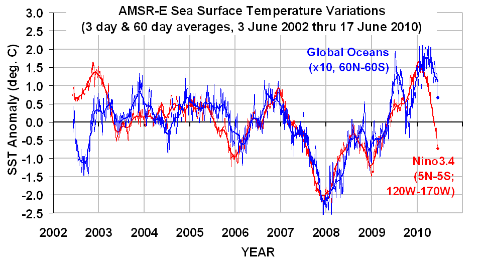
But, I will admit I was surprised. So, I decided to look at the AMSR-E sea surface temperatures (SSTs) that Remote Sensing Systems has been producing from NASA’s Aqua satellite since June of 2002. Even though the SST data record is short, and an average for the global ice-free oceans is not the same as global, the two do tend to vary together on monthly or longer time scales.

The following graph shows that January, 2010, was indeed warm in the sea surface temperature data:
AMSR-E-SST-thru-Jan-2010
But it is difficult to compare the SST product directly with the tropospheric temperature anomalies because (1) they are each relative to different base periods, and (2) tropospheric temperature variations are usually larger than SST variations.

So, I recomputed the UAH LT anomalies relative to the SST period of record (since June, 2002), and plotted the variations in the two against each other in a scatterplot (below). I also connected the successive monthly data points with lines so you can see the time-evolution of the tropospheric and sea surface temperature variations:
UAH-LT-vs-AMSR-E-SST-thru-Jan-2010
As can be seen, January, 2010 (in the upper-right portion of the graph) is quite consistent with the average relationship between these two temperature measures over the last 7+ years.

[NOTE: While the tropospheric temperatures we compute come from the AMSU instrument that also flies on the NASA Aqua satellite, along with the AMSR-E, there is no connection between the calibrations of these two instruments.]