The Search for a Short Term Marker of Long Term Climate Sensitivity

October 4th, 2009

[This is an update on research progress we have made into determining just how sensitive the climate system is to increasing atmospheric greenhouse gas concentrations.]

While published studies are beginning to suggest that net feedbacks in the climate system could be negative for year-to-year variations (e.g., our 2007 paper, and the new study by Lindzen and Choi, 2009), there remains the question of whether the same can be said of long-term climate sensitivity (and therefore, of the strength of future global warming).

Even if we find observational evidence of an insensitive climate system for year-to-year fluctuations in the climate system, it could be that the system’s long term response to more carbon dioxide is very sensitive. I’m not saying I believe that is the case – I don’t – but it is possible. This question of a potentially large difference in short-term and long-term responses of the climate system has been bothering me for many months.

Significantly, as far as I know, the climate modelers have not yet demonstrated that there is any short-term behavior in their models which is also a good predictor of how much global warming those models project for our future. It needs to be something we can measure, something we can test with real observations. Just because all of the models behave more-or-less like the real climate system does not mean the range of warming they produce encompasses the truth.

For instance, computing feedback parameters (a measure of how much the radiative balance of the Earth changes in response to a temperature change) would be the most obvious test. But I’ve diagnosed feedback parameters from 7- to 10-year subsets of the models’ long-term global warming simulations, and they have virtually no correlation with those models known long-term feedbacks. (I am quite sure I know the reason for this…which is the subject of our JGR paper now being revised…I just don’t know a good way around it).

But I refuse to give up searching. This is because the most important feedbacks in the climate system – clouds and water vapor – have inherently short time scales…minutes for individual clouds, to days or weeks for large regional cloud systems and changes in free-tropospheric water vapor. So, I still believe that there MUST be one or more short term “markers” of long term climate sensitivity.

Well, this past week I think I finally found one. I’m going to be a little evasive about exactly what that marker is because, in this case, the finding is too important to give away to another researcher who will beat me to publishing it (insert smiley here).

What I will say is that the marker ‘index’ is related to how the climate models behave during sudden warming events and the cooling that follows them. In the IPCC climate models, these warming/cooling events typically have time scales of several months, and are self-generated as ‘natural variability’ within the models. (I’m not concerned that I’ve given it away, since the marker is not obvious…as my associate Danny Braswell asked, “What made you think of that?”)

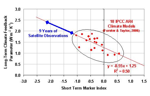
The following plot shows how this ‘mystery index’ is related to the net feedback parameters diagnosed in those 18 climate models by Forster and Taylor (2006). As can be seen, it explains 50% of the variance among the different models. The best I have been able to do up to this point is less than 10% explained variance, which for a sample size of 18 models might as well be zero.
Short-term-marker-of-climate-sensitivity

Also plotted is the range of values of this index from 9 years of CERES satellite measurements computed in the same manner as with the models’ output. As can be seen, the satellite data support lower climate sensitivity (larger feedback parameter) than any of the climate models…but not nearly as low as the 6 Watts per sq. meter per degree found for tropical climate variations by us and others.

For a doubling of atmospheric carbon dioxide, the satellite measurements would correspond to about 1.6 to 2.0 deg. C of warming, compared to the 18 IPCC models’ range shown, which corresponds to warming of from about 2.0 to 4.2 deg. C.

The relatively short length of record of our best satellite data (9 years) appears to be the limiting factor in this analysis. The model results shown in the above figure come from 50 years of output from each of the 18 models, while the satellite range of results comes from only 9 years of CERES data (March 2000 through December 2008). The index needs to be computed from as many strong warming events as can be found, because the marker only emerges when a number of them are averaged together.

Despite this drawback, the finding of this short-term marker of long-term climate sensitivity is at least a step in the right direction. I will post progress on this issue as the evidence unfolds. Hopefully, more robust markers can be found that show even a stronger relationship to long-term warming in the models, and which will produce greater confidence when tested with relatively short periods of satellite data.


The 2007-2008 Global Cooling Event: Evidence for Clouds as the Cause

September 26th, 2009

As I work on finishing our forcing/feedback paper for re-submission to Journal of Geophysical Research – a process that has been going on for months now – I keep finding new pieces of evidence in the data that keep changing the paper’s focus in small ways.

For instance, yesterday I realized that NASA Langley has recently updated their CERES global radiative budget measurement dataset through 2008 (it had previously ran from March 2000 through August 2007).

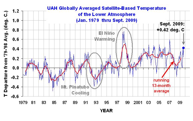
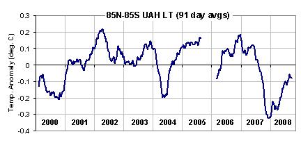
I’ve been anxiously awaiting this update because of the major global cooling event we saw during late 2007 and early 2008. A plot of daily running 91-day global averages in UAH lower tropospheric (LT) temperature anomalies is shown below, which reveals the dramatic 2007-08 cool event.
UAH-LT-during-Terra-CERES

I was especially interested to see if this was caused by a natural increase in low clouds reducing the amount of sunlight absorbed by the climate system. As readers of my blog know, I believe that most climate change – including “global warming” – in the last 100 years or more has been caused by natural changes in low cloud cover, which in turn have been caused by natural, chaotic fluctuations in global circulation patterns in the atmosphere-ocean system. The leading candidate for this, in my opinion, is the Pacific Decadal Oscillation…possibly augmented by more frequent El Nino activity in the last 30 years.

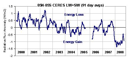
Now that we have 9 years of CERES data from the Terra satellite, we can more closely examine a possible low cloud connection to climate change. The next figure shows the changes in the Earth’s net radiative balance as measured by the Terra CERES system. By “net” I mean the sum of reflected shortwave energy (sunlight), or “SW”, and emitted longwave energy (infrared) or “LW”.
Terra-CERES-LW-SW

The changes in the radiative balance of the Earth seen above can be thought of conceptually in terms of forcing and feedback, which are combined together in some unknown proportion that varies over time. Making the interpretation even more uncertain is that some proportion of the feedback is due not only to radiative forcing, but also to non-radiative forcing of temperature change.

So the variations we see in the above chart is the combined result of three processes: (1) radiative forcing (both internal and external), which can be expected to cause a temperature change; (2) radiative feedback upon any radiatively forced temperature changes; and (3) radiative feedback upon any NON-radiatively forced temperature changes (e.g., from tropical intraseasonal oscillations in rainfall). It turns out that feedback can only be uniquely measured in response to NON-radiatively forced temperature changes, but that’s a different discussion.

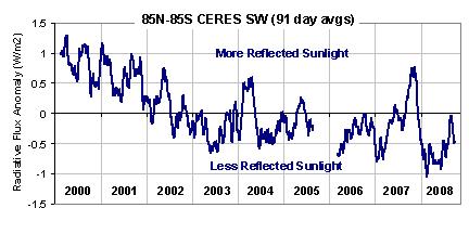
The SW component of the total flux measured by CERES looks like this…note the large spike upward in reflected sunlight coinciding with the late 2007 cooling:
Terra-CERES-SW

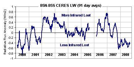
And here’s the LW (infrared) component…note the very low emission late in 2007, a portion of which must be from the colder atmosphere emitting less infrared radiation.
Terra-CERES-LW

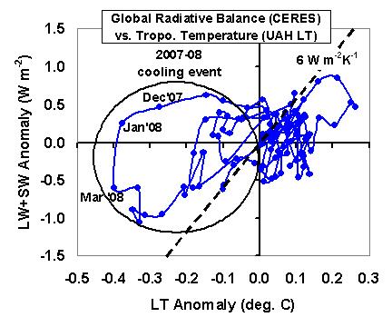
As I discuss at length in the paper I am preparing, the physical interpretation of which of these 3 processes is dominant is helped by drawing a phase space diagram of the Net (LW+SW) radiative flux anomalies versus temperature anomalies (now shown as monthly running 3-month averages), which shows that the 2007-08 cooling event has a classic radiative forcing signature:
Terra-CERES-vs-LT-phase-plot-3-mon

The spiral (or loop) pattern is the result of the fact that the temperature response of the ocean lags the forcing. This is in contrast to feedback, a process for which there is no time lag. The dashed line represents the feedback I believe to be operating in the climate system on these interannual (year-to-year) time scales, around 6 W m-2 K-1 as we published in 2007…and as Lindzen and Choi (2009) recently published from the older Earth Radiation Budget Satellite data.

The ability to separate forcing from feedback is crucial in the global warming debate. While this signature of internal radiative forcing of the 2007-08 event is clear, it is not possible to determine the feedback in response to that temperature change – it’s signature is overwhelmed by the radiative forcing.

Since the fluctuations in Net (LW+SW) radiative flux are a combination of forcing and feedback, we can use the tropospheric temperature variations to remove an estimate of the feedback component in order to isolate the forcing. [While experts will questions this step, it is entirely consistent with the procedures of Forster and Gregory (2006 J. Climate) and Forster and Taylor (2006 J. of Climate), who subtracted known radiative forcings from the total flux to isolate the feedback].

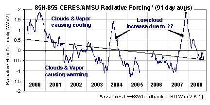
The method is simple: The forcing equals the Net flux minus the feedback parameter (6 W m-2 K-1) times the LT temperature variations shown in the first figure above. The result looks like this:
Terra-CERES-rad-forcing-6.0

What we see are 3 major peaks in radiant energy loss forcing the system: in 2000, 2004, and late 2007. If you look at the features in the separate SW and LW plots above, it is obvious the main signature is in the SW…probably due to natural increases in cloud cover, mostly low clouds, causing internal radiative forcing of the system

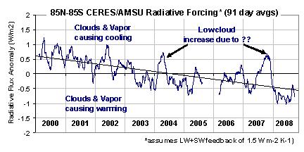
If we instead assume a much smaller feedback parameter, say in the mid-range of what the IPCC models exhibit, 1.5 W m-2 K-1, then the estimate of the radiative forcing looks like this:
Terra-CERES-rad-forcing-1.5

Note the trend lines in either case show a net increase of at least 1 W m-2 in the radiant energy entering the climate system. The anthropogenic greenhouse gas component of this would be (I believe) about 0.4 W m-2, or a little less that half. I’ll update this if someone gives me a better estimate.

So, what might all of this mean in the climate debate? First, nature can cause some pretty substantial forcings…what if these occur on the time scales associated with global warming (decades to centuries)?

But what is really curious is that the 9-year change in radiative forcing (warming influence) of the system seen in the last two figures is at least TWICE that expected from the carbon dioxide component alone, and yet essentially no warming has occurred over that period (see first illustration above). How could this be, if the climate system is as sensitive as the IPCC claims it to be?


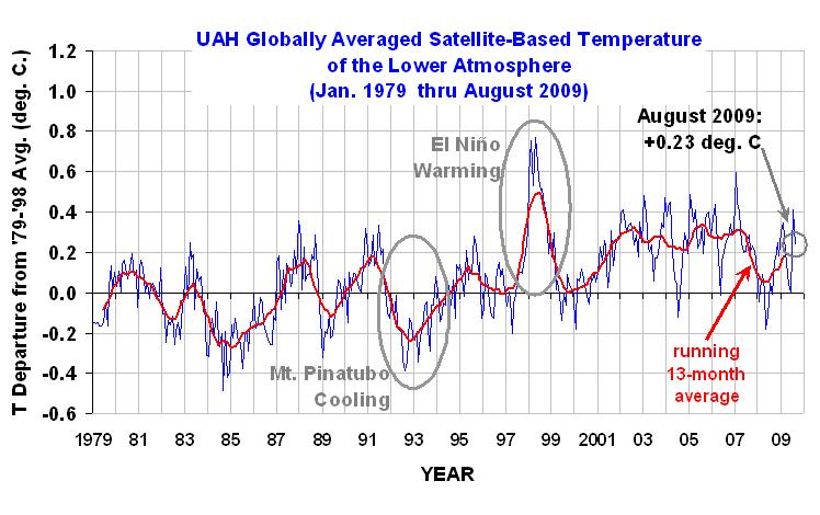
August 2009 Global Temperature Update: +0.23 deg. C

September 4th, 2009


YR MON GLOBE NH SH TROPICS
2009 1 +0.304 +0.443 +0.165 -0.036
2009 2 +0.347 +0.678 +0.016 +0.051
2009 3 +0.206 +0.310 +0.103 -0.149
2009 4 +0.090 +0.124 +0.056 -0.014
2009 5 +0.045 +0.046 +0.044 -0.166
2009 6 +0.003 +0.031 -0.025 -0.003
2009 7 +0.412 +0.212 +0.610 +0.427
2009 8 +0.231 +0.284 +0.179 +0.455

UAH_LT_1979_thru_Aug_09

August 2009 saw a modest fall in the global average tropospheric temperature anomaly, from +0.41 deg. C in July to +0.23 deg. C in August. The tropical and Northern Hemispheric troposphere remain quite warm, but the Southern Hemisphere cooled by over 0.4 deg. C in the last month.

NOTE: For those who are monitoring the daily progress of global-average temperatures here, we are still working on switching from NOAA-15 to Aqua AMSU, which will provide more accurate tracking on a daily basis. We will be including both our lower troposphere (LT) and mid-tropospheric (MT) pre-processing of the data. We will also be adding global sea surface temperature anomalies from the AMSR-E instrument on board the NASA Aqua satellite.


Global Oceanic Climate Update for August 2009

September 1st, 2009

This is the first of what might turn into a series of monthly updates of some maritime climate parameters monitored by the AMSR-E instrument on NASA’s Aqua satellite. All monthly statistics have been computed by me from daily global gridpoint data produced and archived by Remote Sensing Systems (RSS) under the direction of Frank Wentz, a member of our U.S. AMSR-E Science Team. Since Aqua was launched in 2002, the data are available only since June, 2002. A description of how these products were derived, and where they reside, is provided here.

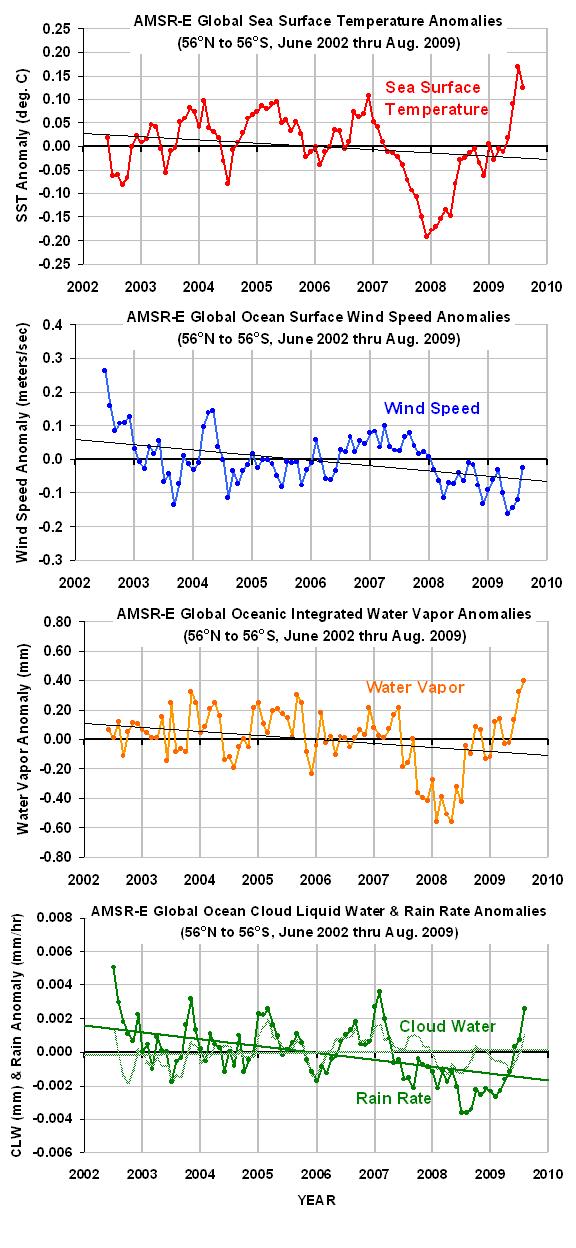
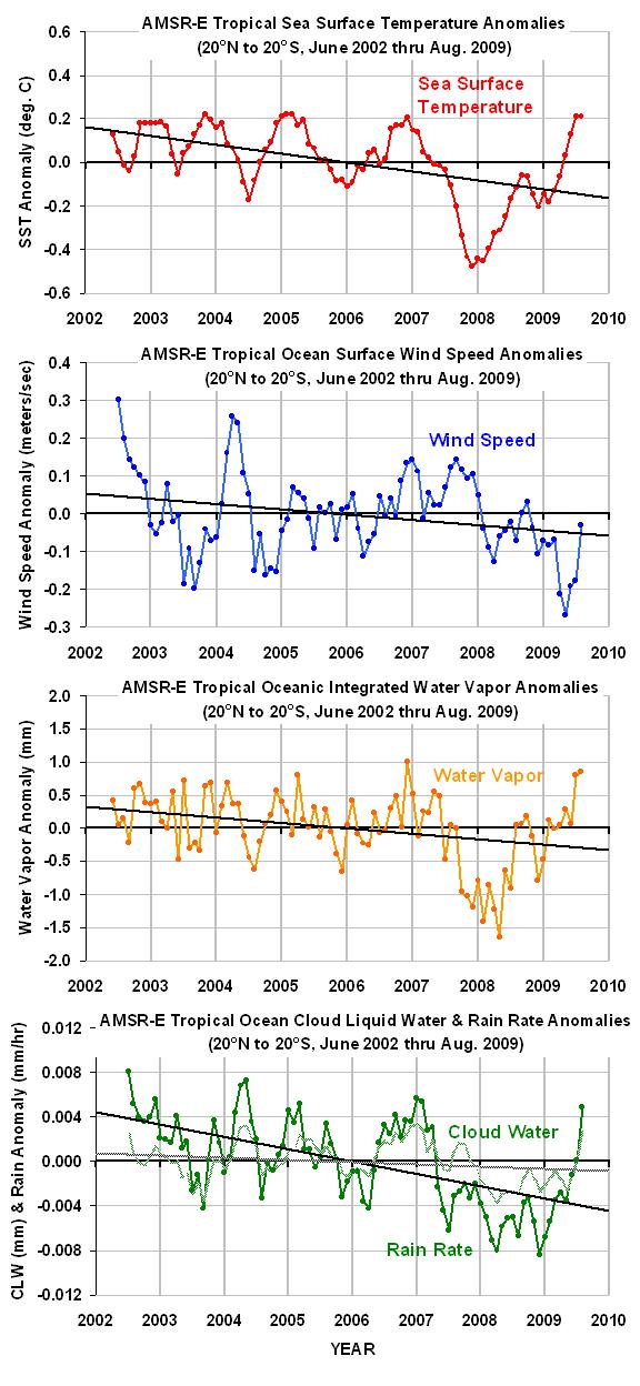
There are 5 “ocean products”: sea surface temperature [SST]; near-surface wind speed; vertically-integrated water vapor; vertically integrated cloud water; and rain rate. I will present time series of monthly anomalies averaged over the global, ice-free oceans (56 deg. N to 56 deg. S latitude), and separately for the deep tropics (20 deg. N to 20 deg. S latitude). ‘Anomalies’ are departures from the average seasonal cycles in those parameters, which will be recomputed as each new month of data is added.

GLOBAL OCEANS

In the first figure below are plotted the 5 ocean products for the global ice free-oceans (56N to 56S). As can be seen in the top panel, SSTs in August cooled slightly from the unusually warm conditions experienced in July.

I have added linear trend lines to each time series, which you are free to misinterpret as you wish. 😉 Since the AMSR-E period of record is only 7.25 years long, a calculated trend won’t have much meaning…although it will be interesting to see how long it takes before the climate system obeys the UN’s command to warm, and the SST trend line begins to go uphill again.

amsre-56N-56S-anomalies-thru-aug-09

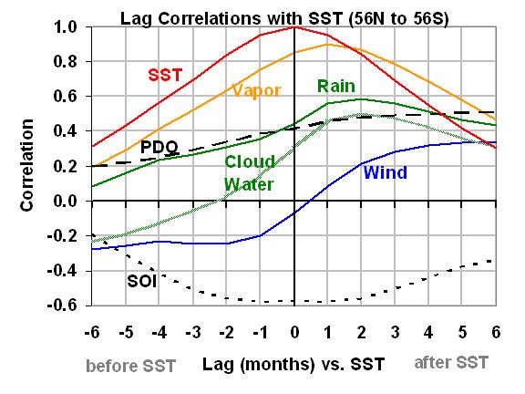
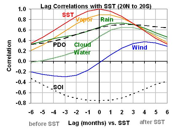
How these different variables change relative to each other is illustrated in the following lag-correlation plot of SST versus the other variables. “PDO” is the Pacific Decadal Oscillation Index, while “SOI” is the Southern Oscillation Index (negative for El Nino, positive for La Nina). A discussion of these curves is provided later, below.

amsre-56N-56S-anomaly-lag-correlations

TROPICAL OCEANS

The next figure shows the ocean product anomalies for just the deep tropics, 20N to 20S latitude….

amsre-20N-20S-anomalies-thru-aug-09

…and the lag correlation plot for the deep tropics is next:

amsre-20N-20S-anomaly-lag-correlations

DISCUSSION

Using the 20N-20S lag correlation plot as an example, you can see that total integrated water vapor is highly correlated with SST, which in turn is highly correlated with El Nino conditions (negative SOI values).

Also note that sea surface temperature tends to peak after months of anomalously low wind conditions, then falls as wind speeds increase.

Cloud water and rain rates increase as SST increases, reaching a maximum 1 to 3 months after the SST peaked.


Spurious SST Warming Revisited

August 31st, 2009

My previous post described what I called “smoking gun” evidence of a spurious drift in the NOAA sea surface temperature (SST) product when compared to SSTs from the TRMM satellite Microwave Imager (TMI). The drift seemed to be mostly confined to 2001, almost a ‘step’ jump. The moored buoy validation statistics of the TMI sea surface temperatures from Frank Wentz’s web site (SSMI.com) suggested that the TMI SSTs had good long-term stability.

But 2001 was also the year that the TRMM satellite was boosted into a higher orbit, which concerned me. I asked Frank about the effect of this event on the TMI SSTs (which also come from his web site). Frank couldn’t remember the details, but said he spent quite a bit of time correcting for the altitude change on the retrieved SSTs since the microwave emission of the sea surface depends upon the TMI instrument’s view angle with respect to the local vertical.

I know from our many years of work together on the AMSR-E Science Team that Frank is indeed a careful researcher, yet it seemed like more than a coincidence that the TMI and NOAA sea surface temperatures diverged during the same year as the orbit boost. So, I went back to see what might have caused the problem. I went back and thought about the different ways in which one can compute area averages from satellite data.

To make a long story short, because the orbit boost caused the TMI to be able to “see” to slightly higher latitudes, the way in which individual latitude bands are handled has a significant impact on the resulting temperature anomalies that are computed over time. The previous results I presented were for the 40N to 40S latitude band, which is nominally what the TMI instrument sees today. But before 2001, the latitudinal extent was slightly smaller than it was after 2001.

As shown in the following figure, if I restrict the latitude range to 38N to 38S, which was always covered during the entire TRMM mission, I find that the divergence between the TMI and NOAA average SST measurements essentially disappears.

TMI-AMSRE-ERSSTv3b-comparisons-1998-2009-revisited

Even though I was processing the NOAA and TMI datasets in the same manner, I should NOT have been. This is because there were not as many gridpoints over cooler SST regions going into the ‘global’ averages before the satellite altitude boost as after the boost. So, for example, one must be very careful in computing a latitude band average, say from 39N to 40N, to make sure that there has been no long-term change in the sampling of that band.

Based upon the above comparisons, I would now say there is no statistically significant difference in the SST trends since 1998 between TMI, the NOAA ERSSTv3b product, and the HadSST2 product. And it does look like July 2009 might well have experienced a warmer SST anomaly than July 1998, as was originally claimed by NOAA. (Remember, TMI can not see all of the global oceans, just equatorward of about 40 deg. N and S latitude.)

In the bottom panel of the above figure, I also have a comparison between the TMI and AMSR-E sea surface temperatures, which are available only since June of 2002 from the Aqua satellite. As can be seen, there is no evidence of a calibration (or sampling) drift in that comparison either.

So, what’s the moral of this story? Always question your results…even after finding the obvious errors. And maybe I should eliminate the term ‘smoking gun evidence’ from any results I describe in the future.

Oh…and don’t believe everything you read on the internet.


Spurious Warming in New NOAA Ocean Temperature Product: The Smoking Gun

August 27th, 2009

IMPORTANT (2:15 p.m. CDT, 8/31/09): The results of this post have been superseded.

After crunching data this week from two of our satellite-based microwave sensors, and from NOAA’s official sea surface temperature (SST) product ERSST v3b, I think the evidence is pretty clear:

The ERSST v3b product has a spurious warming since 1998 of about 0.2 deg. C, most of which occurred as a jump in 2001.

The following three panels tell the story. In the first panel I’ve plotted the TRMM Microwave Imager (TMI) SST anomalies (blue) for the latitude band 40N to 40S. I’ve also plotted SST anomalies from the more recently launched AMSR-E instrument (red), computed over the same latitude band, to show that they are nearly identical. (These SST retrievals do not have any time-dependent adjustments based upon buoy data). The orange curve is anomalies for the entire global (ice-free) oceans, which shows there is little difference with the more restricted latitude band.

TMI-AMSRE-ERSSTv3b-comparisons-1998-2009

In the second panel above I’ve added the NOAA ERSST v3b SST anomalies (magenta), calculated over the same latitude band (40N to 40S) and time period as is available from TRMM.

The third panel above shows the difference [ERSST minus TMI], which reveals an abrupt shift in 2001. The reason why I trust the microwave SST is shown in the following plot, where validation statistics are displayed for match-ups between satellite measurements and moored buoy SST measurements. The horizontal green line is a regression fit to the data. (An average seasonal cycle, and 0.15 deg. C cool skin bias have been removed from these data…neither affects the trend, however.)

TMI-buoy-comparisons-1998-2009

I also checked the TMI wind speed retrievals, and there is no evidence of anything unusual happening during 2001. I have no idea how such a large warm bias could have entered into the ERSST dataset, but I’d say the evidence is pretty clear that one exists.

Finally, the 0.15 to 0.20 deg. C warm bias in the NOAA SST product makes it virtually certain that July 2009 was not, as NOAA reported, a record high for global sea surface temperatures.


TRMM Satellite Suggests July 2009 Not a Record for Sea Surface Temperatures

August 26th, 2009

(UPDATED 8/26/09 at 13:30 CDT
Added a new plot comparing TMI and AMSR-E global monthly SSTs)

NOAA/NCDC recently announced that July 2009 set a new record high global sea surface temperature (SST) for the month of July, just edging out July 1998. This would be quite significant since July 1998 was very warm due to a strong El Nino, whereas last month (July, 2009) is just heading into an El Nino which has hardly gotten rolling yet.

If July was indeed a record, one might wonder if we are about to see a string of record warm months if a moderate or strong El Nino does sustain itself, with that natural warming being piled on top of the manmade global warming that the “scientific consensus” is so fond of.

I started out looking at the satellite microwave SSTs from the AMSR-E instrument on NASA’s Aqua satellite. Even though those data only extend back to 2002, I though it would provide a sanity check. My last post described a significant discrepancy I found between the NOAA/NCDC “ERSST” trend and the satellite microwave SST trend (from the AMSR-E instrument on Aqua) over the last 7 years…but with the AMSR-E giving a much warmer July 2009 anomaly than the NCDC claimed existed! The discrepancy was so large that my sanity-check turned into me going a little insane trying to figure it out.

So, since we have another satellite dataset with a longer record that would allow a direct comparison between 1998 and 2009, I decided to analyze the full record from the TRMM Microwave Imager (TMI). The TRMM satellite covers the latitudes between 40N and 40S, so a small amount of N. Hemisphere ocean is being missed, and a large chunk of the ocean around Antarctica will be missed as well. But since my analysis of the ERSST and AMSR-E SST data suggested the discrepancy between them was actually between these latitudes as well, I decided that the results should give a pretty good independent check on the NOAA numbers. All of the original data that went into the averaging came from the Remote Sensing Systems (RSS) website, SSMI.com. Anomalies were computed about the mean annual cycle from data over the whole period of record.

The results are shown in the following three panels. The first panel shows monthly SST anomalies since January 1998, and as can be seen July 2009 came in about 0.06 deg. C below July 1998. At face value, this suggests that July 2009 might not have been a record. And as you can see from the first 3 weeks of August data, it looks like this month will come in even cooler.

TMI-SST-comparisons-1998-2009
Now, if you are wondering how accurate these monthly anomalies are, the second panel shows the validation statistics that RSS archives in near-real time. Out of the 5 different classes of in situ validation data, I chose just the moored buoys due to their large volume of data (over 200,000 matchups between buoys and satellite observations), and a relatively fixed geographic coverage (unlike drifting buoys). As can be seen, the TMI SST record shows superb long-term stability. The 0.15 deg. C cool bias in the TMI measurements is from the “cool skin” effect, with water temperatures in the upper few millimeters being slightly cooler on average than the SSTs measured by the buoys, typically at a depth around 1 meter.

The third and final panel in the above figure shows that a substantial fraction of the monthly SST variability from year to year is due to the Southern Oscillation (El Nino/La Nina), and the Pacific Decadal Oscillation, PDO. Each of these indices have a correlation of 0.33 with SST for monthly averages over the 40N-40S latitude band, while their sum (taking the negative of the SOI first) is correlated at 0.39. I did not look at lag correlations, which might be higher, and it looks like some additional time averaging would increase the correlation.

I will post again when I have new information on my previously reported discrepancy between NOAA’s results and the AMSR-E results. That is still making me a little crazy.

8/26/09 13:30 CDT UPDATE

I computed the monthly global (60N to 60S latitudes) AMSR-E SST anomalies, adjusted them for the difference in annual cycles with the longer TMI record, and then plotted the AMSR-E and TMI SST anomalies together. Even though the TMI can not measure poleward of 40 deg. latitude (N or S), we see reasonable agreement between the two products.

TMI-AMSRE-SST-comparisons-1998-2009
None of this represents proof that July 2009 was not a record warm month in ocean surface temperatures, but it does cast significant doubt on the claim. But the focus on a single month misses the big picture: recent years have yet to reach the warmth of 1998. Only time will tell whether we get another year that approaches that unusual event.


Something’s Fishy With Global Ocean Temperature Measurements

August 22nd, 2009

(edited 8/23/09 0710 CDT: Changed plots & revised text to reflect the fact that NCDC, not CRU, is apparently the source of the SST dataset; also add discussion of possible RFI interference in satellite measurements)

(edited 8/22/09 1415 CDT: added plot of trend differences by month at bottom)

In my previous blog posting I showed the satellite-based global-average monthly sea surface temperature (SST) variations since mid-2002, which was when the NASA Aqua satellite was launched carrying the Advanced Microwave Scanning Radiometer for EOS (AMSR-E). The AMSR-E instrument (which I serve as the U.S. Science Team Leader for) provides nearly all-weather SST measurements.

The plot I showed yesterday agreed with the NOAA announcement that July 2009 was unusually warm…NOAA claims it was even a new record for July based upon their 100+ year record of global SSTs.

But I didn’t know just HOW warm, since our satellite data extend back to only 2002. So, I decided to download the NOAA/NCDC SST data from their website — which do NOT include the AMSR-E measurements — to do a more quantitative comparison.

From the NOAA data, I computed monthly anomalies in exactly the same manner I computed them with the AMSR-E data, that is, relative to the June 2002 through July 2009 period of record. The results (shown below) were so surprising, I had to go to my office this Saturday morning to make sure I didn’t make a mistake in my processing of the AMSR-E data.

Global-SST-NCDC-vs-AMSRE

As can be seen, the satellite-based temperatures have been steadily rising relative to the conventional SST measurements, with a total linear increase of 0.15 deg C over the 7 year period of record versus the conventional SST measurements.

If the satellite data are correct, then this means that the July 2009 SSTs reached a considerably higher record temperature than NOAA has claimed. The discrepancy is huge in terms of climate measurements; the trend in the difference between the two datasets shown in the above figure is the same size as the anthropogenic global warming signal expected by the IPCC.

I have no idea what is going on here. Frank Wentz and Chelle Gentemann at Remote Sensing Systems have been very careful about tracking the accuracy of the AMSR-E SST retrievals with millions of buoy measurements. I checked their daily statistics they post at their website and I don’t see anything like what is shown in the above figure.

Is it possible that the NCDC SST temperature dataset has been understating recent warming? I don’t know…I’m mystified. Maybe Frank, Chelle, Phil Jones, or some enterprising blogger out there can figure this one out.

UPDATE #1 (8/22/09)
Here’s the trend differences between the satellite and in-situ data, broken out by calendar month. The problem seems to be mainly a Northern Hemisphere warm season phenomenon.

Global-SST-NCDC-vs-AMSRE-trend-diff-by-month

UPDATE#2 (8/23/09)
Anthony Watts has suggested that the radio frequency interference (RFI) that we see in the AMSR-E 6.9 GHz data over land might be gradually invading the ocean as more boats install various kinds of microwave transmitters. While it’s hard for me to believe such an effect could be this strong (we have never seen obvious evidence of oceanic RFI before), this is still an interesting hypothesis, so this week I will examine the daily 1/4 deg. grids of AMSR-E SST and compute a spatial “speckle” statistic to see if there is any evidence of this kind of interference increasing over time. I should note that we HAVE seen more RFI reflected off the ocean from geostationary TV communication satellites in the AMSR-E data in recent years.


Record July 2009 Sea Surface Temperatures? The View from Space

August 21st, 2009

Since NOAA has announced that their data show July 2009 global-average sea surface temperatures (SSTs) reaching a record high for the month of July, I thought I would take a look at what the combined AMSR-E & TMI instruments on NASA’s Aqua and TRMM satellites (respectively) had to say. I thought it might at least provide an independent sanity check since NOAA does not include these satellite data in their operational product.

The SSTs from AMSR-E are geographically the most complete record of global SSTs available since the instrument is a microwave radiometer and can measure the surface through most cloud conditions. AMSR-E (launched on Aqua in May 2002) provides truly global coverage, while the TMI (which was launched on TRMM in late 1997) does not, so the combined SST product produced by Frank Wentz’s Remote Sensing Systems provides complete global coverage only since the launch of Aqua (mid-2002). Through a cooperative project between RSS, NASA, and UAH, The digital data are available from the same (NASA Discover) website that our daily tropospheric temperatures are displayed, but for the SSTs you have to read the daily binary files and compute the anomalies yourself. I use FORTRAN for this, since it’s the only programming language I know.

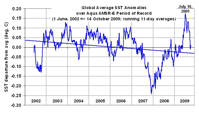
As can be seen in the following plot of running 11 day average anomalies, July 2009 was indeed the warmest month during the relatively short Aqua satellite period of record, with the peak anomaly occurring about July 18.

AMSRE-SST-global

The large and frequent swings in global average temperature are real, and result from changes in the rate at which water evaporates from the ocean surface. These variations are primarily driven by tropical Intraseasonal Oscillations, which change tropical-average surface winds by about 2 knots from lowest wind conditions to highest wind conditions.

As can be seen, the SSTs started to fall fast during the last week of July. If you are wondering what I think they will do in the coming months, well, that’s easy…I have no clue.


July 2009 Global Temperature Update: +0.41 deg. C

August 5th, 2009


YR MON GLOBE NH SH TROPICS
2009 1 +0.304 +0.443 +0.165 -0.036
2009 2 +0.347 +0.678 +0.016 +0.051
2009 3 +0.206 +0.310 +0.103 -0.149
2009 4 +0.090 +0.124 +0.056 -0.014
2009 5 +0.045 +0.046 +0.044 -0.166
2009 6 +0.003 +0.031 -0.025 -0.003
2009 7 +0.410 +0.211 +0.609 +0.427

July 2009 experienced a large jump in the global average tropospheric temperature anomaly, from +0.00 deg. C in June to +0.41 deg. C in July, with the tropics and southern hemisphere showing the greatest warming.

NOTE: For those who are monitoring the daily progress of global-average temperatures here, we will be switching from NOAA-15 to Aqua AMSU in the next few weeks, which will provide more accurate tracking on a daily basis. We will be including both our lower troposphere (LT) and mid-tropospheric (MT) pre-processing of the data.