Global Warming, Ulcers, and Gas Pains

January 23rd, 2009

You have probably already heard about a Pew survey released yesterday, which shows that out of a choice of 20 primary concerns the American public has, the economy and jobs rank at the very top, and global warming ranks at the very bottom. Here are the stats:

pew-survey-public-priorities

A couple of blogs I’ve visited this morning show considerable fretting over this situation, with calls for reframing the global warming issue in terms that hit home with people, or reducing the alarmist rhetoric, etc. In other words, the public just isn’t getting it, and the problem lies with the communicators of the global warming message.

Well, maybe the problem doesn’t lie with the communicators…but instead with the long tradition science has of overselling issues that the scientific community knows relatively little about. The public already knows that science has a history of being spectacularly wrong with long-term predictions of doom. Paul Ehrlich’s Population Bomb bombed, and yet many people still fret over the Earth being overpopulated. (In my view, the only thing we are overpopulated with is stupidity).

And the time it takes for science to realize that the ‘scientific consensus’ is wrong can be very, very long indeed. For instance, as early as 1948 it was learned that administering antibiotics to farm animals eliminated the incidence of stomach ulcers. The medical community was told about this and they considered the idea as preposterous. Finally, in 2005 two Australian scientists were awarded the Nobel Prize for “discovering” the bacterial basis of peptic ulcers. The truth is, one of them was tipped off by a rancher many years earlier to look into using antibiotics.

Gee, I wonder how much more difficult it is to come to a sufficient theoretical understanding of the sensitivity of the climate system, compared to figuring out empirically what works for the treatment of stomach ulcers…when we have had literally millions of patients to test treatments on over the years? And stomach ulcer research doesn’t carry all of the baggage that accompanies global warming research, like economics, politics, the role of government in peoples’ lives, and even our religious beliefs regarding mankind’s relationship to the environment.

And what is particularly fascinating about the Pew study is that addressing global warming (at the bottom of the list of priorities) could supposedly help the economy (at the top of the list). If Obama really believes his own rhetoric about green energy creating green jobs as a way of invigorating the economy, he should be making alternative energy a top priority.

But the dirty little secret is that renewable energy is very expensive and requires large areas of land to be used for its generation…which then has its own environmental impact. I’m attending a PowerSouth electric utility cooperative meeting where the trustees are fretting over where our future energy will come from. While most of the energy producers in America are investor-owned, and will simply pass higher prices on to consumers (with investors continuing to take a piece of the pie), the electric co-ops are more interested in keeping prices low because they are looking out for their customers.

The most interesting presentation I’ve seen at the meeting so far compared the energy content of various energy sources to how much real estate it takes to create that energy. Ethanol was absolutely the worst, with huge amounts of land required to generate relatively little energy. Nuclear power is, of course, at the other end of the spectrum, with a huge amount of energy being generated with very little land.

But the future (it was claimed by the presenter) is with methane and natural gas, large deposits of which are being found under the ocean floor. If one compared how much hydrogen energy is contained in various fuels compared to their carbon content (and thus how much CO2 is produced when the are burned), the order from worst to best runs: wood & biomass, coal, petroleum, natural gas, methane, and pure hydrogen. (Since there are no natural deposits of hydrogen, it’s inclusion is somewhat irrelevant).

And the infrastructure required to retrieve and use these gases to fire electric turbines takes up very little space. His view was that methane IS renewable, continuously being generated by microbes in the Earth’s crust.

Whether these sources will help solve our energy problems, I have no idea. But if for no other reason that the physical limits on how much energy we can get out of one acre of wind, solar, biomass, etc., I predict we will never substantially reduce CO2 emissions until we embrace nuclear once again, or develop some other new energy technology which we, at this point, can only dream about.

(Of course, if you have read my writings, you already know my research suggests that the climate system is relatively insensitive to the CO2 we produce, anyway.)

The energy needs of humanity are so vast (and growing, especially in India and China) that we can only stay economically competitive if we abandon ideas which provide a poor return on investment, and remain open to ideas that might at first seem preposterous…such as using antibiotics to treat ulcers.


The Origin of Increasing Atmospheric CO2 – a Response from Ferdinand Engelbeen

January 22nd, 2009

After yesterday’s post about manmade vs. natural sources of CO2, I received the following e-mail from Ferdinand Engelbeen. I’ve reproduced that e-mail below, and made a couple of comments (also in italics)….I’m at a conference, so I posted this quickly…sorry for any typos… and thanks to Ferdinand for taking the time to respond. – Roy

Dear Dr. Spencer,

I have reacted a few times via Anthony Watts’ weblog on your different thoughts about the origin of the increase of CO2 in the atmosphere. Regardless if that is man made or not, I think we agree that the influence of the increase itself on temperature/climate is limited, if observable at all. But we disagree about the origin of the increase. I am pretty sure that the increase is man-made and have made a comprehensive page to show all the arguments to that at:

http://www.ferdinand-engelbeen.be/klimaat/co2_measurements.html

Thus here follows my critique on your blog page:

Besides the mass balance (which excludes any net natural addition as long as the increase in the atmosphere per year is less than the emissions), there are two essential points:

The d13C reduction:
Indeed it is not directly possible to make a distinction between 13C depleted fossil fuel burning and 13C depleted vegetation decay. The fingerprint of d13C changes by vegetation over the seasons is much larger than from fossil fuel burning (~60 GtC vs. 8 GtC, with about the same average d13C level). But vegetation changes are two-way, while fossil fuel burning is one-way addition. Thus the absolute height of the seasonal variation is not important, only the difference at the end of the year with the previous year is important for the year-by-year and multiyear trend. (Yes…I was making no claim regarding the seasonal cycle as being contributed to by mankind…although a change from one year to the next could still be due to a small imbalance between the huge natural sources and sinks. – Roy)

To know if the biosphere as a whole (sea algues + vegetation + soil bacteria) is a net absorber or emitter, we have a nice distinction between the two opposing actions of growth and decay: oxygen use. That can be used to determine the difference. The type of fuels used are known with reasonable accuracy, and thus their oxygen use when burned is known with reasonable accuracy too. Now since about 1990, oxygen measurements have sufficient accuracy to see the very small changes that fossil fuel use cause and the deficit/addition that the biosphere growth/decay adds to the fossil fuel use of oxygen. This revealed that since about 1990 the biosphere is a net source of oxygen and thus a net sink for CO2 (and thus of preferentially 12CO2), enriching the atmosphere with 13CO2. The biosphere as a whole thus is a net source of 13CO2 and can’t be the origin of the decreasing d13C levels. The oxygen use and d13C changes are used to estimate the partitioning of CO2 sequestering between land biosphere and oceans:
See: http://www.sciencemag.org/cgi/content/abstract/287/5462/2467
and: http://www.bowdoin.edu/~mbattle/papers_posters_and_talks/BenderGBC2005.pdf (up to 2002) (But isn’t this just one component of the total budget? You are talking specifically about what happens to the extra manmade CO2, and how it affects O2 and C13…I’m talking about some sort of oceanic, temperature dependent source…say a decrease in phytoplankton growth associated with warming.-Roy)

Other sources of low d13C don’t exist in fast/large quantities: (deep) oceans, calcite deposits/weathering, volcanic degassing,… in general have high(er) d13C levels (around zero per mil) compared to the atmosphere (-8 per mil). Thus the human use of low d13C (and zero d14C) fossil fuels is the sole cause of decreasing d13C levels. (But Behrenfeld, 2006 showed huge Climate Driven Trends in Contemporary Ocean Productivity…wouldn’t these have a substantial depleted C13 signature? – Roy)

d13C levels decrease as well as in the atmosphere as in the upper oceans in line with the use of fossil fuels: relative stable from 600 to 150 years ago and starting to decrease faster and faster in the past 150 years, see e.g. the decrease of d13C in coralline sponges and ice cores/firn/atmosphere at:
http://www.ferdinand-engelbeen.be/klimaat/klim_img/sponges.gif

Although fossil fuel burning is the sole cause of the d13C decrease, the result is less (about 1/3rd) of what can be expected from the burning of fossil fuels, if every molecule remained in the atmosphere. But that is not the case, as near 20% per year of the atmospheric CO2 is exchanged with vegetation (less influence, as most comes back next season), upper oceans (idem) and deep oceans (that is important, as that disappears in a large mass). With an exchange of about 40 GtC from the deep oceans, the calculated reduction of d13C fits most of the (recent) trend of d13C in the atmosphere…

Further: the sentence:
“And since most of the cycling of CO2 between the ocean, land, and atmosphere is due to biological processes, this alone does not make a decreasing C13/C12 ratio a unique marker of an anthropogenic source.”
Is not accurate, as most of the seasonal cycling between the oceans and atmosphere (~90 GtC) is abiogenic and a matter of solubility of CO2 at different temperatures and salt/bi/carbonate concentrations and pH of the ocean surface layer.
Feely e.a. has made several interesting pages on that: http://www.pmel.noaa.gov/pubs/outstand/feel2331/exchange.shtml (I’m surprised at this claim…I thought the seasonal cycle is dominated by Northern Hemispheric vegetation growing and dying each year? Indeed, my first figure from yesterday’s post clearly shows the seasonal cycle has the largest dC13 signature…? – Roy)

Thus the main conclusion is that the d13C trend is not caused by the biosphere and strengthens the case for a human origin.

The temperature-CO2 connection:
I have had several discussions about this subject. The first point is that most of the people look at too short time intervals. We are interested in the (none) role of increased CO2 accumulation in the atmosphere on climate. Thus let us start with the trend of accumulations: temperature vs. accumulated emissions and accumulation in the atmosphere:

engelbeen-1

Well the temperature trend shows distinct periods with flat to negative trends (1900-1910, 1945-1975 and 1998-current) and upgoing trends (1910-1945, 1975-1998). There is some correlation with CO2 levels. As good as for temperature caused by CO2 levels as the “warmers” assure us, as the opposite way, but not really convincing. On the other hand the accumulation in the atmosphere is a near perfect replica of the accumulated emissions only at a lower level: 55% of the emissions on the whole 100+ years trend or any part of a few years long of that trend. One can see that more clear in the two correlation trends:

engelbeen-2

A huge short term temperature change of halve the scale has an influence of only a few ppmv/°C, while the “long” term temperature change should have an influence of 80 ppmv/°C? Seems rather impossible, especially when compared to the Vostok (and other ice cores) record, where a relative constant ratio of 8 ppmv/°C is recorded over the full past 420,000 years.

Compare that to the emissions-atmospheric accumulation correlation trend:

engelbeen-3

A near perfect fit…

Thus what you see if you look at the year-by-year accumulation rate is a mix of a trend (at about 55% of the emission, or about 1.5 ppmv/yr nowadays) and the direct, short-term influence of (mainly) temperature.

Your formula for the direct temperature influence (both detrended) is:
dCO2/dt = 1.71 ppmv/yr/°C
but there is a problem with this. The detrended plot for dCO2/dt should be around zero, but the plot shows an average of 1.24 ppmv/yr, which is attributed to the temperature changes, thus is not really detrended. And even with a negative temperature anomaly, there still is a continuous increase of CO2, which ends at about -0.7°C temperature anomaly.

The next, more important problem is that the formula has no time limit. Even with a constant temperature, the CO2 increase is indefinitely. If that is applied to the past, then the ice ages should show zero CO2 and the interglacials several thousands of ppmvs… Even on the more nearby past: the LIA lasted several decades, but only shows a decrease of about 8 ppmv/°C, near identical to the long term ratio seen in the Vostok ice core. While the current variability around the trend is in the order of 3 ppmv/°C. That is a lot different from an unlimited trend of 1.71 ppmv/yr/°C.

If we look again at the graph of the temperature and the accumulation of the atmosphere, then according to your interpretation, the CO2 levels would be decreasing increasing 1900-1920, increasing increasing 1920-1940, constant increasing 1940-1975, increasing increasing 1975-1998 and constant/declining increasing 1998-current. Although resembling, not really what is seen in the trends. Still the trend from accumulated emissions is far superior…

My formula looks more like:
dCO2/dt = 3 * dT + 0.55 * d(emissions)
where dCO2/dt holds for any time period (past or present), 3*dT is for short term changes and may expand to 8*dT for long term sustained changes and dT is for any time period, but always the difference over the full period.

Pieter Tans has a better fit than me by including precipitation. See:
http://esrl.noaa.gov/gmd/co2conference/pdfs/tans.pdf

Last but not least, the mass balance is a little difficult to explain with your attribution of a large part of the increase to temperature. As long as no matter disappears to space we have according to your attribution over the past 50 years:

attributed to temperature: +52 ppmv
added by humans: +110 ppmv
observed: +60 ppmv
to be removed by unknown (natural) sinks: 102 ppmv

Thus some natural sinks must remove more CO2 from the atmosphere than the increase of CO2 which is attributed to the temperature increase…

Moreover, as the oceans are the main source of extra CO2 by increasing temperatures, according to this scheme, the sole fast sink remaining is the biosphere. Thus the terrestrial biosphere should have removed 102 ppmv in 50 years, which means the equivalent of about 33% of the total terrestrial vegetation (see http://earthobservatory.nasa.gov/Features/CarbonCycle/Images/carbon_cycle_diagram.jpg )… That in times of disappearing tropical forests seems rather unlikely…

That is the kernel of my objections…

Sincerely,

Ferdinand Engelbeen
retired engineer process automation


Increasing Atmospheric CO2: Manmade…or Natural?

January 21st, 2009

I’ve usually accepted the premise that increasing atmospheric carbon dioxide concentrations are due to the burning of fossil fuels by humans. After all, human emissions average around twice that which is needed to explain the observed rate of increase in the atmosphere. In other words, mankind emits more than enough CO2 to explain the observed increase in the atmosphere.

Furthermore, the ratio of the C13 isotope of carbon to the normal C12 form in atmospheric CO2 has been observed to be decreasing at the same time CO2 has been increasing. Since CO2 produced by fossil fuel burning is depleted in C13 (so the argument goes) this also suggests a manmade source.

But when we start examining the details, an anthropogenic explanation for increasing atmospheric CO2 becomes less obvious.

For example, a decrease in the relative amount of C13 in the atmosphere is also consistent with other biological sources. And since most of the cycling of CO2 between the ocean, land, and atmosphere is due to biological processes, this alone does not make a decreasing C13/C12 ratio a unique marker of an anthropogenic source.

This is shown in the following figure, which I put together based upon my analysis of C13 data from a variety of monitoring stations from the Arctic to the Antarctic. I isolated the seasonal cycle, interannual (year-to-year) variability, and trend signals in the C13 data.

The seasonal cycle clearly shows a terrestrial biomass (vegetation) source, as we expect from the seasonal cycle in Northern Hemispheric vegetation growth. The interannual variability looks more like it is driven by the oceans. The trends, however, are weaker than we would expect from either of these sources or from fossil fuels (which have a C13 signature similar to vegetation).

C13/C12 isotope ratios measured at various latitudes show that CO2 trends are not necessarily from fossil fuel burning.

C13/C12 isotope ratios measured at various latitudes show that CO2 trends are not necessarily from fossil fuel burning.

Secondly, the year-to-year increase in atmospheric CO2 does not look very much like the yearly rate of manmade CO2 emissions. The following figure, a version of which appears in the IPCC’s 2007 report, clearly shows that nature has a huge influence over the amount of CO2 that accumulates in the atmosphere every year.

The yearly increase of CO2 measured at Mauna Loa shows huge natural fluctuations which are caused by temperature changes.

The yearly increase of CO2 measured at Mauna Loa shows huge natural fluctuations which are caused by temperature changes.

In fact, it turns out that these large year-to-year fluctuations in the rate of atmospheric accumulation are tied to temperature changes, which are in turn due mostly to El Nino, La Nina, and volcanic eruptions. And as shown in the next figure, the CO2 changes tend to follow the temperature changes, by an average of 9 months. This is opposite to the direction of causation presumed to be occurring with manmade global warming, where increasing CO2 is followed by warming.

Year to year CO2 fluctuations at Mauna Loa show that the temperature changes tend to precede the CO2 changes.

Year to year CO2 fluctuations at Mauna Loa show that the temperature changes tend to precede the CO2 changes.

If temperature is indeed forcing CO2 changes, either directly or indirectly, then there should be a maximum correlation at zero months lag for the change of CO2 with time versus temperature (dCO2/dt = a + b*T would be the basic rate equation). And as can be seen in the above graph, the peak correlation between these two variables does indeed occur close to zero months.

And this raises an intriguing question:

If natural temperature changes can drive natural CO2 changes (directly or indirectly) on a year-to-year basis, is it possible that some portion of the long term upward trend (that is always attributed to fossil fuel burning) is ALSO due to a natural source?

After all, we already know that the rate of human emissions is very small in magnitude compared to the average rate of CO2 exchange between the atmosphere and the surface (land + ocean): somewhere in the 5% to 10% range. But it has always been assumed that these huge natural yearly exchanges between the surface and atmosphere have been in a long term balance. In that view, the natural balance has only been disrupted in the last 100 years or so as humans started consuming fossil fuel, thus causing the observed long-term increase.

But since the natural fluxes in and out of the atmosphere are so huge, this means that a small natural imbalance between them can rival in magnitude the human CO2 input. And this clearly happens, as is obvious from the second plot shown above!

So, the question is, does long-term warming also cause a CO2 increase, like that we see on in the short term?

Let’s look more closely at just how large these natural, year-to-year changes in CO2 are. Specifically, how much CO2 is emitted for a certain amount of warming? This can be estimated by detrending both the temperature and CO2 accumulation rate data, and comparing the resulting year-to-year fluctuations (see figure below).

mauna-loa-dco2dt-vs-t-anoms

Although there is considerable scatter in the above figure, we see an average relationship of 1.71 ppm/yr for every 1 deg C. change in temperature. So, how does this compare to the same relationship for the long-term trends? This is shown in the next figure, where we see a 1.98 ppm/yr for every 1 deg. C of temperature change.

mauna-loa-dco2dt-vs-t-trendss

This means that most (1.71/1.98 = 86%) of the upward trend in carbon dioxide since CO2 monitoring began at Mauna Loa 50 years ago could indeed be explained as a result of the warming, rather than the other way around.

So, there is at least empirical evidence that increasing temperatures are causing some portion of the recent rise in atmospheric CO2, in which case CO2 is not the only cause of the warming.

Now, the experts will claim that this is all bogus, because they have computer models of the carbon budget that can explain all of long term rise in CO2 as a result of fossil fuel burning alone.

But, is that the ONLY possible model explanation? Or just the one they wanted their models to support? Did they investigate other model configurations that allowed nature to play a role in long term CO2 increase? Or did those model simulations show that nature couldn’t have played a role?

This is the trouble with model simulations. The ones that get published are usually the ones that support the modeler’s preconceived notions, while alternative model solutions are ignored.

If an expert in this subject sees a major mistake I’ve made in the above analysis, e-mail me and I’ll post an update, so that we might all better understand this issue.


Does Nature’s Thermostat Exist? A Global Warming Debate Challenge

January 13th, 2009

Scientific disagreements over just how much mankind’s carbon dioxide emissions will warm the planet can be described with the analogy of the thermostat in your home. You set the thermostat to a certain temperature, and if it senses (for example) that the temperature is rising too much above that preset level, a cooling mechanism (air conditioning) kicks in and works to push the temperature back down.

I, and a number of other scientists, believe that nature has a thermostatic control mechanism that “pushes back” against a warming influence, such as the relatively weak warming from more atmospheric carbon dioxide. (The direct warming effect of more CO2 would amount to little more than 1 deg. F by late in this century, and is generally not the subject of debate.)

In climate research (and engineering, and physics) a thermostatic control mechanism is called ‘negative feedback’, and as discussed elsewhere on my web site there are a number of studies that suggest it really does exist in the climate system. At this point my own research suggests that the natural cooling mechanism is most likely due to the response of clouds to warming. While it is a bit technical, the issue is introduced in this peer-reviewed publication.

To be sure, positive feedbacks also exist in nature, such as the enhanced solar heating of the ocean that accompanies the melting of sea ice. But these are regional and relatively weak compared to the dominating, global influence of cloud feedbacks.

The reason why we keep hearing about how serious global warming will be is that all twenty-something of the computer climate models tracked by the IPCC now have net positive feedbacks. They enhance the small direct warming effect of extra CO2…by near-catastrophic amounts for a couple of the models.

Of course, the models are only behaving the way they are programmed to behave, and here I discuss why I think the modelers have seriously misinterpreted the role of clouds in climate change when building those models. While the modelers do not realize it, their tests of the models’ behavior with satellite observations have not been specific enough to validate the models’ feedback behavior. In effect, their tests are yielding ‘false positives’.

Obviously, the thermostat (feedback) issue is the most critical one that determines whether manmade global warming will be catastrophic or benign. In this context, it is critical for the public and politicians to understand that the vast majority of climate researchers do not work on feedbacks.

In popular political parlance, most climate researchers do not appreciate the nuanced details of how one estimates feedbacks in nature, and therefore they are not qualified to pass judgment on this issue. Therefore, any claims about how many thousands of scientists agree with the IPCC’s official position on global warming are meaningless.

I would challenge any IPCC scientist who considers himself or herself an expert on feedbacks to debate this issue against me. We can invite a variety of physicists and engineers who understand the concept of ‘feedback’, and who do not already have strong philosophical or political biases on the issue, and ask them to judge whether the IPCC models are behaving in realistic ways when it comes to cloud feedbacks.

The debate could be in either oral or written form, with our best arguments presented for evaluation by others. Then, those judges can summarize in lay terms for politicians whether “the science is settled” on this issue.

And I’m particularly interested to see whether anyone can respond to this challenge without using phrases like “this issue is settled”, “the cloud claim is bogus”, or without ad hominem attacks.


New Study Doesn’t Support Climate Models (But You’ll Never Hear About It)

January 11th, 2009

A new study just published in the January 2009 issue of Journal of Climate uses a model to study the effect of warming oceans on the extensive low-level stratocumulus cloud layers that cover substantial parts of the global oceans. This study, entitled “Response of a Subtropical Stratocumulus-Capped Mixed Layer to Climate and Aerosol Changes”, by Peter Caldwell and Christopher Bretherton, is important because it represents a test of climate models, all of which now cause low level clouds to decrease with warming.

And since less low cloud cover means more sunlight reaching the surface, the small amount of direct warming from extra CO2 in climate models gets amplified – greatly amplified in some models. And the greater the strength of this ‘positive cloud feedback’, the worse manmade global warming and associated climate change will be.

But everyone agrees that clouds are complicated beasts…and it is not at all clear to me that positive cloud feedback really exists in nature. (See here and here for such evidence).

The new Journal of Climate study addressed the marine stratocumulus clouds which form just beneath the temperature inversion (warm air layer) capping the relatively cool boundary layer to the west of the continents. The marine boundary layer is where turbulent mixing of water vapor evaporated from the ocean surface gets trapped and some of that vapor condenses into cloud just below the inversion.

That warm temperature inversion, in turn, is caused by rising air in thunderstorms – usually far away — forcing the air above the inversion to sink, and sinking air always warms. The inversion forms at a relatively low altitude where the air is ‘prevented’ from sinking any farther. This relationship is shown in their Figure 1, which I have reproduced below.

Conceptual model of how marine stratocumulus clouds are formed, from Fig. 1 in Caldwell and Bretherton (2009).

Conceptual model of how marine stratocumulus clouds are formed, from Fig. 1 in Caldwell and Bretherton (2009).

The authors used a fairly detailed model to study the behavior of these clouds in response to warming of the ocean and found that the cloud liquid water content increased with warming, under all simulated conditions. This, by itself, would be a negative feedback (natural cooling effect) in response to the warming since denser clouds will reflect more sunlight. At face value, then, these results would not be supportive of positive cloud feedback in the climate models.

But what is interesting is that the authors do not explicitly make this connection. Even though they mention in the Introduction the importance of their study to testing the behavior of climate models, in their Conclusions they don’t mention whether the results support – or don’t support — the climate models.

And I would imagine they will not be happy with me making that connection for them, either. They would probably say that their study is just one part of a giant puzzle that doesn’t necessarily prove anything about the climate models that predict so much global warming.

Fair enough. But a double standard has clearly been established when it comes to publishing studies related to global warming. Published studies that support climate model predictions of substantial manmade global warming are clearly preferred over those that do not support the models, and explicitly stating that support in the studies is permitted.

But results that appear to contradict the models either can not get published…or (like in this study) the contradiction can not be explicitly stated without upsetting one or more of the peer reviewers.

For instance, a paper I recently submitted to Geophysical Research Letters was very rapidly rejected based upon only one reviewer who was asked to review that paper. (I have never heard of a paper’s fate being left up to a single reviewer, unless no other reviewers could be found, which clearly was not the case in my situation). That reviewer was quite hostile to our satellite-based results, which implied the climate models were wrong in their cloud feedbacks.

One wonders whether support of climate models would have been mentioned in the Caldwell and Bretherton paper if their results were just the opposite, and supported the models. Of course, we will never know.


Daily Monitoring of Global Average Temperatures

January 10th, 2009

For those who are interested in monitoring how the current month’s global average tropospheric temperature is shaping up, we have a website where you can plot daily global average satellite-based temperatures since August 1998. The data come from the AMSU instrument flying on the NOAA-15 satellite, and the updates are made automatically once a day in the late afternoon; they run about 1-2 days behind real-time.

The following screenshot shows an example I took from the website today.

NASA Discover project website screenshot of tool to monitor daily global-average temperatures measured by the NOAA-15 satellite.

NASA Discover project website screenshot of tool to monitor daily global-average temperatures measured by the NOAA-15 satellite.

The webpage tool uses Java, which can be kind of slow loading (clearing your browser’s cache first seems to help…e.g., in Firefox use Tools => Clear private data).

Use the drop-down menu to pick “ch5” (AMSU channel 5) which is the channel John Christy and I use to monitor mid-tropospheric temperatures. The fairly large fluctuations seen within individual months are usually due to increases (warming) or decreases (cooling) in tropical rainfall activity, called “intraseasonal oscillations”.

Channel 9 is the channel we use for lower stratospheric temperatures. Channel 13 is in the upper stratosphere, and is kind of interesting since it is expected to cool with increasing atmospheric carbon dioxide concentrations.

The check boxes allow you to choose which years to display. You can also display the daily record highs and lows measured during the first 20 years of our MSU-based record, 1979-1998, but only for AMSU channels 5 (mid-troposphere) and 9 (lower stratosphere).

What we usually watch is how the current month is shaping up compared to the same calendar month in the previous year. For instance, in the screenshot above we see that early January 2009 is running roughly the same as January 2008, which ended up being close to the 1979-98 average.

This web page should be used as only a rough guide, because there are some data adjustments made before we officially post the UAH monthly updated data. (I post a plot of those data here.) The biggest adjustment is the fact that we don’t even use NOAA-15 right now…we are using the AMSU data from NASA’s Aqua satellite in the final UAH product.


Brutal Cold in the IPCC Models versus Nature

January 9th, 2009

Every winter I start thinking about the processes that lead to brutally cold air masses over regions far removed from the warming influence of the oceans…Siberia, interior Canada, etc. Temperatures in interior Alaska have been routinely dipping into the -50’s F over the last week or so. Europe has been hard hit by unusually cold weather, and Vladimir Putin decided this would be a good time to cut off natural gas supplies to a number of European countries.

As of this writing (January 9), it looks like the coldest temperatures in the Lower 48 are yet to come, as the coldest airmass over northwest Canada finds its way down into the central and eastern U.S. starting around next Wednesday (January 14) or so. Gee, where is global warming when you really need it?

The ‘scientific consensus’ is that these frigid air masses are the ones that should warm the most with manmade global warming. The reasoning goes that since they contain very little water vapor (Earth’s main greenhouse gas), the warming effect of the extra carbon dioxide should be proportionately greater there.

But what causes these air masses to get so cold in the first place? Well, little or no sunlight is the most direct reason, which means they radiatively cool to outer space without any solar heating to offset that infrared cooling.

But what limits how cold they can get? Why do these temperatures seldom fall below -60 or -70 deg. F….temperatures reached fairly early in the winter, but which then level off? The answer is mostly related to the water vapor content of the air.

There is an interesting issue of causation involved with these cold and dry air masses. Contrary to what some meteorologists think, the air doesn’t become dry because of the cold. If that was the case, the air would become continuously saturated with clouds and fog as it keeps cooling, rather than clear and relatively dry as is observed.

No, rather than being dry because it is cold, the air instead becomes cold because it is dry. And the reason the air is so dry is because it has been slowly sinking from high in the atmosphere, where there is very little water vapor. And why is THAT air so dry? Because precipitation processes have removed the water vapor as relatively warmer and moister air ascends in low pressure areas — snowstorms — which move around the periphery of the high pressure zones that are created by the strong cooling.

So, ultimately, it is precipitation processes in regions remote from these cold high pressure areas that mostly determine how cold surface temperatures will get. And since we have little understanding of how these precipitation processes in the upper atmosphere might change with ‘global warming’, there is (in my mind) more uncertainty about water vapor feedbacks than the IPCC has led us to believe.

I thought it would be interesting to examine the behavior of the coldest temperatures in the climate models that are tracked by the IPCC. Monthly gridded data are archived at PCMDI for transient CO2 simulations from these models, and we simply took the minimum monthly average temperature anywhere in the Northern Hemisphere for each month in the first 70 years of those simulations. Some of the results are shown in the figure below (note the temperature scaling is relative, not absolute). The red lines are 12-month running averages.

Warming of the coldest monthly temperatures observed anywhere in the N. Hemisphere for the first 70 years of transient CO2 integrations from 22 IPCC climate models.

Across those 22 models, the minimum monthly temperatures warmed by an average of 0.43 deg. C per decade (0.77 deg. F per decade), which is somewhat less than double the average global warming rate in those models. Thus, the coldest air masses in the models do warm much faster than the global average temperature does.

Also, the average minimum monthly temperature for the first February across all 22 models was -50 deg. C (-58 deg. F), indicating that the models do indeed create very cold airmasses.

The model with the greatest rate of warming is also shown: the INM CM3.0 model warmed at an average of 0.80 deg. C per decade (1.44 deg. F per decade). The model with the least warming (actually, it had a zero warming trend) was the FGOALS 1.0, which is also the least sensitive of all the IPCC models analyzed by Forster & Taylor (2006 J. Climate).

What does all this mean for the theory of manmade global warming? How fast have these coldest airmasses warmed, compared to the IPCC models? Well, the location in Siberia that is traditionally the coldest, Ojmjakon, hit -60 deg. C (-76 deg. F) twice last month (December, 2008), a temperature that has been reached only one other time in the last 25 years. So, I suspect that global warming isn’t happening nearly fast enough for the folks who live there.


50 Years of CO2: Time for a Vision Test

January 1st, 2009

(Jan. 10 update: A few people seem to have missed the point of this satirical post. It is a counterpoint to Al Gore’s use of “millions of tons” when talking about CO2 emissions. I’m pointing out that relative to the total atmosphere, millions of tons of CO2 is miniscule. And even a 50% increase in a very small number [the CO2 content of the atmosphere] is still a very small number.)

Now that there have been 50 full years of atmospheric carbon dioxide concentration monitoring at Mauna Loa, Hawaii, I thought January1, 2009 would be an appropriate time to take a nostalgic look back.

As you well know from Al Gore’s movie (remember? It’s the one you were required to come to English class and watch or the teacher would fail your kid), we are now pumping 70 million tons of carbon dioxide into the atmosphere every day as if it’s an “open sewer”.

Well, 50 years of that kind of pollution is really taking its toll. So, without further ado, here’s what 50 years of increasing levels of CO2 looks like on the Big Island:

As you can see, there has been a rapid…what? You can’t see it?…oh, I’m sorry. It’s that flat line at the bottom of the graph…here let me change the vertical scale so it runs from 0 to 10% of the atmosphere, rather than 0 to 100%….

Now, as I was saying…you can see there has been a rapid increase…what? what NOW? You still can’t see it?? It’s that blue line at the bottom! Are you color deaf?

Obviously, you had too much to drink at the New Years party last night, and your eyes are a little blurry. Here, I’ll change the scale…AGAIN..to go from 0 to 1% of the atmosphere….

Now can you see it? Good. As I was saying, 50 years of carbon dioxide emissions by humanity has really caused the CO2 content of the atmosphere to surge upward. It might not look like much, but trust me, Mr. Gore says….

NOW what?? Carbon dioxide is what? Necessary for life on Earth?

What are you, some kind of global warming denying right-wing extremist wacko? The polar bears are drowning!!

I can see I’m just wasting my time…sheesh.


An Open Challenge to Climate Modelers for 2009

December 31st, 2008

Back in 1997, Bob Cess (climate researcher, cloud expert) said in an interview with Science magazine’s Richard Kerr,

“…the [climate models] may be agreeing now simply because they’re all tending to do the same thing wrong. It’s not clear to me that we have clouds right by any stretch of the imagination.”

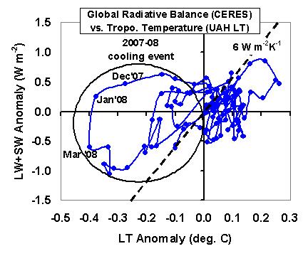
In the last year or so I have become convinced that this is indeed what has happened…..the models are all doing the “same thing wrong”. While I have addressed this before, I am going to continue to harp on this issue until one or more climate modelers finally has a light bulb go on in their head and says, “Ahhh…I see what you’re talking about now…”. The issue is critical, and could completely change our perception of the role of clouds in climate change.

First, though, a little background for the uninitiated. Modern climate change theory is all about radiative forcing (aka, radiative energy imbalance) of the climate system: Something causes either a change in the rate at which solar energy is absorbed by the Earth (for instance, a major volcanic eruption), or the rate at which the Earth emits infrared energy back to outer space (for instance, increasing atmospheric carbon dioxide concentrations). The resulting global average radiative energy imbalance then causes a temperature change. This part of the theory is seldom disputed.

But that temperature change, in turn, causes other elements of the climate system – clouds, water vapor, etc. – to also be altered, which then feeds back on the original temperature change by amplifying it (positive feedback) or reducing it (negative feedback). Those feedbacks are what will determine whether manmade global warming will be either lost in the noise of natural climate variability, or — as NASA’s James Hansen believes — catastrophic. Feedbacks in the climate system are much less certain than the radiative forcing from extra carbon dioxide.

All twenty climate models tracked by the IPCC now have positive cloud feedbacks, which is partly why they project so much global warming in the future. Obviously, we desperately need to know what cloud feedbacks are occurring in the real climate system. And since one needs global observations to do that, it can only be done (if at all) during the modern satellite era.

But some researchers now think the search for the feedback “Holy Grail” is a lost cause. This is partly because researchers get different answers depending on which years of satellite observations are analyzed.

But I think I have discovered why. The issue is not a new one to the climate research community, and it is really quite simple: In order to estimate radiative feedbacks, one must first remove any sources of radiative forcing present in the data.

This ‘radiative forcing removal’ technique has been performed before by Forster & Gregory (2006 J. of Climate) to estimate feedbacks during the global cooling which occurred after the 1991 eruption of Mt. Pinatubo. They removed an estimate of the radiative forcing caused by the volcanic aerosols in the stratosphere in order to estimate radiative feedbacks.

Similarly, Forster & Taylor (also 2006 J. Climate) removed anthropogenic radiative forcings from the output of 20 IPCC climate models in order to diagnose the radiative feedbacks operating in those models.

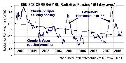
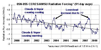
Well, what researchers haven’t accounted for is that there are natural cloud variations in the real climate system, and these also cause radiative forcing. So, in order to estimate feedbacks in the real climate system from satellite data, one would need to first remove those radiative forcings. Unfortunately, this is not easy because those forcings are somewhat chaotic…but, as I
show, they have distinctly different signatures in the data.

Because this ‘contamination’ of the feedback signature by internally-generated radiative forcing by clouds has never been taken into account before, diagnosed feedbacks have been both quite variable (depending upon the time period analyzed), AND they have been significantly biased in the direction of positive feedback.

The result has been the illusion of a sensitive climate system with positive cloud feedback….when in fact the satellite evidence, after accounting for this effect, reveals cloud feedbacks to be negative.

The article I posted here contains the details on all of this, including what I believe to be the most stringent test of climate model feedbacks ever performed. In it I present proof that this natural radiative forcing by clouds is strong, and ever-present…even in the climate models themselves!

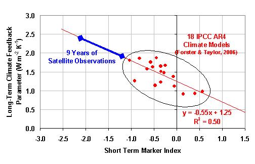
I also provide the first evidence that the short-term feedbacks in the IPCC models are substantially the same as their long-term feedbacks in response to anthropogenic radiative forcing — a key finding if we are to ever apply our short-term satellite observations to the long-term global warming problem.

I challenge modelers to address this important issue, because the current, crude level of model testing has NOT been sufficient to validate feedbacks in climate models.

And yes, some of our early work on this issue has been published in the peer-reviewed literature (Spencer et al., 2007 GRL; Spencer & Braswell, November 1, 2008 J. of Climate). Unfortunately, our work is either being ignored or marginalized.

If anyone has a legitimate objection to my arguments in that article, or think something I’ve presented is not clear, e-mail me (see bottom of this page) and I will post your question and my reply here if I think it would be of general interest. I will not reply to comments or questions which are submitted anonymously.


OK, the Real Blog is A-Comin’…

December 30th, 2008

I’ve gotten a lot of requests for me to turn my pseudo-blog into a real, interactive one, with RSS feed, etc. So, I’m having that done…hopefully in the next several days or so. Stay tuned.