At the White House, the Purge of Skeptics Has Started

January 12th, 2021

Dr. David Legates has been Fired by White House OSTP Director and Trump Science Advisor, Kelvin Droegemeier

President Donald Trump has been sympathetic with the climate skeptics’ position, which is that there is no climate crisis, and that all currently proposed solutions to the “crisis” are economically harmful to the U.S. specifically, and to humanity in general.

Today I have learned that Dr. David Legates, who had been brought to the Office of Science and Technology Policy to represent the skeptical position in the Trump Administration, has been fired by OSTP Director and Trump Science Advisor, Dr. Kelvin Droegemeier.

The event that likely precipitated this is the invitation by Dr. Legates for about a dozen of us to write brochures that we all had hoped would become part of the official records of the Trump White House. We produced those brochures (no funding was involved), and they were formatted and published by OSTP, but not placed on the WH website. My understanding is that David Legates followed protocols during this process.

So What Happened?

What follows is my opinion. I believe that Droegemeier (like many in the administration with hopes of maintaining a bureaucratic career in the new Biden Administration) has turned against the President for political purposes and professional gain. If Kelvin Droegemeier wishes to dispute this, let him… and let’s see who the new Science Advisor/OSTP Director is in the new (Biden) Administration.

I would also like to know if President Trump approved of his decision to fire Legates.

In the meantime, we have been told to remove links to the brochures, which is the prerogative of the OSTP Director since they have the White House seal on them.

But their content will live on elsewhere, as will Dr. Droegemeier’s decision.

UAH Global Temperature Update for December 2020: +0.27 deg. C

January 2nd, 2021

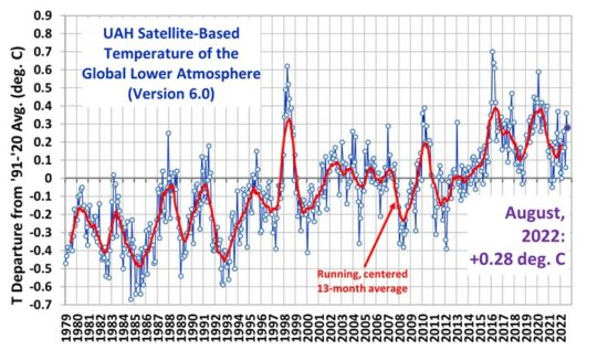
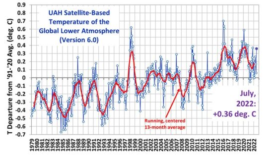
The Version 6.0 global average lower tropospheric temperature (LT) anomaly for December, 2020 was +0.27 deg. C, down substantially from the November, 2020 value of +0.53 deg. C.For comparison, the CDAS global surface temperature anomaly for the last 30 days at Weatherbell.com was +0.31 deg. C.

2020 ended as the 2nd warmest year in the 42-year satellite tropospheric temperature record at +0.49 deg. C, behind the 2016 value of +0.53 deg. C.

Cooling in December was largest over land, with 1-month drop of 0.60 deg. C, which is the 6th largest drop out of 504 months. This is likely the result of the La Nina now in progress.

The linear warming trend since January, 1979 remains at +0.14 C/decade (+0.12 C/decade over the global-averaged oceans, and +0.18 C/decade over global-averaged land).

Various regional LT departures from the 30-year (1981-2010) average for the last 24 months are:

YEAR MO GLOBE NHEM. SHEM. TROPIC USA48 ARCTIC AUST 
2019 01 +0.38 +0.35 +0.41 +0.36 +0.53 -0.14 +1.14
2019 02 +0.37 +0.46 +0.28 +0.43 -0.03 +1.05 +0.05
2019 03 +0.34 +0.44 +0.25 +0.41 -0.55 +0.97 +0.58
2019 04 +0.44 +0.38 +0.51 +0.54 +0.49 +0.93 +0.91
2019 05 +0.32 +0.29 +0.35 +0.39 -0.61 +0.99 +0.38
2019 06 +0.47 +0.42 +0.52 +0.64 -0.64 +0.91 +0.35
2019 07 +0.38 +0.32 +0.44 +0.45 +0.10 +0.34 +0.87
2019 08 +0.38 +0.38 +0.39 +0.42 +0.17 +0.44 +0.23
2019 09 +0.61 +0.64 +0.59 +0.60 +1.13 +0.75 +0.57
2019 10 +0.46 +0.64 +0.27 +0.30 -0.04 +1.00 +0.49
2019 11 +0.55 +0.56 +0.54 +0.55 +0.21 +0.56 +0.37
2019 12 +0.56 +0.61 +0.50 +0.58 +0.92 +0.66 +0.94
2020 01 +0.56 +0.60 +0.53 +0.61 +0.73 +0.12 +0.65
2020 02 +0.75 +0.96 +0.55 +0.76 +0.38 +0.02 +0.30
2020 03 +0.47 +0.61 +0.34 +0.63 +1.08 -0.72 +0.16
2020 04 +0.38 +0.43 +0.34 +0.45 -0.59 +1.03 +0.97
2020 05 +0.54 +0.60 +0.49 +0.66 +0.17 +1.15 -0.15
2020 06 +0.43 +0.45 +0.41 +0.46 +0.37 +0.80 +1.20
2020 07 +0.44 +0.45 +0.42 +0.46 +0.55 +0.39 +0.66
2020 08 +0.43 +0.47 +0.38 +0.59 +0.41 +0.47 +0.49
2020 09 +0.57 +0.58 +0.56 +0.46 +0.96 +0.48 +0.92
2020 10 +0.54 +0.71 +0.37 +0.37 +1.09 +1.23 +0.24
2020 11 +0.53 +0.67 +0.39 +0.29 +1.56 +1.38 +1.41
2020 12 +0.27 +0.22 +0.32 +0.05 +0.56 +0.59 +0.23

The full UAH Global Temperature Report, along with the LT global gridpoint anomaly image for December, 2020 should be available within the next few days here.

The global and regional monthly anomalies for the various atmospheric layers we monitor should be available in the next few days at the following locations:

Lower Troposphere: http://vortex.nsstc.uah.edu/data/msu/v6.0/tlt/uahncdc_lt_6.0.txt
Mid-Troposphere: http://vortex.nsstc.uah.edu/data/msu/v6.0/tmt/uahncdc_mt_6.0.txt
Tropopause: http://vortex.nsstc.uah.edu/data/msu/v6.0/ttp/uahncdc_tp_6.0.txt
Lower Stratosphere: http://vortex.nsstc.uah.edu/data/msu/v6.0/tls/uahncdc_ls_6.0.txt


500 Years of Global SST Variations from a 1D Forcing-Feedback Model

December 11th, 2020

As part of a DOE contract John Christy and I have, we are using satellite data to examine climate model behavior. One of the problems I’ve been interested in is the effect of El Nino and La Nina (ENSO) on our understanding of human-caused climate change. A variety of ENSO records show multi-decadal variations in this activity, and it has even showed up in multi-millennial runs of a GFDL climate model.

Since El Nino produces global average warmth, and La Nina produces global average coolness, I have been using our 1D forcing feedback model of ocean temperatures (published by Spencer & Braswell, 2014) to examine how the historical record of ENSO variations can be included, by using the CERES satellite-observed co-variations of top-of-atmosphere (TOA) radiative flux with ENSO.

I’ve updated that model to match the 20 years of CERES data (March 2000-March 2020). I have also extended the ENSO record back to 1525 with the Braganza et al. (2009) multi-proxy ENSO reconstruction data. I intercalibrated it with the Multivariate ENSO Index (MEI) data up though the present, and further extended into mid-2021 based upon the latest NOAA ENSO forecast. The Cheng et al. temperature data reconstruction for the 0-2000m layer is also used to calibrate the model adjustable coefficients.

I had been working on an extensive blog post with all of the details of how the model works and how ENSO is represented in it, which was far too detailed. So, I am instead going to just show you some results, after a brief model description.

1D Forcing-Feedback Model Description

The model assumes an initial state of energy equilibrium, and computes the temperature response to changes in radiative equilibrium of the global ocean-atmosphere system using the CMIP5 global radiative forcings (since 1765), along with our calculations of ENSO-related forcings. The model time step is 1 month.

The model has a mixed layer of adjustable depth (50 m gave optimum model behavior compared to observations), a second layer extending to 2,000m depth, and a third layer extending to the global-average ocean bottom depth of 3,688 m. Energy is transferred between ocean layers proportional to their difference in departures from equilibrium (zero temperature anomaly). The proportionality constant(s) have the same units as climate feedback parameters (W m-2 K-1), and are analogous to the heat transfer coefficient. A transfer coefficient of 0.2 W m-2 K-1 for the bottom layer produced 0.01 deg. C of net deep ocean warming (below 2000m) over the last several decades which Cheng et al. mentioned there is some limited evidence for.

The ENSO related forcings are both radiative (shortwave and longwave), as well as non-radiative (enhanced energy transferred from the mixed layer to deep ocean during La Nina, and the opposite during El Nino). These are discussed more in our 2014 paper. The appropriate coefficients are adjusted to get the best model match to CERES-observed behavior compared to the MEIv2 data (2000-2020), observed SST variations, and observed deep-ocean temperature variations. The full 500-year ENSO record is a combination of the Braganza et al. (2009) year data interpolated to monthly, the MEI-extended, MEI, and MEIv2 data, all intercalibrated. The Braganza ENSO record has a zero mean over its full period, 1525-1982.

Results

The following plot shows the 1D model-generated global average (60N-60S) mixed layer temperature variations after the model has been tuned to match the observed sea surface temperature temperature trend (1880-2020) and the 0-2000m deep-ocean temperature trend (Cheng et al., 2017 analysis data).

Fig. 1. 1D model temperature variations for the global oceans (60N-60S) to 50 m depth, compared to observations.

Note that the specified net radiative feedback parameter in the model corresponds to an equilibrium climate sensitivity of 1.91 deg. C. If the model was forced to match the SST observations during 1979-2020, the ECS was 2.3 deg. C. Variations from these values also occurred if I used HadSST1 or HadSST4 data to optimize the model parameters.

The ECS result also heavily depends upon the accuracy of the 0-2000 meter ocean temperature measurements, shown next.

Fig. 2. 1D model temperature changes for the 0-2000m layer since 1940, and compared to observations.

The 1D model was optimized to match the 0-2000m temperature trend only since 1995, but we see in Fig. 2 that the limited data available back to 1940 also shows a reasonably good match.

Finally, here’s what the full 500 year model results look like. Again, the CMIP5 forcings begin only in 1765 (I assume zero before that), while the combined ENSO dataset begins in 1525.

Fig. 3. Model results extended back to 1525 with the proxy ENSO forcings, and since 1765 with CMIP5 radiative forcings.

Discussion

The simple 1D model is meant to explain a variety of temperature-related observations with a physically-based model with only a small number of assumptions. All of those assumptions can be faulted in one way or another, of course.

But the monthly correlation of 0.93 between the model and observed SST variations, 1979-2020, is very good (0.94 for 1940-2020) for it being such a simple model. Again, our primary purpose was to examine how observed ENSO activity affects our interpretation of warming trends in terms of human causation.

For example, ENSO can then be turned off in the model to see how it affects our interpretation of (and causes of) temperature trends over various time periods. Or, one can examine the affect of assuming some level of non-equilibrium of the climate system at the model initialization time.

If nothing else, the results in Fig. 3 might give us some idea of the ENSO-related SST variations for 300-400 years before anthropogenic forcings became significant, and how those variations affected temperature trends on various time scales. For if those naturally-induced temperature trend variations existed before, then they still exist today.

UAH Global Temperature Update for November 2020: +0.53 deg. C

December 1st, 2020

The Version 6.0 global average lower tropospheric temperature (LT) anomaly for November, 2020 was +0.53 deg. C, essentially unchanged from the October, 2020 value of +0.54 deg. C.

The linear warming trend since January, 1979 remains at +0.14 C/decade (+0.12 C/decade over the global-averaged oceans, and +0.19 C/decade over global-averaged land).

For comparison, the CDAS global surface temperature anomaly for the last 30 days at Weatherbell.com was +0.52 deg. C.

With La Nina in the Pacific now officially started, it will take several months for that surface cooling to be fully realized in the tropospheric temperatures. Typically, La Nina minimum temperatures (and El Nino maximum temperatures) show up around February, March, or April. The tropical (20N-20S) temperature anomaly for November was +0.29 deg. C, which is lower than it has been in over 2 years.

In contrast, the Arctic saw the warmest November (1.38 deg. C) in the 42 year satellite record, exceeding the previous record of 1.22 deg. C in 1996.

Various regional LT departures from the 30-year (1981-2010) average for the last 23 months are:

YEAR MO GLOBE NHEM. SHEM. TROPIC USA48 ARCTIC AUST 
2019 01 +0.38 +0.35 +0.41 +0.36 +0.53 -0.14 +1.14
2019 02 +0.37 +0.47 +0.28 +0.43 -0.03 +1.05 +0.05
2019 03 +0.34 +0.44 +0.25 +0.41 -0.55 +0.97 +0.58
2019 04 +0.44 +0.38 +0.51 +0.54 +0.49 +0.93 +0.91
2019 05 +0.32 +0.29 +0.35 +0.39 -0.61 +0.99 +0.38
2019 06 +0.47 +0.42 +0.52 +0.64 -0.64 +0.91 +0.35
2019 07 +0.38 +0.33 +0.44 +0.45 +0.10 +0.34 +0.87
2019 08 +0.39 +0.38 +0.39 +0.42 +0.17 +0.44 +0.23
2019 09 +0.61 +0.64 +0.59 +0.60 +1.14 +0.75 +0.57
2019 10 +0.46 +0.64 +0.27 +0.30 -0.03 +1.00 +0.49
2019 11 +0.55 +0.56 +0.54 +0.55 +0.21 +0.56 +0.37
2019 12 +0.56 +0.61 +0.50 +0.58 +0.92 +0.66 +0.94
2020 01 +0.56 +0.60 +0.53 +0.61 +0.73 +0.13 +0.65
2020 02 +0.76 +0.96 +0.55 +0.76 +0.38 +0.02 +0.30
2020 03 +0.48 +0.61 +0.34 +0.63 +1.09 -0.72 +0.16
2020 04 +0.38 +0.43 +0.33 +0.45 -0.59 +1.03 +0.97
2020 05 +0.54 +0.60 +0.49 +0.66 +0.17 +1.16 -0.15
2020 06 +0.43 +0.45 +0.41 +0.46 +0.38 +0.80 +1.20
2020 07 +0.44 +0.45 +0.42 +0.46 +0.56 +0.40 +0.66
2020 08 +0.43 +0.47 +0.38 +0.59 +0.41 +0.47 +0.49
2020 09 +0.57 +0.58 +0.56 +0.46 +0.97 +0.48 +0.92
2020 10 +0.54 +0.71 +0.37 +0.37 +1.10 +1.23 +0.24
2020 11 +0.53 +0.67 +0.39 +0.29 +1.57 +1.38 +1.41

The full UAH Global Temperature Report, along with the LT global gridpoint anomaly image for November, 2020 should be available within the next few days here.

The global and regional monthly anomalies for the various atmospheric layers we monitor should be available in the next few days at the following locations:

Lower Troposphere: http://vortex.nsstc.uah.edu/data/msu/v6.0/tlt/uahncdc_lt_6.0.txt
Mid-Troposphere: http://vortex.nsstc.uah.edu/data/msu/v6.0/tmt/uahncdc_mt_6.0.txt
Tropopause: http://vortex.nsstc.uah.edu/data/msu/v6.0/ttp/uahncdc_tp_6.0.txt
Lower Stratosphere: http://vortex.nsstc.uah.edu/data/msu/v6.0/tls/uahncdc_ls_6.0.txt


Benford’s Law, Part 2: Inflated Vote Totals, or Just the Nature of Precinct Sizes?

November 12th, 2020

SUMMARY: Examination of vote totals across ~6,000 Florida precincts during the 2016 presidential election shows that a 1st digit Benford’s type analysis can seem to suggest fraud when precinct vote totals have both normal and log-normal distribution components. Without prior knowledge of what the precinct-level vote total frequency distribution would be in the absence of fraud, I see no way to apply 1st digit Benford’s Law analysis to deduce fraud. Any similar analysis would have the same problem, because it depends upon the expected frequency distribution of vote totals, which is difficult to estimate because it is tantamount to knowing a vote outcome absent fraud. Instead, it might be more useful to simply examine the precinct-level vote distributions, rather than Benford-type analysis of those data, and compare one candidate’s distribution to that of other candidates.

It has been only one week since someone introduced me to Benford’s Law as a possible way to identify fraud in elections. The method looks at the first digit of all vote totals reported across many (say, thousands) of precincts. If the vote totals in the absence of fraudulently inflated values can be assumed to have either a log-normal distribution or a 1/X distribution, then the relative frequency of the 1st digits (1 through 9) have very specific values, deviations from which might suggest fraud.

After a weekend examining vote totals from Philadelphia during the 2020 presidential primary, my results were mixed. Next, I decided to examine Florida precinct level data from the 2016 election (data from the 2020 general election are difficult to find). My intent was to determine whether Benford’s Law can really be applied to vote totals when there was no evidence of widespread fraud. In the case of Trump votes in the 2020 primary in Philadelphia, the answer was yes, the data closely followed Benford. But that was just one election, one candidate, and one city.

When I analyzed the Florida 2016 general election data, I saw departures from Benford’s Law in both Trump and Clinton vote totals:

Fig. 1. First-digit Benford’s Law-type analysis of 2016 presidential vote totals for Trump and Clinton in Florida, compared to that of a synthetic log-normal distribution having the same mean and standard deviations as the actual vote data, with 99% confidence level of 100 log-normal distributions with the same sample size.

For at least the “3” and “4” first digit values, the results are far outside what would be expected if the underlying vote frequency distribution really was log-normal.

This caused me to examine the original frequency distributions of the votes, and then I saw the reason why: Both the Trump and Clinton frequency distributions exhibit elements of both log-normal and normal distribution shapes.

Fig. 2. Frequency distributions of the precinct-level vote totals in Florida during the 2016 general election. Both Trump and Clinton distributions show evidence of log-normal and normal distribution behavior. Benford’s Law analysis only applies to log-normal (or 1/x) distributions.

And this is contrary to the basis for Bendford’s Law-type analysis of voting data: It assumes that vote totals follow a specific frequency distribution (lognormal or 1/x), and if votes are fraudulently added (AND those fake additions are approximately normally distributed!), then the 1st-digit analysis will depart from Benford’s Law.

Since Benford’s Law analysis depends upon the underlying distribution being pure lognormal (or 1/x power law shape), it seems that understanding the results of any Benford’s Law analysis depends upon the expected shape of these voting distributions… and that is not a simple task. Is the expected distribution of vote totals really log-normal?

Why Should Precinct Vote Distributions have a Log-normal Shape?

Benford’s Law analyses of voting data depend upon the expectation that there will be many more precincts with low numbers of votes cast than precincts with high numbers of votes. Voting locations in rural areas and small towns will obviously not have as many voters as do polling places in large cities, and presumably there will be more of them.

As a result, precinct-level vote totals will tend to have a frequency distribution with more low-vote totals, and fewer high vote totals. In order to produce Benford’s Law type results, the distribution must have either a log-normal or a power law (1/x) shape.

But there are reasons why we might expect vote totals to also exhibit more of a normal-type (rather than log-normal) distribution.

Why Might Precinct-Level Vote Totals Depart from Log-Normal?

While I don’t know the details, I would expect that the number of voting locations would be scaled in such a way that each location can handle a reasonable level of voter traffic, right?

For the sake of illustration of my point, one might imagine a system where ALL voting locations, whether urban or rural, were optimally designed to handle roughly 1,000 voters at expected levels of voter turnout.

In the cities maybe these would be located every few blocks. In rural Montana, some voters might have to travel 100 miles to vote.   In this imaginary system, I think you can see that the precinct-level vote totals would then be more normally distributed, with an average of around 1,000 votes and just as many 500-vote precincts as 1,500 vote precincts (instead of far more low-vote precincts than high-vote precincts, as is currently the case).

But, we wouldn’t want rural voters to have to drive 100 miles to vote, right? And there might not be enough public space to have voting locations every 2 blocks in a city, and as a results some VERY high vote totals can be expected from crowded urban voting locations.

So, we instead have a combination of the two distributions: log-normal (because there are many rural locations with few voters, and some urban voting places that are over-crowded) and normal (because cities will tend to have precinct locations optimized to handle a certain number of voters, as best they can).

Benford-Type Analysis of Synthetic Normal and Log-normal Distributions

If I create two sets of synthetic data, 100,000 values in each, one with a normal distribution and one with a log-normal distribution, this is what the relative frequencies of the 1st digit of those vote totals looks like:

Fig. 3. 1st-digit analysis of a normal frequency distribution versus a long-normal distribution (Benford’s Law).

The results for a normal distribution move around quite a lot, depending upon the assumed mean and standard deviation of that distribution.

I believe that what is going on in the Florida precinct data is simply a combination of normal and log-normal distributions of the vote totals. So, for a variety of reasons, the vote totals do not follow a log-normal distribution and so cannot be interpreted with Benford’s Law-type analyses.

One can easily imagine other reasons for the frequency distribution of precinct-level votes to depart from log-normal.

What one would need is convincing evidence of that the frequency distribution should look like in the absence of fraud. But I don’t see how that is possible, unless one candidate’s vote distribution is extremely skewed relative to another candidate’s vote totals, or compared to primary voting totals.

And this is what happened in Milwaukee (and other cities) in the most recent elections: The Benford Law analysis suggested very different frequency distributions for Trump than for Biden.

I would think it is more useful to just look at the raw precinct-level vote distributions (e.g. like Fig. 2) rather than a Benford analysis of those data. The Benford analysis technique suggests some sort of magical, universal relationship, but it is simply the result of a log-normal distribution of the data. Any departure from the Benford percentages is simply a reflection of the underlying frequency distribution departing from log-normal, and not necessarily indicative of fraud.

Benford’s Law: Evidence of Fraud in Reporting of Voter Precinct Totals?

November 9th, 2020

You might have seen reports in the last several days regarding evidence of fraud in ballot totals reported in the presidential election. There is a statistical relationship known as “Benford’s Law” which states that for many real-world distributions of numbers, the frequency distribution of the first digit of those numbers follows a regular pattern. It has been used by the IRS and financial institutions to detect fraud.

It should be emphasized that such statistical analysis cannot prove fraud. But given careful analysis including the probability of getting results substantially different from what is theoretically-expected, I think it is a useful tool. Its utility is especially increased if there is little or no evidence of fraud for one candidate, but strong evidence of fraud from another candidate, across multiple cities or multiple states.

From Wikipedia:

“Benford’s law, also called the Newcomb-Benford law, the law of anomalous numbers, or the first-digit law, is an observation about the frequency distribution of leading digits in many real-life sets of numerical data. The law states that in many naturally occurring collections of numbers, the leading digit is likely to be small. For example, in sets that obey the law, the number 1 appears as the leading significant digit about 30% of the time, while 9 appears as the leading significant digit less than 5% of the time. If the digits were distributed uniformly, they would each occur about 11.1% of the time. Benford’s law also makes predictions about the distribution of second digits, third digits, digit combinations, and so on.”

For example, here’s one widely circulating plot (from Github) of results from Milwaukee’s precincts, showing the Benford-type plots for Trump versus Biden vote totals.

Fig. 1. Benford-type analysis of Milwaukee precinct voting data, showing a large departure of the voting data (blue bars) from the expected relationship (red line) for Biden votes, but agreement for the Trump votes. This is for 475 voting precincts. (This is not my analysis, and I do not have access to the underlying data to check it).

The departure from statistical expectations in the Biden vote counts is what is expected when some semi-arbitrary numbers, presumably small enough to not be easily noticed, are added to some of the precinct totals. (I verified this with simulations using 100,000 random but log-normally distributed numbers, where I then added 1,2,3, etc. votes to individual precinct totals). The frequency of low digit values are reduced, while the frequency of the higher digit values are raised.

Since I like the analysis of large amounts of data, I thought I would look into this issue with some voting data. Unfortunately, I cannot find any precinct-level data for the general election. So, I instead looked at some 2020 presidential primary data, since those are posted at state government websites. So far I have only looked at the data from Philadelphia, which has a LOT (6,812) of precincts (actually, “wards” and “divisions” within those wards). I did not follow the primary election results from Philadelphia, and I have no preconceived notions of what the results might look like; these were just the first data I found on the web.

Results for the Presidential Primary in Philadelphia

I analyzed the results for 4 candidates with the most primary votes in Philadelphia: Biden, Sanders, Trump, and Gabbard (data available here).

Benford’s Law only applies well to data that that covers at least 2-3 orders of magnitude (say, from 0 to in the hundreds or thousands). In the case of a candidate who received very few votes, an adjustment to Benford’s relationship is needed.

The most logical way to do this (for me) was to generate a synthetic set of 100,000 random, but log-normally distributed numbers ranging from zero and up, but adjusted until the mean and standard deviation of the data matched the voting data for each candidate separately. (The importance of using a log-normal distribution was suggested to me by a statistician, Mathew Crawford, who works in this area). Then, you can do the Benford analysis (frequency of the 1st digits of those numbers) to see what is theoretically-expected, and then compare to the actual voting data.

Donald Trump Results

First, let’s look at the analysis for Donald Trump during the 2020 presidential primary in Philadelphia (Fig. 2). Note that the Trump votes agree very well with the theoretically-expected frequencies (purple line). The classical Benford Law values (green line) are quite different because the range of votes for Trump only went up to 124 votes, with an average of only 3.1 votes for Trump per precinct.

So, in the case of Donald Trump primary votes in Philadelphia, the results are extremely close to what is expected for log-normally distributed vote totals.

Fig. 2. Benford-type analysis of the number of Trump votes across 6,812 Philadelphia precincts. The classical Benford Law expected distribution of the 1st digits in the vote total is in green. The adjusted Benford Law results based upon 100,000 random but log-normally distributed vote values having the same mean and standard deviation as the vote data in in purple. The actual results from the vote data are in black.

Tulsi Gabbard Results

Next, let’s look at what happens when even fewer votes are cast for a candidate, in this case Tulsi Gabbard (Fig. 3). In this case the number of votes was so small that I could not even get the synthetic log-normal distribution to match the observed precinct mean (0.65 votes) and standard deviation (1.29 votes). So, I do not have high confidence that the purple line is a good expectation of the Gabbard results. (This, of course, will not be a problem with major candidates).

Fig. 3. As in Fig. 2, but for Tulsi Gabbard.

Joe Biden Results

The results for Joe Biden in the Philadelphia primary vote show some evidence for a departure of the reported votes (black line) from theory (purple line) in the direction of inflated votes, but I would need to launch into an analysis of the confidence limits; it could be the observed departure is within what is expected given random variations in this number of data (N=6,812).

Fig. 4. As in Fig. 2, but for Joe Biden.

Bernie Sanders Results

The most interesting results are for Bernie Sanders (Fig. 5.), where we see the largest departure of the voting data (black line) from theoretical expectations (purple line). But instead of reduced frequency of low digits, and increased frequency of higher digits, we see just the opposite.

Is this evidence of fraud in the form of votes subtracted from Sanders’ totals? I don’t know… I’m just presenting the results.

Fig. 5. As in Fig 2, but for Bernie Sanders.

Conclusions

It appears that a Benford’s Law- type of analysis would be useful for finding evidence of fraudulently inflated (or maybe reduced?) voter totals. Careful confidence level calculations would need to be performed, however, so one could say whether the departures from what is theoretically expected are larger than, say, 95% or 99% of what would be expected from just random variations in the reported totals.

I must emphasize that my conclusions are based upon analysis of these data over only a single weekend. There are people who do this stuff for a living. I’d be glad to be corrected on any points I have made. Part of my reason for this post is to introduce people to what is involved in these calculations, after understanding it myself, since it is now part of the public debate over the 2020 presidential election results.

UAH Global Temperature Update for October 2020: +0.54 deg. C

November 2nd, 2020

The Version 6.0 global average lower tropospheric temperature (LT) anomaly for October, 2020 was +0.54 deg. C, down slightly from the September, 2020 value of +0.57 deg. C.

The linear warming trend since January, 1979 remains at +0.14 C/decade (+0.12 C/decade over the global-averaged oceans, and +0.18 C/decade over global-averaged land).

For comparison, the CDAS global surface temperature anomaly for the last 30 days at Weatherbell.com was +0.33 deg. C.

With La Nina in the Pacific now officially started, it will take several months for that surface cooling to be fully realized in the tropospheric temperatures. Typically, La Nina minimum temperatures (and El Nino maximum temperatures) show up around February, March, or April.

Various regional LT departures from the 30-year (1981-2010) average for the last 22 months are:

YEAR MO GLOBE NHEM. SHEM. TROPIC USA48 ARCTIC AUST 
2019 01 +0.38 +0.35 +0.41 +0.36 +0.53 -0.14 +1.14
2019 02 +0.37 +0.47 +0.28 +0.43 -0.02 +1.05 +0.05
2019 03 +0.34 +0.44 +0.25 +0.41 -0.55 +0.97 +0.58
2019 04 +0.44 +0.38 +0.51 +0.54 +0.49 +0.93 +0.91
2019 05 +0.32 +0.29 +0.35 +0.39 -0.61 +0.99 +0.38
2019 06 +0.47 +0.42 +0.52 +0.64 -0.64 +0.91 +0.35
2019 07 +0.38 +0.33 +0.44 +0.45 +0.10 +0.34 +0.87
2019 08 +0.39 +0.38 +0.39 +0.42 +0.17 +0.44 +0.23
2019 09 +0.61 +0.64 +0.59 +0.60 +1.14 +0.75 +0.57
2019 10 +0.46 +0.64 +0.27 +0.30 -0.03 +1.00 +0.49
2019 11 +0.55 +0.56 +0.54 +0.55 +0.21 +0.56 +0.37
2019 12 +0.56 +0.61 +0.50 +0.58 +0.92 +0.66 +0.94
2020 01 +0.56 +0.60 +0.53 +0.61 +0.73 +0.13 +0.65
2020 02 +0.76 +0.96 +0.55 +0.76 +0.38 +0.02 +0.30
2020 03 +0.48 +0.61 +0.34 +0.63 +1.09 -0.72 +0.16
2020 04 +0.38 +0.43 +0.33 +0.45 -0.59 +1.03 +0.97
2020 05 +0.54 +0.60 +0.49 +0.66 +0.17 +1.16 -0.15
2020 06 +0.43 +0.45 +0.41 +0.46 +0.38 +0.80 +1.20
2020 07 +0.44 +0.45 +0.42 +0.46 +0.56 +0.40 +0.66
2020 08 +0.43 +0.47 +0.38 +0.59 +0.41 +0.47 +0.49
2020 09 +0.57 +0.58 +0.56 +0.46 +0.97 +0.48 +0.92
2020 10 +0.54 +0.71 +0.37 +0.37 +1.10 +1.23 +0.24

The full UAH Global Temperature Report, along with the LT global gridpoint anomaly image for October, 2020 should be available within the next few days here.

The global and regional monthly anomalies for the various atmospheric layers we monitor should be available in the next few days at the following locations:

Lower Troposphere: http://vortex.nsstc.uah.edu/data/msu/v6.0/tlt/uahncdc_lt_6.0.txt
Mid-Troposphere: http://vortex.nsstc.uah.edu/data/msu/v6.0/tmt/uahncdc_mt_6.0.txt
Tropopause: http://vortex.nsstc.uah.edu/data/msu/v6.0/ttp/uahncdc_tp_6.0.txt
Lower Stratosphere: http://vortex.nsstc.uah.edu/data/msu/v6.0/tls/uahncdc_ls_6.0.txt

UAH Global Temperature Update for September 2020: +0.57 deg. C

October 1st, 2020

The Version 6.0 global average lower tropospheric temperature (LT) anomaly for September, 2020 was +0.57 deg. C, up from from the August, 2020 value of +0.43 deg. C.

The linear warming trend since January, 1979 remains at +0.14 C/decade (+0.12 C/decade over the global-averaged oceans, and +0.18 C/decade over global-averaged land).

For comparison, the CDAS global surface temperature anomaly for the last 30 days at Weatherbell.com is +0.38 deg. C.

With La Nina in the Pacific now officially started, it will take several months for that surface cooling to be fully realized in the tropospheric temperatures. Typically, La Nina minimum temperatures (and El Nino maximum temperatures) show up around February, March, or April.

Various regional LT departures from the 30-year (1981-2010) average for the last 21 months are:

YEAR MO GLOBE NHEM. SHEM. TROPIC USA48 ARCTIC AUST 
2019 01 +0.38 +0.35 +0.41 +0.35 +0.53 -0.14 +1.14
2019 02 +0.37 +0.47 +0.28 +0.43 -0.02 +1.05 +0.05
2019 03 +0.34 +0.44 +0.25 +0.41 -0.55 +0.97 +0.58
2019 04 +0.44 +0.38 +0.51 +0.53 +0.49 +0.93 +0.91
2019 05 +0.32 +0.29 +0.35 +0.39 -0.61 +0.99 +0.38
2019 06 +0.47 +0.42 +0.52 +0.64 -0.64 +0.91 +0.35
2019 07 +0.38 +0.33 +0.44 +0.45 +0.10 +0.34 +0.87
2019 08 +0.38 +0.38 +0.39 +0.42 +0.17 +0.44 +0.23
2019 09 +0.61 +0.64 +0.59 +0.60 +1.14 +0.75 +0.57
2019 10 +0.46 +0.64 +0.27 +0.30 -0.03 +1.00 +0.49
2019 11 +0.55 +0.56 +0.54 +0.55 +0.21 +0.56 +0.37
2019 12 +0.56 +0.61 +0.50 +0.58 +0.92 +0.66 +0.94
2020 01 +0.56 +0.60 +0.53 +0.61 +0.73 +0.12 +0.65
2020 02 +0.75 +0.96 +0.55 +0.76 +0.38 +0.02 +0.30
2020 03 +0.47 +0.61 +0.34 +0.63 +1.09 -0.72 +0.16
2020 04 +0.38 +0.43 +0.33 +0.45 -0.59 +1.03 +0.97
2020 05 +0.54 +0.60 +0.49 +0.66 +0.17 +1.16 -0.15
2020 06 +0.43 +0.45 +0.41 +0.46 +0.38 +0.80 +1.20
2020 07 +0.44 +0.45 +0.42 +0.46 +0.56 +0.39 +0.66
2020 08 +0.43 +0.47 +0.38 +0.59 +0.41 +0.47 +0.49
2020 09 +0.57 +0.58 +0.56 +0.46 +0.97 +0.48 +0.92


The full UAH Global Temperature Report, along with the LT global gridpoint anomaly image for September, 2020 should be available within the next few days here.

The global and regional monthly anomalies for the various atmospheric layers we monitor should be available in the next few days at the following locations:

Lower Troposphere: http://vortex.nsstc.uah.edu/data/msu/v6.0/tlt/uahncdc_lt_6.0.txt
Mid-Troposphere: http://vortex.nsstc.uah.edu/data/msu/v6.0/tmt/uahncdc_mt_6.0.txt
Tropopause: http://vortex.nsstc.uah.edu/data/msu/v6.0/ttp/uahncdc_tp_6.0.txt
Lower Stratosphere: http://vortex.nsstc.uah.edu/data/msu/v6.0/tls/uahncdc_ls_6.0.txt

Climate Hustle 2 Premieres this Evening at 8 p.m.

September 24th, 2020

Guest post by Paul Driessen

Weekly, daily, even hourly, we are told that global temperatures are rising, ice caps are melting, and hurricanes, tornadoes, wildfires, floods and droughts are all getting more frequent, intense and destructive because of climate change. Not just climate change, of course, but manmade climate change, due to humanity’s use of fossil fuels — which provide 80% of all the energy that powers America and the world.

The claims assume Earth’s climate and weather were unchanged and unchanging until recent decades. That presumption is belied of course by multiple glacial and interglacial periods; the Roman and Medieval Warm Periods; the Little Ice Age; the Dust Bowl, Anasazi and Mayan droughts; the Galveston, Texas hurricane of 1900 and Great Labor Day Hurricane of 1935; the 1925 Tri-State Tornado; and countless other climate eras and extreme weather events throughout history.

But all would be vastly better, we are further misinformed, if the world simply stopped using those fuels, and switched to “clean, green, renewable, sustainable” wind, solar, biofuel and battery technologies.

Climate alarm messages are conveyed repeatedly in classrooms, newspapers, television and radio news programs, social media, movies and other media — while contrarian voices and evidence are routinely and vigorously suppressed by an increasingly powerful Big Tech, political and academic Cancel Culture.

These messages, and green energy agendas justified by them, are likely to gain far more influence under a Harris-Biden Administration, especially one pushed further and further to the left by Alexandria Ocasio-Cortez and her vocal, often violent “progressive” allies.

In 2016, the Committee For A Constructive Tomorrow (CFACT) released its documentary film Climate Hustle. The factual, often hilarious movie featured scientists, weather forecasters and other experts who challenged claims that our cars, factories and farms are causing catastrophic climate. It was featured in 400 U.S. movie theaters, where it made a persuasive case that the climate apocalypse is “an overheated environmental con job.”

Now, this Thursday, September 24, CFACT is releasing Climate Hustle 2: Rise of the Climate Monarchy. The worldwide streaming event will go live at 8:00 pm local time, in every time zone on Earth, wherever you live.

You can get your tickets here to watch the online world premiere — with unlimited replay viewing through September 27, in case you miss the opening.

For those who missed it or want a refresher, CFACT is also offering a re-broadcast of Climate Hustle 1 for instant viewing. You can get combined tickets for both events here.

Climate Hustle 2 is masterfully hosted and narrated by Hollywood’s Kevin Sorbo, who played Hercules in the television movie. Like CH1, it features a superb lineup of experts [ including me – Roy] who challenge claims of “climate tipping points” and “extreme weather cataclysms.” Equally important, they also expose, debunk and demolish the tricks, lies and hidden agendas of global warming and green energy campaigners.

CH2 exposes the campaigners’ and politicians’ real agendas. Not surprisingly, as Michael Moore and Jeff Gibbs demonstrate in their Planet of the Humans documentary, those real agendas are money, power, ideology and control. Especially, control over our energy, economy, industries, living standards and personal choices. The campaigners and politicians also have little regard for the ecological, health and human rights consequences that inevitably accompany the ever-widening adoption of wind, solar, biofuel and battery technologies.

Climate Hustle 2: Rise of the Climate Monarchy hits hard. As CFACT says, “Lies will be smashed. Names will be named. Hypocrites unmasked. Grifters defrocked. Would-be tyrants brought low.”

Accompanying Sorbo is CFACT’s and Climate Depot’s Marc Morano, who hosted Climate Hustle 1. The journal Nature Communications has called Morano the world’s most effective climate communicator. He is also the person climate alarmists most want blacklisted and banned from public discourse.

Meteorologist and WattsUpWithThat.com host Anthony Watts says CH2 highlights numerous instances of “hypocrisy, financial corruption, media bias, classroom indoctrination, political correctness and other troubling matters surrounding the global warming issue.” It offers a true perspective of just how hard the media and climate alarmists are pushing an agenda, and how equally hard climate skeptics are pushing back.” Al Gore’s Inconvenient Truth presents rhetoric, doom and misinformation. But “if you want a practical and sensible view of what is really happening with climate, watch Climate Hustle 2.”

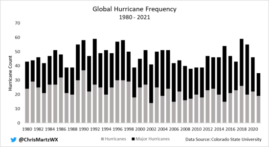
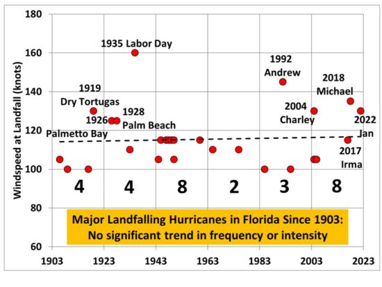
The Wall Street Journal cites scientist Roger Pielke, Jr., who points out that hurricanes hitting the U.S. have not increased in frequency or intensity since 1900. The Journal also notes that the National Oceanic and Atmospheric Administration has said “it is premature to conclude that human activities — and particularly greenhouse gas emissions — have already had a detectable impact on Atlantic hurricane or global tropical cyclone activity.” And let’s not forget the record twelve-year absence of Category 3-5 hurricanes making landfall in the United States. (Was that due to more atmospheric carbon dioxide?)

As to tornadoes, a Washington Post article clearly shows that many more violent F4 and F5 tornadoes hit the United States between 1950 and 1985, than during the next 35 years, 1986-2020. Even more amazing, in 2018, for the first year in recorded history, not one violent tornado struck the U.S.

Canada’s Friends of Science says, once you see Climate Hustle 2, “you can’t unsee the damage the climate monarchy is doing to every aspect of scientific inquiry, to freedom and to democratic society.”

CFACT president Craig Rucker says “Politicians have abandoned any semblance of scientific reality and are instead regurgitating talking points from radical pressure groups to a media that has little interest in vetting their credibility.” In fact, the Cancel Culture is actively suppressing any climate skeptic views.

Twitter actively banned Climate Hustle 2 and froze CFACT’s Twitter account. On appeal the account was unfrozen, but the ban adversely affected thousands of CFACT Twitter followers.

Amazon Prime Video has removed Climate Hustle 1 from its website. CFACT tried to appeal, but Amazon didn’t respond. You can watch the trailer, but the actual film is now “unavailable in your area.” Amazon only lets people buy new DVDs through the film’s producer, CDR Communications ($19.95) — while also processing fulfillment for third party vendors who sell used DVDs (for over $45).

Wikipedia claims Climate Hustle is “a 2016 film rejecting the existence and cause of climate change, narrated by climate change denialist Marc Morano… and funded by the Committee for a Constructive Tomorrow, a free market pressure group funded by the fossil fuel lobby.” (CFACT has received no fossil fuel money for over a decade, and got only small amounts before that.)

Newspapers, TV and radio news programs, social media sites, schools and other arenas should present all the news and foster open discussion and debate. But many refuse to do so. Instead, they function as thought police, actively and constantly finding and suppressing what you can see, read, hear and say, because it goes against their narratives and the agendas they support.

Climate and energy are high on that list. That makes Climate Hustle 1 and 2 especially important this year — and makes it essential that every concerned voter and energy user watch and promote this film.

Paul Driessen is senior policy analyst for the Committee For A Constructive Tomorrow and author of books and articles on energy, environment, climate and human rights issues.

Derecho Iowa Corn Damage Imaged By Satellite

September 5th, 2020

Corn crop destroyed east of Cedar Rapids on 10 August 2020 (Matt Rogers).

The August 10, 2020 derecho event caused an estimated 40 million acres of nearly-mature corn crop to be significantly damaged or destroyed, mainly in Iowa, but also in portions of Nebraska, South Dakota, Illinois, Minnesota, Wisconsin, Indiana, Ohio, and Missouri.

I put together this NASA Terra satellite MODIS imager comparison of the area as imaged on September 2 in both 2014 (a normal crop year) and in 2020, a few weeks after the derecho struck. This date is sufficiently past the event to show areas where the crops are dead and dying. (Click on image if it doesn’t animate.)

Derecho damage to midwest corn crop as seen by the NASA Terra satellite MODIS imager on September 2, 2020 compared to the same date in 2014. (Click on image to animate).

The dashed line in Fig. 1 shows the approximate area where crop damage seems most extensive.

What Causes Derechos? How Common are They? Can they Be Predicted?

Derechos are severe thunderstorm “squall line” high wind events that are particularly widespread and long-lived, typically moving rapidly across multiple states. This video taken in Cedar Rapids shows about 25 minutes of very high winds, with occasional gusts taking out trees and tree limbs.

Derechos are particularly difficult to predict. For example, the NWS Storms Prediction Center early morning outlook (issued at 7 a.m.) for severe weather showed little indication of unusual severe storm activity prior to the August 10 event.

Fig. 2. Storms Prediction Center outlook for severe thunderstorms on 10 August 2020, issued at 7 a.m. CDT.

Once the derecho formed over eastern South Dakota and Nebraska, though, the forecast advisory was updated to reflect the high probability that it would persist and move east.

Like all severe thunderstorms, we know that derechos require an unstable air mass (usually during summertime), with some wind shear provided by an advancing cool front and upper-level trough to the west. But most of these synoptic situations do not cause derechos to form, and forecasters can’t predict one every time such conditions exist or there will be a lot of false alarms.

The following plot shows an 18 year climatology of derecho events during May-August of 1996 through 2013 from a 2016 study by Gaustini & Bosart

Fig. 3. Climatology of progressive derecho events for the warm season (May–August) of 1996–2013. The number of progressive derechos passing through a given 100 km × 100 km grid box over the 18-yr span is located at the center of the grid box and is plotted for those boxes containing at least one progressive derecho. (From Gaustini & Bosart, 2016 Monthly Weather Review ).

Note that a farmer in the corn belt will be impacted by maybe one or two derecho events per growing season, depending upon their location, although ones of the severity of the August 10 event are much more rare. Of course there is nothing a farmer can do about such events, even if they were accurately forecast.

Given the central placement of derecho activity in the corn belt, I suspect that these events are made somewhat worse by the huge moisture requirements of corn, which leads to very high dewpoints (oftentimes in the low-80s F) when the corn is actively growing and transpiring water. Any extra water vapor is extra fuel for these storms.