SUMMARY
The proper way of looking for causal relationships between time series data (e.g. between atmospheric CO2 and temperature) is discussed. While statistical analysis alone is unlikely to provide “proof” of causation, use of the ‘master equation’ is shown to avoid common pitfalls. Correlation analysis of natural and anthropogenic forcings with year-on-year changes in Mauna Loa CO2 suggest a role for increasing global temperature at least partially explaining observed changes in CO2, but purely statistical analysis cannot tie down the magnitude. One statistically-based model using anthropogenic and natural forcings suggests ~15% of the rise in CO2 being due to natural factors, with an excellent match between model and observations for the COVID-19 related downturn in global economic activity in 2020.
Introduction
The record of atmospheric CO2 concentration at Mauna Loa, Hawaii since 1959 is the longest continuous record we have of actual (not inferred) atmospheric CO2 concentrations. I’ve visited the laboratory where the measurements are taken and received a tour of the facility and explanation of their procedures.
The geographic location is quite good for getting a yearly estimate of global CO2 concentrations because it is largely removed from local anthropogenic sources, and at a high enough altitude that substantial mixing during air mass transport has occurred, smoothing out sudden changes due to, say, transport downwind of the large emissions sources in China. The measurements are nearly continuous and procedures have been developed to exclude data which is considered to be influenced by local anthropogenic or volcanic processes.
Most researchers consider the steady rise in Mauna Loa CO2 since 1959 to be entirely due to anthropogenic greenhouse gas emissions, mostly from the burning of fossil fuels. I won’t go into the evidence for an anthropogenic origin here (e.g. the decrease in atmospheric oxygen, and changes in atmospheric carbon isotopes over time). Instead, I will address evidence for some portion of the CO2 increase being natural in origin. I will be using empirical data analysis for this. The results will not be definitive; I’m mostly trying to show how difficult it is to determine cause-and-effect from the available statistical data analysis alone.
Inferring Causation from the “Master Equation”
Many processes in physics can be addressed with some form of the “master equation“, which is a simple differential equation with the time derivative of one (dependent) variable being related to some combination of other (independent) variables that are believed to cause changes in the dependent variable. This equation form is widely used to describe the time rate of change of many physical processes, such as is done in weather forecast models and climate models.
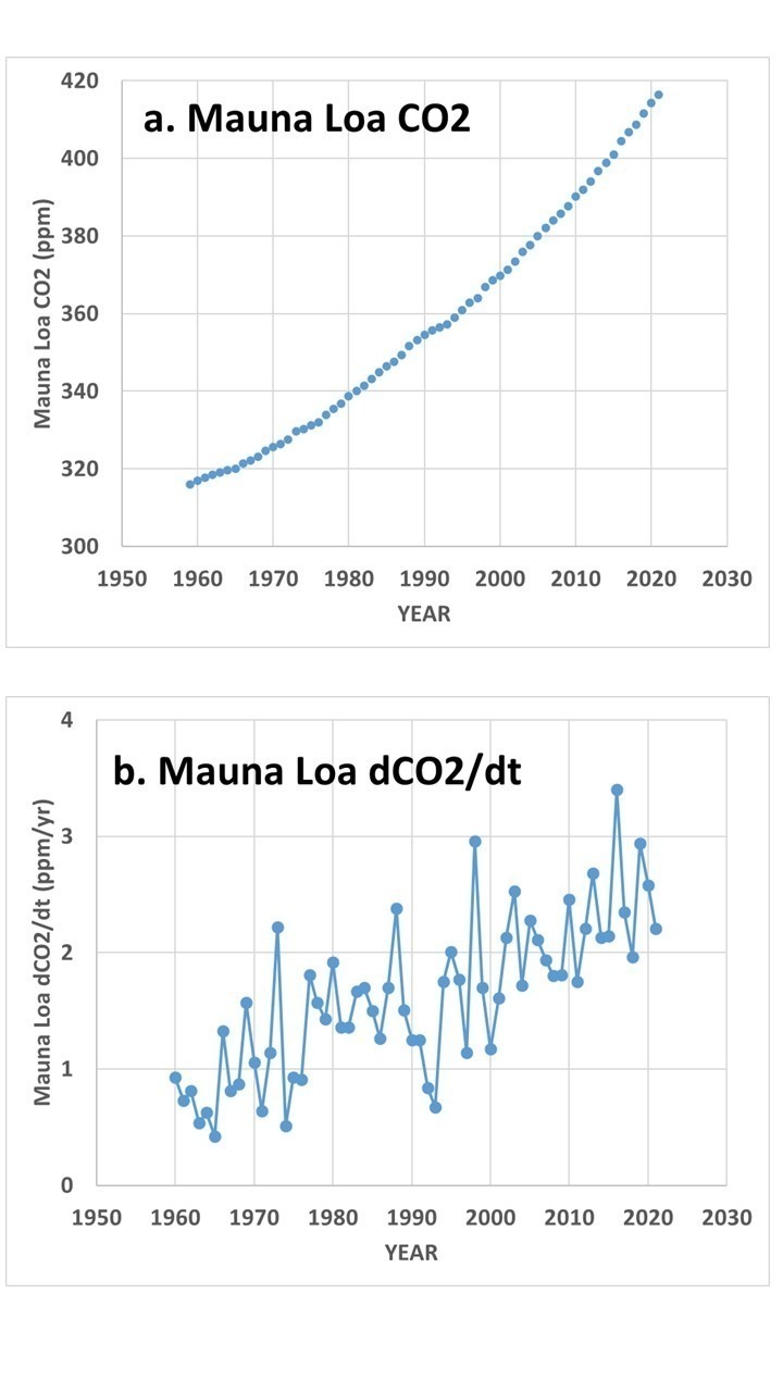
In the case of the Mauna Loa CO2 data, Fig. 1 shows the difference between the raw data (Fig. 1a) and the more physically-relevant year-to-year changes in CO2 (Fig. 1b).
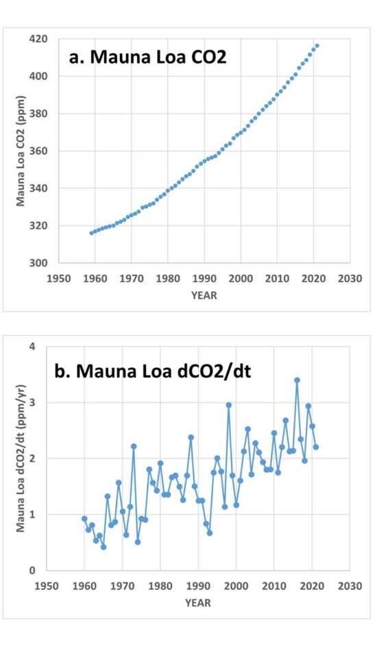
Fig. 1. Mauna Loa CO2 data, 1959-2021, show as (a) yearly average values, and (b) year-on year changes in those values (dCO2/dt).
If one believes that year-to-year changes in atmospheric CO2 are only due to anthropogenic inputs, then we can write:
dCO2/dt ~ Anthro(t),
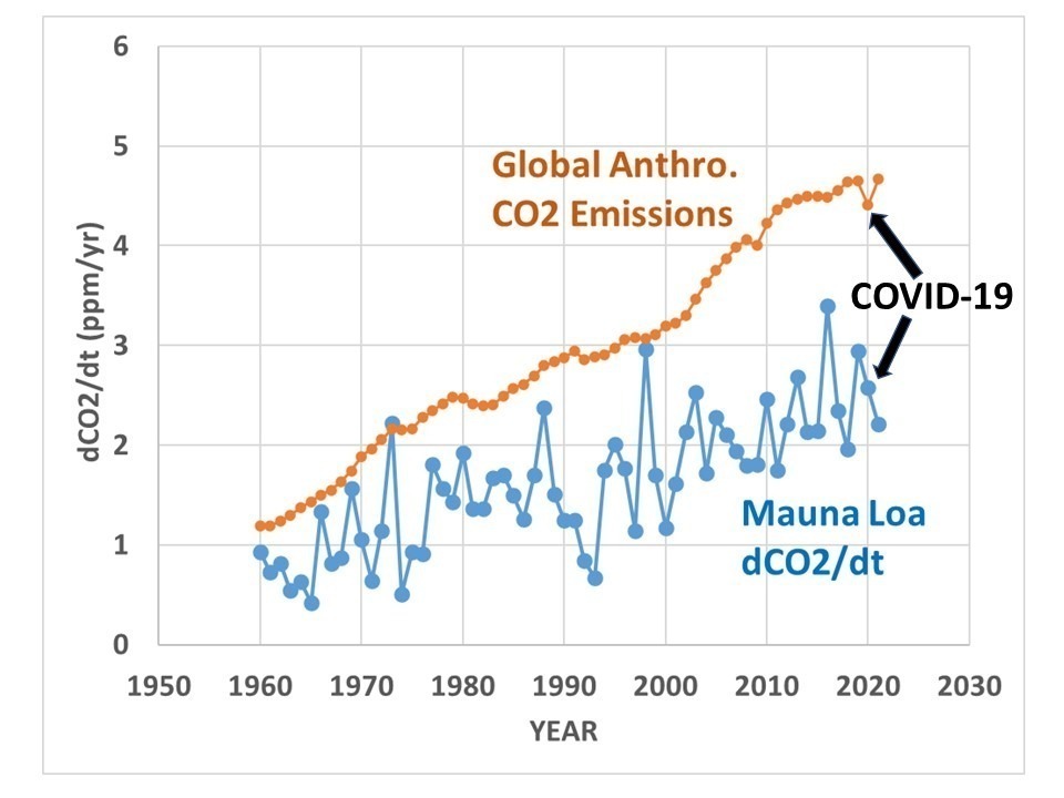
which simply means that the year-to-year changes in CO2 (dCO2/dt, Fig. 1b) are a function of (due to) yearly anthropogenic emissions over time (Anthro(t)). In this case, year-on-year changes in Mauna Loa CO2 should be highly correlated with yearly estimates of anthropogenic emissions. The actual relationship, however, is clearly not that simple, as seen in Fig. 2, where the anthropogenic emissions curve is much smoother than the Mauna Loa data.

Fig. 2. Mauna Loa year-on-year observed changes in CO2 versus estimate of global anthropogenic emissions.
Therefore, there are clearly natural processes at work in addition to the anthropogenic source. Also note those natural fluctuations are much bigger than the ~6% reduction in emissions between 2019 and 2020 due to the COVID-19 economic slowdown, a point that was emphasized in a recent study that claimed satellite CO2 observations combined with a global model of CO2 transports was able to identify the small reduction in CO2 emissions.
So, if you think there are also natural causes of year-to-year changes in CO2, you could write,
dCO2/dt ~ Anthro(t) + Natural(t),
which would approximate what carbon cycle modelers use, since it is known that El Nino and La Nina (as well as other natural modes of climate variability) also impact yearly changes in CO2 concentrations.
Or, if you think year-on-year changes are due to only sea surface temperature, you can write,
dCO2/dt ~ SST(i),
and you can then correlate year-on-year changes in CO2 to a dataset of yearly average SST.
Or, if you think causation is in the opposite direction, with changes in CO2 causing year-on-year changes in SST, you can write,
dSST/dt ~ CO2(t),
in which case you can correlate the year-on-year changes in SST with CO2 concentrations.
In addition to the master equation having a basis in physical processes, it avoids the problem of linear trends in two datasets being mistakenly attributed to a cause-and-effect relationship. Any time series of data that has just a linear trend is perfectly correlated with every other time series having just a linear trend, and yet that perfect correlation tells us nothing about causation.
But when we use the time derivative of the data, it is only the fluctuations from a linear trend that are correlated with another variable, giving some hope of inferring causation. If you question that statement, imagine that Mauna Loa CO2 has been rising at exactly 2 ppm per year, every year (instead of the variations seen in Fig. 1b). This would produce a linear trend, with no deviations from that trend. But in that case the year-on-year changes are all 2 ppm/year, and since there is no variation in those data, they cannot be correlated with anything, because there is no variance to be explained. Thus, using the master equation we avoid inferring cause-and-effect from linear trends in datasets.
Now, this data manipulation doesn’t guarantee we can infer causation, because with a limited set of data (63 years in the case of Mauna Loa CO2 data), you can expect to get some non-zero correlation even when no causal relationship exists. Using the ‘master equation’ just puts us a step closer to inferring causation.
Correlation of dCO2/dt with Various Potential Forcings
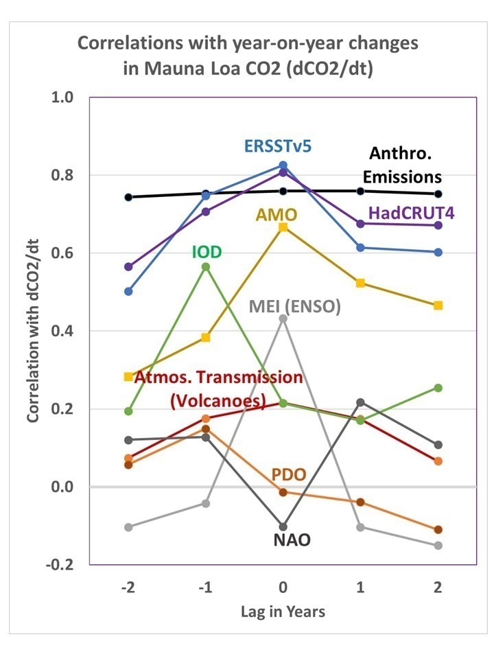
Lag correlations of the dCO2/dt data in Fig. 1b with estimates of global anthropogenic CO2 emissions, and with a variety of natural climate indicies, are shown in Fig. 3.
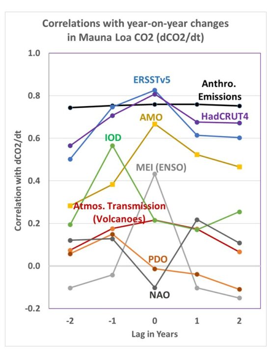
Fig. 3. Lag correlations of Mauna Loa dCO2/dt with various other datasets: Global anthropogenic emissions, tropical sea surface temperature (ERSST), global average surface temperature (HadCRUT4), the Atlantic Multi-decadal Oscillation (AMO), the Indian Ocean Dipole (IOD), the Multivariate ENSO Index (MEI), Mauna Loa atmospheric transmission (mostly major volcanoes),the Pacific Decadal Oscillation (PDO), and the North Atlantic Oscillation (NAO).
The first thing we notice is that the highest correlation is achieved with the surface temperature datasets, (tropical SST or global land+ocean HadCRUT4). This suggests at least some role for increasing surface temperatures causing increasing CO2, especially since if I turn the causation around (correlate dSST/dt with CO2), I get a very low correlation, 0.05.
Next we see that the yearly estimates of global anthropogenic CO2 emissions is also highly correlated with dCO2/dt. You might wonder, if the IPCC is correct and all of the CO2 increase has been due to anthropogenic emissions, why doesn’t it have the highest correlation? The answer could be as simple as noise in the data, especially considering the emissions estimates from China (the largest emitter) are quite uncertain.
The role of major volcanic eruptions in the Mauna Loa CO2 record is of considerable interest. When the atmospheric transmission of sunlight is reduced from a major volcanic eruption (El Chichon in 1983, and especially Pinatubo in 1991), the effect on atmospheric CO2 is to reduce the rate of rise. This is believed to be the result of scattered, diffuse sky radiation penetrating deeper into vegetation canopies and causing enhanced photosynthesis and thus a reduction in atmospheric CO2.
Regression Models of Mauna Loa CO2
At this point we can choose whatever forcing terms in Fig. 3 we want, and do a linear regression against dCO2/dt to get a statistical model of the Mauna Loa CO2 record.
For example, if I use only the anthropogenic term, the regression model is:
dCO2/dt = 0.491*Anthro(t) + 0.181,
with 57.8% explained variance.
Let’s look at what those regression terms mean. On average, the yearly increase in Mauna Loa CO2 equals 49.1% of total global emissions (in ppm/yr) plus a regression constant of 0.181 ppm/yr. If the model was perfect (only global anthropogenic emissions cause the CO2 rise, and we know those yearly emissions exactly, and Mauna Loa CO2 is a perfect estimate of global CO2), the regression constant of 0.181 would be 0.00. Instead, the anthro emissions estimates do not perfectly capture the rise in atmospheric CO2, and so a 0.181 ppm/yr “fudge factor” is in effect included each year by the regression to account for the imperfections in the model. It isn’t known how much of the model ‘imperfection’ is due to missing source terms (e.g. El Nino and La Nina or SST) versus noise in the data.
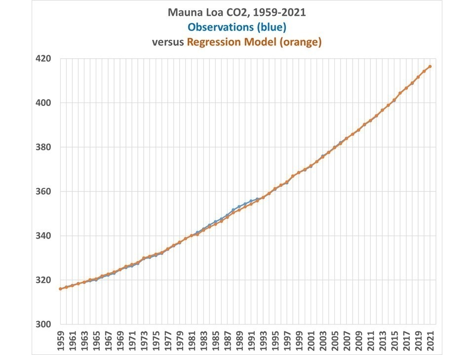
By using additional terms in the regression, we can get a better fit to the Mauna Loa data. For example, I chose a regression model that includes four terms, instead of one: Anthro, MEI, IOD, and Mauna Loa atmospheric transmission. In that case I can improve the regression model explained variance from 57.8% to 82.3%. The result is shown in Fig. 4.
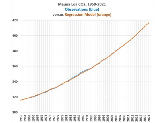
Fig. 4. Yearly Mauna Loa CO2 observations versus a 4-term regression model based upon anthropogenic and natural forcing terms.
In this case, the only substantial deviations of the model from observations is due to the El Chichon and Pinatubo volcanoes, since the Pinatubo event caused a much larger reduction in atmospheric CO2 than did El Chichon, despite the volcanoes producing very similar reductions in solar transmission measurements at Mauna Loa.
In this case, the role of anthropogenic emissions is reduced by 15% from the anthro-only regression model. This suggests (but does not prove) a limited role for natural factors contributing to increasing CO2 concentrations.
The model match to observations during the COVID-19 year of 2020 is very close, with only a 0.02 ppm difference between model and observations, compared to the 0.24 ppm estimated reduction in total anthropogenic emissions from 2019 to 2020.
Conclusions
The Mauna Loa CO2 data need to be converted to year-to-year changes before being empirically compared to other variables to ferret out possible causal mechanisms. This in effect uses the ‘master equation’ (a time differential equation) which is the basis of many physically-based treatments of physical systems. It, in effect, removes the linear trend in the dependent variable from the correlation analysis, and trends by themselves have no utility in determining cause-versus-effect from purely statistical analyses.
When the CO2 data are analyzed in this way, the greatest correlations are found with global (or tropical) surface temperature changes and estimated yearly anthropogenic emissions. Curiously, reversing the direction of causation between surface temperature and CO2 (yearly changes in SST [dSST/dt] being caused by increasing CO2) yields a very low correlation.
Using a regression model that has one anthropogenic source term and three natural forcing terms, a high level of agreement between model and observations is found, including during the COVID-19 year of 2020 when global CO2 emissions were reduced by about 6%.

 Home/Blog


