Home/Blog
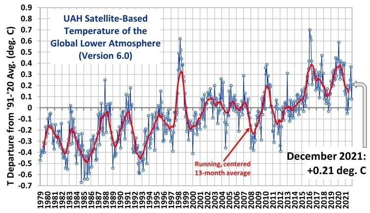
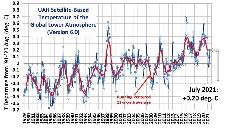
The Version 6.0 global average lower tropospheric temperature (LT) anomaly for January, 2022 was +0.03 deg. C, down from the December, 2021 value of +0.21 deg. C.
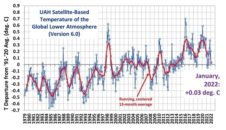 The linear warming trend since January, 1979 now stands at +0.13 C/decade (+0.12 C/decade over the global-averaged oceans, and +0.18 C/decade over global-averaged land).
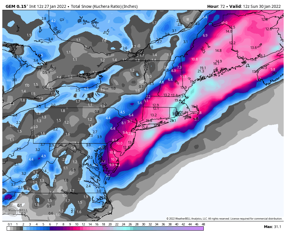
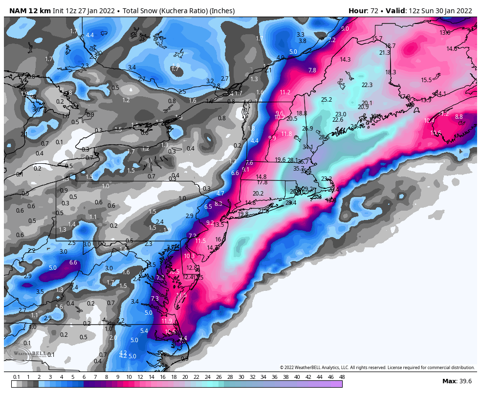
Various regional LT departures from the 30-year (1991-2020) average for the last 13 months are:
YEAR MO GLOBE NHEM. SHEM. TROPIC USA48 ARCTIC AUST
2021 01 0.12 0.34 -0.09 -0.08 0.36 0.50 -0.52
2021 02 0.20 0.32 0.08 -0.14 -0.65 0.07 -0.27
2021 03 -0.01 0.13 -0.14 -0.29 0.59 -0.78 -0.79
2021 04 -0.05 0.05 -0.15 -0.28 -0.02 0.02 0.29
2021 05 0.08 0.14 0.03 0.06 -0.41 -0.04 0.02
2021 06 -0.01 0.31 -0.32 -0.14 1.44 0.63 -0.76
2021 07 0.20 0.33 0.07 0.13 0.58 0.43 0.80
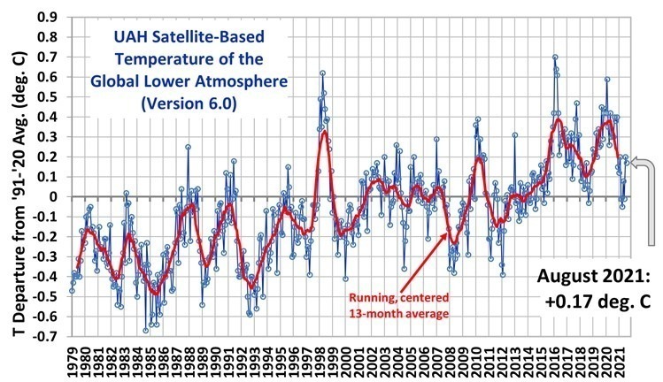
2021 08 0.17 0.27 0.08 0.07 0.33 0.83 -0.02
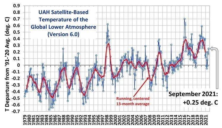
2021 09 0.25 0.18 0.33 0.09 0.67 0.02 0.37
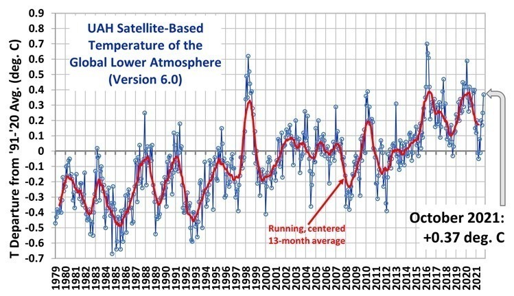
2021 10 0.37 0.46 0.27 0.33 0.84 0.63 0.06
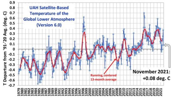
2021 11 0.08 0.11 0.06 0.14 0.50 -0.42 -0.29
2021 12 0.21 0.27 0.15 0.03 1.63 0.01 -0.06
2022 01 0.03 0.06 0.00 -0.24 -0.13 0.68 0.09
The full UAH Global Temperature Report, along with the LT global gridpoint anomaly image for January, 2022 should be available within the next several days here.
The global and regional monthly anomalies for the various atmospheric layers we monitor should be available in the next few days at the following locations:
Lower Troposphere: http://vortex.nsstc.uah.edu/data/msu/v6.0/tlt/uahncdc_lt_6.0.txt
Mid-Troposphere: http://vortex.nsstc.uah.edu/data/msu/v6.0/tmt/uahncdc_mt_6.0.txt
Tropopause: http://vortex.nsstc.uah.edu/data/msu/v6.0/ttp/uahncdc_tp_6.0.txt
Lower Stratosphere: http://vortex.nsstc.uah.edu/data/msu/v6.0/tls/uahncdc_ls_6.0.txt