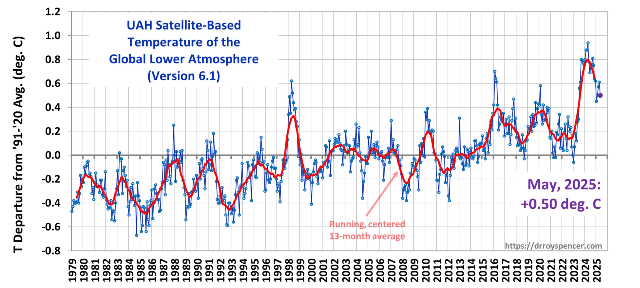
The Version 6.1 global average lower tropospheric temperature (LT) anomaly for June, 2025 was +0.48 deg. C departure from the 1991-2020 mean, down slightly from the May, 2025 anomaly of +0.50 deg. C.
The Version 6.1 global area-averaged linear temperature trend (January 1979 through June 2025) now stands at +0.16 deg/ C/decade (+0.22 C/decade over land, +0.13 C/decade over oceans).
The following table lists various regional Version 6.1 LT departures from the 30-year (1991-2020) average for the last 18 months (record highs are in red).
YEAR
MO
GLOBE
NHEM.
SHEM.
TROPIC
USA48
ARCTIC
AUST
2024
Jan
+0.80
+1.02
+0.58
+1.20
-0.19
+0.40
+1.12
2024
Feb
+0.88
+0.95
+0.81
+1.17
+1.31
+0.86
+1.16
2024
Mar
+0.88
+0.96
+0.80
+1.26
+0.22
+1.05
+1.34
2024
Apr
+0.94
+1.12
+0.76
+1.15
+0.86
+0.88
+0.54
2024
May
+0.78
+0.77
+0.78
+1.20
+0.05
+0.20
+0.53
2024
June
+0.69
+0.78
+0.60
+0.85
+1.37
+0.64
+0.91
2024
July
+0.74
+0.86
+0.61
+0.97
+0.44
+0.56
-0.07
2024
Aug
+0.76
+0.82
+0.69
+0.74
+0.40
+0.88
+1.75
2024
Sep
+0.81
+1.04
+0.58
+0.82
+1.31
+1.48
+0.98
2024
Oct
+0.75
+0.89
+0.60
+0.63
+1.90
+0.81
+1.09
2024
Nov
+0.64
+0.87
+0.41
+0.53
+1.12
+0.79
+1.00
2024
Dec
+0.62
+0.76
+0.48
+0.52
+1.42
+1.12
+1.54
2025
Jan
+0.45
+0.70
+0.21
+0.24
-1.06
+0.74
+0.48
2025
Feb
+0.50
+0.55
+0.45
+0.26
+1.04
+2.10
+0.87
2025
Mar
+0.57
+0.74
+0.41
+0.40
+1.24
+1.23
+1.20
2025
Apr
+0.61
+0.77
+0.46
+0.37
+0.82
+0.85
+1.21
2025
May
+0.50
+0.45
+0.55
+0.30
+0.15
+0.75
+0.99
2025
June
+0.48
+0.48
+0.47
+0.30
+0.81
+0.05
+0.39
The full UAH Global Temperature Report, along with the LT global gridpoint anomaly image for June, 2025, and a more detailed analysis by John Christy, should be available within the next several days here.
The monthly anomalies for various regions for the four deep layers we monitor from satellites will be available in the next several days at the following locations:
Most of you are probably not aware that my wife of 48 years, Doreen (“Reenie”) J. Spencer passed away two weeks ago today, on June 7. Reenie had suffered for many years from autoimmune and fatty liver disease, and her condition worsened in the last several months. By the time she agreed to go to the hospital, it was too late to do anything except keep her comfortable.
We married the year I changed my major from computer science to atmospheric science and moved from Michigan State University to the University of Michigan. Reenie was always my most loyal supporter and fiercest defender, exhibiting the ‘sisu’ of her Finnish heritage.
Her spirit is now relieved of her earthly sufferings.
The Version 6.1 global average lower tropospheric temperature (LT) anomaly for May, 2025 was +0.50 deg. C departure from the 1991-2020 mean, down from the April, 2025 anomaly of +0.61 deg. C.
The Version 6.1 global area-averaged linear temperature trend (January 1979 through May 2025) remains at +0.15 deg/ C/decade (+0.22 C/decade over land, +0.13 C/decade over oceans).
The following table lists various regional Version 6.1 LT departures from the 30-year (1991-2020) average for the last 17 months (record highs are in red).
YEAR
MO
GLOBE
NHEM.
SHEM.
TROPIC
USA48
ARCTIC
AUST
2024
Jan
+0.80
+1.02
+0.58
+1.20
-0.19
+0.40
+1.12
2024
Feb
+0.88
+0.95
+0.81
+1.17
+1.31
+0.86
+1.16
2024
Mar
+0.88
+0.96
+0.80
+1.26
+0.22
+1.05
+1.34
2024
Apr
+0.94
+1.12
+0.76
+1.15
+0.86
+0.88
+0.54
2024
May
+0.78
+0.77
+0.78
+1.20
+0.05
+0.20
+0.53
2024
June
+0.69
+0.78
+0.60
+0.85
+1.37
+0.64
+0.91
2024
July
+0.74
+0.86
+0.61
+0.97
+0.44
+0.56
-0.07
2024
Aug
+0.76
+0.82
+0.69
+0.74
+0.40
+0.88
+1.75
2024
Sep
+0.81
+1.04
+0.58
+0.82
+1.31
+1.48
+0.98
2024
Oct
+0.75
+0.89
+0.60
+0.63
+1.90
+0.81
+1.09
2024
Nov
+0.64
+0.87
+0.41
+0.53
+1.12
+0.79
+1.00
2024
Dec
+0.62
+0.76
+0.48
+0.52
+1.42
+1.12
+1.54
2025
Jan
+0.45
+0.70
+0.21
+0.24
-1.06
+0.74
+0.48
2025
Feb
+0.50
+0.55
+0.45
+0.26
+1.04
+2.10
+0.87
2025
Mar
+0.57
+0.74
+0.41
+0.40
+1.24
+1.23
+1.20
2025
Apr
+0.61
+0.77
+0.46
+0.37
+0.82
+0.85
+1.21
2025
May
+0.50
+0.45
+0.55
+0.30
+0.15
+0.75
+0.99
The full UAH Global Temperature Report, along with the LT global gridpoint anomaly image for May, 2025, and a more detailed analysis by John Christy, should be available within the next several days here.
The monthly anomalies for various regions for the four deep layers we monitor from satellites will be available in the next several days at the following locations:
To quickly summarize, we used the average temperature differences between nearby GHCN stations and related those to population density (PD) differences between stations. Why population density? Well, PD datasets are global, and one of the PD datasets goes back to the early 1800s, so we can compute how the UHI effect has changed over time. The effect of PD on UHI temperature is strongly nonlinear, so we had to account for that, too. (The strongest rate of warming occurs when population just starts to increase beyond wilderness conditions, and it mostly stabilizes at very high population densities; This has been known since Oke’s original 1973 study).
We then created a dataset of UHI warming versus time at the gridpoint level by calibrating population density increases in terms of temperature increase.
The bottom line was that 65% of the U.S. linear warming trend between 1895 and 2023 was due to increasing population density at the suburban and urban stations; 8% of the warming was due to urbanization at rural stations. Most of that UHI effect warming occurred before 1970.
But this does not necessarily translate into NOAA’s official temperature record being corrupted at these levels. Read on…
What Does This Mean for Urbanization Effects in the Official U.S. Temperature Record?
That’s a good question, and I don’t have a good answer.
One of the reviewers, who seemed to know a lot about the homogenization technique used by NOAA, said the homogenized data could not be used for our study because the UHI-trends are mostly removed from those data. (Homogenization looks at year-to-year [time domain] temperature changes at neighboring stations, not the spatial temperature differences [space domain] like we do). So, we were forced to use the raw (not homogenized) U.S. summertime GHCN daily average ([Tmax+Tmin]/2) data for the study. One of the surprising things that reviewer claimed was that homogenization warms the past at currently urbanized stations to make their less-urbanized early history just as warm as today.
So, I emphasize: In our study, it was the raw (unadjusted) data which had a substantial UHI warming influence. This isn’t surprising.
But that reviewer of the paper said most of the spurious UHI warming effect has been removed by the homogenization process, which constitutes the official temperature record as reported by NOAA. I am not convinced of this, and at least one recent paper claims that homogenization does not actually correct the urban trends to look like rural trends, but instead it does “urban blending” of the data. As a result, which trends are “preferred” by that statistical procedure are based upon a sort of “statistical voting” process (my terminology here, which might not be accurate).
So, it remains to be seen just how much spurious UHI effect there is in the official, homogenized land-based temperature trends. The jury is still out on that.
Of course, if sufficient rural stations can be found to do land-based temperature monitoring, I still like Anthony Watts’ approach of simply not using suburban and urban sites for long-term trends. Nevertheless, most people live in urbanized areas, so it’s still important to quantify just how much of those “record hot” temperatures we hear about in cities are simply due to urbanization effects. I think our approach gets us a step closer to answering that question.
Is Population Density the Best Way to Do This?
We used PD data because there are now global datasets, and at least one of them extends centuries into the past. But, since we use population density in our study, we cannot account for additional UHI effects due to increased prosperity even when population has stabilized.
For example, even if population density no longer increases over time in some urban areas, there have likely been increases in air conditioning use, with more stores and more parking lots, as wealth has increased since, say, the 1970s. We have started using a Landsat-based dataset of “impervious surfaces” to try to get at part of this issue, but those data only go back to the mid-1970s. But it will be a start.
I suppose I shouldn’t be surprised. For the uninitiated, while Politico is allegedly a news organization, it has a history of supporting Progressive and Leftist causes.
To be fair, the summary lead at the top of the article is pretty good: “A common refrain: Climate policy hurts the poor, and the continued use of fossil fuels is a boon for humanity.“ But, at best, today’s Politico article entitled, “Meet the 4 influencers shaping Chris Wright�s worldview” is a mix of truths, half-truths, and misleading innuendoes. The article is by Scott Waldman. The four alleged influencers of Energy Secretary Chris Wright’s views on climate science and energy policy are, in order, Bjorn Lomborg, me, Alex Epstein, and John Constable.
I will let the others speak for themselves. What follows is, verbatim, the article addressing my influence on Sec. Wright. I don’t need to comment on everything because some of it is true. I will only offer clarifications where appropriate. Why? Because there are a lot of untruths circulating about me and unless I address them from time to time, those things become part of a narrative that is difficult to dislodge.
Quotes from the article are in italics; my response & clarifications are in bold:
Spencer, whose work was cited as a resource in Wright�s report, is a research scientist at the University of Alabama in Huntsville and is listed as an adviser to the Heartland Institute, which promotes climate misinformation.I used to give talks at Heartland conferences, but haven’t in recent years. I don’t have a formal relationship with them. I don’t speak for Heartland Institute, but I thoroughly disagree with the claim that they promote “climate misinformation”. That shoe fits Politico much better.
While some of Spencer�s work on atmospheric temperatures and other areas of study has been funded by NASA and the Energy Department, he has attacked federal climate researchers as being biased because they receive taxpayer money, and he has claimed that people alive today won�t experience global warming.On the first point… true. On the second point, I believe what I have said is that most people today will never notice global warming in their lifetimes because it is too weak (about 0.02 deg. C per year) compared to natural climate, seasonal, and day-to-day weather variability.In my book, people who believe they have witnessed human-caused global warming are about as delusional as flat-Earthers.
Spencer also served as a visiting fellow for the Heritage Foundation, which produced the Project 2025 policy proposal that has guided the first months of President Donald Trump�s second term.
The groups Spencer has been affiliated with have received millions of dollars in donations from foundations that oppose regulations, but he claims the American public has �been misled by the vested interests who financially benefit from convincing the citizens we are in a climate crisis.� That includes environmental groups and journalists, in his telling. And I stand by that claim. Look at the artwork at the top of this article, and see if you can figure out what it implies.
�Climate change is big business for a lot of players,� he wrote in a Heritage Foundation publication. �That includes a marching army of climate scientists whose careers now depend on a steady stream of funding from governments.�True.And I have said my career also depends upon that funding.
For years, Spencer has worked with organizations that have received funding from an interlinked network of fossil fuel companies � a multitrillion-dollar global industry � as well as wealthy foundations with billions of dollars in holdings that support groups opposing climate and energy regulations.What are you implying, Scott? That I’ve been paid off by this multitrillion dollar global industry? I know that’s what you are doing. But they have never funded me. At most, I have giving an occasional invited talk, which I receive honoraria for when offered (standard practice, and the same has applied to environmental organizations I have spoken to).
He states on his website that he has not been paid by oil companies, but a court filing in 2016 revealed that he received funding from Peabody Energy, the coal giant that for years spent millions of dollars on funding climate denial groups.That was one of my invited talks: As I recall, it was a Peabody board of directors meeting, and they wanted someone to provide a counterpoint to a Natural Resources Defense Council (NRDC) talk given at the same meeting. Peabody never funded me to do work.
Spencer has appeared before Congress a number of times, typically as a Republican witness attacking climate policy and downplaying climate risks. He served as the climatologist for the late conservative commentator Rush Limbaugh, who regularly promoted climate denialism on his show.Again with the “climate denialism” mantra? You really don’t have a second gear, do you, Scott? I don’t deny “climate”. I don’t even deny recent warming. I don’t even deny that recent warming is probably mostly due to humans.
Like Lomborg, Spencer claims climate policy will hurt the poor even as science has overwhelmingly shown the effects of global warming would disproportionately affect the world�s most vulnerable populations. “Science” has shown no such thing. Opportunistic researchers have indeed made such claims, though. But Lomborg, Epstein, and Roger Pielke Jr. are better at refuting those claims than I am.
He authored a book entitled: �Climate Confusion: How Global Warming Hysteria Leads to Bad Science, Pandering Politicians and Misguided Policies That Hurt the Poor.�
Spencer did not respond to a request for comment.True. I long ago learned which media outlets cannot be trusted to represent what I say fairly.
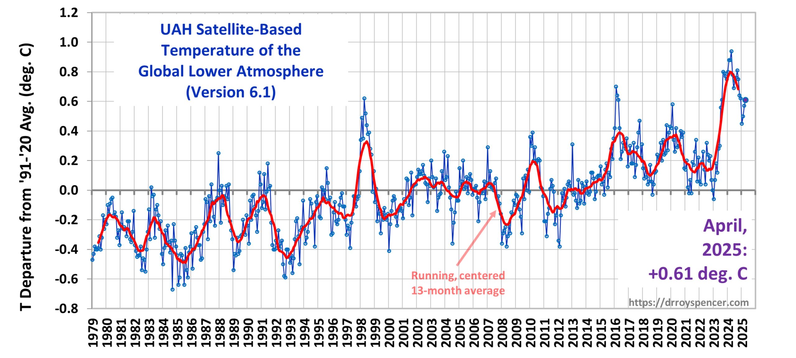
The Version 6.1 global average lower tropospheric temperature (LT) anomaly for April, 2025 was +0.61 deg. C departure from the 1991-2020 mean, up a little from the March, 2025 anomaly of +0.57 deg. C.
The Version 6.1 global area-averaged linear temperature trend (January 1979 through April 2025) remains at +0.15 deg/ C/decade (+0.22 C/decade over land, +0.13 C/decade over oceans).
The following table lists various regional Version 6.1 LT departures from the 30-year (1991-2020) average for the last 16 months (record highs are in red).
YEAR
MO
GLOBE
NHEM.
SHEM.
TROPIC
USA48
ARCTIC
AUST
2024
Jan
+0.80
+1.02
+0.58
+1.20
-0.19
+0.40
+1.12
2024
Feb
+0.88
+0.95
+0.81
+1.17
+1.31
+0.86
+1.16
2024
Mar
+0.88
+0.96
+0.80
+1.26
+0.22
+1.05
+1.34
2024
Apr
+0.94
+1.12
+0.76
+1.15
+0.86
+0.88
+0.54
2024
May
+0.78
+0.77
+0.78
+1.20
+0.05
+0.20
+0.53
2024
June
+0.69
+0.78
+0.60
+0.85
+1.37
+0.64
+0.91
2024
July
+0.74
+0.86
+0.61
+0.97
+0.44
+0.56
-0.07
2024
Aug
+0.76
+0.82
+0.69
+0.74
+0.40
+0.88
+1.75
2024
Sep
+0.81
+1.04
+0.58
+0.82
+1.31
+1.48
+0.98
2024
Oct
+0.75
+0.89
+0.60
+0.63
+1.90
+0.81
+1.09
2024
Nov
+0.64
+0.87
+0.41
+0.53
+1.12
+0.79
+1.00
2024
Dec
+0.62
+0.76
+0.48
+0.52
+1.42
+1.12
+1.54
2025
Jan
+0.45
+0.70
+0.21
+0.24
-1.06
+0.74
+0.48
2025
Feb
+0.50
+0.55
+0.45
+0.26
+1.04
+2.10
+0.87
2025
Mar
+0.57
+0.74
+0.41
+0.40
+1.24
+1.23
+1.20
2025
Apr
+0.61
+0.77
+0.46
+0.37
+0.82
+0.85
+1.21
The full UAH Global Temperature Report, along with the LT global gridpoint anomaly image for April, 2025, and a more detailed analysis by John Christy, should be available within the next several days here.
The monthly anomalies for various regions for the four deep layers we monitor from satellites will be available in the next several days at the following locations:
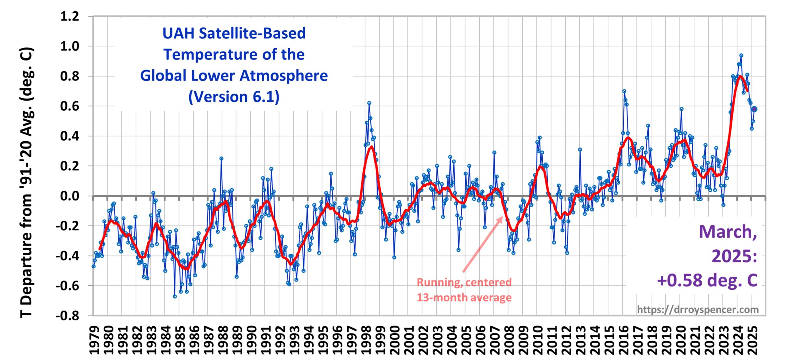
The Version 6.1 global average lower tropospheric temperature (LT) anomaly for March, 2025 was +0.58 deg. C departure from the 1991-2020 mean, up from the February, 2025 anomaly of +0.50 deg. C.
The Version 6.1 global area-averaged linear temperature trend (January 1979 through March 2025) remains at +0.15 deg/ C/decade (+0.22 C/decade over land, +0.13 C/decade over oceans).
The following table lists various regional Version 6.1 LT departures from the 30-year (1991-2020) average for the last 15 months (record highs are in red).
YEAR
MO
GLOBE
NHEM.
SHEM.
TROPIC
USA48
ARCTIC
AUST
2024
Jan
+0.80
+1.02
+0.58
+1.20
-0.19
+0.40
+1.12
2024
Feb
+0.88
+0.95
+0.81
+1.17
+1.31
+0.86
+1.16
2024
Mar
+0.88
+0.96
+0.80
+1.26
+0.22
+1.05
+1.34
2024
Apr
+0.94
+1.12
+0.76
+1.15
+0.86
+0.88
+0.54
2024
May
+0.78
+0.77
+0.78
+1.20
+0.05
+0.20
+0.53
2024
June
+0.69
+0.78
+0.60
+0.85
+1.37
+0.64
+0.91
2024
July
+0.74
+0.86
+0.61
+0.97
+0.44
+0.56
-0.07
2024
Aug
+0.76
+0.82
+0.69
+0.74
+0.40
+0.88
+1.75
2024
Sep
+0.81
+1.04
+0.58
+0.82
+1.31
+1.48
+0.98
2024
Oct
+0.75
+0.89
+0.60
+0.63
+1.90
+0.81
+1.09
2024
Nov
+0.64
+0.87
+0.41
+0.53
+1.12
+0.79
+1.00
2024
Dec
+0.62
+0.76
+0.48
+0.52
+1.42
+1.12
+1.54
2025
Jan
+0.45
+0.70
+0.21
+0.24
-1.06
+0.74
+0.48
2025
Feb
+0.50
+0.55
+0.45
+0.26
+1.04
+2.10
+0.87
2025
Mar
+0.58
+0.74
+0.41
+0.40
+1.25
+1.23
+1.20
The full UAH Global Temperature Report, along with the LT global gridpoint anomaly image for March, 2025, and a more detailed analysis by John Christy, should be available within the next several days here.
The monthly anomalies for various regions for the four deep layers we monitor from satellites will be available in the next several days at the following locations:
While some among us continue to be distracted by supposed “chemtrails” high in the atmosphere, lurking right under our noses has been the ultimate conspiracy: Cartrails.
Modern cars are programmed to emit cartrails, containing nefarious and noxious chemicals. As many people can attest, breathing problems become worse in cities where these vehicles-emitting-deadly-vapour-trails are most concentrated.
This never happened many years ago; I know because my grandfather (who was born in the late 1800s) once told me they NEVER had cartrails back when he was a kid.
So, what kinds of chemicals are they poisoning us with? Well, many years ago it was lead in gasoline. But we found out about that conspiracy, which was meant to destroy the nervous systems of our children. So, what was lead replaced with?
That’s an interesting story. My confidential whistleblower (who must remain nameless for fear of retribution) tells me that the government people got together with the car manufacturing people and the petroleum refining people, and they found a NEW way to poison us: platinum, palladium and rhodium microparticles inside super-heated boxes innocuously called “catalytic converters”.
Do you know what palladium microparticles do to the human nervous system??
Well, neither do I. But I’m sure it isn’t good.
The opportunity to poison us with our own cars is SO much more efficient than “chemtrails”. First, the poisoning occurs right here at ground-level, where we breathe the air into our fragile lungs.
Secondly, the amount of fuel used by cars and trucks is many times that used by jet aircraft, thus increasing the human exposure.
Finally, the emissions are nearly invisible on most days. How sinister is that?? Invisible pollution!
And this is why they make jet aircraft emit so much water vapor (which produces cirrus clouds). It’s to keep people distracted with chemtrail theories so that we don’t realize the real threat is right under our noses: Cartrails. You heard it here first. Spread the word. Start a cartrail blog. Vent your fears and frustrations on social media. Go for it.
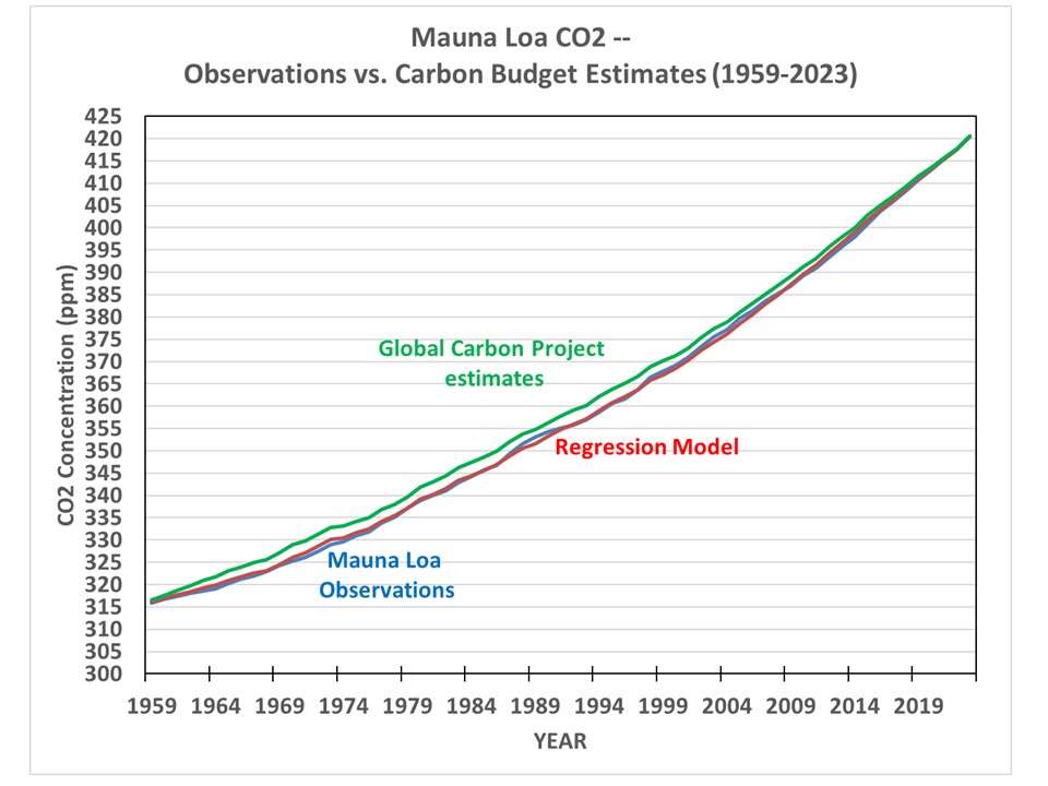
By choosing the “best” models and estimates of CO2 fluxes (those which best explain year-to-year changes in atmospheric CO2 content as measured at Mauna Loa, HI) for the period 1959-2023 as provided by the Global Carbon Project, a multiple linear regression of yearly Mauna Loa CO2 changes against those “best” estimates of sources and sinks leads to the following alterations to the “official ” Global Carbon Project estimates of the sources and sinks leading to the observed rise in atmospheric CO2. (NOTE: being a statistical exercise, this does not constitute “proof”… these are just some areas that carbon budget modelers might want to look into when tweaking their models):
Global anthropogenic CO2 emissions appear to be 30% larger than reported (I find this hard to believe… again, statistics are not necessarily proof).
The Land Sink of CO2 has been underestimated by an average of about 25%
The Ocean Sink of CO2 has been overestimated by about 20% (I don’t know whether they include CO2 outgassing).
The Land Use source of CO2 (primarily biomass burning) has been overestimated by about a factor of 2 (very uncertain)
The cement carbonation sink has been underestimated by about a factor of 7 (very uncertain)
There is a remaining unknown CO2 sink that has averaged 0.2 ppm/yr during 1959-2023 (this could just be a residual of other statistical errors).
Background
Many researchers have spent their careers trying to estimate the various global sources and sinks of atmospheric CO2. The main net sources are anthropogenic emissions (including cement production) and land use (mainly biomass burning). The main CO2 sinks are land (vegetation and soil storage), the ocean (mixing the “excess” atmospheric CO2 downward… biological uptake remains largely unknown), and cement carbonation (old cement absorbs atmospheric CO2).
The Global Carbon Project (GCP) periodically summarizes various estimates of these sources and sinks and produces easily-accessible spreadsheets of the data. I suppose for political expediency (don’t insult your peers), the GCP (like the IPCC does for climate models) just takes virtually all of the estimates of CO2 fluxes and averages them together to produce a single “best” estimate of specific fluxes on a yearly basis. For example, they average 20 (!) different land models results for yearly net CO2 fluxes into the land surface (I say “into” because the current atmospheric “excess” of CO2, around 50% above pre-Industrial levels, causes the land and ocean to be net sinks of CO2).
What I Did
But since I am not part of the global carbon budget research community, I can pick and choose which models and data-based estimates I use. Some of these models are better than others at explaining the yearly increase in atmospheric CO2 at Mauna Loa, Hawaii, and here I will provide an analysis using only the best estimates.
(Now, some researchers believe that an average of all estimates will be better than any individual estimates. I don’t believe that… and neither should you. As a simple example, you can’t make a better estimate of something by averaging a good estimate with a bad estimate.)
So, what I did was to examine how well each individual model estimate (or sometimes an observational estimate) helped to explain the yearly CO2 increases at Mauna Loa. I then chose the best ones, and averaged them together. Then I regresses the yearly CO2 changes at Mauna Loa against these averages. As Fig. 1 shows, this produces a much better estimate of the Mauna Loa CO2 record than the GCP estimates of CO2 fluxes based upon all available estimates from various sources.
Now, to be fair, part of this better agreement comes from the statistical regression. The GCP estimates (quite admirably) use all of the available estimates based upon physics and parameterizations, and then sees how well the results match the Mauna Loa record. And they even include the yearly “residual” in their spreadsheet to show how well (or how poorly) the models fit the data. Kudos.
But I used the best models and estimates, and then use multiple linear regression, to see how closely the data can be fit to the Mauna Loa observations. Again, the year-to-year changes in observed CO2 concentrations are statistically related to the sources and sinks of CO2 which come from (1) anthropogenic emissions, (2) land use emissions, (3) land vegetative and soil uptake, (4) ocean uptake, and (5) cement carbonation (old cement removes CO2 from the atmosphere).
The results give a total regression model explained variance of 81%. The regression coefficients tell us whether the individual CO2 budget terms (sources and sinks of CO2) have been underestimated or overestimated. If the terms equal +1 (for sources) or -1 (for sinks), then the model estimates of the yearly CO2 sources and sinks are (on average) unbiased in their explanation of yearly CO2 changes at Mauna Loa.
Again I emphasize that such statistical results can be misleading. Errors in one term’s regression coefficient can cause errors in other terms’ coefficients. But regression analysis can also sometimes can reveal insights into what physics might be missing. I have seen both in my 40 years of doing such calculations.
Here are the results:
Global Anthropogenic Emissions: Coefficient = 1.3 (+/-0.22) This suggests anthropogenic emissions have been underestimated by about 30%. I find this hard to believe. Energy use is pretty well known. Maybe the cement production source has been underestimated?
Global Land Use: Coefficient = 0.43 (+/-0.45) This suggests land use emissions have been overestimated (but the coefficient uncertainty is large). Also, if there is little skill in a term, a lower coefficient will result due to the “regression to the mean” effect. This result suggests to me that yearly land use as a source of CO2 remains very uncertain.
Global Land Sink: Coefficient = -1.26 (+/-0.16). This suggests the land (mainly vegetation) sink has been underestimated by maybe 25%. The error is the coefficient is pretty small, so I think this result is significant.
Global Ocean Sink: Coefficient = -0.80 (+/- 0.49) This suggests the ocean sink has been overestimated (but with rather large uncertainty) by about 20%. I haven’t looked at whether these ocean models include CO2 outgassing as the temperature rises (a small effect). I’m not convinced that this coefficient is significantly different than 1.0, which would be the case if the models are unbiased in their estimates of the ocean sink.
Cement Carbonation Sink: (-7.3 +/-4.9) This suggests the CO2 uptake by old cement has been greatly underestimated (but with large uncertainty). This is a surprisingly large number, and I don’t know what to make of it.
I’m not convinced of most of these conclusions, except maybe the vegetation sink of CO2 being underestimated by the models. There have been recent papers published finding some vegetation uptake processes have been underestimated by the models.
The global anthropogenic emissions source being underestimated is also intriguing. Being greater than 1, the 1.3 coefficient is the opposite of what we would get from regression if the yearly anthropogenic emissions estimates were poor. So, I’m inclined to believe this is real.
Anyway, this was an quick-and-dirty exercise. Maybe 4 hours of my time. You can access the GCP data spreadsheet here.
P.S. I’m sure someone will ask about adding various natural factors: for example, global surface temperature (land and/or ocean). Yes, that can be done.
Fig. 1. “Study of Cirrus Clouds”, painting by John Constable, circa 1822. Cirrus as a cloud type was first defined by Luke Howard in 1802.
2025 isn’t just the current year, or a Heritage Foundation project of conservative principles for political action for the new Republican President. In the 1990s it was also the result of an Air Force directive to “examine the concepts, capabilities, and technologies the United States will require to remain the dominant air and space force in the future“.
As a partial response to that directive, several students at the Air War College in 1996 produced a document, largely theoretical in content, entitled Weather As a Force Multiplier: Owning the Weather in 2025. That document, which was declassified in 1998, seems to have provided sufficient evidence some people needed to claim that our government has been secretly modifying the weather, altering the atmosphere, poisoning us with chemicals, or whatever else you can think of.
Now, as a general rule, I’m not against conspiracy theories. For example, it has become clear that experts knew early on that the COVID-19 virus likely did indeed come from a lab leak in Wuhan, China, and one might reasonably conclude there was a conspiracy to hide such evidence. Even the New York Times says we were misled. Conspiracies exist.
But not everything we see in the world that we perceive as a threat is the result of a conspiracy, and some people are just easily triggered by what they see. Many years ago I attended a local town hall meeting where a congressional candidate was speaking. During the Q&A period, an appropriately-attired biker dude got up and wanted to know what the candidate was going to do about all of the “chemtrails” the biker saw in the skies above him as he traveled around the country. The candidate provided a an appropriately vague and soothing response.
So, how did this “chemtrail” theory arise?
It seems to be a combination of peoples’ misunderstanding of the clouds they see in the sky combined with increasing distrust in our government, fueled by the 2025 Air Force study alluded to above. It also seems to be exacerbated by lesser standards of math and science education in recent decades, leading to a new generation of adults who can not critically examine claims made by others.
Contrail Production by Jet Aircraft is Well Understood
For those of us who know meteorology, those visible cloud streaks left behind travelling jets are “contrails” (condensation trails), produced during the combustion of jet fuel. The chemistry of jet fuel combustion is well understood, which includes the by-products of that combustion. During combustion, 1 kg of jet fuel produces about 1.3 kg of water (hydrogen in the fuel combines with oxygen from the atmosphere to produce H2O, water). That water exits the jet engine as water vapor in such high concentrations at extremely cold temperatures (around generally -30 to -50 deg. F) that there is much more water than the atmosphere can hold without condensation (cloud formation) occurring.
As a result, trails of cirrus clouds (contrails) are produced. Depending upon the relative humidity (RH) of the surrounding environmental air, those contrails can either rapidly evaporate (if RH is very low), leaving essentially no visible evidence, or can persist and even expand in coverage for many hours if the RH is high. In a high RH environment, jet-produced cirrus can actually scavenge water vapor from the surrounding atmosphere, causing continued growth of the contrails.
Fig. 2. Four-engine contrails produced by jet aircraft. Different illumination situations can change the contrail appearance, just as is the case with natural cirrus clouds (source).
The presence of wind shear (changing wind direction or speed with height) can cause distortion of the resulting clouds into myriad shapes. Often, the resulting jet-produced cirrus clouds are not easily distinguishable from natural cirrus clouds produced by weather systems; other times they are easily distinguishable. Literally as I was writing this, I took a picture out my office window showing both natural and jet-produced cirrus clouds.
Fig. 3. Natural and jet-produced cirrus clouds at sunrise, Huntsville, Alabama, 19 March 2025.
But when, and why, did the “chemtrail” conspiracy theory theory gain traction? And why does it persist today? The theory posits that the visual trails of condensed water vapor seen behind jet aircraft operating at high altitudes in reality represent the spraying of chemicals for some nefarious purpose(s). I routinely see comments on X and Facebook from people alarmed at the “chemtrails” they see. Those evil purposes of chemtrail production range from geoengineering (purposely changing the climate) to mind control and the spread of sickness that can be treated by pharmaceutical companies to increase their profits. Many weather experts have tried to debunk these ideas, for example Cliff Mass, professor of atmospheric science at the University of Washington.
Weather as a Force Multiplier: Owning the Weather in 2025
So, does the U.S. Air Force now own the weather in 2025, as predicted in the 1996 report? Of course not. Most of the theoretically possible technologies in that report for either clearing clouds, or creating clouds, in the battlefield did not exist in the 1990s. The report is full of pie-in-the-sky concepts, including cloud seeding to produce precipitation (the subject of much civilian research in recent decades), but admits “artificial weather technologies do not currently exist. But as they are developed, the importance of their potential applications rises rapidly.”
Yes, there have been experiments (mainly civilian) extending back to the 1950s involving seeding clouds to get them to precipitate. This involved dropping a chemical, such as dry ice or silver iodide crystals, to help convert super-cooled water droplets into precipitation. Project Stormfury, started in the 1960s, researched seeding hurricanes in the periphery to reduce the intensity of the central part of the cyclone, which is where most of the damaging winds and storm surge occur. But the idea was abandoned when it was realized hurricanes already convert almost all of the condensed cloud into precipitation anyway, without any help from humans.
This isn’t to say that it is impossible to seed clouds and produce precipitation, at least on a very localized basis in specific weather situations. But the research results have been mixed, and generally speaking, unless a cloud is getting ready to precipitate anyway, seeding doesn’t do much to the cloud, except make it precipitate sooner rather than later. People have a greatly exaggerated perception of what humans can do to purposely impact weather processes.
Now, I’m not privy to any weather modification technologies that DoD might have in the works. But after nearly a half-century of working in weather and climate, I can tell you there is little we can do to affect weather, either intentionally or unintentionally.
Let’s examine the AF report example of creating or clearing clouds in the battlefield. Imagine a wartime situation where the AF wants to clear a cloud (or fog) to allow precision visual identification of a target for bombing. Theoretically, this could be done with a powerful microwave directed-beam energy source (maybe from a special aircraft flying just ahead of a missile-carrying aircraft) to temporarily evaporate the cloud water. To give some idea of the energy that would be required to do that, we can compute how much energy is required to evaporate a path of fog having dimensions of 100x100x100 meters having a liquid water content of 0.1 grams water per kg of air. Assuming maybe 25% or so of the directed microwave beam energy will go into heating air and evaporating the liquid water, one can estimate the energy required of such a directed-beam device would be around 1 billion Watts (1 billion Joules of energy produced for 1 second). This is indeed in the realm of the estimated power output of DoD directed beam energy sources, at least from the ground. I have no idea whether such a large energy source could be produced by an aircraft.
But, even if the Air Force could, would they even want to? I’m pretty sure smart weapons now exist which have passive microwave technology allowing a target to be seen through relatively modest cloud cover.
So, What About Chemtrails? And Geoengineering?
As far as I can tell, the AF report cited above does not mention technologies that would disperse chemicals through jet exhaust (or other aircraft orifices). Besides, if such chemtrails exist, they are spreading their “chemicals” over everyone, including the families of the people conspiring to cause chemtrails.
Why would anyone do that?
Isolated photos do exist of jets dumping fuel, which comes out of different special wing ports, away from the engines. Sometimes this is cited as evidence of chemicals being spread for nefarious purposes. But this “fuel jettisoning” is a rare occurrence, usually in emergency situations, and is estimated to occur less than once per 100,000 commercial flights.
But there has been lots of research into whether jet contrails inadvertently affect climate, which would be a case of accidental geoengineering. Contrails reduce the amount of sunlight reaching the surface (a cooling effect), but that is more than offset by their reduction in the infrared (IR) cooling of the climate system, leading to a net heating. The best estimates are that global jet traffic produces less than 0.1 Watt per sq. meter of net radiative heating of the climate system, which is in the noise level (by comparison, natural solar heating and infrared cooling of the global-average climate system is ~240 Watts per sq. meter). Locally, where there is lots of air traffic, that value goes up to possibly 0.5 Watts per sq. meter, which is probably still not detectable in the presence of natural variations in temperature. An early study of the temperature effects of a jet traffic shutdown after 9/11 were later debunked by a subsequent study.
Now, what IS being discussed is the possibility of carrying large quantities of sulfur into the upper atmosphere (the stratosphere) to produce sulfur dioxide aerosols in an attempt to slightly reduce incoming sunlight and so partially offset global warming. This is an example of what “geoengineering” usually refers to. This would require huge amounts of sulfur compounds and many jet flights to even come close to the natural cooling effects of a major volcanic eruption, the most recent example of which was the 1991 eruption of Mt. Pinatubo in the Philippines. That eruption injected an estimated 15-20 million tons of SO2 into the stratosphere, which resulted in cool-ish summers over Northern Hemisphere land areas in 1992. Personally, I don’t ever see this happening because there would be too much public resistance to the idea.
But no one bats an eye when Mother Nature does it.
And the few news reports you see where supposed experiments involving the ground-level release of a few kg of sulfur compounds to test the idea of altering clouds are laughable. The EPA estimates that in 2023, 1.7 million tons of SO2 were released in the U.S. from anthropogenic sources. That is over 9 million pounds per day. Compare that to the “experimental” release of a few pounds by some headline-grabbing “researchers”. As I said… laughable.
A Major Reason for the Hysteria: Jet Contrails are Visible
Chemtrail hysteria would not exist if not for the fact that jet contrails are visible. Cars and trucks also produce huge amounts of water vapor, which is sometimes seen as condensed water in cold or high-RH conditions. The reason they don’t persist is that at the temperatures and air pressures present at ground level, the air can hold orders of magnitude more water vapor without cloud formation than jet-altitude air can hold.
But no one accuses car drivers (or car manufacturers) of purposely poisoning our air with chemicals, do they?
Yes, cars produce some chemicals as a by-product of combustion (all invisible), and through EPA regulations some of those chemicals have been greatly reduced with new fuel formulations, engine design changes, and catalytic converters. But cars are never blamed for producing chemtrails because, generally speaking, we never see those emissions (including the water vapor emissions). But we DO see jet contrails.
Finally, one part of the problem is that our public education system has produced too many science-illiterate adults. They are susceptible to crazy ideas spread by attention- (and money-) seeking charlatans, some of whom might be convinced that a chemtrail conspiracy exists. Too many people today seem to be incapable of independent, critical thought.
After all, who would doubt evidence such as this?:

 Home/Blog