Short Answer: It all depends upon how you interpret the data.
It has been quite a while since I have addressed feedback in the climate system, which is what determines climate sensitivity and thus how strong human-caused global warming will be. My book The Great Global Warming Blunder addressed how climate researchers have been misinterpreting satellite measurements of variations the Earth’s radiative energy balance when trying to estimate climate sensitivity.
The bottom line is that misinterpretation of the data has led to researchers thinking they see positive feedback, and thus high climate sensitivity, when in fact the data are more consistent with negative feedback and low climate sensitivity. There have been a couple papers — an many blog posts — disputing our work in this area, and without going into details, I will just say that I am as certain of the seriousness of the issue as I have ever been. The vast majority of our critics just repeat talking points based upn red herrings or strawmen, and really haven’t taken the time to understand what we are saying.
What is somewhat dismaying is that, even though our arguments are a natural outgrowth of, and consistent with, previous researchers’ published work on feedback analysis, most of those experts still don’t understand the issue I have raised. I suspect they just don’t want to take the time to understand it. Fortunately, Dick Lindzen took the time, and has also published work on diagnosing feedbacks in a manner that differs from tradition.
Since we now have over 16 years of satellite radiative budget data from the CERES instruments, I thought it would be good to revisit the issue, which I lived and breathed for about four years. The following in no way exhausts the possibilities for how to analyze satellite data to diagnose feedbacks; Danny Braswell and I have tried many things over the years. I am simply trying to demonstrate the basic issue and how the method of analysis can yield very different results. The following just gives a taste of the problems with analyzing satellite radiative budget data to diagnose climate feedbacks. If you want further reading on the subject, I would say our best single paper on the issue is this one.
The CERES Dataset
There are now over 16 years of CERES global radiative budget data: thermally emitted longwave radiation “LW”, reflected shortwave sunlight “SW”, and a “Net” flux which is meant to represent the total net rate of radiative energy gain or loss by the system. All of the results I present here are from monthly average gridpoint data, area-averaged to global values, with the average annual cycle removed.
The NASA CERES dataset from the Terra satellite started in March of 2000. It was followed by the Aqua satellite with the same CERES instrumentation in 2002. These datasets are combined into the EBAF dataset I will analyze here, which now covers the period March 2000 through May 2016.
Radiative Forcing vs. Radiative Feedback
Conceptually, it is useful to view all variations in Earth’s radiative energy balance as some combination of (1) radiative forcing and (2) radiative feedback. Importantly, there is no known way separate the two… they are intermingled together.
But they should have very different signatures in the data when compared to temperature variations. Radiative feedback should be highly correlated with temperature, because the atmosphere (where most feedback responses occur) responds relatively rapidly to a surface temperature change. Time varying radiative forcing, however, is poorly correlated with temperature because it takes a long time — months if not years — for surface temperature to fully respond to a change in the Earths radiative balance, owing to the heat capacity of the land or ocean.
In other words, the different directions of causation between temperature and radiative flux involve very different time scales, and that will impact our interpretation of feedback.
Radiative Feedback
Radiative feedback is the radiative response to a temperature change which then feeds back upon that temperature change.
Imagine if the climate system instantaneously warmed by 1 deg. C everywhere, without any other changes. Radiative transfer calculations indicate that the Earth would then give off an average of about 3.2 Watts per sq. meter more LW radiation to outer space (3.2 is a global area average… due to the nonlinearity of the Stefan-Boltzmann equation, its value is larger in the tropics, smaller at the poles). That Planck effect of 3.2 W m-2 K-1 is what stabilizes the climate system, and it is one of the components of the total feedback parameter.
But not everything would stay the same. For example, clouds and water vapor distributions might change. The radiative effect of any of those changes is called feedback, and it adds or subtracts from the 3.2 number. If it makes the number bigger, that is negative feedback and it reduces global warming; if it makes the number smaller, that is positive feedback which increases global warming.
But at no time (and in no climate model) would the global average number go below zero, because that would be an unstable climate system. If it went below zero, that would mean that our imagined 1 deg. C increase would cause a radiative change that causes even more radiative energy to be gained by the system, which would lead to still more warming, then even more radiative energy accumulation, in an endless positive feedback loop. This is why, in a traditional engineering sense, the total climate feedback is always negative. But for some reason climate researchers do not consider the 3.2 component a feedback, which is why they can say they believe most climate feedbacks are positive. It’s just semantics and does not change how climate models operate… but leads to much confusion when trying to discuss climate feedback with engineers.
Radiative Forcing
Radiative forcing is a radiative imbalance between absorbed sunlight and emitted infrared energy which is not the result of a temperature change, but which can then cause a temperature change (and, in turn, radiative feedback).
For example, our addition of carbon dioxide to the atmosphere through fossil fuel burning is believed to have reduced the LW cooling of the climate system by almost 3 Watts per sq. meter, compared to global average energy flows in and out of the climate system of around 240 W m-2. This is assumed to be causing warming, which will then cause feedbacks to kick in and either amplify or reduce the resulting warming. Eventually, the radiative imbalance cause by the forcing causes a temperature change that restores the system to radiative balance. The radiative forcing still exists in the system, but radiative feedback exactly cancels it out at a new equilibrium average temperature.
CERES Radiative Flux Data versus Temperature
By convention, radiative feedbacks are related to a surface temperature change. This makes some sense, since the surface is where most sunlight is absorbed.
If we plot anomalies in global average CERES Net radiative fluxes (the sum of absorbed solar, emitted infrared, accounting for the +/-0.1% variations in solar flux during the solar cycle), we get the following relationship:
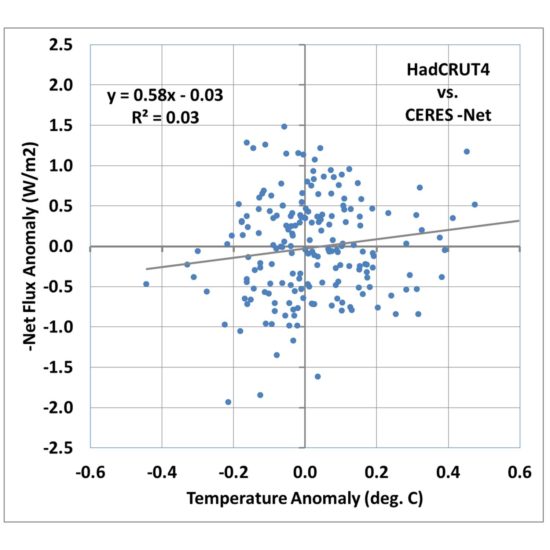
Fig. 1. Monthly global average HadCRUT4 surface temperature versus CERES -Net radiative flux, March 2000 through May 2016.
I’m going to call this the Dessler-style plot, which is the traditional way that people have tried to diagnose feedbacks, including Andrew Dessler. A linear regression line is typically added, and in this case its slope is quite low, about 0.58 W m-2 K-1. If that value is then interpreted as the total feedback parameter, it means that strong positive feedbacks in the climate system are pushing the 3.2 W m-2 K-1 Planck response to 0.58, which when divided into the estimated 3.8 W m-2 radiative forcing from a doubling of atmospheric CO2, results in a whopping 6.5 deg. C of eventual warming from 2XCO2!
Now thats the kind of result that you could probably get published these days in a peer-reviewed journal!
What about All That Noise?
If the data in Fig. 1 all fell quite close to the regression line, I would be forced to agree that it does appear that the data support high climate sensitivity. But with an explained variance of 3%, clearly there is a lot of uncertainty in the slope of the regression line. Dessler appears to just consider it noise and puts error bars on the regression slope.
But what we discovered (e.g. here) is that the huge amount of scatter in Fig. 1 isn’t just noise. It is evidence of radiative forcing contaminating the radiative feedback signal we are looking for. We demonstrated with a simple forcing-feedback model that in the presence of time-varying radiative forcing, most likely caused by natural cloud variations in the climate system, a regression line like that in Fig. 1 can be obtained even when feedback is strongly negative!
In other words, the time-varying radiative forcing de-correlates the data and pushes the slope of the regression line toward zero, which would be a borderline unstable climate system.
This raises a fundamental problem with standard least-squares regression analysis in the presence of a lot of noise. The noise is usually assumed to be in only one of the variables, that is, one variable is assumed to be a noisy version of the other.
In fact, what we are really dealing with is two variables that are very different, and the disagreement between them cant just be blamed on one or the other variable. But, rather than go down that statistical rabbit hole (there are regression methods assuming errors in both variables), I believe it is better to examine the physical reasons why the noise exists, in this case the time-varying internal radiative forcing.
So, how can we reduce the influence of this internal radiative forcing, to better get at the radiative feedback signal? After years of working on the problem, we finally decided there is no magic solution to the problem. If you knew what the radiative forcing component was, you could simply subtract it from the CERES radiances before doing the statistical regression. But you don’t know what it is, so you cannot do this.
Nevertheless, there are things we can do that, I believe, give us a more realistic indication of what is going on with feedbacks.
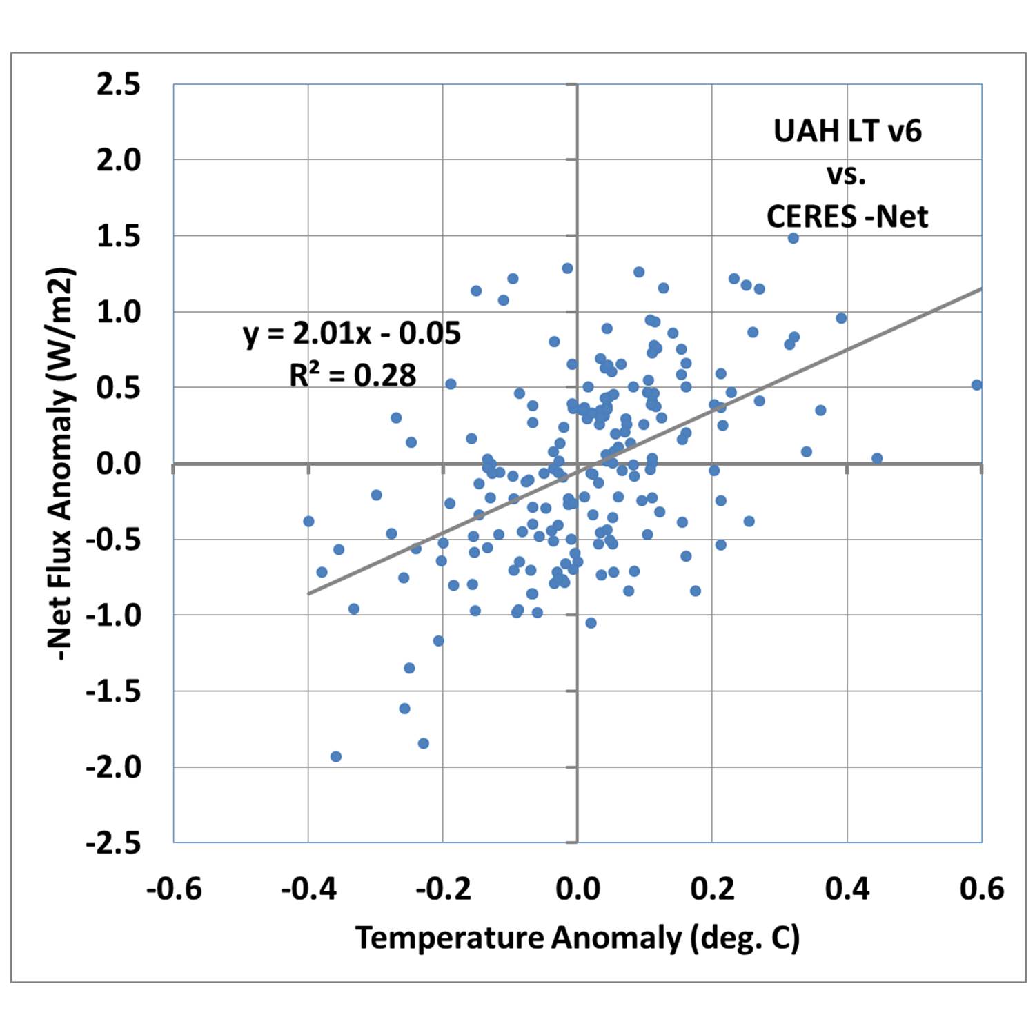
Switching from Surface Temperature to Tropospheric Temperature
During the CERES period of record there is an approximate 1:1 relationship between surface temperature anomalies and our UAH lower troposphere LT anomalies, with some scatter. So, one natural question is, what does the relationship in Fig. 1 look like if we substitute LT for surface temperature?
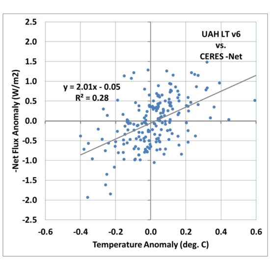
Fig. 2. As in Fig. 1, but surface temperature has been replaced by satellite lower tropospheric temperature (LT).
Fig. 2 shows that the correlation goes up markedly, with 28% explained variance versus 3% for the surface temperature comparison in Fig. 1.
The regression slope is now 2.01 W m-2 K-1, which when divided into the 2XCO2 radiative forcing value of 3.8 gives only 1.9 deg. C warming.
So, we already see that just by changing from surface temperature to lower tropospheric temperature, we achieve a much better correlation (indicating a clearer feedback signal), and a greatly reduced climate sensitivity.
I am not necessarily advocating this is what should be done to diagnose feedbacks; I am merely pointing out how different a result you can obtain when you use a temperature variable that is better correlated with radiative flux, as feedback should be.
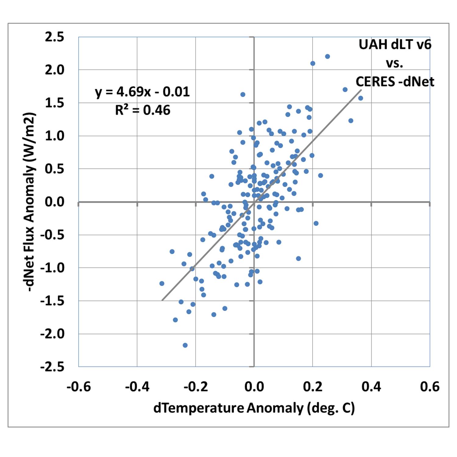
Looking at only Short Term Variability
So far our analysis has not considered the time scales of the temperature and radiative flux variations. Everything from the monthly variations to the 16-year trends are contained in the data.
But there’s a problem with trying to diagnose feedbacks from long-term variations: the radiative response to a temperature change (feedback) needs to be measured on a short time scale, before the temperature has time to respond to the new radiative imbalance. For example, you cannot relate decadal temperature trends and decadal radiative flux trends and expect to get a useful feedback estimate because the long period of time involved means the temperature has already partly adjusted to the radiative imbalance.
So, one of the easiest things we can do is to compute the month-to-month differences in temperature and radiative flux. If we do this for the LT data, we obtain an even better correlation, with an explained variance of 46% and a regression slope of 4.69 W m-2 K-1.
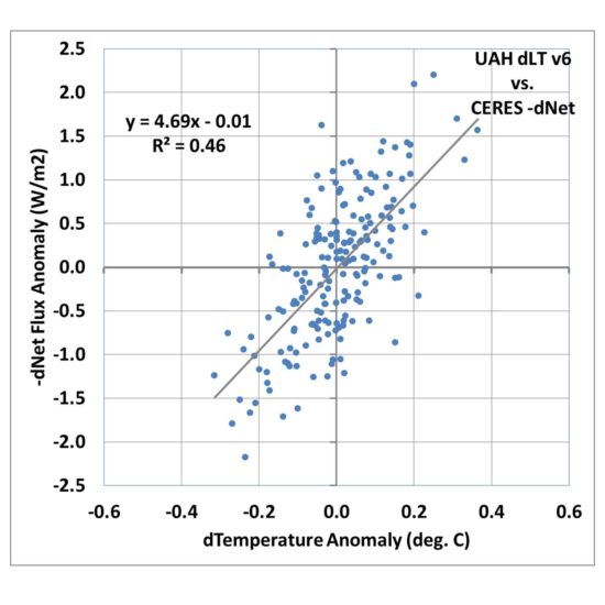
Fig. 3. As in Fig. 2, but for month-to-month differences in each variable.
If that was the true feedback operating in the climate system it would be only (3.8/4.69=) 0.8 deg. C of climate sensitivity for doubled CO2 in the atmosphere(!)
Conclusions
I dont really know for sure which of the three plots above are more closely related to feedback. I DO know that the radiative feedback signal should involve a high correlation, whereas the radiative forcing signal will involve a low correlation (basically, the latter often involves spiral patterns in phase space plots of the data, due to time lag associated with the heat capacity of the surface).
So, what the CERES data tells us about feedbacks entirely depends upon how you interpret the data… even if the data have no measurement errors at all (which is not possible).
It has always bothered me that the net feedback parameter that is diagnosed by linear regression from very noisy data goes to zero as the noise becomes large (see Fig. 1). A truly zero value for the feedback parameter has great physical significance — a marginally unstable climate system with catastrophic global warming — yet that zero value can also occur just due to any process that de-correlates the data, even when feedback is strongly negative.
That, to me, is an unacceptable diagnostic metric for analyzing climate data. Yet, because it yields values in the direction the Climate Consensus likes (high climate sensitivity), I doubt it will be replaced anytime soon.
And even if the strongly negative feedback signal in Fig. 3 is real, there is no guarantee that its existence in monthly climate variations is related to the long-term feedbacks associated with global warming and climate change. We simply don’t know.
I believe the climate research establishment can do better. Someday, maybe after Lindzen and I are long gone, the IPCC might recognize the issue and do something about it.

 Home/Blog