2+2=4.
2+2=4
October 2nd, 2016Matthew to Arrive 4,000 days after Last Major Hurricane
September 29th, 2016Updated 7:30 a.m. EDT Saturday, Oct. 1.
Major Hurricane Matthew was briefly a Category 5 hurricane overnight, the first Cat 5 in the Atlantic in nine years. It now has 155 mph sustained winds, making it a strong Category 4 storm on the Saffir-Simpson scale.
Matthew is over the south-central Caribbean, traveling slowly westward, but a turn to the north is expected on Sunday. Matthew is expected to cross eastern Cuba Tuesday morning and possibly make U.S. landfall somewhere on the East Coast around next Friday or Saturday.
Thursday will mark exactly 4,000 days after Major Hurricane Wilma’s landfall.
Hurricane Wilma, the last major hurricane (Cat 3 or stronger) to hit the U.S., struck Florida on October 24, 2005. Will Matthew arrive as the first major hurricane to strike the U.S. in almost 11 years? Only time will tell. (Sandy was Cat 1 at landfall, and technically not a hurricane at that time. Hurricane Ike, 2008, was a Cat 2.)
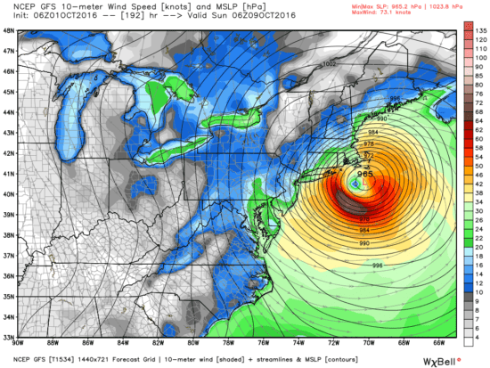
Here is the latest GFS model forecast for Matthew on midnight Sunday, Oct. 9 (graphics courtesy of Weatherbell.com):
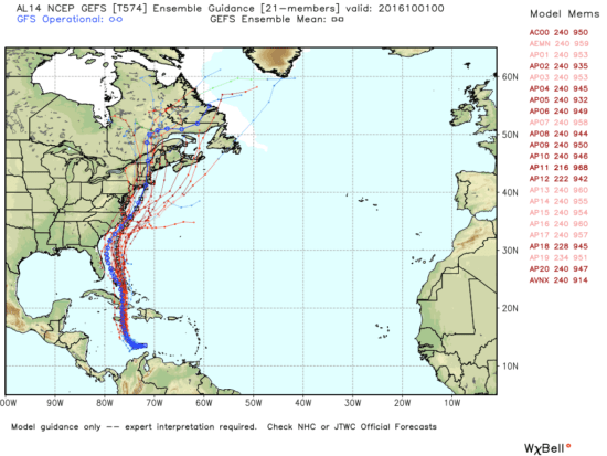
That particular forecast, which remains very uncertain this far in advance, has Matthew making landfall at Cape Hatteras, Cape Cod, and then going inland in Maine. Here is the spread of model forecasts from NOAA’s GEFS ensemble forecast system:
The Faster a Planet Rotates, the Warmer its Average Temperature
September 28th, 2016This is a followup to my post from yesterday where I provided time-dependent model results of the day-night cycle in lunar temperatures.
One of the fascinating things about the model result (which I would not have expected) is that all other things being equal, the faster a solar-illuminated planet rotates, the warmer its average temperature will be. The calculations I provided are for planets without an atmosphere (e.g. the Moon).
Before examining the issue, I would have guessed that the rotation rate would not matter. Or, maybe I would have guessed that a more-slowly rotating planet would get warmer, since the period of sunlight is longer and higher daytime temperatures would be achieved.
But I would have been wrong.
Simple Thought Experiment
The reason is very simple, and is related to the non-linearity of the Stefan-Boltzmann equation, which can be used to estimate how warm a body gets based upon the rate at which it absorbs solar energy when its only mechanism to cool is through thermal emission of radiation:
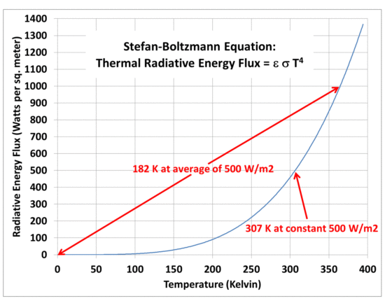
Fig. 1. The non-linearity of the Stefan-Boltzmann equation can lead to very different average planetary temperatures given the same long-term average absorbed solar flux.
Imagine a body with a realistic heat capacity that uniformly absorbs a solar intensity of 1,000 Watts per sq. meter for 1 second, then 0 W/m2 for one second, over and over. Think of it as a 2 sec long diurnal cycle. That rapidly flickering energy source would be too fast for the temperature to come into equilibrium with the absorbed sunlight (or lack of sunlight). It would, in effect, be like a continuous energy source of 500 W/m2 in intensity, and the resulting S-B temperature (assuming a thermal radiative emissivity of 1.0) would be about 307 Kelvin, taken from the curve in Fig. 1.
Now imagine the energy source stays on for a very long time, say 10,000 days, then stays off for 10,000 days (a 20,000 day diurnal cycle…the Moon has a 29.5 day diurnal cycle). From Fig. 1 we see that during the daytime the temperature would approach 365 Kelvin, and at night it would approach 0 Kelvin. In this case the average temperature would be about 182 Kelvin…which is 125 deg. colder than 307 K!
The only difference in the two imaginary cases is the length of the day/night cycle. The long-term average rate of absorbed sunlight is the same.
Yesterday I showed that the difference in rotation rate between the Earth and the Moon caused the more-slowly rotating Moon to be about 55 deg. colder than the Earth, all other things being equal (no atmosphere, the same albedo and IR emissivity, and a surface bulk heat capacity which gives model temperatures than match actual lunar observations). The effect is muted the greater the surface bulk heat capacity, since that also reduces the diurnal temperature range.
Basically, any process which increases the day-night temperature range (such as a longer diurnal cycle) will decrease the average temperature of a planet, simply because of the non-linearity of the S-B equation. I suspect the effect does not exist if the surface being heated has zero heat capacity, since the temperature of the surface will instantly come into equilibrium with the absorbed sunlight; in that case the length of day would not matter. But since that is physically impossible, it does not apply to real planets.
Errors in Estimating Earth’s No-Atmosphere Average Temperature
September 27th, 2016ABSTRACT
While the non-linearity of the Stefan-Boltzmann equation leads to at least a 60 deg. C overestimate of the Moon’s average surface temperature if a global-average solar flux is used in place of computing temperatures over a sphere with a diurnal cycle, the error is only about 5 deg. C for the Earth. The difference is due the the very long lunar day (29.5 Earth days), which causes a very large diurnal cycle in temperature, which enhances the errors arising from the nonlinearity of the S-B equation.
 The greenhouse effect is often claimed to cause an average warming of the Earth’s surface of about 33 deg. C, from an atmosphere-free value of about 255 K to the observed value of around 288 K. In the no-atmosphere case, the absorbed solar flux heats the surface up until the thermal emission of longwave radiation matches the intensity of absorbed sunlight.
Typically this theoretical average surface temperature is computed using a global average of the absorbed solar flux, and then using the Stefan-Boltzmann equation to find the emitting temperature that matches it.
But the strong nonlinearity of how the S-B flux depends upon temperature can lead to a warm bias in the no-atmosphere temperature estimate if a wide range of solar fluxes are used in a single average:
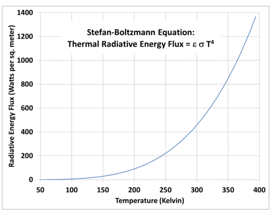
Fig. 1. The non-linearity of the Stefan-Boltzmann equation leads to a warm bias if a global average solar flux is used to estimate a global average equivalent emitting temperature.
If the absorbed solar flux does not vary much over the spherical shape of a planet without an atmosphere, then using a global-average solar flux will give a pretty good estimate of the global average surface temperature.
But the absorbed solar flux actually varies a lot over a spherical planet.
So, just how large of an error is introduced by the use of a global average flux to calculate an average temperature? (My recent discussions with David South, an Auburn forestry professor, led me to reexamine this issue.)
In the case of the Moon, the error is very large. As has been pointed out elsewhere (e.g. by Willis Eschenbach here, and Nikolov & Zeller here), extreme day-night temperature swings on the Moon can cause a single-solar flux estimate of surface temperature to be biased very high, due to the nonlinearity of the S-B equation. The error can be many tens of degrees C.
Clearly, the 33 deg. C estimate for the Earth’s atmospheric greenhouse effect depends upon how accurate our estimate is of the average surface temperature of the Earth without an atmosphere. (I won’t go into the reasons why we really don’t know what the Earth would look like without an atmosphere, which affects it’s albedo and thus how much sunlight it would absorb, which in turn will impact the temperature calculation).
Since the non-linearity induced error depends upon just how hot surface temperature gets during the daytime, you need to do the calculations using a diurnal cycle, including how deep the solar heating (and nighttime cooling) penetrates into the surface. Also, obviously, the calculations need to be done on a sphere.
So, I put together this model spreadsheet that allows you to change planets (through the assumed solar irradiance), the assumed solar albedo of the atmosphere-free planet, surface longwave emissivity, and how deep of a water/soil layer is assumed to change in its temperature in response to imbalances between absorbed sunlight and thermally-emitted longwave radiation.
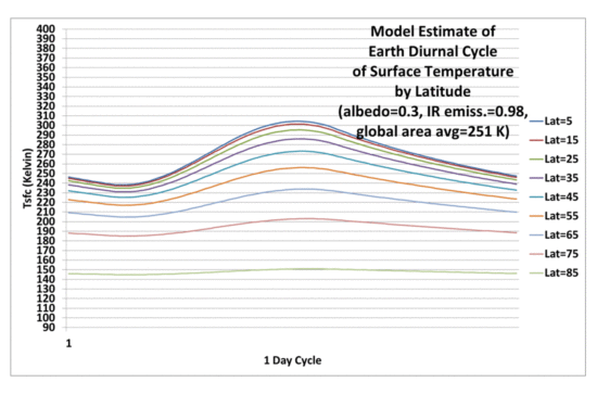
The time-dependent calculations are done in 96 increments of a day, which is 15 minutes for the Earth, at latitudes of 5, 15, 25, 35, 45, 55, 65, 75, and 85 degrees separately at assumed equinox conditions. Cosine latitude weighting then gives a pretty good estimate of the area averaged temperature over the sphere. It can take up to a couple weeks for the polar regions to finally equilibrate when the model is initialized at absolute zero temperature. The plots that follow are after 40 day-night cycles of the model run.
When I run the model for the Moon, which has a 29.5 Earth-day diurnal cycle, I found that I needed a soil layer of about 0.05 meters depth (about 2 inches) to match actual temperature measurements on the Moon (see Willis’s post here for some actual lunar temperature measurements). This is the thickness of soil assumed to be uniform in temperature that responds to solar heating and IR cooling. Of course, in reality the very top of the soil surface will get the hottest/coldest, with the temperature swings dampening strongly with depth; the model just uses a thin, uniform-temperature layer that approximates the average behavior of the real, thicker layer.
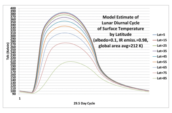
Fig. 2. Diurnal cycle in lunar surface temperatures at different latitudes calculated from a simple time-dependent model during equinox conditions.
Significantly, the resulting global area average lunar temperature of 212 K is 61 K colder than the 273 K one gets by just putting the global average absorbed solar flux through the S-B equation to get a single temperature. As discussed by Willis, this shows the large bias that can result from S-B equation calculations when one doesn’t bother to average over a wide range of temperatures.
So, How Large is the S-B Bias in Earth Temperature Calculations?
Just how big is this warm bias effect when computing what the Earth’s global average surface temperature would be in the absence of an atmosphere?
If I repeat the model calculations in Fig. 2 and only change the length of the diurnal cycle, from 29.5 Earth days (for the Moon) to 1 day, we get (obviously) a greatly reduced diurnal range in temperature (22 deg. C diurnal range, global average, versus 209 deg. C diurnal range for the Moon), and a global average surface temperature of 267 K. This is only 6 deg. below the 273 K value using a single solar flux in the S-B equation:
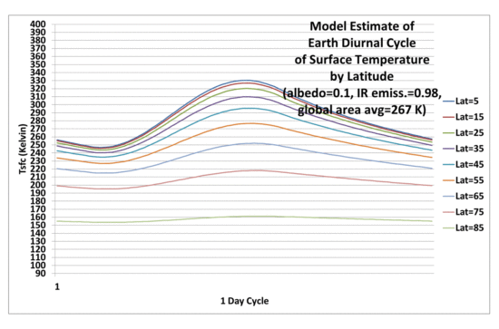
Fig. 3. As in Fig. 2, but with a 24 hr (Earth) diurnal cycle rather than 29.5 days (lunar diurnal cycle).
If I use the more traditionally-used Earth albedo value of 0.3, I get a global average surface temperature of 251 K, which is only 5 deg. C below the single solar flux calculation of 256 K. Thus, the error caused by using a single global average solar flux to estimate a global average terrestrial temperature in the S-B equation is much less for the Earth than it is for the Moon.
Conclusion
Using the S-B equation with a global average absorbed solar flux to compute the global average emitting temperature of the Moon leads to a very large warm bias, as reported by others.
But that lunar bias (about 60 deg. C) is mostly due to the very long period of daylight on the moon, which is 29.5 times longer than on Earth. When the Earth’s diurnal cycle length is used, the warm bias is only about 5 deg. C.
One might then wonder if this means that the 33 deg. C greenhouse effect on Earth should really be 38 deg. C?
Maybe…but I would say that the 33 deg. C number is suspect anyway. First, because it depends upon an albedo of 0.3, which is probably too high. If I use a lunar albedo for the Earth, then the GHE becomes only 21 deg. C with the new calculations. One might wonder if the no-atmosphere Earth would be ice covered, with a very high albedo and very low surface temperatures, but the existence of water would lead to evaporation/sublimation, and a water vapor atmosphere. So an ice Earth is, I believe, incompatible with the assumption of no atmosphere. But I’m open to different arguments on this point.
Secondly, the 33 deg. C number isnt really the greenhouse effect, anyway. It’s more of a total “atmosphere effect”, the final result after atmospheric convection has cooled the surface substantially below the very high temperatures the greenhouse effect would cause in the case of pure radiative equilibrium (see Manabe and Strickler, 1964).
So, you can get a wide variety of numbers for the estimated surface warming effect of the atmosphere (combined effect of greenhouse warming and convective cooling). They depend on what assumptions you make in your calculations related to what an atmosphere-free Earth would look like, which are at the very least uncertain, and at most, physically impossible.
The bottom line, though, is that neglect of the nonlinearity of the S-B equation leads to about a 5 deg. C overestimate of the average surface temperature of the Earth in the absence of an atmosphere.
NOTE: Most of the comments on this post will likely be off-topic, centering around the extreme minority view of a few people that there is no atmospheric “greenhouse effect” involving the atmosphere emitting infrared radiation toward the surface.
UAH Global Temperature Update for August, 2016: +0.44 deg. C
September 1st, 2016August Temperature Up a Little from July
NOTE: This is the seventeenth monthly update with our new Version 6.0 dataset. Differences versus the old Version 5.6 dataset are discussed here. Note we are now at “beta5” for Version 6, and the paper describing the methodology is back to the journal editors from peer review.
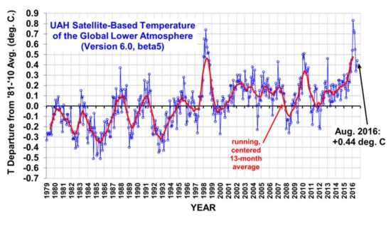
The Version 6.0 global average lower tropospheric temperature (LT) anomaly for August 2016 is +0.44 deg. C, up a little from the July, 2016 value +0.39 deg. C (click for full size version):
The global, hemispheric, and tropical LT anomalies from the 30-year (1981-2010) average for the last 20 months are:
YEAR MO GLOBE NHEM. SHEM. TROPICS
2015 01 +0.30 +0.44 +0.15 +0.13
2015 02 +0.19 +0.34 +0.04 -0.07
2015 03 +0.18 +0.28 +0.07 +0.04
2015 04 +0.09 +0.19 -0.01 +0.08
2015 05 +0.27 +0.34 +0.20 +0.27
2015 06 +0.31 +0.38 +0.25 +0.46
2015 07 +0.16 +0.29 +0.03 +0.48
2015 08 +0.25 +0.20 +0.30 +0.53
2015 09 +0.23 +0.30 +0.16 +0.55
2015 10 +0.41 +0.63 +0.20 +0.53
2015 11 +0.33 +0.44 +0.22 +0.52
2015 12 +0.45 +0.53 +0.37 +0.61
2016 01 +0.54 +0.69 +0.39 +0.84
2016 02 +0.83 +1.17 +0.50 +0.99
2016 03 +0.73 +0.94 +0.52 +1.09
2016 04 +0.71 +0.85 +0.58 +0.94
2016 05 +0.55 +0.65 +0.44 +0.72
2016 06 +0.34 +0.51 +0.17 +0.38
2016 07 +0.39 +0.48 +0.30 +0.48
2016 08 +0.44 +0.55 +0.32 +0.50
The July-August pause in cooling as La Nina approaches is unusual compared to the few other dissipating El Nino events in the satellite period of record; recent weeks’ ENSO predictions from CPC have suggested the coming La Nina won’t be as stong as previously forecast. Also, warmth elsewhere is offsetting cooling in the tropical Pacific, keeping global average temperatures up; the CFSv2 model average surface temperature for August as compiled at Weatherbell.com was +0.42 deg. C.
To see how we are now progressing toward a record warm year in the satellite data, the following chart shows the average rate of cooling for the rest of 2016 that would be required to tie 1998 as warmest year in the 38-year satellite record:
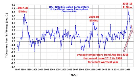
Based upon this chart, as we enter the home stretch, it now looks like a horse race to see whether 2016 will or won’t exceed 1998 as a new record-warm year (since the satellite record began in 1979).
The “official” UAH global image for August, 2016 should be available in the next several days here.
The new Version 6 files (use the ones labeled “beta5”) should be updated soon, and are located here:
Lower Troposphere: http://vortex.nsstc.uah.edu/data/msu/v6.0beta/tlt/uahncdc_lt_6.0beta5.txt
Mid-Troposphere: http://vortex.nsstc.uah.edu/data/msu/v6.0beta/tmt/uahncdc_mt_6.0beta5.txt
Tropopause: http://vortex.nsstc.uah.edu/data/msu/v6.0beta/ttp/uahncdc_tp_6.0beta5.txt
Lower Stratosphere: http://vortex.nsstc.uah.edu/data/msu/v6.0beta/tls/uahncdc_ls_6.0beta5.txt
Simple Time-Dependent Model of the Atmospheric Greenhouse Effect
August 30th, 2016I thought it would be a useful followup to post a simple time-dependent energy balance model (spreadsheet attached) to demonstrate how infrared radiative flows affect the Earth’s surface temperature and atmospheric temperature. (I might have done this before…it sounds familiar).
The model is the simplest I could come up with to demonstrate how an atmosphere that absorbs and emits IR radiation ends up warming the surface, and itself as well, while maintaining an atmospheric temperature below that of the surface.
Here are the basic energy fluxes included in the model. The illustration is just schematic.
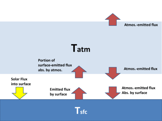
Fig. 1 Cartoon representation of the energy flows in the simple time-dependent energy balance model of the climate system
The energy input from the sun is fixed at an assumed 240 Watts per sq. meter. The radiative fluxes use the Stefan-Boltzmann equation (sigma T^^4), where T is either the surface or atmospheric temperature. Surface emissivity is assumed to be 1 (changing it to 0.95 or less make no difference to the conclusions, only the details).
You can adjust the IR absorptivity of the model in the spreadsheet, which is just a multiplier on the radiative flux coming from the atmosphere, and the radiative flux coming up from the surface and being absorbed by the atmosphere.
The model is initialized at absolute zero Kelvin, and heat capacities are prescribed so you can see the temperature changing over time as the model goes toward energy equilibrium. The heat capacity of the surface and atmosphere are assumed to be the same, equivalent to 1 meter of water for simplicity (the atmosphere is really more like 2 m of water effective heat capacity).
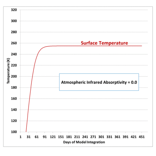
Using “0” for the atmospheric absorptivity leads to a surface temperature of 255 K, and zero atmospheric temperature (the model is radiative only, no convection, no conduction, so without any atmospheric absorption of radiation, the atmosphere cannot warm):
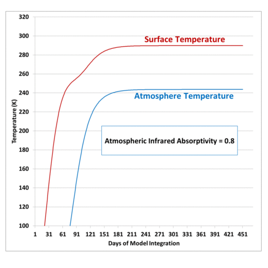
Then, to see how this “no-atmosphere” earth changes with an atmosphere that absorbs and emits IR, an IR absorptivity of 0.8 gives a surface temperature close to 290 K, and an atmospheric temperature of about 244 K.
If the model had dozens of atmospheric layers all interacting, it would produce much higher surface temperatures, and much lower temperatures in the upper atmosphere, producing a strongly super-adiabatic temperature profile (Manabe and Strickler, 1964). This is what causes atmospheric convection, which provides a net transport of heat from the surface to the middle and upper troposphere (not contained in this radiation-only model).
Again, this is an EXTREMELY simplified model of the effect of radiative flows on the global climate system. It is only meant to demonstrate the most basic components of the atmospheric “greenhouse effect”, which act to:
1) make the Earth’s surface warmer than it would otherwise be, and
2) keep the atmosphere cooler than the surface (since the atmosphere cools radiatively to deep space, but partially “blocks” the surface from cooling to space).
UPDATE: Based upon a few comments, it might be useful to point out:
1) the final equilibrium temperature does not depend upon the initial temperature assumed at the beginning of the model integration, it can be 0 K, 100 K, or 1,000 K.
2) the final equilibrium temperature does not depend upon the assumed heat capacities of the Earth’s surface and atmosphere…those just change how much time it takes for equilibrium to be reached.
Experiment Results Show a Cool Object Can Make a Warm Object Warmer Still
August 28th, 2016My previous post explaining a simple experiment to demonstrate that a cool object can make a warm object warmer still led me to give the experiment a try.
The purpose is to demonstrate that, energetically, the atmosphere’s greenhouse effect can make the surface of the Earth warmer than if the greenhouse effect didn’t exist even though the atmosphere is colder than the Earth’s surface. There is no violation of the 2nd Law of Thermodynamics, which states that the net flow of heat must be from higher to lower temperature, which does not preclude cooler object from emitting IR radiation in the direction of warmer objects.
If the atmosphere didn’t exist, the Earth’s surface would lose IR radiation directly to the cold depths of outer space, which is essentially at absolute zero temperature, and emits no energy back to the Earth; but instead the atmosphere, in effect, blocks some of that radiation, and emits some of its own IR radiation back towards the surface.
The net effect is that the surface and lower atmosphere cannot cool as rapidly to deep space, raising its average temperature.
The experiment shown below does not prove that greenhouse gases in the atmosphere perform such a function, only that it is not a violation of the 2nd Law of Thermodynamics for a cooler object emitting infrared radiation to keep a warm object warmer that it would otherwise be if the cooler object was not present.
The reason I am posting this is not to convince the rabid disbelievers, who are probably beyond hope. It is to reduce their influence on others. I’ve discussed all kinds of evidence here, the most convincing is just using a handheld infrared thermometer pointed upward at a “cold” clear sky, then measuring a warmer temperature when point it obliquely at the sky. That shows a cold object (the sky) can warm a surface (the thermopile in the handheld thermometer), even though the sky is colder.
Experimental Setup
The following setup (assisted by one of my daughters) includes a metal plate, painted flat black, and heated with a 250 W flood light. The heated plate has exposed to it a Styrofoam cooler containing ice. The hot plate is kept above the ice to minimize any air convection effects on the results.

Fig. 1. Experimental setup to demonstrate a cooler object can make a heated object even warmer still.
Since a part of the heat budget of the heated plate is its loss of infrared energy to the cold ice, it should be possible to measure an increase in the temperature of the hot plate if the view of the ice is blocked with a second sheet (painted with very high IR emissivity paint, Krylon white #1502) at room temperature.
I tried two setups: the one on the left in Fig. 1 has the temperature probe scotch taped to the hot plate, but it did not stay firmly in contact with the plate, and also the steel plate I used exhibited large temperature gradients. On the right side of Fig 1, a better setup had the temperature probe firmly attached to the back with aluminum tape, and the metal sheet is aluminum flashing, painted flat black. The results presented below are for the arrangement on the right.
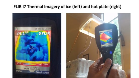
Flir thermal imager measurements of the setup late in the experiment are shown in Fig. 2, where we see the ice is generally below 32 deg. C F (it came from the deep freeze), and the heated plate (in the second phase of the experiment, results below) has a temperature around 110 deg F.
I recorded temperatures every 5 secs with the plate alternately exposed to a view of the ice for 5 minutes, then with the ice covered for 5 minutes. This cycling was repeated five times. The results are shown in Fig. 3. What we see is just what I would expect, that the temperature of the hot plate increases with time when its view of the ice is blocked by the room-temperature sheet.
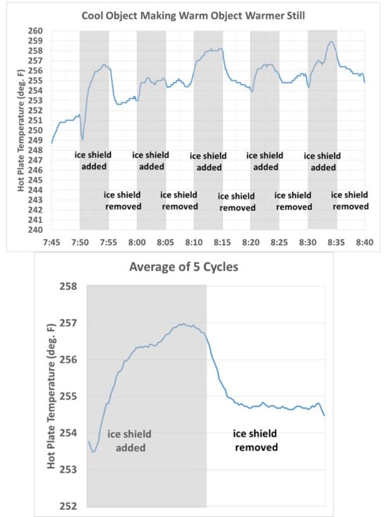
Fig. 3. Time series of temperature of the hot plate as it was alternately exposed to ice, then a room-temperature high-emissivity sheet, every 5 minutes.
Also shown in Fig. 3 are the results averaged over all five cycles, which smooths out some of the noise. The hot plate was so hot that just a small breeze of air from moving the room temperature sheet around the apparatus was found to cool the hot plate by a couple of degrees. The gradual warming trend was due to the ice slowly warming up over the ~1 hr period of the experiment.
Experiments like this often have sources of error when one tries to isolate a certain process. One concern would be whether the room-temperature sheet was slightly reflective to infrared radiation, which would cause the observed temperature effect by reflecting some of the hot-plate emitted IR radiation back on itself. I tested the sheet, which has very high infrared emissivity paint applied, by measuring its IR temperature with the Flir imager outside, both at right angles to the surface, and then at a ~45 deg. angle so the cold sky (today running in the mid-20s deg. F in the Flir measurements) could reflect off the sheet. There was no noticeable difference to a small fraction of a degree, so the paint appears to have an IR emissivity close to 1.0 and is indeed non-reflective in the infrared.
Another concern was the close proximity of the flood lamp to the ice and room temperature shield. If the shield was slightly more reflective to visible light than the ice, it could cause a little more heating of the hot plate. So I moved the lamp down and away from the setup so that there was little noticeable illumination of ice or shield (see the left side of Fig. 4). The hot plate cooled considerably since the lamp wasn’t nearly as close, but the effect of adding the shield was very clear with just one application, with temporary warming of the hot plate until the shield was again removed:
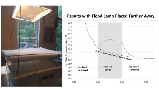
Fig. 4. Second setup where the flood light was place farther away from the plate it was heating, and the results of one cycle with the hot plate shielded from emitting IR toward the ice, then exposed to the ice.
It should be noted that heating a surface with incandescent bulbs will be mainly through infrared radiation, since their emission spectrum is more in the IR than at visible wavelengths. Halogen bulbs, which I did not use, have a somewhat closer spectrum to the solar spectrum.
Conclusion
There is no violation of the 2nd Law of Thermodynamics in the experiment; a cool object can make a warm object even warmer still through infrared radiative effects. The phenomenon can only happen, though, if the cool object replaces something that is even colder, and thereby reduces the rate at which the warm object loses infrared energy to its surroundings. In this experiment, the room temperature plate takes the place of the ice which still emits at around 300 Watts per sq. meter; in the climate system, the atmosphere takes the place of deep space, which emits energy at close to 0 Watts per sq. meter.
The heated plate is placed above the ice so that there is essentially no intermingling of ice-chilled air (which will flow downward) with hot plate-heated air, which will flow upward. Ideally, the experiment would be carried out in a vacuum chamber, so that conduction effects by air would not be present.
There are changes that would make the experiment work better:
1) Dry ice in the place of water ice, to provide a colder target for the hot plate to lose IR energy to;
2) use an open chest freezer (running) covered with a single layer of plastic wrap, so the temperature of the ice won’t increase with time;
3) cover the hot plate holder with plastic wrap, which is about 90% transparent to IR, but will reduce the variations in heat losses due to air currents.
4) if the ice can cover a greater portion of the hemisphere that the plate is losing IR energy too, the effect will be magnified. An open chest freezer would accomplish this, too.
NOTE TO COMMENTERS: I intend to delete any comments which include personal insults.
NOTE TO READERS OF COMMENTS: Some commenters here throw around technical terms and make grand assertions and detailed arguments which I consider fallacious. I do not have time to counter them all every time they arise, although I have addressed virtually all of them in other posts over the years.
Simple Experimental Demonstration that Cool Objects Can Make Warm Objects Warmer Still
August 26th, 2016I continue to receive emails (not to mention the hundreds of sometimes nasty blog comments) objecting to what I just expressed in the title of this article. So, I thought it would be useful to propose a simple experiment that demonstrates the concept.
This is a considerably simpler task than my recently proposed experiment to measure the warming effect of adding CO2 to the atmosphere (which I now believe was not possible, at least as I originally proposed it). This experiment would be easy enough for high school students to perform, and maybe even junior high students. It probably does require a good multi-probe temperature monitoring and data logging device. I use the Extech SD200 three-probe temperature sensor. Alternatively, a $50 handheld IR thermometer might be used in a pinch, if you are careful.
Background
One of the supposed arguments against atmospheric greenhouse gases keeping the Earth’s surface warmer than if those gases were not present is the claim that, since the atmosphere is colder than the surface, it would violate the 2nd Law of Thermodynamics for a cold object (the atmosphere) to increase the temperature of a warm object (the Earths surface).
The Wikipedia entry for the 2nd Law of Thermodynamics includes the following statement from Rudolph Clausius, who formulated one of the necessary consequences of the 2nd Law (emphasis added):
“Heat can never pass from a colder to a warmer body without some other change, connected therewith, occurring at the same time.”
The statement by Clausius uses the concept of ‘passage of heat’. As is usual in thermodynamic discussions, this means ‘net transfer of energy as heat’, and does not refer to contributory transfers one way and the other.
The italicized words are important, and have been ignored by my critics: while it is true that the net flow of heat must be from higher temperature to lower temperature, this does not mean that the lower temperature object cannot (for example) emit radiant energy in the direction of the warmer object, and thus increase the temperature of the warmer object above what it would otherwise be.
But, this statement I just made will lead to endless arguments and objections (watch the comments, below), with hand waving qualitative statements about absorbing and emitting molecules and photons and entropy and perpetual motion and such.
So, let’s envision a simple experiment that will mimic what happens in the climate system, using visible light to heat a warm surface which then cools through infrared radiation toward a cold surface.
Energy Balance of the Global Climate System
The sun’s energy that is absorbed by the Earth’s surface raises its temperature. The surface then loses energy through both (1) non-radiative loss to the atmosphere (conduction, evaporation, and convection), as well as (2) infrared radiative loss to the atmosphere and to outer space.
What is interesting is that the clear atmosphere is mostly transparent to the sunlight passing through it and warming the system, but it is not transparent to the infrared radiation trying to escape back out to cool the system. This is the basis of the atmospheric “greenhouse effect”.
Now, in order for the climate system to maintain a roughly constant average temperature, there must be energy balance: the rate at which the earth-atmosphere system gains energy from the sun must match the rate at which the system loses infrared energy to the cold depths of outer space, which has a radiating temperature of almost absolute zero. If you can reduce the rate at which it cools to outer space, the climate system will increase its temperature until it emits enough infrared energy to restore radiative balance. This is the basis for global warming theory: increasing carbon dioxide in the atmosphere reduces the rate of IR energy loss to deep space, resulting in some warming. (The warming is actually in the lower atmosphere, while the upper atmosphere cools).
The Experiment
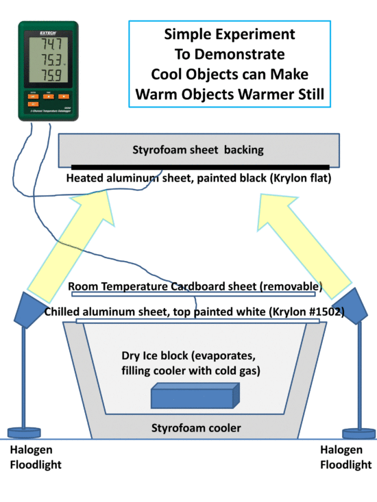
We can mimic these radiative processes by continuously heating one surface with halogen light bulbs (which more closely approximates the solar spectrum of light than incandescent bulbs). The hot surface will then radiatively cool toward a second surface which is chilled (e.g. with dry ice inside a cooler). The heated surface will also lose heat through conduction to the surrounding air, too, but we will reduce that effect with Styrofoam insulation….what we are looking for is a radiative effect.
The following cartoon shows the basic setup.
The heated surface is painted black to absorb as much visible light as possible and raise its temperature. The chilled surface is painted with Krylon white #1502 which has an infrared emissivity close to 1.0 (allowing it to efficiently absorb IR energy from the heated surface) while the white color also reflects visible light and so avoids heating from the lamps.
At some point, energy balance will be reached when temperatures stabilize. (Of course, eventually all of the dry ice will be used up…so there is limited time to do the experiment…maybe an hour or two). I suggest putting the heated surface on top so any heated air goes upward and away from the experimental setup. Similarly, the chilled surface will have chilled air spilling down the sides.
Now, if we simply insert a piece of room-temperature cardboard in between the heated surface and the chilled surface, we should see an increase in the temperature of the heated surface despite the fact that we just used a cooler (room temperature) object to make a warmer object even warmer still, in apparent violation of the 2nd Law of Thermodynamics. The cardboard can probably just be laid on top of the cooler. Or, a sheet of Styrofoam might work just as well, if not better. The temperature of the air between the heated and chilled surfaces could be monitored with the third probe from the SD200 to answer any objections that the intervening cardboard is somehow reducing the mixing of air between the hot and cold surfaces (which shouldn’t happen anyway, if the heated surface is above and the chilled surface is below).
The intervening cardboard (or Styrofoam) sheet mimics what the atmospheric greenhouse effect does, at least in terms of energy flows (but it’s a solid surface, rather than a gas, so maybe it’s more analogous to the greenhouse effect of thick cirrus clouds, which completely block the transfer of infrared light).
I don’t know just how much the observed temperature increase in the heated surface will be when the cardboard sheet blocks its view of the chilled surface. Maybe 1 deg. F, maybe 10 deg. F. But it should be observable. The effect will be greater the bigger the temperature difference that can be maintained between the heated and chilled surfaces, and the closer you can get them together so the heated surface “sees” mostly the chilled surface, instead ot the room-temperature surroundings with which it is also exchanging infrared radiation.
Now, this experiment does not prove that gases can do what the cardboard has done; that is a separate issue that is much more complicated to demonstrate with an experimental setup. It only answers the 2nd Law violation claims some have made against a cool object (here, the cardboard sheet) causing a heated object to be warmer than if the cool object was not present, which is what the Earth’s greenhouse effect does.
NOTE TO COMMENTERS: I intend to delete any comments which include personal insults.
NOTE TO READERS OF COMMENTS: Some commenters here throw around technical terms and make grand assertions and detailed arguments which I consider fallacious. I do not have time to counter them all every time they arise, although I have addressed virtually all of them in other posts over the years.
Observational Evidence of the “Greenhouse Effect” at Desert Rock, Nevada
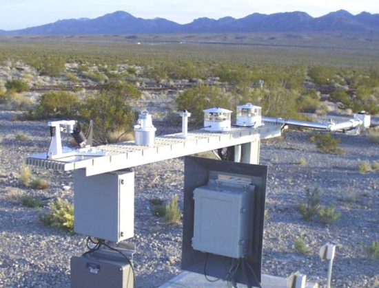
August 23rd, 2016Weather balloon measurements have been made twice daily at Desert Rock, Nevada for many years. In 1998, a surface radiation (SURFRAD) measurement facility was also installed there, which allows new kinds of analysis of how the radiation budget is affected by atmospheric profiles of temperature and humidity.
The location is arid, minimizing the influence of clouds and precipitation, making it an ideal site for analysis of downwelling infrared (IR) sky radiation and how it influences surface temperature.
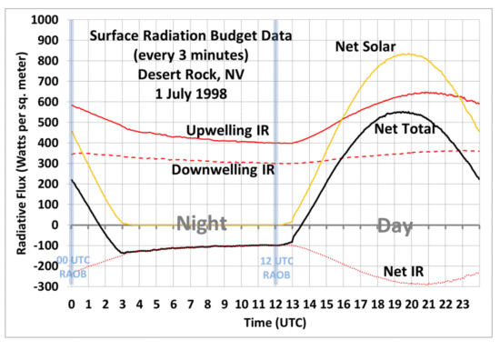
A example of the main radiation components measured every 3 minutes at Desert Rock is shown in the following graph, for July 1, 1998. I have also annotated the approximate times that the radiosonde ascents are made:
There are many more measurements than this in the Desert Rock data archive, such as temperature, wind, relative humidity, barometric pressure, ultraviolet radiation, etc.
Of particular interest is the question: How does the downwelling IR intensity depend on the vertical profiles of temperature and humidity? Obviously, IR intensity depends upon temperature….but there has to be an atmospheric emitter of IR, and that is primarily water vapor.
We can examine the issue using nighttime data, so that we don’t have to deal with the huge fluxes of solar energy during the daytime. If I average the SURFRAD fluxes of downwelling IR between 00 UTC and 12Z every day, and compare them the to average of the 00 and 12 UTC radiosonde profiles in ~100 mb thick atmospheric layers, I can do correlations to see how the nighttime “sky radiation” variability is related to atmospheric temperature and humidity variability.
The results are very interesting:
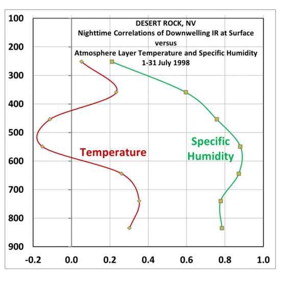
Fig. 3. Correlation coefficients between daily variations of nighttime average downwelling IR and atmospheric temperature and humidity in different layers (vertical axis is pressure altitude, mb), during July 1998 at Desert Rock, NV. Several days that experienced more than scattered clouds and some precipitation were omitted.
The dominant influence of humidity variations on downwelling IR is clearly seen; the greater the humidity, the lower in the atmosphere the downwelling IR radiation measured at the surface originates, and thus the warmer the emitting temperatures and greater the IR intensity.
In contrast, the correlations of downwelling IR variations with temperature variations themselves are rather poor, probably because the temperature variations are so small. Clearly humidity variations dominate the downwelling IR signal, moving the effective radiating altitude up and down as humidity decreases and increases, respectively.
Now, the downwelling IR flux (the dashed line in Fig. 2, above) is what a few of our friends claim does not exist. They claim that there is no “greenhouse effect”, and that the sky (which is almost always colder than the surface) cannot emit IR in the direction of the surface because that would violate the 2nd Law of Thermodynamics.
But, of course, it is the net IR (the sum of upwelling from the warmer surface plus the downwelling from the cooler sky) which must flow from higher to lower temperature, which it does.
So, what, in their minds, is actually being “measured” by these instruments for downwelling IR? Whatever it is, Fig. 3 clearly shows it’s closely related to the humidity of the atmosphere (correlations up to 0.88 for mid-tropospheric humidity), but not very well related to temperature variations in the atmosphere. Barring some sort of conspiracy between all of the atmospheric radiation experts in the world (as well as most of us “skeptics”) it is difficult to imagine how such a “fictitious” measurement, so sensitive to atmospheric humidity, could be constructed by mistake.
But what influence do these variations have on nighttime cooling of surface temperatures? For that is how the “greenhouse effect” is usually expressed: the increase in surface temperatures caused by greenhouse gases compared to if those gases did not exist. It is not possible to answer that question in an absolute sense with measurements because we do not have a full-depth atmosphere with no greenhouse gases we can experiment on. Instead, we can only examine how surface temperature changes by relatively small amounts when the amount of greenhouse gas changes by relatively small amounts.
This can be seen in the next plot, where I have compared the change in surface temperature from 00 UTC (late afternoon) to 12 UTC (early the following morning), to the average downwelling IR during the night:
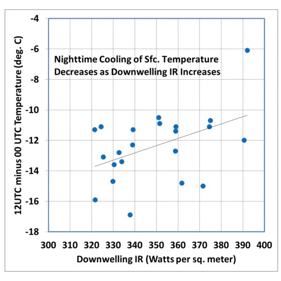
Fig. 4. Nighttime cooling of surface temperatures at Desert Rock during July, 1998 becomes less as downwelling IR intensity increases.
While the relationship is noisy because there are many factors governing nighttime surface cooling (wind speed, storage of solar energy in the soil during the previous day(s), etc.), we still see that the surface temperature drop during the night becomes less as the downwelling IR increases. This follows our daily weather experience that nighttime temperatures cool off more when humidity is lower, all other weather variables being roughly equal.
While the above analysis is preliminary, and there are many more relationships that could be examined (with many more years of data), the results clearly show that increasing greenhouse gas concentration in the atmosphere (in this case, water vapor) increases downwelling IR radiation from the sky, and increases surface temperature. And, while I have used nighttime data to isolate the effect from the complications introduced with daytime solar heating, it should be remembered that infrared effects on surface temperature are occurring 24 hours a day.
Downwelling IR from the sky continuously maintains surface temperatures well above what they would be without greenhouse gases (while at the same time cooling the upper atmosphere well below what it would be without those gases). Surface temperature is a function of energy gain (from the sun) and energy loss (which is reduced by greenhouse gases).
It’s not magic..it’s just physics.
NOTE TO COMMENTERS: I intend to delete any comments which include personal insults.
NOTE TO READERS OF COMMENTS: Some commenters here throw around technical terms and make grand assertions and detailed arguments which I consider fallacious. I do not have time to counter them all every time they arise, although I have addressed virtually all of them in other posts over the years.
Major Hurricane Gaston? A Potential U.S. Threat
August 19th, 2016With the climatological peak in hurricane activity only 3 weeks away, the Atlantic has been fairly quiet so far, despite seasonal forecasts of a more active than normal season.
But recent forecast model runs have been consistently predicting that a low pressure wave in the tropical eastern Atlantic will become Tropical Storm Gaston in the next 5 days or so. Then, it looks like it could intensify into Major Hurricane Gaston, with 110 kt sustained winds by Sunday evening, August 28, which would make Gaston a strong Category 3 hurricane (graphic courtesy of Weatherbell.com):
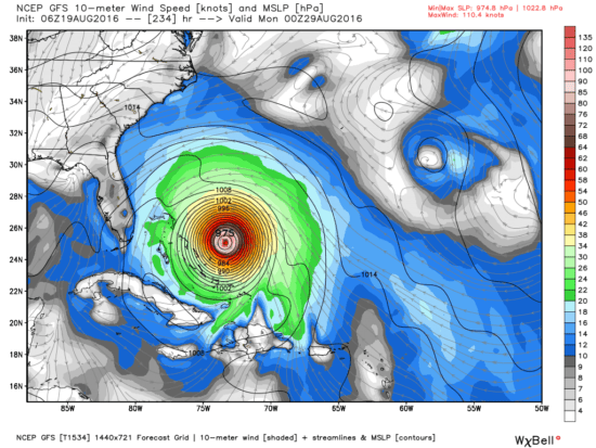
GFS model forecast of seal level pressure and wind speeds for Sunday evening, 28 August 2016. Graphic courtesy of Weatherbell.com.
Of course this is very prelimnary, being almost 10 days out, and the system is currently not even a tropical depression yet. The predicted path of (potential) Gaston is especially uncertain. Interests along the Atlantic and Gulf coasts should monitor this system in the coming days.

 Home/Blog