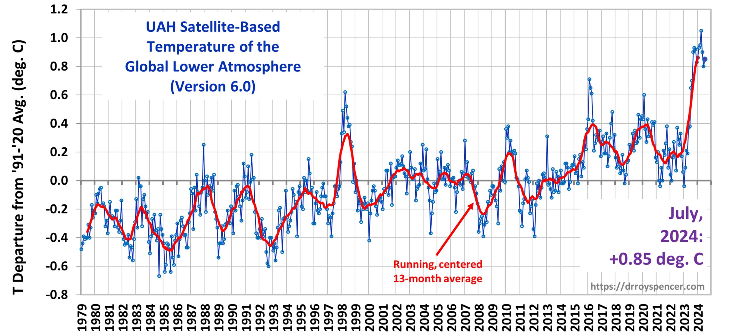
Home/Blog
As the result of complaints I’m getting regarding certain commenters here who can’t make a point without insulting others, I’ve been forced to read through hundreds of comments. I will probably be implementing one or more changes regarding commenting. More on that later…
I’m also seeing some recurring science talking points that are “incorrect” (as incorrect as can be in the realm of science). I’ve gotten where I’ll let bad science be expressed here if it’s done respectfully, and then let others attempt to correct it. But since not everyone can remember what I’ve blogged on in years past (even I can’t remember some of it), I thought it might be good to review some highlights. It might reduce confusion from some of our newer visitors about what *I* understand and promote from the science, rather than letting my allowing of opinions being expressed here being interpreted as some sort of endorsement of others’ ideas.
Yes, the Greenhouse Effect is like a Real Greenhouse
Most objections to using the greenhouse analogy is that the atmosphere does not have a “roof” preventing convective heat loss like a greenhouse does. But those who claim this don’t realize that the greenhouse effect (GHE) is defined with no convective heat transport. The GHE is like a real greenhouse with a perfect roof. The original paper on this is Manabe & Strickler (1964), where they calculated the average surface temperature in pure radiative equilibrium (the surface and each atmospheric layer achieving a temperature where rates of absorbed and emitted radiation are equal– no convection) was about 70 deg. C warmer than what is actually observed. The weaker “33 deg. C” effect you often see attributed to the GHE is actually the sum of [GHE warming + convective cooling]. It is NOT the extra warming from the GHE alone. So, yes, Virginia, Earth’s greenhouse effect is like a real greenhouse (even more so, because its “roof” is perfect, whereas a real greenhouse roof does lose some heat through conduction of heat through the roof and then convective air currents cooling the roof).
No, the Saturation Effect of Increasing CO2 on Global Temperatures is Not Being Ignored in Global Warming Projections
As CO2 increases in the atmosphere, the effect it has on the loss of IR energy to outer space becomes progressively less, producing a saturation effect. But this is true in all climate models as well, including the ones that produce unrealistic (5 deg. C or more) of warming from a doubling of atmospheric CO2. Thus, invoking the “saturation effect” as a magical talisman to refute CO2-induced warming will not work.
In fact, it is not possible for a planetary atmosphere to become totally opaque to IR radiation, because it would have to be fully, 100% saturated across all pressure-broadening affected wavelengths and through the entire depth of the atmosphere. Even Venus, with ~200,000 times as much CO2 as Earth’s atmosphere, is not “saturated” regarding the absorption of IR radiation.
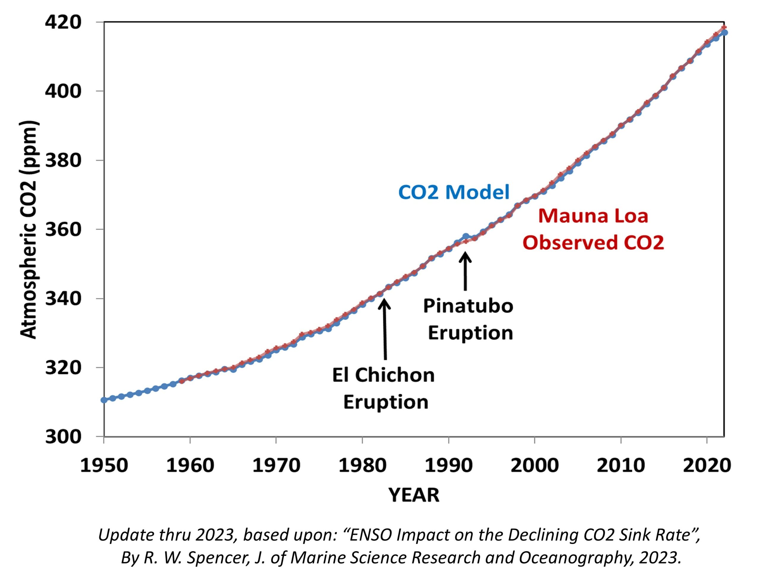
The saturation talking point seems to have ramped up since publication of the recent theoretical line-by-line computations by my friend Will Happer & his co-author last year. But their calculations result in the same amount of radiative forcing from 2XCO2 as others have computed, and (again) are already included in even the most strongly warming climate models out there. Happer’s calculations might be the most complete and accurate to date (I don’t know), but their results do not change what is already in climate models in any significant way.
Yes, the Cold Atmosphere can Keep the Surface Warmer than if the GHE Did Not Exist
Just like adding insulation to the walls in your house in winter can increase the temperature inside (for the same amount of energy input from a furnace), the “cold” atmosphere helps keep the Earth’s surface warmer than if the radiative insulation it provides did not exist. As I’ve stated before, just take a $50 handheld IR thermometer and point it upward in a clear sky, and see how the indicated temperature warms as you point the thermometer obliquely, away from the zenith. That is the GHE acting on the thermopile within the thermometer, raising its temperature because more IR radiation from the sky occurs from the oblique angle than from pointing it straight up…. even though the atmosphere up there is colder than the interior of the thermometer.
A recent experiment posted at Watts Up With That shows how a cooler object can make a warm object even warmer. Over 10 years ago I used a different experimental setup to demonstrate the same thing.
Now, regarding commenting here… To begin with, I think I will spend a couple of hours computing how many of the frequent commenters’ comments here include insults. Would everyone like to see those statistics? Should we consider an award for the person who has the highest percentage of insults?
As you can tell, Dr. Roy is grumpy this morning.
Now, get off my lawn.
UPDATE: I’m going to start limiting comments to 10 per person per day. Also, at least 50% of some commenters’ comments are just insults or other negative noise with no useful input. Start policing your own behavior because in a week or so I might start posting Insult Scores and banning folks. Others visiting this blog don’t want to wade through all of your negativity to find useful insights. Grumble, grumble…