95% of Climate Models Agree: The Observations Must be Wrong

February 7th, 2014

I’m seeing a lot of wrangling over the recent (15+ year) pause in global average warming…when did it start, is it a full pause, shouldn’t we be taking the longer view, etc.

These are all interesting exercises, but they miss the most important point: the climate models that governments base policy decisions on have failed miserably.

I’ve updated our comparison of 90 climate models versus observations for global average surface temperatures through 2013, and we still see that >95% of the models have over-forecast the warming trend since 1979, whether we use their own surface temperature dataset (HadCRUT4), or our satellite dataset of lower tropospheric temperatures (UAH):

CMIP5-90-models-global-Tsfc-vs-obs-thru-2013

Whether humans are the cause of 100% of the observed warming or not, the conclusion is that global warming isn’t as bad as was predicted. That should have major policy implications…assuming policy is still informed by facts more than emotions and political aspirations.

And if humans are the cause of only, say, 50% of the warming (e.g. our published paper), then there is even less reason to force expensive and prosperity-destroying energy policies down our throats.

I am growing weary of the variety of emotional, misleading, and policy-useless statements like “most warming since the 1950s is human caused” or “97% of climate scientists agree humans are contributing to warming”, neither of which leads to the conclusion we need to substantially increase energy prices and freeze and starve more poor people to death for the greater good.

Yet, that is the direction we are heading.

And even if the extra energy is being stored in the deep ocean (if you have faith in long-term measured warming trends of thousandths or hundredths of a degree), I say “great!”. Because that extra heat is in the form of a tiny temperature change spread throughout an unimaginably large heat sink, which can never have an appreciable effect on future surface climate.

If the deep ocean ends up averaging 4.1 deg. C, rather than 4.0 deg. C, it won’t really matter.

UAH Global Temperature Update for January 2014: +0.29 deg. C

February 5th, 2014

The Version 5.6 global average lower tropospheric temperature (LT) anomaly for January, 2014 is +0.29 deg. C, little changed from December (click for full size version):
UAH_LT_1979_thru_January_2014_v5.6

The global, hemispheric, and tropical LT anomalies from the 30-year (1981-2010) average for the last 13 months are:

YR MON GLOBAL NH SH TROPICS
2013 1 +0.497 +0.517 +0.478 +0.386
2013 2 +0.203 +0.372 +0.033 +0.195
2013 3 +0.200 +0.333 +0.067 +0.243
2013 4 +0.114 +0.128 +0.101 +0.165
2013 5 +0.082 +0.180 -0.015 +0.112
2013 6 +0.295 +0.335 +0.255 +0.220
2013 7 +0.173 +0.134 +0.211 +0.074
2013 8 +0.158 +0.111 +0.206 +0.009
2013 9 +0.365 +0.339 +0.390 +0.190
2013 10 +0.290 +0.331 +0.249 +0.031
2013 11 +0.193 +0.160 +0.226 +0.020
2013 12 +0.266 +0.272 +0.260 +0.057
2014 1 +0.291 +0.386 +0.196 -0.027

The global image for January should be available in the next day or so here.

Popular monthly data files (these might take a few days to update):

uahncdc_lt_5.6.txt (Lower Troposphere)
uahncdc_mt_5.6.txt (Mid-Troposphere)
uahncdc_ls_5.6.txt (Lower Stratosphere)

U.S. Dec/Jan Temperatures 3rd Coldest in 30 Years

February 3rd, 2014

NOAA image of minimum temps on Jan. 6, 2014.

NOAA image of minimum temps on Jan. 6, 2014.

Yes, Virginia, it really has been a cold winter.

The winter months of December 2013 and January 2014 averaged over the contiguous 48 United States were the 3rd coldest Dec/Jan in the last 30 years.

The analysis is based upon ~350 NOAA/NWS stations that measure temperatures every 6 hours (or more frequently), many located at airports. This is different from the official NOAA temperature product (update not yet available), which is based upon daily max/min temperatures measured at 1,000+ co-op stations. Those stations have had large adjustments made due to (among other things) changing time of observation (TOBS) over the years.

Here’s a plot of the Dec/Jan averages for the last 41 years (click for large version):
DecJan-USA48-temps-1973-2014

An interesting feature is that 5 of the last 7 years have been below the 41-year average, which has happened only one other time in the 41-year period.

The data I use are adjusted for average spurious urban heat island (UHI) warming that increases with population density around the thermometer site. That relationship is shown at the end of this article. The analysis starts in only 1973 since that is the first year with a large amount of quality-controlled 6-hourly temperature data archived at NOAA.

So, does the cold winter disprove global warming theory? No more than an unusually warm winter proves the theory. It’s just what we used to call “weather”.

UPDATE: John Christy has been running NOAA’s USHCN station data, and with a couple days still missing from the end of January, it looks like the official data will have Dec/Jan (’13/’14) as the 4th (rather than 3rd) coldest in the last 30 years.

SE U.S. Snowstorm Update

January 27th, 2014

Here’s the latest 48 hr total snowfall forecast (from the NAM model) ending Wednesday morning (it assumes all frozen precip. falls as snow…where it’s freezing rain or sleet, the depths will be less):
nam_cum_snow
See our WeatherStreet.com snowstorm forecast page for additional forecast products.

Climate Change’s Inherent Uncertainties

January 26th, 2014

I don’t usually recommend articles on other blogs.

But there is an unusually good essay at Quadrant Online about the pickle climate scientists now find themselves in after selling their souls to their government masters in order to produce “scientific evidence” of human-caused climate change.

In Climate Change’s Inherent Uncertainties, Garth Paltridge also lays out in simple terms why climate forecasts can’t be trusted.

I couldn’t find a single statement that I disagreed with. Which is strange, because I disagree with myself on a routine basis.

SOTU, 2014: Obama will use wintry weather as example of global warming

January 26th, 2014

Obama-climate-change
I predict that, despite the brutally cold weather in DC this Tuesday, Obama will preach on climate change in his State of the Union address. I predict he will even use the cold weather as evidence to support his case.

During his address it looks like there will be a wintry mix starting across the southern reaches of Louisiana, Mississippi, Alabama, Georgia, the Carolinas, and the Florida panhandle. I wouldn’t be surprised if he uses the event as evidence of human-caused climate change.

Precip and cloud forecast for around midnight, Tuesday night.

Precip and cloud forecast for around midnight, Tuesday night.

For those of us old enough to remember, similar events happened back in the epic cold winters of the 1970s. Many instances of snow falling in Florida in the 1800s surely weren’t due to humans. Believe it or not, more snow tends to go with colder weather, not warmer. Go figure.

Snowball fight on the steps of the Florida capitol building, Feb. 10, 1899.

Snowball fight on the steps of the Florida capitol building, Feb. 10, 1899.


Has everyone forgotten that the global warming prophets predicted winters without snow?

And there is no credible evidence that climate change (induced by global warming) can produce colder than normal temperatures. There has been no long-term change in mid-latitude storminess. One climate model out of a hundred might produce colder weather over less than 1% of the Earth with global warming….those are damn long odds to hang your hat on.

But you know that if this winter was 20 deg. above normal rather than below normal, that would be used as evidence of global warming. Some people want to have it both ways. That sounds to me more like political spin than science.

Still, I’m sure the President can find a few scientists who will support him. So he’s covered.

Yes, we live in interesting times.

U.S. temperatures, 1973-2013: A alternative view

January 24th, 2014

Steve Goddard recently posted some results from his analysis of the official U.S. surface temperatures (USHCN, from NOAA) suggesting spurious warming occurring around 1998. I also showed evidence of this back in 2012.

Steve’s post reminded me that it’s been over a year since I’ve updated the U.S.-average Integrated Surface Hourly (ISH) temperature data, using my Population Density Adjusted Temperature (PDAT) algorithm that corrects for changing urban heat island (UHI) effects. This is still an unpublished method, and so should be considered more of a sanity check on the official NOAA USHCN product. But it does support Steve’s contention that there’s something funny going on in the USHCN data.

One of the big differences between my ISH PDAT dataset and the official NOAA products is that mine is based upon about 270 stations which monitor hourly temperatures, from which I compute a daily average temperature from the observations at 00, 06, 12, and 18 UTC. This avoids time-of-observation problems associated with computing daily averages from maximum and minimum temperatures, as is done in the USHCN dataset.

Secondly, my dataset only starts in 1973 because that’s the first year with reasonably complete coverage of the U.S. with the hourly observation sites (not the cooperative observer sites which dominate the USHCN dataset which are more numerous but report daily max and min temperatures).

Thirdly, my adjustment for UHI effects is more straightforward than the NOAA homogenization procedure, which I consider rather “opaque”. I believe the NOAA methodology is prone to warming rural sites to match urban sites, rather than cooling the urban sites to match the rural sites. I can’t prove this because, as I said, the homogenization methodology is, well, opaque. In the U.S., my population density adjustment ends up subtracting off an average of about 0.1 deg. C/decade from the temperature trends, but that varies for each station depending upon the change in population density over time. A good place to start for a description of the population density adjustment to temperatures is here. (I now use a constant population density vs. temperature curve for all areas except the Pacific Northwest and the southwest U.S., which show no obvious average warming effects with population density.)

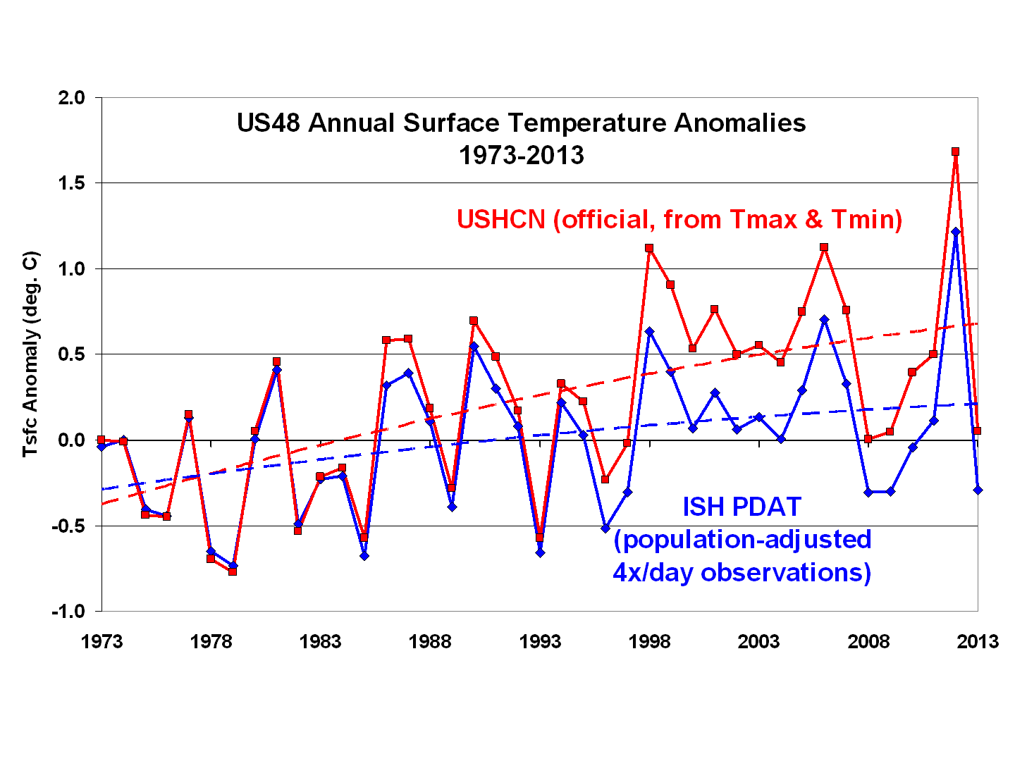
The yearly temperature anomalies for 1973-2013 show that, for the contiguous 48 states, the USHCN Tmax+Tmin observations indicate considerably more warming than the 4x/day temperature observations adjusted for local population density changes (dashed curve fits are 2nd order polynomials):
ISH-PDAT-vs-USHCN-1973-2013
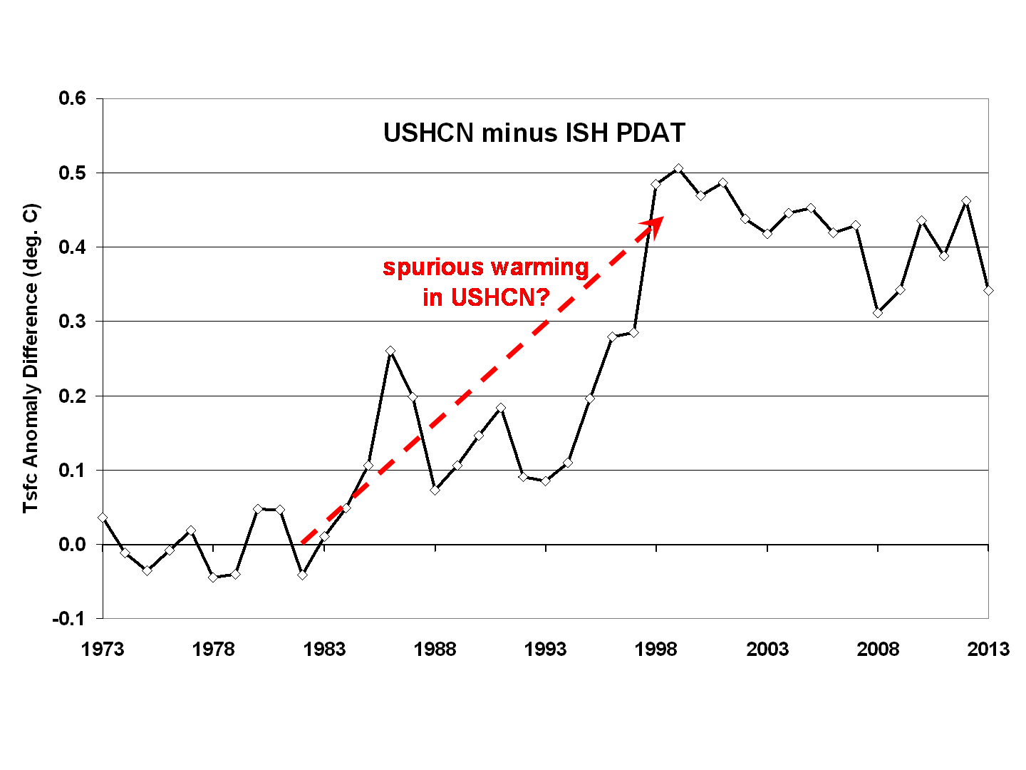
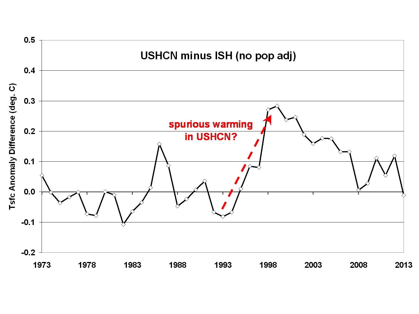
A difference plot of the 2 datasets, as I showed almost 2 years ago, reveals the biggest discrepancy occurs around 1998:
ISH-PDAT-vs-USHCN-differences-1973-2013
I don’t know all of the sources of these discrepancies, which partly remain even if I *don’t* do a population density adjustment to my dataset:
ISH-noPDAT-vs-USHCN-differences-1973-2013
At some point I need to update the population density adjustment, which originally relied on only 1990 and 2000 census data, which I extrapolated forward and backward in time. Now that NASA/SEDAC has population density estimates up to the present, this would provide some improvement to the adjustments for urban heat island effects.

Clearly, adjustments to surface temperature data are at least as large as the global warming signal being sought. Until a transparent analysis of the USHCN methodology is carried out, and alternative methods and temperature datasets are tested, I can’t bring myself to believe any U.S. government pronouncements regarding record warm temperatures.

ADDENDUM
I see that my previous posts don’t really provide the info needed for those interested in how I’m doing the temperature trend adjustments from changes in population density over time. Here’s the regression relationship I am using:
ISH-stn-trends-1973-2012-vs-population-density
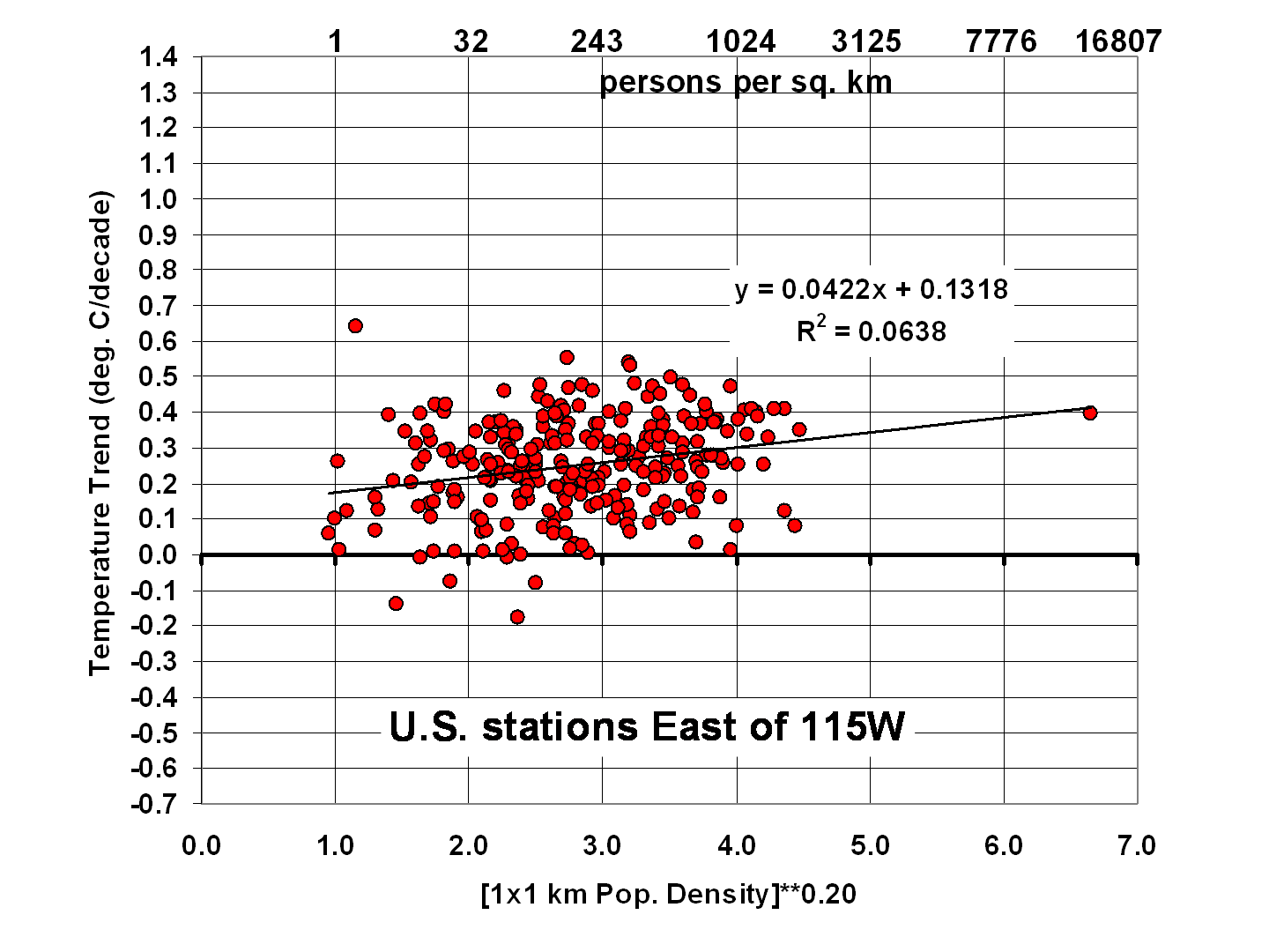
For each station east of 115W, I adjust its temperature anomaly time series using the 0.0422 regression coefficient applied to the change in station location population density (to the 0.2 power) between 1990 and 2000 (extrapolated back to 1973, and forward to 2013). The adjustment starts at zero in 1973, then decreases the trend linearly with time if the population went up, or decreases increases the trend with time if the population went down. The 0.2 power factor is consistent with previous studies that showed the strongest UHI effects occur early in population growth, then level off at higher population densities.

Al Gore’s 10-year warning – only 2 years left, still no warming

January 10th, 2014

It’s been 8 years since Al Gore told us in January 2006 that we had only 10 years left to solve the global warming problem.

In the grand tradition of prophets of doom, his prognostication is not shaping up too well…still no statistically significant warming:
Gores-10-yr-warming-8-yrs-later

And if you use RSS version of the satellite data, it will look even worse for Mr. Gore.

Oh, I know. All that extra energy, hundredths of a degree of it, could be hiding in the deep ocean. Good luck getting Mr. and Mrs. Taxpayer worked up over that one.

John Holdren, Pseudoscience Czar, predicted waste heat would doom humanity

January 10th, 2014

I have to admit to being a little embarrassed for John Holdren, President Obama’s Science Czar. How did this man ever attain such a lofty position, other than his politics?

A couple of days ago, Holdren went on the record claiming the recent cold weather was due to global warming. Published research has found no evidence to back up such a claim…there has been no long-term change in the baroclinic wave pattern. Besides, how does a reduced equator-to-pole temperature gradient lead to more baroclinic wave activity?

But this part of Holdren’s history takes the cake. As described at zombietime.com, Holdren co-authored a book chapter with Paul Ehrlich (the honorary Failed Forecast Czar) back in 1971 entitled Overpopulation and the Potential for Ecocide. In that chapter, they forecast both a human-caused ice age and human-caused warming, with the latter being the biggest threat.

What is astounding from a science perspective is that Holdren blamed warming on waste heat, the result of humans and their energy use, rather than a slowly increasing greenhouse effect. He predicted that the localized nature of this waste heat would eventually spread to be a global problem.

But a little research and few minutes of math (which I assume Holdren learned at some point) would have revealed that humanity’s waste heat generation is, from a global perspective, trivial.

Assuming today’s global energy use is about 150 petawatthours per year, and dividing that by the number of hours in a year and the surface area of the Earth, this yields an average energy flux of 0.03 Watt per sq. meter. This is about 100 times smaller than the estimated heating from increased carbon dioxide in the atmosphere. It is almost 10,000 times smaller than the rate of solar energy input into the Earth.

It scares me that someone with so much energy policy influence has so little knowledge of basic physics.

Global warming meme collection for this week

January 9th, 2014

You have to laugh at least once a day. Because a day without sunshine is like…night.

scotty-polar-vortex

polar-bear-global-warming

blame-this-cold-on-GW

most-interesting-man-climate