
Al Gore meets his match.
Our new paper has finally appeared in Asia Pacific Journal of Atmospheric Science (APJAS). Entitled “
The Role of ENSO in Global Ocean Temperature Changes during 1955-2011 Simulated with a 1D Climate Model“, we use a time-dependent forcing-feedback model of global average ocean temperature as a function of depth to explain the Levitus record ocean temperature variations and trends since 1955.
The modeling philosophy is to answer the question: What combination of net feedback (climate sensitivity) and ocean mixing best explain the observed global average ocean temperature variations since 1955? In the global average, temperature variations are the result of only 3 processes: Forcing, feedback, and ocean mixing. These can be addressed in a simple 1D model.
Our primary interest was to explore how El Nino and La Nina activity since the 1950s affect our interpretation of climate sensitivity. Basically, if all of the ocean warming in the last 50 years (assuming it is real and accurate) has been due to anthropogenic greenhouse gas emissions, it leads to a higher climate sensitivity. But if some of that warming was due to stronger El Nino activity (since the 1970s) it would lead to a lower climate sensitivity. We let a variety of observations tell us how the various influences combine to cause climate change, by varying the model “free” parameters over many thousands of combinations to find a best match to the observations.
We examine three scenarios, shown schematically below.
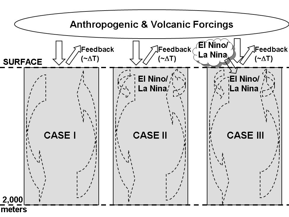
Schematic representation of the 1D forcing-feedback-mixing model. Solid arrows represent radiative energy exchanges, while dashed arrows represent non-radiative energy exchanges.
The first case (CASE I) uses only the RCP radiative forcings (also used by the latest crop of IPCC climate models) to see if we get about the same climate sensitivity as those models get (under the VERY important assumption that those are the ONLY forcings causing warming since the 1950s). This is sort of a sanity check on the model. We run the model with thousands of combinations of climate sensitivity and ocean mixing to get an approximate best-match with the Levitus observations.
In that case we get about 2.2 deg. C of equilibrium warming in response to a doubling of atmospheric CO2, somewhat below the average of the IPCC models. The model fits to the ocean temperature trends as a function of depth are shown in the next figure:
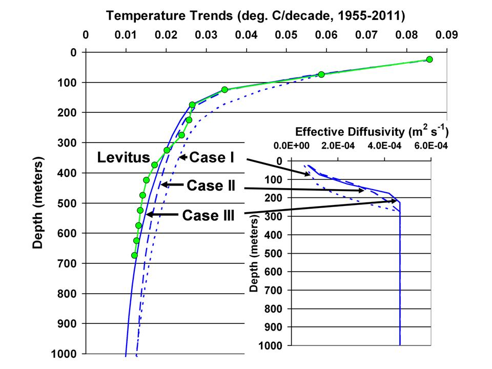
Comparison of three model cases to observed decadal ocean temperature trends as a function of depth, in 50 m layers, for 1955-2011. The layer effective diffusivities used in the model simulations are shown in the inset.
In the second case (CASE II), we add the observed history of El Nino and La Nina activity (from the Multivariate ENSO Index, or MEI) as a change in ocean mixing alone. Basically, using the ocean temperature vs. MEI variations as a guide, we warm the top 100 m of ocean and cool the 100-200 m layer by exactly offsetting amounts, thus conserving thermal energy, in proportion to the strength of El Nino activity. The opposite is done for La Nina activity. Case II leads to a slightly lower climate sensitivity, 2.0 deg. C.
But the third case (CASE III) is the one we were really interested in, because it addresses the debate we have with Andy Dessler over the role of cloud variations associated with El Nino and La Nina. I maintain that the global atmospheric circulations associated with El Nino lead to a slight reduction in global albedo, and so a portion of El Nino warming is actually due to radiative warming of the system, not just a temporary reduction in upwelling of colder water.
In other words, in addition to the model specified feedback parameter (climate sensitivity) which determines how much radiative energy is lost by the Earth to space in response to warming, we also allow the model to change the Earth’s radiative balance preceding warming (or cooling) due to El Nino (or La Nina). The time lead or lag of this “internal radiative forcing” is adjustable, and the model “decides” the best match to the observations.
The observations we use to help guide the model fit is the CERES-observed changes in the global oceanic radiative budget since March 2000. The lag regression plot of these changes in Earth’s radiative budget versus HadSST2 sea surface temperatures shows that only when we include the “internal radiative forcing” aspect of ENSO does the model behavior show the lead-lag behavior seen in the satellite observations:
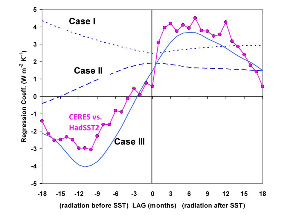
Lag regression coefficients between monthly CERES radiative fluxes and HadSST2 sea surface temperature variations, and compared to the three model simulations
Significantly, when the natural radiative warming effect of El Nino is included, the climate sensitivity is reduced substantially — to 1.3 deg. C.
Basically, a portion of El Nino warming is radiatively forced, probably due to a decrease in low clouds allowing more sunlight in, with the model choosing a 9 month average time lag of the cloud changes preceding the ENSO activity changes.
So, when the Earth went through a ~30 year period of more intense El Nino activity after the mid 1970s, a portion of the warming we experienced was caused by the more frequent El Nino activity. (Although not in the paper, we also found that the model explains the warming before 1940 as a response to stronger El Nino activity back then, as well as the slight cooling from the 1940s to the 1970s from stronger La Nina activity).
Here’s the model response by year for the three Cases, for the 0-50m layer ocean temperature (note how stronger La Ninas explain the lack of recent warming, Case III vs. Case I):
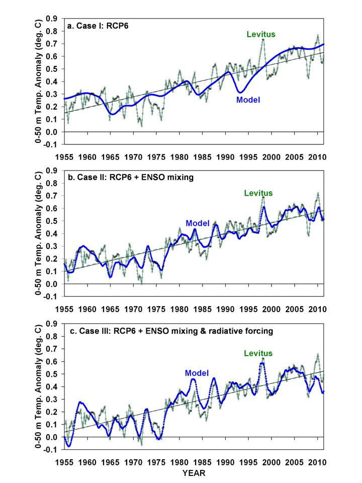
Model simulations of monthly global average 0-50 m layer ocean temperature variations for three cases: (a) only RCP6 radiative forcings; (b) RCP6 plus ENSO-related non-radiative forcing (ocean mixing); and (c) RCP6 plus ENSO-related radiative and non-radiative forcings.
This ENSO-climate change connection has, of course, been hypothesized by others. What we have done is to provide a stronger physically-based framework for quantifying that connection. For example, we find that 1 unit of MEI index (which is 1 standard deviation in the El Nino direction) causes a 0.6 W/m2 of radiative forcing of the climate system.
Again, the model only reproduces the CERES satellite-observed behavior when the radiative budget changes precede the El Nino and La Nina activity, suggesting a cause-and-effect connection. And when that is included, the optimum climate sensitivity chosen by the model is considerably below what the IPCC claims is reasonable for expected warming in our future.
Some of you might recall that Andy Dessler tried to get me to admit that my position was equivalent to saying that “clouds cause El Nino”, which would be inaccurate. What I am saying is that El Nino is associated with changes in Earth’s radiative balance which are not just a feedback response to surface warming, but also force some of that warming. When that “internal radiative forcing” effect is included, optimizing the agreement with 10 years of satellite radiative budget measurements, it considerably reduces the diagnosed sensitivity of the climate system.
In simple terms, the climate system is chaotic, capable of causing global warming (or cooling) all by itself. There probably is no magical normal average albedo, keeping the same amount of sunlight coming in to the climate system year after year. As I keep reminding people, the increase in ocean heat content over the last 50 years is equivalent to a 1 part in 1,000 change in average radiative energy flows. Do we really think nature cannot cause such small changes all by itself?
There needs to be more studies of this type, and I am at a loss to explain why they haven’t been performed. They are relatively easy, and don’t require a marching army of climate modelers. Yet, I will tell you that it is virtually impossible for someone like me to get a proposal specifically funded to perform such a study, because a few gatekeepers in the science community make sure during the peer review process that it doesn’t happen. Instead, we have to piggy-back on other funded projects we have.
I would hope that a simple model like the one we used can help guide the development of the more sophisticated, 3D models. Find a simple, physically-based model that best matches a variety of observations, and add complexity to the model only when it is required to explain observations which the simple model cannot explain.
That’s the way much of science is traditionally done…why not climate science?
Maybe simple modeling studies will gradually emerge from the mainstream climate community, especially with the glaring 15+ year hiatus in warming which is currently being swept under the rug. When they do, I predict it will end up being “their” discovery, not the few skeptics who are working this issue. But I’ve been down this road before, in a previous research life, and I’m OK with that.
Finally, this study leaves open the question of what other natural warming mechanisms there might be out there. We have only addressed ENSO, which alone reduced the diagnosed climate sensitivity in response to increasing CO2 to only 1.3 deg. C, a level I would consider benign or even beneficial. We say nothing about what else might be contributing to warming — I suspect we have already rocked the boat too much.

 Home/Blog


