ENSO and PDO Explain Tropical Average SSTs during 1950-2013

September 26th, 2013

As most of you are aware, the dominant mode of tropical climate variability is the El Nino Southern Oscillation (ENSO), comprised of El Nino (warm ENSO phase) and La Nina (cool ENSO phase) activity.

The IPCC has traditionally maintained that El Nino and La Nina activity effectively cancel each other out over time and so ENSO can’t cause multi-decadal time scale warming or cooling. Some of us think this is nonsense, since we know that there are ~30 year periods when El Ninos are stronger, then ~30 year periods when La Nina is stronger.

So, what does 30 year natural climate change have to do with long-term anthropogenic global warming? Well, AGW is can only explain warming over the last 60 years or so, because there weren’t appreciable greenhouse gas emissions before then. And it just so happens that the last 60 years was comprised of 30 years of stronger La Ninas (cool conditions) followed by 30 years of stronger El Ninos (warm conditions). So, it is only “natural” that some recent papers have (finally!) begun to explore the potential role of natural climate fluctuations in explaining at least some of recent warming (or lack thereof).

While our forthcoming paper will address this in a more physically consistent manner, here I will continue this theme by showing just how easy it is to statistically explain tropical sea surface temperature (SST) variations since 1950 with natural modes of climate variability. This is not an entirely new or novel idea, and if someone else has done something very close to the following, consider this independent verification of their calculations. 😉

You can use statistical linear regression (I did it within Excel, the spreadsheet is here) to explain 5-month running average tropical HadSST3 variations as a linear combination of the Multivariate ENSO Index (MEI), the cumulative MEI index since 1950, and the cumulative Pacific Decadal Oscillation (PDO) index since 1950. The original HadSST3 data, and the model fit are shown in the first panel of the following figure, and the model residuals are shown in the second panel (click for larger version; fitted curves are 3rd order polynomials):
HadSST3-tropics-vs-reg-model

Note the largest excursion in the model residuals (variations the model can’t explain, 2nd panel) is the cooling caused by the Mt. Pinatubo eruption. The linear trends in the observed and model-fitted SSTs are essentially identical.

Of course, the most important (and controversial) aspect of this exercise is explaining the warming trend in terms of the time-accumulation of the MEI index, which would be more than just a statistical artifact *if* persistent La Nina’s early in the record are associated with a net loss of deep-layer ocean thermal energy, and persistent El Nino’s later in the record are associated with a net gain of heat by the ocean. Our paper published next month will show the evidence that this, indeed, happens. The third term in the model equation (time accumulated PDO index) has a smaller influence than the accumulated MEI term, by about a factor of 2.3.

Of course, being a statistical exercise, the above results are far from proof that nature explains everything. From a theoretical perspective, I would expect that increasing CO2 should have some non-zero warming influence.

But as I have mentioned before, the rate of rise in ocean heat content since the 1950s corresponds to only a 1 in 1,000 imbalance in the radiative energy budget of the Earth (~0.25 W/m2 out of ~240 W/m2).

The IPCC’s belief that nature keeps the climate system energy-stabilized to better than 1 part in 1,000 is a matter of faith, not of physical “first principles”.

On Changing ENSO Conditions: The View from SSM/I

September 24th, 2013

Yesterday I posted time series since 1987 of global average oceanic water vapor, surface wind speed, cloud water, and rain rate from the SSM/I and SSMIS instruments. Those plots show the global-average influence of El Nino and La Nina activity.

Today I will show the gridpoint linear trends from those products for the period July 1987 through last Saturday (21 September 2013). The first one (upper left corner) is similar to the one Frank Wentz has at the Remote Sensing Systems website, and shows gridpoint trends in vertically integrated vapor since July 1987 (click for large version):
SSMI-ocean-product-trends-1987-2013

The major patterns shown in these plots are classic La Nina-type patterns, with atmospheric moisture being pushed more towards the western Pacific basin in recent years. The trends reflect the change from stronger El Nino activity over the first ~2/3 of the SSM/I period of record to more La Nina type activity recently.

The recent change from stronger El Nino to stronger La Nina conditions is revealed in monthly Multivariate ENSO Index (MEI) data since 1950…which is also related to the Pacific Decadal Oscillation (PDO, some researchers consider the PDO to be a low-frequency modulation of El Nino and La Nina activity):
MEI-1950-2013
The second panel in the above plot shows the time-cumulative values of MEI since 1950, which is good for seeing the ~30 year periods when one or the other regime persists. (This is nothing new…I and others have pointed this out before).

Of significance to the current ‘global warming hiatus’ issue is the observation that we might have now entered into a new La Nina-dominant phase. In the previous plot, imagine if we repeat the 1950s-1970s period…such a scenario could well lead to a 25- or 30-year period of no warming — or even cooling — just as was experienced up until the 1970s.

But what is different now is the radiative forcing from more CO2 in the atmosphere. Depending upon how sensitive the climate system is, the long-term warming trend from extra CO2 will be superimposed upon the cooling influence of stronger La Nina activity. If the IPCC has overestimated climate sensitivity (which I believe they have), then very weak warming or even flat temperatures could prevail for the next 25-30 years. (Yes, I know I seldom mention solar activity, which I still consider very speculative. But I admit to being under-informed on the issue, so you can probably ignore my opinions on it.)

The fact that it has taken so long for the mainstream climate research community to ‘discover’ the importance of ENSO to multi-decadal climate is very troubling to me. There is no other explanation for them not seeing what was staring them in the face, except the political influence the IPCC and its supporters in government have had on the climate research community, in effect paying them to downplay the role of natural climate variations until nature could no longer be ignored.

Global SSM/I Ocean Product Suite Since 1987

September 23rd, 2013

Our satellite passive microwave radiometer assets have really advanced since the launch of the first Special Sensor Microwave/Imager (SSM/I) in 1987. The SSM/I and SSMIS have been providing global oceanic measurements of surface wind speed, total atmospheric water vapor, total cloud water, and rain rates, since mid-1987.

Frank Wentz and his homies at Remote Sensing Systems have produced intercalibrated ocean products from these sensors and post those products (in binary form, not for the weak of heart) at their ftp server. I’ve downloaded the archive of weekly averages from the separate satellites (you can also get daily and monthly), combined the separate satellites when more than one is operating, and computed weekly anomalies.

Here are the average annual cycles for the 4 products. Note there is little seasonal variations when the oceans are globally averaged:
SSMI-weekly-ocean-products-cycles

Next are the global anomaly time series since July 1987 (departures from the 27-year average weekly cycle, in percent) through Saturday, September 21, 2013.

WATER VAPOR: The vertically-integrated water vapor variations follow sea surface temperature variations rather closely, including moistening during El Nino and drying during La Nina, and support other datasets showing warming until the 1998-2002 time period, then leveling off:
SSMI-weekly-ocean-products-vapor-2013-38

WIND SPEED: Wind speeds tend to decrease during El Nino events and increase during La Nina. I’ll leave it to you to determine whether there has been a recent increase in wind speed which might support Trenberth’s view that increased surface winds have increased ocean mixing and thereby increased the rate of heat storage in the deep ocean:
SSMI-weekly-ocean-products-wind-2013-38

CLOUD WATER:Cloud water tends to increase during El Nino and decrease during La Nina. Also, I’ve previously found from AMSR-E cloud water retrievals that these anomalies correlate positively with CERES reflected sunlight anomalies, so positive values should suggest a cooling influence compared to average:
SSMI-weekly-ocean-products-cloud-2013-38

RAIN RATE:Like water vapor and cloud water, the rain rate anomalies tend to be higher during El Nino and lower during La Nina.
SSMI-weekly-ocean-products-rain-2013-38

The largest and most coherent anomaly patterns will show up during El Nino or La Nina, but right now we are in neutral conditions, so not much is happening. If there is sufficient interest I can provide weekly updates of these plots every week or two (if I’m in town) up through the previous Saturday.

Here’s an Excel spreadsheet with the anomaly time series data from the above 4 plots…please don’t download unless you plan on doing something with the data: SSMI_weekly_global_anoms_60N-60S_percent.

Here are high spatial resolution product examples for the global oceans from today (morning passes from the DMSP F17 satellite SSMIS).

Hurricane Outlooks: An Exercise in Futility?

September 21st, 2013

hurricane-climatology
I believe it was either the hyper-hurricane season of 2005, or the hurricane-drought year of 2006, when my sister living the the Florida Keys complained that the National Hurricane Center shouldn’t even be making seasonal outlooks of hurricane activity.

I defended the NHC outlooks, saying that they do, after all, have some small level of skill. But with this year’s hurricane season shaping up to be another ‘drought’ when ‘floods’ of hurricanes were forecast, I’m beginning to think she had a point. Even if there is “some” skill in forecasting how many hurricanes will form in the entire Atlantic basin, there is no way to know weeks or months in advance where they will hit land, if at all.

In my sister’s case, she and her husband built a nearly hurricane-proof house in Summerland Key, and they were pummeled relentlessly in 2005. Thinking that they needed a safer place to park their sailboat when hurricane season arrives, they then built another coastal house in North Carolina, well west of Cape Hatteras safely tucked up in Pamlico Sound.

Well, guess what happened? Hurricanes stopped hitting the Keys…and instead a hurricane nailed their NC house. So much for planning in advance.

Now, I don’t really think the NHC will ever stop making hurricane season outlooks. I have been told the apparently true story of an U.S. Army Air Force general in World War II who needed a weather forecast weeks in advance, but was told the forecast would have no skill. The general understood that, but needed the forecast “for planning purposes” anyway.

Maybe we can say the same thing about economic forecasts, which also have little skill. People know that have little skill, but make decisions based upon them anyway.

And let’s not forget the IPCC’s super-long-range forecasts of global warming, or climate change, or climate disruption, or whatever they are calling it these days.

I gave an invited talk at a conference of economists a couple years ago, and was struck by how well those on opposite sides of the economic philosophy spectrum got along with each other. I mentioned how antagonistic climate alarmists and skeptics are to one another, and asked why the economists managed to get along so well? I was told that they had all been proved wrong so many times that they had been sufficiently humbled by their experiences.

I can only hope that we are seeing the beginnings of something similar in the climate research community. We skeptics have been saying for years, in effect, “you know, we really don’t know enough about the response of the climate system to be predicting what adding 1 or 2 molecules of CO2 to 10,000 molecules of air is going to do, if anything.”

Warming has stopped. Who would have ever predicted that — except a skeptic?

The IPCC admits they have little confidence in how hurricanes might change with warming. No measures of severe weather, with the possible exception of locally heavy rainfall, have been demonstrated to have changed with warming.

Like hurricane activity, what we can be sure of is that every year, more likely than not, will be different than the previous year. The U.S. will see record warmth one year, then record cold the next. Weather will change, and climate will change.

What direction will it change? Well, you can either spend billions of coins on research to find out, or you can flip one of those coins. The level of skill might well be about the same.

But who needs skill? We need forecasts and outlooks and projections…”for planning purposes”.

Ocean Products from th’ SSM/I

September 19th, 2013

SSMI
What better tide t’ introduce many o’ ye t’ passive microwave ocean products than on national Speak Like a Pirate Day?

I reckon well when I be jus’ a young researcher how I voyagened fer th’ launch o’ th’ first SSM/I (Special Sensor Microwave/Imager), which started providin’ data in th’ moon o’ July 1987.

‘t carried th’ first high frequency microwave channel, 85.5 GHz, thanks t’ Dick Savage, a student o’ Jim Weinman`s (UW-Madison). Dick an’ Jim had figured ou’ that microwave frequencies above 60 GHz ortin’ ta be able t’ observe “cold” (low-emissivity) microwave signatures from thunderstorms, snow, an’ other volume scatterers. An’ they be correct!

An’, aye, Dick Savage be as colorful as his name suggests.

Th’ SSM/I also had a better calibration design than th’ previous SMMR (Scannin’ Multichannel Microwave Radiometer) instrument, which provided sea ice data aft t’ 1979.

Thar would be a series o’ SSM/I`s, built by Hughes Aircraft, followed by th’ SSMIS`s built by Aerojet (aye, confusin’ names, I know). Most o’ th’ current sea ice products ye be seein’ on th’ web be from SSM/I an’ ’tis follow-on, th’ SSMIS.

Anyway, th’ “ocean product suite” o’ ocean surface winds an’ atmospheric vertically integrated water vapor, cloud water, an’ precipitation, ben produced by Frank Wentz an’ his mates at Remote Sensin’ Systems, in Santa Rosa, California. Sea surface temperatures would only be added in mid-2002 wi’ th’ low-frequency 6.9 GHz channel on AMSR-E, th’ instrument fer which I serve as th’ U.S. Science Team leader.

In me opinion, Frank has done more fer th’ interpretation o’ satellite passive microwave measurements than any other single swabbie in me business. He an’ I dasn’t always agree on science (or politics or religion), but he be a national booty in our research community, an’ I consider th’ lad’s a good matey.

I hope t’ start providin’ weekly updates o’ th’ RSS ocean products soon, in th’ form o’ departures from average conditions (anomalies) as well as th’ raw fields, so stay tuned, ya lily livered scallywags!

Pat Michaels Bets $$ on 25 Years of No Warming

September 18th, 2013

global-warming-challenge

This is not Pat Michaels.

As a result of my post yesterday (A Turning Point for the IPCC…and Humanity?), I became aware of a pending bet between Pat Michaels and Scott Supak (a self described progressive environmentalist) regarding the future course of global temperatures.

After exchanging e-mails with both Pat and Scott, you can consider this post as the official announcement of the bet:

Dr. Michaels is betting on no statistically significant warming (at the 95% confidence level) in the HadCRUTx data for the 25 year period starting in 1997. Scott is betting on at least that much warming.

Scott doesn’t want to bet more than $250 (he says he likes to spread his betting $$ around), so the potential value of the embarrassment to the loser is probably worth much more than $250 will buy in early 2022. 😉

I find this a rather bold bet for Pat to make, because based upon my calculations he could still lose and have the observed warming trend below ALL 90 of the CMIP5 climate model forecasts we have examined for global average surface temperature for the period 1997 through 2021, inclusive. [The model with the least warming of the 90 during 1997-2021 has only +0.048 deg. C/decade warming; current HadCRUT4 observations since 1997 stands at just over +0.04 deg. C/decade; max model warming is +0.400 deg. C/decade.] But maybe Pat has a better method of computing the statistical significance than I do…I’ll let Pat and Scott work that out.

I just noticed that the range of model trends ALSO means that ALL of the 90 models predict that warming will accelerate from the currently observed warming trend since 1997.

I’m also in discussions with Scott over betting on a trend that would be 1 standard deviation below the average model warming, which would be +0.162 deg. C/decade for 1997-2021, compared to the 90-model average of +0.226 deg. C/decade. He laid down the gauntlet, not me. I try not to forecast future temperatures…too much like betting on a roll of the dice.

If Pat wins, Scott will pay $250 to the Organization for Autism Research. If Scott wins, Pat will pay $250 to the Climate Science Legal Defense Fund.

A Turning Point for the IPCC…and Humanity?

September 17th, 2013

A climate modeler increasing his model's climate sensitivity

A climate modeler increasing his model’s sensitivity.

I usually don’t comment on recently published climate research papers, partly because they rarely add much, and partly because other blogs do a pretty good job of covering them anyway. The reason why I say “they rarely add much” is that there are a myriad of theories that can be justified with some data, but rarely is the evidence convincing enough to hang your hat on them.

One of the things I’ve learned in the climate research business is that it is really easy to be wrong, and really difficult to be right. There are many competing theories of what causes climate change, and they can’t all be correct.

But recent events are quite exceptional. A few recent papers on climate sensitivity, and on the previously under-appreciated role of natural climate variations, and the apparent backing-off by the IPCC on climate sensitivity in the upcoming AR5 report, now warrants a few comments from me. (We also have our own paper, slated to be published on October 31, which will present new results on climate sensitivity and the role of natural climate variations in recent warming.)

By way of background, I have always been convinced that the IPCC was created by bureaucrats to achieve specific policy ends. I was even told so by one of those bureaucrats, Bob Watson, back in the early 1990s. Not that there aren’t ‘true believers’ in the movement. In my experience, the vast majority of the scientists and politicians involved in the IPCC process appear to really believe they are doing what is right for humanity by supporting restrictions on fossil fuel use.

But now, with the IPCC unable to convincingly explain the recent stall in warming (some say a change to weak cooling), the fact that they are forced to actually recognize reality and make changes in their report — possibly reducing the lower bound for future warming, thus reducing the range of climate sensitivity — is quite momentous.

It might well be that so widespread is the public knowledge of the hiatus in warming, recovering Arctic sea ice (at least temporarily), continuing expansion of Antarctic sea ice, failed predictions of previous IPCC reports, etc., are forcing them to do something to save face. Maybe even to keep from being de-funded.

For the last 10-20 years or more, a few of us have been saying that the IPCC has been ignoring the elephant in the room…that the real climate system is simply not as sensitive to CO2 emissions as they claim. Of course, the lower the climate sensitivity, the less of a problem global warming and climate change becomes.

This elephant has had to be ignored at all costs. What, the globe isn’t warming from manmade CO2 as fast as we predicted? Then it must be manmade aerosols cooling things off. Or the warming is causing the deep ocean to heat up by hundredths or thousandths of a degree. Any reason except reduced climate sensitivity, because low climate sensitivity might mean we really don’t have to worry about global warming after all.

And, if that’s the case, the less relevant the IPCC becomes. Not good if your entire professional career has been invested in the IPCC.

But forecasting the future state of the climate system was always a risky business. The Danish physicist, Niels Bohr, was correct: “Prediction is very difficult, especially about the future.”

Unlike daily forecasts made by meteorologists, the advantage to climate prognosticators of multi-decadal forecasts is that few people will remember how wrong you were when your forecast finally goes bust.

Yet, here we are, with over 20 years of forecasts from the early days of climate modelling, and the chickens are finally coming home to roost.

I’m sure the politicians believed we would have had new energy policies in place by now, in which case they could have (disingenuously) claimed their policies were responsible for global warming “ending”. Not likely, since atmospheric CO2 continues to increase, and even by the most optimistic estimates renewable energy won’t amount to more than 15% of global energy generation in the coming decades.

But it’s been nearly 20 years since Al Gore privately blamed us (now, the UAH satellite temperature dataset) for the failure of his earliest attempt at CO2 legislation. Multiple attempts at carbon legislation have failed. The lack of understanding of basic economic principles on the part of politicians and scientists alike led to the unrealistic expectation that humanity would allow the lifeblood of the global economy — inexpensive energy — to be restricted.

Of course, in the U.S. we still have the EPA as a way to back-door policies some politicians desire, without having to go through the inconvenience of our elected representatives agreeing.

But, I digress. My main point is that nothing stands in the way of a popular theory (e.g. global warming) better than failed forecasts. We are now at the point in the age of global warming hysteria where the IPCC global warming theory has crashed into the hard reality of observations. A few of us are not that surprised, as we always distrusted the level of faith that climate modelers had in their understanding of the causes of climate change.

I continue to suspect that, in the coming years, scientists will increasingly realize that more CO2 in the atmosphere is, on the whole, good for life on Earth. Given that CO2 is necessary for life, and that nature continues to gobble up 50% of the CO2 we produce as fast as we can produce it, I won’t be that surprised when that paradigm shift occurs, either.


UAH V5.6 Global Temperature Update for August, 2013: +0.16 deg. C

September 10th, 2013

Sorry for the late temperature update, I’ve been at a NASA AMSR meeting in California.

The Version 5.6 global average lower tropospheric temperature (LT) anomaly for August, 2013 is +0.16 deg. C (click for large version):
UAH_LT_1979_thru_August_2013_v5.6

The global, hemispheric, and tropical LT anomalies from the 30-year (1981-2010) average for the last 20 months are:

YR MON GLOBAL NH SH TROPICS
2012 1 -0.145 -0.088 -0.203 -0.245
2012 2 -0.140 -0.016 -0.263 -0.326
2012 3 +0.033 +0.064 +0.002 -0.238
2012 4 +0.230 +0.346 +0.114 -0.251
2012 5 +0.178 +0.338 +0.018 -0.102
2012 6 +0.244 +0.378 +0.111 -0.016
2012 7 +0.149 +0.263 +0.035 +0.146
2012 8 +0.210 +0.195 +0.225 +0.069
2012 9 +0.369 +0.376 +0.361 +0.174
2012 10 +0.367 +0.326 +0.409 +0.155
2012 11 +0.305 +0.319 +0.292 +0.209
2012 12 +0.229 +0.153 +0.305 +0.199
2013 1 +0.496 +0.512 +0.481 +0.387
2013 2 +0.203 +0.372 +0.033 +0.195
2013 3 +0.200 +0.333 +0.067 +0.243
2013 4 +0.114 +0.128 +0.101 +0.165
2013 5 +0.083 +0.180 -0.015 +0.112
2013 6 +0.295 +0.335 +0.255 +0.220
2013 7 +0.173 +0.134 +0.212 +0.074
2013 8 +0.158 +0.107 +0.208 +0.009

Note: In the previous version (v5.5, still provided to NOAA due to contract with NCDC) the temps are slightly cooler, probably due to the uncorrected diurnal drift of NOAA-18. Recall that in v5.6, we include METOP-A and NOAA-19, and since June they are the only two satellites in the v5.6 dataset whereas v5.5 does not include METOP-A and NOAA-19.

Names of popular data files:

uahncdc_lt_5.6.txt
uahncdc_mt_5.6.txt
uahncdc_ls_5.6.txt


Revisiting Wood’s 1909 Greenhouse Box Experiment, Part II: First Results

August 26th, 2013

In Part I of this series, I mentioned how Wood’s (1909) “greenhouse box” experiment, which he claimed suggested that a real greenhouse did not operate through “trapping” of infrared radiation, was probably not described well enough to conclude anything of substance. I provided Wood’s original published “Note”, which was only a few paragraphs, and in which he admitted that he covered the issue in only cursory detail.

Wood’s experiment was not described well enough to replicate. We have no idea how much sunlight was passed through his plate of rock salt-covered box versus the glass-covered box. We also don’t know exactly how he placed another glass window over the rock salt window, which if it was very close at all, invalidated the whole experiment.

I also mentioned two more recent experiments which came to totally opposite conclusions: one showed a substantial temperature rise in a glass covered box versus one covered with an IR-transparent material, the other did not.

Here I’ll present first results from my own backyard experiment. Ideally, one wants to have identical boxes in terms of their absorption of sunlight and resistance to conductive heat loss. We want to measure just the effects of IR-transparent and IR-opaque materials placed over the boxes on their energy budgets, as measured by a temperature difference of the air trapped within the boxes.

I used inexpensive Styrofoam coolers purchased from WalMart, doubled-up and sealed with transparent packing tape to trap the air space between them. The insides of the coolers were completely lined with adhesive metal tape from Lowes, then sprayed with 3 coats of Krylon #1502 flat white paint, which has a measured IR emissivity of at least 0.99:
Box-experiment-day-2-materials

Temperatures within the boxes are monitored with K-type probes using a 3-probe Extech SD200 thermometer datalogger, set to record temperatures every 2 minutes, as well as the ambient air temperature in the shade of one of the boxes. The probe tips in the boxes were in the shade near one end, half way between the top and bottom of the coolers:
Box-experiment-day-2-datalogger

Both boxes were covered with kitchen plastic wrap (0.5 mil polyethylene), which is approximately 90% transparent to IR. Both coverings are sealed around their periphery with clear packing tape to make the boxes approximately air-tight. A sheet of 0.22 in thick plexiglass was placed about 1 inch above one of the boxes:
Box-experiment-day-2-boxes-side-view

The first thing I discovered is that, without the plexiglass, it was difficult to get the two boxes to run at the same temperature, one being a little warmer (by 5 deg. F or more) as see in the thermal imager photo:
Box-experiment-day-2-1-box-warmer
I believe this was the result of the spray paint…the warmer one had a slightly more textured painted surface, slightly darker in appearance (and thus absorbing more sunlight) while the cooler box had somewhat smoother paint, with a slightly brighter appearance.

The effect of the plexiglass is to block the IR coming out of the box, as is clearly seen in the following FLIR images of the two boxes, where the one on the left has the plexiglass sitting above the plastic wrap (indicated temperatures are for the crosshair locations):
Box-experiment-day-2-FLIR-of-boxes

After monitoring temperatures and deciding that one box was going to run a little warmer even without the plexiglass present, I decided the best way to see if the plexiglass caused IR warming was to place it over one box, then over the other box, switching boxes every 10 minutes. I figured I would then see how the temperature difference between the two boxes changed as a result. I did this for 2 hours, from 3 p.m. until 5 p.m., with the following temperature readings taken every 2 minutes (gridlines, not the arrows, indicate when the plexiglass was swapped):
Box-experiment-day-2-temperature-plot

The effect of the plexiglass can then be most clearly seen when we then plot the temperature difference between the two boxes over that 2 hour period:
Box-experiment-day-2-temp-diff-plot
Now we clearly see the warming effect of the plexiglass. Even though the plexiglass only passes 92% of the visible sunlight, which by itself should cause cooler temperatures, its presence over one box causes that box to warm relative to the other box (or, you can say its absence causes the other box to run cooler).

This is how the “greenhouse effect” works. Even though the plexiglass is at a cooler temperature than the inside of either of the 2 boxes (just as the atmosphere is at a cooler temperature than the solar-heated surface of the Earth), its presence causes warmer temperatures in the box it is placed over.

I don’t believe this is being caused by suppression of convective heat loss from the plastic wrap because I had considerable air space under the plexiglass and there was a light breeze ventilating that air (see UPDATE, below).

Of course, there are many different ways the experiment could be structured. I could have used black paint instead of white, which would have caused higher temperatures, but I wanted the experiment to produce temperatures closer to those seen naturally. I hope that there is enough detail above for others to replicate what I have done, if they wanted to.

Finally, it should be mentioned that using an experiment like this to demonstrate the fundamental mechanism of the greenhouse effect is somewhat difficult because one is trying to produce a marginally increased greenhouse effect over that which is already present. The sky is already largely opaque to the transfer of IR radiation, and so such an experiment tries to measure the incremental warming effect of a solid surface (the plexiglass) over and above that already being produced by downwelling IR from the sky.

UPDATE: Since there is concern expressed that the plexiglass might be inhibiting convective heat loss from the top of whichever box it is placed over (even through there is a 1+” inch air space for ventilation), here are the temperatures of the two boxes from last evening (during which I swapped the plexiglass a couple of times) and during the night:
Box-experiment-nighttime
Importantly, note that even when the interior of the box is cooler than the ambient temperature, the plexiglass has a warming influence. This is better revealed in a plot of the temperature difference between Box 1 and the ambient air temperature:
Box-experiment-nighttime-T-diff
So, since convection can only transport heat from warmer to colder temperatures, convective inhibition cannot explain the warming effect of the plexiglass. It must be an infrared effect.

Revisiting Wood’s 1909 Greenhouse Box Experiment: Part I

August 23rd, 2013

Much is made in some circles of R.W. Wood’s 1909 experiment which supposedly “disproved” the “greenhouse effect”. As we shall see (below) the experiment reported on in the literature has only cursory detail. It also raises questions over the ability of the setup to demonstrate anything of use to the issue of whether downward IR emission from the sky raises the average surface temperature of the Earth.

I’m finally putting together my own experimental setup, which could be easily replicated by others. We now have widely available materials which are better suited to performing the experiment, and it should be an ideal candidate for High School science experiments.

Part of my interest is the fact that at least two attempts at replicating Wood’s experiment (Pratt’s and Nahle’s) came to totally opposite conclusions(!) Vaughan Pratt has told me he is interested in revisiting the experiment he did as well.

But first, here is R.W. Wood’s original note from Philosophical Magazine (1909 Vol. 17, pp. 319-320), which most have probably not bothered to read, and which I believe reveals some serious shortcomings in his experimental setup:

XXIV. Note on the Theory of the Greenhouse
By Professor R. W. Wood (Communicated by the Author)

THERE appears to be a widespread belief that the comparatively high temperature produced within a closed space covered with glass, and exposed to solar radiation, results from a transformation of wave-length, that is, that the heat waves from the sun, which are able to penetrate the glass, fall upon the walls of the enclosure and raise its temperature: the heat energy is re-emitted by the walls in the form of much longer waves, which are unable to penetrate the glass, the greenhouse acting as a radiation trap.

I have always felt some doubt as to whether this action played any very large part in the elevation of temperature. It appeared much more probable that the part played by the glass was the prevention of the escape of the warm air heated by the ground within the enclosure. If we open the doors of a greenhouse on a cold and windy day, the trapping of radiation appears to lose much of its efficacy. As a matter of fact I am of the opinion that a greenhouse made of a glass transparent to waves of every possible length would show a temperature nearly, if not quite, as high as that observed in a glass house. The transparent screen allows the solar radiation to warm the ground, and the ground in turn warms the air, but only the limited amount within the enclosure. In the “open,” the ground is continually brought into contact with cold air by convection currents.

To test the matter I constructed two enclosures of dead black cardboard, one covered with a glass plate, the other with a plate of rock-salt of equal thickness. The bulb of a thermometer was inserted in each enclosure and the whole packed in cotton, with the exception of the transparent plates which were exposed. When exposed to sunlight the temperature rose gradually to 65oC., the enclosure covered with the salt plate keeping a little ahead of the other, owing to the fact that it transmitted the longer waves from the sun, which were stopped by the glass. In order to eliminate this action the sunlight was first passed through a glass plate.

There was now scarcely a difference of one degree between the temperatures of the two enclosures. The maximum temperature reached was about 55oC. From what we know about the distribution of energy in the spectrum of the radiation emitted by a body at 55oC., it is clear that the rock-salt plate is capable of transmitting practically all of it, while the glass plate stops it entirely. This shows us that the loss of temperature of the ground by radiation is very small in comparison to the loss by convection, in other words that we gain very little from the circumstance that the radiation is trapped.

Is it therefore necessary to pay attention to trapped radiation in deducing the temperature of a planet as affected by its atmosphere? The solar rays penetrate the atmosphere, warm the ground which in turn warms the atmosphere by contact and by convection currents. The heat received is thus stored up in the atmosphere, remaining there on account of the very low radiating power of a gas. It seems to me very doubtful if the atmosphere is warmed to any great extent by absorbing the radiation from the ground, even under the most favourable conditions.

I do not pretend to have gone very deeply into the matter, and publish this note merely to draw attention to the fact that trapped radiation appears to play but a very small part in the actual cases with which we are familiar.

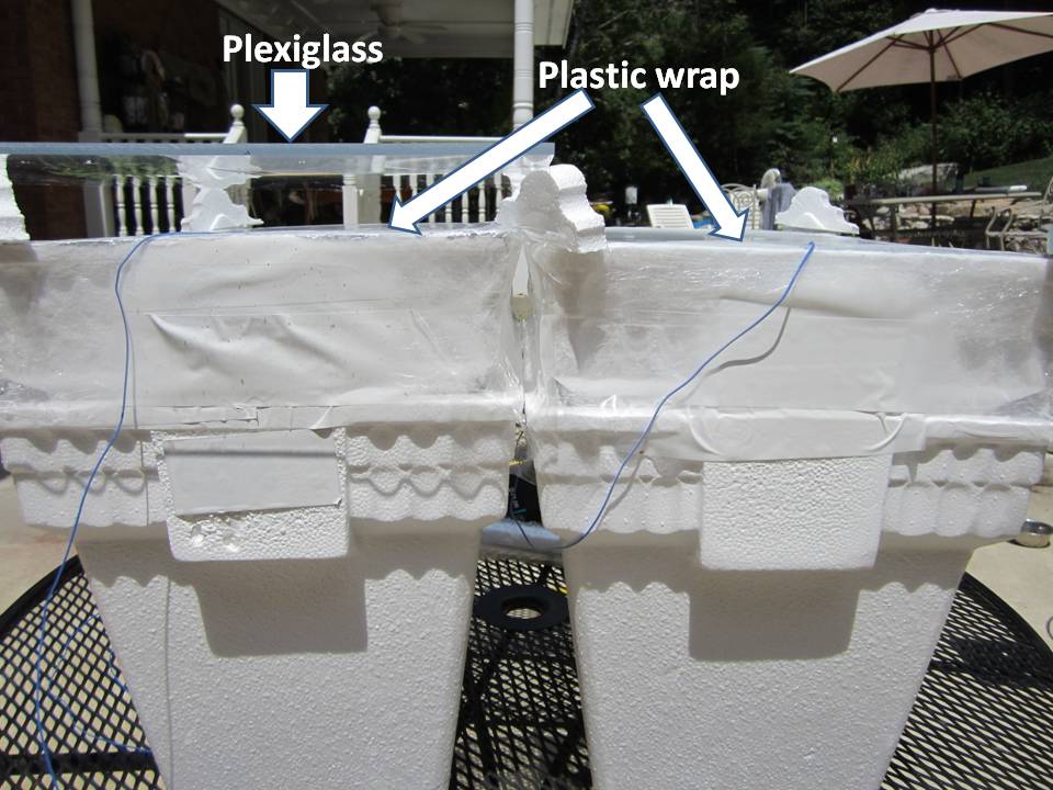
Regarding Wood’s setup, the first question I have is with his use of a rock salt plate, which is indeed mostly transparent to infrared…if it is kept very dry. He said nothing regarding his efforts to keep the plate from absorbing humidity, which will affect its IR transparency. Today, we can use thin polyethylene sheets (e.g. Saran Wrap), which are about 90% transparent to IR.

The second question I have comes from this passage (emphasis added):
“When exposed to sunlight the temperature rose gradually to 65oC., the enclosure covered with the salt plate keeping a little ahead of the other, owing to the fact that it transmitted the longer waves from the sun, which were stopped by the glass. In order to eliminate this action the sunlight was first passed through a glass plate.”

Say what? He put a glass plate in front of the rock salt plate? Well, that would invalidate the experiment altogether! The point was to see whether the IR opaqueness of the glass caused warmer temperatures in the box than did the IR-transparent salt plate. If he put glass over the salt plate, then we no longer have IR transparency, do we?

Another question I have is whether the salt plate and the glass were transmitting the same levels of visible sunlight. Using Saran Wrap (for IR transparency) and Plexiglass (for IR opaqueness) should each pass around 99% over 90% of visible sunlight, from what I have read. Glass is seldom as much as 90% transparent, so it is not the best choice, in my view. The issue is important because, assuming direct sunlight, you might have 800 W/m2 of solar heating available, but a 10% difference in transparency will result in 80 W/m2 difference in how much sunlight is entering the box. This is the same as the difference between downwelling sky radiation (say, 350 W/m2) versus the downward IR emission from a plexiglass plate at 73 deg. F (assuming an IR emissivity close to 1.0).

In other words, two boxes might produce the same interior temperatures (seemingly contradicting greenhouse theory) if a glass covered box is “trapping” 80 W/m2 more IR, but the Saran Wrap covered box is letting in 80 W/m2 more visible sunlight. The covering materials need to be passing very close to the same levels of solar energy. (The IR portion of solar energy flux should be very small since the sun’s emitting temperature is so high, and most of that IR is absorbed by the atmosphere anyway before it ever reaches the ground.) You want an experimental setup where everything is close to identical, except the IR transmission characteristics of the cover material.

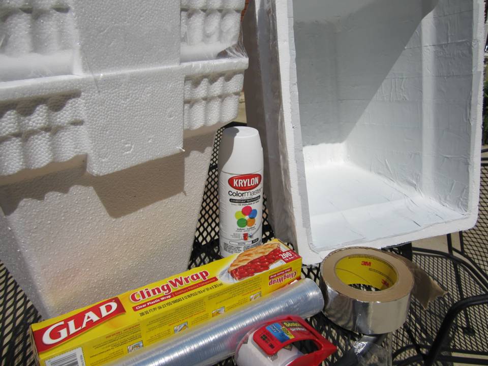
Anyway, this post is meant as an introduction to the experiment I will be carrying out. (I’ve talked to Anthony Watts, who might perform his own experiment at some point.) What I will be using is nested Styrofoam coolers, lined with poster board painted with Krylon #1502 flat white spray paint (0.99 IR emissivity). One cooler will be covered with two layers of Saran Wrap (or equivalent), with an air space for insulation. The other cooler will be covered with Plexiglass. Both coolers will be sealed to be relatively air-tight. I’ve done some calculations which suggest that the similarity in thermal conductivity of the covering materials will be the biggest source of uncertainty….possibly 10 W/m2 or more. Conduction through the doubled Styrofoam containers will be essentially the same, and limited to not much more than 1 W/m2.

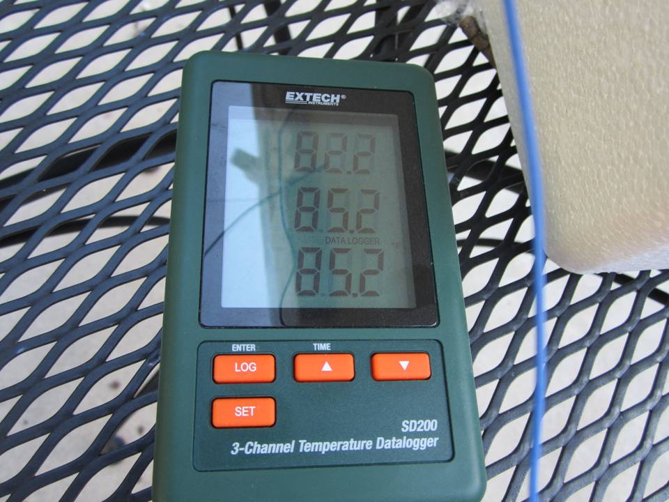
I will be monitoring temperatures with an Extech SD200 3-probe thermometer data logger, which continuously stores 3 temperatures at regular intervals.

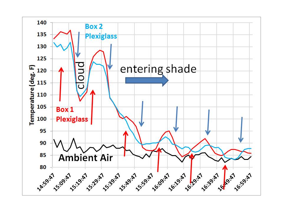
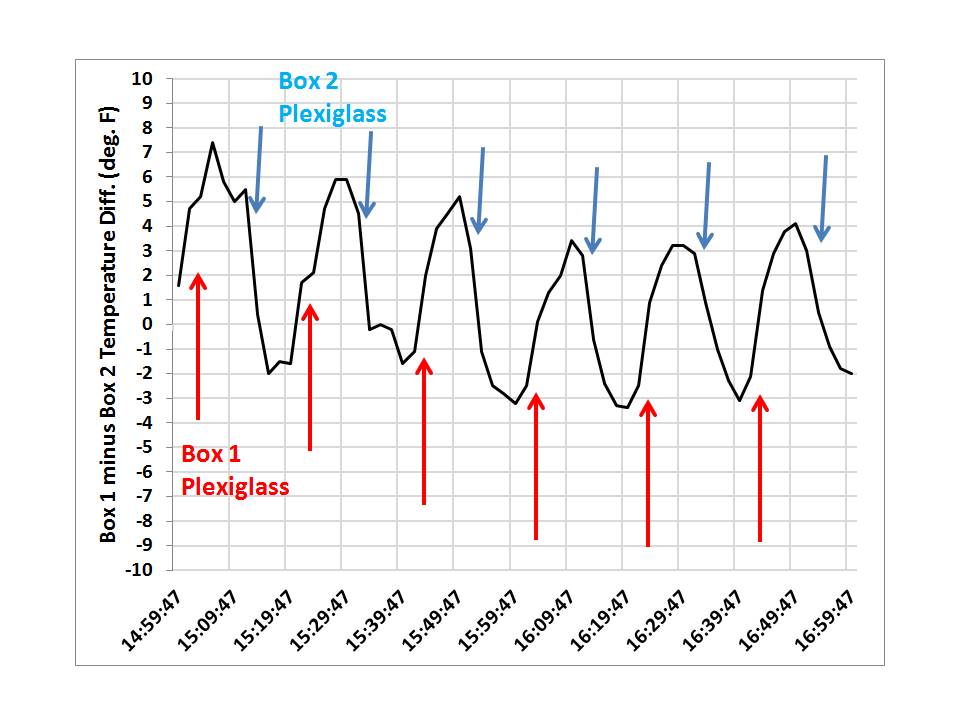
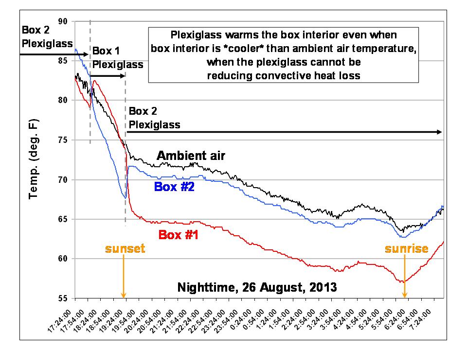
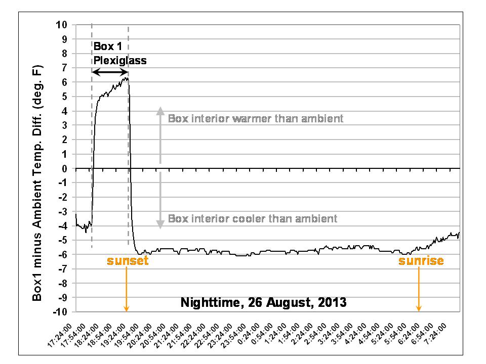
A few of you might recall my backyard box experiment from a few years ago, where I chilled air in a Styrofoam box. This part of the problem is also of interest to me…to see how much cooler at night the air gets in the Saran Wrap covered box than in the Plexiglass covered box. Stay tuned.