It’s Time for the 99% to Start Supporting the 1%

October 17th, 2012

A persistent misconception about our economy is that the same amount of stuff is going to be produced, no matter what government policies are implemented. If that was indeed true, then the political debate only becomes one over how all that stuff is divided up. And that is indeed what many people spend their time debating.

But economic productivity can vary tremendously between countries, and even within a country over time. In fact, there are many poor countries with much lower unemployment than the United States…yet they remain poor.

What really matters for a prosperous nation is what is produced for a given amount of labor. We could have near-zero percent unemployment tomorrow if the government mandated that half the people should dig holes in the ground and the other half fill them up again. But we would be a very poor country, with a very low standard of living.

A high standard of living requires efficiency of production of goods and services that the people want, which in turn requires large investments in facilities, machinery, raw materials, etc. In a competitive free market economy, those investments involve risk…risk that your investment will be lost if someone else figures out a more efficient way to build 10 million smartphones than you figured out.

Now, why would anyone choose to invest large sums of money? Only if they have some hope of receiving much more in return if they are successful. If that incentive provided by the hope for profit is lost, then they will not invest in new business enterprises. No business enterprise for them means no jobs for you.

Our number one priority should be to ensure that producers are allowed to produce, and that they are not penalized for their success. Jobs happen from the top-down (not from the middle-out) when businesses with the money to hire people are allowed the opportunity to succeed.

Yes, a few of them will become rich in the process…but their riches pale in comparison to the greater riches enjoyed by society as a whole through the higher standard of living the good ideas of the rich have enabled. And those profits aren’t kept under a mattress…they are reinvested in the economy, either through expanding the business, hiring more people, or even just buying more stuff which supports other businesses.

Demonizing the rich is demonizing the driving force which elevates the standard of living of the whole country. If you want prosperity, allow the producers to produce. Make it easier for them, not harder.

Not only does this raise our standard of living, it also increases tax revenue, because revenue is a percent of the action, and the more economic activity there is, the greater the tax revenue which is collected to support government services.

And this is how the budget “arithmetic” really works. Balancing the federal budget is not a matter of either (1) increasing tax rates or (2) decreasing spending. That erroneous view mistakenly equates tax rates with tax revenue. Tax revenue (the total number of dollars taken in by the government) is the tax rate multiplied by economic activity. Lowering tax rates, especially on businesses, stimulates economic activity, which then increases tax revenue.

You Don’t Really Want to Play by the Same Rules

For those who like the mantra “everyone should play by the same rules”, let me tell you: you don’t really want to play by the same rules as business. Business owners typically don’t take their share until all of their employees are paid and all of their other business bills are paid.

For every successful rich person, there were many more who tried to become rich but lost everything. Why is it that so many people want a greater share from those who have succeeded, but don’t want to share in the losses of those who failed to become rich?

What if the business you work for fails? How would you like to pay back all of the salary you earned? You got to keep the money, but the business owner or his/her investors lost that money. Do you really want to play by those rules?

And how would you like to work 12+ hours per day trying to abide by all of the regulations increasingly heaped upon businesses by the government?

It’s time for the 99% to start supporting the 1% a little better, because in the end it is the 1% who enables the 99% to maximize their standard of living.
_____________________________

You can learn more about basic economics from my book Fundanomics: The Free Market Simplified.

UAH V5.5 Global Temp. Update for Sept. 2012: +0.34 deg. C

October 5th, 2012

As discussed in my post from yesterday, the spurious warming in Aqua AMSU channel 5 has resulted in the need for revisions to the UAH global lower tropospheric temperature (LT) product.

Rather than issuing an early release of Version 6, which has been in the works for about a year now, we decided to do something simpler: remove Aqua AMSU after a certain date, and replace it with the average of NOAA-15 and NOAA-18 AMSU data. Even though the two NOAA satellites have experienced diurnal drifts in their orbits, we have found that those drifts are in opposite directions and approximately cancel. (The drifts will be corrected for in Version 6.0).

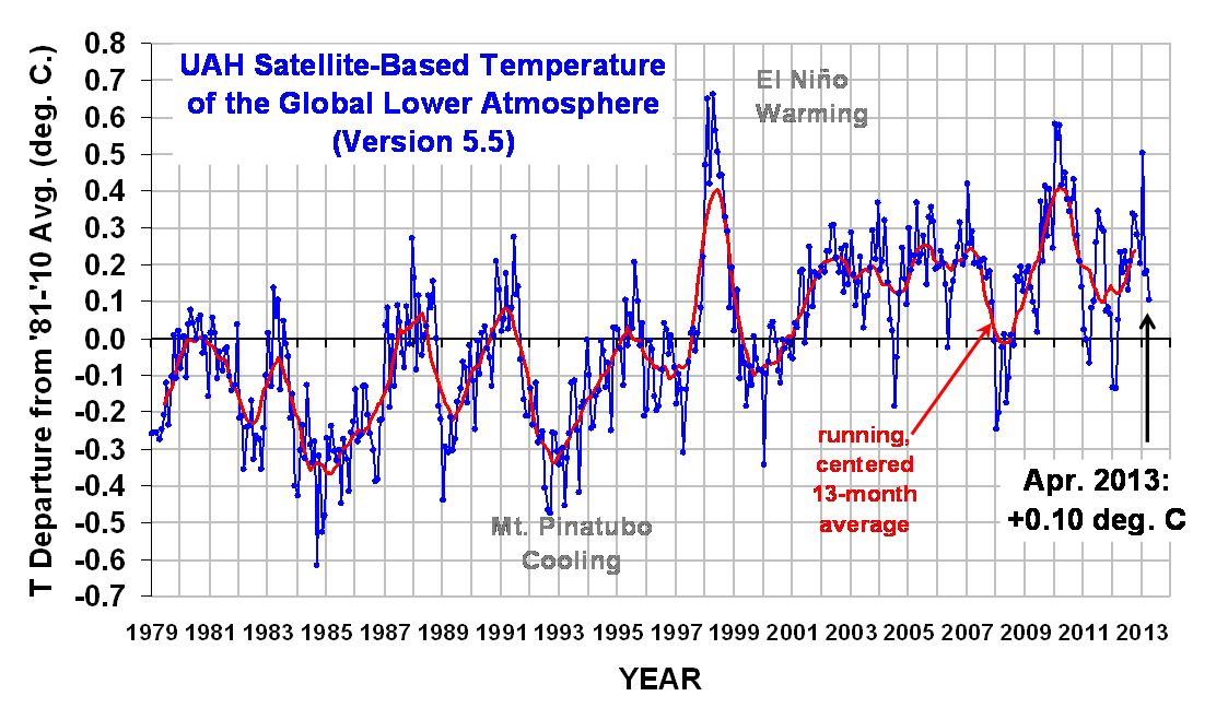
The new interim dataset, Version 5.5, has a September, 2012 global lower tropospheric temperature anomaly of +0.34 deg. C (click for large version):

Note that the new v5.5 dataset brings our monthly anomalies over the last few years somewhat more in line with those from RSS, which have been running significantly cooler than ours. The trend change from v5.4 to v5.5, however, only decreases by 0.001 deg. C/decade. This is partly because the time series is now almost 34 years in length, and adjusting the last several months by 0.1 deg or so is not going to affect the long-term trend substantially.

Evidence of the divergence of Aqua from the two NOAA satellites during 2012 is shown in the next plot:

The global monthly differences between v5.5 and v5.4 are shown next, which reveals the rapid divergence in the last couple months of Aqua AMSU from the average of NOAA-15 1nad NOAA-18 AMSUs:

The Version 5.5 hemispheric and tropical LT anomalies from the 30-year (1981-2010) average since January 2010 are:

YR MON GLOBAL NH SH TROPICS
2010 01 0.581 0.747 0.415 0.660
2010 02 0.542 0.623 0.461 0.738
2010 03 0.577 0.721 0.434 0.665
2010 04 0.416 0.609 0.223 0.596
2010 05 0.449 0.593 0.306 0.679
2010 06 0.376 0.430 0.321 0.464
2010 07 0.343 0.455 0.232 0.303
2010 08 0.376 0.480 0.273 0.216
2010 09 0.430 0.351 0.510 0.114
2010 10 0.278 0.232 0.324 -0.053
2010 11 0.208 0.316 0.100 -0.270
2010 12 0.141 0.207 0.075 -0.441
2011 01 0.022 0.036 0.007 -0.382
2011 02 -0.003 0.005 -0.011 -0.350
2011 03 -0.066 -0.013 -0.120 -0.336
2011 04 0.083 0.132 0.034 -0.233
2011 05 0.101 0.082 0.120 -0.061
2011 06 0.260 0.292 0.229 0.183
2011 07 0.343 0.290 0.396 0.169
2011 08 0.300 0.247 0.353 0.143
2011 09 0.290 0.280 0.301 0.128
2011 10 0.073 0.140 0.006 -0.152
2011 11 0.084 0.072 0.096 -0.060
2011 12 0.066 0.119 0.012 -0.033
2012 01 -0.134 -0.060 -0.203 -0.256
2012 02 -0.135 0.018 -0.289 -0.320
2012 03 0.051 0.119 -0.017 -0.238
2012 04 0.232 0.351 0.114 -0.242
2012 05 0.179 0.337 0.021 -0.098
2012 06 0.235 0.370 0.101 -0.019
2012 07 0.130 0.256 0.003 0.142
2012 08 0.208 0.214 0.202 0.062
2012 09 0.338 0.349 0.327 0.155

Again, Version 5.5 is only meant as an interim solution until our Version 6 is ready, which has new corrections for diurnal drift and an improved calibration strategy for the old MSU instruments.

Our reluctance to make these changes sooner is partly due to the flak we get when we are accused of adjusting temperatures downward for no good reason. There is now sufficient evidence (alluded to above) to make such adjustments.

UAH Global Temperature Update for September, 2012: +?.?? deg. C

October 4th, 2012

I’ve been receiving an increasing number of e-mails asking, basically, is there something wrong with the Aqua satellite daily global temperatures which are posted at the NASA Discover website?

Well, John Christy and I are ready to say, “yes, there is”.

Over the last few years, the NASA Aqua satellite has been our “backbone”, or reference, satellite since it is kept in a stable orbit with on-board propulsion. This means there are no orbital decay adjustments or diurnal drift adjustments necessary for the AMSU measurements made from Aqua.

Because of this advantage Aqua has over the NOAA polar orbiters, the other satellites (NOAA-15 and NOAA-18) are basically forced to agree with the temperature trends from Aqua AMSU in our processing.

Unfortunately, it just so happens that the main channel we use for tropospheric temperature monitoring, AMSU channel 5, has been experiencing increasing noise in recent years on the Aqua satellite. Evidence of this can be seen in the following plot from those 3 satellites (NOAA-15, NOAA-18, and Aqua) over the last 3 years (click for large version):

The numbers plotted are the average absolute differences from each AMSU scan line to the next in our lower tropospheric temperature (LT) retrieval. With a scan line separation of about 50 km, even a noiseless instrument would produce non-zero values because the satellite is always passing over the tropics, then the poles, then the tropics, etc. In other words, the above plot contains both signal and noise.

Obviously, the noise in Aqua AMSU channel 5 has increased dramatically. In fact, the NASA AIRS Team stopped using Aqua AMSU ch. 5 in their temperature retrievals months ago. (BTW, the LT computation causes an amplification of the instrument measurement noise, but the relative increase in Aqua noise vs. the other satellites is not affected, which from the above plot looks like about a factor of 7 or 8).

So, you might ask, why include Aqua AMSU in our processing if the noise is so large? Well, because we use over 300,000 measurements to get a global monthly average. If the noise in Aqua AMSU ch. 5 was truly random, the huge increase in noise seen in the above plot should not cause a drift in the calibration of the instrument.

But increasing noise in a microwave radiometer can have different causes. And not all of the causes would result in truly random noise characteristics. That appears to be the case with Aqua AMSU ch 5.

So What Is the Corrected Temperature Anomaly for September, 2012?

Version 6.0 of our dataset will take care of the diurnal drift effects, but due to our other responsibilities, John and I have not quite finished v6.0. Nevertheless, we think we can we produce a preliminary update in the next couple weeks. The results suggest that there has been a spurious warming in Aqua AMSU LT which has reached close to 0.2 deg. C last month. It has been increasing over the last couple years. Do NOT expect the long term warming trend during 1979-2012 to decrease, though, because there are other changes to the long-term time series which cancels out the recent spurious warming.

Going to the movies? “Snows Of Superior”

October 2nd, 2012


I was recently contacted by a movie producer who expressed interest in a movie script based upon my life. Granted, this guy contacts many people with the same request, hoping someone will have an interesting story to tell.

For years I’ve had people encourage me to write an autobiography, so I took the opportunity of his request to take a few days off of work and write a spec movie script, instead. I needed the diversion anyway.

Wow, what a trip.

Instead of being a story about the global warming wars (which I don’t think would be a commercial success) it ended up being the true story of me starting out as a poor Black child (OK, well, that part is 2/3 true) in rural Amish country, growing up in a dysfunctional family. After moving to Iowa, my mother died unexpectedly (on my 13th birthday) and I was sent away to northern Michigan to live with relatives I didn’t know.

It’s a story of perseverance in spite of numerous obstacles, against a backdrop of the Viet Nam war tearing families apart. An epiphany provided by Mother Nature is what turns things around.

Along the way, I’ve been involved in historical events, and traveled around the world. There are recurring themes from the beginning to the end of the story: poverty and a chronic health problem to overcome, severe weather events, guns, and several brushes with death, to name a few. The global warming debate and congressional testimonies occur near the end of the story, but are mostly intended to support the recurring themes and the protagonist’s struggle to overcome. It’s not a global warming story.

I suppose the closest similarity to an existing movie would be to October Sky (which I love…it’s about Homer Hickham growing up to eventually become a NASA engineer). But I would say my story offers more in the way of personal challenges to overcome and interesting events along the way. And it’s funnier. (By sheer coincidence, Homer attends the church where I perform in a contemporary Christian rock band.)

The bottom line is, I am selfishly using the bully pulpit of my blog to announce that the script (93 111 pages), synopsis, etc. are all finished, so if there are any other movie producers out there who would like to take a look, just let me know.

“Destiny belongs to those who weather the storm.”

Hey, School Teachers: Those Greenhouse Effect Experiments Are Junk

October 2nd, 2012


Now that the kiddies are back in school, I’m seeing greatly increased traffic at my Weather Questions website. The most visited page is almost always the one explaining the greenhouse effect. (WARNING: comments posted in response to this article will undoubtedly include a few from people who claim the greenhouse effect is physically impossible, does not exist, etc. )

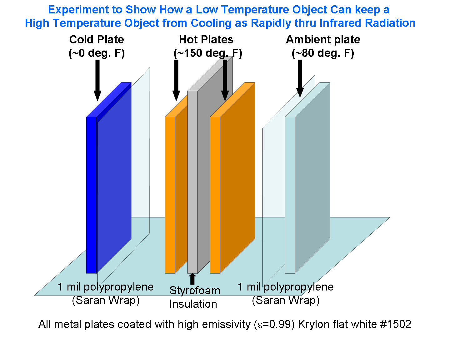
What amazes me are the number of science education web pages out there which claim to describe experiments that supposedly demonstrate the greenhouse effect using jars or other enclosures.

But these experiments can do no such thing.

There is no simple way to demonstrate the greenhouse effect of a small sample of air experimentally with a jar or any other enclosure because over the scale of inches to feet (or even tens of feet) the effect is so weak it cannot be measured with standard thermometers. (Our friend Anthony Watts tried to replicate one totally bogus experiment promoted by Al Gore and Bill Nye the Science Guy).

Now, the infrared absorption properties of small samples of greenhouse gases can indeed be measured with very expensive spectroscopic equipment in a laboratory, but there is no way I know of to do it with jars or other enclosures and a thermometer.

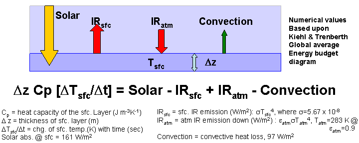
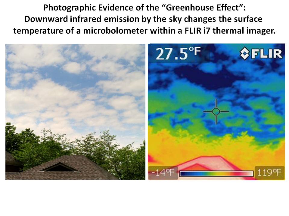
My favorite atmospheric greenhouse effect experiment that does actually work uses an inexpensive handheld infrared thermometer pointed at the sky. This is the most direct demonstration I know of. The reason it is a “direct demonstration” is that the IR thermometer measures tiny temperature changes within the handheld sensor resulting from changes in the amount of IR energy entering the sensor.

This is exactly what the greenhouse effect does to the surface temperature of the Earth: changes in downwelling IR radiation cause changes in surface temperature. It really is that simple.

(NOTE: Even though handheld IR thermometers are supposedly tuned to work at IR wavelengths where atmospheric greenhouse effects are weak, there is still a residual effect. Besides, even if IR thermometers could completely avoid greenhouse gas effects, they would still be sensitive to the greenhouse effect from clouds. Just point the IR thermometer at the clear sky, and then at a low cloud: the warmer IR thermometer reading from the cloud is due to the greenhouse effect from the cloud. Period. End of argument. QED.)

So, science teachers beware. Those greenhouse effect experiments are junk. Do not try them at home.

UAH Global Temperature Update for August, 2012: +0.34 deg. C

September 6th, 2012

The global average lower tropospheric temperature anomaly for August (+0.34 °C) was up from July 2012 (+0.28 °C):

Here are the monthly departures from the 30-year (1981-2010) average:

YR MON GLOBAL NH SH TROPICS
2012 1 -0.09 -0.06 -0.12 -0.13
2012 2 -0.11 -0.01 -0.21 -0.27
2012 3 +0.11 +0.13 +0.10 -0.10
2012 4 +0.30 +0.41 +0.19 -0.12
2012 5 +0.29 +0.44 +0.14 +0.03
2012 6 +0.37 +0.54 +0.20 +0.14
2012 7 +0.28 +0.45 +0.11 +0.33
2012 8 +0.34 +0.38 +0.31 +0.26

As a reminder, the most common reason for large month-to-month swings in global average temperature anomalies (departures from normal) is small fluctuations in the rate of convective overturning of the troposphere, discussed here.

Spurious Warmth in NOAA’s USHCN from Comparison to USCRN

August 22nd, 2012

It looks like the Gold Standard (USHCN) for U.S. temperature monitoring is spuriously warmer than the Platinum Standard (USCRN)

After Anthony Watts pointed out that the record warm July announced by NOAA based upon the “gold standard” USHCN station network was about 2 deg. F warmer than a straight average of the 114 core US Climate Reference Network (USCRN) stations, I thought I’d take a look at these newer USCRN stations (which I will call the “Platinum Standard” in temperature measurement) and see how they compare to nearest-neighbor USHCN stations.

USCRN Stations in Google Earth

First, I examined the siting of the core set of 114 stations in Google Earth. Most of them are actually visible in GE imagery, as seen in this example from Kentucky (click for full-size image):

The most identifiable features of the USCRN sites are the three white solar radiation shields over the 3 temperature sensors, and the circular wind shield placed around the precipitation gauge.

While most of the CRN sites are indeed rural, some of them are what I would call “nearly rural”, and a few will probably have limited urban heat island (UHI) effects due to their proximity to buildings and pavement, such as this one next to a 300 meter-diameter paved surface near Palestine, TX which NASA uses as a research balloon launch site:

The larger image (from October) suggests that the ground cover surrounding the paved area is kept free of vegetation, probably by spraying, except right around the weather sensors themselves.

A few station locations have 2 USCRN sites located relatively close to each other, presumably to check calibration. A particularly interesting pair of sites is near Stillwater, OK, where one site is a few hundred meters from residential Stillwater, while the paired site is about 2.4 km farther out of town:

Whether by design or not, this pair of sites should allow evaluation of UHI effects from small towns. Since the temperature sensors (Platinum Resistance Thermometers, or PRTs) are so accurate and stable, they can be used to establish fairly tiny temperature differences between the few CRN neighboring station pairs which have been installed in the U.S.

From my visual examination of these 114 USCRN sites in Google Earth, the “most visited” site is one in rural South Dakota, which apparently is quite popular with cattle, probably looking for food:

Just 1 km to the southwest is this even more popular spot with the locals:

Hopefully, this USCRN site will not experience any BHI (Bovine Heat Island) effects from localized methane emissions, which we are told is a powerful source of greenhouse warming.

Elevation Effects
One important thing I noticed in my visual survey of the 114 USCRN sites is the tendency for them to be placed at higher elevations compared to the nearby USHCN sites. This is a little unfortunate since temperature decreases with height by roughly 5 deg. C per km, which is 0.5 deg. C per 100 meters, an effect which cannot be ignored when comparing the USCRN and USHCN sites. Since I could not find a good source of elevation data for the USCRN sites, I used elevations from Google Earth.

USCRN and USHCN Station Comparisons

As a first cut at the analysis, I compared all available monthly average temperatures for HCN-CRN station pairs where the stations were no more than 30 km apart in distance and 100 m in elevation. This greatly reduces the number of USCRN stations from nominally 114 to only 42, which were matched up with a total of 46 USHCN stations.

The results for all seasons combined shows that the USHCN stations are definitely warmer than their “platinum standard” counterparts:

The discrepancy is somewhat greater during the warm season, as indicated by the results for just June-July-August:

Regarding that Stillwater, OK USCRN station pair, the site closest to the Stillwater residential area averaged 0.6 deg. C warmer year-round (0.5 deg. C warmer in summer) than the more rural site 2 km farther out of town. This supports the view that substantial UHI effects can arise even from small towns.

The largest UHI effects in the above plots are from USHCN Santa Barbara, CA, with close to 4 deg. C warming compared to the nearby USCRN station. Both stations are located about the same distance (a few hundred meters) from the Pacific Ocean.

What Does this Mean for U.S Temperature Records?

I would say these preliminary results, if they pan out, indicate we should be increasingly distrustful of using the current NOAA USHCN data for long-term trends as supporting evidence for global warming, or for the reporting of new high temperature records. As the last 2 plots above suggest:

1) even at “zero” population density (rural siting), the USHCN temperatures are on average warmer than their Climate Reference Network counterparts, by close to 0.5 deg. C in summer.

2) across all USHCN stations, from rural to urban, they average 0.9 deg. C warmer than USCRN (which approaches Anthony Watt’s 2 deg. F estimate for July 2012).

This evidence suggests that much of the reported U.S. warming in the last 100+ years could be spurious, assuming that thermometer measurements made around 1880-1900 were largely free of spurious warming effects. This is a serious issue that NOAA needs to address in an open and transparent manner.

The good news is that the NOAA U.S. Climate Reference Network is a valuable new tool which will greatly help to better understand, and possibly correct for, UHI effects in the U.S. temperature record. It is to their credit that the program, now providing up to 10 years of data, was created.

Fun with summer statistics. Part 2: The Northern Hemisphere Land

August 15th, 2012

Guest post by John Christy, UAHuntsville, Alabama State Climatologist
(NOTE: Fig. 2.2 has now been extended in time.)

I was finishing up my U.S. Senate testimony for 1 Aug when a reporter sent me a PNAS paper by Hansen et al. (2012) embargoed until after the Hearing. Because of the embargo, I couldn’t comment about Hansen et al. at the Hearing. This paper claimed, among other things, that the proportion of the Northern Hemisphere land area (with weather stations) that exceeded extreme summer hot temperatures was now 10 percent or more for the 2006 to 2011 period.

For extremes at that level (three standard deviations or 3-sigma) this was remarkable evidence for “human-made global warming.” Statistically speaking, the area covered by that extreme in any given hotter-than-average year should only be in the lowest single digits … that is, if the Hansen et al. assumptions are true – i.e., (a) if TMean accurately represents only the effect of extra greenhouse gases, (b) if the climate acts like a bell-shaped curve, (c) if the bell-shaped curve determined by a single 30-year period (1951-1980) represents all of natural climate variability, and (d) if the GISS interpolated and extrapolated dataset preserves accurate anomaly values. (I hope you are raising a suspicious eyebrow by now.)

The conclusion, to which the authors jumped, was that such a relatively large area of recent extremes could only be caused by the enhanced greenhouse effect. But, the authors went further by making an attempt at advocacy, not science, as they say they were motivated by “the need for the public to appreciate the significance of human-made global warming.”

Permit me to digress into an opinionated comment. In 2006, President George W. Bush was wrong when he said we were addicted to oil. The real truth is, oil, and other carbon-based fuels, are merely the affordable means by which we can satisfy our true addictions – long life, good health, prosperity, technological progress, adequate food supplies, internet services, freedom of movement, protection from environmental threats, and so on. As I’ve said numerous times after living in Africa, – without energy, life is brutal and short.

Folks with Hansen’s view are quick to condemn carbon fuels while overlooking the obvious reasons for their use and the astounding benefits they provide (and in which they participate). The lead author referred to coal trains as “death trains – no less gruesome than if they were boxcars headed to the crematoria.” The truth, in my opinion, is the exact opposite – carbon has provided accessible energy that has been indisputably responsible for enhancing security, longevity, and the overall welfare of human life. In other words, carbon-based energy has lifted billions out of an impoverished, brutal existence.

In my view, that is “good,” and I hope Hansen and co-authors would agree. I can’t scientifically demonstrate that improving the human condition is “good” because that is a value judgment about human life. This “good” is simply something I believe to be of inestimable value, and which at this point in history is made possible by carbon.

Back to science. After reading Part 1, everyone should have some serious concerns about the methodology of the Hansen et al. as published in PNAS. [By the way, I went through the same peer-review process for this post as for a PNAS publication: I selected my colleague Roy Spencer, a highly qualified, award-winning climate scientist, as the reviewer.]

With regard to (a) above, I’ve already provided evidence in Part 1 that TMean misrepresents the response of the climate system to extra greenhouse gases. So, I decided to look only at TMax. For this I downloaded the station data from the Berkeley BEST dataset (quality-controlled version). This dataset has more stations than GISS, and can be gridded so as to avoid extrapolated and interpolated values where strange statistical features can arise. This gridding addresses assumption (d) above. I binned the data into 1° Lat x 2° Lon grids, and de-biased the individual station time series relative to one another within each grid, merging them into a single time series per grid. The results below are for NH summer only, to match the results that Hansen et al. used to formulate their main assertions.

In Fig. 2.1 I show the percentage of the NH land areas that Hansen et al. calculated to be above the TMean 3-sigma threshold for 2006 to 2011 (black-filled circles). The next curve (gray-filled circles) is the same calculation, using the same base period (1951-1980), but using TMax from my construction from the BEST station data. The correlation between the two is high, so broad spatial and temporal features are the same. However, the areal coverage drops off by over half, from Hansen’s 6-year average of 12 percent to this analysis at 5 percent (click for full-size version):

Now, I believe assumption (c), that the particular climate of 1951-1980 can provide the complete and ideal distribution for calculating the impact of greenhouse gas increases, displays a remarkably biased view of the statistics of a non-linear dynamical system. Hansen et al. claim this short period faithfully represents the natural climate variability of not just the present, but the past 10,000 years – and that 1981-2011 is outside of that range. Hansen assuming any 30-year period represents all of Holocene climate is simply astounding to me.

A quick look at the time series of the US record of high TMax’s (Fig.1.1 in Part 1) indicates that the period 1951-1980 was one of especially low variability in the relatively brief 110-year climate record. Thus, it is an unrepresentative sample of the climate’s natural variability. So, for a major portion of the observed NH land area, the selection of 1951-80 as the reference-base immediately convicts the anomalies for those decades outside of that period as criminal outliers.

This brings up an important question. How many decades of accurate climate observations are required to establish a climatology from which departures from that climatology may be declared as outside the realm of natural variability? Since the climate is a non-linear, dynamical system, the answer is unknown, but certainly the ideal base-period would be much longer than 30 years thanks to the natural variability of the background climate on all time scales.

We can test the choice of 1951-1980 as capable of defining an accurate pre-greenhouse warming climatology. I shall simply add 20 years to the beginning of the reference period. Certainly Hansen et al. would consider 1931-1950 as “pre-greenhouse” since they considered their own later reference period of 1951-1980 as such. Will this change the outcome?

The result is the third curve from the top (open circles) in Fig. 2.1 above, showing values mostly in the low single digits (6-year average of 2.9 percent) being generally a quarter of Hansen et al.’s results. In other words, the results change quite a bit simply by widening the window back into a period with even less greenhouse forcing for an acceptable base-climate. (Please note that the only grids used to calculate the percentage of area were those with at least 90 percent of the data during the reference period – I couldn’t tell from Hansen et al. whether they had applied such a consistency test.)

The lowest curve in Fig. 2.1 (squares) uses a base reference period of 80 years (1931-2010) in which a lot of variability occurred. The recent decade doesn’t show much at all with a 1.3 percent average. Now, one may legitimately complain that since I included the most recent 30 years of greenhouse warming in the statistics, that the reference period is not pure enough for testing the effect. I understand fully. My response is, can anyone prove that decades with even higher temperatures and variations have not occurred in the last 1,000 or even 10,000 pre-greenhouse, post-glacial years?

That question takes us back to our nemesis. What is an accurate expression of the statistics of the interglacial, non-greenhouse-enhanced climate? Or, what is the extent of anomalies that Mother Nature can achieve on her own for the “natural” climate system from one 30-year period to the next? I’ll bet the variations are much greater than depicted by 1951-1980 alone, so this choice by Hansen as the base climate is not broad enough. In the least, there should be no objection to using 1931-1980 as a reference-base for a non-enhanced-greenhouse climate.

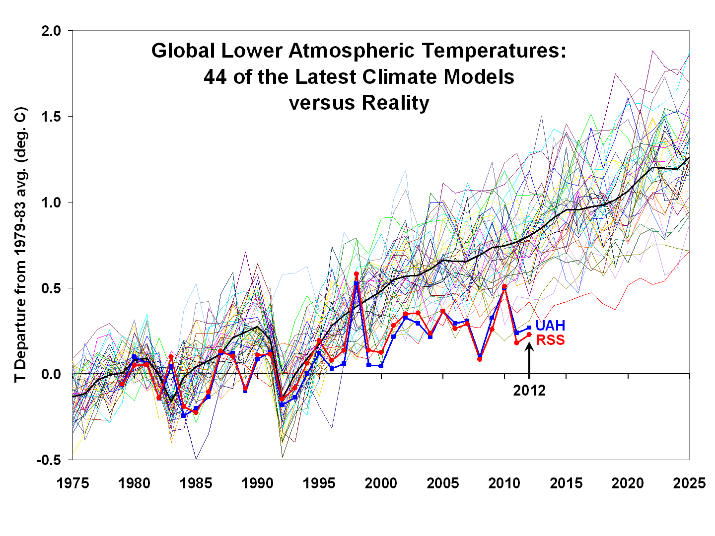
In press reports for this paper (e.g., here), Hansen indicated that “he had underestimated how bad things could get” regarding his 1988 predictions of future climate. According to the global temperature chart below (Fig. 2.2), one could make the case that his comment apparently means he hadn’t anticipated how bad his 1988 predictions would be when compared with satellite observations from UAH and RSS:

By the way, a climate model simulation is a hypothesis and Fig. 2.2 is called ”testing a hypothesis.” The simulations fail the test. (Note that though allowing for growing emissions in scenario A, the real world emitted even more greenhouse gases, so the results here are an underestimate of the actual model errors.)

The bottom line of this little exercise is that I believe the analysis of Hansen et al. is based on assumptions designed to confirm a specific bias about climate change and then, like a legal brief, advocates for public acceptance of that bias to motivate the adoption of certain policies (see Hansen’s Washington Post Op-Ed 3 Aug 2012).

Using the different assumptions above, which I believe are more scientifically defensible, I don’t see alarming changes. Further, the discussion in and around Hansen et al. of the danger of carbon-based energy is simply an advocacy-based opinion of an immensely complex issue and which ignores the ubiquitous and undeniable benefits that carbon-based energy provides for human life.

Finally, I thought I just saw the proverbial “horse” I presumed was dead twitch a little (see Part 1). So, I want to beat it one more time. In Fig. 2.3 is the 1900-2011 analysis of areal coverage of positive anomalies (2.05-sigma or 2.5 percent significance level) over USA48 from the BEST TMax and TMin gridded data. The reference period is 1951-1980:

Does anyone still think TMax and TMin (and thus TMean) have consistently measured the same physical property of the climate through the years?

It’s August and the dewpoint just dipped below 70°F here in Alabama, so I’m headed out for a run.

REFERENCE:
Hansen, J., M. Sato and R. Ruedy, 2012: Perception of climate change. Proc. Nat. Ac. Sci., doi/10.1073/pnas.1205276109.

Fun with summer statistics. Part I: USA

August 13th, 2012

guest post by John Christy, UAHuntsville, Alabama State Climatologist

Let me say two things up front. 1. The first 10 weeks of the summer of 2012 were brutally hot in some parts of the US. For these areas it was hotter than seen in many decades. 2. Extra greenhouse gases should warm the climate. We really don’t know how much, but the magnitude is more than zero, and likely well below the average climate model estimate.

Now to the issue at hand. The recent claims that July 2012 and Jan-Jul 2012 were the hottest ever in the conterminous US (USA48) are based on one specific way to look at the US temperature data. NOAA, who made the announcement, utilized the mean temperature or TMean (i.e. (TMax + TMin)/2) taken from station records after adjustments for a variety of discontinuities were applied. In other words, the average of the daily high and daily low temperatures is the metric of choice for these kinds of announcements.

Unfortunately, TMean is akin to averaging apples and oranges to come up with a rather uninformative fruit. TMax represents the temperature of a well-mixed lower tropospheric layer, especially in summer. TMin, on the other hand, is mostly a measurement in a shallow layer that is easily subjected to deceptive warming as humans develop the surface around the stations.

The problem here is that TMin can warm over time due to an increase in turbulent mixing (related to increasing local human development) which creates a vertical redistribution of atmospheric heat. This warming is not primarily due to the accumulation of heat which is the signature of the enhanced greenhouse effect. Since TMax represents a deeper layer of the troposphere, it serves as a better proxy (not perfect, but better) for measuring the accumulation of tropospheric heat, and thus the greenhouse effect. This is demonstrated theoretically and observationally in McNider et al. 2012. I think TMax is a much better way to depict the long-term temperature character of the climate.

With that as a introduction, the chart of TMax generated by Roy in this post, using the same USHCNv2 stations as NOAA, indicates July 2012 was very hot, coming in at third place behind the scorching summers of 1936 and 1934. This is an indication that the deeper atmosphere, where the greenhouse effect is more directly detected, was probably warmer in those two years than in 2012 over the US.

Another way to look at the now diminishing heat wave is to analyze stations with long records for the occurrence of daily extremes. For USA48 there are 970 USHCN stations with records at least 80 years long. In Fig. 1.1 is the number of record hot days set in each year by these 970 stations (gray). The 1930s dominate the establishment of daily TMax record highs (click for full-size):

But for climatologists, the more interesting result is the average of the total number of records in ten-year periods to see the longer-term character. The smooth curve shows that 10-year periods in the 1930s generated about twice as many hot-day records as the most recent decades. Note too, that if you want to find a recent, unrepresentative, “quiet” period for extremes, the 1950s to 1970s will do (see Part 2 to be posted later).

Figure 1.2 below compares the ten-year averages between high TMax and high TMin records:

There has been a relatively steady rise in high TMin records (i.e. hot nights) which does not concur with TMax, and is further evidence that TMax and TMin are not measuring the same thing. They really are apples and oranges. As indicated above, TMin is a poor proxy for atmospheric heat content, and it inflicts this problem on the popular TMean temperature record which is then a poor proxy for greenhouse warming too.

Before I leave this plot, someone may ask, “But what about those thousands of daily records that we were told were broken this year?” Unfortunately, there is a lot of confusion about that. Records are announced by NOAA for stations with as little as 30 years of data, i.e. starting as late as 1981. As a result, any moderately hot day now will generate a lot of “record highs.” But, most of those records were produced by stations which were not operating during the heat waves of the teens, twenties, thirties and fifties. That is why the plots I’ve provided here tell a more complete climate story. As you can imagine, the results aren’t nearly so dramatic and no reporter wants to write a story that says the current heat wave was exceeded in the past by a lot. Readers and viewers would rather be told they are enduring a special time in history I think.

Because the central US was the focus of the recent heat, I generated the number of Jan-Jul record high daily TMaxs for eight states, AR, IL, IN, IA, KS, MO, NE and OK that includes 2012 (Fig. 1.3):

(Because a few stations were late, I multiplied the number in 2012 by 1.15 to assure their representation). For these states, there is no doubt that the first seven months of 2012 haven’t seen as many record hot days since the 1930s. In other words, for the vast majority of residents of the Central US, there were more days this year that were the “hottest ever” over their lifetimes. (Notice too, that the ten-year averages of TMax and TMin records mimic the national results – high TMin records are becoming more frequent while TMax records have been flat since the 1930s.)

The same plot for the west coast states of CA, OR and WA (Fig. 1.4) shows that the last three years (Jan-Jul only) have seen a dearth of high temperature records:

However, even with these two very different climates, one feature is consistent – the continuously rising number of record hot nights relative to record hot days. This increase in hot nights is found everywhere we’ve looked. Unfortunately because many scientists and agencies use TMean (i.e. influenced by TMin) as a proxy for greenhouse-gas induced climate change, their results will be misleading in my view.

I keep mentioning that the deep atmospheric temperature is a better proxy for detecting the greenhouse effect than surface temperature. Taking the temperature of such a huge mass of air is a more direct and robust measurement of heat content. Our UAHuntsville tropospheric data for the USA48 show July 2012 was very hot (+0.90°C above the 1981-2010 average), behind 2006 (+0.98 °C) and 2002 (+1.00 °C) and just ahead of 2011 (+0.89 °C). The differences (i.e. all can be represented by +0.95 ±0.06) really can’t be considered definitive because of inherent error in the dataset. So, in just the last 34 Julys, there are 3 others very close to 2012, and at least one or two likely warmer.

Then, as is often the case, the weather pattern that produces a sweltering central US also causes colder temperatures elsewhere. In Alaska, for example, the last 12 months (-0.82 °C) have been near the coldest departures for any 12-month period of the 34 years of satellite data.

In the satellite data, the NH Land anomaly for July 2012 was +0.59 °C. Other hot Julys were 2010 +0.69, and 1998 at +0.67 °C. Globally (land and ocean), July 2012 was warm at +0.28 °C, being 5th warmest of the past 34 Julys. The warmest was July 1998 at +0.44 °C. (In Part 2, I’ll look at recent claims about Northern Hemisphere temperatures.)

So, what are we to make of all the claims about record US TMean temperatures? First, they do not represent the deep atmosphere where the enhanced greenhouse effect should be detected, so making claims about causes is unwise. Secondly, the number of hot-day extremes we’ve seen in the conterminous US has been exceeded in the past by quite a bit. Thirdly, the first 10 weeks of 2012’s summer was the hottest such period in many parts of the central US for residents born after the 1930’s. So, they are completely justified when they moan, “This is the hottest year I’ve ever seen.”

By the way, for any particular period, the hottest record has to occur sometime.

REFERENCE
McNider, R.T., G.J. Steeneveld, A.A.M. Holtslag, R.A. Pielke Sr., S. Mackaro, A. Pour-Biazar, J. Walters, U. Nair, and J.R. Christy, 2012: Response and sensitivity of the nocturnal boundary layer over land to added longwave radiative forcing. J. Geophys. Res., 117, D14106, doi:10.1029/2012JD017578.

July 2012 Hottest Ever in the U.S.? Hmmm….I Doubt It

August 8th, 2012

Using NCDC’s own data (USHCN, Version 2), and computing area averages for the last 100 years of Julys over the 48 contiguous states, here’s what I get for the daily High temps, Low temps, and daily Averages (click for large version):

As far as daily HIGH temperatures go, 1936 was the clear winner. But because daily LOW temperatures have risen so much, the daily AVERAGE July temperature in 2012 barely edged out 1936.

Now, of course, we have that nagging issue of just how much urban heat island (UHI) effect remains in the data. The NCDC “homogenization” procedures are not really meant to handle long-term UHI warming, which has probably occurred at most of the 1218 stations used in the above plot.

Also, minimum temperatures are much more influenced by wind conditions and other factors near the surface…Max temperatures give a much better idea of how warm an air mass is over a deep layer.

Also, I thought one month doesn’t make a climate trend? If we look at the 5-year running mean of the daily averages for July’s over the last 100 years, we see that while recent Julys have indeed been warm, it is questionable whether they rival the 1930s:

And if we do the same 5-year averaging on July maximum temperatures, the 1930s were obviously warmer:

So, all things considered (including unresolved issues about urban heat island effects and other large corrections made to the USHCN data), I would say July was unusually warm. But the long-term integrity of the USHCN dataset depends upon so many uncertain factors, I would say it’s a stretch to to call July 2012 a “record”.