
 Home/Blog
Since Gavin Schmidt appears to have dug his heels in regarding how to plot two (or more) temperature times series on a graph having different long-term warming trends, it’s time to revisit exactly why John Christy and I now (and others should) plot such time series so that their linear trend lines intersect at the beginning.
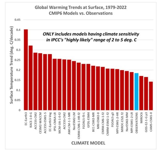
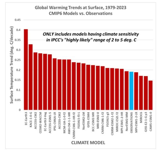
While this is sometimes referred to as a “choice of base period” or “starting point” issue, it is crucial (and not debatable) to note it is irrelevant to the calculated trends. Those trends are the single best (although imperfect) measure of the long-term warming rate discrepancies between climate models and observations, and they remain the same no matter the base period chosen.
Again, I say, the choice of base period or starting point does not change the exposed differences in temperature trends (say, in climate models versus observations). Those important statistics remain the same. The only reason to object to the way we plot temperature time series is to Hide The Incline* in the long-term warming discrepancies between models and observations when showing the data on graphs.
[*For those unfamiliar, in the Climategate email release, Phil Jones, then-head of the UK’s Climatic Research Unit, included the now-infamous “hide the decline” phrase in an e-mail, referring to Michael Mann’s “Nature trick” of cutting off the end of a tree-ring based temperature reconstruction (because it disagreed with temperature observations), and spliced in those observations in order to “hide the decline” in temperature exhibited by the tree ring data.]
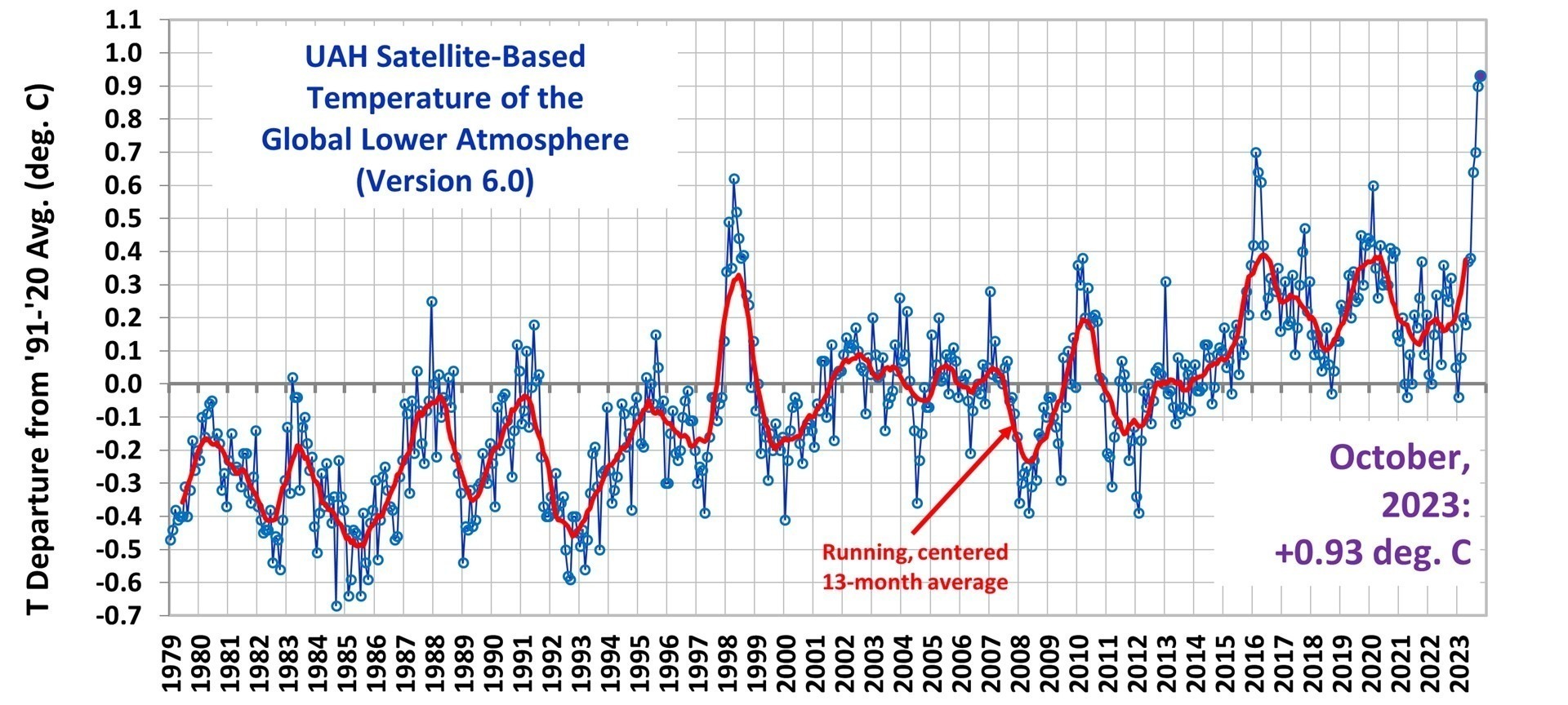
I blogged on this issue almost eight years ago, and I just re-read that post this morning. I still stand by what I said back then (the issue isn’t complex).
Today, I thought I would provide a little background, and show why our way of plotting is the most logical way. (If you are wondering, as many have asked me, why not just plot the actual temperatures, without being referenced to a base period? Well, if we were dealing with yearly averages [no seasonal cycle, the usual reason for computing “anomalies”], then you quickly discover there are biases in all of these datasets, both observational data [since the Earth is only sparsely sampled with thermometers, and everyone does their area averaging in data-void infilling differently], and the climate models all have their own individual temperature biases. These biases can easily reach 1 deg. C, or more, which is large compared to computed warming trends.)
Historical Background of the Proper Way of Plotting
Years ago, I was trying to find a way to present graphical results of temperature time series that best represented the differences in warming trends. For a long time, John Christy and I were plotting time series relative to the average of the first 5 years of data (1979-1983 for the satellite data). This seemed reasonably useful, and others (e.g. Carl Mears at Remote Sensing Systems) also took up the practice and knew why it was done.
Then I thought, well, why not just plot the data relative to the first year (in our case, that was 1979 since the satellite data started in that year)? The trouble with that is there are random errors in all datasets, whether due to measurement errors and incomplete sampling in observational datasets, or internal climate variability in climate model simulations. For example, the year 1979 in a climate model simulation might (depending upon the model) have a warm El Nino going on, or a cool La Nina. If we plot each time series relative to the first year’s temperature, those random errors then impact the entire time series with an artificial vertical offset on the graph.
The same issue will exist using the average of the first five years, but to a lesser extent. So, there is a trade-off: the shorter the base period (or starting point), the more the times series will be offset by short-term biases and errors in the data. But the longer the base period (up to using the entire time series as the base period), the difference in trends is then split up as a positive discrepancy late in the period and a negative discrepancy early in the period.
I finally decided the best way to avoid such issues is to offset each time series vertically so that their linear trend lines all intersect at the beginning. This minimizes the impact of differences due to random yearly variations (since a trend is based upon all years’ data), and yet respects the fact that (as John Christy, an avid runner, told me), “every race starts at the beginning”.
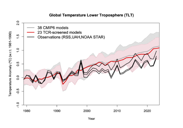
In my blog post from 2016, I presented this pair of plots to illustrate the issue in the simplest manner possible (I’ve now added the annotation on the left):
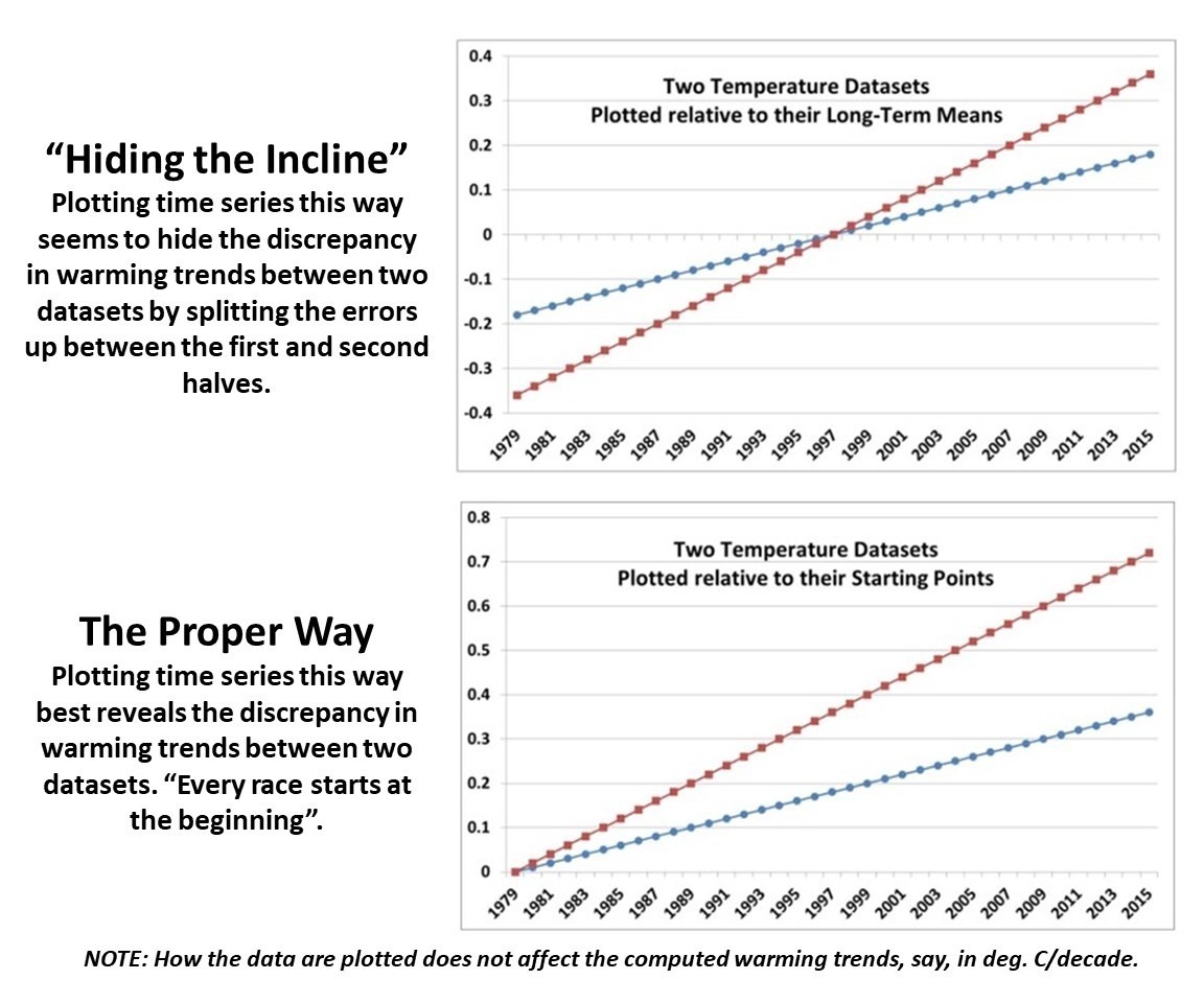
Contrary to Gavin’s assertion that we are exaggerating the difference between models and observations (by using the second plot), I say Gavin wants to deceptively “hide the incline” by advocating something like the first plot. Eight years ago, I closed my blog post with the following, which seems to be appropriate still today: “That this issue continues to be a point of contention, quite frankly, astonishes me.”
The issue seems trivial (since the trends are unaffected anyway), yet it is important. Dr. Schmidt has raised it before, and because of his criticism (I am told) Judith Curry decided to not use one of our charts in congressional testimony. Others have latched onto the criticism as some sort of evidence that John and I are trying to deceive people. In 2016, Steve McIntyre posted an analysis of Gavin’s claim we were engaging in “trickery” and debunked Gavin’s claim.
In fact, as the evidence above shows, it is our accusers who are engaged in “trickery” and deception by “hiding the incline”


