A New Analysis of U.S. Temperature Trends Since 1943

August 6th, 2012

With all of the hoopla over recent temperatures, I decided to see how far back in time I could extend my U.S. surface temperature analysis based upon the NOAA archive of Integrated Surface Hourly (ISH) data.

The main difference between this dataset and the others you hear about is that trends are usually based upon daily maximum and minimum temperatures (Tmax and Tmin), which have the longest record of observation. Unfortunately, one major issue with those datasets is that the time of day at which the maximum or minimum temperature is recorded makes a difference, due to a double-counting effect. Since the time of observation of Tmax and Tmin has varied over the years, this potentially large effect must be adjusted for, however imperfectly.

Here I will show U.S. temperature trends since 1943 based upon 4x per day observations, always made at the same synoptic times 00, 06, 12, and 18 UTC. This ends up including only about 50 stations, roughly evenly distributed throughout the U.S., but I thought it would be a worthwhile exercise nonetheless. Years before 1943 simply did not have enough stations reporting, and it wasn’t until World War II when routine weather observations started being made on a more regular and widespread basis.

The following plot shows monthly temperature departures from the 70-year (1943-2012) average, along with a 4th order polynomial fit to the data, and it supports the view that the 1960s and 1970s were unusually cool, with warmer conditions existing in the 1940s and 1950s (click for large version):

It’s too bad that only a handful of the stations extend back into the 1930’s, which nearly everyone agrees were warmer in the U.S. than the 40’s and 50’s.

What About Urban Heat Island Effects?

Now, the above results have no adjustments made for possible Urban Heat Island (UHI) effects, something Anthony Watts has been spearheading a re-investigation of. But what we can do is plot the individual station temperature trends for these ~50 stations against the population density at the station location as of the year 2000, along with a simple linear regression line fit to the data:

It is fairly obvious that there is an Urban Heat Island effect in the data which went into the first plot above, with the most populous stations generally showing the most warming, and the lowest population locations showing the least warming (or even cooling) since 1943. For those statisticians out there, the standard error of the calculated regression slope is 29% of the slope value.

So, returning to the first plot above, it is entirely possible that the early part of the record was just warm as recent years, if UHI adjustments were made.

Unfortunately, it is not obvious how to make such adjustments accurately. It must be remembered that the 2nd plot above only shows the relative UHI warming of higher population stations compared to the lower population stations, and previous studies have suggested that even the lower population stations experience warming as well. In fact, published studies have shown that most of the spurious UHI warming is observed early in population growth, with less warming as population grows even larger.

Again, what is different about the above dataset is it is based upon temperature observations made 4x/day, always at the same time, so there is no issue with changing time-of-observation, as there is with the use of Tmax and Tmin data.

Of course, all of this is preliminary, and not ready for peer review. But it is interesting.

U.S. Surface Temperature Update for July, 2012: +1.11 deg. C

August 6th, 2012

The U.S. lower-48 surface temperature anomaly from my population density-adjusted (PDAT) dataset was 1.11 deg. C above the 1973-2012 average for July 2012, with a 1973-2012 linear warming trend of +0.145 deg. C/decade (click for full-size version):

I could not compute the corresponding USHCN anomaly this month because it appears the last 4 years of data in the file is missing (ftp://ftp.ncdc.noaa.gov/pub/data/ushcn/v2/monthly/9641C_201208_F52.avg.gz). Someone please correct me if I am mistaken.

Note that the 12-month period ending in July 2012 is also the warmest 12-month period in the 40 year record. I cannot compare these statistics to the (possibly warmer) 1930s because for the most part only max and min temperatures were reported back then, and my analysis depends upon 4x/day observations at a specific synoptic reporting times.

There is also no guarantee that my method for UHI adjustment since 1973 has done a sufficient job of removing UHI effects. A short description of the final procedure I settled on for population density adjustment of the surface temperatures can be found here.

Post-Normal Science: Deadlines, or Conflicting Values?

August 5th, 2012

Never have so many scientists forecast so far into the future such fearful weather with so little risk of consequence for being wrong.” – I just made that up.

There is an excellent essay over at Judith Curry’s Climate Etc. blog by Steven Mosher entitled Post Normal Science: Deadlines, dealing with the factors involved in so-called post-normal science, which as Steve summarized, is science where:

1. Facts are uncertain
2. Values are in conflict
3. Stakes are high
4. Immediate action is required

Not all scientific problems are created equal. Some physical processes are understood well enough to allow their routine use to make predictions which invariably turn out correct. We can launch a mission to Mars based upon our knowledge of the gravitational force exerted by the planets, or predict the future position of the planets many years in advance.

But many other scientific problems are not understood with enough certainty to make accurate predictions. If those problems also have huge societal impacts where policy decisions must also be made, we enter the realm of post normal science (Funtowicz and Ravetz, 1991).

Why the Urgency?

I must admit, I have a problem with the need for such a distinction as “post-normal science”, other than to be an excuse for one set of values to attempt to beat another set of values into submission. All science involves uncertainty. That is nothing new. Also, all policy decisions involve uncertainty, and even without uncertainty there will be winners and losers when policies are changed.

After all, who is to decide whether decisions are urgent? I know that politicians might urgently desire to make new policies in a certain direction which typically favor a certain constituency, but there are abundant examples where decisions are made by government which later turn out to be bad.

The first one that comes to mind is the ethanol mandate. I don’t care if it was well intended. Millions of people throughout history have been killed through the good intentions of a few misguided individuals. Too often, policy decisions have been knee-jerk reactions to some perceived problem which was either exaggerated, or where the unintended consequences of the decisions were ignored — or both.

And it’s not just the politicians who want to change the world. I have related before my experience in talking with “mainstream” climate scientists that they typically believe that no matter what the state of global warming science, we still need to get away from our use of fossil fuels, and the sooner the better.

To the extent that fossil fuels are a finite resource, I would agree with them we will eventually need a large-scale replacement. But in the near-term, what exactly are our policy options? You cannot simply legislate new, abundant, and inexpensive energy sources into existence. We are stuck with fossil fuels as our primary energy source for decades to come simply because the physics have not yet provided us with a clear alternative.

And since poverty is the leading killer of humans, and everything humans do requires energy, any policy push toward more expensive energy should be viewed with suspicion. I could argue from an economic perspective that we should be burning the cheapest fuel as fast as possible to help spur economic growth, which will maximize the availability of R&D funding, so that we might develop new energy technologies sooner rather than later.

Why the need for either “normal” or “post-normal” categories?

Post-normal science follows on Thomas Khun’s 1962 concept of “normal science” in which he claimed science makes the greatest advances through occasional paradigm shifts in the scientific community.

Now, a paradigm shift in science is something which I would argue should not occur, because it implies the scientists were a little too confident (arrogant?) in their beliefs to begin with. If the majority of scientists in some field finally realize they were wrong about something major, what does that say about their objectivity?

Scientists should always be open to the possibility they are wrong — as they frequently are — and it should come as little surprise when they finally discover they were wrong. But scientists are human, gravitating toward popular theories which enjoy favored status in funding, persuasive and even charismatic leader-scientists, and routinely participate in “confirmation bias” where evidence is sought which supports a favored theory, while disregarding evidence which is contrary to the theory.

Anthropogenic global warming

Which brings us to global warming theory. I currently believe that, based upon theory, adding carbon dioxide to the atmosphere should cause some level of warming, but the state of the science is too immature to say with any level of confidence how much warming that will be. If even 50% of the warming we have seen in the last 50 years is part of a natural climate cycle, it would drastically alter our projections of future warming downward.

Or, it is even theoretically possible that adding carbon dioxide to the atmosphere will have no measureable impact on global temperatures or weather, that basically for a given amount of sunlight the climate system maintains a relatively constant greenhouse effect. I’m not currently of this opinion, but I cannot rule it out, either.

So, we are faced with making policy decisions in the face of considerable uncertainty. As such, global warming theory would seem to be the best modern example of post-normal science. Funtowicz and Ravetz argued we must then rely upon other sources of knowledge in order to make decisions. We must look beyond science and include all stakeholders in the process of formulating policy. I have no problem with this. In fact I would say it always occurs, no matter how certain the science is. Scientific knowledge does not determine policy.

The trouble arises when “stakeholders” ends up being a vocal minority with some ideological interest which does not adequately appreciate economic realities.

Deadlines…or Conflicting Values?

In Mosher’s essay he eloquently argues that it is the deadlines which largely lead to not-so-scientific behavior of climate scientists.

But I would instead argue that the deadlines were only imposed because of competing values. Some political point of view had decided to misuse science to get its way, and those supporting the opposing point of view are then dragged into a fight, one which they did not ask for.

Regarding deadlines (the need for “immediate action”), there is no reason why the objective and truthful scientist cannot just say, “we don’t know enough to make an informed decision at this time”, no matter what the deadline is. It’s not the scientist’s job to make a policy decision.

Instead what we have with the IPCC is governmental funding heavily skewed toward the support of research which will (1) perpetuate and expand the role of government in the economy, and (2) perpetuate and expand the need for climate scientists.

To the extent that skeptics such as myself or John Christy speak out on the subject, it is (in my view anyway) an attempt to reveal the evidence, and physical interpretations of the evidence, which do not support putative global warming theory.

Sure, we might have to shout louder than a “normal scientist” would, but that is because we are constantly being drowned out, or even silenced through the pal- …er… peer-review process.

Our involvement in this would not have been necessary if some politicians and elites had not decided over 20 years ago that it was time to go after Big Energy through an unholy alliance between government and scientific institutions. We did not ask for this fight, but to help save the integrity of science as a discipline we are compelled to get involved.

UAH Global Temperature Update for July, 2012: +0.28 deg. C

August 2nd, 2012

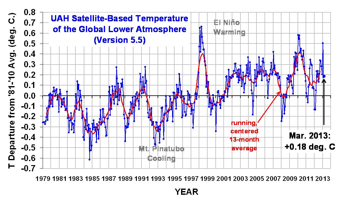
The global average lower tropospheric temperature anomaly for July (+0.28 °C) was down from June 2012 (+0.37 °C). Click on the image for the full-size version:

Here are the monthly stats:

YR MON GLOBAL NH SH TROPICS
2011 01 -0.01 -0.06 +0.04 -0.37
2011 02 -0.02 -0.04 +0.00 -0.35
2011 03 -0.10 -0.07 -0.13 -0.34
2011 04 +0.12 +0.20 +0.04 -0.23
2011 05 +0.13 +0.15 +0.12 -0.04
2011 06 +0.32 +0.38 +0.25 +0.23
2011 07 +0.37 +0.34 +0.40 +0.20
2011 08 +0.33 +0.32 +0.33 +0.16
2011 09 +0.29 +0.30 +0.27 +0.18
2011 10 +0.12 +0.17 +0.06 -0.05
2011 11 +0.12 +0.08 +0.17 +0.02
2011 12 +0.13 +0.20 +0.06 +0.04
2012 1 -0.09 -0.06 -0.12 -0.14
2012 2 -0.11 -0.01 -0.21 -0.28
2012 3 +0.11 +0.13 +0.09 -0.11
2012 4 +0.30 +0.41 +0.19 -0.12
2012 5 +0.29 +0.44 +0.14 +0.03
2012 6 +0.37 +0.54 +0.20 +0.14
2012 7 +0.28 +0.44 +0.11 +0.33

As a reminder, the most common reason for large month-to-month swings in global average temperature is small fluctuations in the rate of convective overturning of the troposphere, discussed here.

JGR Paper Submitted: Modeling Ocean Warming Since 1955

July 18th, 2012

This is meant to be just a heads up that we have submitted a paper to Journal of Geophysical Research (JGR) which I think is quite significant. We used a 1D forcing-feedback-diffusion model of ocean temperature change to 2,000 meters depth to explain ocean temperature variations measured since 1955.

We ask the question: What combination of (1) forcings, (2) feedback (climate sensitivity), and (3) ocean diffusion (vertical mixing) best explain the Levitus global-average ocean temperature trends since 1955? These are the three main processes which control global-average surface temperatures on longer time scales (a point which has also been made by NASA’s James Hansen).

The 1D model has the advantage that it conserves energy, which apparently is still a problem with the IPCC 3D models which exhibit spurious temperature trends (peer reviewed paper here). Our own analysis has shown that at least 3 of the IPCC models actually produce net (full-depth) ocean cooling despite positive radiative forcing over the 2nd half of the 20th Century.

After all, if a climate model can’t even satisfy the 1st Law of Thermodynamics, and global warming is fundamentally a conservation of energy process (net accumulation of energy leads to warming), how then can 3D models be used to explain or predict climate change? I don’t see how the IPCC scientific community continues to avoid mass cognitive dissonance.

The primary forcing used in our model is basically the same as that used in the new CMIP5 experiments, the largest components of which are anthropogenic greenhouse gases and aerosols, and volcanic aerosols. Using these traditional forcings alone in our 1D model gives a climate sensitivity in the range of what the IPCC models produce.

But an important additional component of our model is the observed history of the El Nino/Southern Oscillation (ENSO) as a pseudo-forcing, both through changes in ocean mixing across the thermocline (ENSO’s primary influence), and through potential changes in global albedo preceding ENSO temperature changes. These pseudo-forcings are included only to the extent they help to explain the Levitus ocean temperature data, as well as explain the satellite-observed relationship between radiative flux variations and sea surface temperature.

The results are, shall we say, not as supportive of the IPCC view of the climate system as the IPCC might like; more frequent El Ninos since the late 1970s do impact our interpretation of climate sensitivity and the causes of climate change. The paper also serves as a response to Andy Dessler’s published criticisms of our feedback work.

A shorter version of the paper was first submitted to Geophysical Research Letters (GRL) a few weeks ago, and was rejected outright by the editor as not being appropriate for GRL (!), a claim which seems quite strange indeed. I suspect the editor was trying to avoid the kind of controversy which led to the resignation of the editor of the journal Remote Sensing after publication of a previous paper of ours.

Now we shall see whether it is possible for JGR to provide an unbiased peer review. If our paper is rejected there as well, we might post the paper here so anyone can judge for themselves whether the study has merit.

June 2012 U.S. Temperatures: Not That Remarkable

July 6th, 2012

I know that many journalists who lived through the recent heat wave in the East think the event somehow validates global warming theory, but I’m sorry: It’s summer. Heat waves happen. Sure, many high temperature records were broken, but records are always being broken.

And the strong thunderstorms that caused widespread power outages? Ditto.

Regarding the “thousands” of broken records, there are not that many high-quality weather observing stations that (1) operated since the record warm years in the 1930s, and (2) have not been influenced by urban heat island effects, so it’s not at all obvious that the heat wave was unprecedented. Even if it was the worst in the last century for the Eastern U.S. (before which we can’t really say anything), there is no way to know if it was mostly human-caused or natural, anyway.

“But, Roy, the heat wave is consistent with climate model predictions!”. Yeah, well, it’s also consistent with natural weather variability. So, take your pick.

For the whole U.S. in June, average temperatures were not that remarkable. Here are the last 40 years from my population-adjusted surface temperature dataset, and NOAA’s USHCN (v2) dataset (both based upon 5 deg lat/lon grid averages; click for large version):

Certainly the U.S drought conditions cannot compare to the 1930s.

I really tire of the media frenzy which occurs when disaster strikes…I’ve stopped answering media inquiries. Mother Nature is dangerous, folks. And with the internet and cell phones, now every time there is a severe weather event, everyone in the world knows about it within the hour. In the 1800s, it might be months before one part of the country found out about disaster in another part of the country. Sheesh.

UAH Global Temperature Update for June, 2012: +0.37 deg. C

July 6th, 2012

The global average lower tropospheric temperature anomaly for June (+0.37 °C) was up from May 2012 (+0.29 °C). Click on the image for the super-sized version:

The 4th order polynomial fit to the data (courtesy of Excel) is for entertainment purposes only, and should not be construed as having any predictive value whatsoever.

Here are the monthly stats:

YR MON GLOBAL NH SH TROPICS
2011 01 -0.010 -0.055 +0.036 -0.372
2011 02 -0.020 -0.042 +0.002 -0.348
2011 03 -0.101 -0.073 -0.128 -0.342
2011 04 +0.117 +0.195 +0.039 -0.229
2011 05 +0.133 +0.145 +0.121 -0.043
2011 06 +0.315 +0.379 +0.250 +0.233
2011 07 +0.374 +0.344 +0.404 +0.204
2011 08 +0.327 +0.321 +0.332 +0.155
2011 09 +0.289 +0.304 +0.274 +0.178
2011 10 +0.116 +0.169 +0.062 -0.054
2011 11 +0.123 +0.075 +0.170 +0.024
2011 12 +0.126 +0.197 +0.055 +0.041
2012 1 -0.089 -0.058 -0.120 -0.137
2012 2 -0.111 -0.014 -0.209 -0.276
2012 3 +0.111 +0.129 +0.094 -0.106
2012 4 +0.299 +0.413 +0.185 -0.117
2012 5 +0.292 +0.444 +0.141 +0.033
2012 6 +0.369 +0.540 +0.199 +0.140

As a reminder, the most common reason for large month-to-month swings in global average temperature is small fluctuations in the rate of convective overturning of the troposphere, discussed here.

First Light AMSR2 Images from the GCOM-W1 Satellite

July 5th, 2012

Yesterday, the Japan Aerospace Exploration Agency (JAXA) released first-light imagery from the new AMSR2 instrument on JAXA’s GCOM-W1 satellite (“Shizuku”), which replaces the AMSR-E instrument which failed last fall on NASA’s Aqua satellite after 9+ years of observation.

The Shizuku satellite has been successfully boosted into the NASA A-Train satellite constellation, and the AMSR2 spin rate has been increased to its operational value of 40 rpm.

The following two images are not meant to be science-quality, only to demonstrate the instrument is operating as expected:


Operational products from AMSR2 should start flowing in August.

35 Years Ago Today: Global Cooling Caused Severe Wind Damage

July 4th, 2012


The recent thunderstorm wind event which caused widespread wind damage from Ohio to the mid-Atlantic coast has, rather predictably, led to claims that global warming is the root cause.

Known as a “derecho“, these events are indeed uncommon, but have always been around: the term was originally coined in 1888 in a study of thunderstorm wind damage which occurred in 1877.

In fact, one of the most famous events occurred when global temperatures reached a minimum, back in the 1970’s. Known simply as “The Storm”, it occurred 35 years ago today, on July 4, 1977. There were widespread blowdowns of trees (see the photo, above). Even though the event occurred over relatively unpopulated areas in Minnesota, Wisconsin, and Michigan, the highest recorded wind speed was an astonishing 115 mph, officially recorded with an airport anemometer.

Compare that to the derecho event of last week, which occurred over heavily populated areas: the highest measured wind speed in the extensive list of reports at the Storms Prediction Center was only 92 mph, and even that was on a home weather station, and so is unofficial.

So, why all the fuss over last weeks storm? Because it didn’t hit flyover country. Tens of millions of people were affected, and millions went without power.

Of course, those affected included many journalists, so it is only natural that they would speculate (and seek out experts to speculate) about the sinister causes of such an event.

Surely the silliest comment I saw came from Bill Nye, “The Science Guy”, who stated: “…We had a 30-degree temperature drop in Maryland and Virginia this weekend, in just – in a half-hour. These are consistent with climate models.”

First of all, such temperature drops occur routinely with the passage of mid-latitude thunderstorms. Secondly, climate models predict no such thing anyway. If “The Science Guy” gets it this wrong, how can I trust him on anything else?

U.S. Temperature Update for May 2012: +1.26 deg. C

June 8th, 2012

The U.S. lower-48 surface temperature anomaly from my population density-adjusted (PDAT) dataset was 1.26 deg. C above the 1973-2012 average for May 2012, with a 1973-2012 linear warming trend of +0.14 deg. C/decade (click for full-size version):

The corresponding USHCN anomaly computed relative to the same base period was +1.65 deg. C, with nearly double my warming trend (+0.27 deg. C/decade). The warming of the USHCN relative to my dataset shows that most of the discrepancy arises during the 1996-98 period:

Despite the weaker warming trend in my dataset, Spring 2012 still ranks as the warmest spring since the beginning of my record (1973). The 12-month period ending in May 2012 is also the warmest 12-month period in the record.

Due to a lack of station data and uncertainties regarding urban heat island (UHI) effects, I have no opinion on how the recent warmth compares to, say, the 1930s. There is also no guarantee that my method for UHI adjustment since 1973 has done a sufficient job of removing UHI effects. A short description of the final procedure I settled on for population density adjustment of the surface temperatures can be found here.