UAH Global Temperature Update for May 2012: +0.29°C

June 4th, 2012

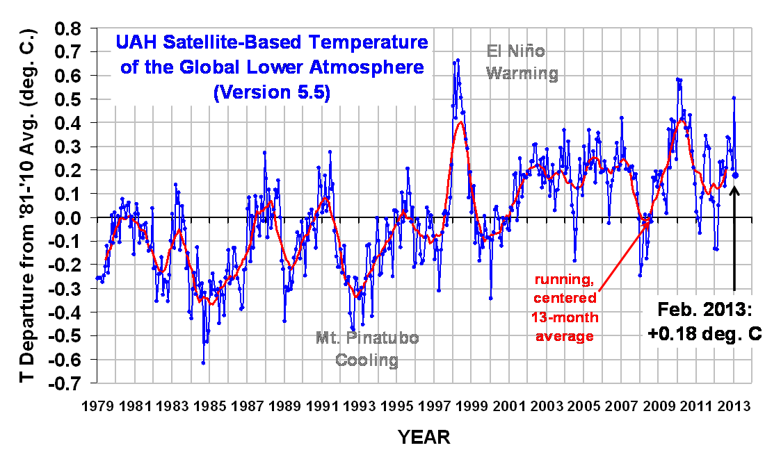
The global average lower tropospheric temperature anomaly for May 2012 (+0.29 °C) changed little from April (+0.30 °C), with some warming to near-average temperatures in the tropics being balanced by a little cooling in the Southern Hemisphere (click on the image for the full-size version):

The 4th order polynomial fit to the data (courtesy of Excel) is for entertainment purposes only, and should not be construed as having any predictive value whatsoever.

Here are the monthly stats:

YR MON GLOBAL NH SH TROPICS
2011 01 -0.010 -0.055 +0.036 -0.372
2011 02 -0.020 -0.042 +0.002 -0.348
2011 03 -0.101 -0.073 -0.128 -0.342
2011 04 +0.117 +0.195 +0.039 -0.229
2011 05 +0.133 +0.145 +0.121 -0.043
2011 06 +0.315 +0.379 +0.250 +0.233
2011 07 +0.374 +0.344 +0.404 +0.204
2011 08 +0.327 +0.321 +0.332 +0.155
2011 09 +0.289 +0.304 +0.274 +0.178
2011 10 +0.116 +0.169 +0.062 -0.054
2011 11 +0.123 +0.075 +0.170 +0.024
2011 12 +0.126 +0.197 +0.055 +0.041
2012 1 -0.089 -0.058 -0.120 -0.137
2012 2 -0.111 -0.014 -0.209 -0.276
2012 3 +0.111 +0.129 +0.094 -0.106
2012 4 +0.299 +0.413 +0.185 -0.117
2012 5 +0.289 +0.439 +0.139 +0.033

As a reminder, the most common reason for large month-to-month swings in global average temperature is small fluctuations in the rate of convective overturning of the troposphere, discussed here.

The AMSR2 Antenna has been Successfully Deployed

May 18th, 2012

UPDATE: AMSR2 has been successfully spun up to its initial spin rate of 4 rpm (it will later be spun up to 40 rpm for normal operations). It will take 45 days for the Shinzuku satellite to be maneuvered into the A-Train satellite constellation; about 3 months for complete instrument checkout.

Now this is a real treat…the first on-orbit image I am aware of taken from the spacecraft of an Earth-observation instrument ON the spacecraft itself (all imagery courtesy of JAXA).

The first image is an artist’s rendering of the Japanese Shizuku satellite (aka GCOM-W) with the location of the camera indicated:

The second is an actual photo from that camera of the AMSR2 instrument after its antenna has been deployed from its stowed position:

I’m not sure of the schedule regarding when calibrated data will start flowing operationally. The calibration design of AMSR2 has been improved, and I’m sure JAXA will want to be pretty confident of their calibration before data are released. Then, the algorithms which convert the calibrated data into products such as sea ice parameters and SST will have to be tested.

Well before those events happen, though, I’m sure we will see some “first light” imagery from the instrument.

A variety of Shizuku photos and artist renderings are available here.

AMSR2 Being Readied for Launch Today

May 17th, 2012

UPDATE: As of 12:00 pm CDT, the launch looked to be successful. All ascent stages have separated, and the Korean satellite (the 2nd payload) has separated from the GCOM-W satellite.


The AMSR2 instrument on the Japanese GCOM-W satellite (now named Shizuku) is scheduled for launch this morning. The 3 minute launch window starts at 11:39 a.m. CDT (a nighttime launch in Japan). The H2A rocket has been moved to the launch pad and fueling is underway.

Spaceflight Now is providing live updates. Live video coverage is supposed to be available here starting 1/2 hour before launch…as of right now, the links are not operable.
The Shizuku satellite will join the NASA A-Train satellite constellation, which includes the Aqua satellite. You might recall that the AMSR-E instrument on Aqua failed last fall after 9+ years of successful operation.

Like AMSR-E, AMSR2 will be used to measure twice-daily sea surface temperatures (even through clouds), sea ice, precipitation rates, columnar water vapor and cloud water contents over the ocean, surface wind speeds over the ocean, and snow cover.

Our Response to Recent Criticism of the UAH Satellite Temperatures

May 9th, 2012

by John R. Christy and Roy W. Spencer
University of Alabama in Huntsville

A new paper by Stephen Po-Chedley and Quang Fu (2012) (hereafter PCF) was sent to us at the end of April 2012 in page-proof form as an article to appear soon in the Journal of Atmospheric and Oceanic Technology. The topic of the paper is an analysis of a single satellite’s impact on the rarely-used, multi-satellite deep-layer global temperature of the mid-troposphere or TMT. Some of you have been waiting for our response, but this was delayed by the fact that one of us (J. Christy) was out of the country when the UW press release was issued and just returned on Tuesday the 8th.

There are numerous incorrect and misleading assumptions in this paper. Neither one of us was aware of the paper until it was sent to us by Po-Chedley two weeks ago, so the paper was written and reviewed in complete absence of the authors of the dataset itself. In some cases this might be a normal activity, but in a situation where complicated algorithms are involved, it is clear that PCF did not have a sufficient understanding of the construction methodology.

By way of summary, here are our main conclusions regarding the new PCF paper:

1) the authors’ methodology is qualitative and irreproducible

2) the author’s are uninformed on the complexity of the UAH satellite merging algorithm

3) the authors use the RSS (Remotes Sensing Systems) satellite dataset as “verification” for their proposed UAH NOAA-9 calibration target adjustment for TMT, but barely mention that their TLT (lower tropospheric) results are insignificant and that trends are essentially identical between UAH and RSS without any adjustment in the NOAA-9 calibration coefficient

4) the authors neglected the main TMT differences among the datasets – and instead try to explain the UAH v. RSS trend difference by only two years of NOAA-9 data, while missing all of the publications which document other issues such as RSS problems with applying the diurnal correction.

The paper specifically claims to show that a calibration target coefficient of one satellite, NOAA-9, should be a value different than that calculated directly from empirical data in UAH’s version of the dataset. With an adjustment to the time series guesstimated by PCF, this increases the UAH overall global trend by +0.042 °C/decade. Their new UAH trend, being +0.042 warmer, then becomes the same as the TMT trend from RSS. This, they conclude, indicates a verification of their exercise.

More importantly, with regard to the most publicized UAH dataset, the temperature of the lower troposphere (TLT), there was no similar analysis done by PCF – an indication that their re-calculations would not support their desired outcome for this dataset, as we shall demonstrate below.

All of this will soon be moot, anyway. Since last year we have been working on v6.0 of the UAH datasets which should be ready with the tropospheric temperature datasets before summer is out. These will include (1) a new, more defensible objective empirical calculation to correct for the drift of the satellites through the diurnal cycle, and (2) a new hot calibration target effective emissivity adjustment which results in better agreement between simultaneously operating satellites at the calibration step, making the post-calibration hot-target adjustment PCF criticizes unnecessary. So, since our new v6.0 dataset is close to completion and submission for publication, we have chosen this venue to document PCF’s misinformation in a rather informal, but reproducible, way rather than bother to submit a journal rebuttal addressing the older dataset. However, to show that version 5.4 of our datasets was credible, we discuss these issues below.

The Lower Tropospheric Temperatures (TLT)

We shall return to TMT below, but most of the research and popular use of the UAH datasets have focused on the lower tropospheric temperature, or TLT (surface to about 300 hPa, i.e. without stratospheric impact). Thus, we shall begin our discussion with TLT because it is rightly seen as a more useful variable because it documents the bulk heat content of the troposphere with very little influence from the stratosphere. And [this is important in the TMT discussion] the same hot-target coefficients for NOAA-9 were used in TLT as in TMT.

PCF focused on the deep layer TMT, i.e. temperature of the surface to about 75 hPa, which includes quite a bit of signal above 300 hPa. As such, TMT includes a good portion of the lower stratosphere – a key weakness when utilizing radiosondes which went through significant changes and adjustments during this time. [This was a period when many stations converted to the Vaisala 80 radiosonde which introduced temperature shifts throughout the atmosphere (Christy and Norris 2004).]

As indicated in their paper, it seems PCF’s goal was to explain the differences in trend between RSS and UAH, but the history of this effort has always been to find error with UAH’s products rather than in other products (as we shall see below). With us shut out of the peer-review cycle it is easy to assume an underlying bias of the authors.

Lord Kelvin told us that “All science is numbers”, so here are some numbers. First, let’s look at the “global” trends of UAH and RSS for TLT (70S to 82.5N) for Jan 1979 to Apr 2012:

+0.137 °C/decade UAH LT (70S-82.5N)
+0.134 °C/decade RSS LT (70S-82.5N)

These trends are, for all practical purposes, identical. This, however, hides the fact that there are indeed differences between the two time series that, for one reason or another, are balanced out when calculating the linear trend over the entire 30+ year period. As several papers have documented (see Christy et al. 2011, or C11, for the list – by the way, C11 was not cited by PCF) the evidence indicates RSS contains a spurious warming in the 1990’s then a spurious cooling from around 2002 onward (note that the RSS temperature anomaly for last month, April, 2012, was 0.08°C cooler than our UAH anomaly).

This behavior arises, we believe, from an over-correction of the drift of the satellites by RSS (in the 1990’s the satellites drifted to cooler times of day, so the correction must add warming, and in the 2000’s the satellites drifted to warmer times of day so a correction is needed to cool things down.) These corrections are needed (except for the Aqua satellite operating since 2002, which has no diurnal drift and which we use as an anchor in the UAH dataset) but if not of the right magnitude they will easily affect the trend.

In a single paragraph, PCF admit that the UAH TLT time series has no significant hot-target relationship with radiosonde comparisons (which for TLT are more robust) over the NOAA-9 period. However, they then utilize circular reasoning to claim that since RSS and UAH have a bit of disagreement in that 2-year period, and RSS must be correct, that then means UAH has a problem. So, this type of logic, as stated by PCF, points to their bias – assume that RSS is correct which then implies UAH is the problem. This requires one to ignore the many publications that show the opposite.

Note too that in their press release, PCF claim that observations and models now are closer together for this key parameter (temperature of the bulk troposphere) if one artificially increases the trend in UAH data. This is a questionable claim as evidence shows TLT for CMIP3 and CMIP5 models averages about +0.26 °C/decade (beginning in 1979) whereas UAH *and* RSS datasets are slightly below +0.14 °C/decade, about a factor of 2 difference between models and observations. We shall let the reader decide if the PCF press-release claim is accurate.

The key point for the discussion here (and below) is that TLT uses the same hot-target coefficients as TMT, yet we see no problem related to it for the many evaluation studies we have published. Indeed this was the specific result found in Christy and Norris 2004 – again, work not cited by PCF.

The Mid-Tropospheric Temperature (TMT)

About 12 years ago we discovered that even though two different satellites were looking at the same globe at the same time, there were differences in their measurements beyond a simple bias (time-invariant offset). We learned that these were related to the variations in the temperature of the instrument itself. If the instrument warmed or cooled (differing solar angles as it orbited or drifted), so did the calculated temperature. We used the thermistors embedded in the hot-target plate to track the instrument temperature, hence the metric is often called the “hot target temperature coefficient.”

To compensate for this error, we devised a method to calculate a coefficient that when multiplied by the hot target temperature would remove this variation for each satellite. Note that the coefficients were calculated from the satellite data, they were not estimated in an ad hoc fashion.

The calculation of this coefficient depends on a number of things, (a) the magnitude of the already-removed satellite drift correction (i.e. diurnal correction), (b) the way the inter-satellite differences are smoothed, and (c) the sequence in which the satellites are merged.

Since UAH and RSS perform these processes differently, the coefficients so calculated will be different. Again recall that the UAH (and RSS) coefficients are calculated from a system of equations, they are not invented. The coefficients are calculated to produce the largest decrease in inter-satellite error characteristics in each dataset.

To make a long story short, PCF focused on the 26-month period of NOAA-9 operation, basically 1985-86. They then used radiosondes over this period to estimate the hot-target coefficient as +0.048 rather than UAH’s calculated value of +0.0986. [Note, the language in PCF is confusing, as we cannot tell if they conclude our coefficient is too high by 0.051 or should actually be 0.051. We shall assume they believe our coefficient is too high by 0.051 to give them the benefit of the doubt.]

Recall, radiosondes were having significant shifts with the levels monitored by TMT primarily with the switch to Vaisala 80 sondes, and so over small, 26-month periods, just about any result might be expected. [We reproduced PCF’s Fig. 2 using only US VIZ sondes (which had no instrument changes in the 26-month period and span the globe from the western tropical Pacific to Alaska to the Caribbean Sea) and found an explained variance of less than 4% – an insignificant value.]

Another problematic aspect of PCF’s methodology is that when looking at the merged time series, one does not see just NOAA-9’s influence, but the impact of all of the other satellites which provided data during 1985-86, i.e. NOAA-6, -7 and -8 as well. So, it is improper to assume one may pick out NOAA-9’s impact individually from the merged satellite series.

That PCF had little understanding of the UAH algorithm is demonstrated by the following simple test. We substituted the PCF value of +0.048 directly into our code. The increase in trend over our v5.4 TMT dataset was only +0.022 °C/decade for 1979-2009 (not 0.042), and +0.019 °C/decade for 1979-2012.

To put it another way, PCF overestimated the impact of the NOAA-9 coefficient by a factor of about 2 when they artificially reconstructed our dataset using 0.048 as the NOAA-9 coefficient. In fact, if we use an implausible target coefficient of zero, we still can’t return a trend difference greater than +0.037 °C/decade. Thus PCF have incorrectly assumed something about the construction methodology of our time series that gave them a result which is demonstrated here to be faulty.

In addition, by changing the coefficient to +0.048 in an ad hoc fashion, they create greater errors in NOAA-9’s comparisons to other satellites. Had they contacted us at any point about this, we would have helped them to understand the techniques. [There were 4 emails from Po-Chedley in Aug and Sep 2011, but this dealt with very basic facts about the dataset, not the construction methodology. Incidently, these emails were exchanged well after C11 was published.]

PCF brought in a third dataset, STAR, but this one uses the same diurnal corrections and sequential merging methodology as RSS, so it is not a truly independent test. As shown in C11, STAR is clearly the outlier for overall trend values due to a different method of debiasing the various satellite data and a differing treatment of the fundamental brightness temperature calibration.

We have additional information regarding UAH’s relatively low error statistics. Using radiosondes to evaluate microwave temperatures requires great care. In our tests, we concentrated on sondes which had documented characteristics and a high degree of consistency such as the US VIZ and Australian sondes. These comparisons have been published a number of times, but most recently updated in C11.

Here are the comparisons for the US VIZ radiosonde network (stretching from the western tropical Pacific to Alaska down across the conterminous US and to the Caribbean.) As you can see, UAH MT provides the lowest error magnitudes and highest reproducibility of the three data sets. Similar results were found for the Australian comparisons.

For data through April 2012 we have the following global TMT trends: UAH +0.045, RSS +0.079 and STAR +0.124 °C/decade. So, RSS, in the middle, is closer to UAH than STAR, yet PCF chose to examine UAH as the “problem” dataset. Had PCF wanted to pick some low-hanging fruit regarding the differences between UAH, RSS and STAR, they would have (a) looked at the diurnal differences between UAH and RSS (see publications) or (b) looked at a simple time series of differences between the three datasets (below). One thing that pops out is a spurious upward shift in STAR TMT relative to UAH and RSS of about +0.06 °C on precisely 1 Jan 2001 – an obvious beginning-of-year glitch. Why not look there?

The Bottom Line

In conclusion, we believe that the result in PCF was a rather uninformed attempt to find fault with the UAH global temperature dataset, using an ad hoc adjustment to a single, short-lived satellite while overlooking the greater problems which have been documented (published or as demonstrated in the figure above) regarding the other datasets.

And think about this. If PCF is correct that we should be using a revised NOAA-9 coefficient, and since we use the same coefficient in both TMT and TLT, then the near perfect agreement currently between RSS and UAH for TLT will disappear; our TLT trend will become warmer, and then RSS will have the lowest warming trend of all the satellite datasets. The authors of the new study cannot have it both ways, claiming their new adjustment brings RSS and UAH closer together for TMT (a seldom used temperature index), but then driving the UAH and RSS trends for TLT farther apart, leaving RSS with essentially the same warming trend that UAH had before.

Since it is now within 3 months of the publication cutoff for research to be included in the IPCC AR5, one is tempted to conclude that PCF will be well-received by the Lead Authors (some of whom are closely associated with the RSS dataset) without critical evaluation such as briefly performed here. However, we cannot predict what the AR5 outcome will be or, for that matter, what waning influence the IPCC might still exert.

That PCF brushed aside the fact that the UAH and RSS trends for the LOWER troposphere are essentially identical (for which the UAH NOAA-9 coefficient is the same) seems to us to be a diversionary tactic we have seen before: create a strawman problem which will allow the next IPCC report to make a dismissive statement about the validity of an uncooperative dataset with a minimum of evidence. We hope that rationality instead prevails.

References

Christy, J.R. and W. B. Norris, 2004: What may we conclude about global tropospheric temperature trends? Geophys. Res. Lett. 31, No. 6.

Christy, J.R., R.W. Spencer and W.B Norris (deceased), 2011: The role of remote sensing in monitoring global bulk tropospheric temperatures. Int. J. Remote Sens. 32, 671-685, DOI:10.1080/01431161.2010.517803.

Po-Chedley, S. and Q. Fu, 2012: A bias in the midtropospheric channel warm target factor on the NOAA-9 Microwave Sounding Unit. J. Atmos. Oceanic Tech. DOI: 10.1175/JTECH-D-11-00147.1.

UAH Global Temperature Update for April 2012: +0.30°C

May 9th, 2012

The global average lower tropospheric temperature anomaly increased again in April, 2012, to +0.30°C., with warming in both Northern and Southern Hemispheres, but slightly cool conditions persisting in the tropics (click on the image for the full-size version):

The corresponding April anomaly from RSS, using a common baseline period of 1981-2010, is considerably cooler at +0.21°C. The 3rd order polynomial fit to the data (courtesy of Excel) is for entertainment purposes only, and should not be construed as having any predictive value whatsoever.

Here are the monthly stats:

YR MON GLOBAL NH SH TROPICS
2011 01 -0.010 -0.055 +0.036 -0.372
2011 02 -0.020 -0.042 +0.002 -0.348
2011 03 -0.101 -0.073 -0.128 -0.342
2011 04 +0.117 +0.195 +0.039 -0.229
2011 05 +0.133 +0.145 +0.121 -0.043
2011 06 +0.315 +0.379 +0.250 +0.233
2011 07 +0.374 +0.344 +0.404 +0.204
2011 08 +0.327 +0.321 +0.332 +0.155
2011 09 +0.289 +0.304 +0.274 +0.178
2011 10 +0.116 +0.169 +0.062 -0.054
2011 11 +0.123 +0.075 +0.170 +0.024
2011 12 +0.126 +0.197 +0.055 +0.041
2012 01 -0.090 -0.057 -0.123 -0.138
2012 02 -0.112 -0.013 -0.212 -0.277
2012 03 +0.110 +0.129 +0.092 -0.108
2012 04 +0.295 +0.411 +0.179 -0.120

As a reminder, the most common reason for large month-to-month swings in global average temperature is small fluctuations in the rate of convective overturning of the troposphere, discussed here.

U.S. Temperature Update for April, 2012: +1.28 deg. C

May 1st, 2012

With John Christy out of the country for a several days and so our global temperature report being delayed, I thought I would update my new U.S.-only surface temperature dataset for April, 2012.

The April, 2012 U.S. temperature anomaly remained above average (+1.28 deg. C), but down considerably from the very warm March anomaly (+3.62 deg. C). That very unusual March warmth was traced to record strong southerly flow, which (as I discussed here) is difficult to blame on “global warming” because it must be matched by an equal amount of anomalously strong northerly flow elsewhere.

A quick recap regarding this new temperature dataset: the area averages for the contiguous U.S. are based upon approximately 300 stations in the NCDC Integrated Surface Hourly (ISH) archive, which is updated daily here. Most of the stations I use are National Weather Service or FAA reporting sites at airports. The stations must have been in continuous operation since 1973 for them to be included.

My computation of a daily average temperature from each station requires 4 observations (at 00, 06, 12, and 18 UTC, which are standard synoptic reporting times), and there must be at least 80% of the days present for a monthly average to be computed for a station. Then there must be 80% of the months available over the 1973-2012 period of record, including all of 1973 and 2011.

I quantified the average increase in station temperature trends with increasing population density, and adjusted all stations based upon that average relationship to a nominal population density of 1 person per sq. km (this involved no extrapolation). Presumably, this is adjusting for the urban heat island (UHI) effect which apparently grows over time (people tend to build more buildings, roads, parking lots, add more AC, etc.)

Here are the resulting monthly temperature departures from the period average (click for large version):

Note that the linear warming trend I get (+0.13 deg. C/decade) is about 50% of that I get from analyzing the USHCN data (+0.26 deg. C/decade).

It is also a considerable reduction below what I get if I perform no population density adjustment (+0.22 deg. C/decade). Since that population adjustment is so large, here are the data supporting it (click for large version):

The regression coefficient (.0422) has a standard error of estimate of about +/- 25%, which gives some idea of the level of uncertainty in the UHI adjustment I have made. The population adjustment is based upon the stations east of 115 deg. W longitude, since there did not appear to be a relationship between temperature trend and population west of that. The UHI adjustment is admittedly simple, being based only upon local population density in year 2000, and it might well be that some other method would do a better job of removing the UHI effect.

If you read my previous post on this new dataset, you might be wondering why I am now getting a warmer trend than I did before. When using hourly temperature data, it turns out you have to be careful because of the increase in the number of “special” (off-hour) reports in recent years, which changes the average local time of the observations. Now, I am only using observations taken in the 10 minutes before the top of the hour, which are the routine hourly reports that have been made for many decades. (I actually took some of those observations myself in the 1970s when I worked at a NWS office, so I have some familiarity with the issue.)

New Evidence Our Record Warm March was Not from Global Warming

April 13th, 2012

As part of my exploration of different surface temperature datasets, I’m examining the relationship between average U.S. temperatures and other weather variables in NOAA’s Integrated Surface Hourly (ISH) dataset. (I think I might have mistakenly called it “International” before, instead of “Integrated” Surface Hourly).

Anyway , one of the things that popped out of my analysis is related to our record warm March this year (2012). Connecting such an event to “global warming” would require either lazy thinking, jumping to conclusions, or evidence that the warmth was not caused by persistent southerly flow over an unusually large area for that time of year.

The U.S. is a pretty small place (about 2% of the Earth), and so a single high or low pressure area can cover most of the country. For example, if unusually persistent southerly flow sets up all month over most of the country, there will be unusual warmth. In that case we are talking about “weather”, not “climate change”.

Why do I say that? Because one of the basic concepts you learn in meteorology is “mass continuity”. If there is persistent and widespread southerly flow over the U.S., there must be (by mass continuity) the same amount of northerly flow elsewhere at the same latitude.

That means that our unusual warmth is matched by unusual coolness someplace else.

Well, guess what? It turns out that our record warm March was ALSO a record for southerly flow, averaged over the U.S. This is shown in the next plot, which comes from about 250 weather stations distributed across the Lower 48 (click for large version; heavy line is trailing 12 month average):

Weather records are broken on occasion, even without global warming. And here we see evidence that our March warmth was simply a chance fluctuation in weather patterns.

If you claim, “Well, maybe global warming caused the extra southerly flow!”, you then are also claiming (through mass continuity) that global warming ALSO caused extra northerly flow (with below normal temperatures) somewhere else.

And no matter what anyone has told you, global warming cannot cause colder than normal weather. It’s not in the physics. The fact that warming has been greatest in the Arctic means that the equator-to-pole temperature contrast has been reduced, which would mean less storminess and less North-South exchange of air masses — not more.

USHCN Surface Temperatures, 1973-2012: Dramatic Warming Adjustments, Noisy Trends

April 11th, 2012

Since NOAA encourages the use the USHCN station network as the official U.S. climate record, I have analyzed the average [(Tmax+Tmin)/2] USHCN version 2 dataset in the same way I analyzed the CRUTem3 and International Surface Hourly (ISH) data.

The main conclusions are:

1) The linear warming trend during 1973-2012 is greatest in USHCN (+0.245 C/decade), followed by CRUTem3 (+0.198 C/decade), then my ISH population density adjusted temperatures (PDAT) as a distant third (+0.013 C/decade)

2) Virtually all of the USHCN warming since 1973 appears to be the result of adjustments NOAA has made to the data, mainly in the 1995-97 timeframe.

3) While there seems to be some residual Urban Heat Island (UHI) effect in the U.S. Midwest, and even some spurious cooling with population density in the Southwest, for all of the 1,200 USHCN stations together there is little correlation between station temperature trends and population density.

4) Despite homogeneity adjustments in the USHCN record to increase agreement between neighboring stations, USHCN trends are actually noisier than what I get using 4x per day ISH temperatures and a simple UHI correction.

The following plot shows 12-month trailing average anomalies for the three different datasets (USHCN, CRUTem3, and ISH PDAT)…note the large differences in computed linear warming trends (click on plots for high res versions):

The next plot shows the differences between my ISH PDAT dataset and the other 2 datasets. I would be interested to hear opinions from others who have analyzed these data which of the adjustments NOAA performs could have caused the large relative warming in the USHCN data during 1995-97:

From reading the USHCN Version 2 description here, it appears there are really only 2 adjustments made in the USHCN Version 2 data which can substantially impact temperature trends: 1) time of observation (TOB) adjustments, and 2) station change point adjustments based upon rather elaborate statistical intercomparisons between neighboring stations. The 2nd of these is supposed to identify and adjust for changes in instrumentation type, instrument relocation, and UHI effects in the data.

We also see in the above plot that the adjustments made in the CRUTem3 and USHCN datasets are quite different after about 1996, although they converge to about the same answer toward the end of the record.

UHI Effects in the USHCN Station Trends
Just as I did for the ISH PDAT data, I correlated USHCN station temperature trends with station location population density. For all ~1,200 stations together, we see little evidence of residual UHI effects:

The results change somewhat, though, when the U.S. is divided into 6 subregions:


Of the 6 subregions, the 2 with the strongest residual effects are 1) the North-Central U.S., with a tendency for higher population stations to warm the most, and 2) the Southwest U.S., with a rather strong cooling effect with increasing population density. As I have previously noted, this could be the effect of people planting vegetation in a region which is naturally arid. One would think this effect would have been picked up by the USHCN homogenization procedure, but apparently not.

Trend Agreement Between Station Pairs

This is where I got quite a surprise. Since the USHCN data have gone through homogeneity adjustments with comparisons to neighboring stations, I fully expected the USHCN trends from neighboring stations to agree better than station trends from my population-adjusted ISH data.

I compared all station pairs within 200 km of each other to get an estimate of their level of agreement in temperature trends. The following 2 plots show the geographic distribution of the ~280 stations in my ISH dataset, and the ~1200 stations in the USHCN dataset:

I took all station pairs within 200 km of each other in each of these datasets, and computed the average absolute difference in temperature trends for the 1973-2012 period across all pairs. The average station separation in the USHCN and ISH PDAT datasets were nearly identical: 133.2 km for the ISH dataset (643 pairs), and 132.4 km for the USHCN dataset (12,453 pairs).

But the ISH trend pairs had about 15% better agreement (avg. absolute trend difference of 0.143 C/decade) than did the USHCN trend pairs (avg. absolute trend difference of 0.167 C/decade).

Given the amount of work NOAA has put into the USHCN dataset to increase the agreement between neighboring stations, I don’t have an explanation for this result. I have to wonder whether their adjustment procedures added more spurious effects than they removed, at least as far as their impact on temperature trends goes.

And I must admit that those adjustments constituting virtually all of the warming signal in the last 40 years is disconcerting. When “global warming” only shows up after the data are adjusted, one can understand why so many people are suspicious of the adjustments.

Regional U.S. Population Adjustments to Surface Temperatures Since 1973: Still Little Warming

April 6th, 2012

UPDATE: I’ve added 6 regional U.S temperature plots, for the Northwest, North Central, Northeast, Southwest, South Central, and Southeast.

Thanks for the comments and suggestions on yesterday’s post introducing a new U.S. population-density adjusted temperature (PDAT) dataset. As a result of the comments, I have stratified the U.S. into 6 subregions, and performed station temperature trend vs. population regressions, rather than just lumping all 280 stations together. This should help reduce the effect of any fortuitous (but real) regional warming which just happens to be located where more people live. It should better isolate the true urban heat island (UHI) effect on temperature trends.

The results are shown in the following plot, with the regional regression coefficients listed being the scaling factor between station temperature trend (deg. C/decade) and population density (persons per sq. km) to the 0.2 power (click for high res. version):

As can be seen, 4 of the 6 regions have quite strong dependence of the trends on population density. Only the Southwest U.S. has cooling with increasing population density, which is probably the result of people planting vegetation in what is mostly an arid region to begin with.

The impact of making regional — rather than whole U.S. — population adjustments on the U.S. average temperature variations results in only a slight increase in the resulting temperature trend I posted yesterday, which is still well below that computed from the CRUTem3 dataset (click for high res. version):

Of course, the regional trends would change substantially, since now I am actually warming the Soutwest U.S. temperatures with time, based upon station population density. But the Southeast U.S. trends will be cooled even more than before, because of the strong relationship between temperature trend and population density found there (see 1st plot, above).

UPDATE: Here are the population-adjusted temperature variations for the 3 northern U.S. sectors, with just the trailing 12-month averages plotted to reduce the messiness:

…and here are the 3 southern U.S. sectors:

The bottom line is that there is still clear evidence of an urban heat island effect on temperature trends in the U.S. surface station network. Now, I should point out that most of these are not co-op stations, but National Weather Service and FAA stations. How these results might compare to the GHCN network of stations used by NOAA for climate monitoring over the U.SA., I have no idea at this point.

Also, I need to clear up a misconception…the adjustments I perform do not remove the trends in the data. They remove only the component of the trend which is due to population density, using the regression coefficient alone (not the regression constant). There are no adjustments in January 1973 (the beginning of my data record), and then the adjustments increase linearly with time.

New U.S. Population-Adjusted Temperature Dataset (PDAT), 1973-2012

April 5th, 2012

This is the first of what I hope will be monthly surface temperature updates for the contiguous U.S., based upon 280 International Surface Hourly (ISH) stations which have reasonably complete temperature records since 1973.

Following up on my previous post showing that ISH station warming trends during 1973-2011 were a function of population density, I have quantified the average temperature trend increase with population density (2000 population data) over the U.S, then applied a linear trend correction to each of the stations based upon that relationship.

A few of the findings:

1) Essentially all of the +0.20 deg. C/decade average warming trend over the U.S. in the last 40 years computed from the CRUTem3 dataset (which the IPCC relies upon for its official global warming pronouncements) evaporates after population adjustment (no claim is made for countries other than the U.S.)

2) Even without any adjustments, the ISH data have a 20% lower warming trend than the CRUTem3 data, a curious result since the CRUTem3 dataset is supposedly adjusted for urban heat island effects.

3) The only calendar month with obvious long-term warming is January, due to unusually cold U.S. winters during the 1970s.

4) Last month (March, 2012) is the second warmest monthly temperature anomaly in the 40 year record, and easily the warmest March, even after population adjustment.

For the time being, I’ve decided to post the results for comment rather than attempt to get the work published, which would be a much bigger effort. My hope is that the new dataset will stimulate debate in the climate research community over the existence of residual urban heat island (UHI) effects causing a spurious warming component in commonly used temperature datasets.

Unadjusted ISH Temperature Data vs. CRUTem3 Over the U.S.

As discussed in my previous post, the raw data come from the International Surface Hourly (ISH) database which is continuously updated at NCDC. I average the 4 synoptic reporting times (00, 06, 12, and 18 UTC) together to get a daily average temperature for each station. These are the most often reported times of day in the record, and using them alone maximizes the number of stations available for analysis while at the same time providing (what I believe to be) a more physically meaningful “daily” average than maximum and minimum temperatures do.

At least 80% of the daily data must be present to compute an average for a month from each station, and at least 90% of the months during 1973-present must also be available, as well as ALL calendar months from 1973 and 2011. Nominally 280 stations in the U.S. meet this requirement, a number which does not change substantially throughout the 40 year record.

When monthly anomalies (relative to 1973-2011) are computed in 5 deg. lat/lon grids covering the contiguous U.S. from both the CRUTem3 dataset and from the unadjusted data from 280 stations, here are the resulting monthly variations during 1973 through March, 2012 for ISH and through January 2012 for CRUTem3 (all images can be clicked to see the large, detailed versions):

The monthly correlation between the two time series in the above plot is 0.994. Curiously, even without any adjustments to the ISH data, the resulting ISH linear warming trend (+0.157 deg. C/decade) is about 20% lower than the CRUTem3 trend (+0.198 deg. C/decade).

If we difference the two time series, we get this (click for full res version):

There are a couple things to note. First, we see that the excess warming in CRUTem3 versus unadjusted ISH data is growing with time.

Secondly, there is some evidence of artifacts which are likely from the CRUTem3 dataset, such as a sudden downward adjustment starting about November, 1996. My understanding is that the CRUTem3 dataset has a station distribution which changes over time. Also, I believe there are adjustments made to the data from individual stations. In the ISH dataset, however, we have 280 stations with essentially complete data from beginning to end of the record, with no adjustments; it is difficult to see how such a jump could have arisen from the ISH data.

The Population Density Adjustment

Linear temperature trends computed from each of the 280 stations reveal a dependence on population density. Just as has been found in previous studies based upon spatial temperature patterns (cities being warmer than the surrounding countryside), we find that the warming trend with time increases rapidly with population at low population densities, then levels off at high population densities.

This nonlinear relationship is found here to go as population density (PD) raised to the 0.2. power (warming ~ PD0.2). The following plot shows the results for all stations individually, as well as for averages in 4 population subgroups (click for full res version):

As seen in the above pair of plots, essentially the same regression coefficient is computed whether I use all stations individually, or average them into 4 population subgroups. The standard error of the regression coefficient is +/- 20%, which should give some idea of the statistical uncertainty in the population-based adjustments to the temperature data shown below.

Significantly, I will assume that this average relationship between temperature trend and population density is entirely due to the urban heat island effect, and remove it from each station. Of course, not all stations would have a UHI effect, but others will have a strong effect. The above plots’ regression lines show the average relationship across all stations, which I simply remove from all stations. This avoids qualitative decisions about individual stations’ histories, which would be difficult to reproduce by other investigators, and keeps the methodology simple.

Since (as we will see) this adjustment removes most of the warming trend in the U.S. since 1973, it will be the most criticized. It will be claimed that the warming trends are indeed real, and that it must be by coincidence that the most populated regions of the country have also warmed the most.

But that claim has no independent evidence, other than the thermometer data. It has no more support than my claim that the warming dependence on population is spurious, due to the UHI effect.

In fact, I think it has less support. We know based upon many published studies that the UHI effect is real, at least in spatial terms (cities average warmer than the surrounding countryside). The above plots show a similar effect on temperature trends, with a nonlinear functional dependence approximately like that seen in the spatial dependence found by other investigators. That this effect would be fortuitous seems to stretch credulity.

Results with Population Density Adjustment

The regression coefficient from the above plot was used to make a linear temperature trend adjustment to the ISH temperatures, starting with zero adjustment in January 1973. The resulting plot, analogous to the very first one above, for U.S. temperature variations since 1973 is shown next (click for full res. version):

Significant, the population adjustment erases essentially all of the U.S. warming over the last 40 years. Nevertheless, last month (March, 2012) is seen to be the 2nd warmest month in the 40 year record, and (as we will see) easily the warmest March.

The corresponding difference plot between the two datasets shows what I am interpreting to be considerable spurious warming in the CRUTem3 dataset:

U.S Temperature Variations, 1973-2012, by Calendar Month

When we examine the seasonal dependence of U.S. temperature changes over the last 40 years, we find that the only month with significant warming is January, and even that is only because there were so many cold Januaries in the late 1970s and early 1980s. The other months are essentially flat. Plots for individual months are shown next, and note that the January, February, and March plots end in 2012, while the others end in 2011 (click for full res. versions):


Conclusions

I am quite surprised that, even without any adjustments, the ISH data show 20% less U.S. warming than the CRUTem3 data over the 1973-2011 period. Since the CRUTem3 data are supposedly adjusted for urban heat island (UHI) effects, this seems quite curious, to say the least.

When the ISH temperature data are corrected for the average warming bias — shown here to be a function of population density — it essentially erases 40 years of U.S. warming: from +0.20 deg C/decade in the IPCC-blessed CRUTem3 dataset, to +0.01 deg. C/decade. For those interested in statistical uncertainties, the standard error in the regression coefficient I used would amount to about +/-20% uncertainty in the reduction in the warming trend.

The warmth of March, 2012 is indeed anomalous, at least in the context of the last 40 years. But as the plot for all March’s (above) shows, one month does not a warming trend make. 🙂

UPDATE #1: The Recent Warm Winter
Regarding the recent winter, if we plot trailing 3-month averages of the population-adjusted temperatures, we see that January through March of this year (2012) was the warmest 3 month period of the 40-year record. Of course, the warmest 3 months must occur at some point in the record, and since there is no long-term trend in the data, I would wager that it is a temporary blip, rather than a sudden shift into a new climate regime:

UPDATE #2: Why the Discrepancy with UAH LT Temperatures?
It has been pointed out that our UAH LT (tropospheric temperature) product has a warming trend for 1979-2011 of about +0.20 deg. C, so why the difference with my near-zero surface temperature trend (which is near-zero whether you start in 1973, or 1979)?

The monthly correlation between the two datasets is 0.87, so there is reasonably good agreement on that time scale, but a time series plot of their difference suggests some sort of step jump in 1995:
.
The direction of the change would be either spurious warming in UAH LT or spurious cooling in the ISH PDAT surface temperature data. The plot really doesn’t look like the CRUTem3 -minus- ISH PDAT plot (reproduced below), so I don’t have a ready explanation for it:

Now, 1995 happens to be when the NOAA-11 satellite was replaced by NOAA-14, and those two satellites had to be intercalibrated with NOAA-12, which was going through its own diurnal drift. So, there might be a diurnal drift issue here that has not been sufficiently accounted for. Maybe our new (but unfinished) diurnal adjustement strategy for Version 6 of the UAH dataset will shed light on this.

Of course, it is always possible that a weather regime change around that time led to a change in the tropospheric temperature lapse rate, but that is pure speculation on my part.