Spaceballs!

December 23rd, 2011

I see this morning a news report of a metal ball falling out of the sky and landing in Namibia:

While the find seems to have baffled local authorities, it didn’t take me long to identify it as a satellite hydrazine propellant tank, made of titanium:

The size (14 inches in diameter) and weight (about 8 kg) match.

Lotsa stuff flying around in orbit these days, and eventually it all must come back down. Fortunately, most of it burns up before reaching the ground.

Addressing Criticisms of the UAH Temperature Dataset at 1/3 Century

December 21st, 2011

The UAH satellite-based global temperature dataset has reached 1/3 of a century in length, a milestone we marked with a press release in the last week (e.g. covered here).

As a result of that press release, a Capital Weather Gang blog post by Andrew Freedman was dutifully dispatched as damage control, since we had inconveniently noted the continuing disagreement between climate models used to predict global warming and the satellite observations.
What follows is a response by John Christy, who has been producing these datasets with me for the last 20 years:

Many of you are aware that as a matter of preference I do not use the blogosphere to report information about climate or to correct the considerable amount of misinformation that appears out there related to our work. My general rule is never to get in a fight with someone who owns an obnoxious website, because you are simply a tool of the gatekeeper at that point.

However, I thought I would do so here because a number of folks have requested an explanation about a blog post connected to the Washington Post that appeared on 20 Dec. Unfortunately, some of the issues are complicated, so the comments here will probably not satisfy those who want the details and I don’t have time to address all of its errors.
Earlier this week we reported on the latest monthly global temperature update, as we do every month, which is distributed to dozens of news outlets. With 33 years of satellite data now in the hopper (essentially a third of a century) we decided to comment on the long-term character, noting that the overall temperature trend of the bulk troposphere is less than that of the IPCC AR4 climate model projections for the same period. This has been noted in several publications, and to us is not a new or unusual statement.
Suggesting that the actual climate is at odds with model projections does not sit well with those who desire that climate model output be granted high credibility. I was alerted to this blog post within which are, what I can only call, “myths” about the UAH lower tropospheric dataset and model simulations. I’m unfamiliar with the author (Andrew Freedman) but the piece was clearly designed to present a series of assertions about the UAH data and model evaluation, to which we were not asked to respond. Without such a knowledgeable response from the expert creators of the UAH dataset, the mythology of the post may be preserved.

The first issue I want to address deals the relationship between temperature trends of observations versus model output. I often see such posts refer to an old CCSP document (2006) which, as I’ve reported in congressional testimony, was not very accurate to begin with, but which has been superseded and contradicted by several more recent publications.

These publications specifically document the fact that bulk atmospheric temperatures in the climate system are warming at only 1/2 to 1/4 the rate of the IPCC AR4 model trends. Indeed actual upper air temperatures are warming the same or less than the observed surface temperatures (most obvious in the tropics) which is in clear and significant contradiction to model projections, which suggest warming should be amplified with altitude.

The blog post even indicates one of its quoted scientists, Ben Santer, agrees that the upper air is warming less than the surface – a result with which no model agrees. So, the model vs. observational issue was not presented accurately in the post. This has been addressed in the peer reviewed literature by us and others (Christy et al. 2007, 2010, 2011, McKitrick et al. 2010, Klotzbach et al. 2009, 2010.)

Then, some people find comfort in simply denigrating the uncooperative UAH data (about which there have been many validation studies.) We were the first to develop a microwave-based global temperature product. We have sought to produce the most accurate representation of the real world possible with these data – there is no premium in generating problematic data. When problems with various instruments or processes are discovered, we characterize, fix and publish the information. That adjustments are required through time is obvious as no one can predict when an instrument might run into problems, and the development of such a dataset from satellites was uncharted territory before we developed the first methods.

The Freedman blog post is completely wrong when it states that “when the problems are fixed, the trend always goes up.” Indeed, there have been a number of corrections that adjusted for spurious warming, leading to a reduction in the warming trend. That the scientists quoted in the post didn’t mention this says something about their bias.

The most significant of these problems we discovered in the late 1990’s in which the calibration of the radiometer was found to be influenced by the temperature of the instrument itself (due to variable solar shadowing effects on a drifting polar orbiting spacecraft.) Both positive and negative adjustments were listed in the CCSP report mentioned above.

We are always working to provide the best products, and we may soon have another adjustment to account for an apparent spurious warming in the last few years of the aging Aqua AMSU (see operational notes here). We know the data are not perfect (no data are), but we have documented the relatively small error bounds of the reported trends using internal and external evidence (Christy et al. 2011.)

A further misunderstanding in the blog post is promoted by the embedded figure (below, with credit given to a John Abraham, no affiliation). The figure is not, as claimed in the caption, a listing of “corrections”:

The major result of this diagram is simply how the trend of the data, which started in 1979, changed as time progressed (with minor satellite adjustments included.) The largest effect one sees here is due to the spike in warming from the super El Nino of 1998 that tilted the trend to be much more positive after that date. (Note that the diamonds are incorrectly placed on the publication dates, rather than the date of the last year in the trend reported in the corresponding paper – so the diamonds should be shifted to the left by about a year. The 33 year trend through 2011 is +0.14 °C/decade.)

The notion in the blog post that surface temperature datasets are somehow robust and pristine is remarkable. I encourage readers to check out papers such as my examination of the Central California and East African temperature records. Here I show, by using 10 times as many stations utilized in the popular surface temperature datasets, that recent surface temperature trends are highly overstated in these regions (Christy et al. 2006; 2009). We also document how surface development disrupts the formation of the nocturnal boundary layer in many ways, leading to warming nighttime temperatures.

That’s enough for now. The Washington Post blogger, in my view, is writing as a convinced advocate, not as a curious scientist or impartial journalist. But, you already knew that.

In addition to the above, I (Roy) would like to address comments made by Ben Santer in the Washington Post blog:

A second misleading claim the (UAH) press release makes is that it’s simply not possible to identify the human contribution to global warming, despite the publication of studies that have done just that. “While many scientists believe it [warming] is almost entirely due to humans, that view cannot be proved scientifically,” Spencer states.

Ben Santer, a climate researcher at Lawrence Livermore National Laboratory in California, said Spencer and Christy are mistaken. “People who claim (like Roy Spencer did) that it is “impossible” to separate human from natural influences on climate are seriously misinformed,” he wrote via email. “They are ignoring several decades of relevant research and literature. They are embracing ignorance.” “Many dozens of scientific studies have identified a human “fingerprint” in observations of surface and lower tropospheric temperature change,” Santer stated.

In my opinion, the supposed “fingerprint” evidence of human-caused warming continues to be one of the great pseudo-scientific frauds of the global warming debate. There is no way to distinguish warming caused by increasing carbon dioxide from warming caused by a more humid atmosphere responding to (say) naturally warming oceans responding to a slight decrease in maritime cloud cover (see, for example, “Oceanic Influences on Recent continental Warming“).

Many papers indeed have claimed to find a human “fingerprint”, but upon close examination the evidence is simply consistent with human caused warming — while conveniently neglecting to point out that the evidence would also be consistent with naturally caused warming. This disingenuous sleight-of-hand is just one more example of why the public is increasingly distrustful of the climate scientists they support with their tax dollars.

UAH Global Temperature Update for Nov. 2011: +0.12 deg. C

December 15th, 2011

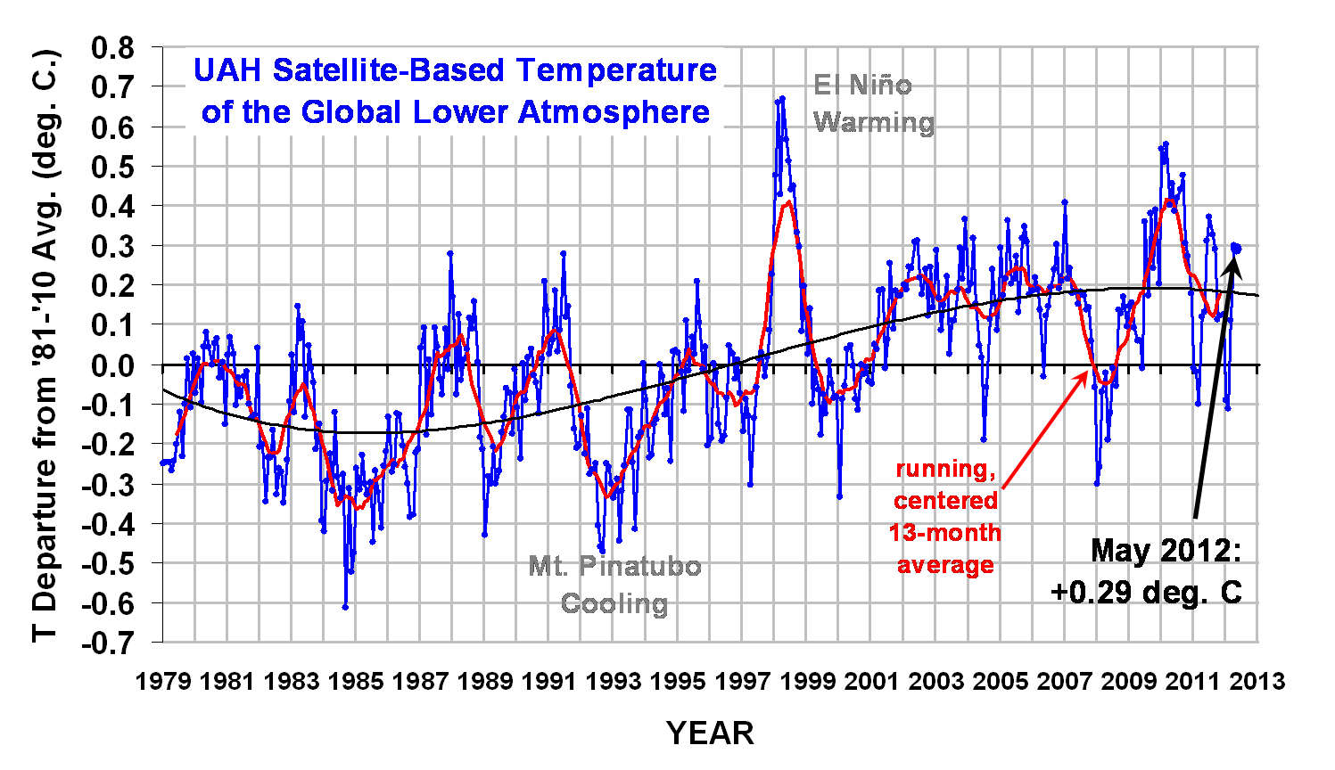
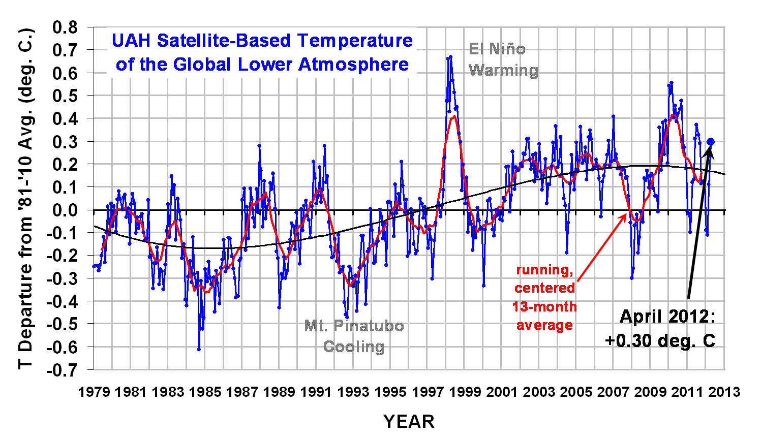
The global average lower tropospheric temperature anomaly for November, 2011 remained about the same as last month, at +0.12 deg. C (click on the image for the full-size version):

The 3rd order polynomial fit to the data (courtesy of Excel) is for entertainment purposes only, and should not be construed as having any predictive value whatsoever.

Here are this year’s monthly stats:

YR MON GLOBAL NH SH TROPICS
2011 1 -0.010 -0.055 0.036 -0.372
2011 2 -0.020 -0.042 0.002 -0.348
2011 3 -0.101 -0.073 -0.128 -0.342
2011 4 +0.117 +0.195 +0.039 -0.229
2011 5 +0.133 +0.145 +0.121 -0.043
2011 6 +0.315 +0.379 +0.250 +0.233
2011 7 +0.374 +0.344 +0.404 +0.204
2011 8 +0.327 +0.321 +0.332 +0.155
2011 9 +0.289 +0.304 +0.274 +0.178
2011 10 +0.116 +0.169 +0.062 -0.054
2011 11 +0.123 +0.075 +0.170 +0.024

Since last month I predicted another temperature fall for November, which did not occur, I will admit that I should have followed my own advice: don’t try predicting the future based upon the daily temperature updates posted at the Discover website.

FYI, I’m making progress on the Version 6 of the global temperature dataset, and it looks like the new diurnal drift correction method is working.

[Reminder: Since AMSR-E failed in early October, there will be no more sea surface temperature updates from that instrument.]

November Global Temperature Update Delayed

December 9th, 2011

There has been a delay in our monthly processing of global temperature data from AMSU.

An undersea telecommunications cable used to transmit about half of the huge volume of data coming from the Aqua satellite was cut in late November off the coast of the Netherlands, delaying receipt of that data. While there were redundant data transmission capabilities, apparently both failed.

Also, John Christy and I have been on separate travels quite a bit lately (I spent 2 weeks in Miami after my daughter had an emergency C-section — I’m a grandpa!) and now I’m at the AGU in San Francisco, with a trip to DC early next week, so monitoring of the situation has been difficult.

Version 6 of the UAH Dataset is in the Works

I have been working on a new diurnal drift correction for the UAH global temperature dataset, which will be released as Version 6 when it is finished.

The orbital drift of most of the satellites carrying the AMSUs (and earlier MSUs) has been the largest source of uncertainty in getting long-term satellite temperature trends, and the correction for this drift has been a research topic for us off-and-on for many years.

Fortunately, there has always been at least one satellite operating without significant drift, and so we have used those satellites as a “backbone”, or anchor, for the others. The Aqua satellite is the only one which has its orbit maintained with on-board propulsion, but channel 5 on the Aqua AMSU instrument has become increasingly noisy in recent years, so we anticipate at some point we will no longer be able to rely on it, thus the need for a new diurnal drift adjustment.

I’m hopeful that the new procedure I’ve developed will work well, which is rather novel and is mostly insensitive to instrument calibration (see if you can figure out how that would work, wink-wink). The ultimate test will be the removal of long-term drift between simultaneously operating satellites, which also depends on season. It should allow us to get better regional temperature trends, land-vs-ocean trends, and remove some spurious season-dependent differences in temperature trends.

The earliest Version 6 of the UAH dataset would be available is the early January update of the December temperature data.

Climategate 2.0: Bias in Scientific Research

November 23rd, 2011

Ever since the first Climategate e-mail release, the public has become increasingly aware that scientists are not unbiased. Of course, most scientists with a long enough history in their fields already knew this (I discussed the issue at length in my first book Climate Confusion), but it took the first round of Climategate e-mails to demonstrate it to the world.

The latest release (Climategate 2.0) not only reveals bias, but also some private doubts among the core scientist faithful about the scientific basis for the IPCC’s policy goals. Yet, the IPCC’s “cause” (Michael Mann’s term) appears to trump all else.

So, when the science doesn’t support The Cause, the faithful turn toward discussions of how to craft a story which minimizes doubt about the IPCC’s findings. After considerable reflection, I’m going to avoid using the term ‘conspiracy’ to describe this activity, and discuss it in terms of scientific bias.

It’s Impossible to Avoid Bias

We are all familiar with competing experts in a trial who have diametrically opposed opinions on some matter, even given the same evidence. This happens in science all the time.

Even if we have perfect measurements of Nature, scientists can still come to different conclusions about what those measurements mean in terms of cause and effect. So, biases on the part of scientists inevitably influence their opinions. The formation of a hypothesis of how nature works is always biased by the scientist’s worldview and limited amount of knowledge, as well as the limited availability of research funding from a government that has biased policy interests to preserve.

Admittedly, the existence of bias in scientific research – which is always present — does not mean the research is necessarily wrong. But as I often remind people, it’s much easier to be wrong than right in science. This is because, while the physical world works in only one way, we can dream up a myriad ways by which we think it works. And they can’t all be correct.

So, bias ends up being the enemy of the search for scientific truth because it keeps us from entertaining alternative hypotheses for how the physical world works. It increases the likelihood that our conclusions are wrong.

The IPCC’s Bias

In the case of global warming research, the alternative (non-consensus) hypothesis that some or most of the climate change we have observed is natural is the one that the IPCC must avoid at all cost. This is why the Hockey Stick was so prized: it was hailed as evidence that humans, not Nature, rule over climate change.

The Climategate 2.0 e-mails show how entrenched this bias has become among the handful of scientists who have been the most willing participants and supporters of The Cause. These scientists only rose to the top because they were willing to actively promote the IPCC’s message with their particular fields of research.

Unfortunately, there is no way to “fix” the IPCC, and there never was. The reason is that its formation over 20 years ago was to support political and energy policy goals, not to search for scientific truth. I know this not only because one of the first IPCC directors told me so, but also because it is the way the IPCC leadership behaves. If you disagree with their interpretation of climate change, you are left out of the IPCC process. They ignore or fight against any evidence which does not support their policy-driven mission, even to the point of pressuring scientific journals not to publish papers which might hurt the IPCC’s efforts.

I believe that most of the hundreds of scientists supporting the IPCC’s efforts are just playing along, assured of continued funding. In my experience, they are either: (1) true believers in The Cause; (2) think we need to get away from using fossil fuels anyway; or (3) rationalize their involvement based upon the non-zero chance of catastrophic climate change.

My Biases

I am up front about my biases: I think market forces will take care of the fact that “fossil” fuels are (probably) a limited resource. Slowly increasing scarcity will lead to higher prices, which will make alternative energy research more attractive. This is more efficient that trying to legislate new forms of energy into existence.

I also think currently proposed energy policies will cause widespread death and suffering. The IPCC not only destroys scientific objectivity and scientific progress, it also destroys lives.

Therefore, I view it as my moral duty to support the “forgotten science” of natural climate change, a class of alternative hypotheses that have all but been ignored by the IPCC and government funding agencies.

I hope I am correct that most climate change we have experienced is natural. But I also know that “hoping” doesn’t make it so. If I had new scientific evidence that human-caused climate change really was a threat to life on Earth, I would publish it. It would sure be easier to publish than evidence against.

But from everything I’ve seen, I still think Nature probably rules, and that humans (as part of nature) also have some unknown level influence on climate. We know that the existence of trees affects climate – why not the existence of humans?

Countering the Bias

Scientists are human, and so you will never remove the tendencies toward bias in scientific research. You can’t change human nature.

But you can level the playing field by supporting alternative biases.

For years John Christy and I have been advising Congress that some portion of the appropriated funds for federal agencies supporting climate change research should be mandated to support alternative hypotheses of climate change. It’s time for the pendulum to start swinging back the other way.

After all, scientists will go where the money is. If scientists are funded to find evidence of natural sources of climate change, believe me, they will find it.

If you build such a playing field, they will come.

But when only one hypothesis is allowed as the explanation for climate change (e.g. “the science is settled”), the bias becomes so thick and acrid that everyone can smell the stench. Everyone except the IPCC leadership, that is.

UAH Global Temperature Update for October 2011: +0.11 deg. C

November 3rd, 2011

The global average lower tropospheric temperature anomaly for October, 2011 dropped , to +0.11 deg. C (click on the image for the full-size version):

The 3rd order polynomial fit to the data (courtesy of Excel) is for entertainment purposes only, and should not be construed as having any predictive value whatsoever.

Here are this year’s monthly stats:

YR MON GLOBAL NH SH TROPICS
2011 1 -0.010 -0.055 +0.036 -0.372
2011 2 -0.020 -0.042 +0.002 -0.348
2011 3 -0.101 -0.073 -0.128 -0.342
2011 4 +0.117 +0.195 +0.039 -0.229
2011 5 +0.133 +0.145 +0.121 -0.043
2011 6 +0.315 +0.379 +0.250 +0.233
2011 7 +0.374 +0.344 +0.404 +0.204
2011 8 +0.327 +0.321 +0.332 +0.155
2011 9 +0.289 +0.304 +0.274 +0.178
2011 10 +0.114 +0.169 +0.059 -0.056

The Northern Hemisphere, Southern Hemisphere, and tropics have all cooled substantially, consistent with the onset of another La Nina, with the tropics now back below the 1981-2010 average.

[Since AMSR-E failed in early October, there will be no more sea surface temperature updates from that instrument.]

For those tracking the daily AMSU 5 data at the Discover website, the temperature free-fall continues so I predict November will see another substantial drop in global temperatures (click for large version):

WHAT MIGHT THIS MEAN FOR CLIMATE CHANGE?
…taking a line from our IPCC brethren… While any single month’s drop in global temperatures cannot be blamed on climate change, it is still the kind of behavior we expect to see more often in a cooling world. 😉

Brrr…the Troposphere Is Ignoring Your SUV

October 30th, 2011

For those tracking the daily global temperature updates at the Discover website, you might have noticed the continuing drop this month in global temperatures. The mid-tropospheric AMSU channels are showing even cooler temperatures than we had at this date with the last (2008) La Nina. The following screen shot is for AMSU channel 6 (click for large version).

A check of the lower stratospheric channels (9, 10) suggests this is not a stratospheric effect bleeding over into the tropospheric channels.

With the current (and forecast to continue) stormy pattern over the U.S., I have to wonder whether the atmosphere is currently in a destabilized state. I doubt that surface temperatures anomalies are as anomalously low as the mid-troposphere temperatures are running, which in combination with anomalously cold mid- and upper-tropospheric temperatures means there is extra energy available for storms. (Since AMSR-E failed in early October, our sea surface temperature plot is no longer showing current data, so I have no easy way to check surface temperatures.)

Of course, this too shall pass. I just thought it was an interesting curiosity during a time when some pundits are claiming global warming is “accelerating”. Apparently, they are still stuck in the last millennium.

Our GRL Response to Dessler Takes Shape, and the Evidence Keeps Mounting

October 12th, 2011

I will be revealing some of the evidence we will be submitting to Geophysical Research Letters (GRL) in response to Dessler’s paper claiming to refute our view of the forcing role of clouds in the climate system.

To whet your appetite, here is a draft version of one of the illustrations (click for the large version). It clearly shows the large discrepancy which exists between the IPCC climate models and satellite observations in the way they show the Earth shedding excess radiant energy in response to warming. This is central to question of how much warming can be expected from anthropogenic greenhouse gas emissions, because the less radiant energy the model’s shed per degree of warming, the more the models continue to warm.

The figure above represents 700 years of data (50 years each from all 14 models we have analyzed), and all 20 years of global Earth radiant energy budget data which exists from 2 satellite periods. Each point plotted represents an estimate of how much energy is lost (gained) by the Earth per degree of warming (cooling) during year-to-year climate variations in the individual decades.

Results for various averaging times are shown: Monthly (used by Dessler), 3 and 12 monthly (used by Forster & Gregory, 2006 J. Climate in their analysis of ERBE data, results of which are plotted as blue squares above), and 18 months used by only us in our analysis of the CERES data. We decided showing results for multiple averaging times is better than arguing with our critics over what averaging time is best. (If there are two options, A and B, and we chose A, our critics would claim there was an Exxon-funded conspiracy to exclude B.)

Of course, this evidence also supports one of the main conclusions of our Remote Sensing paper published earlier this year: there is a large discrepancy between the IPCC climate models and observations. That’s the paper which led to the resignation of the journal’s Chief Editor, and an apology from that journal to Kevin Trenberth for even publishing our paper (never mind it was peer reviewed by researchers who also publish on the subject).

The Effect of Volcanoes in Models versus Observations

One new twist that emerges from the above figure comes from the blue triangles, representing the model decades involving large episodic radiative forcing events by volcanic aerosols, compared to decades without volcanic forcing (yellow triangles). These blue triangles clearly show that a low bias in the regression-diagnosed feedback parameter tends to occur when time-varying radiative forcing is present (The volcanoes were Mt. Agung in the 1960s, El Chichon in the 1980’s, and Mt. Pinatubo in the 1990s. 7 of the 14 models included strong, episodic volcanic forcing, as independently decided from data presented by Forster & Taylor, 2006 J. Climate).

Furthermore, comparison of those blue triangles to the Pinatubo-influenced ERBE satellite data (blue squares, separately computed and previously published by IPCC-affiliated researchers) shows even a larger discrepancy than do the yellow (non-volcanic) triangles compared to the (orange) CERES data, which experience no major volcanic events. While one might argue that the CERES satellite measurements (orange circles) are not totally inconsistent with the yellow model triangles, the same cannot be said about the ERBE Pinatubo-influenced observations (blue squares) versus the blue model triangles. This has become a common IPCC defense of the climate models (“…well, the observations aren’t totally inconsistent with all of the models…”), as if this somehow constitutes validation of the climate models.

How Do the Results Jibe with Dessler (2010)?
Dessler (2010) in effect made a calculation representing the single orange circle on the far left. He interpreted it as evidence of positive cloud feedback (all of the IPCC models now exhibit positive cloud feedback), and indeed if I were to take that single circle, with its diagnosed net feedback parameter of only 1.2 W m-2 K-1, I might be inclined to agree it does, indeed, suggest positive cloud feedback.

But note how that single orange circle compares to the models (the triangles) when the exact same calculation is made from them. There is a significant discrepancy, which is seen to grow at the longer averaging times where the feedback signal is expected to more clearly emerge.

And the discrepancy appears to be the greatest in decades that experienced major volcanic eruptions.

Conclusion

The evidence keeps mounting that the Earth is more resistant to radiative forcing than are the climate models used by the IPCC to project future climate change. While it doesn’t actually prove the models are wrong in their projections of global warming, I don’t see how discrepancies this large can continue to be ignored.

If not for the public policy implications (which Dessler admits was the impetus for his 2011 paper criticizing our work), evidence as strong as that contained in the above illustration would be easily embraced by the climate research community. Maybe some day.

It will be interesting to see whether GRL rejects our paper out of hand. Maybe it would help if I joined the Union of Concerned Scientists. Hmmmm.

P.S….another tidbit for those following Dessler’s claim that clouds can’t cause climate change…
Dessler claims that changes in ocean temperature are way too large to be caused by clouds. Well, the year-to-year changes in Levitus global ocean heat content of the 0-700 m layer during the 2000-2010 satellite period of record yields a yearly standard deviation of 0.5 Watts per sq. meter for the energy required. In comparison, the yearly standard deviation of the global oceanic CERES satellite radiative fluxes is 0.3 Watts per sq. meter, which represents 60% of the energy required to cause the ocean temperature changes. Using any reasonable feedback parameter combined with the sea surface temperature variations yields only 0.1 Watts per sq. meter.

Thus, cloud variations (or maybe even natural water vapor variations?) can constitute an important natural forcing component of climate variability. And since it is our physical interpretation of observed climate variability that impacts our estimates of climate sensitivity, it also impacts our estimates of future global warming (aka climate change).

At this point, I suspect Dessler’s conclusions to the contrary are partly the result of a large amount of noise in temperature changes with time computed from short-term Levitus ocean heat content data.

I’ve Looked at Clouds from Both Sides Now -and Before

October 8th, 2011

…sometimes, the most powerful evidence is right in front of your face…..

I never dreamed that anyone would dispute the claim that cloud changes can cause “cloud radiative forcing” of the climate system, in addition to their role as responding to surface temperature changes (“cloud radiative feedback”). (NOTE: “Cloud radiative forcing” traditionally has multiple meanings. Caveat emptor.)

But that’s exactly what has happened. Andy Dessler’s 2010 and 2011 papers have claimed, both implicitly and explicitly, that in the context of climate, with very few exceptions, cloud changes must be the result of temperature change only.

Shortly after we became aware of Andy’s latest paper, which finally appeared in GRL on October 1, I realized the most obvious and most powerful evidence of the existence of cloud radiative forcing was staring us in the face. We had actually alluded to this in our previous papers, but there are so many ways to approach the issue that it’s easy to get sidetracked by details, and forget about the Big Picture.

Well, the following graph is the Big Picture. It shows the 3-month variations in CERES-measured global radiative energy balance (which Dessler agrees is made up of forcing and feedback), and it also shows an estimate of the radiative feedback alone using HadCRUT3 global temperature anomalies, assuming a feedback parameter (λ) of 2 Watts per sq. meter per deg (click for full-size version):

What this graph shows is very simple, but also very powerful: The radiative variations CERES measures look nothing like what the radiative feedback should look like. You can put in any feedback parameter you want (the IPCC models range from 0.91 to 1.87…I think it could be more like 3 to 6 in the real climate system), and you will come to the same conclusion.

And if CERES is measuring something very different from radiative feedback, it must — by definition — be radiative forcing (for the detail-oriented folks, forcing = Net + feedback…where Net is very close to the negative of [LW+SW]).

The above chart makes it clear that radiative feedback is only a small portion of what CERES measures. There is no way around this conclusion.

Now, our 3 previous papers on this subject have dealt with trying to understand the extent to which this large radiative forcing signal (or whatever you want to call it) corrupts the diagnosis of feedback. That such radiative forcing exists seemed to me to be beyond dispute. Apparently, it wasn’t. Dessler (2011) tries to make the case that the radiative variations measured by CERES are not enough energy to change the temperature of the ocean mixed layer…but that is a separate issue; the issue addressed by our previous 3 papers is the extent to which radiative forcing masks radiative feedback. [For those interested, over the same period of record (April 2000 through June 2010) the standard deviation of the Levitus-observed 3-month changes in temperature with time of the upper 200 meters of the global oceans corresponds to 2.5 Watts per sq. meter]

I just wanted to put this evidence out there for people to see and understand in advance. It will be indeed part of our response to Dessler 2011, but Danny Braswell and I have so many things to say about that paper, it’s going to take time to address all of the ways in which (we think) Dessler is wrong, misused our model, and misrepresented our position.

UAH Global Temperature Update for September 2011: +0.29 deg. C

October 4th, 2011

The global average lower tropospheric temperature anomaly for September, 2011 retreated a little again, to +0.29 deg. C (click on the image for the full-size version):

The 3rd order polynomial fit to the data (courtesy of Excel) is for entertainment purposes only, and should not be construed as having any predictive value whatsoever.

Here are this year’s monthly stats:

YR MON GLOBAL NH SH TROPICS
2011 1 -0.010 -0.055 0.036 -0.372
2011 2 -0.020 -0.042 0.002 -0.348
2011 3 -0.101 -0.073 -0.128 -0.342
2011 4 +0.117 +0.195 +0.039 -0.229
2011 5 +0.133 +0.145 +0.121 -0.043
2011 6 +0.315 +0.379 +0.250 +0.233
2011 7 +0.374 +0.344 +0.404 +0.204
2011 8 +0.327 +0.321 +0.332 +0.155
2011 9 +0.289 +0.309 +0.270 +0.175

The global sea surface temperatures from AMSR-E through the end of AMSR-E’s useful life (October 3, 2011) are shown next. The trend line is, again, for entertainment purposes only:

On the subject of the drop-off in temperatures seen in the AMSR-E data in the last week, I have been getting questions about the daily AMSU tracking data at the Discover website which shows Aqua AMSU channel 5 (which our monthly updates are computed from) is now entering record-low territory (for the date, anyway, and only since the Aqua record began in 2002). While I have always cautioned people against reading too much into week-to-week changes in global average temperature, this could portend a more significant drop in the next (October) temperature update, as the new La Nina approaches.