On the Divergence Between the UAH and RSS Global Temperature Records

July 7th, 2011

…or, OMG! HAS UAH BEEN BOUGHT OFF BY GREENPEACE!?

Over the last ten years or so there has been a growing inconsistency between the UAH and Remote Sensing Systems versions of the global average lower tropospheric temperature anomalies. Since I sometimes get the question why there is this discrepancy, I decided it was time to address it.

If we look at the entire 30+ year record, we see that the UAH and RSS temperature variations look very similar, with a correlation coefficient of 0.963 and linear trends which are both about +0.14 deg. C per decade:


(In the above plot I have re-computed the RSS anomalies so they are relative to the 1981-2010 average annual cycle we use; this does not affect the trends…just makes it more of an apples-to-apples comparison).

But if we examine a time series of the DIFFERENCE between the two temperature records, we see some rather interesting structure:


(Note: I have applied a 3-month smoother to the data to reduce noise).

As can be seen, in the last 10 years or so the RSS temperatures have been cooling relative to the UAH temperatures (or UAH warming relative to RSS…same thing). The discrepancy is pretty substantial…since 1998, the divergence is over 50% of the long-term temperature trends seen in both datasets.

WHY THE DIVERGENCE?

So, why the discrepancy? Well, if it was OUR (UAH) data that was cooling relative to RSS, people would accuse us of being bought off by Exxon-Mobil (I wish!…still waiting for that check..). At least that has been the history of this debate.

But now WE are the ones with “excess” warming. So where are the accusations that RSS is being bought off by Big Oil?

Hmmmm?

(It’s OK, we are used to the hypocrisy. 🙂 )

Anyway, my UAH cohort and boss John Christy, who does the detailed matching between satellites, is pretty convinced that the RSS data is undergoing spurious cooling because RSS is still using the old NOAA-15 satellite which has a decaying orbit, to which they are then applying a diurnal cycle drift correction based upon a climate model, which does not quite match reality. We have not used NOAA-15 for trend information in years…we use the NASA Aqua AMSU, since that satellite carries extra fuel to maintain a precise orbit.

Of course, this explanation is just our speculation at this point, and more work would need to be done to determine whether this is the case. The RSS folks are our friends, and we both are interested in building the best possible datasets.

But, until the discrepancy is resolved to everyone’s satisfaction, those of you who REALLY REALLY need the global temperature record to show as little warming as possible might want to consider jumping ship, and switch from the UAH to RSS dataset.

It’s OK, we’ve developed thick skin over the years. 🙂 You can always come home later.

Gee, I wonder if some of all that green money will start flowing our way now? I’m not going to hold my breath.

UAH Global Temperature Update for June, 2011: +0.31 deg. C

July 7th, 2011

Post-La Nina Warming Continues
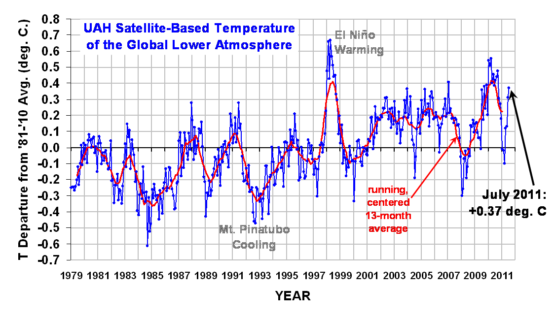
The global average lower tropospheric temperature anomaly for June, 2011 increased to +0.31 deg. C (click on the image for a LARGE version):

The Northern Hemisphere, Southern Hemisphere, and and Tropics all experienced temperature anomaly increases in June:

YR MON GLOBAL NH SH TROPICS
2011 1 -0.010 -0.055 +0.036 -0.372
2011 2 -0.020 -0.042 +0.002 -0.348
2011 3 -0.101 -0.073 -0.128 -0.342
2011 4 +0.117 +0.195 +0.039 -0.229
2011 5 +0.133 +0.145 +0.121 -0.043
2011 6 +0.314 +0.377 +0.251 +0.235

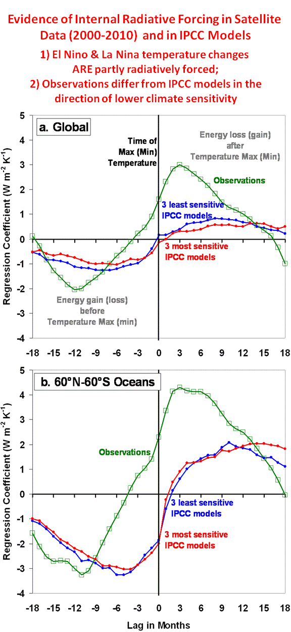
I would like to remind everyone that month-to-month changes in global-average tropospheric temperature have a large influence from fluctuations in the average rate of heat transfer from the ocean to the atmosphere. In other words, they are not of radiative origin (e.g. not from greenhouse gases). El Nino/La Nina is probably the most dramatic example of this kind of activity, but there are also “intraseasonal oscillations” in the ocean-atmosphere energy exchanges occurring on an irregular basis, too.

YEARLY temperature averages probably provide a better indication of the existence of radiative forcings on the climate system (whether warming or cooling). Nevertheless, we must remember that even DECADAL time scale (or longer) changes in the ocean circulation could also be involved, which can cause long-term climate change independent of any kind of greenhouse gas (or cosmic ray-induced) radiative forcing. (That last sentence has not been approved by the IPCC…but I don’t really care.)

FUNDANOMICS: The Free Market, Simplified

July 4th, 2011


I’m pretty excited that today (Independence Day, 2011) is the release date for my new book, Fundanomics: The Free Market, Simplified.

Our friend, Josh, did the cover art and it perfectly captures one of the book’s main messages: the greatest prosperity for ALL in a society is achieved when people are free to benefit from their good ideas.

In Chapter 1, A Tale of Two Neanderthals, Borgg and Glogg are the tribe’s firestarters, who get the idea to invent firesticks (matches). This leads to a system of trading with a neighboring tribe which has many great hunters, and as a result the inventors’ tribe never goes hungry again.

But the favored treatment the inventors receive from the tribe’s elders later leads to resentment in the tribe, and people forget how much better off they all are than before — even the poorest among them. Technology and prosperity might change, but human nature does not.

Simply put, a successful economy is just people being allowed to provide as much stuff as possible for each other that is needed and wanted. Economics-wise, everything else is details. When we allow politicians and opportunistic economists to fool us into supporting a variety of technical and murky government “fixes” for the economy, we lose sight of the fundamental motivating force which must be preserved for prosperity to exist: Liberty and the pursuit of happiness.

The main role of the government in the economy is help ensure people play fair…and then get out of the way.

I devote each chapter to a common economic myth.

For example, it’s not about money, which has no inherent value and is simply a convenient means of exchange of goods and services that is more efficient than bartering.

It’s not even about “jobs”, because it makes all the difference what is done in those jobs. Many poor countries have a much lower standard of living than ours, yet fuller employment. If we want full employment, just have half the population dig holes in the ground and the other half can fill them up again. The goal is a higher standard of living…not just “jobs”.

And the desire of some for a “more level playing field” and for “spreading the wealth around” is simply pandering to selfishness and laziness. The truth is that most of the wealth has already been spread around, in the form of a higher standard of living. If we do not allow the few talented and risk-taking people among us have at least the hope of personally benefiting in proportion to their good ideas, then economic progress stops.

The good news is that those few talented people need help, which is where most of the rest of us come in. One person with a new idea for a computer cannot design, manufacture, market, distribute, and sell millions of computers to the rest of society. They need our help, and in the process everyone benefits.

I also examine the role of various government economic programs, most of which end up hurting more than helping. A major reason why the government is so prone to failure is the lack of disincentives against failure in government service. In the real marketplace failures are not rewarded, which helps keep us on the right track to prosperity.

Even the truly needy in our country would be better off if we allowed private charitable organizations, rather than inefficient government bureaucracies to compete for the public’s donations.

I’ve been interested in basic economics for the last 25 years, but frustrated by the technical details (marginal costs, money supply, etc.) that too often scare people away from understanding the most basic forces which propel societies to ever high standards of living. Now, with our country facing tough decisions about our financial future, I decided it was time to stop yelling at the idiots on TV (and giving away all my ideas to talk show hosts) and put the material in a short — less than 100 pages — book that would be approachable by anyone.

I’ll be signing the first 500 copies. The price is $12.95 (including free shipping in the U.S.) You can see all of the chapter first pages at Fundanomics.org. I think this book would be especially valuable to homeschoolers.

(NOTE REGARDING COMMENTS, BELOW: In response to a comment that it was ironic for a scientist whose research is 100% funded by the U.S. Government to be against wasteful government spending, my statement that “I view my job a little like a legislator” has caused quite a stir, especially over at ThinkProgress. This was a rather poor analogy…my point was that a federally-funded person like myself can be against excess government spending, just as some federally-funded legislators are, that’s all. I did not mean to imply I wanted to be a de facto legislator. The context of the full comment, below, should have made that clear.

And, once again, ThinkProgress reveals the hypocrisy of those who think its OK for Al Gore to play a climate scientist, or NASA’s James Hansen to actively campaign for Malthusian energy policy changes and for presidential candidates – in violation of the Hatch Act, as NASA employees are told during their annual ethics training classes.)

More Evidence that Global Warming is a False Alarm: A Model Simulation of the last 40 Years of Deep Ocean Warming

June 25th, 2011

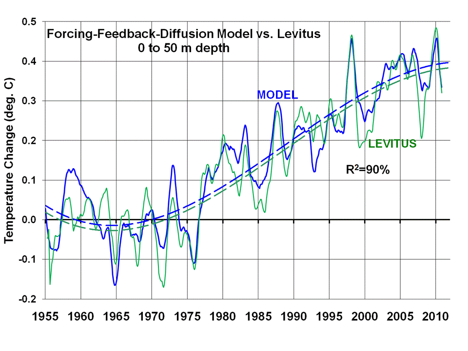
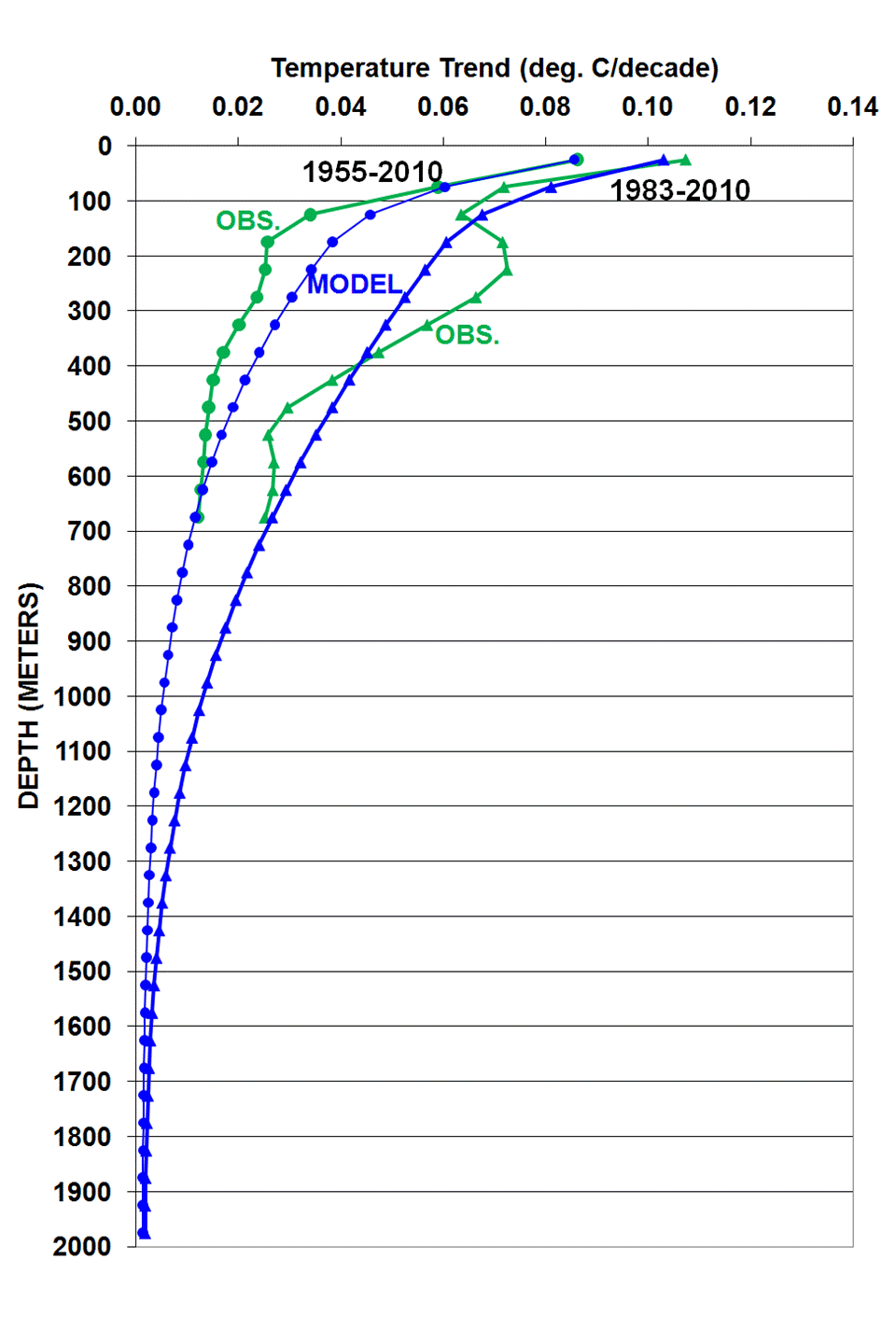
NOTE: I am making available the Excel spreadsheet with the simple forcing-feedback-diffusion model so people can experiment with it. The spreadsheet is fairly self-explanatory. THE DIFFUSION COEFFICIENTS CANNOT BE VARIED TOO DRASTICALLY SINCE, WITH A MONTHLY TIME STEP, THE MODEL WILL CREATE UNSTABLE TEMPERATURE OSCILLATIONS. This is a common problem with numerical integration, which could be eliminated by reducing the time step, but I wanted to keep the model file size manageable:
simple-forcing-feedback-ocean-heat-diffusion-model-v1.0
FOLLOWUP NOTE: The above spreadsheet has an error in the equations, which does not change the conclusions, but affects the physical consistency of the calculations. The heat capacity used for water is 10 times too low, and the diffusion coefficients are also 10x too low. Those errors cancel out. I will post a new spreadsheet when I get back to the office, as I am on travel now.

NASA’s James Hansen is probably right about this point: the importance of ocean heat storage to a better understanding of how sensitive the climate system is to our greenhouse gas emissions. The more efficient the oceans are at storing excess heat during warming, the slower will be the surface temperature response of the climate system to an imposed energy imbalance.

Unfortunately, the uncertainties over the rate at which vertical mixing takes place in the ocean allows climate modelers to dismiss a lack of recent warming by simply asserting that the deep oceans must somehow be absorbing the extra heat. Think Trenberth’s “missing heat“. (For a discussion of the complex processes involved in ocean mixing see here.)

Well, maybe what is really missing is the IPCC’s willingness to admit the climate system is simply not as sensitive to our greenhouse gas emissions as they claim it is. Maybe the missing heat is missing because it does not really exist.

This is where we can learn from the 40+ year record of deep ocean temperature changes. Even the 2007 IPCC report admitted the oceans have warmed more slowly at depth than the climate models can explain.

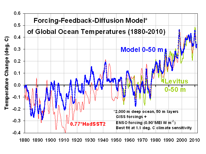
Here I will show quantitatively with a simple forcing-feedback-diffusion model that recent ocean warming is actually consistent with a climate sensitivity which is so low that the IPCC considers it very unlikely.

I will also show how disingenuous the IPCC 2007 report was in presenting the ocean warming evidence to support its view that anthropogenic global warming will be a serious problem.

The Need for Ocean Layers in a Climate Model

Ten years ago Dick Lindzen used a simple climate model to look into the issue of whether the rate of ocean warming at 500 meters depth might help us better understand how sensitive the climate system is. He concluded that it is the surface temperature that is most important, not what happens deeper down in the ocean.

Conceptually, the line of reasoning here would be that the deep ocean can’t warm unless the surface warms first, and the rate of surface warming is largely controlled by atmospheric feedbacks.

In contrast, Roger Pielke, Sr. has always maintained that the heat content of the ocean is what we should be monitoring, not the surface temperature, to better understand how sensitive the climate system is to various forcings.

I WILL say I firmly believe that the surface temperature is THE MOST important temperature in the climate system. This is because (1) the surface is where most sunlight is absorbed, (2) the atmosphere is then convectively coupled to the surface, and (3) the surface and atmosphere together are the ONLY way for the Earth to radiatively cool to space in the face of continuous solar heating.

But, as we will see, the detailed profile of recent warming with depth in the ocean does appear to have additional information about climate sensitivity that is not apparent from surface warming alone.

Explaining the Observed Heating Profile of the Ocean

The following picture is worth a thousand words….but I will try to use fewer than that. First, it is partly a reworking of Fig. 9.15 of the IPCC 2007 report, showing the substantial discrepancy between observed global-average warming of the oceans to 700 meters depth (red curve), and warming estimated from the PCM1 climate model (solid green curve) for the 40-year period ending (I believe) around 2005 (click for the large version).

The green dashed line is my simple model simulation of the PCM1 model’s 40-year warming profile, where I used the GISS yearly global climate forcings to force temperature changes in the 30-layer model, where all layers have adjustable diffusion coefficients.

To get this match to the PCM1 model results, I specified the known PCM1 model net feedback parameter (1.8 Watts per sq. meter per degree), and then adjusted the diffusion coefficients between the simple model’s 50-meter thick layers extending from the surface to a depth of 1,500 meters until I got good agreement between my simple model and the PCM1 model results.

As you can see, my model fit (green dashed line) to the PCM1 model results (green solid line) is pretty good. (Some small amount of warming occurs all the way to the 1,500 m bottom of the model, although it is extremely weak). This demonstrates that the simple model can basically replicate the behavior of the much more complex PCM1 model, albeit for only global-average results.

Next, after I got the simple model to mimic the PCM1 model, then I tried to explain the observations (red) curve by adjusting (1) the model sensitivity (assumed feedback parameter), and (2) the diffusion coefficients, until the model explained the actual observed warming profile. Interestingly, the diffusion coefficients only needed to be changed for the top three ocean layers (down to 200 m depth, which would be about the bottom of the themocline.) The rest of the diffusion coefficients remained the same as in the PCM1-matching simulation.

The result is the blue curve. Significantly, the simple model required a feedback parameter equivalent to a climate sensitivity of only 1.3 deg. C in response to a doubling of CO2. This is well below the range of warming the IPCC claims is most likely (2.5 to 4 deg. C).

What It Means

The bottom line is that 40 years of warming of the 0-700 meter ocean layer has been so modest that, even if we assume it was caused by the GISS forcings (which Hansen believes will eventually cause strong warming) , it corresponds to low climate sensitivity anyway.

In other words, the oceans have not warmed enough to support the IPCC’s predictions of future warming.

The problem in the IPCC models seems to be that they mix excess heat too rapidly from the mixed layer into the deep ocean. This allows the models to retain high climate sensitivity, while limiting the amount of surface warming they produce to match the observed warming to date.

Voila! The models can thus “explain” the surface temperature record AND STILL predict strong warming for the future.

Even though the model I use is admittedly simple, this does not really matter because, in the global average, long-term temperature change is only a function of 3 basic processes:

(1) the strength of the forcing (imposed energy imbalance on the climate system, due to whatever);

(2) the strength of the climate system’s resistance to that forcing (net feedback, which determines climate sensitivity); and,

(3) the rate of ocean mixing (which affects surface temperature, which affects the rate of energy loss to space through feedback processes).

Everything else is details.

How the IPCC Cheated

In the process of this little study I learned that the IPCC’s 2007 presentation of the ocean warming data was, at best, disingenuous. Here’s the original PCM1 panel of Fig. 9.15 from the 2007 IPCC report, from which I took numbers to re-plot on the figure, above:

With this figure, the IPCC was cleverly able to make it LOOK like there was general agreement between their climate models (green shaded area) and observations (red curve), with no less than four ploys:

1) They chose a climate model (PCM1) that is the 2nd LEAST sensitive of the twenty-something climate models they survey. PCM1 produces even less warming than the IPCC’s official projected range of warming from a doubling of CO2.

2) For the PCM1 model results, they presented a rather broad range of warming (green shaded area), meant to represent natural climate variations about the average warming produced by the model. In this way, they were able to get the weak observed warming to better overlap with the model produced warming, suggesting agreement.

3) They omitted the 0 deg. (no temperature change) vertical line from the figure, the presence of which would have visually revealed the significant discrepancy between the PCM1 model results and the observations.

4) They made the ocean depth scale nonlinear, which disproportionally emphasized the agreement in the relatively shallow mixed layer of the ocean, while downplaying the rather large discrepancy deeper down. But there is NO physical reason to make the ocean depth scale nonlinear; the total heat carrying capacity of the ocean varies linearly with depth, not non-linearly.

Conclusion

It appears that the vertical profile of ocean warming could be a key ingredient in getting a better idea of how sensitive the climate system is to our greenhouse gas emissions. The results here suggests the warming has been considerably weaker than what would be expected for a sensitive climate system.

The sensitivity number I estimate — 1.3 deg. C — arguably puts future warming in the realm of “eh, who cares?”

It will be interesting to see how the next IPCC report, now in the early stages of preparation, explains away the increasing discrepancies between their climate models and the observations. Since IPCC outcomes are ultimately driven by desired governmental policies and politicians, rather than science, I’m sure the wordsmithing (and figuresmithing) will be artfully done.

IMPORTANT NOTE: The above model simulation does not account for the possibility that some of recent warming could have been due to one or more natural processes, in which case the diagnosed climate sensitivity would be even lower.

UAH Temperature Update for May, 2011: +0.13 deg. C

June 7th, 2011

Little Change from Last Month
The global average lower tropospheric temperature anomaly for May, 2011 was just about the same as last month: up slightly to +0.13 deg. C (click on the image for a LARGE version):

Note the tropics continue to warm as La Nina fades:

YR MON GLOBAL NH SH TROPICS
2011 1 -0.010 -0.055 0.036 -0.372
2011 2 -0.020 -0.042 0.002 -0.348
2011 3 -0.101 -0.073 -0.128 -0.342
2011 4 0.117 0.195 0.039 -0.229
2011 5 0.131 0.143 0.120 -0.044

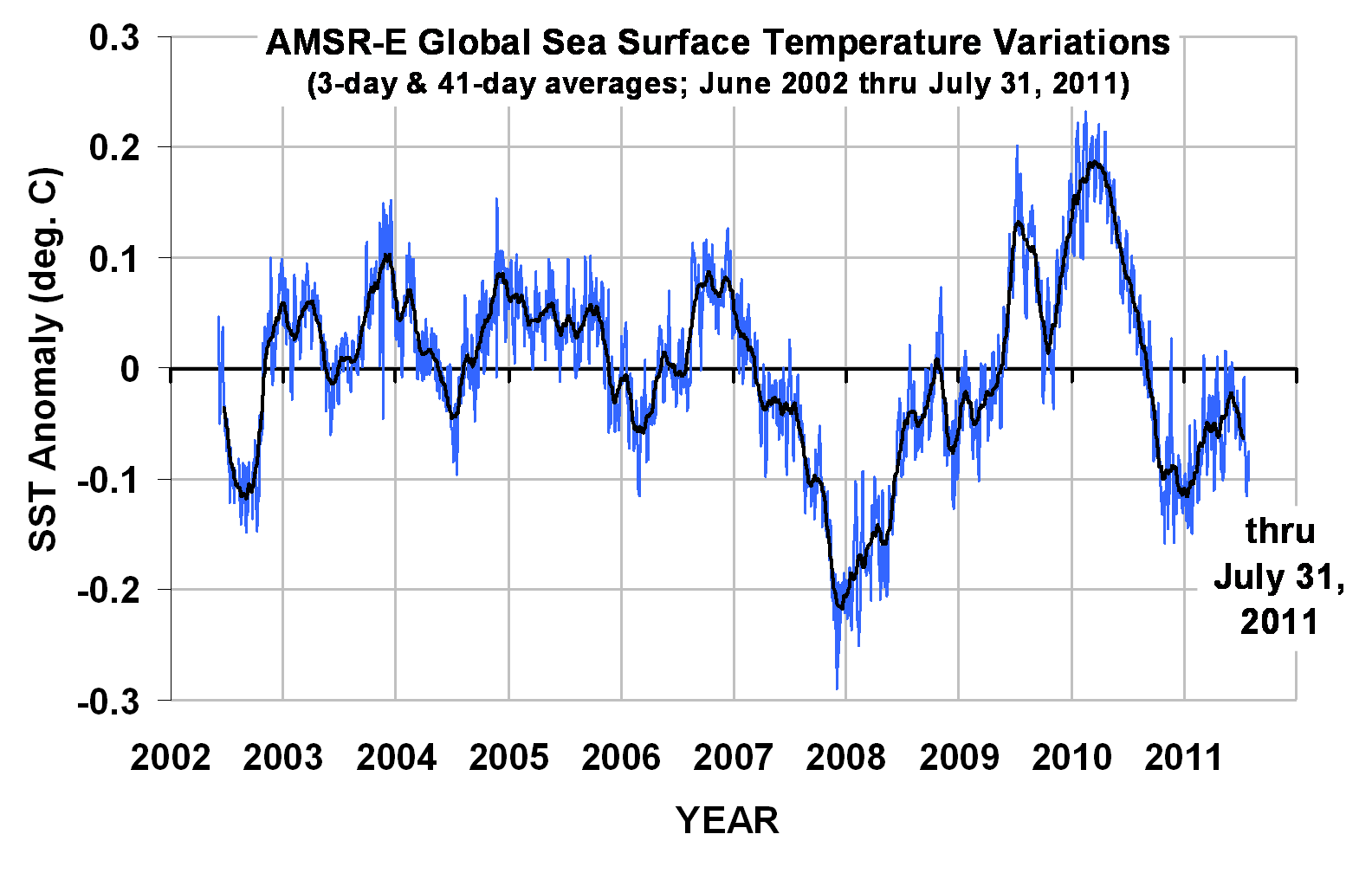
I have also updated the global sea surface temperature (SST) anomalies computed from AMSR-E through yesterday, June 8 6 (note that the base period is different, so the zero line is different than for the lower tropospheric temperature plot above):

WeatherShop.com Gifts, gadgets, weather stations, software and more...click here!

Recent Cooling of Northern Hemisphere Mid-Latitudes Viewed from Aqua

June 6th, 2011

I’ve been getting quite a few e-mails about the data on the UAH/NASA Discover website, which gives daily global average deep-layer average temperatures from the AMSU instruments on the NOAA-15 satellite and NASA’s Aqua satellite (as well as sea surface temperatures from the AMSR-E instrument on Aqua).

I have been advising users that, of all the AMSU channels listed there, to trust only the “ch. 5” (mid-tropospheric) temperatures, since all of the other channels at the Discover website are from the NOAA-15 satellite, which has diurnal drift issues. Hopefully later this week we will transition those other channels from NOAA-15 AMSU to Aqua AMSU, so there will be no long-term drift issues from changes in the satellite observation time. The downside will be that all of the data will only be available since Aqua data started flowing, in mid-2002. (Again, the sea surface temperature variations are very accurate, and come from a completely different instrument using different methods).

Since there is considerable interest in the subject of “global cooling”, I thought I would give a preview of some of the Aqua AMSU data for the Northern Hemisphere mid-latitudes, which are shown in the following plot…these are daily running 31-day averages, area averaged over the 30N to 60N latitude band (click on the image for the HUGE version):

There are several observations that can be made from the above plot:

1) there has been no significant long-term LINEAR trend in any of the channels;

2) the mid-troposphere and low-troposphere channels show warming early in the record, then cooling late in the record, as indicated by the 2nd order polynomial curved fits shown;

3) Late summer 2010 was, indeed, quite warm in the NH mid-latitudes.

Note that, in general, ch. 3 should not be relied upon to infer temperature changes, due to it’s sensitivity to a variety of non-temperature effects from the surface. This is especially true over the ocean, where low clouds produce an anomalous warm signature against the radiometrically cold ocean background (I will show an example later).

But since we are looking at a primarily land-covered latitude band, we only need to be concerned with a different non-temperature effect: snowcover. The particularly strong late-period cooling seen in the channel 3 data is likely the result of volume scattering by enhanced snow cover in 2010 and 2011. This is a known issue with passive microwave measurements, and is the basis for snow cover, snow depth, and snow water equivalent retrievals which are used by NASA and NOAA, primarily from the AMSR-E instrument.

Note that the polynomial fits I have applied to the data are only meant to show what happened during this period…I am not suggesting they have any forecast value for the future. I will let others discuss that. Nevertheless, I think the data are useful for getting some idea of what has happened over the last decade in the region where most people live. I think the bottom line from a global warming perspective is that there has been no obvious sign of warming in the last 9 years.

The Arctic Since 2002

Here are the results for the Arctic region, 60N to 85N, but without channel 7 which has a large stratospheric contamination in Arctic air masses:

The tropospheric temperatures show no trend, while the channel 3 data shows an upward trend. In the Arctic, the channel 3 data now also become sensitive to sea ice, which causes a warm signature compared to the cold ocean background. If you don’t believe ice can cause a “warm” signal, check out today’s NOAA-15 channel 3 imagery, which shows warm signatures in the Arctic ocean and in the sea ice area surrounding Antarctica:

This is because microwave radiometers measure brightness temperature, which is a product of the temperature of an object and its microwave emissivity (1 minus its reflectivity).

To make things even more difficult in the interpretation of ch. 3, more snow cover on sea ice will cause an anomalously cold signal, rather than warm signal, just as it does over land — unless the snow is melting, in which case it switches to an anomalously warm signal. The point is that it is difficult to interpret what the upward trend in the Arctic channel 3 data is due to. Stratifying the data by season would probably give some insight.

For now, though, I think the tropospheric (AMSU ch. 5) data are pretty clear: there are no signs of warming in the last nine years in those regions where the strongest warming in the last 30 to 40 years has occurred, that is, in the Northern Hemisphere mid- and high-latitudes. And, there might even be signs of recent cooling over the last few years in the mid-latitudes, but whether this will persist is anyone’s guess.

The Tornado – Pacific Decadal Oscillation Connection

May 25th, 2011

This is a continuation of the theme of my last 2 blog posts, dealing with the fact that a greater number of strong to violent tornadoes occur in unusually COOL years, not warm years. As a quick review, the following plot clearly shows this:

This refutes the claim of a few of the global-warming-causes-everything pundits who assume that more tornadoes MUST be Gaia’s way of punishing us for providing her with more plant food (carbon dioxide).

There are 2 main reasons why stronger tornadoes are usually associated with unseasonably cool conditions, and why there has been a decrease in strong tornadoes during a period of average warming:

1) The missing ingredient for tornado formation is not a lack of warm moist air, but a lack of synoptic (large) scale wind shear.

2) At least until recently, the positive phase of the Pacific Decadal Oscillation (PDO) which has predominated since the late 1970’s has suppressed strong tornado activity.

Let’s look at these two issues.

THE MISSING INGREDIENT: WHY 99% OF THUNDERSTORMS DO NOT PRODUCE TORNADOES
I’ve been trying to think of why some might assume a warmer climate would produce more tornadoes, and I suspect the main reason is that tornadoes are produced by thunderstorms, and thunderstorms require warm, moist air for fuel. Ergo, warming should lead to more tornadoes.

But even here in the U.S., which is Tornado Central for the world, 99 out of 100 thunderstorms do NOT produce tornadoes. Why is this?

The missing ingredient is wind shear, specifically an increase in wind speed with height, and a change in wind direction with height.

So what causes this type of wind shear? It occurs in advance of low pressure areas that form along the boundary between warm and cool air masses. So, anything that increases the frequency of these conditions could lead to more tornadoes.

The classic tornado situation involves a longwave low pressure trough over the western U.S., caused by an unusually cool atmosphere in the lowest 5-10 miles of the atmosphere. This has remained true for this year’s enhanced tornado activity. I suspect the persisting mountain snowpack from a very snowy winter has played a role in this.

The following plot of the U.S. shows correlation between the annual number of strong (F3) to violent (F5) warm-season (March through August) tornadoes and regional temperature departures from normal.

First, we see in ALL regions a negative correlation between temperature and the total number of strong to violent tornadoes in the U.S.

This is basically the regional breakdown of the U.S.-average relationship shown in the first plot above, which demonstrates that the increased frequency of strong tornadoes with cooler, not warmer, temperatures. This is no doubt an indirect effect, mirroring the more frequent intrusion of unseasonably cool air masses, which cause the wind shear conditions more conducive to tornado formation.

Secondly, we see that the relationship is the strongest over the western U.S. This pattern is consistent with a longwave low pressure trough over the western U.S., which favors more tornado formation for the reasons outlined above.

So, the next question is, what favors unseasonably cool weather over the West during tornado season? This is where the Pacific Decadal Oscillation (PDO) comes in.

THE TORNADO-PDO CONNECTION

The following plot shows that the positive phase of the PDO, which predominated roughly from the late 1970s up until just a few years ago, was also a period of depressed strong tornado activity in the U.S. Conversely, more strong tornadoes seem to be associated with the negative phase of the PDO.

The reason why this is the case appears to be that the negative phase of the PDO also favors longwave low pressure troughs over the U.S. The following regional correlation plot between the negative of the PDO and temperature shows this quite clearly, with a very cool West and somewhat warm South and Southeast:

Of course, the negative PDO/more tornadoes connection will not necessarily hold every year, just as the La Nina/more hurricanes connection does not hold every year.

But the major point here is that it is NOT the lack of warm air that inhibits tornado formation during tornado season…it is the lack of sufficient wind shear to cause thunderstorms to rotate. And it is the persistence of unseasonably cool air, over most of the U.S., that produces these wind shear conditions.

Today’s Tornado Outlook: High Risk of Global Warming Hype

May 24th, 2011


After the catastrophic death toll from the Joplin, MO tornado, which now stands at 117, we are no doubt in for more claims — dutifully amplified by the news media — that ‘climate change’ must somehow be at least partly responsible for this Spring’s wild weather.

And, to some extent, I’m inclined to agree. That is, if they are talking about the natural cooling effects of La Nina and the tendency for tornado outbreaks to be associated with cooler (not warmer) climate conditions.

But I suspect that’s just the opposite of the message they will be preaching.

So, let’s look at 2 statistics: 1) the number of strong to violent tornadoes, and 2) the deadliest tornadoes in U.S. history

THE DOWNTURN IN STRONG TORNADOES WITH WARMING
The bottom panel of following graphic shows what most meteorologists already know: there has been a downward trend in strong (F3) to violent (F5) tornadoes in the U.S. since statistics began in the 1950s. As seen in the top panel, this has also been a period of general warming. For those statistics buffs, the correlation coefficient is -0.31. Obviously, the conclusion should be that warming causes fewer strong tornadoes, not more. (Or, maybe a lack of tornadoes causes global warming!)

Even when I de-trend the data, the remaining year-to-year variability still has a negative correlation: -0.17, so the conclusion is the same for the long-term trend AND the year-to-year variations in strong tornado activity.

So how does anyone get away with claiming that global warming is contributing to more tornadoes?

Well, maybe because there has indeed been an UPward trend in total reported tornado sightings in the U.S. during the same period of time. But this is only because (as I mention in my first book, Climate Confusion) there are so many more people now spread across the fruited plain, with so many video cameras, and now so many Doppler radars are measuring the wind rotation associated with tornadoes, that it is difficult for any to go unnoticed by at least someone.

THE DOWNTURN IN TORNADO DEATHS
Also, if you hear any news reports that more deaths due to tornadoes are due to global warming, this is also a bogus claim. Here’s a little quiz for you:

QUESTION: Out of the 25 deadliest tornadoes in U.S history, how many would you guess have occurred in the last 50 years (since 1960)?

…wait for it….

ANSWER: Up until a month ago, NONE of them.

On April 27, one of the Alabama tornadoes made the bottom of the list at #25, but now has been knocked back off the list because Sunday’s tornado in Joplin will be ranked #8.

So, to the extent that you hear reports of ANYONE connecting tornadoes to global warming, I think it proves only one thing: The belief that global warming is causing most of the world’s ills is so pervasive that the facts simply do not matter anymore.

Indirect Solar Forcing of Climate by Galactic Cosmic Rays: An Observational Estimate

May 19th, 2011

UPDATE (12:35 p.m. CDT 19 May 2011): revised corrections of CERES data for El Nino/La Nina effects.

While I have been skeptical of Svensmark’s cosmic ray theory up until now, it looks like the evidence is becoming too strong for me to ignore. The following results will surely be controversial, and the reader should remember that what follows is not peer reviewed, and is only a preliminary estimate.

I’ve made calculations based upon satellite observations of how the global radiative energy balance has varied over the last 10 years (between Solar Max and Solar Min) as a result of variations in cosmic ray activity. The results suggest that the total (direct + indirect) solar forcing is at least 3.5 times stronger than that due to changing solar irradiance alone.

If this is anywhere close to being correct, it supports the claim that the sun has a much larger potential role (and therefore humans a smaller role) in climate change than what the “scientific consensus” states.

BACKGROUND

The single most frequently asked question I get after I give my talks is, “Why didn’t you mention the sun?” I usually answer that I’m skeptical of the “cosmic ray gun” theory of cloud changes controlling climate. But I point out that Svensmark’s theory of natural cloud variations causing climate change is actually pretty close to what I preach — only the mechanism causing the cloud change is different.

Then, I found last year’s paper by Laken et al. which was especially interesting since it showed satellite-observed cloud changes following changes in cosmic ray activity. Even though the ISCCP satellite data they used are not exactly state of the art, the study was limited to the mid-latitudes, and the time scales involved were days rather than years, the results gave compelling quantitative evidence of a cosmic ray effect on cloud cover.

With the rapid-fire stream of publications and reports now coming out on the subject, I decided to go back and spend some time analyzing ground-based galactic cosmic ray (GCR) data to see whether there is a connection between GCR variations and variations in the global radiative energy balance between absorbed sunlight and emitted infrared energy, taken from the NASA CERES radiative budget instruments on the Terra satellite, available since March 2000.

After all, that is ultimately what we are interested in: How do various forcings affect the radiative energy budget of the Earth? The results, I must admit, are enough for me to now place at least one foot solidly in the cosmic ray theory camp.

THE DATA

The nice thing about using CERES Earth radiative budget data is that we can get a quantitative estimate in Watts per sq. meter for the radiative forcing due to cosmic ray changes. This is the language the climate modelers speak, since these radiative forcings (externally imposed global energy imbalances) can be used to help calculate global temperature changes in the ocean & atmosphere based upon simple energy conservation. They can then also be compared to the estimates of forcing from increasing carbon dioxide, currently the most fashionable cause of climate change.

From the global radiative budget measurements we also get to see if there is a change in high clouds (inferred from the outgoing infrared measurements) as well as low clouds (inferred from reflected shortwave [visible sunlight] measurements) associated with cosmic ray activity.

I will use only the ground-based cosmic ray data from Moscow, since it is the first station I found which includes a complete monthly archive for the same period we have global radiative energy budget data from CERES (March 2000 through June 2010). I’m sure there are other stations, too…all of this is preliminary anyway. Me sifting through the myriad solar-terrestrial datasets is just as confusing to me as most of you sifting through the various climate datasets that I’m reasonably comfortable with.

THE RESULTS

The following plot (black curve) shows the monthly GCR data from Moscow for this period, as well as a detrended version with 1-2-1 averaging (red curve) to match the smoothing I will use in the CERES measurements to reduce noise.

Detrending the data isolates the month-to-month and year-to-year variability as the signal to match, since trends (or a lack of trends) in the global radiative budget data can be caused by a combination of many things. (Linear trends are worthless for statistically inferring cause-and-effect; but getting a match between wiggles in two datasets is much less likely to be due to random chance.)

The monthly cosmic ray data at Moscow will be compared to global monthly anomalies the NASA Terra satellite CERES (SSF 2.5 dataset) radiative flux data,

which shows the variations in global average reflected sunlight (SW), emitted infrared (LW), and Net (which is the estimated imbalances in total absorbed energy by the climate system, after adjustment for variations in total solar irradiance, TSI). Note I have plotted the variations in the negative of Net, which is approximately equal to variations in (LW+SW)

Then, since the primary source of variability in the CERES data is associated with El Nino and La Nina (ENSO) activity, I subtracted out an estimate of the average ENSO influence using running regressions between running 5-month averages of the Multivariate ENSO Index (MEI) and the CERES fluxes. I used the MEI index along with those regression coefficients in each month to correct the CERES fluxes 4 months later, since that time lag had the strongest correlation.

Finally, I performed regressions at various leads and lags between the GCR time series and the LW, SW, and -Net radiative flux time series, the results of which are shown next.

The yearly average relationships noted in the previous plot come from this relationship in the reflected solar (SW) data,

while the -Net flux (Net is absorbed solar minus emitted infrared, corrected for the change in solar irradiance during the period) results look like this:

It is that last plot that gives us the final estimate of how a change in cosmic ray flux at Moscow is related to changes in Earth’s radiative energy balance.

SUMMARY

What the above three plots show is that for a 1,000 count increase in GCR activity as measured at Moscow (which is somewhat less than the increase between Solar Max and Solar Min), there appears to be:

(1) an increase in reflected sunlight (SW) of 0.64 Watts per sq. meter, probably mostly due to an increase in low cloud cover;
(2) virtually no change in emitted infrared (LW) of +0.02 Watts per sq. meter;
(3) a Net (reflected sunlight plus emitted infrared) effect of 0.55 Watts per sq. meter loss in radiant energy by the global climate system.

WHAT DOES THIS MEAN FOR CLIMATE CHANGE?

Assuming these signatures are anywhere close to being real, what do they mean quantitatively in terms of the potential effect of cosmic ray activity on climate?

Well, just like any other forcing, a resulting temperature change depends not only upon the size of the forcing, but also the sensitivity of the climate system to forcing. But we CAN compare the cosmic ray forcing to OTHER “known” forcings, which could have a huge influence on our understanding of the role of humans in climate change.

For example, if warming observed in the last century is (say) 50% natural and 50% anthropogenic, then this implies the climate system is only one-half as sensitive to our greenhouse gas emissions (or aerosol pollution) than if the warming was 100% anthropogenic in origin (which is pretty close to what we are told the supposed “scientific consensus” is).

First, let’s compare the cosmic ray forcing to the change in total solar irradiance (TSI) during 2000-2010. The orange curve in following plot is the change in direct solar (TSI) forcing between 2000 and 2010, which with the help of Danny Braswell’s analytical skills I backed out from the CERES Net, LW, and SW data. It is the only kind of solar forcing the IPCC (apparently) believes exists, and it is quite weak:

Also shown is the estimated cosmic ray forcing resulting from the month-to-month changes in the original Moscow cosmic ray time series, computed by multiplying those monthly changes by 0.55 Watts per sq. meter per 1,000 cosmic ray counts change.

Finally, I fitted the trend lines to get an estimate of the relative magnitudes of these two sources of forcing: the cosmic ray (indirect) forcing is about 2.8 times that of the solar irradiance (direct) forcing. This means the total (direct + indirect) solar forcing on climate associated with the solar cycle could be 3.8 times that most mainstream climate scientists believe.

One obvious question this begs is whether the lack of recent warming, since about 2004 for the 0-700 meter layer of the ocean, is due to the cosmic ray effect on cloud cover canceling out the warming from increasing carbon dioxide.

If the situation really was that simple (which I doubt it is), this would mean that with Solar Max rapidly approaching, warming should resume in the coming months. Of course, other natural cycles could be in play (my favorite is the Pacific Decadal oscillation), so predicting what will happen next is (in my view) more of an exercise in faith than in science.

In the bigger picture, this is just one more piece of evidence that the IPCC scientists should be investigating, one which suggests a much larger role for Mother Nature in climate change than the IPCC has been willing to admit. And, again I emphasize, the greater the role of Nature in causing past climate change, the smaller the role humans must have had, which could then have a profound impact on future projections of human-caused global warming.

Weak Warming of the Oceans 1955-2010 Implies Low Climate Sensitivity

May 12th, 2011

UPDATE (1:20 pm. CDT 5/13/11): Since the issue of deep ocean warming (below 700 m depth) has been raised in the comments section, I have re-run the forcing-feedback model for the following two observations: 1) a net 50 year warming of 0.06 deg. C for the 0-2000 meter layer, and (2) a surface warming of 0.6 deg. C over the same period. The results suggest a net feedback parameter of 3 W m-2 K-1, which corresponds to a climate sensitivity of 1.3 deg. C from 2XCO2, which is below the 1.5 deg. C lower limit the IPCC has placed on future warming.

Weak Warming of the Oceans 1955-2010 Implies Low Climate Sensitivity

Assuming that the Levitus record of global oceanic heat content increase is anywhere near accurate, what might it tell us about climate sensitivity; e.g., how much global warming we might expect from increasing atmospheric carbon dioxide concentrations? As we will see, the oceans have not warmed nearly as much as would be expected if the climate system really is as sensitive as the IPCC claims.

The following now-familiar plot of ocean heat content change for the surface – 700 meter depth layer is the result of a layer average temperature increase of about 0.17 deg. C over the 55 year record:

In the meantime, global average sea surface temperatures have reportedly increased at about 3.5 times this rate, about 0.6 deg. C, based upon the HadSST2 data.

As Bob Tisdale has pointed out, the above plot expressing heat content in terms of gazillions of Joules sounds dramatic (if you didn’t know, 1022 is 1 gazillion) — but the 0.2 deg. C warming upon which it is based?…maybe not so much.

Nevertheless, what is useful about the heat content data is that it is relatively easy to then calculate from the yearly changes in ocean heat content how much of an energy imbalance (energy flow rate into the ocean) is required to achieve such changes.

This ends up being an average of 0.2 Watts per sq. meter for the 55 year period 1955-2010…a calculation that Levitus also made. Here’s what the yearly energy imbalances look like which are required to cause the yearly changes in ocean heat content:

Note that with considerable smoothing of the data, we see a peak imbalance around 0.6 W m-2 during the maximum warming rate around the year 2000.

Now, by way of comparison, how much radiative forcing does James Hansen (GISS) estimate the climate system has undergone during the same period of time? The following plot shows the various forcings Hansen has assumed:

Let’s assume, for the sake of illustration, that Hansen is correct for all of these forcings. In that case, the average of the all-forcings curve over the period 1955-2010 is about 0.8 W m-2.

Now let’s compare these 2 numbers for the period 1955-2010:

Average Radiative Forcing from CO2, aerosols, volcanoes: 0.8 W m-2
Average Radiative Imbalance from increasing ocean heat content: 0.2 W m-2

Assuming the ocean heat content data and Hansen’s forcing estimates are accurate, how could the average radiative forcing be 4 times the average radiative imbalance? The answer is FEEDBACK:

Radiative Imbalance = Forcing – Feedback

As the system GAINS energy (and warms) from forcing, it LOSES energy from feedbacks: e.g., changes in clouds, water vapor, and most importantly the extra loss of IR energy directly to space from warmer temperatures (which is usually not considered a feedback per se, but it is THE main climate stabilizing influence, and for purposes of discussion I will treat it as a “feedback”).

If there was no feedback (which would indicate a borderline unstable climate system), then the ocean heat content-inferred radiative imbalance (0.2 W m-2) would equal the forcing (0.8 W m-2), which it clearly doesn’t since there is a 4x difference.

Of course, some believe that CO2 forcings do not even exist (although I’m not one of them). Here I am simply trying to determine what might be concluded about climate sensitivity if we assume Hansen’s forcings and the OHC increases are correct. As we will see, the large difference between forcing (0.8) and radiative imbalance (0.2) implies an insensitive climate system.

Next, we can use these numbers to estimate the net feedbacks operating in the climate system. The simple time-dependent model of the climate system in this case looks like this:

Cp[dT700/dt] = Forcing – λTsfc

Which computes the change in temperature with time of the 700 m deep ocean layer (dT700/dt) which has a heat capacity of Cp in response to Hansen’s radiative forcings and radiative feedback in response to surface temperature changes (λTsfc).

The reason why we need to use 2 temperatures is that the surface has reportedly warmed about 3.5 times faster than the 0-700 meter ocean layer does, and radiative feedback will be controlled by changes in the temperature of the sea surface and the atmosphere that is convectively coupled to it.

If we run this model, we can adjust the feedback parameter λ until we get the kinds of radiative imbalances inferred from the ocean heat content changes. The following shows what seemed to provide a reasonable match:

The feedback parameter λ used here is 4 W m-2 K-1, which implies a climate sensitivity of only 1 deg. C warming from a doubling of CO2. This is much less than the IPCC’s estimate of 2.5 to 3 deg. C of warming.

In particular, note from the above model simulation how the strong feedback mostly offsets the forcing, leaving a small radiative imbalance, consistent with the large discrepancy between Hansen’s average forcing (0.8 W m-2) and the ocean heat content-inferred energy imbalance (0.2 W m-2).

The bottom line is that the ocean has not warmed nearly as much as would be expected based upon the climate sensitivities exhibited by all of the climate models tracked by the IPCC.

Now, what I do not fully understand is why the IPCC claims that the ocean heat content increases indeed ARE consistent with the climate models, despite the relatively high sensitivity of all of the IPCC models. While some might claim that it is because warming is actually occurring much deeper in the ocean than 700 m, the vertical profiles I have seen suggest warming decreases rapidly with depth, and has been negligible at a depth of 700 m.

Also, note that I have not even addressed any natural sources of warming. If Mother Nature was also involved in the ocean warming during 1955-2010, then this would imply an even LOWER climate sensitivity than I have estimated here.