Partly as a result of my recent e-mail debate with Andy Dessler on cloud feedbacks (the variable mostly likely to determine whether we need to worry about manmade global warming), I have once again returned to an analysis of the climate models and the satellite observations.
I have just analyzed the 20th Century runs from the IPCC’s three most sensitive models (those producing the most global warming), and the 3 least sensitive models (those that produce the least global warming), and compared their behavior to the 10 years of global temperature and radiative budget data Dessler analyzed (as did Spencer & Braswell, 2010).
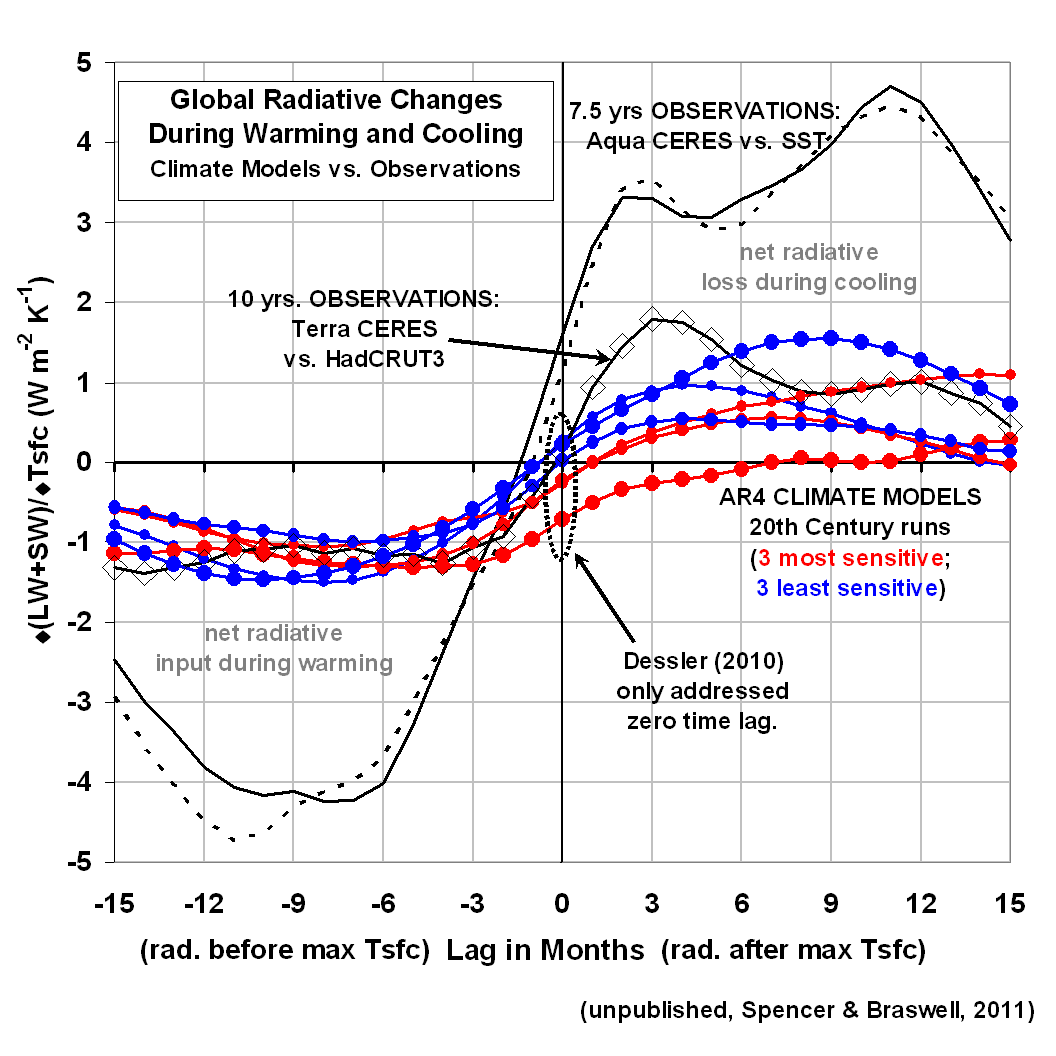
The following plot shows the most pertinent results. While it requires some explanation, an understanding of it will go a long way to better appreciating not only how climate models and the real world differ, but also what happens when the Earth warms and cools from year-to-year…say from El Nino or La Nina.
What the plot shows is (on the vertical axis) how much net loss or gain in radiant energy occurs for a given amount of global-average surface warming, at different time lags relative to that temperature peak (on the horizontal axis). You can click on the graph to get a large version.

All observations are shown with black curves; the climate model relationships are shown in either red (3 models that predict the most global warming during the 21st Century), or blue (the 3 models predicting the least warming). Let’s examine what these curves tell us:
1) RADIATIVE ENERGY ACCUMULATES DURING WARMING IN ADVANCE OF THE TEMPERATURE PEAK: In the months preceding a peak in global temperatures (the left half of the graph), both models and observations show the Earth receives more radiant energy than it loses (try not to be confused by the negative sign). This probably occurs from circulation-induced changes in cloud cover, most likely a decrease in low clouds letting more sunlight in (“SW” means shortwave, i.e. solar)…although an increase in high cloud cover or tropospheric humidity could also be involved, which causes a reduction in the rate if infrared (longwave, or “LW”) energy loss. This portion of the graph supports my (and Lindzen’s) contention that El Nino warming is partly a radiatively-driven phenomenon. [The curves with the much larger excursions are for oceans-only, from instruments on NASA’s Aqua satellite. The larger excursions are likely related to the higher heat capacity of the oceans: it takes more radiative input to cause a given amount of surface warming of the oceans than of the land.]
2) RADIATIVE ENERGY IS LOST DURING COOLING AFTER THE TEMPERATURE PEAK: In the months following a peak in global average temperature, there is a net loss of radiative energy by the Earth. Note that THIS is where there is more divergence in the behavior of the climate models, and the observations. While all the climate models showed about the same amount of radiative input per degree of warming, during the cooling period there is a tendency for the least sensitive climate models (blue curves) to lose more energy than the sensitive models. NOTE that this distinction is NOT apparent at zero time lag, which is the relationship examined by Dessler 2010.
WHAT DOES THE DIVERGENCE BETWEEN THE MODELS DURING THE COOLING PERIOD MEAN?
Why would the climate models that produce less global warming during the 21st Century (blue curves) tend to lose MORE radiant energy for a given amount of surface temperature cooling? The first answer that comes to my mind is that a deeper layer of the ocean is involved during cooling events in these models.
For instance, look that the red curve with the largest dots…the IPCC’s most sensitive model. During cooling, the model gives up much less radiant energy to space than it GAINED during the surface warming phase. The most obvious (though not necessarily correct) explanation for this is that this model (MIROC-Hires) tends to accumulate energy in the ocean over time, causing a spurious warming of the deep ocean.
These results suggest that much more can be discerned about the forcing and feedback behavior of the climate system when time lags between temperature and radiative changes are taken into account. This is why Spencer & Braswell (2010) examined phase space plots of the data, and why Lindzen is emphasizing time lags in 2 papers he is currently struggling to get through the peer review cycle.
SO WHICH OF THE CLIMATE MODELS IS MORE LIKELY TO BE CORRECT?
This is a tough one. The above plot seems to suggest that the observations favor a low climate sensitivity…maybe even less than any of the models. But the results are less than compelling.
For instance, at 3 months after the temperature peak, the conclusion seems clear: the satellite data show a climate system less sensitive than even the least sensitivie model. But by 9 months after the temperature peak, the satellite observations show the same relationship as one of the most sensitive climate models.
So, I’m sure that you can look at this chart and see all kinds of relationships that support your view of climate change, and that’s fine. But *MY* contention is that we MUST move beyond the simplistic statistics of the past (e.g., regressions only at zero time lag) if we are to get ANY closer to figuring out whether the observed behavior of the real climate system supports either (1) a resilient climate system virtually immune to the activities of humans, or (2) a climate system that is going to punish our use of fossil fuels with a global warming Armageddon.
The IPCC is no nearer to answering that question than they were 20 years ago. Why?

 Home/Blog


